 201 201 | print by Maurits Cornelis Escher (1898-1972), Netherlands Maurits Cornelis Escher, master artist and creator of tessellations, was born in Leeuwarden, Netherlands in 1898. After an aborted attempt to become an architect, Escher studied graphic art at the School for Architecture and Decorative Arts in Haarlem. Over the years and throughout his travels, he created a number of fascinating landscapes, portraits, and geometric designs, but the work for which he is most famous, his tessellations, were his main preoccupation. Since his first visit to the Alhambra in Spain in 1922, Escher was intrigued by the Moorish mosaics. Escher animated his own versions of the abstract geometrical designs he had seen. Through his extraordinary creativity and an inate understanding of the mathematics involved, Escher created hundreds, perhaps even thousands, of tessellating shapes in the form of fish, birds, dogs, crabs, insects, horses, humans, and other beasts. In the Escher section of Totally Tessellated, you will find a variety of information about M. C. Escher, but by no means all that is available. When there is a particular reference that will supplement your studies of Escher and tessellations, the reference will be noted. Here you will find a brief bibliography, and introduction to Escher's collective works, and a section on his tessellations, including an analysis of a selection of Escher's best, and instructions on how to create some of your own. All M. C. Escher works (c) Cordon Art B.V.-Baarn-the Netherlands. |
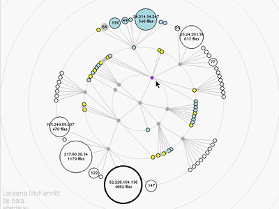
 470 470 | 1998 computer graphics by Emmanuel Frécon WebPath is "... a tool that unobtrusively visualises a user's trail as they browse the Web", developed by Emmanuel Frécon, a researcher in the Distributed Collaborative Environments group at SICS, and Gareth Smith in the Computing Department, at Lancaster University. See Frécon and Smith's 1998 paper for more information. "WebPath - A three-dimensional Web History", IEEE Symposium on Information Visualization (InfoVis '98), Chapel Hill. NC, USA. |
 42 42 | 1785 print by August Friedrich Wilhelm Crome, Germany Superimposed squares to compare areas (of European states). Crome, A. F. W. (1785). Über die Grösse and Bevölkerung der Sämtlichen Europäschen Staaten . Leipzig: Weygand. Nikolow, S. (2001). A.f.w. crome's measurements of the strength of the state: Statistical representations in central europe around 1800. In J.L. Klein and M.S. Morgan (eds.), The Age of Economic Measurement . Raleigh, NC: Duke University Press. |
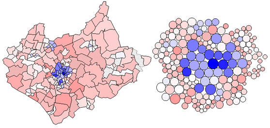
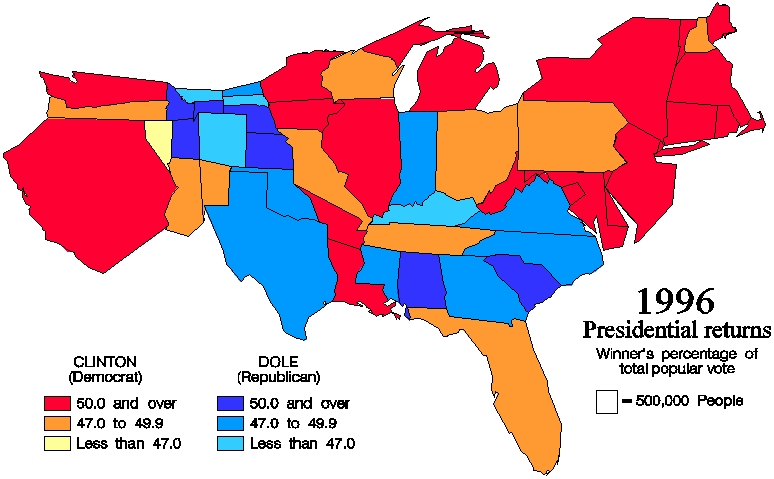 540 540 | computer graphics The results of the popular vote in the 1996 U.S. presidential race are visualized above using traditional thematic mapping. Each state is colored either a shade of red or a shade of blue, denoting the majority winner of each state as Clinton or Dole, respectively, with color saturation indicating the magnitude of the winning percentage. There is a significant problem with this visualization. Without prior knowledge of population density across the country, the viewer has no clear indicator as to who actually won the election. While this map provides a medium of familiarity, it produces an intrinsic distortion of the very data we are trying to analyze. Since elections are not won on square miles, the results would be better visualized on a map more representative of population. These same election results are shown below on a 1996 equal population cartogram generated using the Constraint-Based Method. |
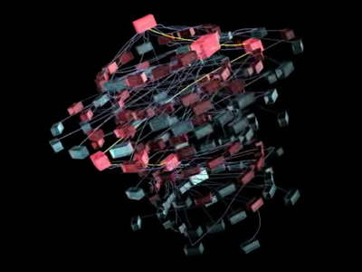
 907 907 | 2004 computer graphics by Gerhard Dirmoser In the last years, Gerhard Dirmoser has developed a set of strikingly complex visualization posters under the theme "Art-in-Context" (Die Kunst der Ausstellung). The form of this context is usually a diagram in the size of a poster (aprox. 240cm x 180cm), split in 4 parts. In this poster, Dirmoser analyzes most author's contributions to Ars Electronica in the last 25 years. Due to the limitations of the available surface, it wasn't possible to provide a complete detailed presentation of all the participating artists, scientists and developers (about 3100 persons are listed). All the participants were compared with the AEC/Ars database. The language material used was taken from publications on "ars electronica", notes (on the symposium lectures) and relevant literature. The study "Designing Gestures" on ars electronica 2003 was carried out in parallel. The choice/placement is thus to be regarded as the author of the study's subjective/content-based selection.The study is intended to provide a wide-ranging survey, but it cannot substitute for reading the catalogues. In some cases, key works (or concepts) are cited, which were not shown in Linz, but are described in detail in catalogues. The poster can also be used as an index with the page numbers. The first image shows one of the four pieces of the poster and the second image is a detailed view of it. To see the poster in a public installation, click here |
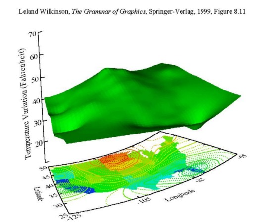 134 134 | 1999 computer graphics by Leland Wilkinson (1944-), USA Grammar of Graphics: A comprehensive systematization of grammatical rules for data and graphs and graph algebras within an object-oriented, computational framework. Wilkinson, L. (1999). The Grammar of Graphics. New York: Springer. ISBN 0-387-98774-6. |
 306 306 | 1996 computer graphics by Stephen G. Eick and colleagues, Bell Laboratories Two examples of the research work of Stephen G. Eick and colleagues at Bell Laboratories into the visualization and analysis of Internet traffic flows. Their 1996 research paper "3D Geographic Network Display" provides further details. |
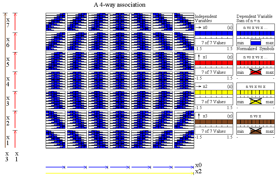 145 145 | 1989 computer graphics by Ted Mihalisin, USA Use of 'nested dimensions' (related to trellis and mosaic displays) for the visualization of multidimensional data. Continuous variables are binned, and variables are allocated to the horizontal and vertical dimensions in a nested fashion. Mihalisin, T., Gawlinski, E., Timlin, J., and Schwegler, J. (Oct. 1989). Multi-dimensional graphing in two dimensional spaces. Scientific Computing and Automation, 6:15-20. Mihalisin, T., Schwegler, J., and Timlin, J. (1992). Hierarchical multivariate visualization. In H. J. Newton (ed.), Computing Science and Statistics: Proceedings of the 24th Symposium on the Interface, vol. 24, pp.141-149. |
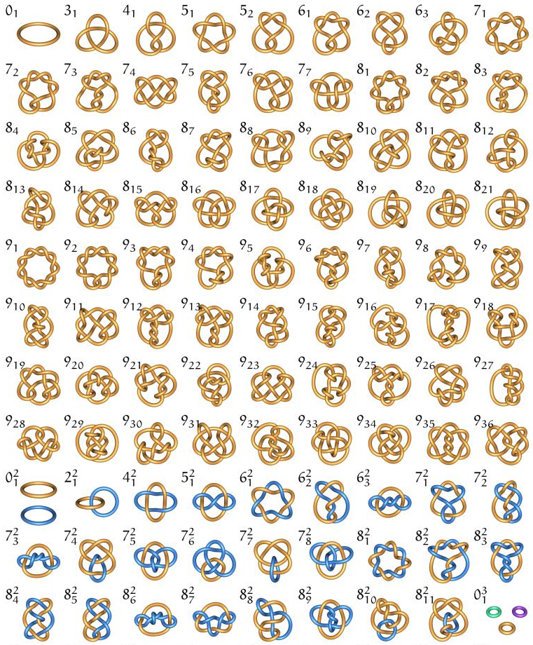 194 194 | 1998 computer graphics (KnotPlot) by Robert G. Scharein From the knotplot.com/zoo website, you can click on a knot to load it into an interactive 3D viewer (requires Java). |
 195 195 | 1998 computer graphics (KnotPlot) by Robert G. Scharein From the knotplot.com/zoo website, you can click on a knot to load it into an interactive 3D viewer (requires Java). |
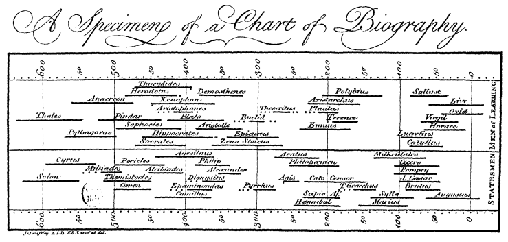 43 43 | 1765 print by Joseph Priestley (1733-1804), England Historical time line (life spans of 2,000 famous people, 1200 B.C. to 1750 A.D.), quantitative comparison by means of bars. Priestley, J. (1765). A Chart of Biography . London: (n.p.). BL: 611.I.19. |
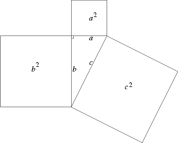 229 229 | Wolfgang Slany Proofs are usually dry, dusty stuff sprinkled liberally with symbols. What about proving something with a picture? This proof of the Pythagorean Theorem is attributed to Bhaskara, a Hindu mathematician of the 12th century. We are given the bottom right triangle. Construct a square by making three copies of the triangle, as shown. Got it? The side of the small square is b-a, and its area is (b-a)² or b²-2ab+a². The area of our triangle is ab/2. The area of all four triangles is 2ab. Then the area of all four triangles, plus the area of the small square is b²+a². So c²=a²+b². See also the AMS page: http://www.math.sunysb.edu/~tony/whatsnew/column/visual-0300/visual1.html |
 921 921 | 2005 computer graphics by Kenneth Allendoerfer, Serge Aluk The usability of knowledge domain visualization (KDViz) tools can be assessed at several levels. Cognitive Walkthrough (CW) is a well-known usability inspection method that focuses on how easily users can learn software through exploration. Typical applications of CW follow structured tasks where user goals and action sequences that lead to achievement of the goals are welldefined. KDViz and other information visualization tools, however, are typically designed for users to explore data and user goals and actions are less well understood. In this paper, presented at the 2005 IEEE Symposium on Information Visualization,the authors describe how the traditional CW method may be adapted for assessing the usability of these systems. They apply the adapted version of CW to CiteSpace, a KDViz tool that uses bibliometric analyses to create visualizations of scientific literatures. They describe usability issues identified by the adapted CW and discuss how CiteSpace supported the completion of tasks, such as |
 635 635 | 2006 computer graphics (interactive) by thepurehands.org a visualization of the entire book collection from Amazon. the size of categories reflects the approximate number of books within that category. users can zoom in to explore the books that are filed under the category, until indivisual individual books are visible. currently still a prototype. see also amazon treemap & amaztype & music plasma. From "thepurehands.org" website: "Walking into the university for me keeps me bumping into people which generate interesting flows of information. The key observation was that of a library. The conversation turned to open and closed stack libraries. Closed stack libraries ( like the British Library) you walk in and order the book you want and that’s what you get. Open stack libraries you get the books your self and you get to see the books near the ones your looking for. This can lead to wonderful accidents. The software for UCL’s library is closed stack - it tells you about what you asked for and nothing else. We noted that on Amazon acts like a closed stack ( you ask for books it finds them ) and tries to act like a (open shelf) library or a book shop. It does this by presenting similar books to the one you take notice of. We called this ‘slit shelf’ ( between open and closed ). At first we like the notion of producing an interface to all of the UCL library. Trying to get the data would be FAR too difficult for a short project. A little research showed that Amazon had and a way to let developers access all the data (if a little slowly).So the project became to visualise all of Amazon (books). This was good as Amazon is distinctly pre-Google. The primary web-page is stuffed with information noise. Each page is also overwhelms the reader with considerable excess and irrelevant information. From a design point of view it would be good to bring some clarity to the browsing process. What would you do?" |
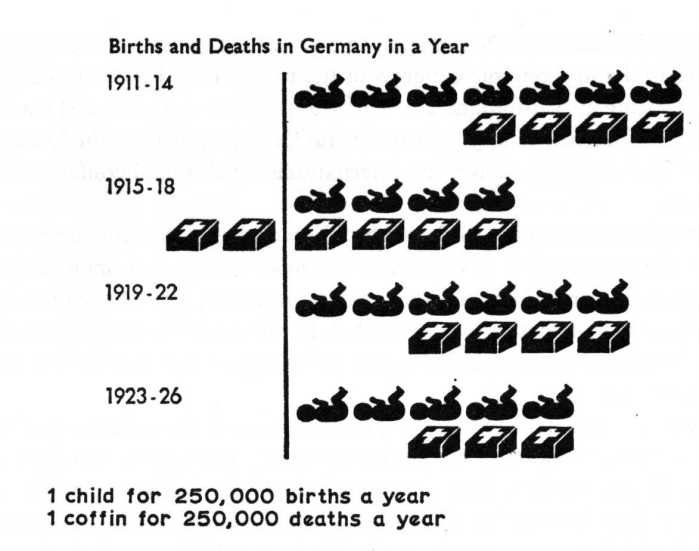
 115 115 | 1919 print by Leonard Porter Ayres (1879-1946), USA Social statistical chartbook, containing a variety of graphic and semi-graphic displays in a USA Government report. [This image is a fine early example of a semi-graphic display, showing four variables simultaneously.] Ayres, L. P. (1919). The War with Germany, A Statistical Summary . Washington, D.C.: U.S. Government Printing Office. ISBN 040511852X. Commonly known as the Ayres report; reprinted: Arno Press, NY, 1979. *Tufte, E. R. (1983). The Visual Display of Quantitative Information . Cheshire, CT: Graphics Press. |
 959 959 | 2002 computer graphics by Marius Watz Marius Watz, Art Director of Generator.x, has used the nom-de-guerre Amoeba since 1995 for experimentation in electronic media, with the web site Evolutionzone.com as the output. In this environment, Watz shows amazing generative art pieces that are both intriguing and captivating. AmoebaAbstracts 1-3, is a set of 3 experiments in abstract computational composition and dynamic form. The abstracts, responsive to user input, were built with Processing for the exhibition "Abstraction Now", Kunstlerhaus Wien, September 2003, and were also exhibited at Sonar 2004, Barcelona. The images shown are representative of Abstract 2, an endlessly emerging geometric pattern. This generative piece of visual abstraction doesn't consider any set of actual data, however, its aesthetical visual depiction represents a fresh approach that might prove inspiring to any network visualization endeavor. |
 74 74 | 1888 print by Émile Cheysson (1836-1910), France First anamorphic maps, using a deformation of spatial size to show a quantitative variable (e.g., the decrease in time to travel from Paris to various places in France over 200 years). Palsky, G. (1996). Des Chiffres et des Cartes: Naissance et développement de la cartographie quantitative française au XIXe siècle. Paris: Comité des Travaux Historiques et Scientifiques (CTHS). ISBN 2-7355-0336-3. (Fig. 63-64) |
 986 986 | 2001 computer graphics by Ka-Ping Yee, Danyel Fisher, Rach Presented at InfoVis 2001, this project presents a new animation technique for supporting interactive exploration of a graph using a radial tree layout method. As an alternative to trying to fit an entire graph into one view, this project provides exploration of subregions of the graph. Even if a graph is small enough to display all at once, it can be difficult to understand all of its relationships from only a single view. The ability to interactively view a graph from different perspectives can yield new insights. The authors used a visualization paradigm in which the view of a graph is determined by the selection of a single node as the center of interest, or focus. The main contribution of this work is a new technique for animating the transitions from one view to the next in a smooth, appealing manner. The algorithm augments the well-known radial layout method by linearly interpolating the polar coordinates of the nodes and enforcing constraints on the new layout to keep it as similar as possible to the previous layout. When combined with a method for aggregating or eliding nodes far away from the focus, this technique can also provide an effective way to explore very large graphs. |
 189 189 | 1998 computer graphics (KnotPlot) by Robert G. Scharein Third stage in the construction of Antoine's necklace. The next stage would be to replace each component ring in the above with a linked chain of rings. At the end of an infinite number of such steps we are left with Antoine's necklace, an object homeomorphic to the Cantor space. |
 781 781 | 1997 computer graphics by (unknown) A potential for a visualization (similar to http://moat.nlanr.net/AS/background.html) maps Autonomous Systems as nodes on the surface of a sphere, and then interconnect via reachability paths. The following visualization attempts to to this, by then also mapping the nine BGP peers (which exchange data with the server in Oregon) onto a site of the sphere opposite the target AS number (90). The graphic shows the (green) Oregon server on the left site, connected to the (purple) BGP sites, from where then the paths emerge via (yellow) pipes and (red) Autonomous System spheres at the inside of the (blue, transparent) system sphere, towards the (green) target network. |
 190 190 | 2003 computer graphics (KnotPlot) by Robert G. Scharein Clifford Ashley (1881-1947), an American painter and writer, is probably better known as an expert knot tyer and the author of the magnificent The Ashley Book of Knots. You could do no better than to go to that source for thousands of intricate drawings of knots and the process of tying them. Since I can't tie a bowline without consulting a manual, I admire Ashley mainly as a drawer of knots. Ashley includes many knots that are primarily decorative. Some of these are closed loops (as are mathematical knots). I call the knots on this page "Ashley knots," but of course many of them were invented long before Ashley. Please consult Ashley's book to see the origin of each of these knots. |
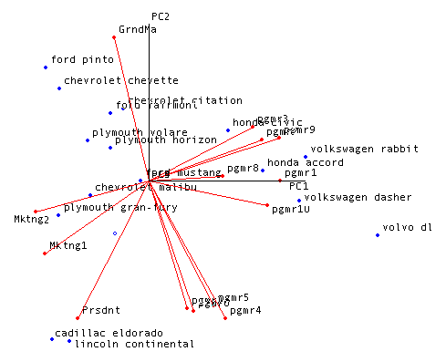
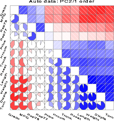 163 163 | 2002 by Friendly, M. Correlation (and covariance) matrices provide the basis for all (classical) multivariate statistical techniques, but most of these compress the correlations into a low-dimensional summary. How about a direct graphical display? The correlogram uses two general techniques: (a) rendering the value of a correlation to depict its sign and magnitude. This image shows just two: circular ``pac-man'' pies, and shading, with diagonal stripes indicating the direction. In both, Blue is used for positive correlations, and red for negative, with the intensity of shading proportional to the magnitude of the correlation. (b) re-ordering the variables in a correlation matrix so that ``similar'' variables are positioned adjacently. Here, the variables have been permuted based on the angular ordering of the first two principal components. The figure shows the correlations among 12 measures of 74 automobiles from the 1979 year, from Friendly, M., "Corrgrams: Exploratory displays for correlation matrices" (2002). The American Statistician v.1.5. |
 132 132 | 1968 print by Roberto Bachi (1909-1995), Israel Systematic "graphical rational patterns" for statistical presentation. Bachi, R. (1968). Graphical Rational Patterns, A New Approach to Graphical Presentation of Statistics. Jerusalem: Israel Universities Press. |
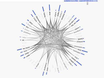 1018 1018 | 2006 computer graphics by (unknown) Backchannel is a real-time view of the conversation happening in the #etech IRC channel at O'Reilly's Emerging Technology Conference. Stamen Design has a bot observing events in the channel, publishing them as a web-service via XML and JSON, and making them available to a visualization component built in Flash. A conference backchannel is home to a lot of interesting conversational dynamics: additional context, participation from speakers, visitors from elsewhere in the world, sniping, and coordinated walkouts. The authors were intrigued by the idea of a pointedly live visual environment that would illustrate and respond to this other space. Each participant in the backchannel is shown in a circle, with nicknames arranged alphabetically, counter-clockwise from right. Blue bars next to each nickname show how active each participant has been. Connections between nicknames show participants who?ve spoken around the same time. Events are marked in a narrow strip across the top, in blue. The most recent events are at right, stretching back in time about three hours to the left. |
 909 909 | 2005 computer graphics by Ero Carrera, Gergely Erdelyi Windows binary malware has come a long way. Today's average worm is often tens or hundreds of kilobytes of code exhibiting a level of complexity that surpasses even some operating systems. This degree of complexity, coupled with the overwhelming flow of new malware, calls for improvements to tools and techniques used in analysis. F-Secure produced this rich 3D animation that visualizes the structure and execution of the W32/Bagle.AG@mm worm. The boxes in the picture are functions of the worm. The one on the top is the 'main' where the execution starts. The first ring contains all the functions that 'main' calls. The second all the functions that the ones on the first ones call and so on. All connecting lines represent the calls from one function to the other. Red boxes belong to the virus code while the blue ones are API calls library code that do not belong to the malicious code. The animation was created using IDA Pro, IDAPython, Blender and other custom scripts. For a direct link to the animation (quicktime required), click here. |
 1230 1230 | 2006 computer graphics by Robert Pietrusko and Nadia Ries-Shen (PIIM) The 2005 BRAC recommendation describes in great detail the flow of troops, civilian jobs and military equipment that will occur over the next ten years in response to a massive base realignment and closure scheme. This information, however, is spread over many hundreds of pages that obscure the interdependencies between states as well as economic and environmental ramifications. PIIM's visualization provides a more intuitive and faster access to BRAC dynamics that would allow decision makers to delve into the details that specifically show how decisions made at bases impact the dynamics of the people and economy in even distant states. After familiarization with an accompanying legend, a user can quickly gain an overall understanding of how each state, and each base, is impacted by the BRAC initiative. Over thousands of data points can thus be reviewed rapidly and in the context of bases, recommendations and the nation. |
 1211 1211 | 2006 computer graphics by Robert Pietrusko and Nadia Ries-Shen (PIIM) After familiarization with this legend, one can quickly gain an overall understanding of how each state, and each base, is impacted by the BRAC initiative in the main visualization. Thousands of data points can thus be reviewed rapidly and in the context of bases, recommendations and the nation. |
 1210 1210 | 2006 computer graphics by Robert Pietrusko and Nadia Ries-Shen (PIIM) Fort Monmouth Recommendation This visual snapshot maps the effect of the Army recommendation to close Fort Monmouth Army base and redistribute personnel to other bases within the BRAC initiative. An interactive tool based on all BRAC data will permit six view options. These include (1) the effect of a single recommendation on a single base, (2) the effect of a single recommendation on all affected bases, (3) the effects of all recommendations on a single base, (4) the effects of all recommendations on all bases, (5) the effects of a single base on all affected bases regardless of recommendation, and lastly (6) the effects on a single base by immediately impacting bases regardless of recommendation. (The depicted view currently shows an example of option two: the effect of a single recommendation on all affected bases). |
 865 865 | 2004 computer graphics by Karsten Schmidt Four-letter words have a special status in the english language and culture. Counting in at over 1650 words, in most cases the term is only used to address the more crude, sexual subset and its use has been effectively eliminated from the language of "good" society, mainly due to its negative connotations with lack of education, etiquette and status. In a way, the use of those four-letter words reflects the schizoid prudence and class system in English speaking societies, still evident today. base26 is a startling interactive visualization project that attempts to give a spatial overview of the entirety of this part of English language heritage, as well as to explore and visualize relations between all those words. Letters are interpeted as 4D coordinates, shown in a smoothly transforming 3D space, produced with Processing. |
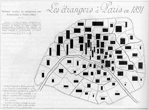 77 77 | 1896 print by Jacques Bertillon (1851-1922), France Use of area rectangles on a map to display two variables and their product (population of arrondisements in Paris, percent foreigners; area = absolute number of foreigners). Bertillon, J. (1896). Fréquence des étrangers à Paris en 1891. In Cours élementaire de statistique administrative. Paris: Societé d'éditions scientifiques. (map). Palsky, G. (1996). Des Chiffres et des Cartes: Naissance et développement de la cartographie quantitative française au XIXe siècle . Paris: Comité des Travaux Historiques et Scientifiques (CTHS). ISBN 2-7355-0336-3. (Fig. 85) |
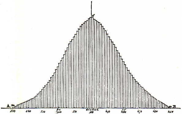 72 72 | 1846 print by Adolphe Quetelet (1796-1874), Belgium Results of sampling from urns shown as symmetrical histograms, with limiting "curve of possibility" (later called the normal curve). Quetelet, A. (1846). Lettres sur la Théorie des Probabilités, Appliquée aux Sciences Morales et Politiques. Brussels: M. Hayez. |
 122 122 | 1971 print by Rubin Gabriel (1929-2003), USA Development of the biplot, a method for visualizing both the observations and variables in a multivariate data set in a single display. Observations are typically represented by points, variables by vectors, such that the position of a point along a vector represents the data value. Gabriel, K. R. (1971). The biplot graphic display of matrices with application to principal components analysis. Biometrics, 58(3):453-467. |
 121 121 | 1971 print by Rubin Gabriel (1929-2003), USA Development of the biplot, a method for visualizing both the observations and variables in a multivariate data set in a single display. Observations are typically represented by points, variables by vectors, such that the position of a point along a vector represents the data value. Gabriel, K. R. (1971). The biplot graphic display of matrices with application to principal components analysis. Biometrics, 58(3):453-467. |
 106 106 | 1924 print by Otto Neurath (Director of the Social and Economic Museum) (1882-1945), Vienna, Austria Museum of Social Statistical Graphics and the ISOTYPE system (International System of Typographic Picture Education). Neurath, O. (1973). From Vienna method to Isotype. In M. Neurath and R. S. Cohen (eds.), Empiricism and Sociology, pp. 214-248. Dordrecht, NL: Reidel. (papers written 1925-45). Neurath, O. (1991). Gesammelte Bildpaedagogische Schriften. Vienna: Verlag Hoelder-Pichler-Tempsky. ISBN 3209008639. Rudolf Haller and Robin Kinross (eds.). |
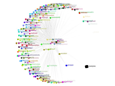
 1255 1255 | 2007 Web by Daniele Galiffa using Actionscript Analysis and experiments on relations into the Italian Blogosphere I’ve been invited to join to the blogbabel initiative that aims to map the italian blogosphere. My effort in this interesting project is about to find some new, useful infovis-related solutions to offer some better cognitive tools to approach the Italian blog world and its relations. I started looking around to find interesting solutions about blog-mapping ( from the Manuel Lima’s blogviz, to the BlogoPole French initiative and the first BlogBabel visualization from Ludo). What seemed to me really interesting is mainly the relations Analysis and not the Graph representation, because it tends to offer a “star-system†style visual environment that requires some more deep work in order to be used to understand how blogs are related each other. My idea is really simple: suppose you have a line where you can use points to represent Blogs. Above the line I can have arches connecting a source blog (on the left side of the arch) to another (on the right side of the arch). Below the line I can have also arches, but the connection direction is from right to left. The use of arches and circles come out from “The Shape of Songs†by Martin Wattenberg. In this way we have a LinksOut View (UP) and a LinksIn View (DOWN) and we could use the opacity of each arch to visualize how relations are relevant considering the numeber of links (in/out) among blogs. The above description was modified from: http://www.mentegrafica.it/blog/2007/05/10/analisys-and-experiments-on-relation-into-the-italian-blogosphere/ (images may be found at http://flickr.com/photos/danielegaliffa/tags/blogosphere/) |
 749 749 | 2001 computer graphics by Ernst Kleiberg, Huub van de Wete This method is based on the observation that we can easily see the branches, leaves and their arrangement in a botanical tree, despite of the large number of elements. The strand model of Holton is used to convert an abstract tree into a geometric model. Non-leaf nodes are mapped to branches and child nodes to sub-branches. Furthermore, continuing branches are emphasized, long branches are contracted, and sets of leaves are shown as fruit. The method is applied to the visualization of directory structures. The elements, directories and files, as well as their relations can easily be extracted, thereby showing that methods from botanical modeling can be effective for information visualization. |
 123 123 | 1969 print by John W. Tukey (1915-2000), USA Graphical innovations for exploratory data analysis (stem-and-leaf, graphical lists, box-and-whisker plots, two-way and extended-fit plots, hanging and suspended rootograms). Tukey, J. W. (1972). Some graphic and semigraphic displays. In T. A. Bancroft (ed.), Statistical Papers in Honor of George W. Snedecor, pp. 293-316. Ames, IA: Iowa State University Press. Presented at the Annual Meeting of the American Statistical Association, August 1969. |
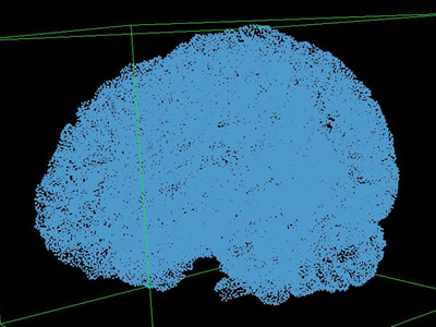 993 993 | 2004 computer graphics by Patrick Yau As an undergraduate at UC Davis, Patrick Yau had the opportunity to work at the Visualization and Graphics Research Group in the Institute for Data Analysis and Visualization (IDAV). He was under the guidance of Professor Bernd Hamann and Dr. Lars Linsen when he and his colleagues developed the project "Brain Mapping via Hierarchical Isosurface Segmentation Based on Discrete Curvature". The idea of the project is to look into the surface of two brains and identify the similarities between then. They focused in particular on the curvature of the brains (folds and bumps). Yau worked on data preprocessing and the automated brain mapping algorithm. He wrote a procedure that automatically identifies the front, side and the top for two brains using Principal Component Analysis (PCA), and he also wrote a procedure that constructs a topology graph based on the curvature of a brain. The two images shown here reveal different representations of the same brain: as points and as a topology graph. |
 197 197 | 1942 oil on canvas by Piet Mondrian This is not an actual tessellation since it does not repeat. However, the heavy usage of squares and rectangles is a technique that can create tessellations easily. The coloring technique is also interesting. Mondrian balances the three colors used in this design (the primary colors plus gray) to give balance to the artwork. (Posted by Nicolas Pioch.) The Museum of Modern Art, New York |
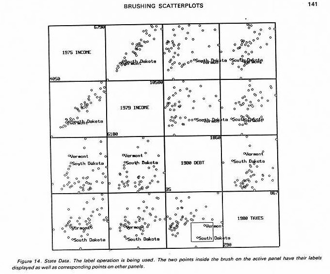 141 141 | 1987 computer graphics by Richard A. Becker and William S. Cleveland, USA Figure 14 from "Brushing scatterplots" showing interactive labeling of brushed points. An example of interactive statistical graphics allowing brushing, linking, and other forms of interaction. Becker, R. A. and Cleveland, W. S. (1987). Brushing scatterplots. Technometrics, 29:127-142. |
 873 873 | 2005 computer graphics by Adam D'Angelo BuddyZoo is a visualization analysis tool that maps AIM buddy lists in order to detect a series of patterns. Here's how it works: Users submit their AIM buddy lists to buddyzoo.com, and then the application runs all kinds of analysis on the data, letting users: - Find out which buddies they have in common with their friends. - Measure how popular they are. - Detect cliques they're part of. - See a visualization of their Buddy List. - View their Prestige, computed in a similar manner as Google's PageRank. - See the degrees of separation between different screen-names. |
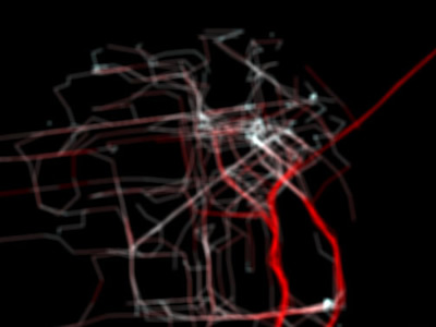 1021 1021 | 2006 computer graphics by Shawn Allen, Thomas Apodaca, Mik Invisible Dynamics is a research project sponsored by The Exploratorium which explores the meanings and representations of place. Working across the domains of art, design, cultural geography, cartography, information design, sociology, hydrology, marine sciences, and history, I.D. hosts residencies and workshops, as well as developing exhibitions and public programs. Using new technologies for the representation and analysis of spatial information, I.D. investigates the complexities of the San Francisco Bay Region in the context of the Pacific Rim. As part of Invisible Dynamics, Stamen Design has been exploring visualizations of GPS data generated by Yellow Cab taxi cabs in San Francisco. In these frame-by-frame maps of the locations of cabs in the Bay Area, the city ebbs and pulses like the beating of a heart in a truly captivating sequence. Both visualizations are part of a video where each frame shows 15 minutes of activity in a dynamic map of taxicabs' speed and position. In the first image, speed is represented by the change in color (White: 0 mph Red: >35 mph), while in the second, larger crosses represent faster taxis. Cabspotting is a product of San Francisco's Stamen Design, a boutique services firm specializing in data visualization, map making, interactive media, and creative technology reinterpretation. You might remember Stamen from such projects as Mappr or In The News / Vox Delicii. |
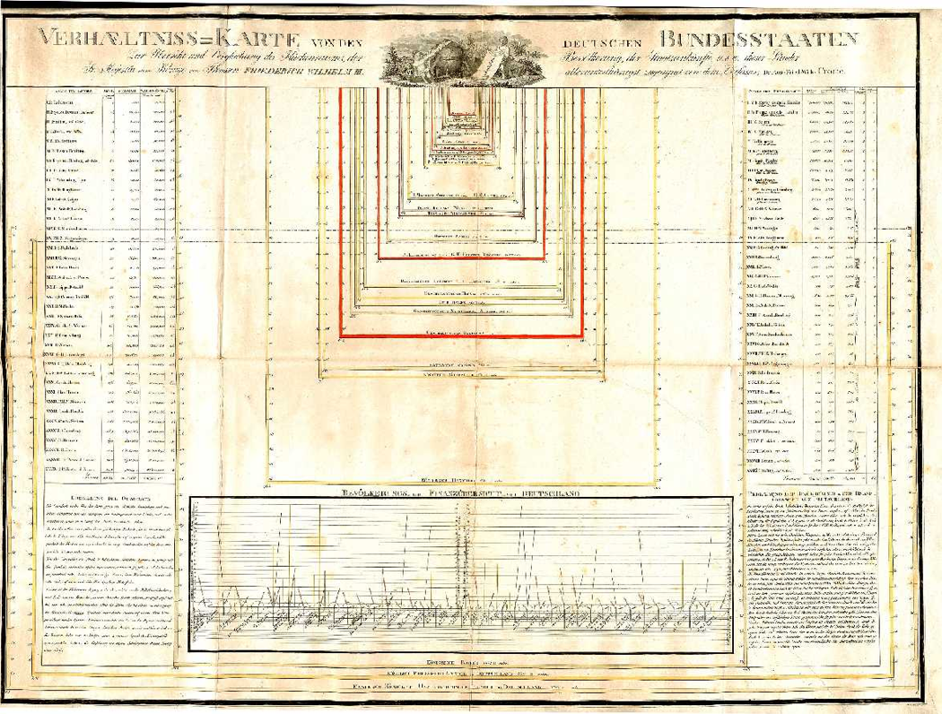
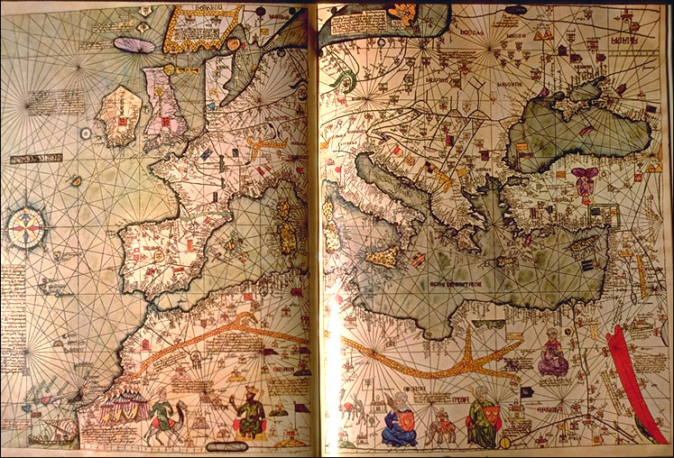 1 1 | 1375 print by Abraham Cresques (1325-1387), Majorca, Spain Catalan Atlas, an exquisitely beautiful visual cosmography, perpetual calendar, and thematic representation of the known world. |
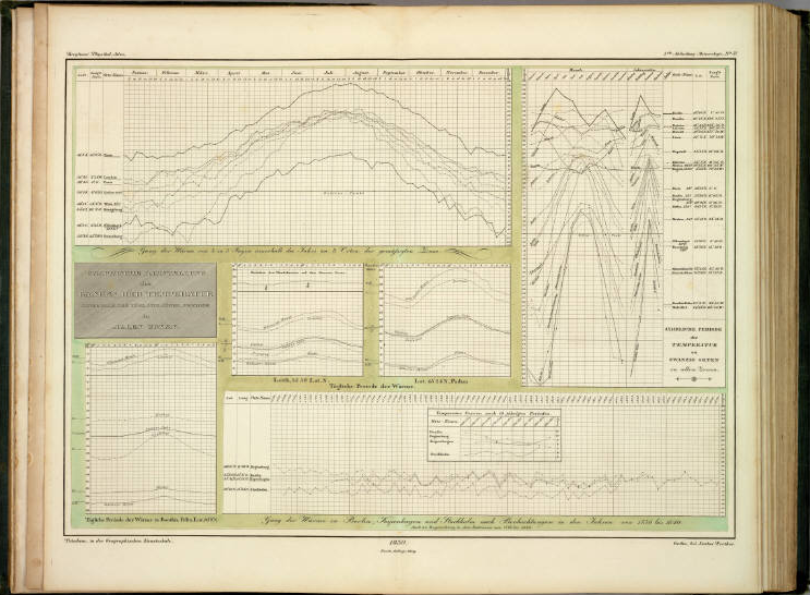
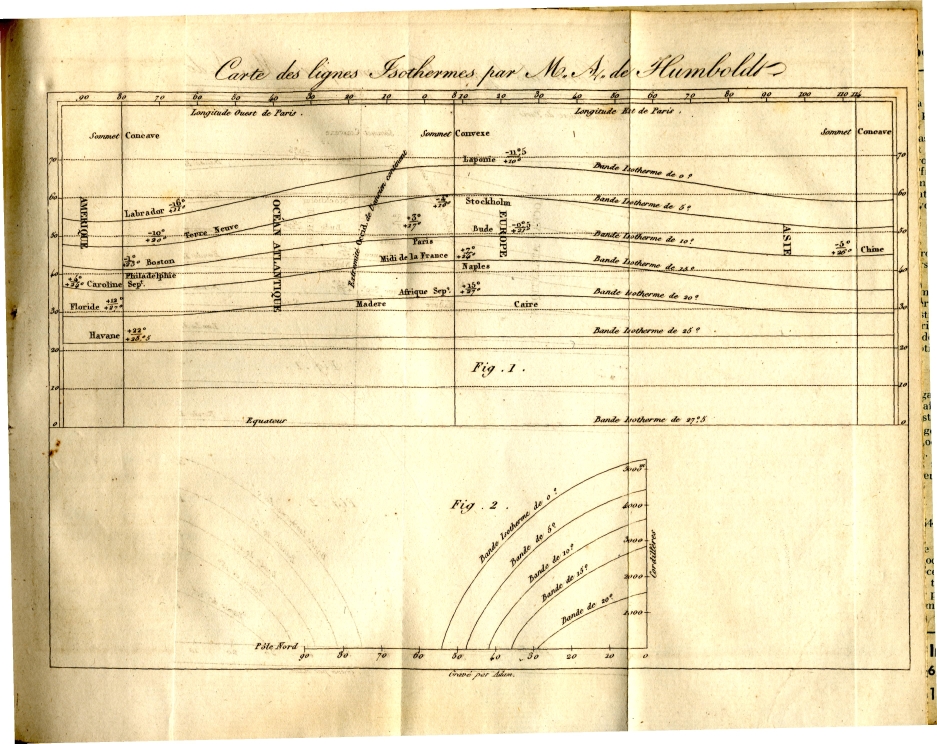 64 64 | 1817 print by Alexander von Humboldt (1769-1859), Germany First graph of isotherms, showing mean temperature around the world by latitude and longitude. Recognizing that temperature depends more on latitude and altitude, a subscripted graph shows the direct relation of temperature on these two variables. von Humboldt, A. (1817). Sur les lignes isothermes. Annales de Chimie et de Physique, 5:102-112. |
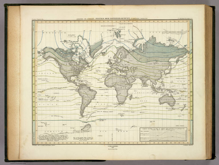 66 66 | 1817 print by Alexander von Humboldt (1769-1859) von Humboldt isotherms from Berghaus' 1849 AtlasrnrnFirst graph of isotherms, showing mean temperature around the world by latitude and longitude. Recognizing that temperature depends more on latitude and altitude, a subscripted graph shows the direct relation of temperature on these two variables - Germany |
 557 557 | computer graphics |
 48 48 | 1819 print by Baron Pierre Charles Dupin (1784-1873), France Cartogram, map with shadings from black to white (distribution and intensity of illiteracy in France), the first (unclassed) choropleth map, and perhaps the first modern statistical map. (This cartogram dates from 1826 (Dupin 1827, Plate 1, vol.2) according to Robinson (p.232), rather than 1819 according to Funkhouser). Dupin, C. (1826). Carte figurative de l'instruction populaire de la France . Jobard. BNF: Ge C 6588 (Funkhouser (1937, p.300) incorrectly dates this as 1819). Dupin, C. (1827). Forces productives et commerciales de la France. Bachelier. Robinson, A. H. (1982). Early Thematic Mapping in the History of Cartography . Chicago: University of Chicago Press. ISBN 0-226-72285-6. Funkhouser, H. G. (Nov. 1937). Historical development of the graphical representation of statistical data. Osiris, 3(1):269-405. Reprinted Brugge, Belgium: St. Catherine Press, 1937. |
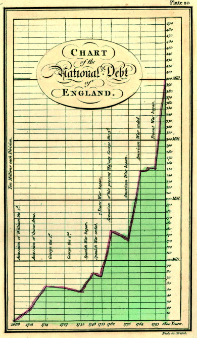 40 40 | 1786 print by William Playfair (1759-1823), England Bar chart, line graphs of economic data. Playfair, W. (1786). Commercial and Political Atlas: Representing, by Copper-Plate Charts, the Progress of the Commerce, Revenues, Expenditure, and Debts of England, during the Whole of the Eighteenth Century . London: Corry. Re-published in Wainer, H. and Spence, I. (eds.), The Commercial and Political Atlas and Statistical Breviary, 2005, Cambridge University Press, ISBN 0-521-85554-3. |
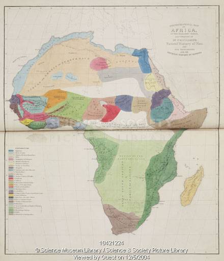
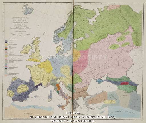
 47 47 | 1838 print by Heinrich Berghaus (1797-1884), Germany Physical atlas of the distribution of plants, animals, climate, etc., one of the most extensive and detailed thematic atlases; most of the maps contained tables, graphs, pictorial profiles of distributions over altitude, and other visual accompanyments. Berghaus, H. (1838). Physikalischer Atlas . Gotha: Justus Perthes. 2 vols., published 1845-48. |
 160 160 | 1991 by Jason Dykes and David Unwin There are many difficulties in showing rates of incidence or proportions in maps, when both the areas of geographic regions, and the populations in those regions vary, often inversely. In spatial epidemiology, for example, Standardized Mortality Ratios are often used, expressing the ratios of the number of deaths in each area to those expected on the basis of some externally specified (typically national) age-sex specific rates. This figure uses a Chi-square metric to depict the distribution of number of cars, O, in each ward in Leicestershire, UK, expressed as a signed chi-square contribution, (Oi - Ei)/ Ö Ei, relative to the expected number, E, per capita. A diverging colour scheme applies hues of red and blue to those areas with higher and lower than expected values with colour saturation showing the magnitude of the variation. Thus whiter zones are close to the expected value and deeper blues and fuller reds show the extremes. This map still confounds area and population with visual impact, which the use of a cartogram base, with circle areas proportional to the population, helps avoid. Figures from Maps of the Census: A Rough Guide, by Jason Dykes and David Unwin (http://www.agocg.ac.uk/reports/visual/casestud/dykes/abstra_1.htm). Abstract: This Case Study describes the considerations that are needed to produce maps of data from the Census of Population. The `area value' or choropleth map is the standard means of displaying such information on paper. It is a very imperfect visualisation device. First, it is necessary to be careful about the numbers that are mapped and, in particular, never to map absolute numbers. Second, choropleth maps are very sensitive to the mapping zones being used. To produce maps that do not distort the underlying distributions it is necessary to understand how the zones were defined and the effects of their varying sizes on the mapped pattern. Third, there are a series of strictly cartographic considerations related to how these maps are classed and the symbolism used. All of these issues are illustrated using data from the 1991 Population Census for Leicestershire, UK. These problems lead to a consideration of the need to develop new mapping tools. Dynamic maps can take advantage of an interactive software environment to overcome some of the limitations of the static map. The possibilities which they provide for interactive engagement with data make them appropriate tools for exploratory analysis, or visual thinking. A mapping tool is introduced, which exemplifies this form of map use and examples of the techniques that might be used to visualize the UK Census of Population are provided. |
 46 46 | 1787 print by Ernest Florens Friedrich Chladni (1756-1827), Germany Visualization of vibration patterns (by spreading a uniform layer of sand on a disk, and observing displacement when vibration is applied). Chladni, E. F. F. (1787). Entdeckungen uber die Theorie des Klanges. Leipzig: Bey Weidmanns Erben und Reich. |
 904 904 | 2004 computer graphics by Moritz Stefaner As a follow-up job, Moritz Stefaner developed a visual semantic web browser for the project WINDS, an EC-funded project in the 5th Framework, Information Society Technologies programme, Flexible University key action. The main goal of WINDS is to contribute to the reorganisation of the pedagogical, cultural and functional aspects of design education at university. Stefaner produced this flash demo that allows an incredibly smooth navigation through the content of the CIA Factbook, jumping from country to country with extreme fluidity. For every country one can easily see its neighboring countries, the official languages, water and terrestrial boundaries, and even more detailed info by expanding the country's sphere. The visualized data came from a semi-automatically generated learning object index of the eLearning environment ALE. |
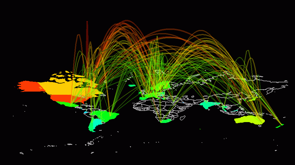
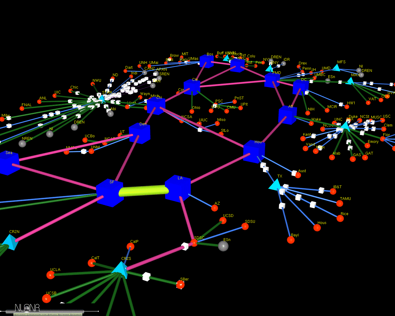 486 486 | computer graphics (Cichlid) by Jeff Brown A screenshot of a 3D model of the vBNS network which connects universities and laboratories in the USA. The model was created by Jeff Brown, a researcher at MOAT, National Laboratory for Applied Network Research (NLANR), USA, using his Cichlid data visualisation software. The model is animated to show how traffic flows over the links. More information on their work can be found in the paper "Network Performance Visualization: Insight Through Animation" by J.A. Brown, McGregor A.J and H-W Braun. |
 79 79 | 1885 print by Émile Levasseur (1828-1911), France Comprehensive review of all available statistical graphics presented to the Statistical Society of London, classified as figures, maps, and solids (3D), perhaps the first mature attempt at a systematic classification of graphical forms. Levasseur, É. (1885). La statistique graphique. Journal of the Statistical Society of London, 50?:218-250. |
 169 169 | 1981 Data are often presented in a table or chart whose rows and columns are intrinsically unordered, but which are arranged in an order which conceals patterns, rather than reveal them. The top figure shows a classification of townships (columns) by binary characteristics (rows, presence or absence), both arranged in arbitrary order. Can you see any patterns or trends? One of Bertin's graphical methods consists simply of permuting the rows and columns to place similar rows and columns together. This gives the bottom figure, where now the trends are clear. See also: Harri Siirtola's The Reorderable Matrix (Java 1.1 Applet, + you need Swing) for an interactive demo. The Jacques Bertin, Semiologie Graphique web site has a nice dynamic display of the reorderable matrix. [Source: Bertin (1981), Graphics and Graphic Information Processing.] |
 638 638 | computer graphics (Graphviz) by Graphviz - Graph Visualization Software This small example illustrates dot's feature to draw nodes and edges in clusters or separate rectangular layout regions. Clusters are encoded as subgraphs whose names have the prefix 'cluster'. The color attribute of a cluster is interpreted as its outline color or its background color if its style is 'filled'. Mdiamond and Msquare are modified symbols for data flow diagrams. |
 571 571 | 2005 computer graphics by Martin Wattenberg and Jonathan Feinberg 2005-08-29: "Color Code" - Interactive Map of the English Language From InfoVis:Wiki Martin Wattenberg and Jonathan Feinberg created Color Code, an astonishing interactive map of 33,000 English nouns: A picture of 33,000 English nouns, grouped by meaning. Each word is given the average color of web images found when searching for that term.[Wattenberg and Feinberg, 2005] A picture of 33,000 English nouns, grouped by meaning. Each word is given the average color of web images found when searching for that term. [Wattenberg and Feinberg, 2005] Color Code is a full-color portrait of the English language. The artwork is an interactive map of more than 33,000 words. Each word has been assigned a color based on the average color of images found by a search engine. The words are then grouped by meaning. The resulting patterns form an atlas of our lexicon. [Wattenberg and Feinberg, 2005] via thedesignweblog [Wattenberg and Feinberg, 2005] Martin Wattenberg and Jonathan Feinberg, Color Code: A Color Portrait of the English Language, Retrieved at: August 29, 2005. http://loop.aiga.org/resources/loop/loop9/colorproject/index.html |
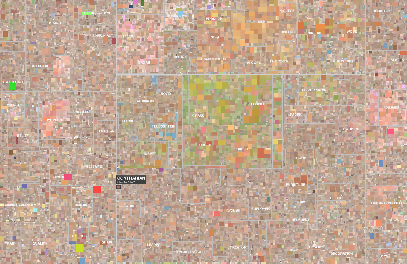 572 572 | 2005 computer graphics by Martin Wattenberg and Jonathan Feinberg 2005-08-29: "Color Code" - Interactive Map of the English Language From InfoVis:Wiki Martin Wattenberg and Jonathan Feinberg created Color Code, an astonishing interactive map of 33,000 English nouns: A picture of 33,000 English nouns, grouped by meaning. Each word is given the average color of web images found when searching for that term.[Wattenberg and Feinberg, 2005] A picture of 33,000 English nouns, grouped by meaning. Each word is given the average color of web images found when searching for that term. [Wattenberg and Feinberg, 2005] Color Code is a full-color portrait of the English language. The artwork is an interactive map of more than 33,000 words. Each word has been assigned a color based on the average color of images found by a search engine. The words are then grouped by meaning. The resulting patterns form an atlas of our lexicon. [Wattenberg and Feinberg, 2005] via thedesignweblog [Wattenberg and Feinberg, 2005] Martin Wattenberg and Jonathan Feinberg, Color Code: A Color Portrait of the English Language, Retrieved at: August 29, 2005. http://loop.aiga.org/resources/loop/loop9/colorproject/index.html |
 35 35 | 1772 print by Johann Heinrich Lambert (1728-1777), Germany Diagrams developed to represent color systems. In 1758, Mayer developed a system of constructing and naming many of the possible colours. Lambert extended this with a 3D pyramid indicating "depth" (saturation). Lambert wanted to extend the coverage of the system to include the concept of depth. He believed that the colour pyramid would be useful to textile merchants to decide if they stocked all the colours, and to dyers and printers as a source of inspiration. Lambert, J. H. (1772). Beschreibung einer mit dem Calauschen Wachse ausgemalten Farbenpyramide . Berlin: n.p. |
 36 36 | 1758 print by Johanes Tobias Mayer (1723-1762), Germany Diagrams developed to represent color systems. In 1758, Mayer developed a system of constructing and naming many of the possible colours. Lambert extended this with a 3D pyramid indicating "depth" (saturation). Mayer, J. T. (1758). De affinitate colorum commentatio , chap. Farbendreieck. n.p. Edited by Lichtenberg, 1775. |
 1248 1248 | Comment Flow2007 software (Java) by Dietmar Offenhuber A browser visualizing conversations via guest book entries across myspace profiles We have designed and implemented a flexible tool for the content driven exploration and visualisation of a social network. Building upon a traditional force-directed network layout consisting of nodes (profiles) and edges (friend-links), our system shows the activity and the information exchange (postings in the comment box) between nodes, taking the sequence and age of the messages into account. This project serves both as an illustration of one approach to the general problem of individuated network visualization and as an example of the practical uses of such representations. In the mySpace service network-only visualization methods are no longer sufficient to meaningfully represent the community structure. Numerous commercial profiles, fake/spam/celebrity profiles and tools such as automated friend adders result in a huge numbers of connections, many of which carry little information about a person’s actual social ties and behavior. The average myspace user has more than 130 friends, but there are also profiles with over a million “friends”. By going beyond the “skeleton” of network connectivity and looking at the flow of information between the individual actors we can create a far more accurate portrait of online social life. |
 1246 1246 | Comment Flow2007 software (Java) by Dietmar Offenhuber A browser visualizing conversations via guest book entries across myspace profiles We have designed and implemented a flexible tool for the content driven exploration and visualisation of a social network. Building upon a traditional force-directed network layout consisting of nodes (profiles) and edges (friend-links), our system shows the activity and the information exchange (postings in the comment box) between nodes, taking the sequence and age of the messages into account. This project serves both as an illustration of one approach to the general problem of individuated network visualization and as an example of the practical uses of such representations. In the mySpace service network-only visualization methods are no longer sufficient to meaningfully represent the community structure. Numerous commercial profiles, fake/spam/celebrity profiles and tools such as automated friend adders result in a huge numbers of connections, many of which carry little information about a person’s actual social ties and behavior. The average myspace user has more than 130 friends, but there are also profiles with over a million “friends”. By going beyond the “skeleton” of network connectivity and looking at the flow of information between the individual actors we can create a far more accurate portrait of online social life. |
 1247 1247 | Comment Flow2007 software (Java) by Dietmar Offenhuber A browser visualizing conversations via guest book entries across myspace profiles We have designed and implemented a flexible tool for the content driven exploration and visualisation of a social network. Building upon a traditional force-directed network layout consisting of nodes (profiles) and edges (friend-links), our system shows the activity and the information exchange (postings in the comment box) between nodes, taking the sequence and age of the messages into account. This project serves both as an illustration of one approach to the general problem of individuated network visualization and as an example of the practical uses of such representations. In the mySpace service network-only visualization methods are no longer sufficient to meaningfully represent the community structure. Numerous commercial profiles, fake/spam/celebrity profiles and tools such as automated friend adders result in a huge numbers of connections, many of which carry little information about a person’s actual social ties and behavior. The average myspace user has more than 130 friends, but there are also profiles with over a million “friends”. By going beyond the “skeleton” of network connectivity and looking at the flow of information between the individual actors we can create a far more accurate portrait of online social life. |
 1249 1249 | Comment Flow2007 software (Java) by Dietmar Offenhuber A browser visualizing conversations via guest book entries across myspace profiles We have designed and implemented a flexible tool for the content driven exploration and visualisation of a social network. Building upon a traditional force-directed network layout consisting of nodes (profiles) and edges (friend-links), our system shows the activity and the information exchange (postings in the comment box) between nodes, taking the sequence and age of the messages into account. This project serves both as an illustration of one approach to the general problem of individuated network visualization and as an example of the practical uses of such representations. In the mySpace service network-only visualization methods are no longer sufficient to meaningfully represent the community structure. Numerous commercial profiles, fake/spam/celebrity profiles and tools such as automated friend adders result in a huge numbers of connections, many of which carry little information about a person’s actual social ties and behavior. The average myspace user has more than 130 friends, but there are also profiles with over a million “friends”. By going beyond the “skeleton” of network connectivity and looking at the flow of information between the individual actors we can create a far more accurate portrait of online social life. |
 1252 1252 | Comment Flow2007 software (Java) by Dietmar Offenhuber A browser visualizing conversations via guest book entries across myspace profiles We have designed and implemented a flexible tool for the content driven exploration and visualisation of a social network. Building upon a traditional force-directed network layout consisting of nodes (profiles) and edges (friend-links), our system shows the activity and the information exchange (postings in the comment box) between nodes, taking the sequence and age of the messages into account. This project serves both as an illustration of one approach to the general problem of individuated network visualization and as an example of the practical uses of such representations. In the mySpace service network-only visualization methods are no longer sufficient to meaningfully represent the community structure. Numerous commercial profiles, fake/spam/celebrity profiles and tools such as automated friend adders result in a huge numbers of connections, many of which carry little information about a person’s actual social ties and behavior. The average myspace user has more than 130 friends, but there are also profiles with over a million “friends”. By going beyond the “skeleton” of network connectivity and looking at the flow of information between the individual actors we can create a far more accurate portrait of online social life. |
 1036 1036 | 2006 computer graphics by Matthias Trier (et al) Commetrix is a software application to support Community Moderators, Members, and Researchers. The functionality covers four main features: (1) Import of existing virtual communication over the Internet (2) Extraction of underlying electronic communication networks and knowledge communities (3) Visualization of community properties, structures and dynamic behaviour (4) Evaluation of important properties using a qualitative and quantitative measurement system. Besides all the promising features of Commetrix I must admit I was somehow fascinated with a Commetrix output sample video showing the animated formation of a community over time, quite compelling. To see the video just go to the "Documents/Videos" section. |
 1273 1273 | 2007 Web application by Christian Marc Schmidt and Maki Tsuchiya/Processing Identity goes beyond brand: the character of a community is largely determined by its plan. This visualization of 12 new communities around the world seeks to address the question: How is identity expressed in the design of the branded communities appearing in or adjacent to cities around the world? |
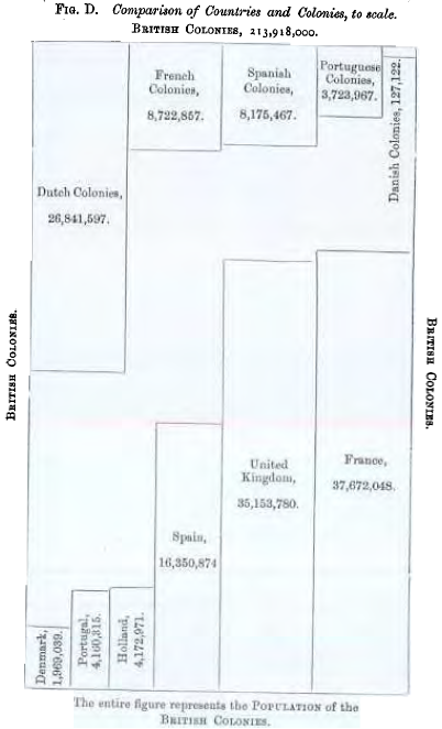 76 76 | 1885 print by Émile Levasseur (1828-1911), France Area diagram comparing populations of countries to their colonies. Comprehensive review of all available statistical graphics presented to the Statistical Society of London, classified as figures, maps, and solids (3D), perhaps the first mature attempt at a systematic classification of graphical forms. Levasseur, É. (1885). La statistique graphique. Journal of the Statistical Society of London, 50?:218-250. |
 53 53 | 1843 print by Léon Lalanne (1811-1892), France Contour map of a 3D table, temperature x hour x month (published in 1845). Lalanne, L. (1845). Appendice sur la representation graphique des tableaux météorologiques et des lois naturelles en général. In L. F. Kaemtz (ed.), Cours Complet de Météorologie , pp. 1-35. Paulin. Translated and annotated by C. Martins. |
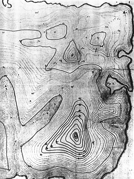
 81 81 | 1874 print by L.L. Vauthier, France Population contour map (population density shown by contours), the first statistical use of a contour map. Vauthier, L. L. (1874). Note sur une carte statistique figurant la répartition de la population de Paris. Comptes Rendus des Séances de L'Académie des Sciences, 78:264-267. ENPC: 11176 C612. |
 37 37 | 1752 print by Phillippe Buache (1700-1733), France Contour map. Buache, P. (1752). Essai de géographie physique. Mémoires de L'Académie Royale des Sciences , pp. 399-416. BNF: Ge.FF-8816-8822. |
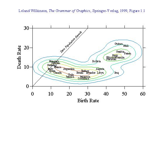 135 135 | 1999 computer graphics by Leland Wilkinson (1944-), USA Grammar of Graphics: A comprehensive systematization of grammatical rules for data and graphs and graph algebras within an object-oriented, computational framework. Wilkinson, L. (1999). The Grammar of Graphics. New York: Springer. ISBN 0-387-98774-6. |
 639 639 | 19930319 computer graphics (Graphviz) by Stephen North A (non-authoritative) diagram of heritage of the Unix operating system. This "crazy" version of the classic graph was created to stress test the polygon shape generator and color map manager with random values. |
 49 49 | 1833 print by Andre Michel Guerry (1802-1866) The first comprehensive analysis of data on "moral statistics" (crimes, suicide, literacy, etc.) shown on thematic unclassed choropleth maps; bar charts (of crime, by age groupings and months). Guerry, A.-M. (1833). Essai sur la statistique morale de la France . Paris: Crochard. ISBN 0-7734-7045-X. English translation: Hugh P. Whitt and Victor W. Reinking, Lewiston, N.Y. : Edwin Mellen Press, 2002. |
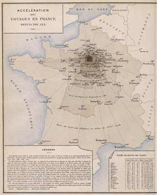
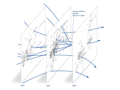 878 878 | 2005 computer graphics by (unknown) ATA (Advanced Technology Assessment) is a business intelligence company developing a unique combination of knowledge-bases, software, technological solutions and expertise to support decision-makers in identifying actionable patterns in complex dynamic business environments. One of ATA's network visualization techniques is called Dynamic Network Rendering. The method supports effective representations of both static structural information and changes over time, which significantly boost understanding of complex relational datasets, and allow analysts to effectively gather competitive technological and organizational intelligence. Representation of time evolution can be addressed from complementary perspectives that can be integrated into unified graph visualization solutions: Static Approach - networks are generated corresponding to "slices" of the original dataset at different points in time; Dynamic Approach - changes to network structure and node relative positions over time are conveyed by motion of graphical elements on the screen. This graph incorporates ATA's network-based technology and represents a time-sliced view of hypothetical network trajectories of individuals involved in the terrorist attack in Spain, March 2004. (Data from J. A. Rodriguez) |
 411 411 | computer graphics by Luc Girardin An example map from Luc Girardin's, The Graduate Institute of International Studies, Switzerland, "cyberspace geography visualization" system. |
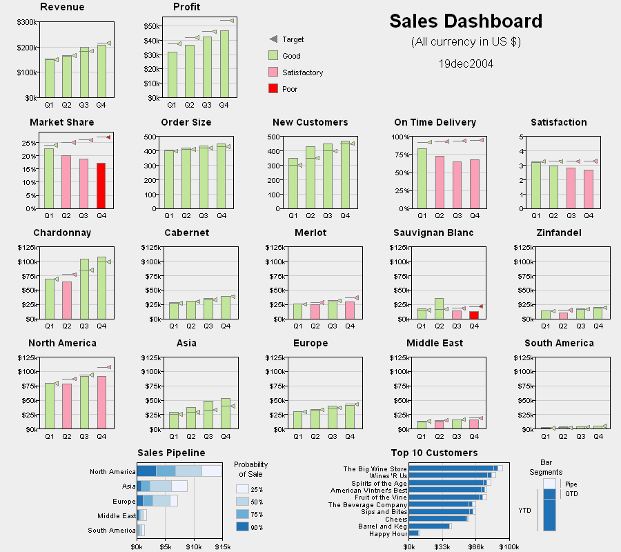 175 175 | 2005 interactive computer graphics by Robert Allison, SAS Institute DM Review sponsored a data visualization contest related to data presentation for buisness purposes. One scenario was to create a 'sales dashboard' that highlighted aspects of poor performance for a company. This entry, by Robert Allison of SAS Institute was the winner, and a lovely example of a multi-panel dashboard display for business decision. It combines a variety of indicators in a coherently organized display: Revenue and profit, performance metrics, product (wine) type, and region, with well-designed color coding and target indicators. One can easily see that while revenue and profit were good and rising, market share was falling, as were delivery time and satisfaction, etc. See Robert's description of the approach and design for this display (http://www.math.yorku.ca/SCS/Gallery/allison/scen3_info.htm). |
 640 640 | computer graphics (Graphviz) by Graphviz - Graph Visualization Software The graph file was generated automatically from a session with the LDBX graphical interface to the standard DBX debugger. Nodes are drawn with the 'record' shape. Labels of this shape are interpreted specially as nested horizontal and vertical box lists formatted as tables. In a record label, curly braces { } enclose lists, vertical bar | separates list items, and creates a port identifier for attaching edges. Edges are also labeled with 'id' attributes. Though not demonstrated in this particular file, these attributes allow referencing multiple (parallel) edges between the same node pair. |
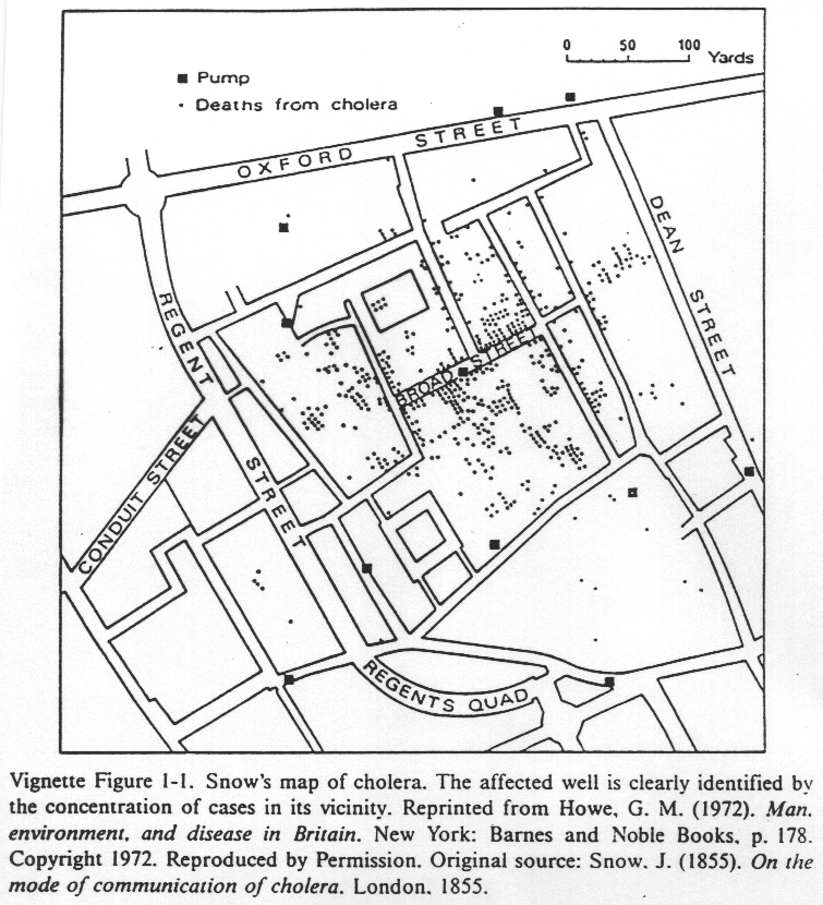 83 83 | 1855 print by John Snow (1813-1858 ), England Use of a dot map to display epidemiological data, leads to discovery of the source of a cholera epidemic. Snow, J. (1855). On the Mode of Communication of Cholera. London: (n.p.), 2nd ed. Gilbert, E. W. (1958). Pioneer maps of health and disease in England. Geographical Journal, 124:172-183. |
 570 570 | 2005 computer graphics by Olivier Zitvogel Delicous Soup shows related del.icio.us tags in a circular graph manner: Delicious Soup - A tool that reveals your del.icio.us activities... [Zitvogel, 2005] via information aesthetics blog [edit] 3 References [Ivy, 2005] Ivy, Revealicious, Created at: 2005, Retrieved at: September 15, 2005. http://www.ivy.fr/revealicious/ [Zitvogel, 2005] Olivier Zitvogel, Delicous Soup, Created at: 2005, Retrieved at: September 15, 2005. http://www.zitvogel.com/delicioussoup/ Retrieved from "http://www.infovis-wiki.net/index.php?title=2005-09-15:_%22Revealicious%22_and_%22Delicious_Soup%22_-_two_Flash_based_del.icio.us_visualization_tools" |
 882 882 | 2005 computer graphics by Olivier Zitvogel Delicious Soup is playful visualization tool that maps one's del.icio.us tags in a radial structure. Tags are represented by bouncing bubbles, while edges provide relationships between the tags. |
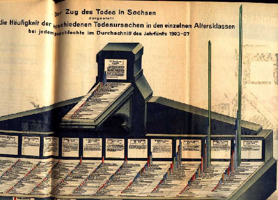 103 103 | 1911 print by Emil Eugen Roesle (organizer of the First International Hygiene Exhibition in Dresden) (1875-1962), Germany First International Hygiene-Exhibition in Dresden, with 259 graphical-statistical figures of 35 national and international exhibitors and more than 5 million visitors. [Roesle also wrote publications which dealt with the structure of graphical-statistical displays (Roesle, 1913).] Roesle, E. E. (1911). Sonderkatalog für die Gruppe Statistik der wissenschaftlichen Abteilung der Internationalen Hygiene-Ausstellung . Dresden, Germany: Verlag der Internationelen Hygiene-Ausstellung. (15 colored reproductions of posters from the exhibition). Roesle, E. E. (1913). Graphische-statistische darstellungen, ihre technik, methodik und wissenschaftliche bedeutung. Archiv für soziale Hygiene, 8 :369-406. Ostermann, R. (2001). Emil Eugen Roesle - grafikpionier im bereich der medizinstatistik und epidemiologie. Informatik, Biometrie und Epidemiologie in Medizin und Biologie, 244. |
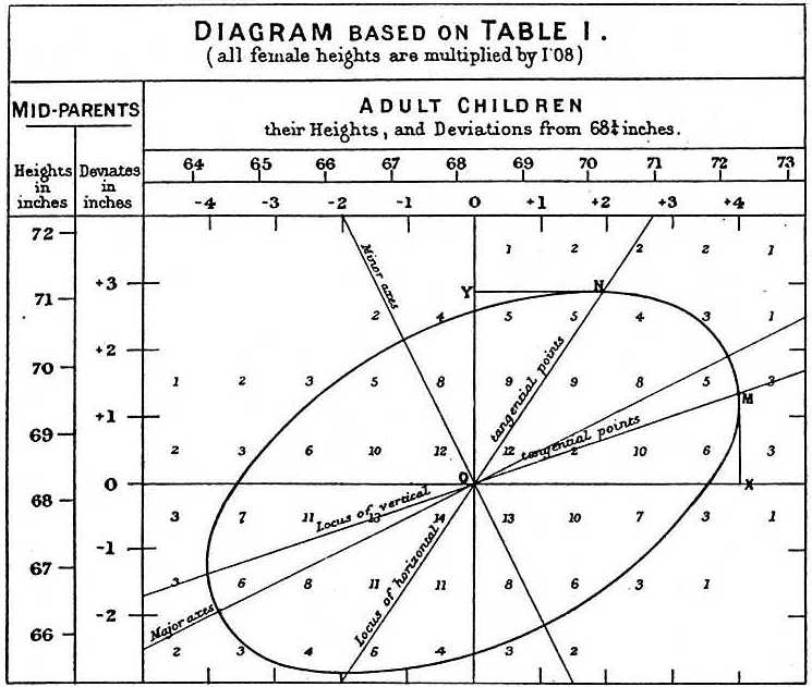 78 78 | 1885 print by Francis Galton (1822-1911), England Normal correlation surface and regression, the idea that in a bivariate normal distribution, contours of equal frequency formed concentric ellipses, with the regression line connecting points of vertical tangents. Galton, F. (1886). Regression towards mediocrity in hereditary stature. Journal of the Anthropological Institute, 15:246-263. |
 50 50 | 1801 print by William Playfair (1759-1823), England Invention of the pie chart, and circle graph, used to show part-whole relations. Playfair, W. (1801). Statistical Breviary; Shewing, on a Principle Entirely New, the Resources of Every State and Kingdom in Europe . London: Wallis. Re-published in Wainer, H. and Spence, I. (eds.), The Commercial and Political Atlas and Statistical Breviary, 2005, Cambridge University Press, ISBN 0-521-85554-3. |
 129 129 | 1957 print by Edgar Anderson, USA Circular glyphs, with rays to represent multivariate data. Anderson, E. (1957). A semigraphical method for the analysis of complex problems. Proceedings of the National Academy of Sciences, 13(3):923-927. Reprinted in Technometrics, 2:387-391 (August 1960). |
 138 138 | 1988 computer graphics by Antony Unwin and Graham Wills, England Interactive graphics for multiple time series with direct manipulation (zoom, rescale, overlaying, etc.). Unwin, A. R. and Wills, G. (1988). Eyeballing time series. In Proceedings of the 1988 ASA Statistical Computing Section, pp. 263-268. American Statistical Association. |
 168 168 | 1997 print by John Fox (1947-) This graph shows a scatterplot of data from a survey of Chilean voters held six months before the plebicite held in September 1988 on the future of the military government of Augusto Pinochet. The ordinate, "Voting Intention" is a binary variable, 0 = No = Return to Civilian government, 1 = Yes = Continue Military rule. The abscissa reflects a scale of Support for the Status Quo. The graph shows the binary observations at the top and bottom of the display, jittered vertically to avoid overplotting. The solid line is a linear regression; the solid curve is a logistic regression. A non-parametric (lowess) curve is shown by the broken line. Although there is no data in the middle of the graph, the visual elements combine to show how the propensity to vote Yes increases steadily with Support for the status quo. Discrete, categorical data presents difficult challenges for graphical display. It is hard to show the data, because many points coincide. Figure from John Fox's Applied Regression Analysis, Linear Models, and Related Methods, Figure 15.1. |
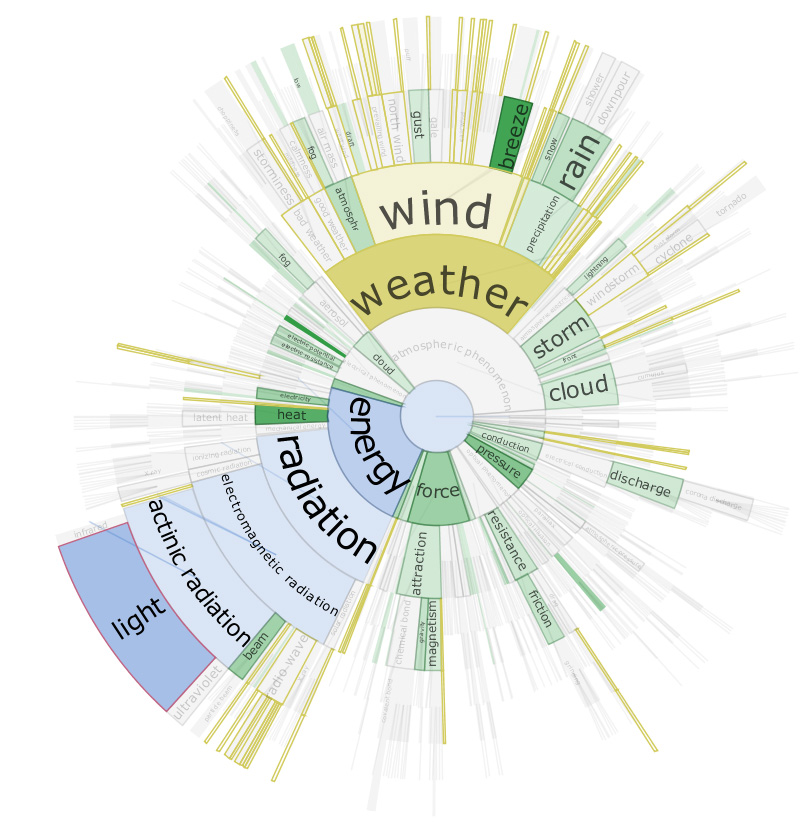 1266 1266 | 2006 Java by Christopher Collins DocuBurst is the first visualization of document content which takes advantage of the human-created structure in lexical databases. We use an accepted design paradigm to generate visualizations which improve the usability and utility of WordNet as the backbone for document content visualization. A radial, space-filling layout of hyponymy (IS-A relation) is presented with interactive techniques of zoom, filter, and details-on-demand for the task of document visualization. The techniques can be generalized to multiple documents. This image shows a DocuBurst graph rooted at "atmospheric phenomenon". Node opacity is directly related to the occurrences of related terms in the target text. The graph structure is the WordNet hyponymy tree. Gold coloured nodes are search results for words that start with "w". Blue nodes trace the path from the node under the mouse ("light") to the graph's root. |
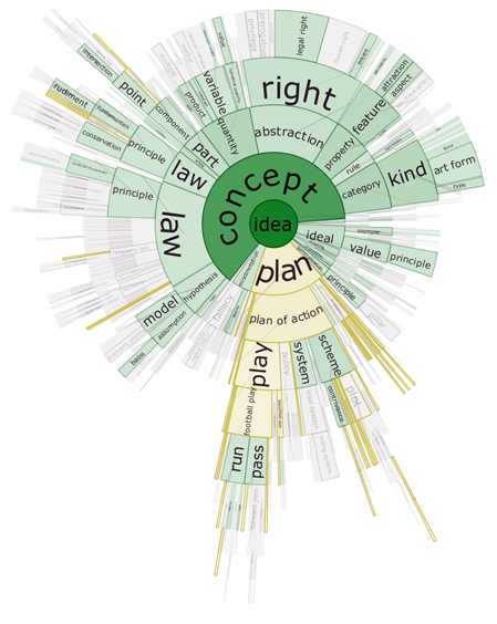 1264 1264 | 2006 Java by Christopher Collins DocuBurst is the first visualization of document content which takes advantage of the human-created structure in lexical databases. We use an accepted design paradigm to generate visualizations which improve the usability and utility of WordNet as the backbone for document content visualization. A radial, space-filling layout of hyponymy (IS-A relation) is presented with interactive techniques of zoom, filter, and details-on-demand for the task of document visualization. The techniques can be generalized to multiple documents. This image shows the occurrences of "idea" words in a general science textbook. The opacity of the node fill colour corresponds to the strength of occurrence of related terms in the target text. The graph structure is the WordNet hyponymy graph, rooted at "idea", and the gold coloured nodes match a search query for words starting with "pl". |
 1268 1268 | 2006 Java by Christopher Collins DocuBurst is the first visualization of document content which takes advantage of the human-created structure in lexical databases. We use an accepted design paradigm to generate visualizations which improve the usability and utility of WordNet as the backbone for document content visualization. A radial, space-filling layout of hyponymy (IS-A relation) is presented with interactive techniques of zoom, filter, and details-on-demand for the task of document visualization. The techniques can be generalized to multiple documents. In this DocuBurst graph, occurrences of words in the document of interest (a science textbook) is indicated by increased opacity of the corresponding graph node. The graph structure is the WordNet hyponymy tree. Here, we can see that "kind" and "quantity" occur more often than "feature" and "idea", while "concept" does not occur at all. |
 1265 1265 | 2006 Java by Christopher Collins DocuBurst is the first visualization of document content which takes advantage of the human-created structure in lexical databases. We use an accepted design paradigm to generate visualizations which improve the usability and utility of WordNet as the backbone for document content visualization. A radial, space-filling layout of hyponymy (IS-A relation) is presented with interactive techniques of zoom, filter, and details-on-demand for the task of document visualization. The techniques can be generalized to multiple documents. This image shows the DocuBurst interface. A note in the main graph is selected, and all occurrences of words corresponding to that node are highlighted in orange in the document browser on the right. The bottom panel highlights occurrences of the selected words in the original text. |
 1267 1267 | 2006 Java by Christopher Collins DocuBurst is the first visualization of document content which takes advantage of the human-created structure in lexical databases. We use an accepted design paradigm to generate visualizations which improve the usability and utility of WordNet as the backbone for document content visualization. A radial, space-filling layout of hyponymy (IS-A relation) is presented with interactive techniques of zoom, filter, and details-on-demand for the task of document visualization. The techniques can be generalized to multiple documents. The subtree rooted at "radiation" is "rolled up" using the mouse wheel, to allow other nodes to expand their angular extent. |
 966 966 | 2005 computer graphics by Sebastian Heycke DOLBY is an interactive application for the visualization of the subject catalog of INCOM. INCOM is the Internet-based communication platform of the Interface Design Department of Potsdam's University of Applied Sciences. INCOM's goal is to improve internal communication among students and faculty as a community informational aggregator of projects, articles, seminars and events. INCOM is developed and produced by students and coworkers of the Interface Design Department, under the direction of Professor Boris Mueller. DOLBY maps INCOM's existing key words on a clockwise radial structure, organized alphabetically by small circles. In addition all contributions are represented by rectangles shown in an encircled radius. One can easily rollover a keyword to see which articles relate to it, or mouse over an article and discover the array of associated keywords, and the title and author of the contribution. If an article or specific keyword is clicked, the selection centers itself being immediately surrounded by its related articles/keywords in an ever-morphing constellation. DOLBY visualizes both qualitative and quantitative relationships of the subject catalog of INCOM, and through its visualization it answers questions not fully solved on the INCOM platform. |
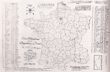 58 58 | 1830 Print by Armand Joseph Frère de Montizon (1788-?), France First simple dot map of population by department, 1 dot = 10,000 people. Frère de Montizon, A. J. (1830). Carte philosophique figurant la population de la France. BNF. Robinson, A. H. (1982). Early Thematic Mapping in the History of Cartography . Chicago: University of Chicago Press. ISBN 0-226-72285-6. |
 45 45 | 1782 print by Marcellin du Carla-Boniface, France First topographical map. du Carla-Boniface, M. (1782). Expression des nivellements; ou, méthode nouvelle pour marquer sur les cartes terrestres et marines les hauteurs et les configurations du terrain. In François de Dainville, ``From the Depths to the Heights,'' translated by Arthur H. Robinson, Surveying and Mapping, 1970, 30:389-403, on page 396. |
 199 199 | 1998 computer graphics The centroid of a polygon is simply the center of balance for the polygon. In regular polygons, the centroid is the same distance from all vertices and is also the same distance from all sides. We can create a new tessellation from an existing one by joining the centroids of adjacent polygons. The polygons that are made from all of these joinings is called the dual of the original tessellation. This is the demiregular tessellation 3.3.4.3.4 / 3.3.4.12 / 3.4.3.12. |
 198 198 | 1998 computer graphics The centroid of a polygon is simply the center of balance for the polygon. In regular polygons, the centroid is the same distance from all vertices and is also the same distance from all sides. We can create a new tessellation from an existing one by joining the centroids of adjacent polygons. The polygons that are made from all of these joinings is called the dual of the original tessellation. This is the demiregular tessellation 3.3.4.3.4 / 3.3.4.12 / 3.4.3.12; it is the dual with the original tessellation removed. |
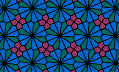 200 200 | 1998 computer graphics The centroid of a polygon is simply the center of balance for the polygon. In regular polygons, the centroid is the same distance from all vertices and is also the same distance from all sides. We can create a new tessellation from an existing one by joining the centroids of adjacent polygons. The polygons that are made from all of these joinings is called the dual of the original tessellation. This is the demiregular tessellation 3.3.4.3.4 / 3.3.4.12 / 3.4.3.12 with centroids of adjacent polygons connected; the original tessellation is shown in gray. |
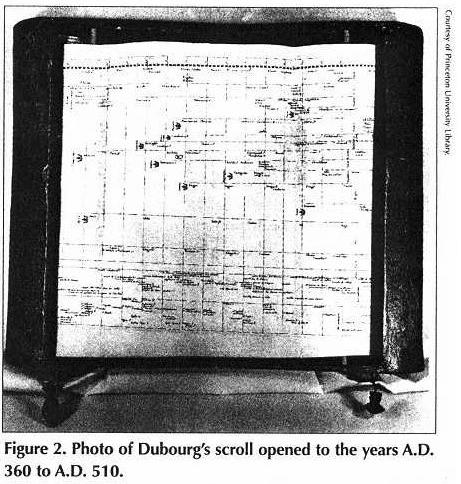 44 44 | 1753 print by Jacques Barbeu-Dubourg (1709-1779), France "Carte chronologique": An annotated time line of history (from Creation) on a 54-foot scroll, including names and descriptive events, grouped thematically, with symbols denoting character (martyr, tyrant, heretic, noble, upright, etc.) and profession (painter, theologian, musician, monk, etc.). Ferguson, S. (1991). The 1753 carte chronographique of Jacques Barbeu-Dubourg. Princeton University Library Chronicle, 52:190-230. Wainer, H. (1998). The graphical inventions of Dubourg and Ferguson: Two precursors to William Playfair. Chance, 11(4):39-41. |
 923 923 | 2005 computer graphics by Pak Chung Wong, Patrick Mackey, These images are part of a paper presented at InfoVis'05, which describes a novel technique to visualize graphs with extended node and link labels. The lengths of these labels range from a short phrase to a full sentence to an entire paragraph and beyond. The proposed solution is different from existing approaches that rely on intensive computational effort to optimize the label placement problem. Instead, the authors share the visualization resources with the graph and present the label information in static, interactive, and dynamic modes without the requirement for tackling the intractability issues. This allows the reallocation of the computational resources for dynamic presentation of real-time information. The paper also includes a user study to evaluate the effectiveness and efficiency of this visualization technique. |
 879 879 | 2005 computer graphics by (unknown) ATA (Advanced Technology Assessment) is a business intelligence company developing a unique combination of knowledge-bases, software, technological solutions and expertise to support decision-makers in identifying actionable patterns in complex dynamic business environments. ATA's DyNet is an innovative knowledge visualization tool which enables rapid domain analysis. Data are mined from corporate databases and public data sources. Relationships between concepts and entities (i.e. firms, patents, publications) are identified using citations, descriptive terms, or textual similarities. Linkages among thousands of concepts and entities are then represented as an evolving network in time. The software includes a variety of features which allow exploration, mapping and manipulation of knowledge networks, and which give detail-on-demand, enabling rapid and powerful multi-level analysis of complex, attribute-rich data. |
 126 126 | 1960 print by Howard Fisher, USA Initial development of geographic information systems, combining spatially-referenced data, spatial models and map-based visualization. Example: Harvard Laboratory for Computer Graphics (and Spatial Analysis) develops SYMAP, producing isoline, choropleth and proximal maps on a line printer. Chrisman, N. (1988). The risks of software innovation: A case study of the harvard lab. The American Cartographer, 15(3):291-300. Tomlinson, R. and Petchenik, B. (eds.) (1988). Reflections on a Revolution: The Transition from Analogue to Digital Representations of Space, 1958-1988, vol. 15 (3). The American Cartographer. (Special issue). |
 119 119 | 1911 print by Emil Eugen Roesle (organizer of the First International Hygiene Exhibition in Dresden) (1875-1962), Germany First International Hygiene-Exhibition in Dresden, with 259 graphical-statistical figures of 35 national and international exhibitors and more than 5 million visitors. [Roesle also wrote publications which dealt with the structure of graphical-statistical displays (Roesle, 1913).] Roesle, E. E. (1911). Sonderkatalog für die Gruppe Statistik der wissenschaftlichen Abteilung der Internationalen Hygiene-Ausstellung . Dresden, Germany: Verlag der Internationelen Hygiene-Ausstellung. (15 colored reproductions of posters from the exhibition). Roesle, E. E. (1913). Graphische-statistische darstellungen, ihre technik, methodik und wissenschaftliche bedeutung. Archiv für soziale Hygiene , 8 :369-406. Ostermann, R. (2001). Emil Eugen Roesle - grafikpionier im bereich der medizinstatistik und epidemiologie. Informatik, Biometrie und Epidemiologie in Medizin und Biologie, 244. |
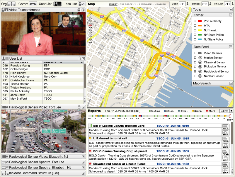 1212 1212 | 2006 computer graphics by Parsons Institute for Information Mapping (PIIM) This desktop-based visual platform is an integrated, intuitive environment for enabling situation awareness, in use by the Port Authority of New York and New Jersey. The EOC allows users to "drill down" for further information about narrative event data, and to share and exchange such information. PIIM provided the conceptualization, storyboarding, visualization and design of the graphical user interface. Key features include: The EOC tool brings together geospatial data, situation reports, data feeds and video teleconference capabilities through a single platform. Agencies can share data feeds among themselves, with users accessing feed location, output and metadata. User lists, organizational information, and shared task lists allow for collaboration across agencies and locations. Users can access map views and full-text reports from summaries. |
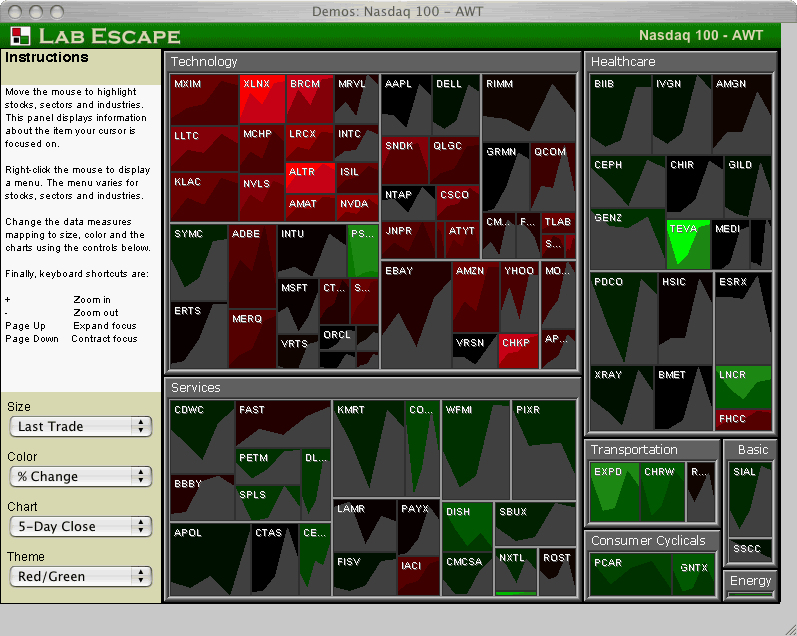 565 565 | 2005 computer graphics by Lab Escape 2005-08-24: Integrating graphs into Treemaps From InfoVis:Wiki Lab Escape has integrated time-series graphs into their Treemap application Enterprise Tree Map 2.0 Demo of Enterprise Tree Map 2.0 showing stock market data. Time-series graphs of individual stocks are integrated into the Treemap[Lab Escape, 2005] Demo of Enterprise Tree Map 2.0 showing stock market data. Time-series graphs of individual stocks are integrated into the Treemap [Lab Escape, 2005] via information aesthetics blog [Lab Escape, 2005] Lab Escape, Screenshot of Enterprise Tree Map 2.0 Demo, Retrieved at: 2005-08-24, http://labescape.com/products/treemap/index.html |
 648 648 | computer graphics (Graphviz) by Neato (and Graphviz?) Layouts made with neato have the property that all edges tend to have about the same length (unless there is a manual adjustment). By default neato uses randomization, so it makes a different layout each time, but this particular example almost always look well. Edge labels are placed at the edge's midpoint. |
 51 51 | 1843 Print by James Cowles Pritchard (1786-1848) and Alexander Keith Johnston (1804-1871), England Ethnographic maps showing distribution of ethnic groups throughout the world. Johnston, A. K. (1843). The National Atlas of Historical, Commercial, and Political Geography. London: William Blackwood and Sons. Prichard, J. C. (1843). Researches Into the Physical History of Man. London: Houlston & Stoneman. |
 52 52 | 1843 Print by James Cowles Pritchard (1786-1848) and Alexander Keith Johnston (1804-1871), England Ethnographic maps showing distribution of ethnic groups throughout the world. Johnston, A. K. (1843). The National Atlas of Historical, Commercial, and Political Geography. London: William Blackwood and Sons. Prichard, J. C. (1843). Researches Into the Physical History of Man. London: Houlston & Stoneman. |
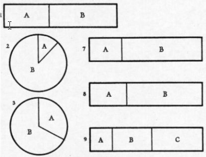 116 116 | 1926 print by Walter C. Eells Experimental test of statistical graphical forms (pie vs. subdivided bar charts). Eells, W. C. (1926). The relative merits of circles and bars for representing component parts. Journal of the American Statistical Association, 21:119-132. |
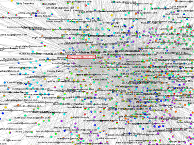 751 751 | 2005 computer graphics by Jeffrey Heer This project attempts to take the first steps toward an exploratory data environment for e-mail corpora, using the Enron e-mail corpus as a motivating data set. The interface--currently named "enronic"--unifies information visualization techniques with various algorithms for processing the e-mail corpus, including social network inference, message categorization, and community analysis. Though still a preliminary design, enronic shows promise as a platform for more tightly coupling manual and automated data analysis. The graph on the left shows the resulting social network visualization. People are drawn as nodes with labels containing either their name or their e-mail address, depending on what was present in the database. Edges represent the histories of ALL e-mail traffic between two people. Pie graphs are placed in the center of each edge, conveying an overall picture of how the e-mail traffic represented by that edge has been categorized. |
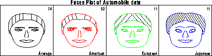 124 124 | 1973 print by Herman Chernoff (1923-), USA Cartoons of human face to represent multivariate data. Chernoff, H. (1973). The use of faces to represent points in k-dimensional space graphically. Journal of the American Statistical Association, 68:361-368. |
 57 57 | 1820 Print by Michael Faraday (1791-1867), England An increasing number of scientific publications begin to contain graphs and diagrams which describe, but do not analyze, natural phenomena (magnetic variation, weather, tides, etc.). |
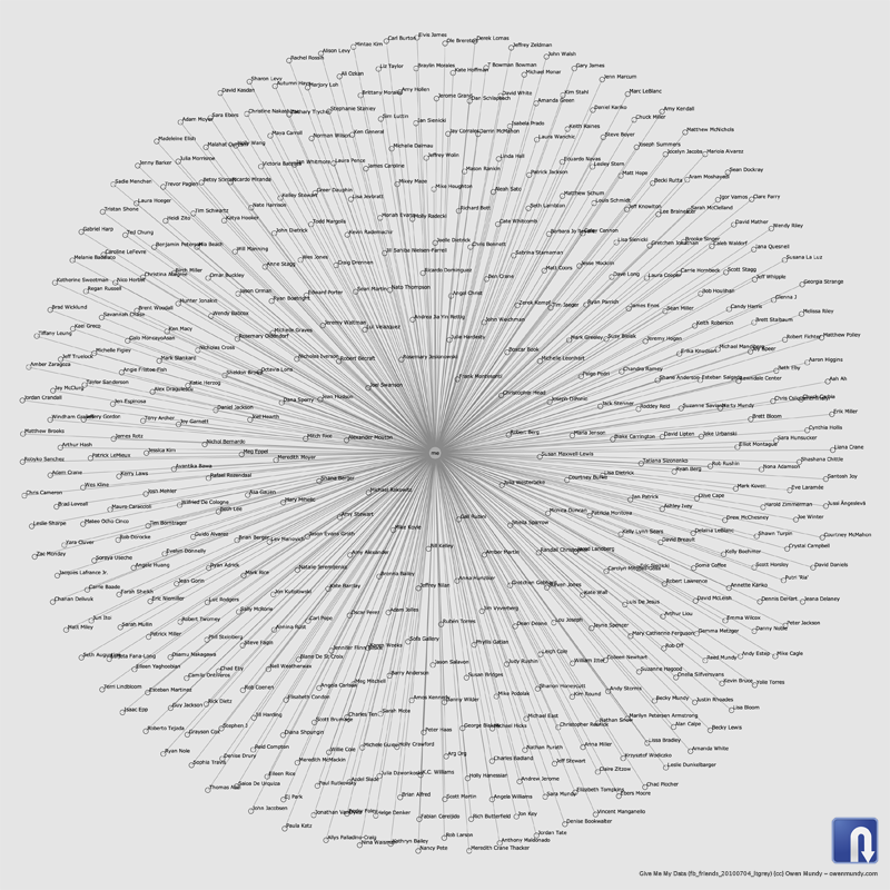 1399 1399 | 2010 by Give Me My Data / Nodebox 1.0 Network graph visualization of Facebook contacts using data retrieved using Give Me My Data http://givememydata.com and Nodebox 1.0. |
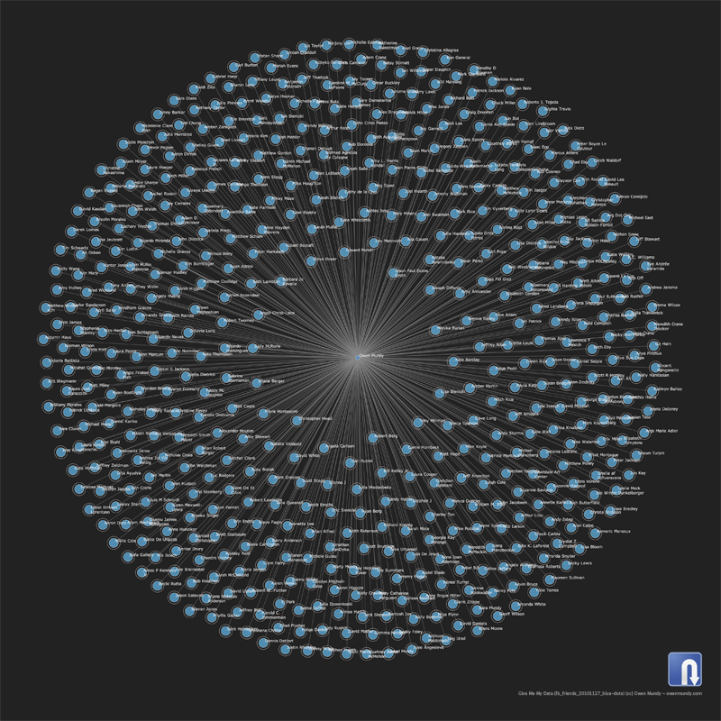 1400 1400 | 2010 by Give Me My Data / Nodebox 1.0 Network graph visualization of Facebook contacts using data retrieved using Give Me My Data http://givememydata.com and Nodebox 1.0. |
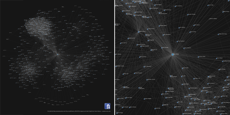 1401 1401 | 2010 by Give Me My Data / Nodebox 1.0 Network graph visualization of Facebook contacts and mutual contacts using data retrieved using Give Me My Data http://givememydata.com and Nodebox 1.0. |
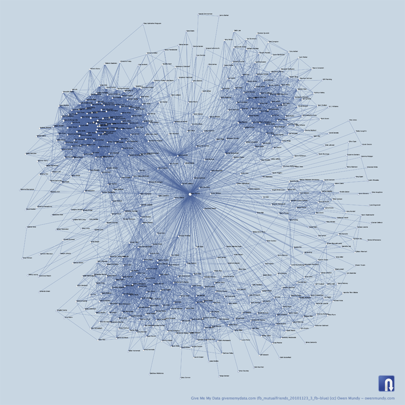 1402 1402 | 2010 by Give Me My Data / Nodebox 1.0 Network graph visualization of Facebook contacts and mutual contacts using data retrieved using Give Me My Data http://givememydata.com and Nodebox 1.0. |
 641 641 | computer graphics (Graphviz) by Graphviz - Graph Visualization Software This is a drawing of a finite automaton. The rankdir and orientation request a left-to-right drawing in landscape mode. Note the use of text labels on edges. |
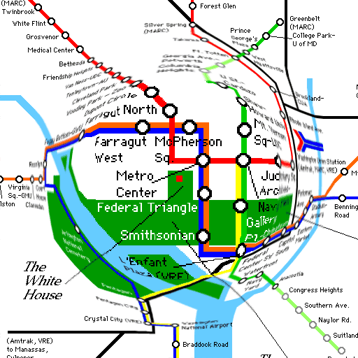 136 136 | 1981 computer graphics by George W. Furnas, USA Fisheye view: an idea to provide focus and greater detail in areas of interest of a large amount of information, while retaining the surrounding context in much less detail. Furnas, G. W. (1981). The Fisheye View: A New Look at Structured Files. Tech. Rep. Technical Memorandum 81-11221-9, Bell Labs. |
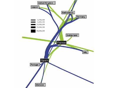 927 927 | 2005 computer graphics by Doantam Phan, Ling Xiao, Ron Yeh Flow Map Layout is a novel visualization technique seen as a hybrid of graphs and flow maps. Cartographers have long used flow maps to show the movement of objects from one location to another, such as the number of people in a migration, the amount of goods being traded, or the number of packets in a network. One of the most famous flow maps, depicting Napoleon's Russian Campaign, was created by Charles Joseph Minard in 1869, and can be seen here. The advantage of flow maps is that they reduce visual clutter by merging edges. Most flow maps are drawn by hand and there are few computer algorithms available. In Flow Map Layout, the authors present a method for generating flow maps using hierarchical clustering given a set of nodes, positions, and flow data between the nodes. The technique is inspired by graph layout algorithms that minimize edge crossings and distort node positions, while maintaining their relative position to one another. The authors have demonstrated the technique by producing flow maps for network traffic, census data, and trade data. The first image illustrates a close-up of top 15 imports to Spain and France. Notice the branching structure is shared across different nodes, for example Spain, and France branch to the Netherlands, Germany and the UK in the same way. The second image represents an outgoing migration map from Colorado (USA) from 1995-2000, generated by the algorithm without layout adjustment or edge routing. |
| | 1837 print by Henry Drury Harness (1804-1883), Ireland First published flow maps, showing transportation by means of shaded lines, widths proportional to amount (passengers). Harness, H. D. (1838). Atlas to Accompany the Second Report of the Railway Commissioners, Ireland . Dublin: H.M.S.O. (a) Map showing the relative number of passengers in different directions by regular public conveyances, 80 x 64 cm; (b) map showing the relative quantities of traffic in different directions, 80 x 64 cm; (c) map showing by varieties of shading the comparative density of the population, 80 x 64 cm. Robinson, A. H. (1955). The 1837 maps of Henry Drury Harness. Geographical Journal, 121:440-450. Robinson, A. H. (1982). Early Thematic Mapping in the History of Cartography . Chicago: University of Chicago Press. ISBN 0-226-72285-6. |
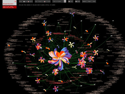 964 964 | 2005 computer graphics by Greg Judelman, Maria Lantin flowerGarden is an web-based software application, produced in Flash, for real-time social network and conversation visualization. It was used at the 3-day Bodies in Play summit in Banff, May 2005, at which the 50 participants were invited to input information about who they spoke to and what they discussed during the duration of the event. The visualization was projected on a large screen in the main summit venue to reflect the current state of the social network and discussion space of the summit. Each participant, upon entering information into a form, is visually represented by a flower, with a petal growing on the flower in real-time as a new conversation is entered. The flowers of individuals who have conversed with one another are connected by green vines, and the closer two flowers are distanced from each other the more those people have spoken. The concepts discussed between all participants are laid out in the background according to their frequency of use. By rolling over flowers, petals, and words, different perspectives of the information can be seen. |
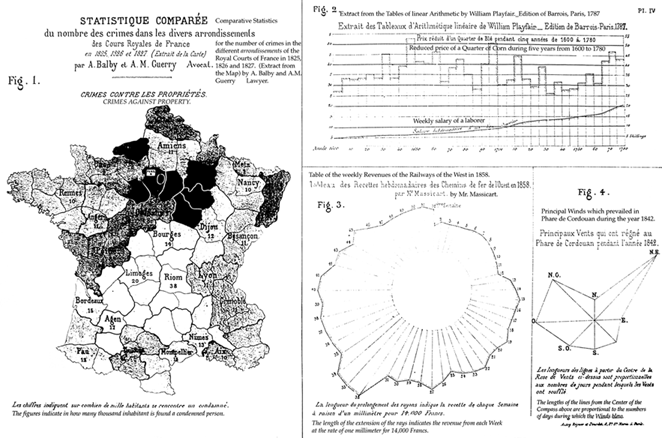 84 84 | 1885 print by Émile Levasseur (1828-1911), France Comprehensive review of all available statistical graphics presented to the Statistical Society of London, classified as figures, maps, and solids (3D), perhaps the first mature attempt at a systematic classification of graphical forms. Levasseur, É. (1885). La statistique graphique. Journal of the Statistical Society of London, 50?:218-250. |
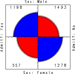 137 137 | 1975 computer graphics by Stephen E. Fienberg "Four-Fold Circular Display" to represent 2x2 table. Fienberg, S. E. (1975). Perspective Canada As a Social Report. Tech. rep., Department of Applied Statistics, University of Minnesota. Unpublished paper. |
 55 55 | 1821 print by Jean Baptiste Joseph Fourier (1768-1830), France Ogive or cumulative frequency curve, inhabitants of Paris by age groupings (shows the number of inhabitants of Paris per 10,000 in 1817 who were of a given age or over. The name "ogive" is due to Galton.). Fourier, J. B. J. (1821). Notions generales, sur la population. Recherches Statistiques sur la Ville de Paris et le Departement de la Seine, 1:1-70. |
 54 54 | 1838 print by Heinrich Berghaus (1797-1884), Germany Physical atlas of the distribution of plants, animals, climate, etc., one of the most extensive and detailed thematic atlases; most of the maps contained tables, graphs, pictorial profiles of distributions over altitude, and other visual accompaniments. Berghaus, H. (1838). Physikalischer Atlas. Gotha: Justus Perthes. 2 vols., published 1845-48. |
 75 75 | 1878 print by Eadweard Muybridge (1830-1904), USA Recording of motion (of a running horse) by means of a set of glass-plate cameras, triggered by strings. |
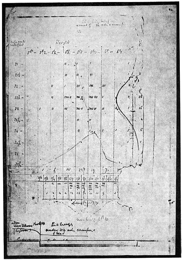 99 99 | 1874 print by Francis Galton (1822-1911), England Galton's first semi-graphic scatterplot and correlation diagram, of head size and height, from his notebook on Special Peculiarities. Hilts, V. L. (1975). A Guide to Francis Galton's English Men of Science, vol.65. Philadelphia, PA: American Philosophical Society. |
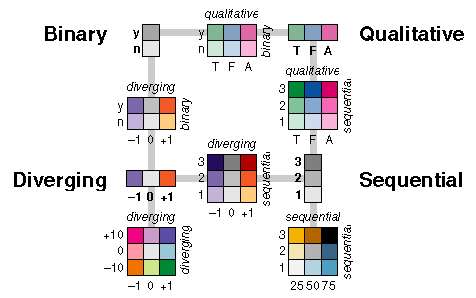 162 162 | 1994 by Cynthia Brewer Appropriate use of color for data display allows interrelationships and patterns within data to be easily observed. The careless use of color will obscure these patterns. When color is used 'appropriately,' the organization of the perceptual dimensions of color corresponds to the logical ordering in the data. Brewer develops a color scheme typology which matches the ways in which data are organized with corresponding organizations of hue and lightness. Four types of color schemes are represented. The image also illustrates how they can be used in combination for two-variable maps or visulizations. * diverging-- when the coloring variable has a meaningful midpoint (e.g., 0) * sequential-- for a continuously increasing series of values * qualitative-- when the coloring variable is categorical * binary-- for a two-level categorical coloring variable. Figure from Cynthia Brewer, Color Use Guidelines for Mapping and Visualization (http://www.personal.psu.edu/faculty/c/a/cab38/ColorSch/SchHome.html). Cynthia A. Brewer, 1994, "Color Use Guidelines for Mapping and Visualization," Chapter 7 (pp. 123-147) in Visualization in Modern Cartography, edited by A.M. MacEachren and D.R.F. Taylor, Elsevier Science, Tarrytown, NY. Cynthia A. Brewer, 1994, "Guidelines for Use of the Perceptual Dimensions of Color for Mapping and Visualization," Color Hard Copy and Graphic Arts III, edited by J. Bares, Proceedings of the International Society for Optical Engineering (SPIE), San Jose, February 1994, Vol. 2171, pp. 54-63. See also, Brewer's online color scheme picker, appropriately called "ColorBrewer," (http://www.personal.psu.edu/cab38/ColorBrewer/ColorBrewer_intro.html) and my Color Picker Page (http://www.math.yorku.ca/SCS/Gallery/colorpick.html). |
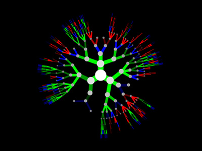 977 977 | 2004 computer graphics by (unknown) Understanding the results of genetic programming can be a daunting task. Are the trees being generated correctly? Are recombination and mutation happening as desired? Which branches are more stable than others - where is the evolution taking place?rnrnGenetic Programming TreeVisualizer is a free, open source function tree rendering and visualization Java code that can quickly answer some of these questions. It allows seeing what a tree looks like from one generation to the next. One could view the best individual per generation in a sequence of images to see how evolution is affecting the population. This heuristic feel for what is going on could provide valuable insight and inspiration for any Genetic Programming experiment. |
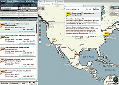 1215 1215 | Geospace & Media Tool (GMT): Geolocated news2007 computer graphics by Parsons Institute for Information Mapping (PIIM) This screenshot shows a selected news abstract set in geographical context. GMT Description The Geospace & Media Tool is an advanced information visualization application that ties incoming news flow with geospatial, census, and human network data. Related news articles are scored and aggregated into single, convenient event files. Easy-to-use graphic and geographic visualizations give the user the ability to see events, demographics, rnorganizations and current as well as past professional connections between people. Key features include: Detailed content and metadata on every news article Full dossier of individuals mentioned in every news articlern Ability to track and search events by location, topic, and customized filters Automatic extraction and aggregation of related network and statistical data Visual display of network connections between professionals Access to hundreds of statistical values specifically relevant to each news article, accompanied by map overlays |
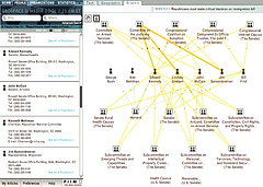 1213 1213 | Geospace & Media Tool (GMT): Human organizational networks2007 computer graphics by Parsons Institute for Information Mapping (PIIM) This screenshot shows the relationships among individuals as a human organizational network diagram. GMT Description The Geospace & Media Tool is an advanced information visualization application that ties incoming news flow with geospatial, census, and human network data. Related news articles are scored and aggregated into single, convenient event files. Easy-to-use graphic and geographic visualizations give the user the ability to see events, demographics, rnorganizations and current as well as past professional connections between people. Key features include: Detailed content and metadata on every news article Full dossier of individuals mentioned in every news articlern Ability to track and search events by location, topic, and customized filters Automatic extraction and aggregation of related network and statistical data Visual display of network connections between professionals Access to hundreds of statistical values specifically relevant to each news article, accompanied by map overlays |
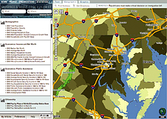 1214 1214 | Geospace & Media Tool (GMT): Statistics2007 computer graphics by Parsons Institute for Information Mapping (PIIM) This screenshot shows census data for a selected congressional district. GMT Description The Geospace & Media Tool is an advanced information visualization application that ties incoming news flow with geospatial, census, and human network data. Related news articles are scored and aggregated into single, convenient event files. Easy-to-use graphic and geographic visualizations give the user the ability to see events, demographics, rnorganizations and current as well as past professional connections between people. Key features include: Detailed content and metadata on every news article Full dossier of individuals mentioned in every news articlern Ability to track and search events by location, topic, and customized filters Automatic extraction and aggregation of related network and statistical data Visual display of network connections between professionals Access to hundreds of statistical values specifically relevant to each news article, accompanied by map overlays |
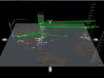 914 914 | 2004 computer graphics by Thomas Kapler, William Wright Presented at the IEEE Symposium on Information Visualization (InfoVis 2004), Geotime by Thomas Kapler and William Wright is a project financed by NGA (National Geo-Spatial Intelligence Agency) and it aims to analyze observations over Time and Geography, which is always a particular hard task to achieve. This project is one of the best I've seen in dealing with the overlapping of these two realms. A working application of GeoTime is not available online, but for those who had the opportunity of seeing it working live, it proved to be a quite interesting interactive technique. A visualization method was needed to improve perception of movements, events and relationships as they change over time within a spatial context. A combined temporal-spatial space was constructed in which to show interconnecting streams of events over a range of time in a single picture. Put simply, events are represented within an X,Y,T coordinate space, in which the X,Y plane shows geographic space and the Z-axis represents time into the future and past. In addition to providing the spatial context, the ground plane marks the instant of focus between before and after - events along the timeline "occur" when they meet the surface. Events are arrayed in time along time tracks, which are located wherever events occur within the spatial plane. |
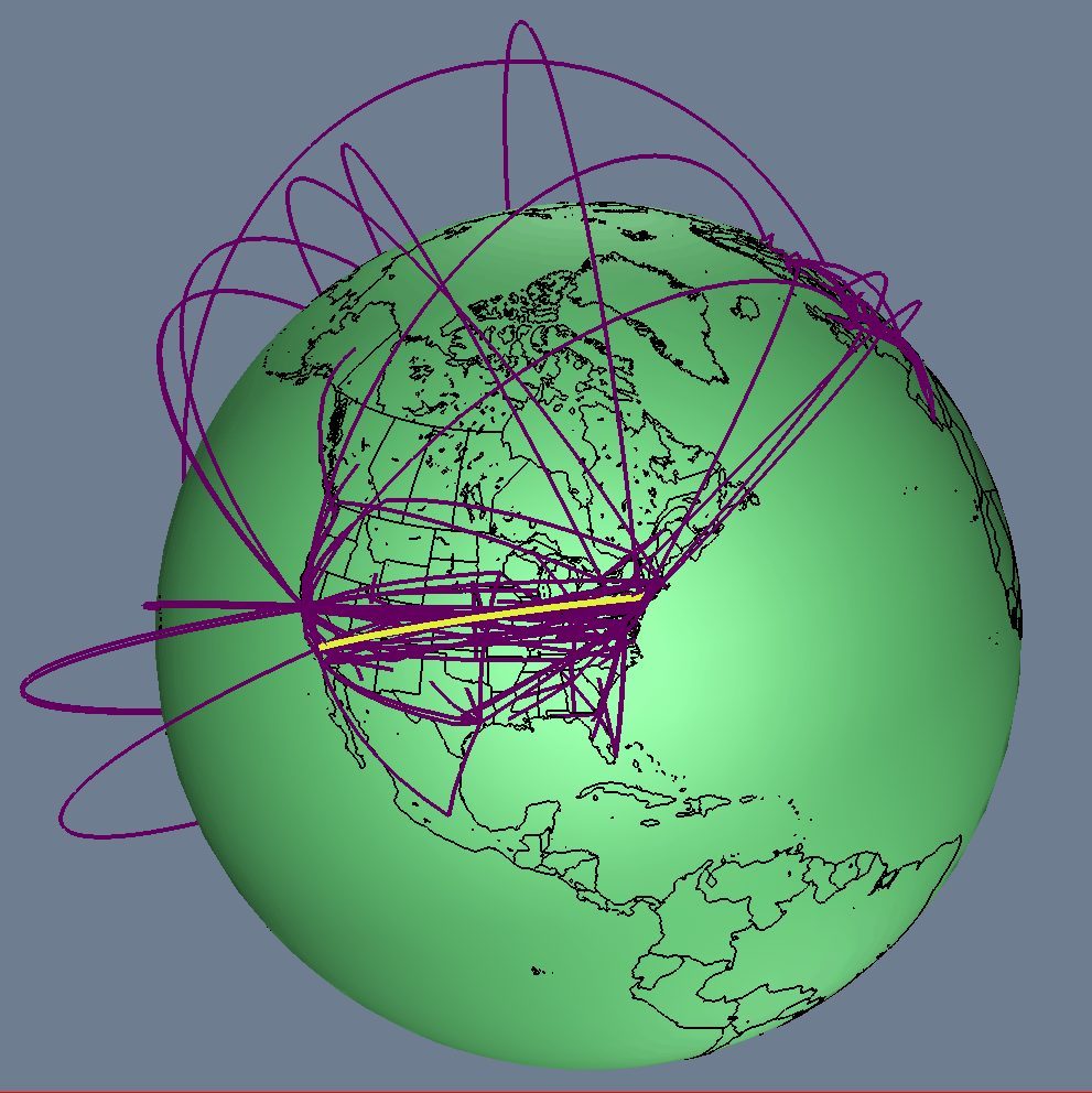 315 315 | 1996 computer graphics by Tamara Munzner Tamara Munzner and colleagues are visualising the global topology of the MBone using 3D global geographic models: http://www-graphics.stanford.edu/papers/mbone/ [For more information on the MBone maps see the Map of the Month article "Internet Arcs Around the Globe" in Mappa.Mundi Magazine.] Proceedings of the 1996 IEEE Symposium on Information Visualization, pp. 85-92, October 28-29 1996, San Francisco, CA, 1996. |
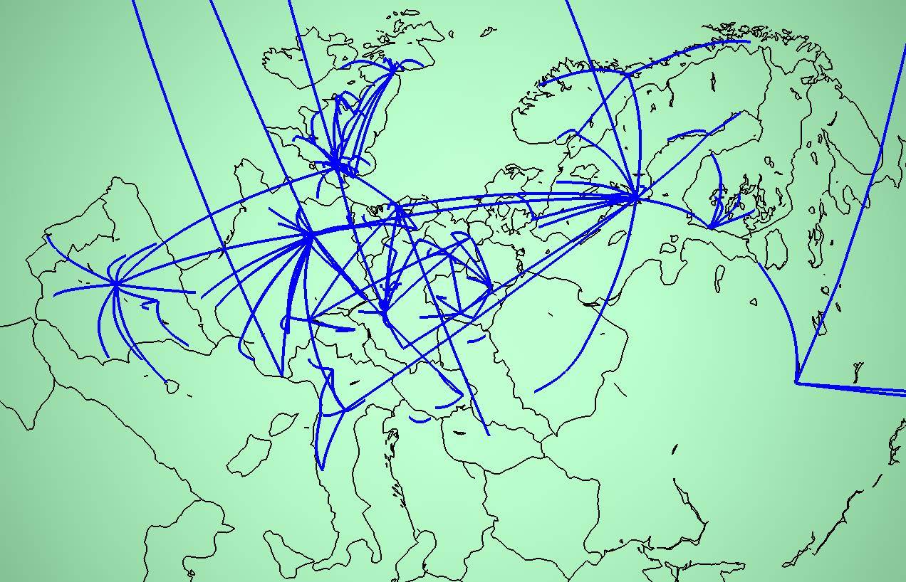 316 316 | 1996 computer graphics by Tamara Munzner Tamara Munzner and colleagues are visualising the global topology of the MBone using 3D global geographic models: http://www-graphics.stanford.edu/papers/mbone/ [For more information on the MBone maps see the Map of the Month article "Internet Arcs Around the Globe" in Mappa.Mundi Magazine.] Proceedings of the 1996 IEEE Symposium on Information Visualization, pp. 85-92, October 28-29 1996, San Francisco, CA, 1996. |
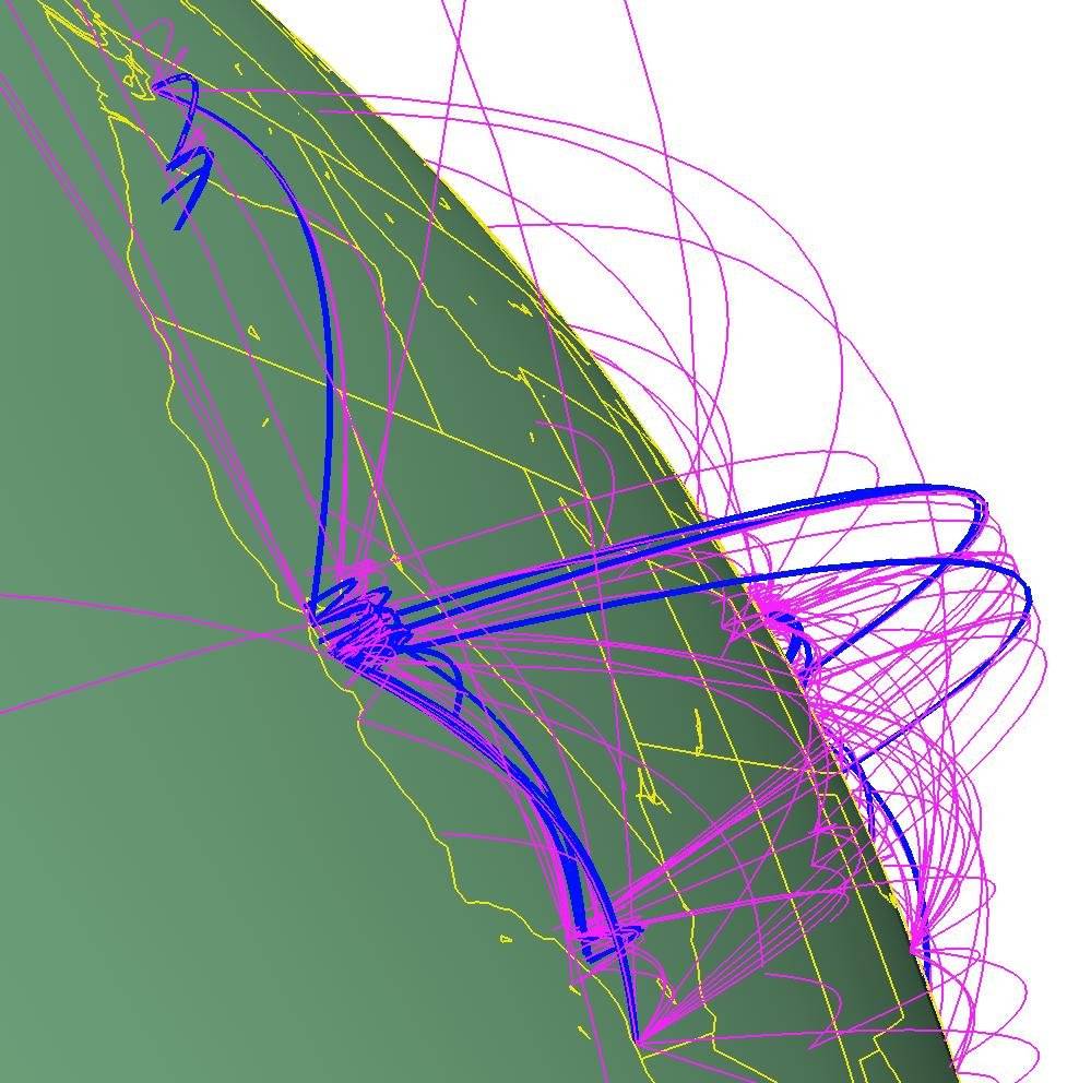 317 317 | 1996 computer graphics by Tamara Munzner Tamara Munzner and colleagues are visualising the global topology of the MBone using 3D global geographic models: http://www-graphics.stanford.edu/papers/mbone/ [For more information on the MBone maps see the Map of the Month article "Internet Arcs Around the Globe" in Mappa.Mundi Magazine.] Proceedings of the 1996 IEEE Symposium on Information Visualization, pp. 85-92, October 28-29 1996, San Francisco, CA, 1996. |
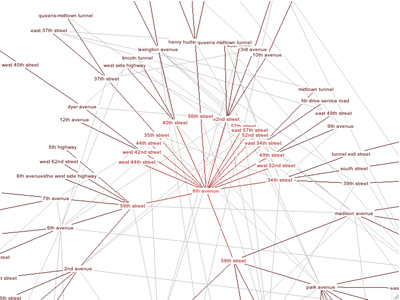 1027 1027 | 2004 computer graphics by Richard Jones Google Cartography uses the Google Search API to build a visual representation of the interconnectivity of streets in an area. It is indeed a very innovative and appealing concept, particularly since its interactive functionality allows a deeper understanding of the vast mesh of intersections that form a city's street network. This application takes a starting street and finds streets that intersect with it. Traversing the streets in a breadth-first manner, further intersections are discovered. Eventually a connected graph is produced showing the interconnectivity of streets flowing from the starting street. The largest connected subgraph is visualized using a Radial Layout algorithm provided by the Prefuse graph visualization framework. The graph is initially centered on the start street but will automatically adjust its focus to center around the most recently selected street. On the provided URL you can try navigating through the streets of New York or Melbourne, or in case you have a Google key, you can explore your own area. |
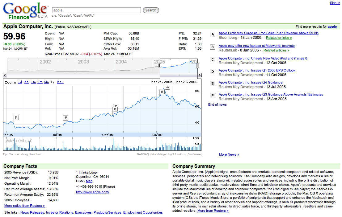 574 574 | 2006 computer graphics by Google 2006-03-27: Google Finance - Interactive Flash graphs to explore stock price data From InfoVis:Wiki Google Finance - Interactive Flash graphs to explore stock price data [Google, 2006] Interactive Flash graphs that combine stock price data in form of Line graphs (top) and sold volumes via Spike graphs (bottom). The data can be explored interactively providing Details on demand for each day; navigation can be performed via dragging the chart by mouse or moving the top Overview-plus-Detail slider. The current level of detail can be determined by dragging the overview window or selecting predefined granularities. Furthermore, company news are related to time by placing flags along the price chart. Details: http://finance.google.com via information aesthetics blog [Google, 2006] Google, Finance BETA, Retrieved at: March 27, 2006. http://finance.google.com |
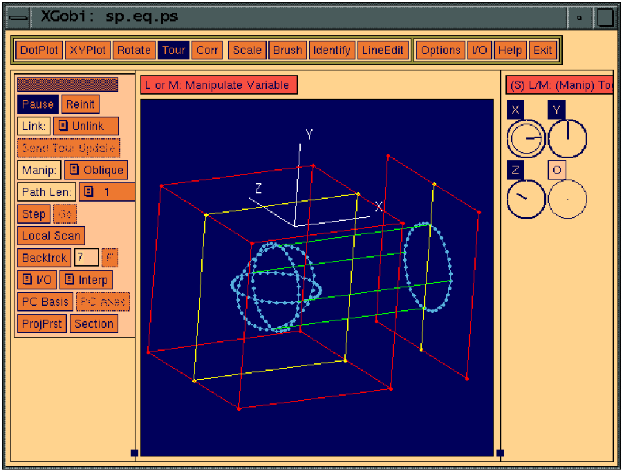 140 140 | 1988 computer graphics (XGobi) by Deborah F. Swayne, Di Cook, Andreas Buja, USA First inclusion of grand tours in an interactive system that also has linked brushing, linked identification, visual inference from graphics, interactive scaling of plots, etc. From 1991 to 1996, there was a spate of development and public distribution of highly interactive systems for data analysis and visualization, e.g., XGobi, ViSta by Deborah Swayne, Di Cook, Andreas Buja, and Forrest Young (1940-2006). Buja, A., Asimov, D., Hurley, C., and McDonald, J. A. (1988). Elements of a viewing pipeline for data analysis. In William S. Cleveland and M. E. McGill (eds.), Dynamic Graphics for Statistics. Pacific Grove, CA: Brooks/Cole. Swayne, D. F., Cook, D., and Buja, A. (1992). XGobi: Interactive dynamic graphics in the X Window System with a link to S. In Proceedings of the 1991 American Statistical Association Meetings, pp. ??-?? American Statistical Association. Buja, A., Cook, D., and Swayne, D. F. (1996). Interactive high-dimensional data visualization. Journal of Computational and Graphical Statistics , 5 (1):78-99. Swayne, D. F., Cook, D., and Buja, A. (1998). XGobi: Interactive dynamic data visualization in the X Window System. Journal of Computational and Graphical Statistics, 7(1):113-130. Young, F. W. (1994). ViSta: The Visual Statistics System . Tech. Rep. RM 94-1, L.L. Thurstone Psychometric Laboratory, UNC. |
 24 24 | 1686 print by Edmond Halley (1656-1742), England Bivariate plot of a theoretical curve derived from observations (barometric pressure vs. altitude), graphical analysis based on empirical data. Halley, E. (1686). On the height of the mercury in the barometer at different elevations above the surface of the earth, and on the rising and falling of the mercury on the change of weather. Philosophical Transactions , 16 :104-115. |
 32 32 | 1763 print by Thomas Bayes (1702-1761), England Graph of the beta density. |
 1015 1015 | 2006 computer graphics by Magnus Rembold, Jurgen Spath In 2004 a book was published by the Interaction Design Institute of the University of Applied Sciences and Arts Zirich, on the subject of "the interaction" and its place in the world of man-machine-communications. The book, Total Interaction, is a compilation of nineteen essays which offer different perspectives on this complex thematic field. In order to help the reader understand not only the content of each individual essay, but also the thematic links relating the essays to each other, Magnus Rembold and Jurgen Spath created a visualization piece that illustrates the book's content. The concentric circles represent the individual essays, with the radius in direct proportion to the essay's character count. A word's frequency is proportional to both its type size and the diameter of its circle. In addition, the essays are depicted as a pie slice that has been color-coded and whose width of the central angle derives from the number of coinciding words between the essay in question and that of the secondary author. The radius of the pie slice also derives from the length of the individual essays (the same is true of the concentric circles). The barcode structure which appears within the concentric circle of the essay in question breaks down its structure, and both the central angle and transparency of each bar correspond to the length of the essay's paragraphs. |
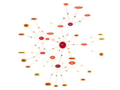 1069 1069 | 2006 computer graphics by Roberto Bianchettin The GraphNews project (beta released) has been developed as a new visualization and browsing feature of the Libero WebNews service, part of the Libero portal, one of the major Italian Internet Service providers. Libero WebNews, developed from Arianna Team, allows a fast visualization of the news published on the Web from more than 1.100 journalistic sources online. GraphNews analyzes the content of the news articles processed in Libero WebNews, with the goal of highlighting the main subjects, i.e. the people, the products, the localities, the societies, the institutions, etc., and extracts the relations that elapse between them. The final result of this elaboration is a graph visualization of these subjects and their relations. The graph is browsable through a simple one click: GraphNews also allows the change of detail level and the time period (day, week, month) of the graph. In the cases shown here, the inputted word for the first image was "Apple", while on the second was "Google". |
 954 954 | 2005 computer graphics by Eytan Adar GUESS is an exploratory data analysis and visualization tool for graphs and networks. The system contains a domain-specific embedded language called Gython (an extension of Python, or more specifically Jython) which supports the operators and syntactic sugar necessary for working on graph structures in an intuitive manner. An interactive interpreter binds the text that one types in the interpreter to the objects being visualized for more useful integration. GUESS also offers a visualization front end that supports the export of static images and dynamic movies. Because GUESS is Jython/Java based one can also construct their own applications and applets without much coding. GUESS is distributed as GPL and makes use of a number of other open source packages and contributions. |
 28 28 | 1620 print by Edmund Gunter (1581-1626) and William Oughtred (1574-1660), England Invention of a mechanical device, containing a logarithmic scale of equal parts and trigonomic functions which, with the aid of a pair of calipers, could be used as a slide rule. This device, called "Gunter's scale", or the "gunter" by seamen, was soon replaced by a true slide rule, containing two parallel logarithmic scales. Babcock, B. E. (1994). Some notes on the history and use of Gunter's scale. Journal of the Oughtred Society , 3 :14-20. Gunter, E. (1624). Description and use of the sector, the crosse-staffe and other instruments. |
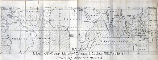 30 30 | 1656 print by Edmond Halley (1656-1742), England First known weather map, showing prevailing winds on a geographical map of the Earth. Halley, E. (1686). On the height of the mercury in the barometer at different elevations above the surface of the earth, and on the rising and falling of the mercury on the change of weather. Philosophical Transactions , 16 :104-115. |
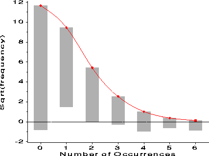 130 130 | 1965 print by John W. Tukey (1915-2000), USA Beginnings of EDA: improvements on histogram in analysis of counts, tail values (hanging rootogram). Tukey, J. W. (1965). The future of processes of data analysis. In Proceedings of the Tenth Conference on the Design of Experiment in Army Research Development and Testing, pp. 691-729. Durham, NC: U.S. Army Research Office. ARO-D Report 65-3. |
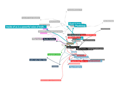 894 894 | 2005 computer graphics by Harm van den Dorpel Harmlog Sitemap is a visualization model, developed by Harm van den Dorpel, with the intent of mapping the contents of a blog (which is linear in time). Harm tagged different categories, which rotate in a three-dimensional space, and can easily expand by clicking on them. The project brings a fresh approach to this sort of visualizations, in particular for its fluid, almost organic structure. (Flash Player is required) |
 112 112 | 1911 print by Elnar Hertzsprung (1873-1967), Denmark The Hertzsprung-Russell diagram, a log-log plot of luminosity as a function of temperature for stars, used to explain the changes as a star evolves. It provided an entirely new way to look at stars, and laid the groundwork for modern stellar physics and evolution, developed independently by Elnar Hertzsprung (1873-1967), Denmark [127] and Henry Norris Russell (1877-1957), USA. See (Spence, below) for a recent appraisal. Hertzsprung, E. (1911). Publikationen des astrophysikalischen observatorium zu Potsdam. Num. 63. Spence, I. and Garrison, R. F. (1993). A remarkable scatterplot. The American Statistician, 47 (1):12-19. |
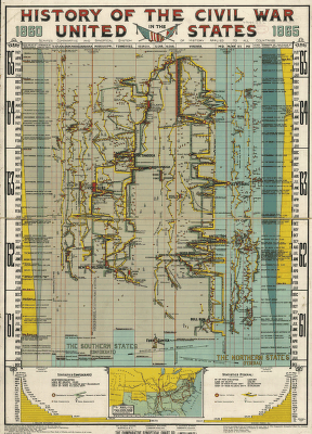 165 165 | print by Library of Congress, Visual Memory Project How can you show the details of a history visually? Time provides one obvious dimension. What else can you show to tell the story? Most timeline charts use a 2D representation, time x {place or theme}. Some are more successful in integrating additional dimensions. This image, from the Library of Congress, Visual Memory Project, History of the Civil War in the United States, 1860-1865 shows the progress of the war, with a time scale in months, and principal battles, troop movements, etc, using "Scaife's comparative and synoptical system of history applied to all countries." A reproduction may be purchased from the Kroll Map Company See the timelines page (http://www.math.yorku.ca/SCS/Gallery/timelines.html) for more on timelines. |
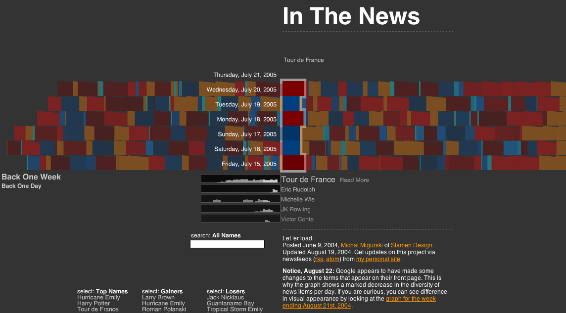 563 563 | 20040609 computer graphics by Michal Migurski 2005-07-21: "In The News" - Interactive Visualization of Google News From InfoVis:Wiki Apart from the well known Newsmap visualization that utilizes Treemaps to present the current distribution of Google News topics, another very interesting visualization exists: In The News is the title of Michal Migurski's interactive Flash application that was posted already a year ago: http://news.stamen.com/ In contrast to Newsmap that only shows current news, In The News adds temporal aspects via presenting the history of news topics over time. Thus, it allows for interactive exploration of the development of news topics over time. In The News (Google News visualization) [Migurski, 2004] Michal Migurski, In The News. Created at: June 9, 2004. Retrieved at: July 21, 2005. http://news.stamen.com/ * One week worth of news is represented in rows on the display. * A single news topic is represented as color chip whereas the size of a chip denotes its relative importance on that day. * Color is used to show whether an item has gained or lost importance relative to the previous day. * When selecting a news topic, the corresponding color chips are highlighted and a small bar graph showing the topic's performance over the last month is shown below the main visualization. * If a new topic is selected, another small bar graph is added while keeping the history of the last five selected topics visible and allowing for their comparison. * Furthermore, news topics can be searched and lists of Top Names, Top Gainers, and Top Losers are provided. The different views are very well coordinated and smooth transitions are provided, which adds to the coherent picture of the whole application making it an excellent example for a highly interactive exploration tool for time-oriented abstract data. And even nicer, the source code is available and released under a Creative Commons License. via sendung.de blog [Migurski, 2004] Michal Migurski, In The News. Created at: June 9, 2004. Retrieved at: July 21, 2005. http://news.stamen.com/ |
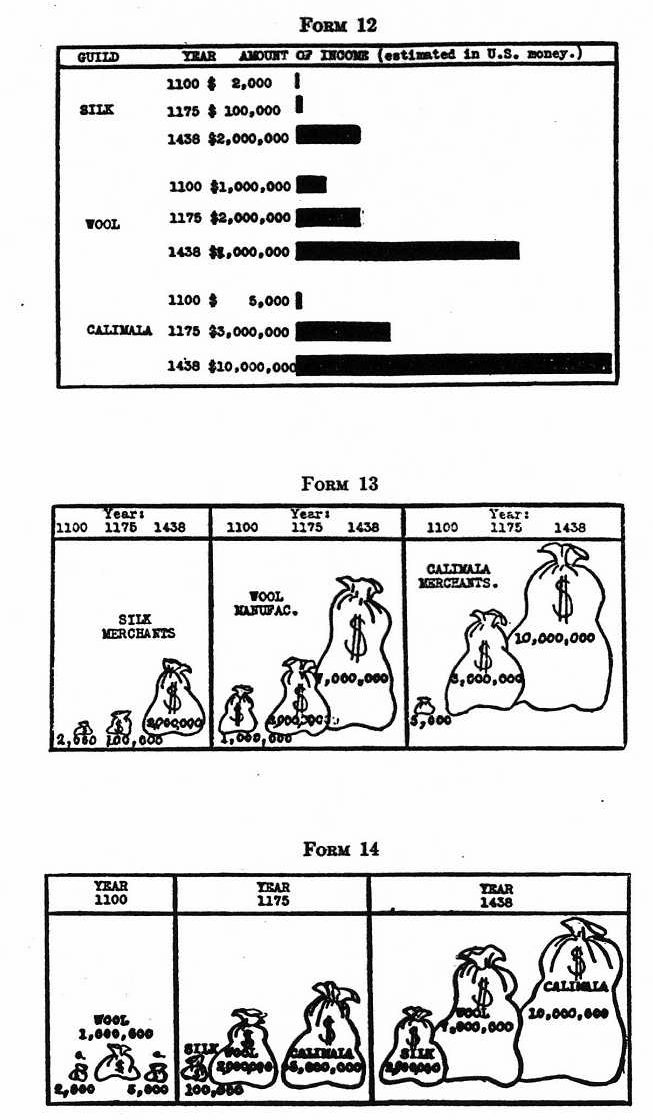 118 118 | 1927 print by J. N. Washburne, USA Spate of articles on experimental tests of statistical graphical forms: R. von Huhn, F. E. Croxton, J. N. Washburne, USA. Washburne, J. N. (1927). An experimental study of various graphic, tabular and textual methods of presenting quantitative material. Journal of Educational Psychology, 18:361-376, 465-476. von Huhn, R. (1927). A discussion of the Eells' experiment. Journal of the American Statistical Association, 22:31-36. Croxton, F. E. (1927). Further studies in the graphic use of circles and bars. Journal of the American Statistical Association, 22:36-39. Croxton, F. E. and Stein, H. (1932). Graphic comparisons by bars, squares, circles and cubes. Journal of the American Statistical Association, 27:54-60. Croxton, F. E. and Stryker, R. E. (1927). Bar charts versus circle diagrams. Journal of the American Statistical Association, 22:473-482. |
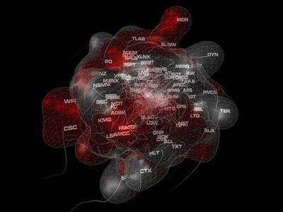 756 756 | 2004 computer graphics by Andrew Vande Moere This research demonstrates how principles of self-organization and behavior simulation can be used to represent dynamic data evolutions by extending the concept of information flocking, originally introduced by Proctor & Winter, to time-varying datasets. A rule-based behavior system continuously controls and updates the dynamic actions of individual, three-dimensional elements that represent the changing data values of reoccurring data objects. As a result, different distinguishable motion types emerge that are driven by local interactions between the spatial elements as well as the evolution of time-varying data values. Notably, this representation technique focuses on the representation of dynamic data alteration characteristics, or how reoccurring data objects change over time, instead of depicting the exact data values themselves. In addition, it demonstrates the potential of motion as a useful information visualization cue. |
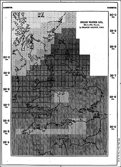 87 87 | 1861 print by Francis Galton (1822-1911), England The modern weather map, a chart showing area of similar air pressure and barometric changes by means of glyphs displayed on a map. These led to the discovery of the anti-cyclonic movement of wind around low-pressure areas. |
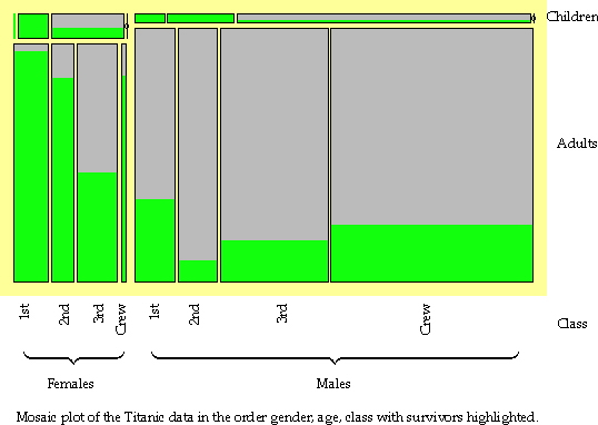 166 166 | 1994 computer graphics (MANET) by George Hawkins, Heike Hoffman, and Bernd Siegel Categorical data are often shown as tables of frequencies, cross-classified by two or more discrete variables. Interactive mosaic plots can display complex multivariate relationships surprisingly clearly. Interaction is essential to query the displays (because axis descriptions become messy in several dimensions) and to reorder the displays to emphasise different features. This plot, from the Augsburg MANET software, shows survival rates by gender, age and class from the Titanic disaster. The left lower section shows how female adult survival rates declined with class and the right lower section reveals that the pattern of male rates was different. Reordering by class, age and gender would highlight the comparison of male and female rates by class and the poor survival rate of children in the third class. [Thanks to Antony Unwin for this contribution.] |
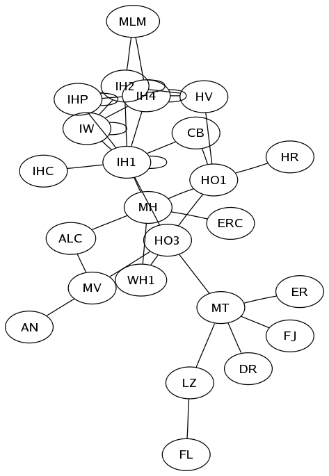 650 650 | computer graphics (Graphviz) by Graphviz - Graph Visualization Software This is the graph of an intranet. The edge length adjustment in the last line is an attempt to improve the placement of two nodes that otherwise wind up too close. Notice the way of using subgraphs to create a fully-connected subgraph between the nodes IHP, IW, IH1, IH2, and IH4. |
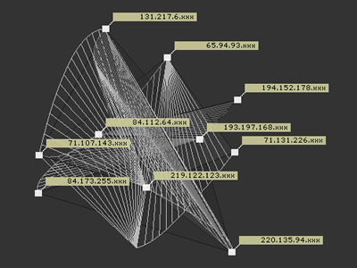 930 930 | 2002 computer graphics by Annja Krautgasser, Rainer Mandl, IP-III is a visualization application for mapping the online user presence in the Internet. The basic idea is to create a space typical to the Internet, which does not refer to the usual geographic information of online users (compare traffic visualization tools), but rather derives directly from the Internet specific code of the IP numbers.If the binary code of the IP addresses is transposed into spatial coordinates, a space constructing structure can be produced, which corresponds to a spatial language inherent to the Internet. Through the online user's applications as spatial coordinates, the created space modifies itself in real-time with the behavior of its visitors. An important aspect of the code conversion of the IP addresses into spatial coordinates is that the spatial interpretation of the IP addresses is not geographically translated in a classical sense, but rather the IP addresses are broken down into their binary code and, following this, allocated to a Cartesian coordinate system. With this, a virtual map is generated in which an autogenous net space is described - quasi a spatial map of the virtual Internet space. The installable net project 'IP-III' is comprised of two parts: In the 'online part' which is immediately defined for the online user as a website and in an 'installable part' of the exhibition. The sum of both parts produces a superposition of virtual and real space. |
 38 38 | 1701 print by Edmond Halley (1656-1742), England Contour maps showing curves of equal value (an isogonic map, lines of equal magnetic declination for the world, possibly the first contour map of a data-based variable). Halley, E. (1701). The description and uses of a new, and correct sea-chart of the whole world, shewing variations of the compass. London. Thrower, N. J. W. (ed.) (1981). The Three Voyages of Edmond Halley in the Paramore 1698 - 1701 . London: Hakluyt Society. ISBN 0 904 180 02. 2nd series, vol 156-157 (2 vols). |
 110 110 | 1924 print by Otto Neurath (Director of the Social and Economic Museum) (1882-1945), Vienna, Austria Museum of Social Statistical Graphics and the ISOTYPE system (International System of Typographic Picture Education). Neurath, O. (1973). From Vienna method to Isotype. In M. Neurath and R. S. Cohen (eds.), Empiricism and Sociology, pp. 214-248. Dordrecht, NL: Reidel. (papers written 1925-45). Neurath, O. (1991). Gesammelte Bildpaedagogische Schriften. Vienna: Verlag Hoelder-Pichler-Tempsky. ISBN 3209008639. Rudolf Haller and Robin Kinross (eds.). |
 558 558 | 2005 computer graphics (processing.org) by Carolin Horn and Florian Jenett 2005-11-29: Jellyfish - visualization of an art encyclopedia (developed using processing.org) From InfoVis:Wiki Jellyfish visualizes an encyclopedia of the arts. [Horn and Jenett, 2005] Jellyfish visualizes an encyclopedia of the arts. The project should be seen as an experiment, which deals with a dynamic interface. The purpose was to remove a static, conventional design and to achieve a playful interface. The application is developed in Processing and uses an XML-database to update content. [Horn and Jenett, 2005] Homepage: http://www.carohorn.de/jellyfish/index.htm [Horn and Jenett, 2005] Carolin Horn and Florian Jenett, Jellyfish - an encyclopedia of the arts, Created at: 2005, Retrieved at: November 29, 2005. http://www.carohorn.de/jellyfish/index.htm |
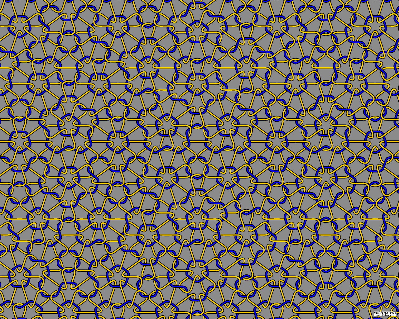 191 191 | 1995 computer graphics by Robert G. Scharein The link pictured here is an infinitely complex link consisting of an infinite number of unknots. Each unknot has five-fold symmetry about its centre. |
 6 6 | print The oldest known map? (There are several claimants for this honor.)- unknown, Museum at Konya, Turkey. |
 109 109 | 1924 print by Otto Neurath (Director of the Social and Economic Museum) (1882-1945), Vienna, Austria Museum of Social Statistical Graphics and the ISOTYPE system (International System of Typographic Picture Education). Neurath, O. (1973). From Vienna method to Isotype. In M. Neurath and R. S. Cohen (eds.), Empiricism and Sociology, pp. 214-248. Dordrecht, NL: Reidel. (papers written 1925-45). Neurath, O. (1991). Gesammelte Bildpaedagogische Schriften. Vienna: Verlag Hoelder-Pichler-Tempsky. ISBN 3209008639. Rudolf Haller and Robin Kinross (eds.). |
 91 91 | 1883 print by Charles Lallemand (1857-1938), France Combination of many variables into multi-function nomograms, using 3D, juxtaposition of maps, parallel coordinate and hexagonal grids (L'Abaque Triomphe). Lallemand, C. (1885). Les abaques héxagonaux: Nouvelle méthode générale de calcul graphique, avec de nombreux exemples d'application. Paris: Ministère des travaux publics, Comité du nivellement général de la France. |
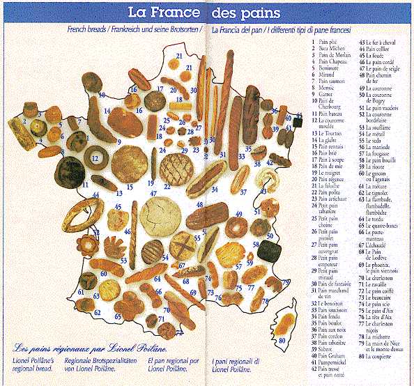 178 178 | print (poster) Not all thematic maps have to have a serious purpose. Cartes gastronomiques were quite common in the early 20th century and many fine examples are held in the Bibliotheque Nationale. I found these examples in a brochure distributed by Coté France on the Autoroute du Sud. Now, what's the shortest distance between a Cantal and a pain de mie? Further described in: http://strangemaps.wordpress.com/2007/03/27/94-gastronomic-cartography-the-france-of-breads/ |
 68 68 | 1846 print by Léon Lalanne (1811-1892), France Logarithmic grid (the first log-log plot, as a nomogram for showing products from the factors). Lalanne, L. (1846). Mémoire sur les tables graphiques et sur la géométrie anamorphique appliquées a diverses questions qui se rattachent a l'art de l'ingénieur. Annales des Ponts et Chausées, 2e series, 11:1-69. Read 1843. |
 809 809 | 2004 computer graphics by Jeffrey Heer This image is a visualization of Jeffrey Heer's personal friendster network to 3 hops out, an online social network consisting of Jeffrey, his "friends", his friends' friends, and his friends' friends' friends. The resulting networks consist of 47471 people connected by 432430 friendship relations. The data was collected during the timespan of October 2003 to February 2004 as part of the Vizster project. The images were created using the prefuse visualization toolkit. Nodes are colored by proximity to the center of the network (which in this case is Jeffrey Heer himself). The central person is the brightest, that person's friends next brightest and so on. The elements are also ordered so that friends and relations closer from the central person are drawn on top of more distant relations and people. The graph layout was computed using a standard force-directed layout method in which nodes exert anti-gravity against each other and the edges are treated as springs. |
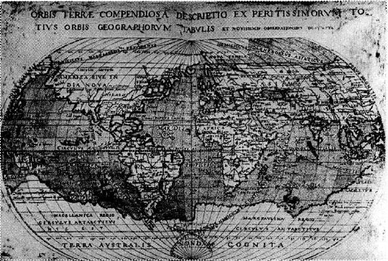 25 25 | 1603 print by Guillaume Le Nautonier (1557-1620), France Tables, and first world map showing lines of geomagnetism (isogons), used in work on finding longitude by means of magnetic variation. The tables give the world distribution of the variation, by latitude, along each of the meridians . Mandea, M. and Mayaud, P.-N. (2004). Guillaume le nautonier, un precurseur dans l'histoire du géomagnétisme magnetism. Revue d'Histoire des Sciences , 57 (1):161-174. Nautonier, G. L. (1602-1604). Mecometrie de l'eymant, c'est a dire la maniere de mesurer les longitudes par le moyen de l'eymant . Paris: n.p. BL: 533.k.9. |
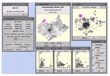 133 133 | 1996 computer graphics by Jason Dykes, England Cartographic Data Visualiser: a map visualization toolkit with graphical tools for viewing data, including a wide range of mapping options for exploratory spatial data analysis. Dykes, J. A. (1996). Dynamic maps for spatial science, a unified approach to cartographic visualization. In D. Parker (ed.), Innovations in GIS 3, pp. 177-187. London: Taylor & Francis. |
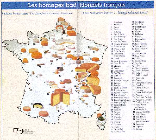 179 179 | Not all thematic maps have to have a serious purpose. Cartes gastronomiques were quite common in the early 20th century and many fine examples are held in the Bibliotheque Nationale. I found these examples in a brochure distributed by Coté France on the Autoroute du Sud. Now, what's the shortest distance between a Cantal and a pain de mie? |
 144 144 | 1990 computer graphics by M. Keiding, England Display of multivariate data in the context of life-history. Keiding, M. (1990). Statistical inference in the lexis diagram. Philosophical transactions of the Royal Society of London, series A, 332:487-509. |
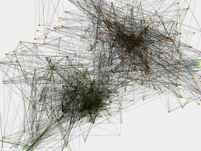 752 752 | 2004 computer graphics by Mateusz Herczka Life Support Systems - Vanda is an attempt to analyze electrical signals from the vanda hybrida orchid, and apply language modeling techniques to these signals in a computer. The result is a virtual model, which continues to generate similar signals long after the original orchids are gone - a kind of computerized longevity. Vandas language and behaviour model is stored in a hacked Microsoft Xbox, its future container. It can be accessed at any time, should one want to experience the essence of Vanda again. The work is installed as a kind of laboratorium with life support facilities for the orchids, a computer visualization of the language model, the Xbox, and the generated signals presented as sound. Besides turning a scientific experiment into an aesthetic construct, the work tangents questions of consciousness, longevity, and new lifeforms through computing. |
 296 296 | 2001 computer graphics by Christian Reiniger This is a visualization of the structure of the Linux kernel, the core software of the operating system. It shows all the individual files of the kernel and the function calls between them. The visualization was created by Christian Reiniger at the Free Code Graphing Project, based on earlier work by Rusty Russell. There is a separate small section showing the code for ISDN drivers. |
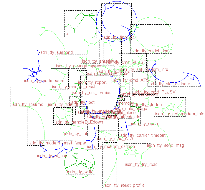 295 295 | 2001 computer graphics by Christian Reiniger This is a visualization of the structure of the Linux kernel, the core software of the operating system. It shows all the individual files of the kernel and the function calls between them. The visualization was created by Christian Reiniger at the Free Code Graphing Project, based on earlier work by Rusty Russell. A small section showing the code for ISDN drivers is below. (To really see the detail you need to download the large postscript version.) |
 819 819 | computer graphics by Patrick Barry LJNet is an interactive visualization of LiveJournal.com (LJ) members' social networks. It shows the friends and friends of friends of any given LJ member. The user can simultaneously browse the networks of friendship connections and interest matches amongst all these displayed members. The user can do this by clicking on any user in the display - any non-friends of theirs will fade away and any member that shares interests with the clicked member will gain a translucent yellow halo (sized in relation to their shared interests). LJNet is the work of Patrick Barry. It was made initially as a project in Golan Levin's class Information Visualization as Art Practice during his Master's coursework at Carnegie Mellon's Human-Computer Interaction Institute. |
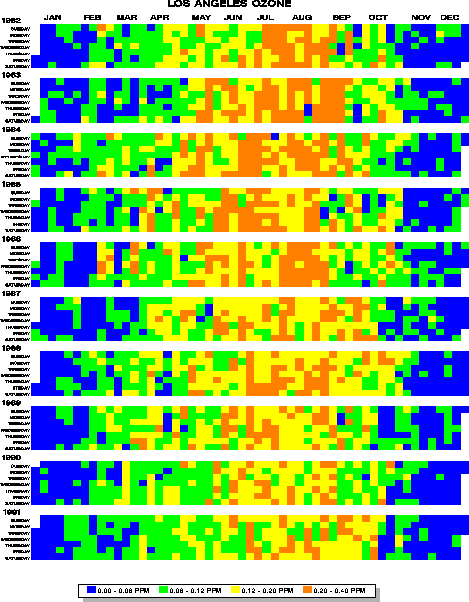 172 172 | 1997 computer graphics by Mintz, D., Fitz-Simons, T., and Wayland, M. The tile map is a useful semi-graphical display for data with seasonal variation. One square (tile) is plotted for each day of the year; the color of the tile shows the level of Ozone concentration in Los Angeles for that day, with lighter shades indicating lower concentration and darker shades showing higher concentrations. (Ed. note: This is true of the B/W version in the printed paper, but not true of the color version shown here, which uses 'elevation mapping' of colors to ozone concentration. The rendition in color is not exemplary.) The figure shows the data for the 10 years, 1982 - 1991. Within each year, ozone concentrations are higher in the summer months; Over years, the concentrations in the summer months have decreased. Figure from Mintz, D., Fitz-Simons, T. & Wayland, M. "Tracking Air Quality Trends with SAS/GRAPH", SUGI 22 Proceedings, 807-812. |
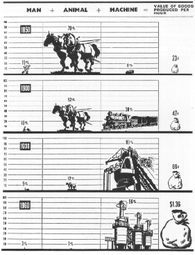 95 95 | 1884 print by Michael George Mulhall (1836-1900), England Pictogram, used to represent data by icons proportional to a number. Mulhall, M. G. (1884). Dictionary of statistics. London. |
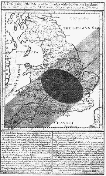 224 224 | 1700? print by Edmund Halley (1656-1742), England Edmund Halley prepared this map of the predicted path of the shadow of the moon over England. But, how to describe the process that created an eclipse? Halley used the diagram at the left to show how the moon passed between the earth and sun, creating the eclipse. The letters A, B, C, D, etc. to describe their relations. C, for example, refers to the part of England predicted to be most darkened (Northhampton, 54 miles from London). |
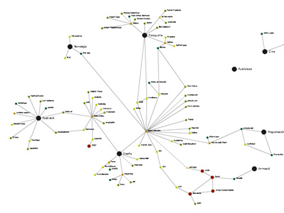 906 906 | 2005 computer graphics by Guille Lopez Gines The knowledge has revealed like a key factor in the development of any idea or project. Nowadays we are surrounded by information, but what really interests it is to be able to interpret and understand data, thus to obtain knowledge. For it, under the idea of this project, it has to arise a new form to show and to interact with the information: the schematic. The schematic is a logical and structured language, where data and abstract slight knowledge can be show in a "organized complex" visualization constituted by significant informative elements and the established underlying relations among them. Really, a place where the user can understand each data in its own context. This flash tools visualizes a series of URL's organized by main areas such as: Design, Illustration, Photography, Music, Science, etc, in an effort to organize one's source of inspiration for new ideas to arise. |
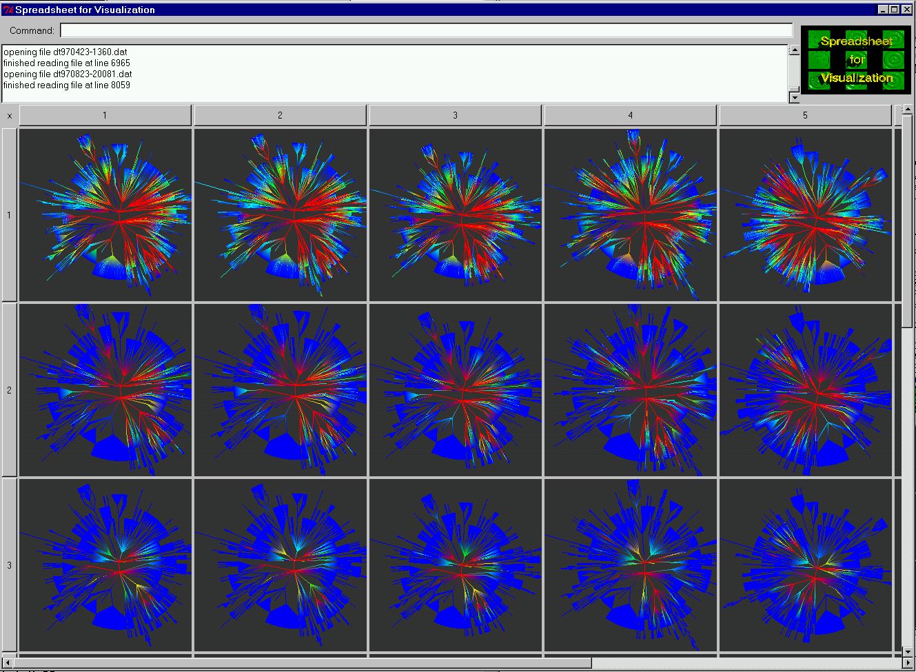 514 514 | 1999 computer graphics by Ed H. Chi, Stuart K. Card and colleagues Mapping the evolving structure and content of large Web sites developed by Ed H. Chi, Stuart K. Card and colleagues at the User Interface Research group at Xerox PARC. The visualisation examples above use Cone Trees and Disk Trees within an interactive visualisation spreadsheet environment. "Sensemaking of Evolving Web Site Using Visualization Spreadsheets" EH Chi, SK Card - Information Visualization, 1999.(Info Vis' 99) Proceedings. "Visualizing the Evolution of Web Ecologies". Ed H. Chi, James Pitkow, Jock Mackinlay, Peter Pirolli, Rich Gossweiler,et al. Proceedings of the Conference on Human Factors in Computing Systems CHI'98 |
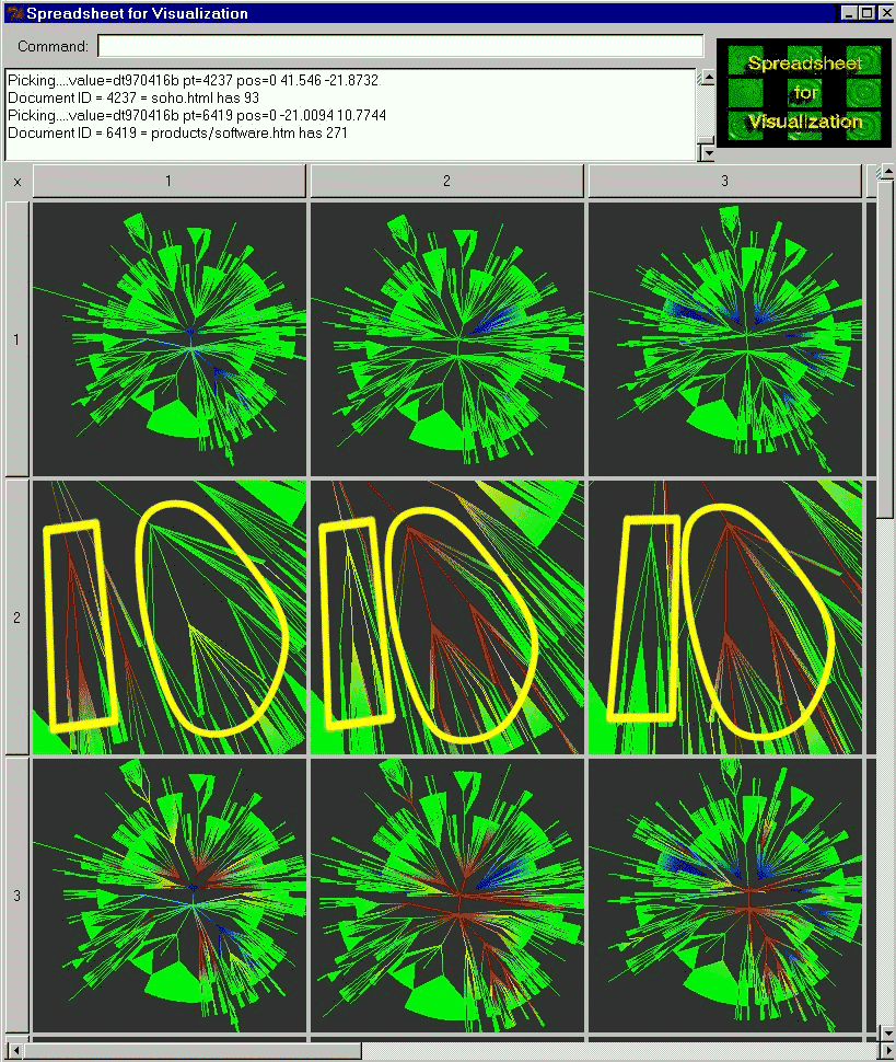 515 515 | 1999 computer graphics by Ed H. Chi, Stuart K. Card and colleagues Mapping the evolving structure and content of large Web sites developed by Ed H. Chi, Stuart K. Card and colleagues at the User Interface Research group at Xerox PARC. The visualisation examples above use Cone Trees and Disk Trees within an interactive visualisation spreadsheet environment. "Sensemaking of Evolving Web Site Using Visualization Spreadsheets" EH Chi, SK Card - Information Visualization, 1999.(Info Vis' 99) Proceedings. "Visualizing the Evolution of Web Ecologies". Ed H. Chi, James Pitkow, Jock Mackinlay, Peter Pirolli, Rich Gossweiler,et al. Proceedings of the Conference on Human Factors in Computing Systems CHI'98 |
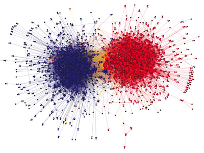 939 939 | 2005 computer graphics by Lada Adamic, Natalie Glance In this paper, the authors studied the linking patterns and discussion topics of political bloggers. The goal was to measure the degree of interaction between liberal and conservative blogs, and to uncover any differences in the structure of the two communities. Specifically, they analyzed the posts of 40 "A-list" blogs over the period of two months preceding the U.S. Presidential Election of 2004, to study how often they referred to one another and to quantify the overlap in the topics they discussed, both within the liberal and conservative communities, and also across communities. They also studied a single day snapshot of over 1,000 political blogs. This snapshot captured blogrolls (the list of links to other blogs frequently found in sidebars), and presents a more static picture of a broader blogosphere. Most significantly, the authors found differences in the behavior of liberal and conservative blogs, with conservative blogs linking to each other more frequently and in a denser pattern. The image shown, portraits the community structure of the analyzed political blogs (expanded set), shown using utilizing a GEM layout in the GUESS visualization and analysis tool. The colors reflect political orientation, red for conservative, and blue for liberal. Orange links go from liberal to conservative, and purple ones from conservative to liberal. The size of each blog reflects the number of other blogs that link to it. |
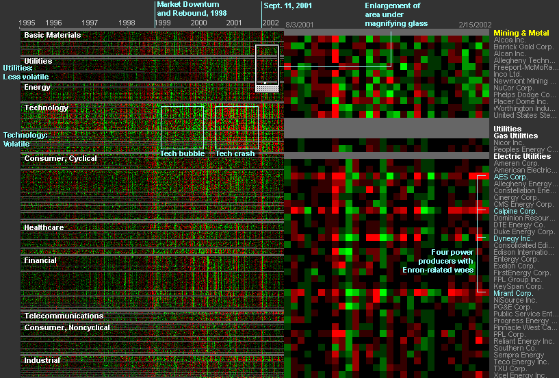 568 568 | 2006 computer graphics by SmartMoney.com 2006-03-27: Market Radar: interactive data visualization of historical stock prices at SmartMoney.com From InfoVis:Wiki Market Radar - interactive data visualization of historical stock prices using dotplots [SmartMoney.com, 2006] THE MARKET RADAR is a new way to get a broad, historical view of stock prices. Our first radar tool displays nine years of weekly price changes for 500 companies — more than 200,000 data points in all. Presenting such a large database in a single picture makes it possible to see market dynamics that might otherwise be invisible. [...] Each weekly price change is represented by a single dot on the screen, colored green if the stock went up that week and red if it went down. Large movements are colored brightly, while smaller changes are dimmer. The dots are arranged in a grid, with each row representing a single company's performance, and columns representing points in time. The labels at top show the passage of time. The companies are grouped by sector and industry. [SmartMoney.com, 2006] Details: http://www.smartmoney.com/marketradar/ via information aesthetics blog [SmartMoney.com, 2006] SmartMoney.com, Market Radar, Retrieved at: March 27, 2006. http://www.smartmoney.com/marketradar/ |
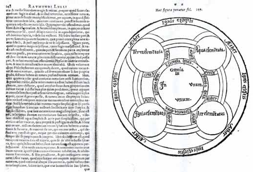 3 3 | 1235 print by Ramon Llull (1235-1316), Spain Mechanical diagrams of knowledge, as aids to reasoning (served as an inspiration to Leibnitz in the development of symbolic logic) (Spain). |
 181 181 | 2005 print by Icaro Doria Icaro Doria is Brazilian, 25 and has been working for the magazine Grande Reportagem, in Lisbon, Portugal, for the last 3 years. He is part of the team (with Luis Silva Dias, Joao Roque, Andrea Vallenti and Joao Roque) that produced the flags campaign which has been circulating the Earth in chain letters via e-mail. Icaro Doria is Brazilian, 25 and has been working for the magazine Grande Reportagem, in Lisbon, Portugal, for the last 3 years. He is part of the team (with Luis Silva Dias, João Roque, Andrea Vallenti and João Roque) that produced the flags campaign which has been circulating the Earth in chain letters via e-mail. Icaro gave us a small statement about the campaign, translated by Isabell Erdmann: The magazine Revista Grande Reportagem is a Hard Journalism magazine, on the same line as the Times. The idea was to bring across the concept that the magazine offers profound journalism about topics of real importance to the world of today. This is how we thought of the concept Meet the World. We started to research relevant, global, and current facts and, thus, came up with the idea to put new meanings to the colours of the flags. We used real data taken from the websites of Amnesty International and the UNO. The campaign has been running in Portugal since January 2005. There are eight flags that portray very current topics like the division of opinions about the war in Iraq in the United States, the violence against women in Africa, the social inequality in Brazil, the drug trafficking in Columbia, Aids and malaria in Angola, etc. With regards to the email presenting the campaign as being done by a Norwegian diplomat, this information is completely wrong. There is no Norwegian diplomat called Charung Gollar, there was no presentation in the UNO, and the campaign is not called ‘The Power of the Stars’. This was all invented and is going round the world via email. |
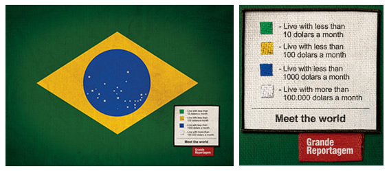 182 182 | 2005 print by Icaro Doria Icaro Doria is Brazilian, 25 and has been working for the magazine Grande Reportagem, in Lisbon, Portugal, for the last 3 years. He is part of the team (with Luis Silva Dias, Joao Roque, Andrea Vallenti and Joao Roque) that produced the flags campaign which has been circulating the Earth in chain letters via e-mail. Icaro Doria is Brazilian, 25 and has been working for the magazine Grande Reportagem, in Lisbon, Portugal, for the last 3 years. He is part of the team (with Luis Silva Dias, João Roque, Andrea Vallenti and João Roque) that produced the flags campaign which has been circulating the Earth in chain letters via e-mail. Icaro gave us a small statement about the campaign, translated by Isabell Erdmann: The magazine Revista Grande Reportagem is a Hard Journalism magazine, on the same line as the Times. The idea was to bring across the concept that the magazine offers profound journalism about topics of real importance to the world of today. This is how we thought of the concept Meet the World. We started to research relevant, global, and current facts and, thus, came up with the idea to put new meanings to the colours of the flags. We used real data taken from the websites of Amnesty International and the UNO. The campaign has been running in Portugal since January 2005. There are eight flags that portray very current topics like the division of opinions about the war in Iraq in the United States, the violence against women in Africa, the social inequality in Brazil, the drug trafficking in Columbia, Aids and malaria in Angola, etc. With regards to the email presenting the campaign as being done by a Norwegian diplomat, this information is completely wrong. There is no Norwegian diplomat called Charung Gollar, there was no presentation in the UNO, and the campaign is not called ‘The Power of the Stars’. This was all invented and is going round the world via email. |
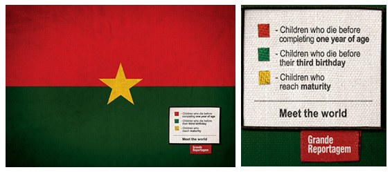 183 183 | 2005 print by Icaro Doria Icaro Doria is Brazilian, 25 and has been working for the magazine Grande Reportagem, in Lisbon, Portugal, for the last 3 years. He is part of the team (with Luis Silva Dias, Joao Roque, Andrea Vallenti and Joao Roque) that produced the flags campaign which has been circulating the Earth in chain letters via e-mail. Icaro Doria is Brazilian, 25 and has been working for the magazine Grande Reportagem, in Lisbon, Portugal, for the last 3 years. He is part of the team (with Luis Silva Dias, João Roque, Andrea Vallenti and João Roque) that produced the flags campaign which has been circulating the Earth in chain letters via e-mail. Icaro gave us a small statement about the campaign, translated by Isabell Erdmann: The magazine Revista Grande Reportagem is a Hard Journalism magazine, on the same line as the Times. The idea was to bring across the concept that the magazine offers profound journalism about topics of real importance to the world of today. This is how we thought of the concept Meet the World. We started to research relevant, global, and current facts and, thus, came up with the idea to put new meanings to the colours of the flags. We used real data taken from the websites of Amnesty International and the UNO. The campaign has been running in Portugal since January 2005. There are eight flags that portray very current topics like the division of opinions about the war in Iraq in the United States, the violence against women in Africa, the social inequality in Brazil, the drug trafficking in Columbia, Aids and malaria in Angola, etc. With regards to the email presenting the campaign as being done by a Norwegian diplomat, this information is completely wrong. There is no Norwegian diplomat called Charung Gollar, there was no presentation in the UNO, and the campaign is not called ‘The Power of the Stars’. This was all invented and is going round the world via email. |
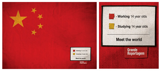 184 184 | 2005 print by Icaro Doria Icaro Doria is Brazilian, 25 and has been working for the magazine Grande Reportagem, in Lisbon, Portugal, for the last 3 years. He is part of the team (with Luis Silva Dias, Joao Roque, Andrea Vallenti and Joao Roque) that produced the flags campaign which has been circulating the Earth in chain letters via e-mail. Icaro Doria is Brazilian, 25 and has been working for the magazine Grande Reportagem, in Lisbon, Portugal, for the last 3 years. He is part of the team (with Luis Silva Dias, João Roque, Andrea Vallenti and João Roque) that produced the flags campaign which has been circulating the Earth in chain letters via e-mail. Icaro gave us a small statement about the campaign, translated by Isabell Erdmann: The magazine Revista Grande Reportagem is a Hard Journalism magazine, on the same line as the Times. The idea was to bring across the concept that the magazine offers profound journalism about topics of real importance to the world of today. This is how we thought of the concept Meet the World. We started to research relevant, global, and current facts and, thus, came up with the idea to put new meanings to the colours of the flags. We used real data taken from the websites of Amnesty International and the UNO. The campaign has been running in Portugal since January 2005. There are eight flags that portray very current topics like the division of opinions about the war in Iraq in the United States, the violence against women in Africa, the social inequality in Brazil, the drug trafficking in Columbia, Aids and malaria in Angola, etc. With regards to the email presenting the campaign as being done by a Norwegian diplomat, this information is completely wrong. There is no Norwegian diplomat called Charung Gollar, there was no presentation in the UNO, and the campaign is not called ‘The Power of the Stars’. This was all invented and is going round the world via email. |
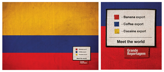 185 185 | 2005 print by Icaro Doria Icaro Doria is Brazilian, 25 and has been working for the magazine Grande Reportagem, in Lisbon, Portugal, for the last 3 years. He is part of the team (with Luis Silva Dias, Joao Roque, Andrea Vallenti and Joao Roque) that produced the flags campaign which has been circulating the Earth in chain letters via e-mail. Icaro Doria is Brazilian, 25 and has been working for the magazine Grande Reportagem, in Lisbon, Portugal, for the last 3 years. He is part of the team (with Luis Silva Dias, João Roque, Andrea Vallenti and João Roque) that produced the flags campaign which has been circulating the Earth in chain letters via e-mail. Icaro gave us a small statement about the campaign, translated by Isabell Erdmann: The magazine Revista Grande Reportagem is a Hard Journalism magazine, on the same line as the Times. The idea was to bring across the concept that the magazine offers profound journalism about topics of real importance to the world of today. This is how we thought of the concept Meet the World. We started to research relevant, global, and current facts and, thus, came up with the idea to put new meanings to the colours of the flags. We used real data taken from the websites of Amnesty International and the UNO. The campaign has been running in Portugal since January 2005. There are eight flags that portray very current topics like the division of opinions about the war in Iraq in the United States, the violence against women in Africa, the social inequality in Brazil, the drug trafficking in Columbia, Aids and malaria in Angola, etc. With regards to the email presenting the campaign as being done by a Norwegian diplomat, this information is completely wrong. There is no Norwegian diplomat called Charung Gollar, there was no presentation in the UNO, and the campaign is not called ‘The Power of the Stars’. This was all invented and is going round the world via email. |
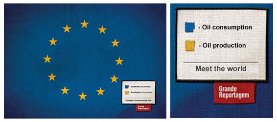 186 186 | 2005 print by Icaro Doria Icaro Doria is Brazilian, 25 and has been working for the magazine Grande Reportagem, in Lisbon, Portugal, for the last 3 years. He is part of the team (with Luis Silva Dias, Joao Roque, Andrea Vallenti and Joao Roque) that produced the flags campaign which has been circulating the Earth in chain letters via e-mail. Icaro Doria is Brazilian, 25 and has been working for the magazine Grande Reportagem, in Lisbon, Portugal, for the last 3 years. He is part of the team (with Luis Silva Dias, João Roque, Andrea Vallenti and João Roque) that produced the flags campaign which has been circulating the Earth in chain letters via e-mail. Icaro gave us a small statement about the campaign, translated by Isabell Erdmann: The magazine Revista Grande Reportagem is a Hard Journalism magazine, on the same line as the Times. The idea was to bring across the concept that the magazine offers profound journalism about topics of real importance to the world of today. This is how we thought of the concept Meet the World. We started to research relevant, global, and current facts and, thus, came up with the idea to put new meanings to the colours of the flags. We used real data taken from the websites of Amnesty International and the UNO. The campaign has been running in Portugal since January 2005. There are eight flags that portray very current topics like the division of opinions about the war in Iraq in the United States, the violence against women in Africa, the social inequality in Brazil, the drug trafficking in Columbia, Aids and malaria in Angola, etc. With regards to the email presenting the campaign as being done by a Norwegian diplomat, this information is completely wrong. There is no Norwegian diplomat called Charung Gollar, there was no presentation in the UNO, and the campaign is not called ‘The Power of the Stars’. This was all invented and is going round the world via email. |
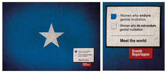 187 187 | 2005 print by Icaro Doria Icaro Doria is Brazilian, 25 and has been working for the magazine Grande Reportagem, in Lisbon, Portugal, for the last 3 years. He is part of the team (with Luis Silva Dias, Joao Roque, Andrea Vallenti and Joao Roque) that produced the flags campaign which has been circulating the Earth in chain letters via e-mail. Icaro Doria is Brazilian, 25 and has been working for the magazine Grande Reportagem, in Lisbon, Portugal, for the last 3 years. He is part of the team (with Luis Silva Dias, João Roque, Andrea Vallenti and João Roque) that produced the flags campaign which has been circulating the Earth in chain letters via e-mail. Icaro gave us a small statement about the campaign, translated by Isabell Erdmann: The magazine Revista Grande Reportagem is a Hard Journalism magazine, on the same line as the Times. The idea was to bring across the concept that the magazine offers profound journalism about topics of real importance to the world of today. This is how we thought of the concept Meet the World. We started to research relevant, global, and current facts and, thus, came up with the idea to put new meanings to the colours of the flags. We used real data taken from the websites of Amnesty International and the UNO. The campaign has been running in Portugal since January 2005. There are eight flags that portray very current topics like the division of opinions about the war in Iraq in the United States, the violence against women in Africa, the social inequality in Brazil, the drug trafficking in Columbia, Aids and malaria in Angola, etc. With regards to the email presenting the campaign as being done by a Norwegian diplomat, this information is completely wrong. There is no Norwegian diplomat called Charung Gollar, there was no presentation in the UNO, and the campaign is not called ‘The Power of the Stars’. This was all invented and is going round the world via email. |
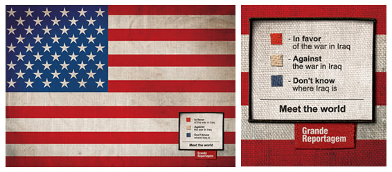 188 188 | 2005 print by Icaro Doria Icaro Doria is Brazilian, 25 and has been working for the magazine Grande Reportagem, in Lisbon, Portugal, for the last 3 years. He is part of the team (with Luis Silva Dias, Joao Roque, Andrea Vallenti and Joao Roque) that produced the flags campaign which has been circulating the Earth in chain letters via e-mail. Icaro Doria is Brazilian, 25 and has been working for the magazine Grande Reportagem, in Lisbon, Portugal, for the last 3 years. He is part of the team (with Luis Silva Dias, João Roque, Andrea Vallenti and João Roque) that produced the flags campaign which has been circulating the Earth in chain letters via e-mail. Icaro gave us a small statement about the campaign, translated by Isabell Erdmann: The magazine Revista Grande Reportagem is a Hard Journalism magazine, on the same line as the Times. The idea was to bring across the concept that the magazine offers profound journalism about topics of real importance to the world of today. This is how we thought of the concept Meet the World. We started to research relevant, global, and current facts and, thus, came up with the idea to put new meanings to the colours of the flags. We used real data taken from the websites of Amnesty International and the UNO. The campaign has been running in Portugal since January 2005. There are eight flags that portray very current topics like the division of opinions about the war in Iraq in the United States, the violence against women in Africa, the social inequality in Brazil, the drug trafficking in Columbia, Aids and malaria in Angola, etc. With regards to the email presenting the campaign as being done by a Norwegian diplomat, this information is completely wrong. There is no Norwegian diplomat called Charung Gollar, there was no presentation in the UNO, and the campaign is not called ‘The Power of the Stars’. This was all invented and is going round the world via email. |
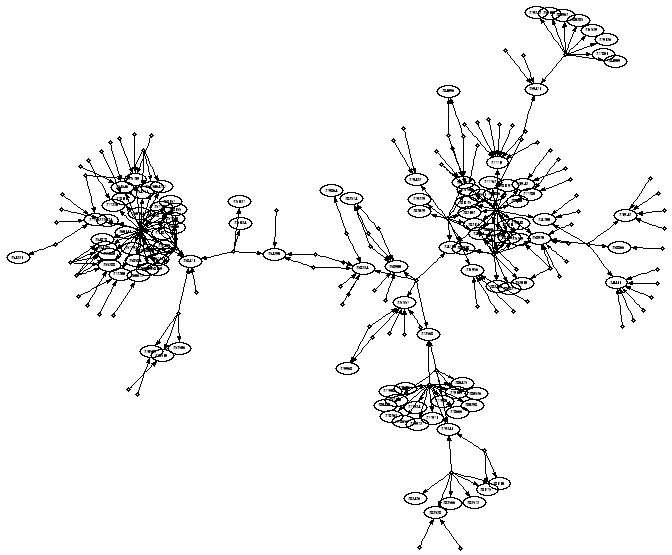 652 652 | computer graphics by Graphviz - Graph Visualization Software The graph represents dependencies between modifications to a large program. Because testing such programs is difficult and expensive, the graph was made to discover which subsets of modifications might be tested separately by understanding or even eliminating a few key dependencies. |
 899 899 | 2003 computer graphics by T.J. Jankun-Kelly, Kwan-Liu Ma Graph and tree visualization techniques enable interactive exploration of complex relations while communicating topology. However, most existing techniques have not been designed for situations where visual information such as images is also present at each node and must be displayed. MoireGraphs intents to address this need. MoireGraphs combine a focus+context radial graph layout with a suite of interaction techniques (focus strength changing, radial rotation, level highlighting, secondary foci, animated transitions and node information) to assist in the exploration of graphs with visual nodes. The method is scalable to hundreds of displayed visual nodes. Source: IEEE Computer Science Press 2003 |
 142 142 | 1981 computer graphics by John Hartigan and Beat Kleiner, USA Mosaic display á la Hartigan and Kleiner. Hartigan, J. A. and Kleiner, B. (1981). Mosaics for contingency tables. In W. F. Eddy (ed.), Computer Science and Statistics: Proceedings of the 13th Symposium on the Interface, pp. 268-273. New York, NY: Springer-Verlag. Friendly, M. (2002). A brief history of the mosaic display. Journal of Computational and Graphical Statistics, 11(1):89-107. |
 202 202 | From the book: Racinet, Auguste. Full-Color Picture Sourcebook of Historic Ornament: All 120 Plates from "L'Ornement Polychrome," Series II. New York: Dover Publications, Inc., 1989. Location: Plate 54 Meyer, Franz Sales. Handbook of Ornament. New York: Dover Publications, Inc., 1957. |
 105 105 | 1913 print by Henry Gwyn Jeffreys Moseley (1887-1915), England Discovery of the concept of atomic number, based largely on graphical analysis (a plot of serial numbers of the elements vs. square root of frequencies from X-ray spectra) The linear relations showed that the periodic table was explained by atomic number rather than, as had been supposed, atomic weight, and predicted the existence of several yet-undiscovered elements. Moseley, H. (1913). The high frequency spectra of the elements. Philosophical Magazine, 26:1024-1034. (Part II, 27:1914, pp.703-). |
 955 955 | 2005 computer graphics by Natalia Rojas This project has been initiated during the first "Digital Information Design Camp" (DID), a three-week-long course organized by Professor John Maeda in the summer of 2005, and its original idea (v.1.0) was done with the supervision of Ben Fry. MSN History Visualization reads the xml files that are being stored by the MSN, and makes a graphical display that allows comparisons between conversations with different people and tries to answer to the following questions: - How many words do I use to write in each utterance? - Which are the words that I use at the most? The application has been thought to be downloaded and used by any person who has stored his conversations using the MSN history. |
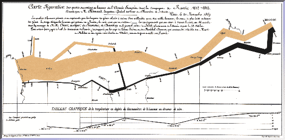 243 243 | print by Charles Joseph Minard A graphical display of the time course of Minard's works reveals some interesting patterns. The plot below shows the time course of Minard's graphic output with a smooth (loess) curve, in relation to some events in his life. Tick marks at the top and bottom show the date of each each graphic work, categorized by content (related to the distribution of Goods vs. Other topics). |
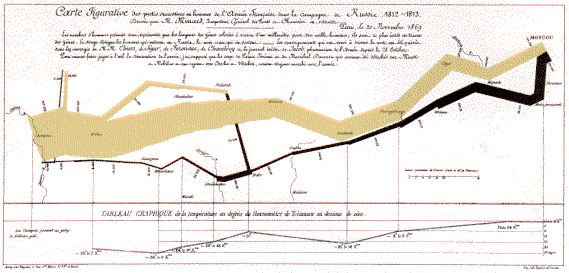 92 92 | 1869 print by Charles Joseph Minard (1781-1870), France Minard's flow map graphic of Napoleon's March on Moscow (called "the best graphic ever produced" by Tufte). Minard, C. J. (20 Nov. 1869). Carte figurative des pertes successives en hommes de l'armée qu'Annibal conduisit d'Espagne en Italie en traversant les Gaules (selon Polybe). Carte figurative des pertes successives en hommes de l'armée française dans la campagne de Russie, 1812-1813. lith. (624 x 207, 624 x 245). ENPC: Fol 10975, 10974/C612. Tufte, E. R. (1983). The Visual Display of Quantitative Information . Cheshire, CT: Graphics Press. |
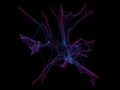 755 755 | computer graphics by Jared Schiffman, Tom White and M Central to the Society of Mind are the concepts of 'nemes', which are agencies responsible for representing fragments of states of minds. Together with K-lines, they form critical bridges interconnecting agents in different ways. "The goal of our project will be to create a Neme simulator that illustrates the three axes of topology, function, and environment. Each of these axes will be illustrated by a system that allows active manipulation and graphical visualization of nemetic structure, its interactions with agents, or exposure to a variety of stimuli. Additionally, since the human mind would have to contain millions of complex interconnected nemes in order to enable us to recognize, memorize, and associate concepts the way we do, we will in this project, discuss the scalability of nemetic structures." |
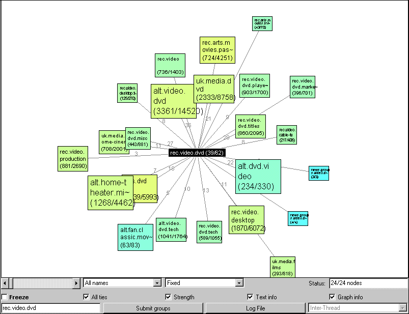 484 484 | computer graphics by Marc Smith Netscan is an ambitious project analysing the social structure of Usenet news. It is being developed by Marc Smith, a research sociologist at Microsoft Research. This example is a screenshot of the Crosspost Visualization tool of Netscan which enables you to analyse the connections between newsgroups. [For more information see the Map of Month article, "Netscan Project: Mapping the Social Geography of Usenet News".] |
 1234 1234 | 2006 computer graphics by Arno Klein and Nadia Ries-Shen (PIIM) Networks can be represented in many different forms, each of which may be projected into different mathematical spaces for analysis. Node-link diagrams can expose network vulnerabilities, highlight optimal paths, and cluster nodes for analysis. Radial formats provide alternate ways of layering, integrating, and navigating networks. Quantitative icons can help to explore the dynamics of interacting subnetworks. |
 1232 1232 | 2006 computer graphics by Arno Klein and Sayoko Yoshida (PIIM) Radial formats provide alternate ways of layering, integrating, and navigating networks. This “combination lock†approach to decision making uses stepwise combinatorics to selectively navigate a solution space. Other network representations include more conventional node-link diagrams that can expose network vulnerabilities, highlight optimal paths, and cluster nodes for analysis, and even quantitative icons that can help to explore the dynamics of interacting subnetworks. |
 1235 1235 | 2006 computer graphics by Arno Klein and Nadia Ries-Shen (PIIM) Network visualizations can take unexpected forms, such as discontinuous yet related glyphs for wayfinding through regions with varying resources. Other network representations include node-link diagrams that can expose network vulnerabilities, highlight optimal paths, and cluster nodes for analysis, as well as radial formats that provide alternate ways of layering, integrating, and navigating networks. |
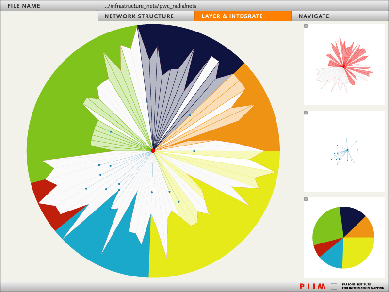 1233 1233 | 2006 computer graphics by Arno Klein and Sayoko Yoshida (PIIM) Layering and integrating networks presents information in a form for rapid analysis. Layers may consist of different network representations, such as node-link diagrams, radial formats, and quantitative icons. |
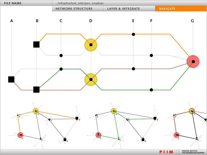 1231 1231 | 2006 computer graphics by Jamie Smith, Arno Klein, and Nadia Ries-Shen (PIIM) Node-link diagrams can expose critical network vulnerabilities and highlight optimal paths. Networks can be represented in a multitude of forms quite distinct from node-link diagrams. For example, radial formats provide alternate ways of layering, integrating, and navigating networks, and even quantitative icons can help to explore the dynamics of interacting subnetworks. |
 227 227 | 1999 drawing by Mark Lombardi (1955-2000) Mark Lombardi (1955-2000) was an abstract painter, best known for his network diagrams of crime and conspiracy. Lombardi's drawings attempt to document financial and political frauds by power brokers. Nodes in the diagrams represent individuals, corporations and government agencies, connected by lines showing associations, deals and so forth. His 1999 drawing, entitled George W. Bush, Harken Energy and Jackson Stephens, ca 1979-90, shows the proven connections between James Bath, the Bush and bin Laden families, and business deals in Texas and around the world. Thirteen lines originate with or point to James R. Bath, more than any other name presented. Among those linked to this obscure yet central character are George W. Bush, Jr., George H.W. Bush, Sr., Senator Lloyd Bentsen of Texas, Governor John B. Connally of Texas, Sheik Salim bin Laden of Saudi Arabia, and Sheik Salim's younger brother, Osama bin Laden. Lombardi's other network diagrams relate to the Iran-Contra Affair, World Finance Corporation, the Bay of Pigs invasion, and so forth. Each was based on thousands of notes gathered from news reports and written on index cards. |
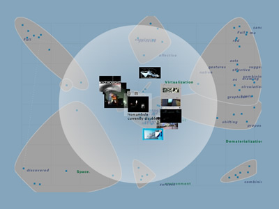 957 957 | 2001 computer graphics by Gabriele Blome, Boris Muller, Ja This Semantic Map is part of the netzspannung.org project that is lead by Monika Fleischmann and Wolfgang Strauss at the MARS Exploratory Media Lab, Fraunhofer Gesellschaft - Institute for Media Communication. The netzspannung.org project is funded by the German Ministry for Education and Research (BMBF). The basic idea behind the Map is to graphically present and communicate the content of the netzspannung.org database as well as visualizing metadata about the content. The graphical visualization presents the data in a intuitive way, so the constellations of the data form a statement about their contextual surroundings. They are part of the netzspannung.org tools. |
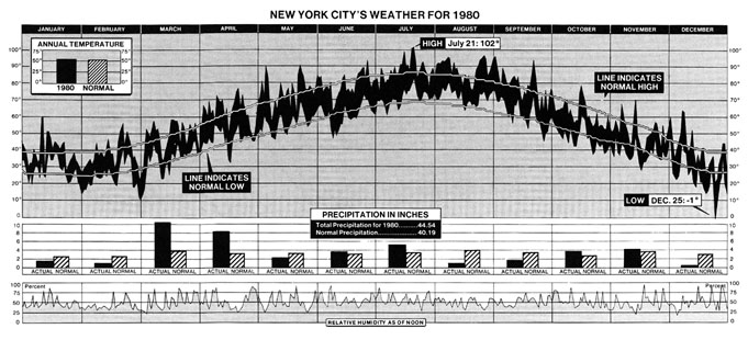 173 173 | 1981 print by New York Times Newspapers and magazines usually choose simplicity over detail, because it is hard to show much information in a single, comprehensible display. A collection of truly bad examples from the popular media are shown on our Darts pages. Here, the attention to detail, and to graphic design are evident. This graph, from the New York Times (Jan. 11, 1981, p. 32; Tufte (1983), p. 30) shows--- both valiantly, and sucessfully--- 2200 numbers which summarize the trends and patterns in weather in New York City in 1980. The three aligned charts show temperature, precipitation, and relative humidity. In the graph of temperature, the area is filled between the daily low and daily high. What makes this graph successful, in spite of the large amount of information presented are (a) clear visual comparisons between the 1980 data and the long-run average, (b) clear textual labels, (c) visual segregation between the three series. For example, it is easy to see that March and April were about of normal temperature, but a lot wetter. |
 745 745 | 1999 computer graphics by Graham J. Wills The difference between displaying networks with 100-1,000 nodes and displaying ones with 10,000-100,000 nodes is not merely quantitative, it is qualitative. Layout algorithms suitable for the former are too slow for the latter, requiring new algorithms or modified (often relaxed) versions of existing algorithms to be invented. The density of nodes and edges displayed per inch of screen real estate requires special visual techniques to filter the graphs and focus attention. NicheWorks is a visualization tool for the investigation of very large graphs. By 'very large' we mean graphs for which we cannot look at the complete set of labeled nodes and edges on one static display. Typical analyses performed using NicheWorks have between 20,000 and 1,000,000 nodes. On current mid-range workstations, a network of around 50,000 nodes and edges can be visualized and manipulated in real time with ease. Increased size decreases interactive performance linearly. NicheWorks allows the user to examine a variety of node and edge attributes in conjunction with their connectivity information. Categorical, textual and continuous attributes can be explored with a variety of one-way, two-way, and multidimensional views. |
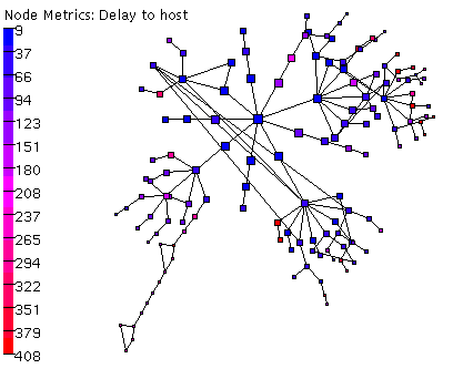 678 678 | 2006 computer graphics (Otter) Otter is a historical CAIDA tool used for visualizing arbitrary network data that can be expressed as a set of nodes, links or paths. Otter was developed to handle visualization tasks for a wide variety of Internet data, including data sets on topology, workload, performance, and routing. Otter is in maintenance rather than development mode. |
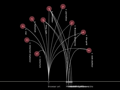 941 941 | computer graphics by Ricard Montolio, Noemi Guillaume Nodecurated is a management tool for online curatorships. This tool synthesizes the basic parameters defined in the functions of author as manager and work of art as a tool, where the user plays the determinant role in its configuration. Nevertheless, this project aims to be a tool of analysis of the practices of creation on the net. In this way, an open context is defined in the environment of cultural production on the net, favoring the presence of conceptual suggestions in the area of digital practices. Nodecurated is a system of information visualization for curatorial projects on the net, a field where there is too much dependence on traditional curatorial projects. Nodecurated proposes to rethink of the net from the net itself, putting forward a tool of dialogue, where the different suggestions of curatorial practice do not remain unheard but open to multiple relationships through the process of the reading of these. |
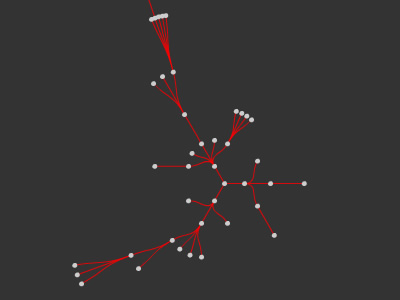 938 938 | 2005 computer graphics by Jordi Puig Vila, Mar Canet NodeMail is a visualization tool for email and a free and open device for social activism. The application renders NetActivism visible by exploiting email technology. It provides information about the social relations that configure the communication of any activism-related message. Nodemail works as follows: everytime someone generates a message through the online application, a principal node is created. For each user who receives the message, another node is created, and the hierarchies among these are maintained by chronological order. In this manner, the user can see who has sent the message for the first time, to whom he or she has sent them, how it arrives, and which users it has gone through. The user can also see how far his or her voice reached, and how his or her contacts sent the message to others all the way to the thousands or millions. It is a free and open tool for social mobilization, for each user is free to use this device to send content. Currently, Nodemail can only visualize the spread of one message at a time, but the authors hope that in a future version they'll be able implement the working of several messages at the same time. |
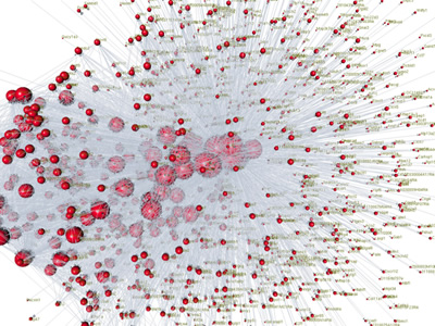 1072 1072 | 2006 computer graphics by Issac Trotts, Shawn Mikula BrainMaps.org is an interactive zoomable high-resolution digital brain atlas and virtual microscope that is based on more than 10 million megapixels of scanned images of serial sections of both primate and non-primate brains and that is integrated with a high-speed database for querying and retrieving data about brain structure and function over the internet. Currently featured are complete brain atlas datasets for various species, including Macaca mulatta, C. aethiops, Felis catus, and Mus musculus. On their website one can find a suite of desktop applications for interacting with and analyzing BrainMaps.org data. One of this applications (featured here) is Nodes3D, a 3D graph visualization program written by Issac Trotts in consultation with Shawn Mikula, in the labs of Edward G. Jones. |
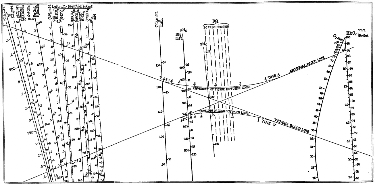 113 113 | 1928 print by Lawrence Joseph Henderson (1878-1942), USA Nomogram of chemical concentrations in blood, showing the relations among over 20 components. Henderson, L. J. (1928). Blood: A Study in General Physiology. New Haven, CT: Yale University Press. |
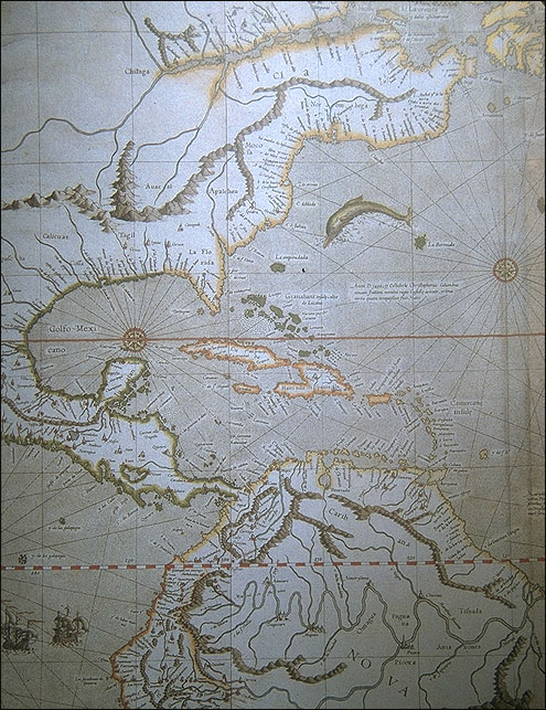 2 2 | 1569 print by Gerardus Mercator (1512-1594), Belgium Invention of cylindrical projection for portraying the globe on maps, to preserve straightness of rhumb lines. van Rupelmonde, G. M. (1569). Nova et aucta orbis terrae descriptio ad usum navigantum emendate accomodata. |
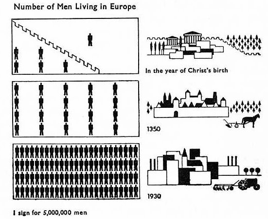 108 108 | 1924 print by Otto Neurath (Director of the Social and Economic Museum) (1882-1945), Vienna, Austria Museum of Social Statistical Graphics and the ISOTYPE system (International System of Typographic Picture Education). Neurath, O. (1973). From Vienna method to Isotype. In M. Neurath and R. S. Cohen (eds.), Empiricism and Sociology, pp. 214-248. Dordrecht, NL: Reidel. (papers written 1925-45). Neurath, O. (1991). Gesammelte Bildpaedagogische Schriften. Vienna: Verlag Hoelder-Pichler-Tempsky. ISBN 3209008639. Rudolf Haller and Robin Kinross (eds.). |
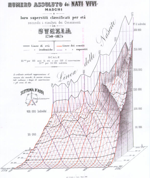 101 101 | 1879 print by Luigi Perozzo, Italy Stereogram (three-dimensional population pyramid) modeled on actual data (Swedish census, 1750-1875). Perozzo, L. (1880). Della rappresentazione graphica di una collettività di individui nella successione del tempo. Annali di Statistica, 12:1-16. BL: S.22. |
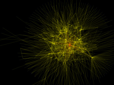 764 764 | 2005 computer graphics by Timothy M. O'Brien Timothy O'Brien used Python and GraphViz to generate this astonishing visualization of his 1st and 2nd level of connections on the O'Reilly Connection social networking site. The red highlighted connections are from Tim O'Reilly to other people, and, predictably, he's at the center of the activity. The graph was created by crawling FOAF (Friend Of A Friend) documents from Timothy's O'Reilly Connection profile and then obtaining the FOAF documents of people associated with him. The results were then stored in a neato format and visualized using graphviz neato. |
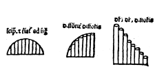 20 20 | 1350 print by Nicole Oresme (Bishop of Lisieus) (1323-1382), France Proto-bar graph (of a theoretical function), and development of the logical relation between tabulating values, and graphing them (pre-dating Descartes). Oresme proposed the use of a graph for plotting a variable magnitude whose value depends on another, and, implicitly, the idea of a coordinate system- Nicole Oresme (Bishop of Lisieus). Oresme, N. (1482). Tractatus de latitudinibus formarum. Padova. BL: IA 3Q024. Oresme, N. (1968). Nicole Oresme and the Medieval Geometry of Qualities and Motions: A Treatise on the Uniformity and Difformity Known as Tractatus de Configrationibus Qualitatum et Motuum . Madison WI: University of Wisconsin Press. Tr.: M. Clagget. |
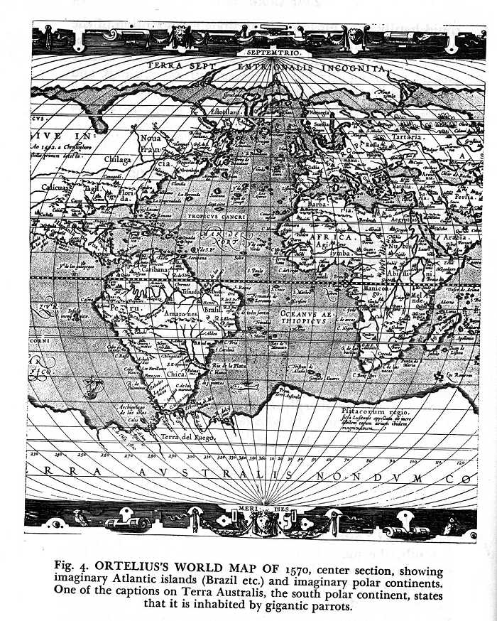 5 5 | 1570 print by Abraham Ortelius (Ortel) (1527-1598), Antwerp, Belgium The first modern atlas, Teatrum Orbis Terrarum. Ortelius, A. (May 1570). Theatrum Orbis Terrarum . Antwerp: Coppenium Diesth. 53 maps in coperplate, 41 x 29 cm. |
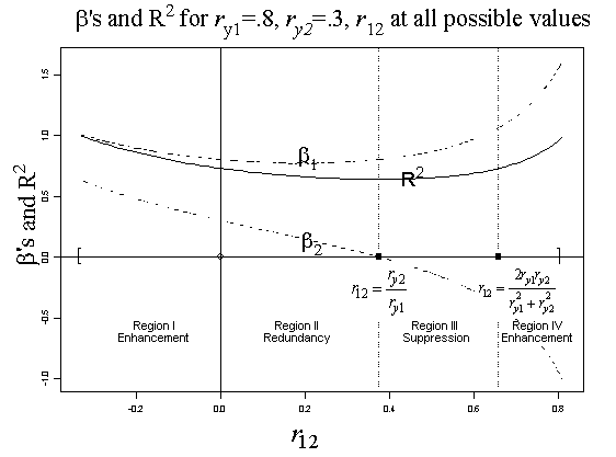 228 228 | 2005 by Friedman, L. and Wall, M. Classical suppression refers to the paradoxical result that a predictor variable (X1) may have no correlation with an outcome variable (Y), yet it increases the variance accounted for (R2) in a multiple regression with another predictor (X2). A variety of other paradoxical effects (enhancement, redundancy) can also occur, depending on the correlations among these variables. This diagram, by Friedman and Wall (2005), puts all these effects in context. It shows the regression coefficients and R2 for particular values of the correlations of Y with X1 and X2, as the correlation r12 between X1 and X2 varies over its range. The regions in which various effects occur are demarked by vertical lines. Reference: Friedman, L. and Wall, M. (2005), Graphical views of suppression and multicolinearity in multiple linear regression, The American Statistician, 59(2), 127-136. |
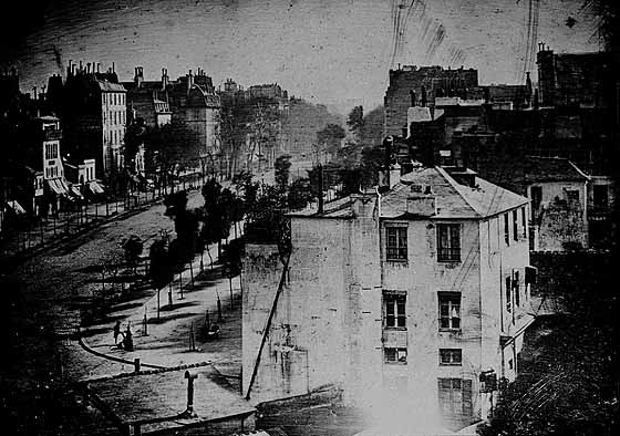 56 56 | 1839 Print by Louis Jacques Mandé Daguerre (1787-1851), France Invention of the first practical photographic process, using coated plates of metal and glass. |
| | computer graphics by Graphviz - Graph Visualization Software This example illustrates the use of partially transparent colors for node fill and graph background. |
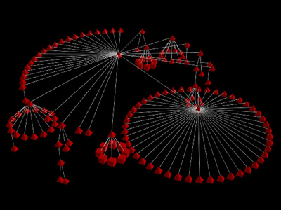 949 949 | 2002 computer graphics by Yvan Bourquin A customer browsing a company website leaves traces in the form of log files generated by the server. When analyzed, those files reveal significant information about the customer's on-line activity. PathFinder is a system that analyses web server log files. It displays the website structure and the customers navigation paths in a 3d visualization. PathFinder aims at helping website designers and administrators to discover the standard navigation paths of the website and to use this information to improve the site content and ergonomics. It is built in order to answer 3 fundamental questions: What paths are used to reach a specific page? What paths are typical of a specific time/date? What pages are often/rarely accessed? As a prototype, PathFinder explores an alternative way of communicating web usage information. PathFinder represents the website structure in the form of a 3d cone tree. The idea of the cone tree is to display each node at the top of a 3d cone and to arrange the nodes hierarchically lower around the cone's circular base. The project was programmed in Java. It can be decomposed in three main parts. The first part is a web crawler (sometimes also called spider or robot) that is used to grab the structure of the web sites. The second part is responsible for the analysis of the log files. The third part, realized with Java3D, controls the 3d visualization. |
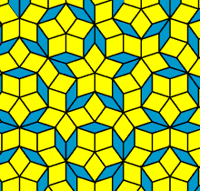 203 203 | Roger Penrose (1931-), England Roger Penrose, a math professor at the Oxford University in England, began exploring tilings as a student at Cambridge University. After tiring of periodic coverings, he searched for aperiodic or quasiperiodic tilings. Through years of experimentation and reams of paper, Penrose finally found a solution--a quasiperiodic tiling of the plane with only 2 figures. All of this may seem like a joke, to dedicate years of research to pretty pictures, but an application was found by a French company, in the quasiperiodic crystal coating on frying pans! A penrose tiling is an example of quasiperiodic tilings of the plane. A tiling of a plane is a way in which the entire space of the plane can be covered with a few shapes repeatedly in such a way that the shapes do not overlap. A periodic tiling is one in which the pattern of shapes repeats. For such a tiling to be quasiperiodic, it is not periodic, but identical copies of small sections of the tiling can be found elsewhere on the plane. |
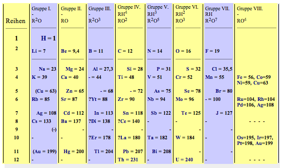 93 93 | 1869 print by Dmitri Mendeleev (1834-1907), Russia The periodic table used to classify chemical elements according to their properties, and allowing the prediction of new elements that would be discovered later. |
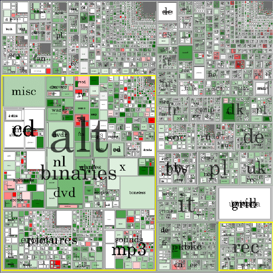 569 569 | 2005 computer graphics by Turner, T. C., Smith, M. A., Fisher, D., and Welser, H. T. 2005-08-26: New article on visualizion techniques for the Usenet From InfoVis:Wiki Treemap of January 2004 Usenet posts. [Turner et al., 2005] The current issue (10(4), 2005) of the Journal of Computer-Mediated Communication contains a special theme on "Online Communities". One of the articles is about information visualization techniques used for the Usenet: Picturing Usenet: Mapping Computer-Mediated Collective Action [Turner et al., 2005] Turner, T. C., Smith, M. A., Fisher, D., and Welser, H. T. Picturing Usenet: Mapping computer-mediated collective action. Journal of Computer-Mediated Communication, 10(4), article 7, 2005. |
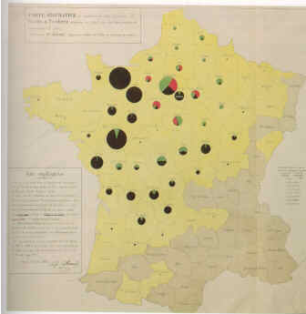 96 96 | 1851 print by Charles Joseph Minard (1781-1870), France Map incorporating statistical diagrams: circles proportional to coal production (published in 1861). Minard, C. J. (1861). Des Tableaux Graphiques et des Cartes Figuratives. Paris: E. Thunot et Cie. ENPC: 3386/C161; BNF: V-16168. |
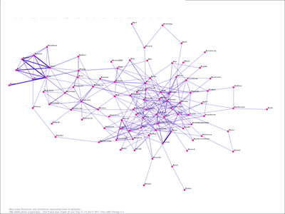 810 810 | 2004 computer graphics by Paul Mutton PieSpy is an IRC bot that monitors a set of IRC channels. It uses a simple set of heuristics to infer relationships between pairs of users. These inferrences allow PieSpy to build a mathematical model of a social network for any channel. These social networks can be drawn and used to create animations of evolving social networks. PieSpy was presented at the Information Visualization conference (IV'04) in July 2004. It has also appeared in Computer Weekly and c't magazine. |
 4 4 | 950 print Earliest known attempt to show changing values graphically (positions of the sun, moon, and planets throughout the year)(Europe) |
 102 102 | 1873 print by R. A. Fisher, c.1955, after Josiah Willard Gibbs (1839-1903), USA Graphical methods applied to explain fundamental relations in thermodynamics; this includes diagrams of entropy vs. temperature (where work or heat is proportional to area), and the first use of trilinear coordinates (graphs of (x,y,z) where x+y+z=constant). Bumstead, H. A. (ed.) (1961). The Scientific Papers of J. Willard Gibbs . New York: Dover Publications, Inc. (an unabridged republication of the work originally published by Longmans, Green and Company in 1906). Gibbs, J. W. (1873). Graphical methods in the thermodynamics of fluids. Transactions of the Connecticut Academy of Arts and Sciences, 2:309-342. Reprinted in Bumstead (above). Gibbs, J. W. (1873). A method of geometrical representation of the thermodynamic properties of substances by means of surfaces. Transactions of the Connecticut Academy of Arts and Sciences, 2:382-404. Reprinted in Bumstead (above). |
 60 60 | 1827 Photograph by Joseph Nicephore Niépce, France First successful photograph produced (an 8-hour exposure). [A type of asphalt (bitumen of Judea) was coated on metal plates. After exposure it was washed in solvents, the light areas were shown by the bitumen, dark areas by bare metal. Exposed to iodine, the plate darkened in the shadowed areas.]. |
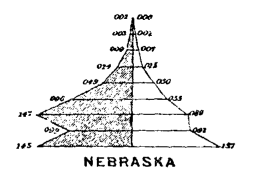 89 89 | 1874 print by Francis Amasa Walker (Superintendent of U.S. Census) (1840-1897), USA Age pyramid (bilateral histogram), bilateral frequency polygon, and the use of subdivided squares to show the division of population by two variables jointly (an early mosaic display) in the first true U.S. national statistical atlas. Walker, F. A. (1874). Statistical Atlas of the United States, Based on the Results of Ninth Census, 1870, with Contributions from Many Eminent Men of Science and Several Departments of the [Federal] Government. New York: Julius Bien. |
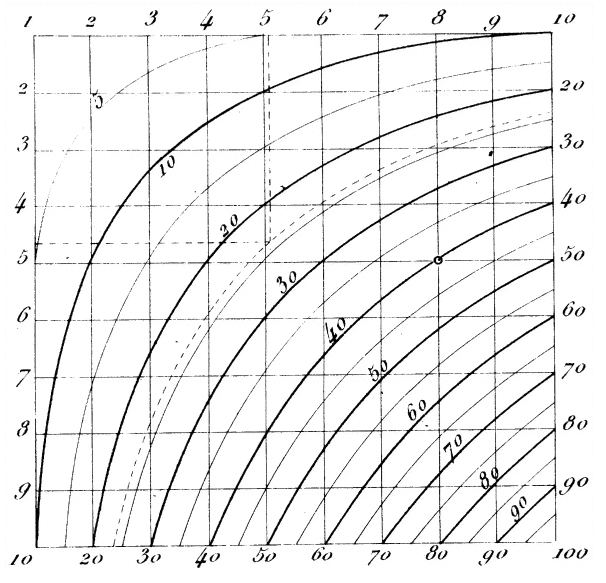 33 33 | 1795 print by Louis Ézéchiel Pouchet (1748-1809), France Multi-number graphical calculation (proto-nomogram: contours applied to multiplication table, later rectified by Lalanne -- see ref. below). Pouchet, L. E. (1795). Arithmétique linéaire. In Echelle Graphique des Nouveaux Poids, Mesures et Monnaies de la République Française . Rouen: Seyer. (Appendix). Lalanne, L. (1846). Mémoire sur les tables graphiques et sur la géométrie anamorphique appliquées a diverses questions qui se rattachent a l'art de l'ingénieur. Annales des Ponts et Chausées , 2e series, 11 :1-69. Read 1843. |
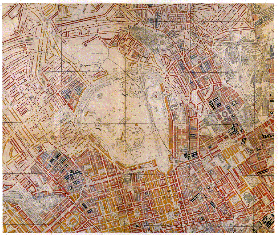 80 80 | 1889 print by Charles Booth (1840-1916), London, England Street maps of London, showing poverty and wealth by color coding, transforming existing methods of social survey and poverty mapping towards the end of the nineteenth century. Booth, C. (1889). Charles Booth's descriptive map of London poverty 1889 by Charles Booth; introduction by David A. Reeder. London: London Topographical Society, 1984. BL: Maps 182.c.1 Facsimile of maps published in Labour and Life of the People, Appendix to vol. II, 1891. Booth, C. (1889). Labour and Life of the People. London: Macmillan and Co. (2 volumes, plus maps under separate cover; expanded to 17 volumes in 1902 edition). |
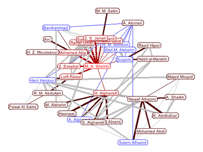 874 874 | 2004 computer graphics by Jeffrey Heer, Alan Newberger prefuse is a user interface toolkit for building highly interactive visualizations of structured and unstructured data. This includes any form of data that can be represented as a set of entities (or nodes) possibly connected by any number of relations (or edges). Examples of data supported by prefuse include hierarchies (organization charts, taxonomies, file systems), networks (computer networks, social networks, web site linkage) and even non-connected collections of data (timelines, scatterplots). These images show a prefuse applet that visualizes suspected connections between terrorists involved in the September 11th attacks. The width of the line indicates how strong the suspected link is. People are placed on concentric circles based on the number of links between them and the central person, making it easy to measure the social distance between the central person and any other person. This applet applies re-implementations of techniques used in Animated Exploration of Dynamic Graphs with Radial Layout by Ping Yee, Danyel Fisher, Rachna Dhamija, and Marti Hearst, IEEE Symposium on Information Visualization, 2001. |
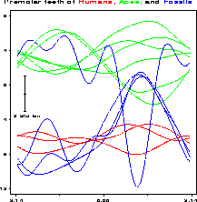 127 127 | 1972 print by David F. Andrews, Canada Form of Fourier series to generate plots of multivariate data. Andrews, D.F. (1972). Plots of high dimensional data. Biometrics, 28:125-136. |
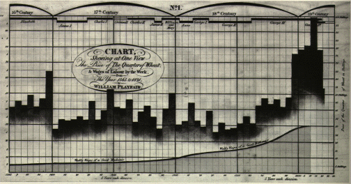 31 31 | 1786 print by William Playfair (1759-1823), England Bar chart, line graphs of economic data. Playfair, W. (1786). Commercial and Political Atlas: Representing, by Copper-Plate Charts, the Progress of the Commerce, Revenues, Expenditure, and Debts of England, during the Whole of the Eighteenth Century . London: Corry. Re-published in Wainer, H. and Spence, I. (eds.), The Commercial and Political Atlas and Statistical Breviary, 2005, Cambridge University Press, ISBN 0-521-85554-3. |
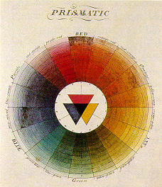 34 34 | 1766 print by Moses Harris (1731-1785), Germany Diagrams developed to represent color systems. In 1758, Mayer developed a system of constructing and naming many of the possible colours. Lambert extended this with a 3D pyramid indicating "depth" (saturation). Harris, M. (1766). The natural system of colours , chap. Prismatic color mixture system. Licester-Fields: Laidler. |
 27 27 | 1693 print by Edmond Halley (1656-1742), England First use of areas of rectangles to display probabilities of independent binary events. Halley, E. (1693). An estimate of the degrees of mortality of mankind, drawn from curious tables of the births and funerals at the city of Breslaw, with an attempt to ascertain the price of annuities on lives. Philosophical Transactions, 17 :596-610. |
 651 651 | computer graphics, after hand-made figure by Graphviz - Graph Visualization Software This graph was created from a hand-made figure in an operating system paper. |
 643 643 | computer graphics (Graphviz) by Graphviz - Graph Visualization Software This is the dynamic profile of a sort program, generated from the 'gprof' tool. Nodes represent functions and edges represent function calls. They are colored according to gprof's estimate of the time spent within a given function and the time charged to a given call site. The colors are encoded as hue-saturation-brightness triples. We have found it advantageous to vary both hue and saturation to draw attention to hot spots, rather than present a baffling rainbow of colors. |
 832 832 | 2002 computer graphics by Alex Adai LGL (Large Graph Layout) is a compendium of software applications for making the visualization of large networks and trees tractable. LGL was specifically motivated by the need to make the visualization and exploration of large biological networks more accessible. The website contains a rich gallery with a collection of different graphs and trees generated by LGL from different sources of biological data. This image represents a Protein Homology Graph - 32,727 Proteins with 1,206,654 Edges. Color coded is based on layout hierarchy. |
 834 834 | 2002 computer graphics by Alex Adai LGL (Large Graph Layout) is a compendium of software applications for making the visualization of large networks and trees tractable. LGL was specifically motivated by the need to make the visualization and exploration of large biological networks more accessible. The website contains a rich gallery with a collection of different graphs and trees generated by LGL from different sources of biological data. This image portraits the Protein Homology Network in an impressive visualization. The network summarizes the results of aprox. 92 billion pairwise amino acid sequence alignments between 289,069 proteins from 90 genomes. The final network is composed of 27,325 connected sets summing to 7,940,873 edges. An edge is colored blue if it connectes 2 proteins from the same species, and red if it connects 2 proteins from 2 different species. If that information is not available the edges are colored based on layout hierarchy. |
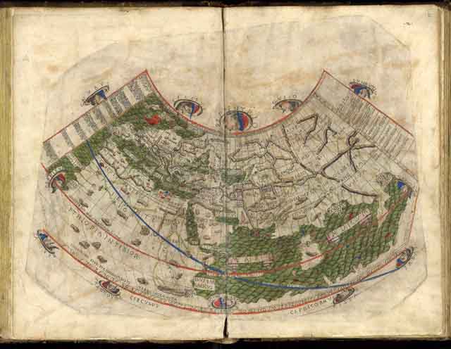 21 21 | 150 print by Claudius Ptolemy (c. 85-c. 165), Alexandria, Egypt Map projections of a spherical earth and use of latitude and longitude to characterize position (first display of longitude) - Alexandria, Egypt. |
 988 988 | 2005 computer graphics by SM Douglas, GT Montelione, M Ger PubNet is a utility that accepts as input up to two PubMed queries, and returns as output a network graph (in multiple image formats) based on user-specified node and edge selection properties. PubMed is a search system offered by the United States National Library of Medicine as part of the Entrez system. It provides a means of searching the MEDLINE database. The resulting nodes from PubNet output represent data items associated with publications returned by the queries (such as paper ids, author names, and databank ids), and edges represent instances of shared properties. PubNet can be used to visualize a variety of relationships, such as the degree to which two authors collaborate or the MeSH Term relatedness of publications with PDB ids. The visualization is done with the aid of aiSee visualization software. The particular image on the left is the result of two queries: Mark+Mike. |
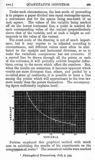 100 100 | 1863 print by William Stanley Jevons (1835-1882), England Semilogarithmic grid (showing percentage changes in commodities). Jevons, W. S. (1863). A serious fall in the value of gold ascertained, and its social effects set fourth. London. Jevons, W. S. ([1879] 1958). Graphical method. In Principles of Science: A Treatise on Logic and Scientific Method, pp. 492-496. New York: Dover, 3rd edn. First ed.: 1874; page numbers from 3rd Ed. Dover reprint (1958). |
 642 642 | computer graphics (Graphviz) by Graphviz - Graph Visualization Software (drawn using twopi) A real-world network containing 300 sites over 40 countries. The diagram was made to trace network incidents and to support maintenance. Original names and other details were obfuscated for anonymity. (This was not an AT&T network!) Drawn using twopi. |
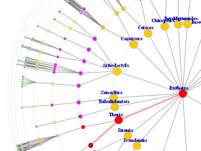 738 738 | computer graphics by Nihar Sheth This tool is an extended version of the Radial Tree Browser. The original version was developed by Jason Baumgartner and Nihar Sheth and is an integral part of the Information Visualization Software Repository (IV repository) at Indiana University. |
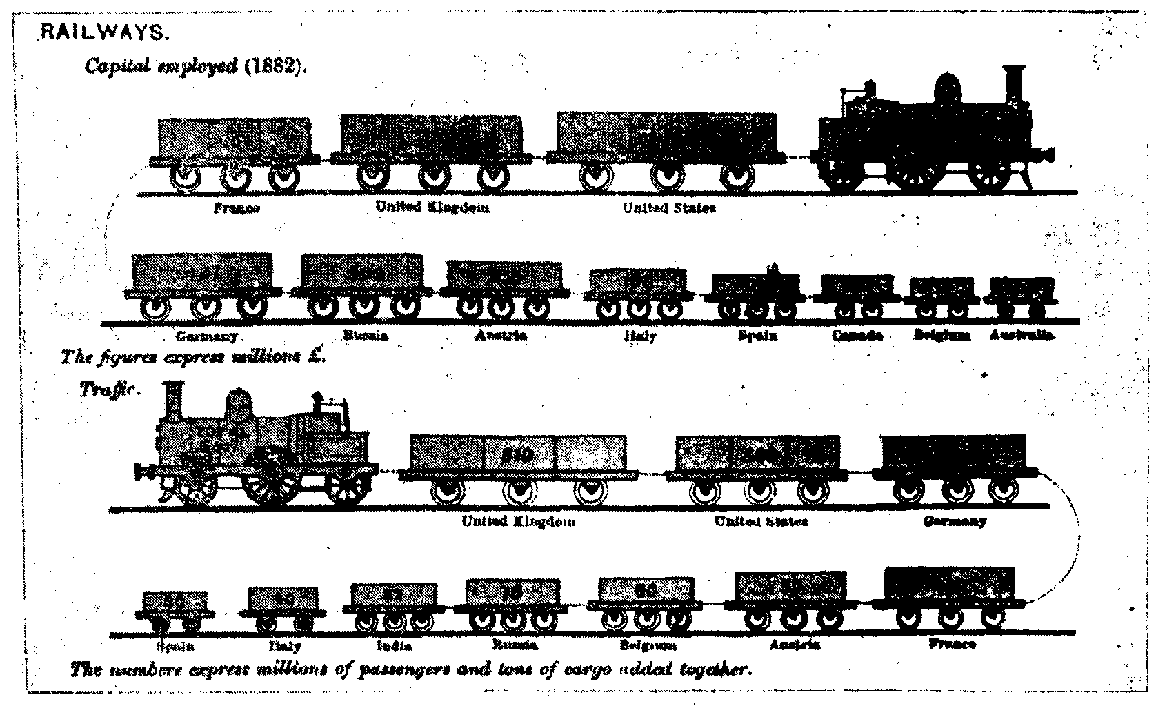 94 94 | 1884 print by Michael George Mulhall (1836-1900), England Pictogram, used to represent data by icons proportional to a number. Mulhall, M. G. (1884). Dictionary of statistics. London. |
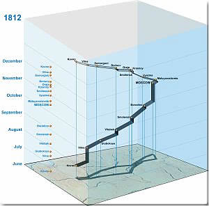 244 244 | 2001 3D computer graphics by Menno-Jan Kraak This version of Minard's Napolean's March is by Menno-Jan Kraak, of the International Institute for Aerospace Survey and Earth Sciences (ITC) is one of several 3D renditions on a lovely web site, Geovisualization and Minard's Map (http://www.itc.nl/personal/kraak/1812/). This one unravels time into the 3rd dimension, superposed above the base map. The web site contains the largest collection of variations of Minard's map, with several interactive and animated versions, and a comprehensive list of references and other links. Flash version: http://www.itc.nl/personal/kraak/1812/3dnap.swf |
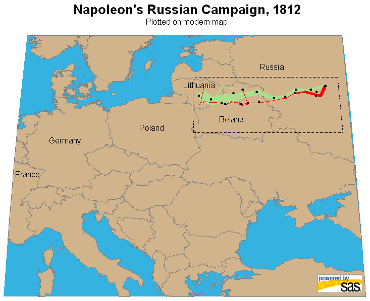 239 239 | computer graphics (SAS) by Robert Allison Robert Allison created this two-level, zoomable version with interactive tooltips, as a lovely "proof-of-concept" example. He used SAS/GRAPH map data sets for the map information, and PROC GMAP to draw the map, using the SAS/GRAPH annotate facility to overlay Minard's data on the map. The interactive zooming and tooltips make use of the SAS ODS facility. How he did it: http://www.math.yorku.ca/SCS/Gallery/minard/allison/minard_info.htm |
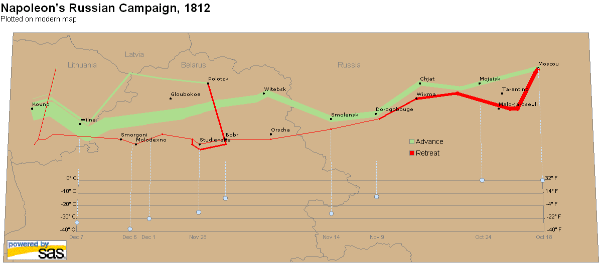 240 240 | computer graphics (SAS) by Robert Allison Robert Allison created this two-level, zoomable version with interactive tooltips, as a lovely "proof-of-concept" example. He used SAS/GRAPH map data sets for the map information, and PROC GMAP to draw the map, using the SAS/GRAPH annotate facility to overlay Minard's data on the map. The interactive zooming and tooltips make use of the SAS ODS facility. |
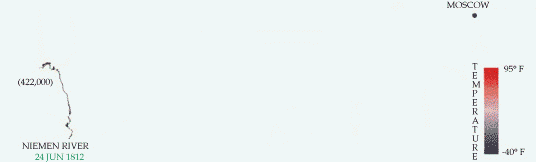 242 242 | computer graphics by Max Boylan This version of Minard's Napolean's March is an animated GIF image, from Max Boylan at SFSU. We start with an empty map on June 24, 1812, as the campaign begins at the Nemen River with 422,000 troops. The animation shows the step-by-step progress of the Grand Army to Moscow and back. The coding of temperature by color is done somewhat better than in the SAGE graphic above. The animation repeats 10 times. |
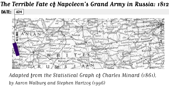 236 236 | 1996 computer graphics by Aaron Walburg and Stephen Hartzog This version of Minard's Napolean's March, by Aaron Walburg and Stephen Hartzog, listed on the University of York History of Statistics page uses a real map of the region from Poland to Moscow as the background. It overlays on this an animated sequence showing the size of Napoleon's army (with dates), and the retreat, together with the decline of temperature. Static image: http://www.math.yorku.ca/SCS/Gallery/minard/march-animated.gif |
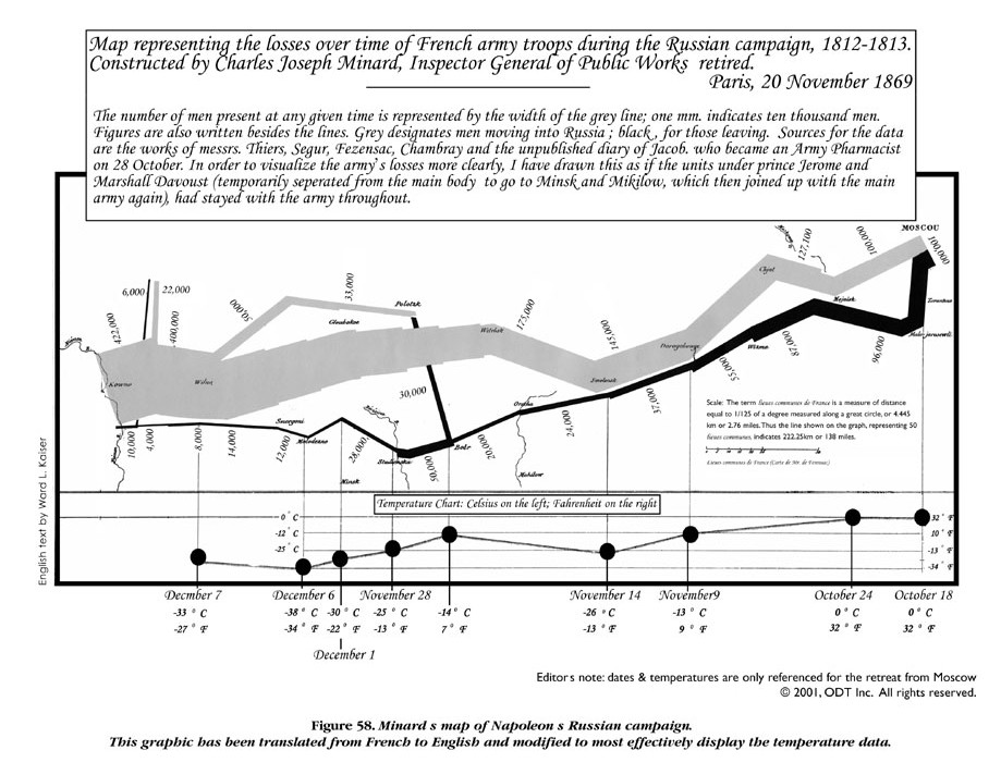 237 237 | 2001 print by Ward L. Kaiser, Denis Wood, after Charles Joseph Minard ODT, Inc. has recently published Seeing Through Maps: The Power of Images to Shape Our World View by Ward Kaiser and Denis Wood. It contains this version of Minard's image with the caption translated into English and displayed legibly. The scale of temperature is displayed in both F and Celsius and given somewhat more prominence and readability. |
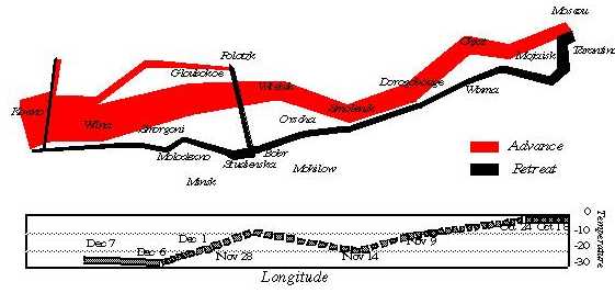 235 235 | 1999 computer graphics by Wilkinson In Chapter 15 of The Grammar of Graphics, Wilkinson (1999) describes the encoding of the information from Minard's graphic according to his graph grammar. This is notable because the specification for the graph is declarative (what the graph consists of) rather than procedural (how to draw it). |
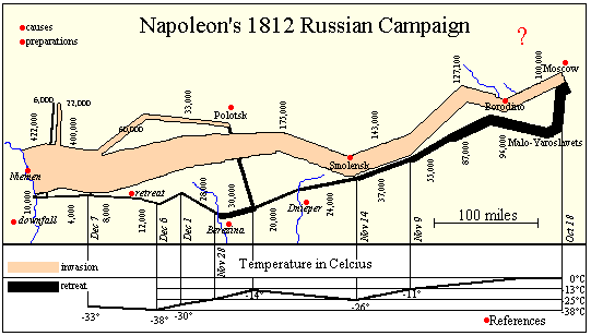 241 241 | computer graphics by Sunny of Andrew Donoho's Information Design course at the University of Texas at Austin The WWW and other new technology (CD rom, DVD) allows the easy integration of the easy integration of text, graphics, sound, and other media. Andrew Donoho teaches an Information Design course at the University of Texas at Austin. For the past several years, a course project asked students to design a web presentation based on Minard's graphic. Sunny's page is one example of the graphic linked (as an image map) to pages of text describing the major battles of the campaign. Another image map compares the account in War and Peace with historical sources. Lori Eichelberger's page (http://www.ddg.com/LIS/InfoDesignF97/lkeich/index.htm) is another example, relating the March on Moscow to the memoirs of Francois Bourgogne, a Sergeant in Napoleon's Imperial Guard. Other interesting attempts may be found on the LIS Class Projects page (http://www.ddg.com/LIS/). |
 231 231 | computer graphics (SAGE) by Sage Visualization Group, Carnegie Mellon University This graph, from the Visualization and Intelligent Interfaces group at CMU is one re-design, attempting to link the information about temperature directly to the path and strength of Napoleon's army, emphasizing their interrelations more directly. The (X,Y) coordinates are still map-based (latitude and longitude). "The use of color clearly shows the heat wave during the advance and the steady decline in temperature through the retreat. The exception, a spell of temperatures above freezing, is clearly visible when the retreating army is between the cities of Krasnyj and Bobr." Sage Visualization Group, Carnegie Mellon University: http://www.cs.cmu.edu/~sage/ |
 232 232 | computer graphics (SAGE) by Sage Visualization Group, Carnegie Mellon University "The temporal characteristics of the march were weakly conveyed in the original because they were expressed as text labels. Here the relation between date, troop location (longitude only), and temperature is more strongly conveyed because they are all exp ressed as properties of the rectangles. Battle sites are indicated in text." Sage Visualization Group, Carnegie Mellon University: http://www.cs.cmu.edu/~sage/ |
 234 234 | 1993 computer graphics (Mathematica) by Shaw and Tigg In Chapter 4 of Applied Mathematica: Getting Started, Getting it Done, Shaw and Tigg (1993) describe a Mathematica function, NapoleonicMarchOnMoscowAndBackAgainPlot[] to re-create a close approximation to Minard's graphic. A simpler function, Minard[] in the file Minard.m draws the same graph. |
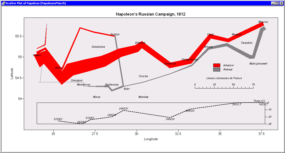 233 233 | computer graphics (SAS Interactive Matrix Language) by SAS/IML Workshop SAS/IML Workshop is client-server extension of the SAS Interactive Matrix Language, with an object-oriented flavor. This version, programmed in NapoleonsMarch.iml, works by defining a data structure and modules suitable to drawing paths on a 2D surface, a generalization of Minard's idea of the flow map. Idea: http://www.math.yorku.ca/SCS/Gallery/minard/IML-thinking.html Code: http://www.math.yorku.ca/SCS/Gallery/minard/NapoleonsMarch.iml |
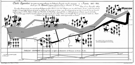 238 238 | 2001 computer graphics by Dragga and Voss In an article published in Technical Communication, August 2001, Dragga and Voss "The Inhumanity of Technical Illustrations" suggest that Minard's graphic does not convey the human cost directly--- ``We don't see the people and we don't see their anguish.'' They present this image using pictographs, which gradually change from soldiers to burial crosses, to illustrate how "ethically conscious technical communicators could introduce the human element..." |
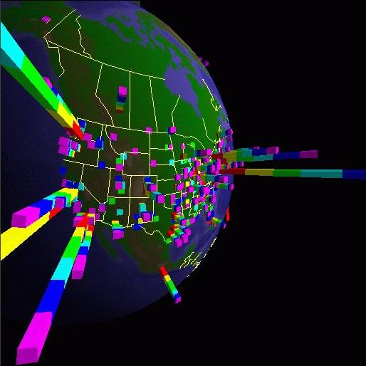 310 310 | computer graphics by Stephen E. Lamm and Daniel A. Reed, Department of Computer Science, University of Illinois, USA |
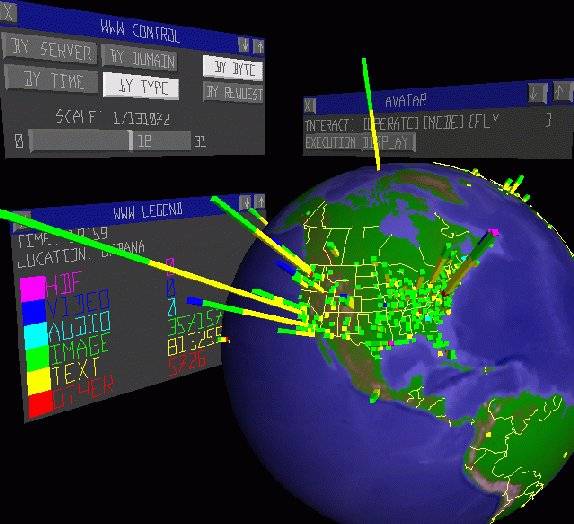 311 311 | computer graphics by Stephen E. Lamm and Daniel A. Reed, Department of Computer Science, University of Illinois, USA |
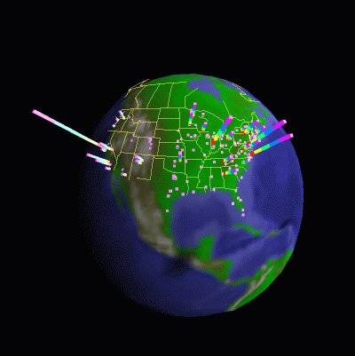 312 312 | computer graphics by Stephen E. Lamm and Daniel A. Reed, Department of Computer Science, University of Illinois, USA |
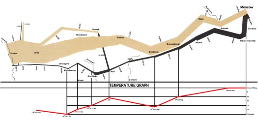 230 230 | John Schneider, after Charles Joseph Minard From John Schneider's Napoleonic Literature page (http://www.napoleonic-literature.com/index.html); this is the largest and most detailed re-creation of Minard's graphic I have found on the Web. All the place names and troop strengths are highly legible. The Napoleonic Literature site contains many electronic books and a wealth of information. |
 150 150 | 1989 computer graphics (REGARD) by Graham Wills, J. Haslett, Anton Unwin, and P. Craig, England; Mark Monmonier, USA Statistical graphics interactively linked to map displays. Wills, G., Haslett, J., Unwin, A. R., and Craig, P. (1989). Dynamic interactive graphics for spatially referenced data. In F. Faulbaum (ed.), Fortschritte der Statistik-Software 2, pp. 278-287. Stuttgart: Gustav Fischer Verlag. Monmonier, M. (1989). Geographic brushing: Enhancing exploratory analysis of the scatterplot matrix. Geographical Analysis, 21 (1):81-84. |
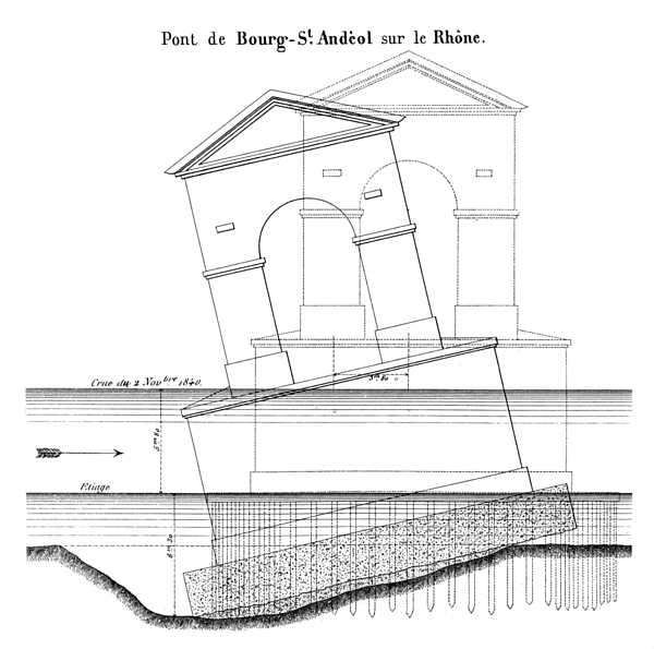 222 222 | 1840 print by Charles Joseph Minard (1781-1870), France Minard as a visual engineer: Report on the collapse of a bridge over the Rhone in 1840. Minard's main career was as an engineer for the Ecole Nationale des Ponts et Chaussees in Paris. In 1840 he was asked to investigate the cause of the collapse of the bridge at Bourg St. Andeol on the Rhone. His report consisted of this drawing, to which words provide little extra by way of explanation. Why did the bridge collapse? As shown, the bed beneath the left side of the bridge had washed away. Image source: Tufte (1983, p. 39) |
 147 147 | 1985 computer graphics by Alfred Inselberg, USA Parallel coordinates plots for high-dimensional data. Inselberg, A. (1985). The plane with parallel coordinates. The Visual Computer, 1:69-91. Inselberg, A. (1989). Discovering multi-dimensional structure using parallel coordinates. In Proc. Amer. Stat. Assoc, Sec. on Stat.Graphics, pp. 1-16. American Statistical Association. ISBN 0-8186-2083-8 (PAPER). Inselberg, A. and Dimsdale, B. (1990). Parallel coordinates: a tool for visualizing multi-dimensional geometry. In VIS '90: Proceedings of the 1st conference on Visualization '90, pp. 361-378. Los Alamitos, CA, USA: IEEE Computer Society Press. ISBN 0-8186-2083-8 (PAPER). |
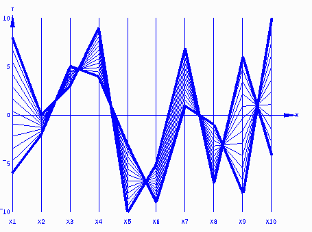 146 146 | 1985 computer graphics by Alfred Inselberg, USA Parallel coordinates plots for high-dimensional data. Inselberg, A. (1985). The plane with parallel coordinates. The Visual Computer, 1:69-91. Inselberg, A. (1989). Discovering multi-dimensional structure using parallel coordinates. In Proc. Amer. Stat. Assoc, Sec. on Stat.Graphics, pp. 1-16. American Statistical Association. ISBN 0-8186-2083-8 (PAPER). Inselberg, A. and Dimsdale, B. (1990). Parallel coordinates: a tool for visualizing multi-dimensional geometry. In VIS '90: Proceedings of the 1st conference on Visualization '90, pp. 361-378. Los Alamitos, CA, USA: IEEE Computer Society Press. ISBN 0-8186-2083-8 (PAPER). |
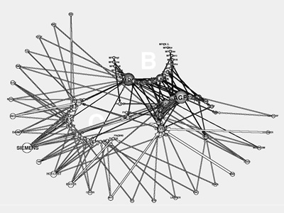 842 842 | computer graphics by Lothar Krempel This diagram represents a system of three Research Organizations and the participation of the 25 most significant industrial companies in their advisory committees. The number of spatial positions has been enhanced by 50 percent. |
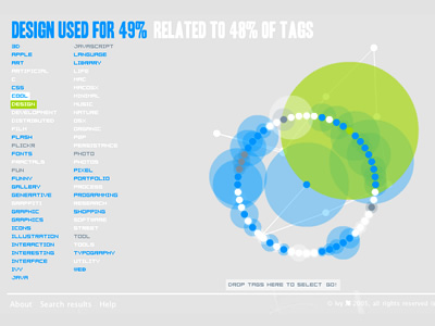 860 860 | 2005 computer graphics by Sebastien Pierre, Olivier Zitvog Revealicious is a set of graphic visualisations for any del.icio.us account that allows one to browse, search and select tags, as well as viewing posts matching them. As the authors clarify: Revealicious is a graphic design project lead from June to September 2005. It was developed in ActionScript 2.0 using MTASC and SWFMill. Its aim is to demonstrate how using different kind of visualisations can reveal surprising aspects of information. Del.icio.us was chosen as a source of data because of the unformalised semantic richness of its tag system. The images on the left illustrate one of Revealicious visualization methods entitled SpaceNav. It lets the user explore their del.icio.us tags represented as an inifinite 2D space. It enables one to discover the relations between their tags, as well as recognize different patterns and characteristics of certain groups of tags. |
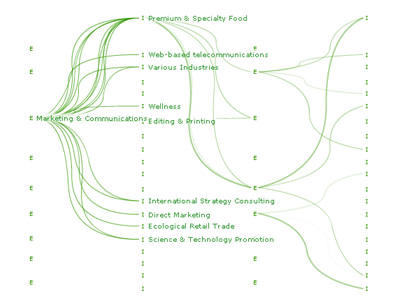 1004 1004 | 2005 computer graphics by Alain Leclerc von Bonin, Balz Le rkssc Project Network is a visualization of the database of a business consultant and a representation of lateral thinking. The projects are categorised by industry and expertise. A project is represented as a connection between an industry and an expertise. The user can choose a category and the system then shows all connections of the chosen category. The projects are not shown as separate units but as a network. |
 107 107 | 1924 print by Otto Neurath (Director of the Social and Economic Museum) (1882-1945), Vienna, Austria Museum of Social Statistical Graphics and the ISOTYPE system (International System of Typographic Picture Education). Neurath, O. (1973). From Vienna method to Isotype. In M. Neurath and R. S. Cohen (eds.), Empiricism and Sociology, pp. 214-248. Dordrecht, NL: Reidel. (papers written 1925-45). Neurath, O. (1991). Gesammelte Bildpaedagogische Schriften. Vienna: Verlag Hoelder-Pichler-Tempsky. ISBN 3209008639. Rudolf Haller and Robin Kinross (eds.). |
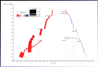 661 661 | computer graphics by The SAGE Visualization Group This picture, generated with the SAGE system, depicts most of the information in Minard's original picture. The same data set was mapped to different graphical techniques. The temporal characteristics of the march were weakly conveyed in the original because they were expressed as text labels. Here the relation between date, troop location (longitude only), and temperature is more strongly conveyed because they are all expressed as properties of the rectangles. Battle sites are indicated in text. Notice the clear gaps which indicate lengthy stays at particular locations as well as the battle sites indicated as yellow diamonds. In the original picture it was not clear what happened along the northern flank of the army. Here it is clear: it branched off from the main force, captured Polock in August and remained there until after a second battle in October. Later in November, they rejoined the main retreat as the temperature dropped dramatically. |
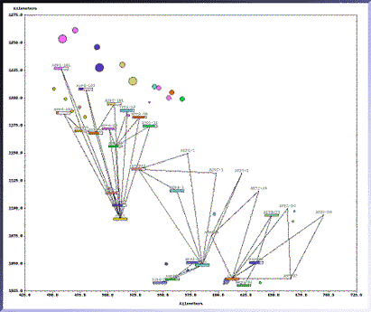 662 662 | computer graphics by The SAGE Visualization Group This graphic demonstrates the utility of SAGE for exploratory data analysis. Users can obtain displays of diverse combinations of information. The graphic integrates a unique combination of network, map (2D coordinates), and conventional chart size, color, and gauge techniques in a single display. Current research is focusing on interactive control of the design characteristics and information content of displays. |
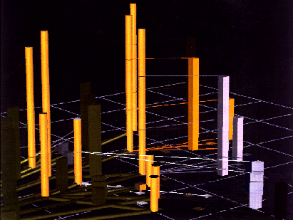 663 663 | computer graphics by The SAGE Visualization Group The full impact of applying AI techniques to automate the process of designing graphics will be realized when SAGE can support 3D visualization. As these graphics illustrate, we are exploring 3D approaches to represent this knowledge both for 3D graphics drawn in perspective and using binocular, stereoscopic display technology. This picture is a snapshot of a 3D environment in which planners can interactively explore supply networks and inventory requirements for distribution areas. The green pipes along the surface plane represent main transportation routes (MSR). The green rectangles emanating from the center of each MSR can convey its capacity, quantities o materials currently flowing along it, demand or other quantitative characteristics. The MSRs connect supply points (yellow cylinders), whose heights also convey relevant quantities (e.g. the total requirements for distribution areas expected to obtain materials from it). Distribution areas are represented as rectangles whose heights convey material requirements. A thin line connects each distribution area to the supply point which provide its materials. |
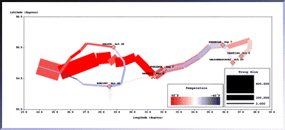 660 660 | computer graphics by The SAGE Visualization Group This picture, generated with the SAGE system, uses most of the same techniques as the original by Minard. The flexibility of SAGE's graphic design environment enabled the use of color to express temperature during marches between cities, emphasizing the relation between quantities and locations more directly. The use of color clearly shows the heat wave during the advance and the steady decline in temperature through the retreat. The exception, a spell of temperatures above freezing, is clearly visible when the retreating army is between the cities of Krasnyj and Bobr. |
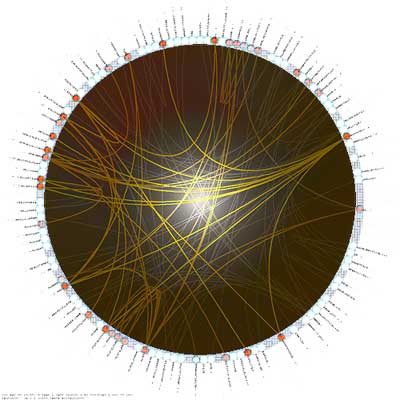 564 564 | 2004 computer graphics by Martin Krzywinski 2005-08-24: "Schemaball" - Schema Viewer for SQL Databases From InfoVis:Wiki Visualization of a MySQL Database schema [Krzywinski, 2004] Schemaball is a flexible schema visualizer for SQL databases. The purpose of Schemaball is to help visualize the relationships between tables. Tables are related by foreign keys, which are fields which store the value of a record field from another table. Foreign keys create a lookup relationship between two tables. Large schemas can have hundreds of tables and table relationships. Keeping track of them call can be tedious, error-prone and slow down the schema development process. Schemaball provides a means to create flexible, static graphic images of a schema. Tables and table links can be hidden, highlighted and foreign key relationships can be traversed forward or backward to highlight connected tables. Schemaball produces images called schema balls. Schema balls are schema visualizations in which tables are ordered along a circle with table relationships drawn as curves or straight lines. Using an input configuration file, all elements of the schema ball can be configured. Schemaball is free software, licensed under GPL. It is written in Perl and requires a few CPAN modules to run. It's simple to use, while being able to produce high quality schema balls suitable for publication. In particular, you can use Schemaball to generate elements of a schema ball and then create a composite in an image editing program. One such result is shown in the figure at right. [Krzywinski, 2004] via information aesthetics blog [Krzywinski, 2004] Martin Krzywinski, Schemaball - Schema Viewer for SQL Databases, Created at: 2004, Retrieved at: 2005-08-24, http://mkweb.bcgsc.ca/schemaball/ |
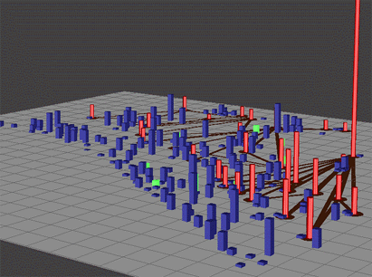 657 657 | computer graphics (SDM) by The SAGE Visualization Group The aim of SDM is to provide users with a high degree of selectivity and object dynamics while manipulating visualizations to analyze and explore diverse information. It does this by giving users freedom in manipulating 2D and 3D objects while providing constraints and feedback to prevent confusion. In support of this, SDM allows flexible control of any object parameter. One example of this is shown in these three figures. Many of the selected objects (shown in green) are occluded and it is difficult to analyze them as a set. Using SDM, selected objects can be elevated over the scene (not shown here), thus eliminating occlusion while maintaining context. Users can also accomplish the same goal by shifting selecting objects horizontally. Spatial shift operations are also useful for creating subsets of objects in the visualization. Spatial shift operations maintain relative positions, and thus can be manipulated separately to view patterns within them. |
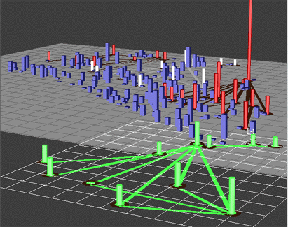 659 659 | computer graphics (SDM) by The SAGE Visualization Group The aim of SDM is to provide users with a high degree of selectivity and object dynamics while manipulating visualizations to analyze and explore diverse information. It does this by giving users freedom in manipulating 2D and 3D objects while providing constraints and feedback to prevent confusion. In support of this, SDM allows flexible control of any object parameter. Many of the selected objects (shown in white) are occluded and it is difficult to analyze them as a set. Using SDM, selected objects can be elevated over the scene, thus eliminating occlusion while maintaining context. Users can also accomplish the same goal by shifting selecting objects horizontally. Spatial shift operations are also useful for creating subsets of objects in the visualization. Spatial shift operations maintain relative positions, and thus can be manipulated separately to view patterns within them. |
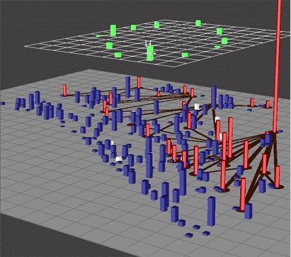 658 658 | computer graphics (SDM) by The SAGE Visualization Group The aim of SDM is to provide users with a high degree of selectivity and object dynamics while manipulating visualizations to analyze and explore diverse information. It does this by giving users freedom in manipulating 2D and 3D objects while providing constraints and feedback to prevent confusion. In support of this, SDM allows flexible control of any object parameter. Many of the selected objects (shown in white) are occluded and it is difficult to analyze them as a set. Using SDM, selected objects can be elevated over the scene, thus eliminating occlusion while maintaining context. Users can also accomplish the same goal by shifting selecting objects horizontally. Spatial shift operations are also useful for creating subsets of objects in the visualization. Spatial shift operations maintain relative positions, and thus can be manipulated separately to view patterns within them. |
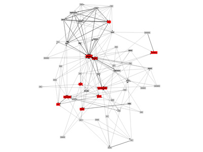 943 943 | 2005 computer graphics by Ciro Cattuto Ciro Cattuto wrote a simple piece of code that builds and visualizes a network of inferred semantic relations among the tags that Flickr users attach to their photos. He wrote a Python script that collects tagging info for the public photos of a given user. It does so by using FlickrClient, a Python interface to the Flickr API. The collected information is analyzed using this simple idea: if the presence of tag X and the presence of tag Y are statistically correlated, then X and Y must be somehow "semantically related". The script focuses on the 50 most used tags of a given user. It loops over pairs of tags and uses a simple correlation heuristic to decide whether two tags are related or not. A graph is built by connecting related tags (nodes) with links (edges). Frequency information is used to measure the strength of a link and a simple conditional probability analysis is used to guess the link orientation, so that "less general" tags point to "more general" ones. The resulting partially directed graph is stored in DOT format and handed over to Graphviz (neato) for visualization. Nodes correspond to tags, red nodes are the 10 most frequently used tags for the given user, label size increases with tag frequency, and thick edges represent statistically strong links. In this visualization model, strong links act as "elastic strings" pulling nodes close to each other: the closer two nodes are, the stronger is their correlation. Weak links are not shown, in an attempt to keep the graph readable. |
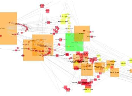 567 567 | 2006 computer graphics by Dietmar Offenhuber and Gerhard Dirmoser 2006-05-24: SemaSpace - Graph editor for large knowledge networks From InfoVis:Wiki SemaSpace - Graph editor for large knowledge networks [Offenhuber and Dirmoser, 2006] SemaSpace is a fast and easy to use graph editor for large knowledge networks, specially designed for the application in non technical sciences and the arts. It creates interactive graph layouts in 2d and 3d by means of a flexible algorithm. The system is powerful enough for the calculation of complex networks and can incorporate additional data such as images, sounds and full texts. [Offenhuber and Dirmoser, 2006] Details: http://residence.aec.at/didi/FLweb/ [Offenhuber and Dirmoser, 2006] Dietmar Offenhuber and Gerhard Dirmoser, SemaSpace, Retrieved at: May 24, 2006. http://residence.aec.at/didi/FLweb/ |
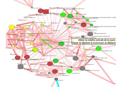 1040 1040 | 2005 computer graphics by (unknown) Semiophore is a platform for visualization of databases. Semiophore provides several visual tools to interactively explore databases as well as methods of analysis to filter, organize, classify and qualify information. These images are from Semiophore Miner, which is a software of analysis and visualization of documents. These documents can be flat or structured (XML or dynamic databases). Semiophore Miner makes it possible to navigate in the documents through networks of collaborations or networks of concepts which are generated by the software. It is mainly used on databases but it can treat any type of document. |
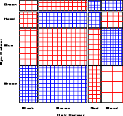 149 149 | 1983 computer graphics by Hans Riedwyl (1935-) and Michel Schüpbach, Switzerland Sieve diagram, for representing frequencies in a two-way contingency table. Riedwyl, H. and Schüpbach, M. (1983). Siebdiagramme: Graphische Darstellung von Kontingenztafeln . Tech. Rep. 12, Institute for Mathematical Statistics, University of Bern, Bern, Switzerland. |
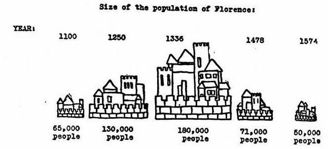 117 117 | 1927 print by J. N. Washburne, USA Spate of articles on experimental tests of statistical graphical forms: R. von Huhn, F. E. Croxton, J. N. Washburne, USA. Washburne, J. N. (1927). An experimental study of various graphic, tabular and textual methods of presenting quantitative material. Journal of Educational Psychology, 18:361-376, 465-476. von Huhn, R. (1927). A discussion of the Eells' experiment. Journal of the American Statistical Association, 22:31-36. Croxton, F. E. (1927). Further studies in the graphic use of circles and bars. Journal of the American Statistical Association, 22:36-39. Croxton, F. E. and Stein, H. (1932). Graphic comparisons by bars, squares, circles and cubes. Journal of the American Statistical Association, 27:54-60. Croxton, F. E. and Stryker, R. E. (1927). Bar charts versus circle diagrams. Journal of the American Statistical Association, 22:473-482. |
 62 62 | 1801 print by William Smith (1769-1839), England The first large-scale geological map of England and Wales, setting the pattern for geological cartography, and founding stratigraphic geology. Recently called (hyperbolically) "the map that changed the world." (Smith's map was first drawn in 1801, but the final version was not published until 1815.) Smith, W. (Feb. 1815). A delineation of the strata of England and Wales, with part of Scotland; exhibiting the collieries and mines, the marshes and fenlands originally overflowed by the sea, and the varieties of soil according to the substrata, illustrated by the most descriptive names . London: John Cary. BL: Maps 1180.(19). Morton, J. L. (1992). Strata: How William Smith drew the First map of the Earth in 1801 and inspired the Science of Geology. Stroud, England: Tempus Publishing. ISBN 0 7524 1992. Winchester, S. (2001). The Map That Changed the World: William Smith and the Birth of Modern Geology. New York: Harper Collins. |
 164 164 | 1975 computer graphics The scatterplot matrix displays the relationships among all pairs of many variables. This example shows the relation among three measures of social competence, but the data in each plot are stratified by the type of setting. To aid perception of how the relations differ across setting, each subplot is enhanced with a data ellipse showing the strength of the relationship. The diagonal panels show the univariate distribution of each variable, again stratified by type of setting. Color is used effectively to keep the settings visually distinct. |
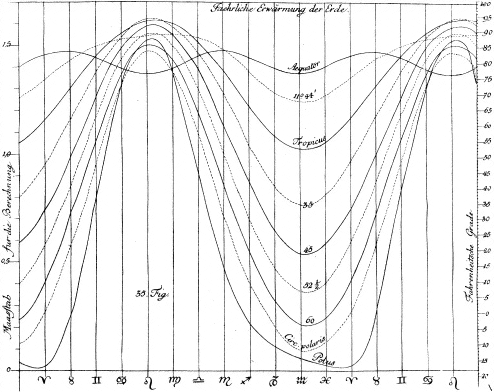 39 39 | 1779 print by Johann Heinrich Lambert (1728-1777), Germany Graphical analysis of periodic variation (in soil temperature), and the first semi-graphic display combining tabular and graphical formats. Hankins, T. L. (1999). Blood, dirt, and nomograms: A particular history of graphs. Isis, 90:50-80. Lambert, J. H. (1779). Pyrometrie; oder, vom maasse des feuers und der wärme mit acht kupfertafeln. Berlin. |
 90 90 | 1873 print by Etienne-Jules Marey (1830-1904), France Invention of precursor of motion-picture camera, recording a series of photographs to study fight of birds, running and walking. Marey, E.-J. (1873). La machine animale, locomotion terestre et aérienne. |
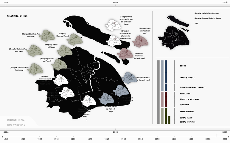 1217 1217 | 2006 computer graphics by Robert Pietrusko, Jamie Smith, and Sayoko Yoshida (PIIM) A geographic interface allows a researcher to inspect the scale and coverage of different data sources. By selecting any point on the map, the researcher would see each piece of data that covers the selected region. Source Description Do We Know What We Don't Know? Source is a proposed software environment where a community of researchers will be able to contribute information at any temporal or spatial resolution, and at varying levels of detail and formality. The tool will highlight data that are consistent across datasets with regard to data format, resolution and availability. The tool will also highlight those aspects that remain incommensurable. Additionally, the researchers will be provided a set of visualization tools that will allow them to analyze and reason with both quantitative and qualitative information as well as gauge what areas of the information space are still poorly defined, thus fostering future work and data gathering. When applied to test case data about the cities of New York, Mumbai, and Shanghai, Source highlighted an abundance of data from Mumbai compared with the other two cities. This does not suggest there are more data for Mumbai than New York, but rather that the team of scholars were largely experts on Indian urban research and had not sufficiently built their knowledge base for a true comparative study. The tool made explicit and visually accessible how much of what kinds of data were available, exposing problems with the researchers' assumptions and intuitions. |
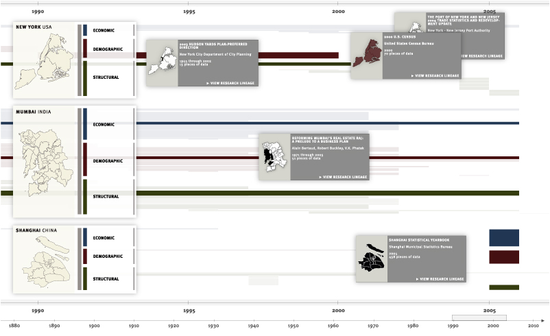 1219 1219 | 2006 computer graphics by Robert Pietrusko, Jamie Smith, and Sayoko Yoshida (PIIM) Data lines that come from the same source are highlighted. Multiple sources could be inspected simultaneously. Source Description Do We Know What We Don't Know? Source is a proposed software environment where a community of researchers will be able to contribute information at any temporal or spatial resolution, and at varying levels of detail and formality. The tool will highlight data that are consistent across datasets with regard to data format, resolution and availability. The tool will also highlight those aspects that remain incommensurable. Additionally, the researchers will be provided a set of visualization tools that will allow them to analyze and reason with both quantitative and qualitative information as well as gauge what areas of the information space are still poorly defined, thus fostering future work and data gathering. When applied to test case data about the cities of New York, Mumbai, and Shanghai, Source highlighted an abundance of data from Mumbai compared with the other two cities. This does not suggest there are more data for Mumbai than New York, but rather that the team of scholars were largely experts on Indian urban research and had not sufficiently built their knowledge base for a true comparative study. The tool made explicit and visually accessible how much of what kinds of data were available, exposing problems with the researchers' assumptions and intuitions. |
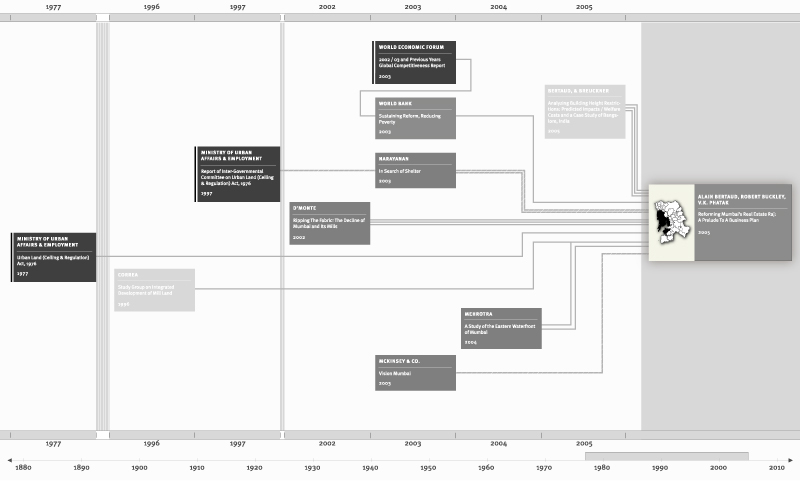 1216 1216 | 2006 computer graphics by Robert Pietrusko, Jamie Smith, and Sayoko Yoshida (PIIM) The Lineage View illustrates how documents are related through citation. Source Description Do We Know What We Don't Know? Source is a proposed software environment where a community of researchers will be able to contribute information at any temporal or spatial resolution, and at varying levels of detail and formality. The tool will highlight data that are consistent across datasets with regard to data format, resolution and availability. The tool will also highlight those aspects that remain incommensurable. Additionally, the researchers will be provided a set of visualization tools that will allow them to analyze and reason with both quantitative and qualitative information as well as gauge what areas of the information space are still poorly defined, thus fostering future work and data gathering. When applied to test case data about the cities of New York, Mumbai, and Shanghai, Source highlighted an abundance of data from Mumbai compared with the other two cities. This does not suggest there are more data for Mumbai than New York, but rather that the team of scholars were largely experts on Indian urban research and had not sufficiently built their knowledge base for a true comparative study. The tool made explicit and visually accessible how much of what kinds of data were available, exposing problems with the researchers' assumptions and intuitions. |
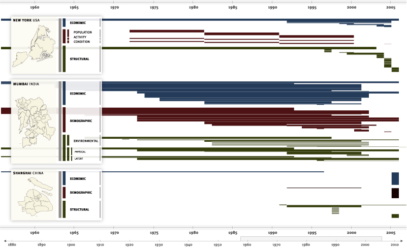 1218 1218 | 2006 computer graphics by Robert Pietrusko, Jamie Smith, and Sayoko Yoshida (PIIM) Data collected by researchers can be compared by region as well as by content. This visualization shows the buildup of economic, demographic and structural knowledge of Mumbai over a fifty-year period. Source Description Do We Know What We Don't Know? Source is a proposed software environment where a community of researchers will be able to contribute information at any temporal or spatial resolution, and at varying levels of detail and formality. The tool will highlight data that are consistent across datasets with regard to data format, resolution and availability. The tool will also highlight those aspects that remain incommensurable. Additionally, the researchers will be provided a set of visualization tools that will allow them to analyze and reason with both quantitative and qualitative information as well as gauge what areas of the information space are still poorly defined, thus fostering future work and data gathering. When applied to test case data about the cities of New York, Mumbai, and Shanghai, Source highlighted an abundance of data from Mumbai compared with the other two cities. This does not suggest there are more data for Mumbai than New York, but rather that the team of scholars were largely experts on Indian urban research and had not sufficiently built their knowledge base for a true comparative study. The tool made explicit and visually accessible how much of what kinds of data were available, exposing problems with the researchers' assumptions and intuitions. |
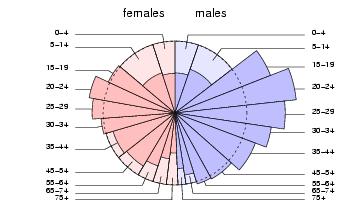 171 171 | 2003 print by Israel Bureau of Statistics The crusty pie chart gets a new topping! A pie chart depicts a partition. A Spie chart combines two pie charts to compare partitions. One pie chart is drawn as-is, and serves as the basis for comparison. The other is superimposed on the first, using the same angles for the slices, but different radii, so as to achieve the desired areas. The example shows road casualties data from Israel. The base pie chart shows the general population parititoned into gender and age groups. The superimposed chart shows the same partitioning for the population of road casualties. Obviously the main age group hit is 20--24, and males are much more often involved in accidents that females. Reference: D. G. Feitelson, "Comparing Partitions with Spie Charts". Technical Report 2003-87, School of Computer Science and Engineering, The Hebrew University of Jerusalem, Dec 2003. URL: http://www.cs.huji.ac.il/~feit/papers/Spie03TR.pdf |
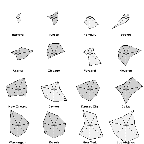 131 131 | 1971 print by J. H. Siegel, R. M. Goldwyn, and Herman P. Friedman, USA Irregular polygon ("star plot") to represent multivariate data (with vertices at equally spaced intervals, distance from center proportional to the value of a variable) [but see Georg von Mayr in 1877 [S.78] for first use]. Siegel, J.H., Goldwyn, R.M., and Friedman, H.P. (1971). Pattern and process of the evolution of human septic shock. Surgery, 70:232-245. Mayr, G.v. (1877). Die Gesetzmäßigkeit im Gesellschaftsleben. Oldenbourg. |
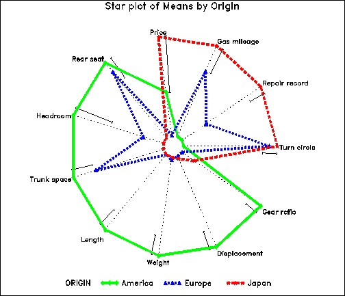 167 167 | computer graphics It is difficult to compare the means of several groups on many variables. Profile or parallel coordinate plots are often confusing when the curves for different groups cross a great deal. The multivariate star plot shows each of an arbitrary number of variables on radial axes from the origin, here for the means of automobile models, classified by region of manufacture. In this plot, the variables Price, Gear Ratio and Turning Circle are reflected so larger values represent "better" for all variables; then all variables are first scaled to a 0-1 range. Variables are arranged around the circle by a multivariate effect ordering according to their order on the largest discriminant dimension. The error bars next to each radial axis shows the smallest value of a difference between means required for a (univariate) .05 significant difference. |
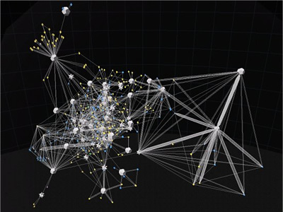 862 862 | 2003 computer graphics by (unknown) Starlight is a generic information visualization tool, developed by the Pacific Northwest National Laboratory (USA), that is applicable to a wide range of problems. In these images, Starlight is being used as an assisting tool to uncover complex file systems. Many information resources are organized into hierarchical structures. Starlight's Hierarchy View can be used to explore the contents of extremely large categorical ontologies such as large, multipart documents, Web directories such as Yahoo, or, as shown here, large file directory structures. The images show a Hierarchy View of a typical Microsoft Windows "Program Files" directory structure that was mapped out using the Starlight DirCrawler information harvesting utility. Provided with a starting directory, DirCrawler will navigate downwards through all constituent subdirectories, collecting file and directory property information as it goes. Once this process has been completed, the application outputs an XML file that can be used as input to Starlight. The directory structure shown below contains approximately 41,000 individual files organized into about 1400 discrete directories. The individual file glyphs have been color-encoded according to file extension, with image files colored green, text documents blue, computer programming-related files (e.g. source code) orange, etc. Executable files (.exe, .dll, etc.) are shown in yellow. |
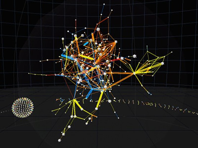 868 868 | 2003 computer graphics by (unknown) Starlight is a generic information visualization tool, developed by the Pacific Northwest National Laboratory (USA), that is applicable to a wide range of problems. Computer network security has become an increasingly pressing issue for many organizations. Starlight can enable network analysts to quickly achieve and maintain an in-depth understanding of network vulnerabilities and security status. The first image shows a Starlight Network View of computer NIDS data associated with an actual network intrusion incident. In this incident, several unauthorized users gained access to computers on official U.S. Government computer networks. In this example of "edge-oriented" network data visualization, individual NIDS log entries describing suspicious connections among computers are represented as edges in the display, with the nodes representing the individual computers (IP addresses) referenced in the data. This depiction portrays approximately 10,000 connections involving several hundred discrete IP addresses. The edges in this display have been color-encoded according to the "warning level" of the connection, with bright yellow indicating the most critical events. The second image is a closeup view of the suspicious connection (yellow line, left) shown in the preceeding image. |
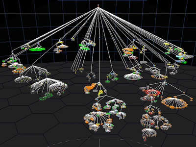 863 863 | 2003 computer graphics by (unknown) Starlight is a generic information visualization tool, developed by the Pacific Northwest National Laboratory (USA), that is applicable to a wide range of problems. The first image shows a Starlight Network View representation of the "Information Visualization" Web community. This collection of Web pages was harvested using the Google search engine to retrieve the top 100 ranked pages containing the phrase "information visualization," as well as all pages that link to, or are linked to from, the pages in the query result set. The entire collection consists of approximately 1500 pages. In this view, nodes represent discrete Web pages, and edges represent hyperlink references among the pages. The pages are color-encoded according to their link class, with pages in the original result set colored green, result set inlinks colored blue, and result set outlinks colored yellow. Note that the majority of the result set pages are embedded in the clique (dodecahedra) and cluster (stellated dodecahedra) nodes. The second image portraits the same Web page collection, now displayed as a Starlight Concept View. It shows conceptual correlations among the contents of the page text. Groups of conceptually related pages are shown displayed in the same cluster, and the clusters are arranged spatially such that clusters that are most similar are spatially adjacent. |
| | 2002 print by New York Times Sometimes a map wants to be the forground rather than the background for a data display. Anamorphic maps deform the map for this purpose,This map from the New York Times shows the state of the U.S. presidential race from polls conducted before the 2000 election. In order to show the contribution of each state to a victory by Bush or Gore, each state is sized according to the number of votes it has in the Electoral College, with one square for each vote. A 5-level color scale distinguishes 'safe' from 'leaning', and a bar graph at the bottom shows the totals for all states. Presented by Archie Tse in a session on Information Graphics at the 2002 Joint Statistical Meetings, Aug. 12, 2002. |
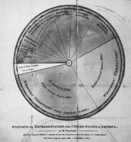 69 69 | 1805 print by William Playfair (1759-1823), England Invention of the pie chart, and circle graph, used to show part-whole relations. Playfair, W. (1801). Statistical Breviary; Shewing, on a Principle Entirely New, the Resources of Every State and Kingdom in Europe . London: Wallis. Re-published in Wainer, H. and Spence, I. (eds.), The Commercial and Political Atlas and Statistical Breviary, 2005, Cambridge University Press, ISBN 0-521-85554-3. |
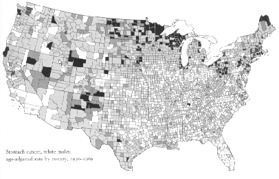 125 125 | 1974 print by U.S. Bureau of the Census CDC map of the incidence of stomach cancer in white males. Color-coded bivariate matrix to represent two intervally measured variables in a single map (Urban Atlas series)[but see Georg von Mayr in 1874 [Fig. XIX] for first use]- U.S. Bureau of the Census. U.S. Bureau of the Census (1974). Urban Atlas. Washington, D.C.: U.S. Government Printing Office. Series GE-80. Mayr, G. v. (1874). Gutachten Ãœber die Anwendung der Graphischen und Geographischen Methoden in der Statistik. (n.p.). |
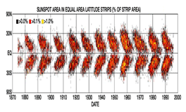 104 104 | 1904 print by Edward Walter Maunder (1851-1928), England Use of the "butterfly diagram" to study the variation of sunspots over time, leading to the discovery that they were markedly reduced in frequency from 1645-1715 (the "Maunder minimum"). [Earlier work, started in 1843 by H. Schwabe, showed that sunspots exhibit an approximately twenty-two year cycle, with each eleven-year cycle of sunspots followed by a reversal of the direction of the sun's magnetic field] (Maunder's butterfly diagram) - England |
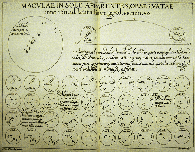 29 29 | 1626 print by Christopher Scheiner (1575-1650), Italy Visual representations used to chart the changes in sunspots over time. Also, the first known use of the idea of "small multiples" to show a series of images in a coherent display. Scheiner, C. (1626-1630). Rosa Ursina sive Sol ex Admirando Facularum & Macularum Suarum Phoenomeno Varius . Bracciano, Italy: Andream Phaeum. BL: 532.l.6. |
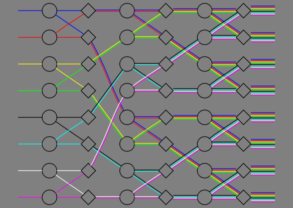 645 645 | computer graphics (Graphviz) by Graphviz - Graph Visualization Software A non-blocking switch network consisting of only 2-way splitters and selectors. This graph was created to illustrate the parallel edge feature. |
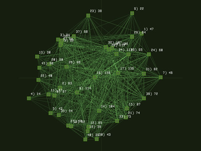 892 892 | 2005 computer graphics by Ethan Miller The SXSW INTERACTIVE FESTIVAL brings together uber-geeks and digital innovators from around the world for four days of keynote speeches, trade shows, panels, parties and assorted evening fun. The 2005 SXSW Interactive Program of panels is targeted at both insiders and outsiders with the intent of attracting, informing and tantalizing potential attendees. As such it is the most public face of the conference. Ethan Miller has taken the text from this program and made obvious the conceptual connections between the presentations in a visualization build with Processing. Connections are extracted from vocabulary used in more than one description. Lines connect paragraphs with common words and the total number of connections is tallied. Each square represents a transcript from the SXSW conference. The brightness of the lines connecting boxes indicates the number of words shared ("noise words" are filtered out). The distance to the center of the visualization indicated the total number of connections the text shares. The closer to the center, the more words the text shares with other texts. By default, all connections are displayed. Hovering on a box shows only the connections for that text, and the name of the text at the top of the screen. Clicking on a box selects it, so that one can hover over a second box. When hovering over a box while another box is selected, the connections for both texts will be shown, along with the titles, and the words they have in common at the top of the screen. |
 86 86 | 1878 print by James Joseph Sylvester (1814-1897), England The term "graph" introduced, referring to diagrams showing analogies between the chemical bonds in molecules and graphical representations of mathematical invariants (also coined the term "matrix"). Sylvester, J. J. (1878). On an application of the new atomic theory to the graphical representation of the invariants and covariants of binary quantics, with three appendices. American Journal of Mathematics, 1:64-128. |
 192 192 | 1998 computer graphics (KnotPlot) by Robert G. Scharein The notion of deriving a knot energy by viewing a knot as a radiating tube is due to Gregory Buck of Saint Anselm College in New Hampshire. This energy, the symmetric energy has been extensively studied by Buck together with Jonathan Simon from The University of Iowa, and myself (Robert G. Scharein). This page is a collection of images visualizing the symmetric energy. |
 193 193 | 1998 computer graphics (KnotPlot) by Robert G. Scharein The notion of deriving a knot energy by viewing a knot as a radiating tube is due to Gregory Buck of Saint Anselm College in New Hampshire. This energy, the symmetric energy has been extensively studied by Buck together with Jonathan Simon from The University of Iowa, and myself (Robert G. Scharein). This page is a collection of images visualizing the symmetric energy. |
 180 180 | 2005 computer graphics by Electronic Journal of Combinatorics Venn diagrams are often used in logic to show intersection relations among sets, but they are usually limited to being shown as three overlapping circles. Here (http://www.combinatorics.org/Surveys/ds5/VennSymmEJC.html) is a page that explains a general way to construct symmetric Venn diagrams using ellipses. The example shows a Venn diagram made from 5 congruent ellipses. The regions are colored according to the number of ellipses in which they are contained: grey = 0, yellow = 1, red = 2, blue = 3, green = 4, and black = 5. Note that the number of regions colored with a given color corresponds to the appropriate binomial coefficient: #(grey) = #(black) = 1, #(yellow) = #(green) = 5, and #(red) = #(blue) = 10. The Electronic Journal of Combinatorics (http://www.combinatorics.org/) has many other lovely examples and visual explanations. The Electronic Journal of Combinatorics (ed. June 2005), DS #5. |
 644 644 | computer graphics (Graphviz) by Graphviz - Graph Visualization Software A diagram of the relationships between objects in an SDH (Synchronous Digital Hierarchy) network. This graph was created to show a multiplicity of semantic relationships in a single graph. In the graph file, the setting of the global page size, graph layout size, aspect ratio (to fill the allowed layout size) and centering means that the layout will be placed in a box that is precisely 7.5" wide by 7" high and centered on an 8.5x11 page. The default node is to draw nodes unlabeled. Subgraphs are employed to mark sets of nodes to be placed on the same rank (level) in the layout, and as local scopes for node or edge attribute initialization. |
 85 85 | 1861 print by Francis Galton (1822-1911), England The modern weather map, a chart showing area of similar air pressure and barometric changes by means of glyphs displayed on a map. These led to the discovery of the anti-cyclonic movement of wind around low-pressure areas. Galton, F. (1861). Meteorological charts. Philosophical Magazine, 22:34-35. Galton, F. (1870). Barometric predictions of weather. Nature, 2:501-503. |
 151 151 | 1994 computer graphics (Table Lens) by Ramana Rao and Stuart K. Card, Xerox Parc, USA Table lens: Focus and context technique for viewing large tables; user can expand rows or columns to see the details, while keeping surrounding context. Rao, R. and Card, S. K. (1994). The table lens: Merging graphical and symbolic representations in an interactive focus+context visualization for tabular information. In Proc. CHI'94, pp.318-322. ACM, Boston, Massachusetts. |
 111 111 | 1924 print by Heinz Von Foerster (1911-2002), Austria Table of historical events drawn on logarithmic paper. von Foerster observed that the closer to the present, the more densely filled the paper was with historical events; conversely, the further you went back the thinner the table. Plotting the data using a logarithmic time scale allowed the history of time to be plotted on one table. |
 41 41 | 1782 print by Charles de Fourcroy, France Use of geometric, proportional figures (squares) to compare demographic quantities by superposition, an early "tableau graphique." Fourcroy, C. d. (1782). Essai d'une table poléométrique, ou amusement d'un amateur de plans sur la grandeur de quelques villes . Paris: Dupain-Triel. |
 59 59 | 1844 Print by Charles Joseph Minard (1781-1870), France "Tableau-graphique" showing transportation of commercial traffic by variable-width (distance), divided bars (height ~ amount), area ~ cost of transport [An early form of the mosaic plot.]. Minard, C. J. (May 1844). Tableaux figuratifs de la circulation de quelques chemins de fer. lith. (n.s.). ENPC:5860/C351, 5299/C307. Dainville, F. d. (Oct. 1970). Les bases d'une cartographie industrielle de L'Europe au XIXe siècle. Tech. Rep. 540, Centre National de la Recherch Scientifique, Lyon. Colloques Internationaux du C.N.R.S. Robinson, A. H. (1967). The thematic maps of Charles Joseph Minard. Imago Mundi, 21 :95-108. |
 13 13 | print In 1508 a map of the Roman empire came in the way of Konrad Peutinger from Augsburg. Later this map was called after him: Tabula Peutingeriana, Peutinger-map. A few centuries before Peutinger got the map he was copied from an old Roman world-map, from the 4th century A.D, and was copied from the world-map of Agrippina, end 1st century B.C. The Peutinger-map was drawn on a narrow book-roll with a length of 7 metres. He shows the whole Roman empire, from todays Great Britain till the Indus. The creator was sure that Rome was the central point, therefor Rome was located at the centre of the map. There were 12 ways to leave Rome. The map wasn't meant as an accurate map like we find in todays atlasses rather an outline for people who were traveling. The creator only reasoned left to right, but that was enough for a traveller. He also mentioned the distance next to the roads, because the length of the lines on the map had no meaning. (366-335 BCE) Further text: The whole of the Roman world is reproduced on this painted parchment 34 centimetres in height and almost 7 metres in length. Although it is the most reproduced Roman chart, the Table of Peutinger does not make it possible to perceive the extent of the cartographic work undertaken by the Romans. Land conquerors, they had a utilitary vision of geography and their cartographic representations were related to the imperial conquests. Topographers accompanied the Roman armies in their campaigns in order to recognize the conquered grounds. Information collected was used for the military needs and the development of infrastructures such as the routes, but also to describe the routes. The table of Peutinger, named after the XVI century German collector to which it was offered, was a form of very widespread geographical description. If this chart does not bring topographic information, it gives indications of distances and size of the places, very practical information for the traveller. The North-South distances are represented on a smaller scale than the East-West distances, thus making it possible to the traveller to unfold or unroll the section which corresponded to its course. |
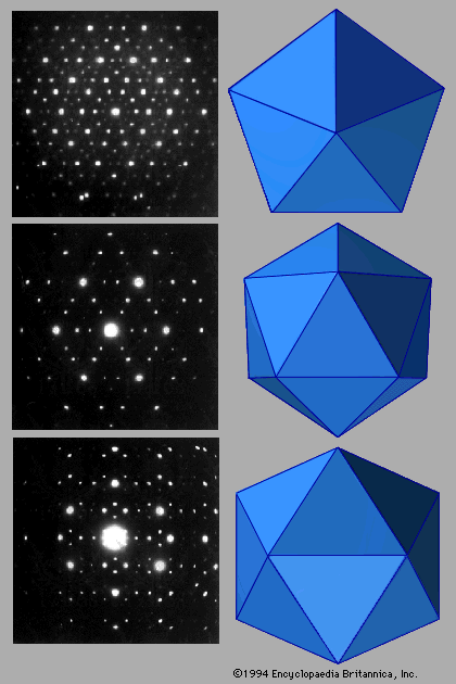 204 204 | 1984 x-ray crystallography, computer graphics by D. Shechtman This image suggests the relationship between tessellations, symmetry, and x-ray crystallography. Original Caption: Figure 16: (Left) Electron diffraction patterns of quasicrystalline aluminum-manganese. (Top left) View is along the fivefold symmetry axis; (centre left) rotating by 37.38 reveals the threefold axis, and (bottom left) rotating by 58.29 reveals the twofold axis. (Right) Corresponding views of icosahedrons show that quasicrystalline symmetries match those of the icosahedrons. (Left) D. Shechtman, Physical Review Letters, vol. 53, no. 20, Nov. 1984 Reprinted with permission from Encyclopaedia Britannica: Image of electron diffraction pattern at http://library.advanced.org/16661/history/math.html from Encyclopedia Britannica Online http://www.eb.com:180/cgi-bin/g?DocF=cap/matter025.html, Karen Farmer, kfarmer@eb.com, August 1998. |
 1034 1034 | 2006 computer graphics by W. Bradford Paley For the "Places & Spaces: Mapping Science" exhibition, W. Bradford Paley approached making a map of science indirectly, by making a map of a book describing The History of Science. In this way, he leveraged the intelligent organization by Henry Smith Williams (the history's author): this map was created more to take advantage of a culturally recognized way of organizing science than to invent a new one. The history's first two volumes are organized strictly historically, so as the book wraps around the right side of the ellipse it is organized as a time line. The next two volumes distinguish two major domains - making two time lines - for more recent scientific exploration: the physical sciences (along the bottom left) and the life sciences (top left). Since the scattered words are pulled toward the places where they are used in the text, structure emerges: names of individuals appear along the outside, as they are usually mentioned in only one or two places, and concepts that are common to science of all eras (e.g., system, theory, experiment) are pulled to the center, as they are mentioned everywhere. This map was on display at the NYPL Science, Industry, and Business Library, New York, as part of the "Places & Spaces: Mapping Science" exhibition, from April 3rd - August 31st, 2006. |
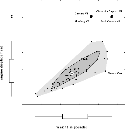 155 155 | 1971 computer graphics by Peter Rousseeuw, Ida Ruts, and John W. Tukey, USA The univariate boxplot has been widely used since proposed by Tukey around 1971. Tukey (1975) also suggested a multivariate generalization of depth of an observation on which the boxplot is based, but no implementation of this idea had been available until quite recently. [Others had earlier suggested peeling the convex hull, but this doesn't quite get it right. Multivariate depths does, but is computationally intensive.] Peter Rousseeuw and Ida Ruts worked out the bivariate extension, called a bagplot, illustrated here. The large + marks the bivariate median. The dark inner region (the "bag") contains the 50% of the observations with greatest bivariate depth. The lighter surrounding "loop" marks the observations within the bivariate fences. Observations outside the loop are plotted individually and labeled. *Peter Rousseeuw, Ida Ruts and John W. Tukey. 1999. The Bagplot: A Bivariate Boxplot. The American Statistician 53(4): 382-387. [Figure 1] |
 561 561 | 20050603 computer graphics by CNET Networks 2005-10-04: "The Big Picture" - Ontology viewer for cnet.com articles From InfoVis:Wiki The Big Picture is an online ontology viewer that is applied to c|net News.com articles to show relationships between stories, companies, and topics. It allows for a completely new and very interesting way of exploring news stories. The tool has been developed in cooperation with Liveplasma.com (formerly MusicPlasma). The Big Picture - Ontology viewer that connects stories, companies, and topics within the News.com website. The example shows the network centered around the article Apple to ditch IBM, switch to Intel chips.[CNET, 2005a] The Big Picture - Ontology viewer that connects stories, companies, and topics within the News.com website. The example shows the network centered around the article Apple to ditch IBM, switch to Intel chips. [CNET, 2005a] via information aesthetics blog [edit] References * [CNET, 2005a] CNET Networks. The Big Picture. Retrieved at: October 4, 2005. http://beta.news.com.com/The+Big+Picture/2030-12_3-5843390.html? * [CNET, 2005b] CNET Networks. Apple to ditch IBM, switch to Intel chips. Created at: June 3, 2005. Retrieved at: October 4, 2005. http://beta.news.com.com/Apple+to+ditch+IBM%2C+switch+to+Intel+chips/2100-1006_3-5731398.html?tag=nl |
 223 223 | 1700? print by Edmund Halley (1656-1742), England In the early 1700s, Edmund Halley developed methods for computing the tracks of total eclipses of the sun. He determined that a total solar eclipse would sweep over southern England and Wales on Friday, April 22, 1715, the first time since 1140. He prepared a pamphlet titled The Black Day, or a prospect of Doomsday exemplified in the great and terrible eclipse which will happen on the 22nd of April 1715. |
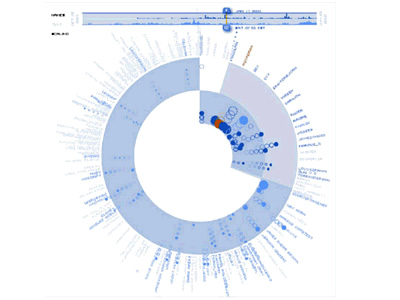 1070 1070 | computer graphics by Li-Te Cheng, Bernard Kerr Open source software, such as Firefox, Linux, and Eclipse, is created collaboratively by a group of individuals who make the code accessible to the public to both use and enhance. Seeing the pattern of contributions to these projects can provide useful insights into the vitality of the project and the community building it. The Bloom Diagram provides a visualization of contribution activity in open source projects. At a glance, this tool can summarize the overall level of coding and discussion in a project, show which individuals are the recent key contributors, and allow comparisons across multiple projects. The Bloom Diagram is being used to study Sourceforge.net, one of the most popular open source community sites, and the IIOSB (the IBM Internal Open Source Bazaar), a site hosted internally within IBM to promote open source-style development. The screenshot below is an example of the Bloom Diagram for a Sourceforge project. The upper left portion provides summary statistics about the project, for example the total number of events by commentor and coder. Using the slider in the timeline, top right, users can see the state of the project at different points in time. Users can also play an animation of the activity over time from this timeline. The inset on the bottom left is a live "magnifying glass" view around the current mouse position. Keyboard controls are also available to let users zoom in, out, and pan around the screen. This diagram gives us a clear sense of the overall proportion of coding to commenting activity in this project. The inner ring, which represents code events, takes up slightly more than a quarter of the circle. One quarter of the outer ring, which represents comment events, overlaps with the inner ring, revealing that only 25% of the community is commenting and coding. The majority of contributors (75%) are just discussing the project. When the user moves the timeline slider, animated bubbles appear in the inner or outer ring. A bubble in the inner ring represents a code event, while a bubble in the outer ring indicates a comment event. The bubble position as it animates provides a cue about the frequency and recency of the event. If the person associated with the event seldom contributes code or comments after that event, the bubble drifts outward, leaving a "trail" (a series of unfilled circles). If the person continues to create code or comments, the bubble moves back to its starting position, creating a "bounce-back" effect. Judging from this diagram, there seems to be a core group of developers who frequently contribute code (25% of the bubbles in the inner ring are bouncing around the center) and a peripheral group of people commenting on the project less frequently (75% bubbles in the outer ring with fewer bouncing toward the center). Bloom Diagrams can provide useful insights into how things are going on a project. For example, project leads can use them as a dashboard to monitor how often people are contributing and follow up when contributions start to slow. Potential contributors may decide whether or not to join a project depending on the activity they see. Hosting providers of open source projects can identify the hot projects to promote on the front pages of their community sites or check on the ones that seem to be dying down. |
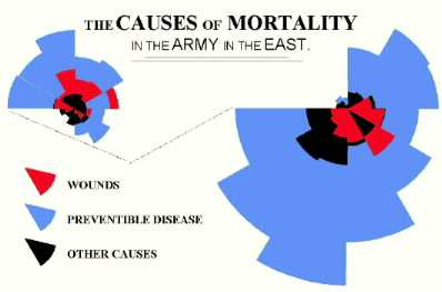 82 82 | 1857 print by Florence Nightingale (1820-1910), England Polar area charts, known as "coxcombs" (used in a campaign to improve sanitary conditions of army). Nightingale, F. (1857). Mortality of the British Army. London: Harrison and Sons. |
 1067 1067 | 2006 computer graphics by (unknown) This project represents a visualization of the genealogical tree of an online community (Breedster). Breedster is an online community website designed for friends. The main goal of the service is to make one's social life, and that of their friends, more active and stimulating, by both enriching existing relationships and establishing new ones by reaching out to people never met before. Breedster organizes every personal web of acquaintances in an innovative format called Copulogram. It doesn't just show one's personal network, it gives an accurate depiction of all their relations. These images represent a Copulogram of all 10313 Breedster members (6018 active, 4295 terminated accounts) generated on 2004-05-22. Not all relations are mapped, encounters that produced no offspring are not visualised to avoid further clutter. Father relations are shown in blue, mother relions in red, children with identical parents are grouped in semi circles. All 43 community founders are shown in the center, the youngest generation is shown on the perimeter. |
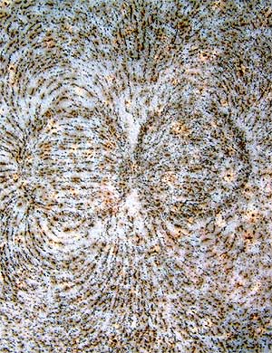 63 63 | 1830 print by Michael Faraday (1791-1867), England Graphical analysis of natural phenomena begins to appear on a regular basis in scientific publications, particularly in England. For example, in 1832, Faraday proposes pictorial representation of electric and magnetic lines of force. |
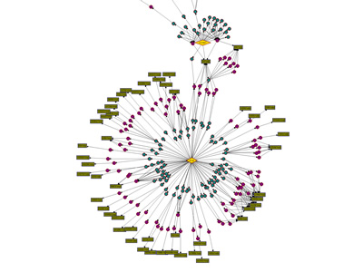 980 980 | 2003 computer graphics by Ed Blanchfield Ed Blanchfield used a Firewall/Intrusion Detection System (IDS) log data to get "before" and "after" graphs showing the impact of an MS-SQL worm, which hit the Internet around January 25th 2003. When this particular worm hit a large class B sized network, an IDS system designed and implemented by Blanchfield for a large managed services provider, was one of the first sites in the world to detect and report the incident. Ed posted his original findings and info to various security lists and quickly wrote up a parser to create GDL files from Firewall and IDS logs, which he fed into aiSee Graph Layout Software in order to visually map this worm's effect on their customer's network. The first image is a visualization of log data for a class B firewall without background worm traffic, while the second represents the same data with background worm traffic. The graphs show just 15 minutes worth of traffic at midnight, but the impact of the worm is already clearly visible. You can imagine what 24 hours must have been like. |
 19 19 | print by Anaximander of Miletus (c. 610-546 BC), Turkey The first world map? No extant copies, but described in books II and IV of Herodotus "Histories." |
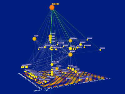 852 852 | computer graphics by H. Shiozawa, Y. Matsushita The Natto View proposes an effective use of the third dimension, taking full advantage of the Z axis: drawing diagrams in two dimensions and reminding the third dimension for interactive manipulation. The project is a set of 3D interactive visualizing techniques and provides dynamic focus+context operation for graph structure such as the World Wide Web. Information nodes, or HTML documents, are placed on the fundamental floor-plane in 3D space, and users can select and move arbitrary node with direct manipulation. As the user lifts a focused node up, the nodes to which it links are lifted up together, and thus complicated networks are disentangled dynamically. By three dimensional perspective technique, the user can view both details of information connections near the selected node and global context of the large information space like fisheye lens model. The differences of the Natto View from most of other graphical visualization are: It supports not only visualization but also interactive and dynamic manipulation on users' demand. It is a layout-independent method and thus suitable for dynamic enlargement of diagram such as incremental access to huge distributed information networks. |
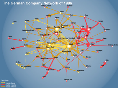 830 830 | computer graphics by Martin Hopner, Lothar Krempel For over 100 years, the German company network was a major feature of organized corporate governance in Germany. Martin Hopner and Lothar Krempel used network visualization techniques and qualitative-historical analysis to discuss the structure, origins and development of this network and to analyze the reasons for its recent erosion. "Network visualization makes it possible to identify crucial entanglement patterns that can be traced back historically. In three phases of network formation - the 1880s, 1920s and the 1950s - capital entanglement resulted from the interplay of company behavior and government policy. In its heyday, the company network was de facto encompassing and provided its core participants, especially the banks, with a national, macroeconomic perspective. Because of the strategic reorientation of the largest banks toward investment banking, ties between banks and industry underwent functional changes. Since the year 2000, the German government's tax policy has sped up network erosion. Vanishing capital ties imply a declining degree of strategic coordination among large German companies." |
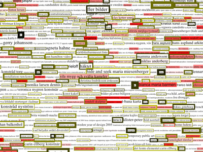 1005 1005 | 2006 computer graphics by Lisa Jevbratt The Voice is commissioned by The Swedish National Public Art Council (Statens Konstrid) and it is a public art project for their network/website. The project is in progress and will be finalized in Winter 2006. The Art Council is a government body responsible to the Ministry of Education, Research and Culture whose primary function is to commission permanent, site-specific contemporary works of art and to purchase art for placement in government premises. This project is their first attempt to work with an Internet art project as site-specific, public artwork. The Voice visualizes the words the users of the Art Council website are searching for on the site and in search engines in order to find the site, and a comparison of these words with the word usage at the office of the Art Council (for example words written in emails and read by the office staff on web pages). The visualization consists of the last two thousand words searched for, displayed in different font sizes/colors, with different border sizes/colors, reflecting how many times it has been searched for, when it was searched for, how much it has been mentioned in the internal communication and how much it is used on the Internet in general. Each word links to the pages on the server that contains the search-word, the visualization thus functions an alternate interface to the Art Council website. The visualization is updated daily and each new "image" is saved in an archive accessible by the user. |
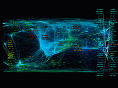 831 831 | computer graphics by David Gleich, Matt Rasmussen, Ke The World of Music, by researchers at Standford, MIT and Yahoo!, intends to render the music space in an unprecedented way. This visualization shows 9,276 artists and how they are related to each other. The artist relation data is mined from user ratings of artists in the Yahoo! Music service. The researchers used a technique called semidefinite programming (which is sometimes called Semidefinite embedding) to layout and cluster the data. Semidefinite embedding is a method for mapping high dimensional data into a lower dimensional Euclidean vector space. The dataset used consists of all the ratings made by users on the Yahoo! Music service during a 30-day period. The full dataset contains 250 million ratings on 100,000 artists from 4 million users. The ratings are on a scale from 1 (dislike) to 100 (like). "We pre-processed the data by eliminating all ratings below 75 and considered only users and artists with at least 100 ratings. After these modifications, the new dataset contains 9,276 artists and 150,000 users with 2.5 million ratings." |
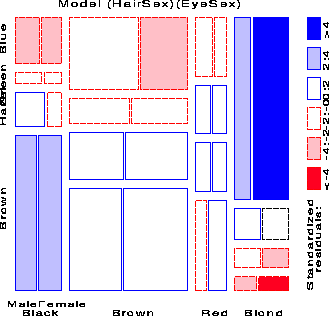 143 143 | 1991 computer graphics by Michael Friendly (1945-), Canada Mosaic display developed as a visual analysis tool for log-linear models (beginning general methods for visualizing categorical data). Friendly, M. and Fox, J. (Dec. 1991). Interpreting Higher Order Interactions in Loglinear Analysis: A Picture is Worth 1000 Words . Tech. rep., Institute for Social Research, York University, Toronto, CA. Friendly, M. (1994). Mosaic displays for multi-way contingency tables. Journal of the American Statistical Association, 89:190-200. |
 196 196 | 1998 computer graphics (KnotPlot) by Robert G. Scharein Torus knots are knots that can be drawn on the surface of a standard torus without intersections. Here is a collection of torus knots (and links) arranged according to crossing number. |
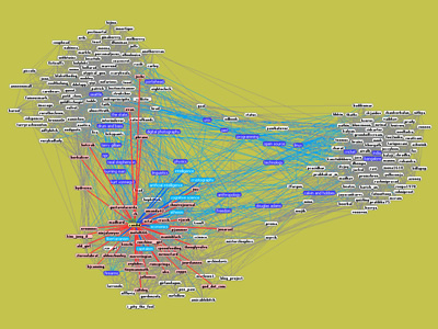 969 969 | 2005 computer graphics by Trejkaz Xaoza LiveJournal's Statistics page indicates that there are over 300,000 hosted weblogs updated daily, making LiveJournal one of the largest online social network communities. The magnitude of the LiveJournal userbase combined with their accommodating data collection policies makes it a perfect platform for social network visualization. The TouchGraph LiveJournal Browser displays users as nodes connected by edges indicating friendship. Above the users float their mutually shared interests. Moving the mouse over an interest highlights the users that share that interest, and moving a mouse over a user highlights the friends and interests of that user. By examining at the interests above and between clusters one can see the subjects that bring together individuals and communities. Similar applications have been created using TouchGraph, such as the Amazon Browser and Google Browser. |
 772 772 | 2004 computer graphics by W. Bradford Paley, Jeff Han TraceEncounters is a social network tracking and visualization project. It was debuted September 3 in Linz, Austria at the 2004 Ars Electronica festival. White circles connect cliques of size greater than 3 when the user clicks the 'Find cliques' button. The brighter links mean more encounters between the two people involved, and they're also the strongest springs, so it's possible to extract cliques by pulling out one or more of the people involved in the clique. (Often the greenest ones - the people having the most connections to other people regardless of the number of conversations - are the best to pull on; they're intentionally the easiest to pick when several nodes are nearby. The project distributed aproximately 900 small stickpins, each of which uses limited-rage infrared data exchange to remember every other pin that it encounters. When pin wearers came to a central location to view the accreting network, they saw a thousand circles on a plasma display panel, each representing a pin. |
 897 897 | 2005 computer graphics by Aaron Siegel This visualization model was created by Aaron Siegel for the Switch Online Journal for New Media Issue 20 to attempt to address the phenomenon of transvergence in the context of ISEA 2006/Zero One San Jose Festival. As the author inquires: "Is the phenomenon of transvergence something that exists within a single instance, or within relationships the instance shares with others?". While studying transvergence, Aaron came to view it as the borrowing of skills and knowledge-bases from various disciplines when required to fulfill a project. The intent of the created model was to view not only the differing skills and disciplines attributing to any individual project, but the ways a particular skill or discipline is unintentionally shared amongst an assortment of projects. Visitors are asked to enter their own transdisciplinary project and reflect on the attributing skills and knowledgebases. |
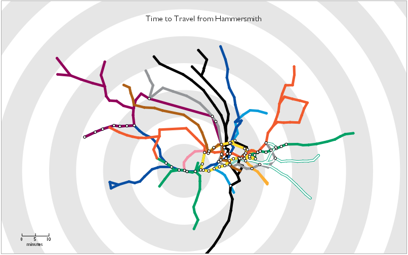 560 560 | 2006 computer graphics by Tom Carden 2006-01-25: Travel Time Tube Map From InfoVis:Wiki Travel Time Tube Map - Screenshot of an processing Applet that distorts the London underground network circularly according to travel times from a selected station.[Carden, 2006] Travel Time Tube Map - Screenshot of an processing Applet that distorts the London underground network circularly according to travel times from a selected station. [Carden, 2006] Travel Time Tube Map is a processing Applet that distorts the London underground network circularly according to travel times from a selected station. Homepage: http://www.tom-carden.co.uk/p5/tube_map_travel_times/applet/ [Carden, 2006] Tom Carden, Travel Time Tube Map, created at: January 1, 2006, retrieved at: January 25, 2006. http://www.tom-carden.co.uk/p5/tube_map_travel_times/applet/ |
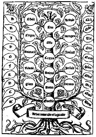 22 22 | 1305 print by Ramon Llull (1235-1316), Spain Mechanical diagrams of knowledge, as aids to reasoning (served as an inspiration to Leibnitz in the development of symbolic logic). |
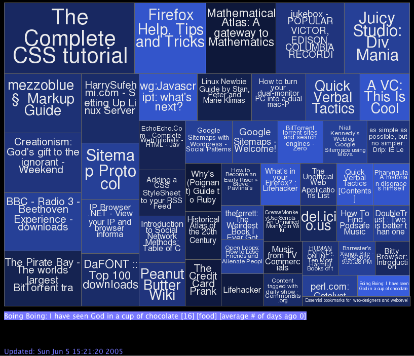 562 562 | 2005 computer graphics by codecubed.com 2005-07-18: Treemap representation of del.icio.us most popular bookmarks From InfoVis:Wiki Treemap representation of del.icio.us bookmarks [codecubed.com, 2005] codecubed.com offers a treemap represenation of the most popular bookmarks in the del.icio.us online social bookmarks manager: http://codecubed.com/map.html via information aesthetics blog [codecubed.com, 2005] dgottfrid@gmail.com, Retrieved: July 19, 2005. http://codecubed.com/map.html |
 152 152 | 1991 computer graphics (TreeViz) by Ben Shneiderman Treemaps, for space-constrained visualization of hierarchies, using nested rectangles (size proportional to some numerical measure of the node). Shneiderman, B. (1991). Tree visualization with treemaps: A 2-D space-filling approach. Tech. Rep. TR 91-03, University of Maryland, HCIL. (Published in ACM Transactions on Graphics, vol.11(1): 92-99, 1992). Johnson, B. and Shneiderman, B. (1991). Treemaps: A space-filling approach to the visualization of hierarchical information structures. In Proc. of the 2nd International IEEE Visualization Conference , pp. 284-291. San Diego, CA. |
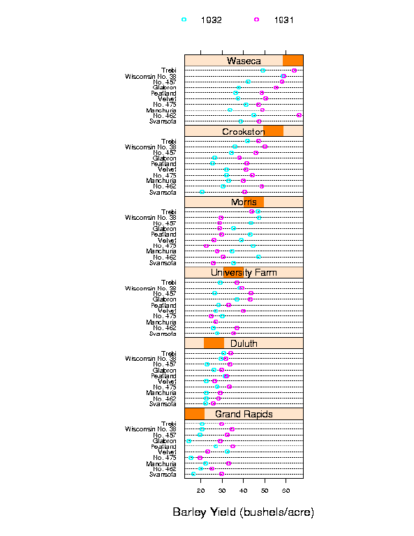 177 177 | 1991 print by R. A. Fisher Figure 3: A dotplot of the barley data showing yield against site and year given variety. The figure is a Trellis display of data from an agricultural field trial of barley yields at six sites in Minnesota; ten varieties of barley were grown in each of two years. The data were presented by R. A. Fisher in The Design of Experiments and analyzed subsequently by many others. William Cleveland's display of these data shows an apparent surprise missed by previous investigators, which occurs at the Morris site: For all other sites, 1931 produced a significantly higher overall yield than 1932. The reverse is true at Morris. But most importantly, the amount by which 1932 exceeds 1931 at Morris is similar to the amounts by which 1931 exceeds 1932 at the other sites. More displays, a statistical modeling of the data, and some background checks on the experiment led to the conclusion that the data are in error -- the years for Morris were inadvertently reversed. The background of the data, and analysis with Trellis are described in more detail in The Visual Design and Control of Trellis http://www.research.att.com/areas/stat/doc/95.8.color.ps). The graph uses main effect ordering to arrange the 6 sites and 10 barley varieties from bottom to top according to increasing values of the median yields (collapsed over other factors). This greatly aids perception of trends in the data and makes the Morris data stand out as unusual. |
 23 23 | 1280 by Ramon Llull (1235-1316), Spain Triangular diagrams of paired comparisons for electoral systems (how to elect a Pope or Mother Superior, when all the candidates are voting). |
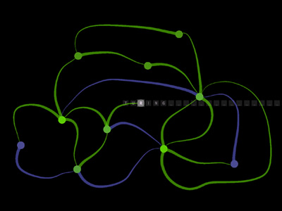 917 917 | computer graphics by Jared Schiffman Turing is an interactive visualization of Alan Turing's famous computational machine. It is the first in a series of projects which aim to make the process of programming more intuitive. A Turing machine is essentially a miniature model of a computer with a memory tape, and a memory-reading head. Upon reading the current letter on the tape, the head may write a new letter onto the tape, and then move left or right on the tape. The logic in the machine is embodied in the transitions between the states. Each transition has associated with it an input symbol, an output symbol, and a selection between left and right. If the letter on the tape matches the input symbol, the output symbol is written to the tape, and it then moves left or right. It has been proven in fact that any thing which could be computed, could be done on a Turing machine. |
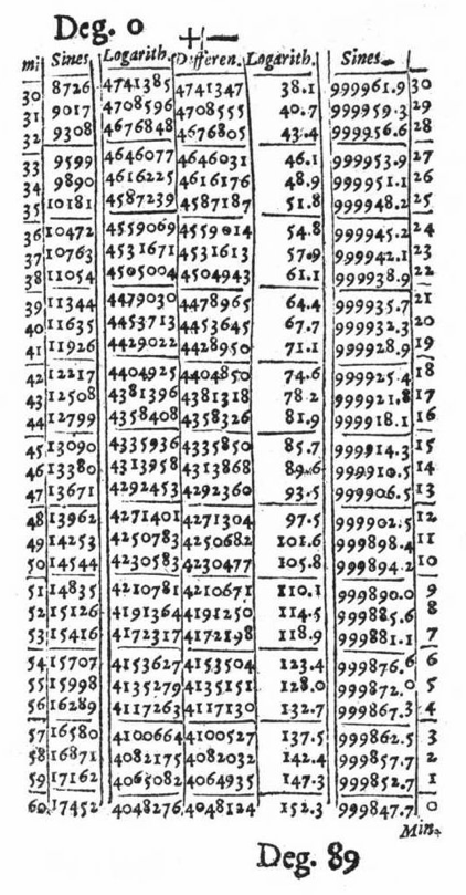 26 26 | 1614 print by John Napier (1550-1617), Scotland Invention of logarithms, and the first published tables of logarithms. Napier, J. (1614). Mirifici logarithorum canonis descriptio. (English translation, A Description of the Admirable Table of Logarithms, published in 1616 by Edward Wright, London: Nicholas Okes). |
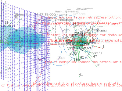 953 953 | 2004 computer graphics by (unknown) txtkit is an Open Source visual text mining tool for exploring large amounts of multilingual texts. It's a multi-user application which mainly focuses on the process of reading and reasoning as a series of decisions and events. To expand this single perspective activity txtkit collects all of the users mining data and uses them to create content recommendations through collaborative filtering. The txtkit interface is divided into two parts: txtshell (shell interface) and txtvbot (visual bot). txtshell provides several commands to browse, to read and to select text, whilst txtvbot displays the user activity in real-time. The visualization is based on the users actions, statistical information about the data as well as collaborative filtering schemes. Therefore, the complexity of its visual output relates to the increasing number of users. |
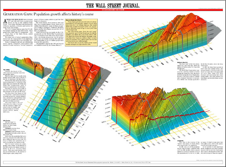 597 597 | computer graphics by Karl Hartig Three views of a three-dimensional model created with U.S. Census data. The model is a visualization of the distribution of people in the U.S. population from birth to age 100, for each year from 1900 through 2050. The wave down the middle is the Baby Boom moving though time. The valley in front of it is the effect of The Great Depression on the birth rate. |
 649 649 | computer graphics (Graphviz) by Graphviz - Graph Visualization Software The fdp layout program supports edges between nodes and clusters and cluster-to-cluster. The syntax is fairly obvious. fdp is being actively worked on, so the probability of hitting a bug is higher than with neato. Also the quality of the layouts will be improving. |
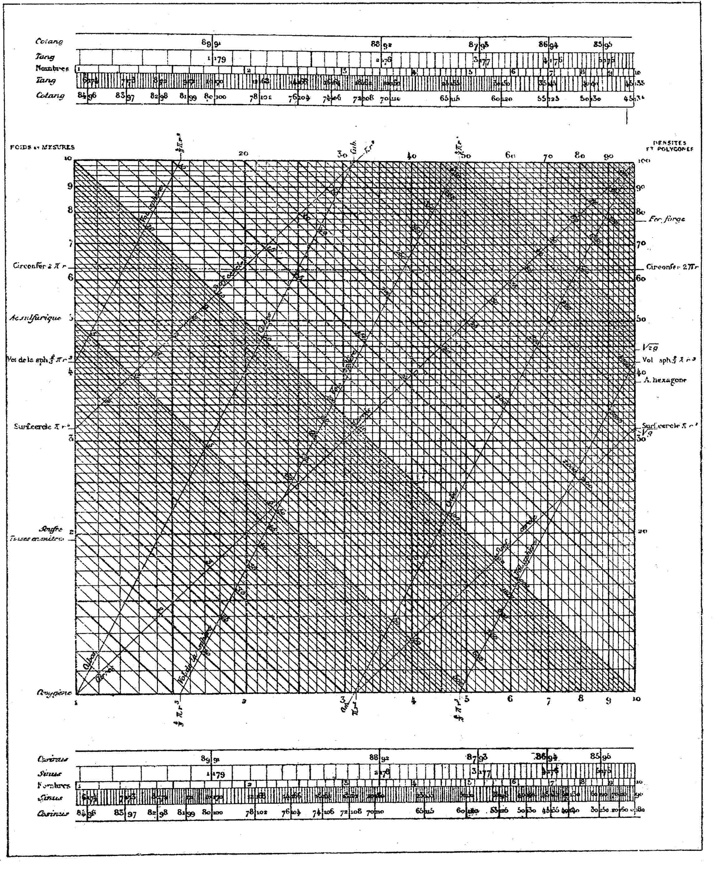 67 67 | 1846 print by Léon Lalanne (1811-1892), France Logarithmic grid (the first log-log plot, as a nomogram for showing products from the factors). Lalanne, L. (1846). Mémoire sur les tables graphiques et sur la géométrie anamorphique appliquées a diverses questions qui se rattachent a l'art de l'ingénieur. Annales des Ponts et Chausées, 2e series, 11:1-69. Read 1843. |
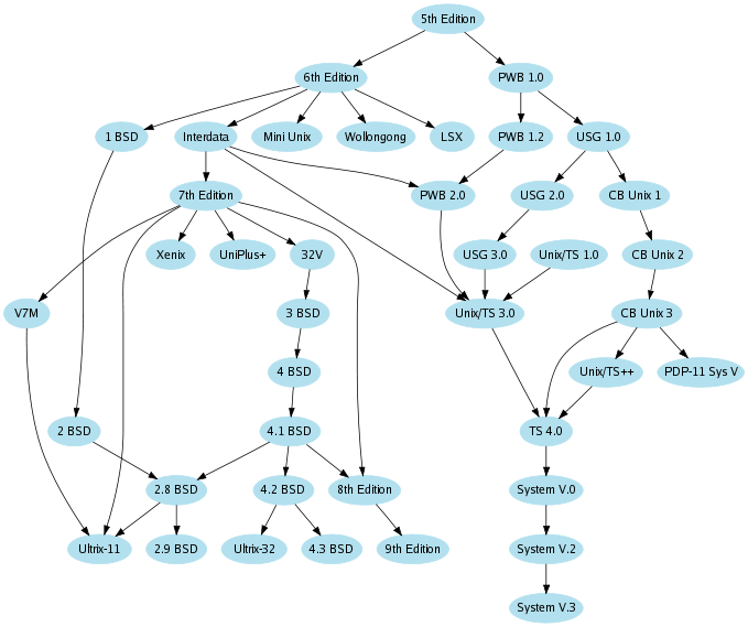 646 646 | 1984 computer graphics (Graphviz) by after Ian Darwin and Geoff Collyer This is our earliest example file (Graphviz). The graph was originally hand-drawn by Ian Darwin and Geoff Collyer in 1984 and 1986, though we added to it a little. |
 153 153 | 1983 computer graphics by Mark Monmonier, USA Visibiltiy Base Map, a map of the United States where areas are adjusted to provide a readily readable platform for area symbols for smaller states, such as Delaware and Rhode Island, with compensating reductions in the size of larger states. Monmonier, M. and Schnell, G. (1983). The Study of Population: Elements, Patterns, Processes. Columbus, OH: Charles E. Merrill. |
 148 148 | 1975 computer graphics by William S. Cleveland and Beat Kleiner, USA USA 1970 Draft Lottery Data, with median and quartile traces. Enhancement of scatterplot with plots of three moving statistics (midmean and lower and upper semimidmean). Cleveland, W. S. and Kleiner, B. (1975). A graphical technique for enhancing scatterpiots with moving statistics. In Proceedings of the Annual Meeting. American Statistical Association, Atlanta, GA. |
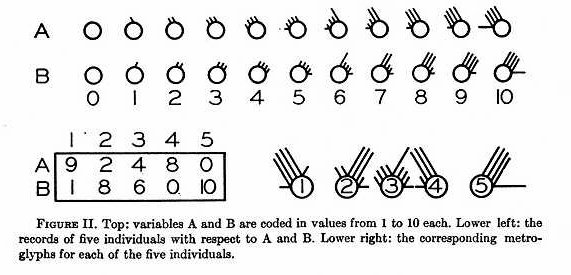 128 128 | 1957 print by Edgar Anderson, USA Circular glyphs, with rays to represent multivariate data. Anderson, E. (1957). A semigraphical method for the analysis of complex problems. Proceedings of the National Academy of Sciences, 13(3):923-927. Reprinted in Technometrics, 2:387-391 (August 1960). |
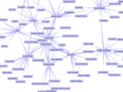 1014 1014 | 2003 computer graphics by Christian Langreiter The goal of this project is to envision and implement compelling, useful and/or enlightening visualizations of the Vanilla snip/link structure. Vanilla is a simple, extensible hypertext system and framework for developing small-scale web applications written in REBOL. The first incarnation of vanilla-vista uses TouchGraph, a Java framework for creating dynamic graph visualizations developed by Alex Shapiro. On langreiter.com, one can experience vanilla-vista in many ways throughout the site by clicking on a particular icon whenever one can spot it (e.g. at the upper right in the header of snips). A very interesting application of vanilla-vista (available at langreiter.com) is visualizing Google sets, in particular when mapping the relationships and sphere of influence of a particular person, such as Isaac Newton, Plato, Galileo, or Frank Sinatra. Once the initial graph has loaded, you can wander further by double-clicking on a node (which loads the next few neighbouring nodes, should there be any). Be sure to right-click on nodes to see more options (like jumping to the node of interest in the browser). |
 88 88 | 1880 print by John Venn (1834-1923), England Representation of logical propositions and relations diagrammatically. [Actually, Liebnitz and, to some degree, Euler had used such diagrams previously.]. Venn, J. (1880). On the diagrammatic and mechanical representation of propositions and reasonings. The London, Edinburgh, and Dublin Philosophical Magazine and Journal of Science, 9:1-18. Venn, J. (1881). Symbolic Logic. London: MacMillan. |
 1013 1013 | 2005 computer graphics by Gerhard Dirmoser In the last years, Gerhard Dirmoser has developed a set of strikingly complex visualization posters under the theme "Art-in-Context" (Die Kunst der Ausstellung). The form of this context is usually a diagram in the size of a poster (aprox. 240cm x 180cm), split in 4 parts. Dirmoser has been systematically observing and analyzing Ars Electronica for 25 years, and has produced a thematic graphic representation of all perspectives, aspects and individuals that seem relevant to Ars Electronica. In this piece, Verben im Kontext (Verbs in Context) - How to do things with words, Dirmoser maps 44,000 verbs used in the texts generated by the past 25 years of Ars Electronica. |
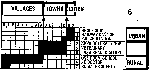 170 170 | 1981 Data are often presented in a table or chart whose rows and columns are intrinsically unordered, but which are arranged in an order which conceals patterns, rather than reveal them. The top figure shows a classification of townships (columns) by binary characteristics (rows, presence or absence), both arranged in arbitrary order. Can you see any patterns or trends? One of Bertin's graphical methods consists simply of permuting the rows and columns to place similar rows and columns together. This gives the bottom figure, where now the trends are clear. See also: Harri Siirtola's The Reorderable Matrix (Java 1.1 Applet, + you need Swing) for an interactive demo. The Jacques Bertin, Semiologie Graphique web site has a nice dynamic display of the reorderable matrix. [Source: Bertin (1981), Graphics and Graphic Information Processing.] |
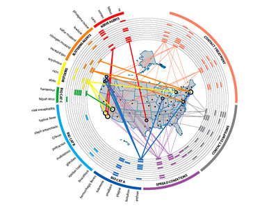 963 963 | 2005 computer graphics by Yarden Livnat, Jim Agutter, Shau Presented at the Infovis 2005 Conference in Minneapolis, MN (USA), VisAware reveals a novel visual correlation paradigm that takes advantage of human perceptive and cognitive facilities in order to enhance users' situational awareness and support decision-making. The first image reflects VisAware used in a Biowatch scenario where its structure classifies agents in colored sections around a ring. It shows the different categories of biological agents and the different types of chemical agents (i.e. blistering and nerve agents). With the map in the middle, it is easy to correlate the presence of agents to the sensor that detected it. The correlating line has a variable width that shows the probability of the agent under analysis; the thicker the line the greater the probability of an actual attack. The second image shows VisAlert, a visualization method for network intrusion detection. The authors based their approach on representing the network alerts as connections between two domains. These two domains are a one dimensional domain representing the node attribute, and a two-dimensional domain representing the time and type attributes. A network alert instance, in this scheme, is thus a straight line from a point in the type-time domain to a point in the node domain. They choose to separate the node attribute from the type and time as nodes provide a more or less static set of objects that can be used as visualization anchors for the transient alert instances. |
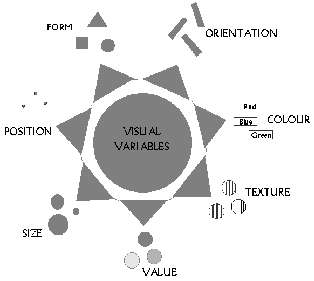 120 120 | 1967 print by Jacques Bertin (1918-), France Comprehensive theory of graphical symbols and modes of graphics representation. Jacques Bertin published the monumental Semiologie Graphique (1967). To some, this appeared to do for graphics what Mendeleev had done for the organization of the chemical elements, that is, to organize the visual and perceptual elements of graphics according to the features and relations in data. Bertin, J. (1967). Sémiologie Graphique: Les diagrammes, les réseaux, les cartes. Paris: Gauthier-Villars. Bertin, J. (1983). Semiology of Graphics. Madison, WI: University of Wisconsin Press. (trans. W. Berg). |
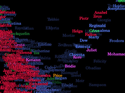 739 739 | 1995 computer graphics by Judith S. Donath The population of a real-world community creates many visual patterns. Some are patterns of activity: the ebb and flow of rush hour traffic or the swift appearance of umbrellas at the onset of a rain-shower. Others are patterns of affiliation, such as the sea of business suits streaming from a commuter train, or the bright t-shirts and sun-glasses of tourists circling a historic site.rnrnVisual Who makes these patterns visible. It creates an interactive visualization of the members' affiliations and animates their arrivals and departures. The visualization uses a spring model. The user chooses groups (for example, subscribers to a mailing-list) to place on the screen as anchor points. The names of the community members are pulled to each anchor by a spring, the strength of which is determined by the individual's degree of affiliation with the group represented by the anchor. The visualization is dynamic, with the motion of the names contributing to the viewer's understanding of the underlying data. |
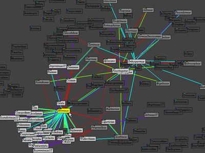 1064 1064 | 2000 computer graphics by Martin Graham Acknowledging that most of the efforts of tree structure visualization concentrate on visualising the structure and properties of just a single tree, Martin Graham's PhD premise was to develop a metaphor that allows users to explore the relations and properties of and across multiple tree structures. With that in mind, from 2000 onward, Martin Graham and his colleagues developed a series of graph visualizations of overlapping taxonomic data. Overlapping hierarchies could be switched on/off with colour indicating relationships in a particular hierarchy. Eventually they moved to a multiple tree format as a preferred visualisation after feedback from users. |
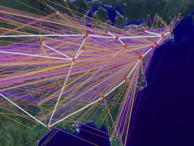 729 729 | 1994 computer graphics by Cox, Donna; Patterson, Robert This high-definition computer animation educates general audiences about the exponential growth of networking in the US and world. A data visualization spanning a two-year period represents rapid traffic growth that exceeds ten's of billions of bytes per day. The first image represents byte traffic into the ANS/NSFNET T3 backbone from its client networks for the month of December'94. The virtual connections, colored by traffic level, visualize traffic statistics collected by Merit Network Incorporated. The line colors represent traffic levels ranging from 0 bytes (purple) to one trillion bytes (white) The second image is a visualization study of inbound traffic measured in billions of bytes on the NSFNET T1 backbone for September 1991. The traffic volume range is depicted from purple (zero bytes) to white (100 billion bytes). |
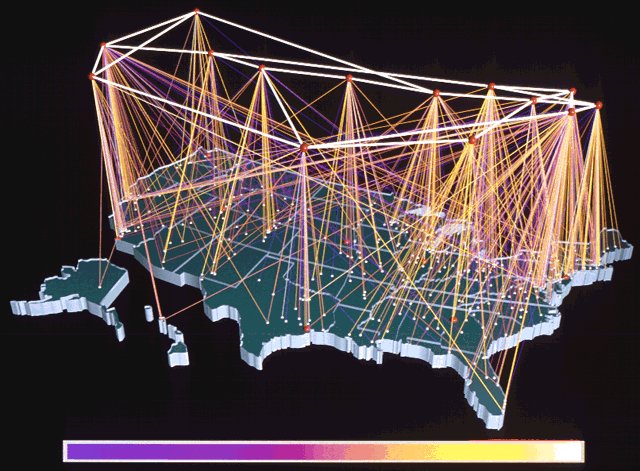 303 303 | 1992 computer graphics by Donna Cox and Robert Patterson, NCSA A fascinating Visualization Study of the NSFNET, undertaken by Donna Cox and Robert Patterson from the NCSA in 1992. |
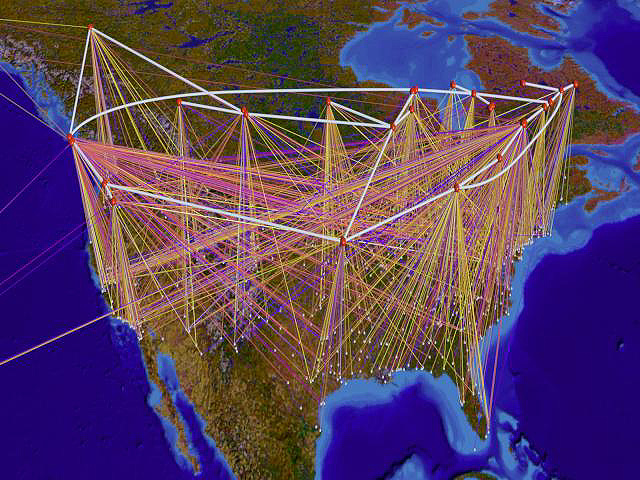 304 304 | 1992 computer graphics by Donna Cox and Robert Patterson A fascinating Visualization Study of the NSFNET, undertaken by Donna Cox and Robert Patterson from the NCSA in 1992. |
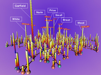 912 912 | 2003 computer graphics by Katy Borner, Chaomei Chen, Kevin Advanced data mining and information visualization techniques can be applied to support science and technology management. Large amounts of, e.g., publication, patent, and grant data are analyzed, correlated, and visualized to map the semantic space of researchers, publications, funding, etc.. The resulting visualizations can be utilized to objectively identify major research areas, experts, institutions, grants, publications, journals, etc. in a research area of interest. In addition, they can assist identify interconnections, the import and export of research between fields, the dynamics (speed of growth, diversification) of scientific fields, scientific and social networks, and the impact of strategic and applied research funding programs among others. Using a tutorial style, various algorithms were applied to map papers related to "Visualizing Knowledge Domain" research, the so called ARIST data set. Never before have so many knowledge domain mapping algorithms been applied to one data set. |
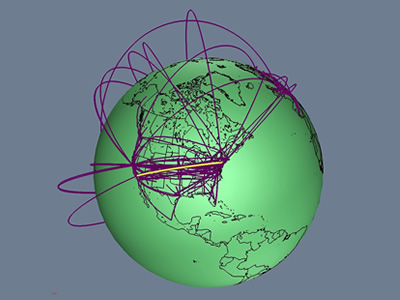 736 736 | 1996 computer graphics by Tamara Munzner, Eric Hoffman, K. We present a case study of visualizing the global topology of the Internet MBone. Developed and initially deployed by researchers within the Internet community, the MBone has been extremely popular for efficient transmission across the Internet of real-time video and audio streams such as conferences, meetings, congressional sessions, and NASA shuttle launches. The MBone, like the Internet itself, grew exponentially with no central authority. The resulting suboptimal topology is of growing concern to network providers and the multicast research community. We create a geographic representation of the tunnel structure as arcs on a globe by resolving the latitude and longitude of MBone routers. The interactive 3D maps permit an immediate understanding of the global structure unavailable from the data in its original form as lines of text with only hostnames and IP addresses. Data visualization techniques such as grouping and thresholding allow further analysis of specific aspects of the MBone topology. |
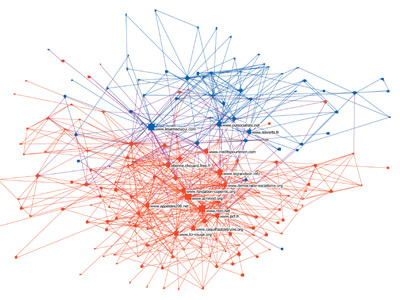 925 925 | 2005 computer graphics by Franck Ghitalla, Guilhem Fouetil This visualization reflects the impact of blogs and websites in swinging public opinion on the May referendum about European Constitution in France. The goal of this study was to better understand the political debate on the Web and how it is structured in terms of sites correlations. Taking as treating starting point ten sites of the referendum, the authors repatriated more than 12.000 sites and 2.500.000 pages. After an extensive automated filtering process seeking for words or expressions in connection with the debate, 295 sites were selected and classified in either sites of Yes or sites of No. The No campaign set up 161 of the 295 sites focusing on the constitutional debate, helping redress a bias towards the Yes campaign in the mainstream media. The No vote eventually won the referendum on May 29 with a 55 per cent majority. It is the community of No which is densest, 76% of its bonds are intercommunity against 52,5% for Yes. If one brings back these figures to the respective sizes of the communities and calculates the coefficient of opening for each community, there's a coefficient of opening 20% more significant for the community of Yes than for that of No. In the depicted graph, red nodes denote the No sites while the blue ones reflect the Yes. Edges express relationships (linkage) and the nodes' size represents the level of authority (popularity), in analogy to GoggleRank. |
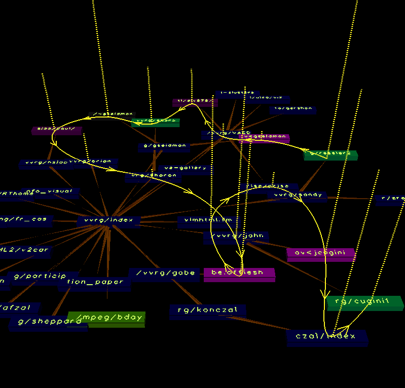 461 461 | computer graphics by John Cugini The image above is a VISVIP visualisation of a user path through a Web site. It was developed by John Cugini and colleagues in the Visualization and Virtual Reality Group at the National Institute of Standards and Technology, USA. The user's path through the site is shown by the curving yellow line overlaid on the site structure. The length of time spent at each page is represented by the height of dotted line projecting up from the graph. |
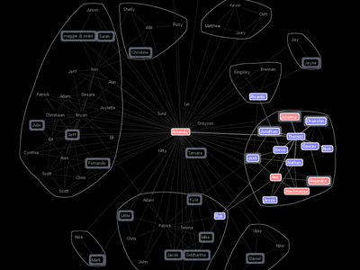 797 797 | 2004 computer graphics by Jeffrey Heer Vizster is an interactive visualization tool for online social networks, allowing exploration of the community structure of social networking services such as friendster.com, tribe.net, and orkut. Such services provide means by which users can publicly articulate their mutual "friendship" in the form of friendship links, forming an undirected graph in which users are the nodes and friendship links are the edges. These services also allow users to describe themselves in a profile, including attributes such as age, marital status, sexual orientation, and various interests. Vizster provides a visualization of such services, providing an interactive sociogram for exploring the links between network members. In addition to visualizing "friendship" linkages, Vizster supports a range of exploratory search features, providing visualization of the rich profile data characteristic of these services, features which traditional sociograms are not designed to communicate. |
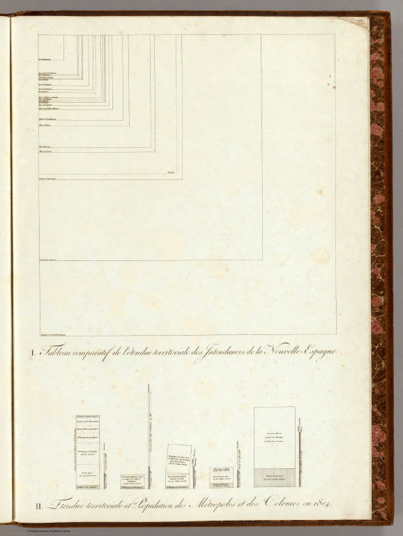 71 71 | 1811 print by Alexander von Humboldt (1769-1859), Germany Charts using subdivided bar graphs, and superimposed squares, showing the relative size of Mexican territories and populations in the colonies. von Humboldt, A. (1811). Atlas Géographique et Physique du Royaume de la Nouvelle-Espagne. Paris: F. Schoell. |
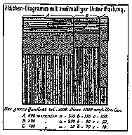 98 98 | 1877 print by Georg von Mayr (1841-1925), Germany First use of proportional, divided square in the modern (mosaic) form for data representation. Mayr, G. v. (1877). Die Gesetzmäßigkeit im Gesellschaftsleben. Oldenbourg. |
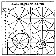 97 97 | 1877 print by Georg von Mayr (1841-1925), Germany First use of polar diagrams and star plots for data representation. Mayr, G. v. (1877). Die Gesetzmäßigkeit im Gesellschaftsleben. Oldenbourg. Ostermann, R. (1999). Georg von Mayrs beiträge zur statistichen graphik. Algemeines Statistiches Archiv, 83(3):350-362. |
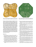 629 629 | Voronoi Treemaps200510 computer graphics by Michael Balzer, Oliver Deussen Treemaps are a well-known method for the visualization of at- tributed hierarchical data. Previously proposed Treemap layout algorithms are limited to rectangular shapes, which causes prob- lems with the aspect ratio of the rectangles as well as with identify- ing the visualized hierarchical structure. The approach of Voronoi Treemaps presented in this paper eliminates these problems through enabling subdivisions of and in polygons. Additionally, this allows for creating Treemap visualizations within areas of arbitrary shape, such as triangles and circles, thereby enabling a more flexible adap- tation of Treemaps for a wider range of applications. ... Similarly to the other Treemap layout algorithms, enhancements like borders, adaptive edge sizes, cushions, coloring, etc., may also be applied to the described layout method. This additionally sup- ports the user in the perception and interpretation of the Treemap visualization. Examples for such enhanced Voronoi Treemap lay- outs are presented in Figures 10–12. Figure 10: Enhanced AW Voronoi Treemap layout of 4075 nodes at 10 hierarchy levels (a brighter color indicates a lower hierarchy level) Figure 11: Enhanced PW Voronoi Treemap layout of 16288 nodes at 7 hierarchy levels (a brighter color indicates a lower hierarchy level) |
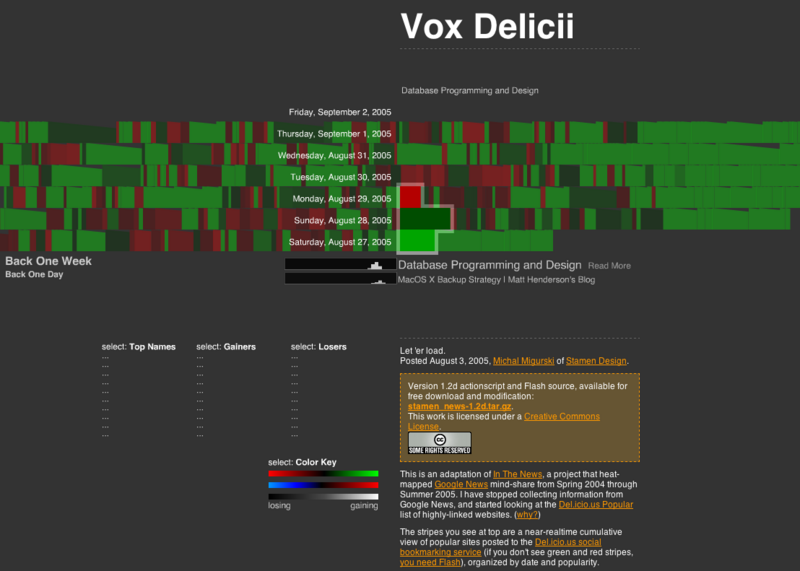 559 559 | 2005 computer graphics by Michal Migurski 2005-09-02: "In The News" moves from Google News to del.icio.us tags and is now called "Vox Delicii" From InfoVis:Wiki Michal Miguski's interesting work In The News (see 2005-07-21: "In The News" - Interactive Visualization of Google News) abandoned the visualization of Google News entries due to various issues regarding Google's News service and moved over to visualizing del.icio.us bookmark tags. The only downside is the disappearance of the Search functionality... Vox Delicii (del.icio.us bookmarks visualization) [Migurski, 2005] Related Information * 2005-07-18: Treemap representation of del.icio.us most popular bookmarks * 2005-07-21: "In The News" - Interactive Visualization of Google News [Migurski, 2005] Michal Migurski, Vox Delicii. Created at: August 3, 2005. Retrieved at: September 2, 2005. http://news.stamen.com/vox/ |
 205 205 | 1994 by David E. Joyce This is the simplest symmetry group. It consists only of translations. There are neither reflections, glide-reflections, nor rotations. The two translation axes may be inclined at any angle to each other. Its lattice is parallelogrammatic, so a fundamental region for the symmetry group is the same as that for the translation group, namely, a parallelogram. For many actual wallpaper patterns, translations are the only trasformations that leave the pattern invariant. One of the translation directions is vertical, up and down the wallpaper strip. Usually, horizontal transations are not invariant on commercial wallpaper. Instead, the pattern is raised or lowered on adjacent wallpaper strips. |
 214 214 | 1994 by David E. Joyce This is the first group with a 90° rotation, that is, a rotation of order 4. It also has rotations of order 2, that is, half-turns. The centers of the half-turns are midway between the centers of the order-4 rotations. There are neither reflections nor glide-reflections. The lattice is square, and a quarter of a square fundamental region for the translation group is a fundamental region for the symmetry group. (See accompanying image and legend on the website.) |
 215 215 | 1994 by David E Joyce This group differs from the last one (p4) in that it also has reflections. The axes of reflection are inclined to each other by 45° so that four axes of reflection pass through the centers of the order-4 rotations. In fact, all the rotation centers lie on the reflection axes. The lattice is square, and an eighth, a triangle, of a fundamental region for the translation group is a fundamental region for the symmetry group. There are glide reflections in this group as well, but the image is pretty cluttered even without their axes being drawn. The axes of the glide reflections are midway between parallel reflection axes. They go in all four directions just as the reflections axes do. Some of them pass through the centers of the half-turns (black dots), but others miss those centers. (See accompanying image and legend on the website.) |
 216 216 | 1994 by David E Joyce Like symmetry group 12, this group also contains reflections and rotations of orders 2 and 4. But the axes of reflection are perpendicular (none at 45°), and none of the centers of the rotations of order 4 lie on the reflection axes. Again, the lattice is square, and an eighth of a square fundamental region of the translation group is a fundamental region for the symmetry group. (See accompanying image and legend on the website.) |
 217 217 | 1994 by David E Joyce This is the first group that contains a 120° rotation, that is, a rotation of order 3, and the first one whose lattice is hexagonal. There are neither reflections nor glide-reflections. The basic hexagon of the lattice is divided into six equilateral triangles. The rotation centers can be found at the corners of these triangles and at the center of them. A fundamental region is one-third of one of these triangles. (See accompanying image and legend on the website.) |
 218 218 | 1994 by David E Joyce This group contains reflections (whose axes are inclined at 60° to one another) and rotations of order 3. Some of the centers of rotation lie on the reflection axes, and some do not. The lattice is hexagonal. A fundamental region for the symmetry group is one-sixth of an equilateral triangle for the lattice. There are glide reflections in this group as well. The axes of the glide reflections are midway between parallel reflection axes, so they miss the centers of all the rotations. They go in all three directions just as the reflections axes do. (See accompanying image and legend on the website.) |
 219 219 | 1994 by David E Joyce This group is similar to the group 14 in that it contains reflections and order-3 rotations. The axes of the reflections are again inclined at 60° to one another, but for this group all of the centers of rotation lie on the reflection axes. The lattice is hexagonal. Again, a fundamental region for the symmetry group is one-sixth of an equilateral triangle of the lattice. (See accompanying image and legend on the website.) |
 220 220 | 1994 by David E. Joyce This group contains 60° rotations, that is, rotations of order 6. It also contains rotations of orders 2 and 3, but neither reflections nor glide reflections. The lattice is hexagonal. A fundamental region for the symmetry group is one-sixth of an equilateral triangle of the lattice. (See accompanying image and legend on the website.) |
 221 221 | 1994 by David E Joyce This most complicated group has rotations of order 2, 3, and 6 as well as reflections. The axes of reflection meet at all the centers of rotation. At the centers of the order-6 rotations, six reflection axes meet and are inclined at 30° to one another. The lattice is hexagonal. A fundamental region for the symmetry group is one-twelfth of an equilateral triangle for the lattice. (See accompanying image and legend on the website.) There are glide reflections in this group as well, but the image is pretty cluttered even without their axes being drawn. The axes of the glide reflections are midway between parallel reflection axes, so they pass through the centers of the half-turns (black dots). They go in all six directions just as the reflections axes do. |
 206 206 | 1994 by David E. Joyce This group differs only from the first group in that it contains 180° rotations, that is, rotations of order 2, also called "half-turns." As in all symmetry groups there are translations, but there are no reflections or glide-reflections. The two translation axes may be inclined at any angle to each other. The lattice is a parallelogrammatic. A fundamental region for the symmetry group is half of a parallelogram that is a fundamental region for the translation group. It may be a little difficult to see the half-turns, so their fixed points are covered with black dots in this image. Half-turn symmetries are subtile and aren't very easy to find. Note that in this example (as in all patterns with this symmetry) there are four essentially different centers of half-turns (see accompanying image on website). |
 207 207 | 1994 by David E. Joyce This is the first group that contains reflections. The axes of reflection are parallel to one axis of translation and perpendicular to the other axis of translation. There are no rotations or glide reflections. A fundamental region for the translation group is a rectangle, and one can be chosen that is split by an axis of reflection so that one of the half rectangles forms a fundamental region for the symmetry group. Reflections are usually easy to see. Also called "bilateral symmetries," humans seem to be designed to recognize them, although it helps if the axis of reflection is vertical. In the example, the axes of reflection are inclined, so it's a little harder to see them. They're drawn as red lines in an accompanying image on the website. |
 208 208 | 1994 by David E. Joyce This is the first group that contains glide-reflections. The direction of the glide reflection is parallel to one axis of translation and perpendicular to the other axis of translation. There are neither rotations nor regular reflections. The lattice is rectanglular, and a rectangular fundamental region for the translation group can be chosen that is split by an axis of a glide reflection so that one of the half rectangles forms a fundamental region for the symmetry group. On an accompanying image on the website you see the pattern marked up with lines for the axes of all the glide reflections. Some lie midway between the dark blue patches, but others lie along them. Half-turns were hard to see, but glide-reflections are even harder to see. A glide-reflecion is composed of a reflection across an axis and a translation along the axis. Here, the axis of the glide reflection is drawn in magenta. The green arrows on either side of it suggest the glide reflection. If you reflect across the magenta axis, then translate along it (either up or down), one green arrow will fall onto another green arrow on the other side of the axis. |
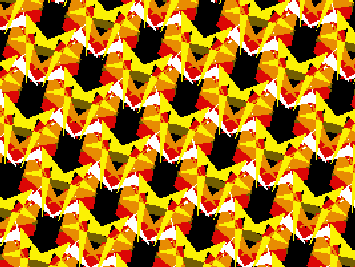 209 209 | 1994 by David E. Joyce This group contains reflections and glide-reflections with parallel axes. The translations may be inclined at any angle to each other, but the axes of the reflections bisect the angle formed by the translations, so the fundamental region for the translation group is a rhombus. A fundamental region for the symmetry group is half the rhombus. There are no rotations in this group. On an accompanying image on the website you see the pattern marked up with red lines for the axes of the reflections and green lines for the axes of the glide reflections. |
 210 210 | 1994 by David E. Joyce This symmetry group contains reflections whose axes are perpendicular. There are no glide-reflections (except those which have the same axis as an axis of reflection). The only rotations are half-turns whose fixed points lie at intersections of axes of reflection. The lattice is rectanglular, and a rectangle can be chosen for the fundamental region of the translation group so that a quarter-rectangle of it is a fundamental region for the symmetry group. You can see the axes of reflection in red in an accompanying image on the website. The black dots indicate the fixed points of half turns. |
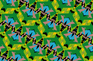 211 211 | 1994 by David E. Joyce This group has both reflections (with parallel axes) and half-turns. The fixed points of the half-turns do not lie on the axes of reflection. The lattice is rectangular, and a quarter-rectangle of a fundamental region for the translation group is a fundamental region for the symmetry group. On an accompanying image on the website, you see the image marked up with red lines for the axes of reflections, green lines for the axes of glide reflections, and black dots for the fixed points of the half-turns. We'll continue to use these conventions for the remaining images. Although the previous symmetry group also had reflections and half-turns, you can see the differences in the placement of the axes and fixed points. |
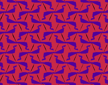 212 212 | 1994 by David E. Joyce This group contains no reflections, but it has glide-reflections and half-turns. There are perpendicular axes for the glide-reflections, and the fixed points of the half-turns do not lie on these axes. Again, the lattice is rectangular, and a quarter-rectangle of a fundamental region for the translation group is a fundamental region for the symmetry group. In an accompanying image on the website, the fixed points of the half-turns are indicated by black dots, and the axes of the glide-reflections are drawn in green. |
 213 213 | 1994 by David E. Joyce This group has perpendicular reflection axes, as does group 6 (pmm), and has half-turns, that is, rotations of order 2. Some of the centers of the the half-turns lie on the intersections of the axes of reflection, but others lie on the intersections of the axes of the glide reflections. The lattice is rhomic, and a quarter of a fundamental region for the translation group is a fundamental region for the symmetry group. In an accompanying image on the website, the fixed points of the half-turns are indicated by black dots, and the axes of the glide-reflections are drawn in green and axes of reflection in red. |
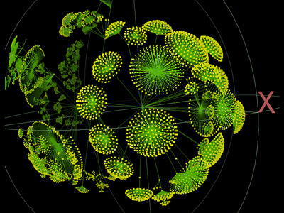 746 746 | 2001 computer graphics by Young Hyun Walrus is an interactive visualization tool that allows the analyst to view massive graphs from any position. The graph is projected inside a 3D sphere using a special kind of space based hyperbolic geometry. This is a non-Euclidean space, which has useful distorting properties of making elements at the center of the display much larger than those on the periphery. You interact with the graph in Walrus by selecting a node of interest, which is smoothly moved into the center of the display, and that region of the graph becomes greatly enlarged, enabling you to focus on the fine detail. Yet the rest of the graph remains visible, providing valuable context of the overall structure. Hyperbolic space projection is commonly know as 'focus+context' in the field of information visualization and has been used to display all kinds of data that can be represented as large graphs in either two and three dimensions. |
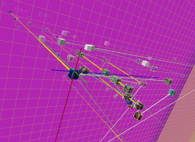 471 471 | 1998 computer graphics by Emmanuel Frécon WebPath is "... a tool that unobtrusively visualises a user's trail as they browse the Web", developed by Emmanuel Frécon, a researcher in the Distributed Collaborative Environments group at SICS, and Gareth Smith in the Computing Department, at Lancaster University. See Frécon and Smith's 1998 paper for more information. "WebPath - A three-dimensional Web History", IEEE Symposium on Information Visualization (InfoVis '98), Chapel Hill. NC, USA. |
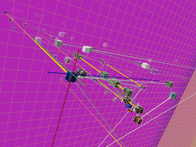 813 813 | computer graphics by Emmanuel Frecon and Gareth Smith These images show WebPath, "... a tool that unobtrusively visualises a user's trail as they browse the Web", developed by Emmanuel Frecon, a researcher in the Distributed Collaborative Environments group at SICS, and Gareth Smith in the Computing Department, at Lancaster University. For more information see Frecon and Smith's 1998 paper for more information. "WebPath - A three-dimensional Web History, IEEE Symposium on Information Visualization (InfoVis' 98), Chapel Hill. NC, USA." |
 656 656 | computer graphics by Teuvo Kohonen WEBSOM is a method for automatically organizing collections of text documents and for preparing visual maps of them to facilitate the mining and retrieval of information. The documents are in the points, or "pigeon-holes", of the map, and their contents can be browsed by clicking the points visible on the lowest level of the map display. You can use a full text search to find an interesting starting point for browsing. |
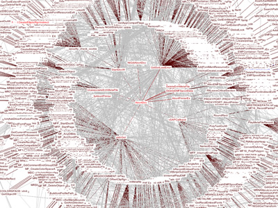 992 992 | computer graphics by Pedram Amini Founded in June of 2005 as the brainchild of Pedram Amini, the Open Reverse Code Engineering community was created to foster a shared learning environment among researchers interested in the field of reverse engineering. OpenRCE aims to serve as a centralized resource for reverse engineers (currently heavily win32/security/malcode biased) by hosting files, blogs, forums articles and more. The Win32 Call Chains database, initially contributed to OpenRCE by Pedram Amini, attempts to provide a useful and comprehensive interface to the function call trees of the main Microsoft Windows Dynamic Link Libraries (DLLs). The data-set was originally contructed during the development of a proof of concept Windows Intrusion Prevention System (IPS), similar to NAI Entercept and Okena/Cisco CSA. The database is organized by each Windows Operating System version (2000, 2003 SE, XP) and can be easily browsed and searched. Within each OS version, there's an interactive Java visualization for every module which creates some of the most amazingly complex graphs. The first image shows the resulting graph of Windows XP SP2 GDI32 module, while the second represents the NETAPI32 module of the same OS. |
 70 70 | 1843 print by Léon Lalanne (1811-1892), France Use of polar coordinates in a graph (frequency of wind directions). Lalanne, L. (1845). Appendice sur la representation graphique des tableaux météorologiques et des lois naturelles en général. In L. F. Kaemtz (ed.), Cours Complet de Météorologie, pp. 1-35. Paulin. Translated and annotated by C. Martins. |
 647 647 | computer graphics (Graphviz) by after Forrester This is a graph from Forrester's book World Dynamics. It originally appeared as an example in the Messinger [sic], Rowe et al paper on the GRAB system. We (Graphviz) added "same rank" constraints to force a certain level assignment, to evaluate edge crossing avoidance heuristics. |
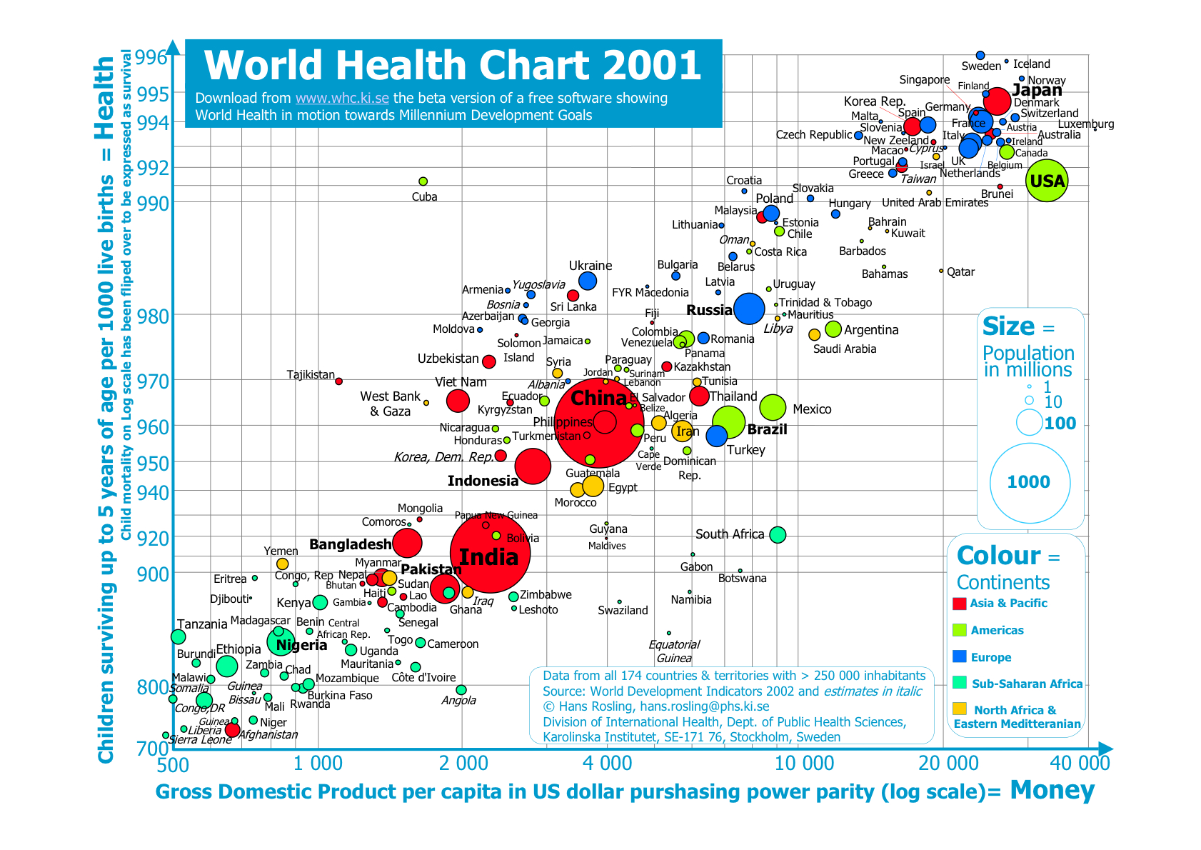 174 174 | 2002 print, interactive computer graphics by Hans Rosling, Stockholm, Sweden Making complex information about social and human development throughout the world available and understandable is as difficult as it is important. Gapminder is a project in Malmo, Sweden designed to produce accessible, easily used interactive software used to study trends in data on world income distribution, human health and development, and similar topics. In addition to the very nice interactive applications, the static graphs are also models of clarity of graphic design. Data from all 174 countries & territories with > 250 000 inhabitants Source: World DevelopmentIndicators2002 and estimatesin italic © Hans Rosling, hans.rosling@phs.ki.se Division of International Health, Dept. of Public Health Sciences, Karolinska Institutet, SE-171 76, Stockholm, Sweden Interactive version: http://www.whc.ki.se/index.php |
 73 73 | 1838 print by Heinrich Berghaus (1797-1884), Germany Physical atlas of the distribution of plants, animals, climate, etc., one of the most extensive and detailed thematic atlases; most of the maps contained tables, graphs, pictorial profiles of distributions over altitude, and other visual accompanyments. Berghaus, H. (1838). Physikalischer Atlas. Gotha: Justus Perthes. 2 vols., published 1845-48. |
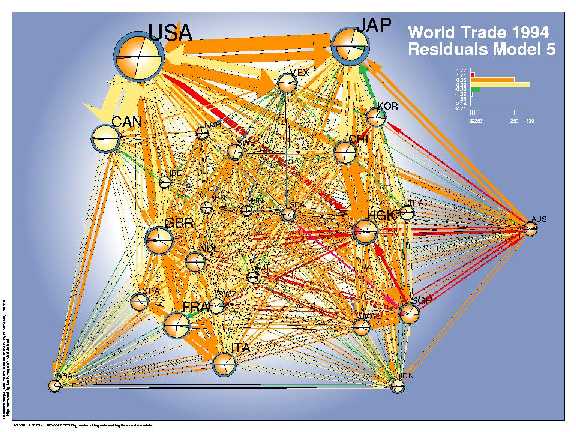 176 176 | 1998 by Lothar Krempel and Thomas Plumper Network diagrams are often used to show the relations between pairs of objects. Among other difficulties, it is hard to produce a pleasing arrangement of the nodes and links, and hard to use a network diagram as a data display. Krempel and Plümper used the geographic distances among 26 countries with a spring-embedding algorithm to obtain a simplistic geographical layout. They fit a series of regression models predicting the amount of bilateral trade between these countries, and used the network diagram to show both the data (trade volume) and the residuals (errors) from a given model. This visual procedure was used to suggest additional variables to be included into the models. The network diagrams show the volumes of bilateral trade (sizes of the arrows) and use colors to depict the errors of a given model--- which countries trade more than estimated (orange, red) or less (green, blue). The size of the country symbols stands for their volume of trade (in $ US), the balance of trade can be read from the comparision of the imports (bottom) and the exports (top). The pie slices indicate the degree to which the volume of the imports and exports (size) of a single country are overestimated respectively underestimated (colors). Model 2, which accounts for geographical distance and the GDP of the importing and exporting countries, shows a systematic regional imperfection of the estimates for the Pacific region. An enhanced model accounts additionally for joint borders, joint oceans regional economic areas and yields an improved fit. Nevertheless one can easily detect a systematic component in the errors, which points to the importance of the former British Commonwealth (GBR - HKG - AUS) for which the trade volumes are systematically underestimated. From Lothar Krempel and Thomas Plümper, Exploring the Dynamics of International Trade by Combining the Comparative Advantages of Multivariate Statistics and Network Visualisations An online version and the color images are available under: Version 2.1. 14.07.1998 http://www.mpi-fg-koeln.mpg.de/~lk/netvis/visualtrade |
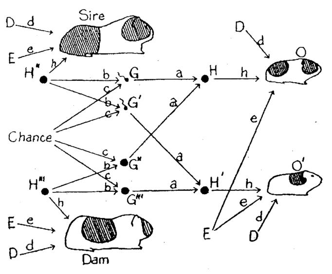 114 114 | 1920 print by Sewall Wright (1889-1988), USA Invention of the path diagram to show relations among a network of endogenous and exogenous variables forming a system of structural equations. Wright, S. (1920). The relative importance of heredity and environment in determining the piebald pattern of guinea-pigs. Proceedings of the National Academy of Sciences, 6:320-332. |
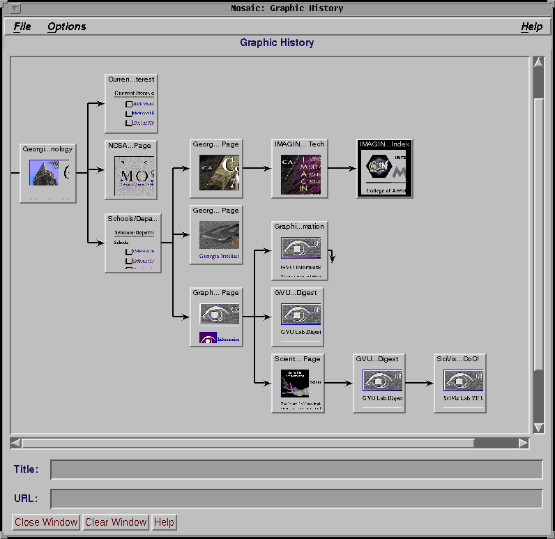 474 474 | 1995 computer graphics by Eric Ayers and John Stasko The WWW Graphic History Browser developed by Eric Ayers and John Stasko at Graphics Visualization, and Usability Center, Georgia Tech in 1995. Further information on this surf map is contained in their paper "Using Graphic History in Browsing the World Wide Web", from The Fourth International World Wide Web Conference. |
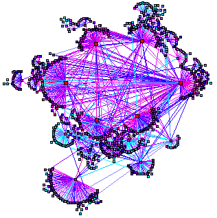 685 685 | computer graphics (PLankton) |
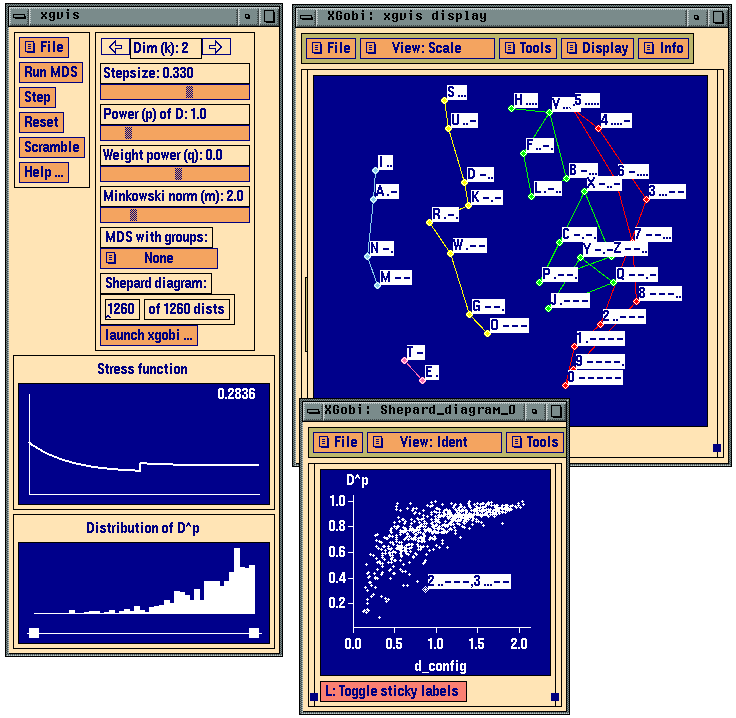 139 139 | 1991 computer graphics (XGvis) by Andreas Buja, Deborah F. Swayne, Michael L. Littman, Nathaniel Dean From 1991 to 1996, there was a spate of development and public distribution of highly interactive systems for data analysis and visualization, e.g., XGobi, ViSta by Deborah Swayne, Di Cook, Andreas Buja, and Forrest Young (1940-2006). Buja, A., Asimov, D., Hurley, C., and McDonald, J. A. (1988). Elements of a viewing pipeline for data analysis. In William S. Cleveland and M. E. McGill (eds.), Dynamic Graphics for Statistics. Pacific Grove, CA: Brooks/Cole. Swayne, D. F., Cook, D., and Buja, A. (1992). XGobi: Interactive dynamic graphics in the X Window System with a link to S. In Proceedings of the 1991 American Statistical Association Meetings, pp. ??-?? American Statistical Association. Buja, A., Cook, D., and Swayne, D. F. (1996). Interactive high-dimensional data visualization. Journal of Computational and Graphical Statistics , 5 (1):78-99. Swayne, D. F., Cook, D., and Buja, A. (1998). XGobi: Interactive dynamic data visualization in the X Window System. Journal of Computational and Graphical Statistics, 7(1):113-130. Young, F. W. (1994). ViSta: The Visual Statistics System . Tech. Rep. RM 94-1, L.L. Thurstone Psychometric Laboratory, UNC. |
 833 833 | 2002 computer graphics by Alex Adai LGL (Large Graph Layout) is a compendium of software applications for making the visualization of large networks and trees tractable. LGL was specifically motivated by the need to make the visualization and exploration of large biological networks more accessible. The website contains a rich gallery with a collection of different graphs and trees generated by LGL from different sources of biological data. This image represents a zoomed region of the Yeast Protein Interaction Map in 3D (VRML) |
 932 932 | 2005 computer graphics by (unknown) yFiles is an extensive Java class library that provides algorithms and components enabling the analysis, visualization, and the automatic layout of graphs, diagrams, and networks. The yFiles library offers the user many advantages, one of which is its ability to create, edit, and visualize large graphs with hundreds and thousands of elements. Here shown is a huge site map laid out and routed organically. For a large version of this image click here. |