Found 11 results for "telegeography":
 283 283 | 1995 computer graphics by TeleGeography Inc. Example of the statistical maps and diagrams produced by TeleGeography, Inc. This map shows European telecommunications traffic flows in 1995. [For more information see the Map of the Month article "TeleGeography's Traffic Flow Maps".] |
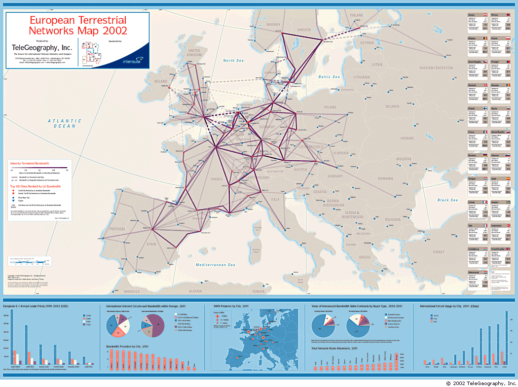 610 610 | 2002 computer graphics by TeleGeography |
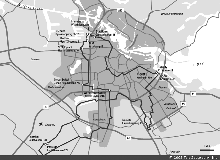 260 260 | 2002 computer graphics by TeleGeography, Inc. An example of the detailed city maps of fibre routes produced by TeleGeography. This example shows the Interoute's fibre ring for Amsterdam. TeleGeography's metropolitan area networks report provides technical data and detailed maps on many network providers in major U.S. and European cities. |
| | computer graphics by TeleGeography, Inc The TeleGeography, Inc. research consultancy tracks the global geography of submarine and satellite telecommunications infrastructure. They publish detailed maps, like this one. |
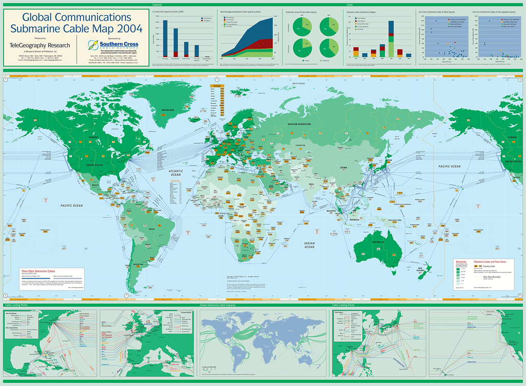 609 609 | 2004 computer graphics by TeleGeography |
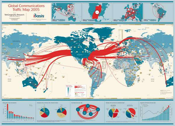 611 611 | 2005 computer graphics by TeleGeography |
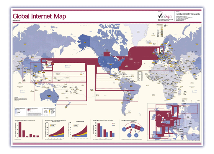 607 607 | 2006 computer graphics by TeleGeography TeleGeography's Global Internet Map 2006 shows the latest view of the internet's international infrastructure. The map features: * International internet bandwidth, scaled by capacity—covering backbones operated by more than 300 international Internet carriers as of mid-2005 * Detailed inset map showing intra-European internet bandwidth * Charts including international internet bandwidth growth, internet traffic and capacity growth forecasts through 2008, Gigabit Ethernet IP price declines, and interregional internet bandwidth * Countries color-coded to show international internet bandwidth * Dialing codes and internet domains for every country in the world * Country tags color-coded according to host density (Internet hosts per 10,000 people) |
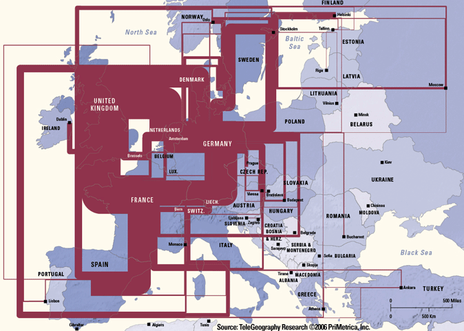 608 608 | 2006 computer graphics by TeleGeography TeleGeography's Global Internet Map 2006 shows the latest view of the internet's international infrastructure. The map features: * International internet bandwidth, scaled by capacity—covering backbones operated by more than 300 international Internet carriers as of mid-2005 * Detailed inset map showing intra-European internet bandwidth * Charts including international internet bandwidth growth, internet traffic and capacity growth forecasts through 2008, Gigabit Ethernet IP price declines, and interregional internet bandwidth * Countries color-coded to show international internet bandwidth * Dialing codes and internet domains for every country in the world * Country tags color-coded according to host density (Internet hosts per 10,000 people) |
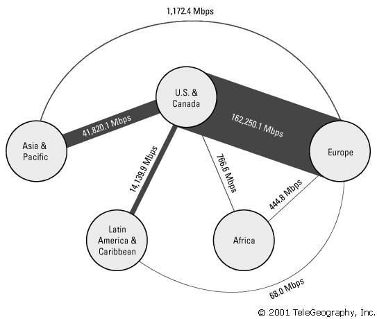 282 282 | 2001 computer graphics by TeleGeography, Inc. Example of the statistical maps and diagrams produced by TeleGeography, Inc. This map shows aggregate international Internet bandwidth between regions from 2001. [For more information see the Map of the Month article "TeleGeography's Traffic Flow Maps".] |
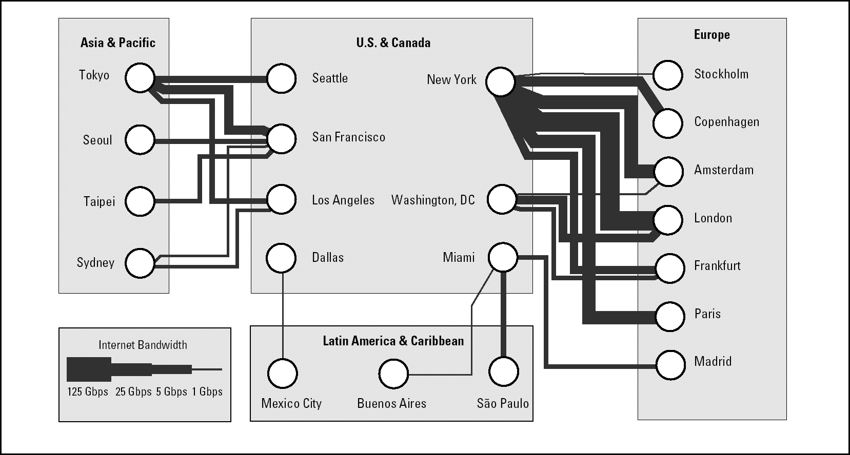 284 284 | 2001 computer graphics by TeleGeography, Inc. Example of the statistical maps and diagrams produced by TeleGeography, Inc. This map shows telegeography routes between regions from 2001. [For more information see the Map of the Month article "TeleGeography's Traffic Flow Maps".] |
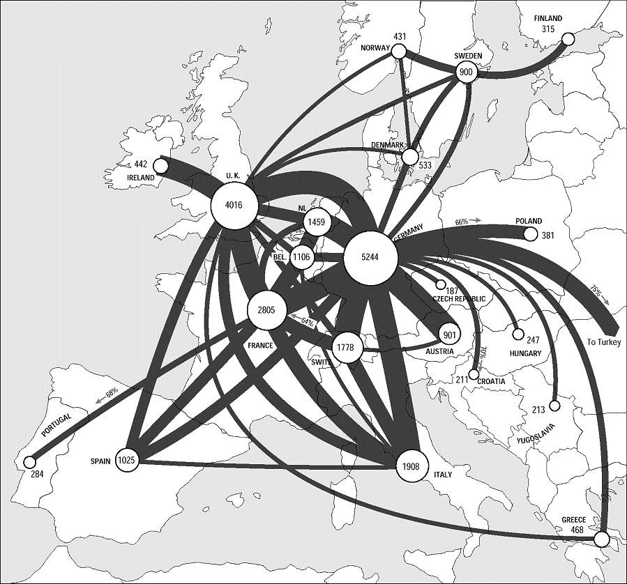
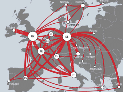 727 727 | 2000 computer graphics by (unknown) TeleGeography has produced arguably the best flows maps of the Net thus far, based on the volume of international telephone traffic between nations. Below is an example of one of their handcrafted telecommunications traffic flow maps for the European region. The map shows countries with traffic flows between them represented as smoothly curving red lines. The thickness of the lines is proportional to the annual volume of traffic between those two countries, measured in millions of minutes of voice telecommunication. (Note: only the principal route pairs, above a set threshold, are shown, to avoid cluttering the map.) Circular symbols, located on the capital city, encode the country's total annual outgoing traffic to all other countries. It is clear from the map that the UK, Germany, and France dominate traffic intra-European flows, forming a powerful triangle at the heart of the continent. Source: (http://mappa.mundi.net/maps/maps_014/) |