Found 45 results for "text":
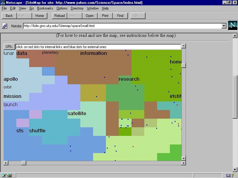 421 421 | computer graphics by Xia Lin, Drexel University This example is SiteMap developed by Xia Lin, Drexel University, maps part of the Web space relating to astronomy and space science as stored in the Yahoo directory. The hierarchical, text listing in Yahoo is transformed into landuse cybermap. |
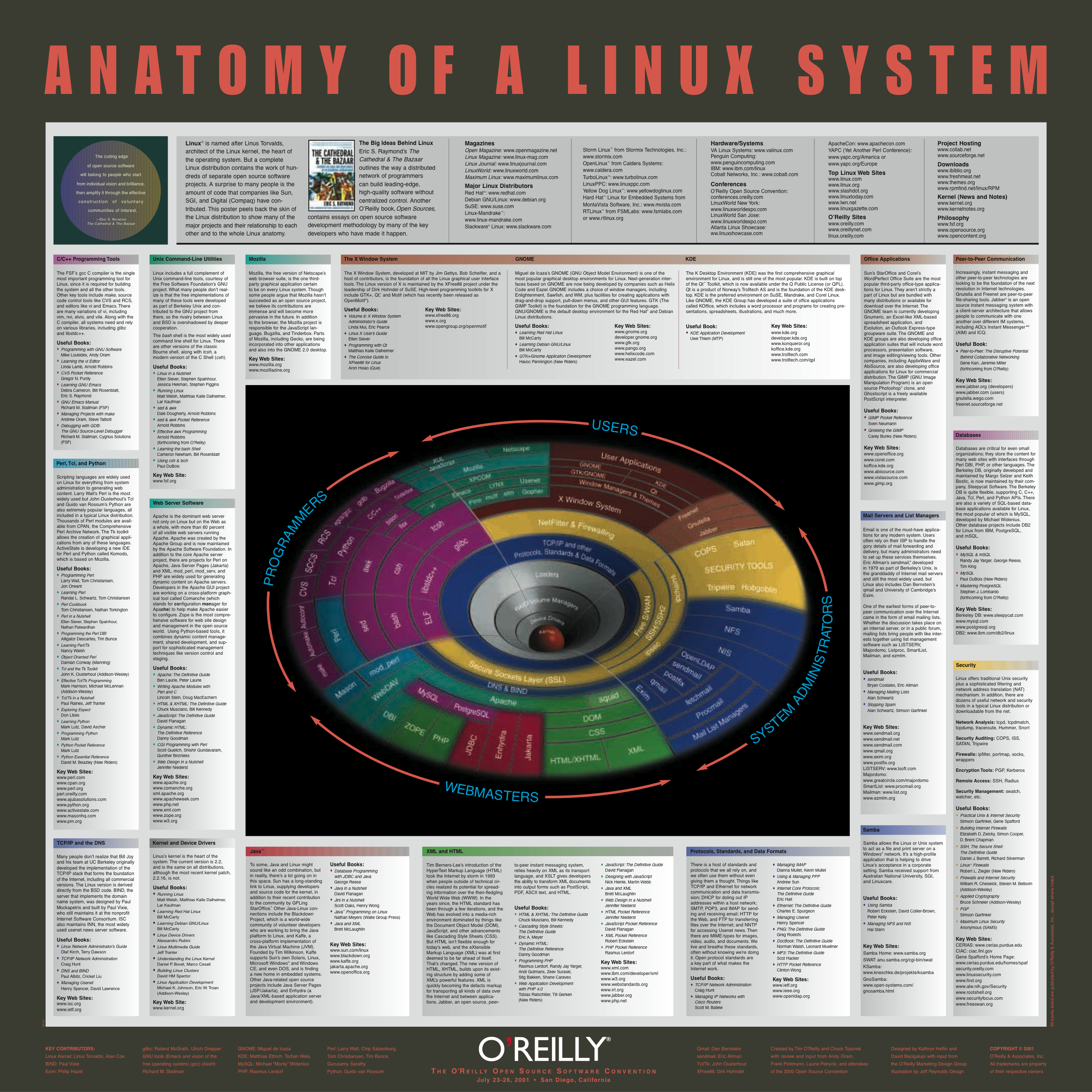 293 293 | 2001 computer graphics by O'Reilly This poster from O'Reilly, entitled "Anatomy of a Linux System", provides a conceptual map to key software components of this significant open source operating system, that powers much of the Internet. The aim is to "... give viewers a concise and comprehensive look at the Linux universe" and at the heart of the poster is a gravity well graphic showing the core software components, surrounded by explanatory text. Produced for The O'Reilly Open Source Software Convention in San Diego, California (July, 2001). |
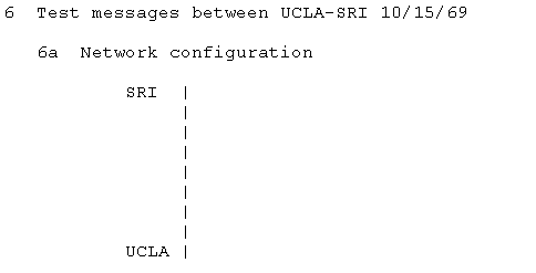 328 328 | 1969 ASCII text by Elmer B. Shapiro A very simple ascii map of the first network link on ARPANET between UCLA and SRI taken from RFC-4 Network Timetable, by Elmer B. Shapiro, March 1969. |
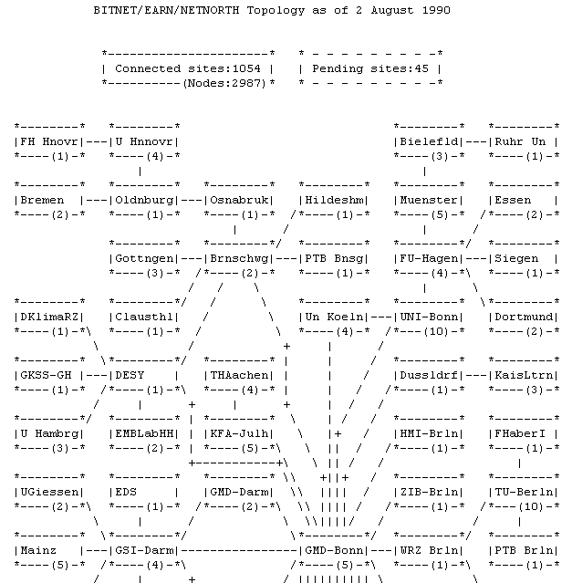 352 352 | 1981 ASCII text The topology of the BITNET in 1981 (partial map). |
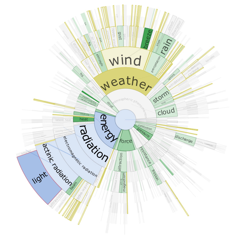 1266 1266 | 2006 Java by Christopher Collins DocuBurst is the first visualization of document content which takes advantage of the human-created structure in lexical databases. We use an accepted design paradigm to generate visualizations which improve the usability and utility of WordNet as the backbone for document content visualization. A radial, space-filling layout of hyponymy (IS-A relation) is presented with interactive techniques of zoom, filter, and details-on-demand for the task of document visualization. The techniques can be generalized to multiple documents. This image shows a DocuBurst graph rooted at "atmospheric phenomenon". Node opacity is directly related to the occurrences of related terms in the target text. The graph structure is the WordNet hyponymy tree. Gold coloured nodes are search results for words that start with "w". Blue nodes trace the path from the node under the mouse ("light") to the graph's root. |
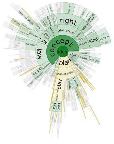 1264 1264 | 2006 Java by Christopher Collins DocuBurst is the first visualization of document content which takes advantage of the human-created structure in lexical databases. We use an accepted design paradigm to generate visualizations which improve the usability and utility of WordNet as the backbone for document content visualization. A radial, space-filling layout of hyponymy (IS-A relation) is presented with interactive techniques of zoom, filter, and details-on-demand for the task of document visualization. The techniques can be generalized to multiple documents. This image shows the occurrences of "idea" words in a general science textbook. The opacity of the node fill colour corresponds to the strength of occurrence of related terms in the target text. The graph structure is the WordNet hyponymy graph, rooted at "idea", and the gold coloured nodes match a search query for words starting with "pl". |
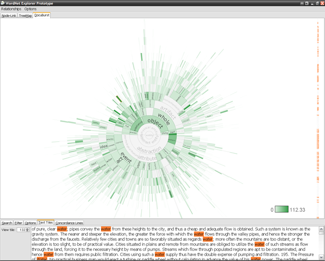 1265 1265 | 2006 Java by Christopher Collins DocuBurst is the first visualization of document content which takes advantage of the human-created structure in lexical databases. We use an accepted design paradigm to generate visualizations which improve the usability and utility of WordNet as the backbone for document content visualization. A radial, space-filling layout of hyponymy (IS-A relation) is presented with interactive techniques of zoom, filter, and details-on-demand for the task of document visualization. The techniques can be generalized to multiple documents. This image shows the DocuBurst interface. A note in the main graph is selected, and all occurrences of words corresponding to that node are highlighted in orange in the document browser on the right. The bottom panel highlights occurrences of the selected words in the original text. |
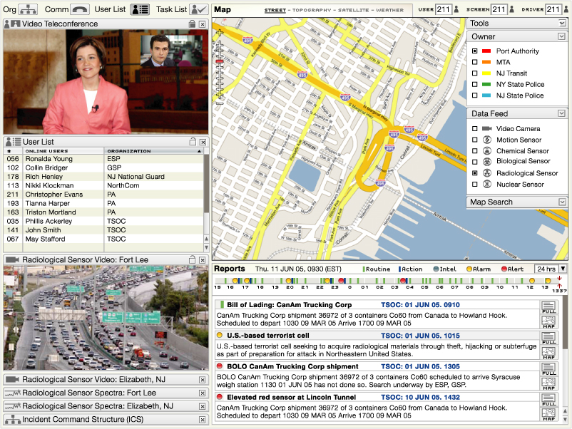 1212 1212 | 2006 computer graphics by Parsons Institute for Information Mapping (PIIM) This desktop-based visual platform is an integrated, intuitive environment for enabling situation awareness, in use by the Port Authority of New York and New Jersey. The EOC allows users to "drill down" for further information about narrative event data, and to share and exchange such information. PIIM provided the conceptualization, storyboarding, visualization and design of the graphical user interface. Key features include: The EOC tool brings together geospatial data, situation reports, data feeds and video teleconference capabilities through a single platform. Agencies can share data feeds among themselves, with users accessing feed location, output and metadata. User lists, organizational information, and shared task lists allow for collaboration across agencies and locations. Users can access map views and full-text reports from summaries. |
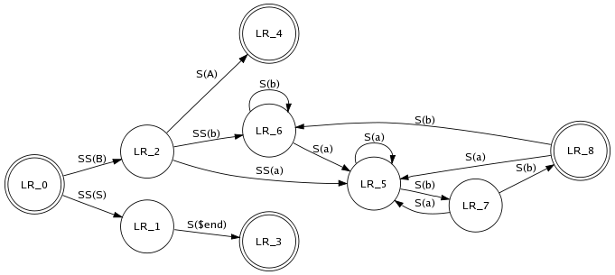 641 641 | computer graphics (Graphviz) by Graphviz - Graph Visualization Software This is a drawing of a finite automaton. The rankdir and orientation request a left-to-right drawing in landscape mode. Note the use of text labels on edges. |
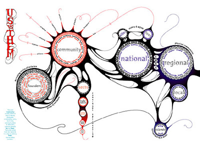 1022 1022 | 2005 computer graphics by Marian Bantjes I have to admit I only recently found the amazing work of Marian Bantjes, but certainly enough I became an instant admirer. As portrayed by the Brazilian magazine tupigrafia: "Hidden in a forest near Vancouver, Marian Bantjes promotes a silent revolution. Pulverizing the borders between calligraphic gesture and digital precision, her work is remarkable for its flow. Any tool in her hands can be a weapon to serve this revolution: vectors, bitmaps, or even a plain ballpoint pen". The images shown here are part of a project Bantjes developed for Fontshop's Font 004 magazine, where she was given the opportunity to write/draw over 3 spreads on the subject of Community. The process is better described by Bantjes herself: "I initially wrote a fairly lengthy piece on the inclusiveness/exclusiveness of community and the varying levels of exclusivity, as well as the various potential communities to which we all belong. And after writing, I started to draw. And as I drew, I eliminated the text as it became absorbed into the graphics. I used 6 Fontshop typefaces in the piece, breaking most of the typographic rules I diligently insist my typography students observe. I also created 31 pattern rings made from dissected pieces of the typefaces. The whole became a kind of organic narrative diagram, and is by far one of my favourite pieces ever". |
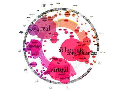 1015 1015 | 2006 computer graphics by Magnus Rembold, Jurgen Spath In 2004 a book was published by the Interaction Design Institute of the University of Applied Sciences and Arts Zirich, on the subject of "the interaction" and its place in the world of man-machine-communications. The book, Total Interaction, is a compilation of nineteen essays which offer different perspectives on this complex thematic field. In order to help the reader understand not only the content of each individual essay, but also the thematic links relating the essays to each other, Magnus Rembold and Jurgen Spath created a visualization piece that illustrates the book's content. The concentric circles represent the individual essays, with the radius in direct proportion to the essay's character count. A word's frequency is proportional to both its type size and the diameter of its circle. In addition, the essays are depicted as a pie slice that has been color-coded and whose width of the central angle derives from the number of coinciding words between the essay in question and that of the secondary author. The radius of the pie slice also derives from the length of the individual essays (the same is true of the concentric circles). The barcode structure which appears within the concentric circle of the essay in question breaks down its structure, and both the central angle and transparency of each bar correspond to the length of the essay's paragraphs. |
 870 870 | 2004 computer graphics by Ero Carrera, Gergely Erdelyi Windows binary malware has come a long way. Today's average worm is often tens or hundreds of kilobytes of code exhibiting a level of complexity that surpasses even some operating systems. This degree of complexity, coupled with the overwhelming flow of new malware, calls for improvements to tools and techniques used in analysis. The authors focused greatly on graph theory to aid the analysis of these viruses. They use a series of tools for reverse engineering malware such as: IDA - the Interactive DisAssembler, IDAPython - Python extension for IDA, and pydot - Python interface to Graphviz utilities. IDAPython and pydot were developed by the authors and released as open source. The resulting graphs are done by exploring the code of a malware sample looking for all the functions and the relationships between them (who calls who). This information, together with text references, are then exported using pydot into a format that Graphviz utilities can read. These two images illustrate a comparative analysis between two viruses, respectively, Netsky.AD (first image) and Buchon (second image). |
 869 869 | 2004 computer graphics by Ero Carrera, Gergely Erdelyi Windows binary malware has come a long way. Today's average worm is often tens or hundreds of kilobytes of code exhibiting a level of complexity that surpasses even some operating systems. This degree of complexity, coupled with the overwhelming flow of new malware, calls for improvements to tools and techniques used in analysis. The authors focused greatly on graph theory to aid the analysis of these viruses. They use a series of tools for reverse engineering malware such as: IDA - the Interactive DisAssembler, IDAPython - Python extension for IDA, and pydot - Python interface to Graphviz utilities. IDAPython and pydot were developed by the authors and released as open source. The resulting graphs are done by exploring the code of a malware sample looking for all the functions and the relationships between them (who calls who). This information, together with text references, are then exported using pydot into a format that Graphviz utilities can read. These images show a graph representing the structure of the Sobig.F Virus. |
 954 954 | 2005 computer graphics by Eytan Adar GUESS is an exploratory data analysis and visualization tool for graphs and networks. The system contains a domain-specific embedded language called Gython (an extension of Python, or more specifically Jython) which supports the operators and syntactic sugar necessary for working on graph structures in an intuitive manner. An interactive interpreter binds the text that one types in the interpreter to the objects being visualized for more useful integration. GUESS also offers a visualization front end that supports the export of static images and dynamic movies. Because GUESS is Jython/Java based one can also construct their own applications and applets without much coding. GUESS is distributed as GPL and makes use of a number of other open source packages and contributions. |
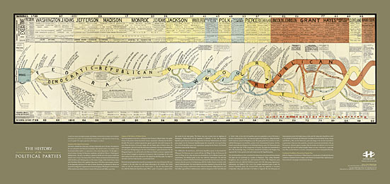 1074 1074 | print by unknown This unique, dramatic print contains a map and explanatory text of the history of the US political parties from 1730 to 1892. It is a high-quality reproduction of an original antique print created circa 1894 by an unknown designer. The diagram vividly depicts the birth and death of each party as streams flowing across the graphic. Design: Unknown |
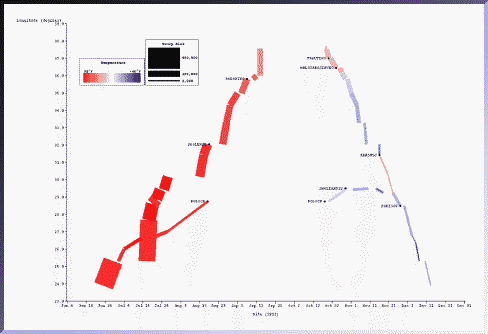
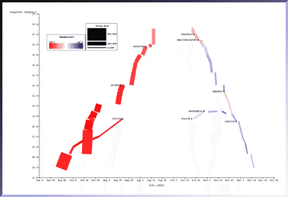
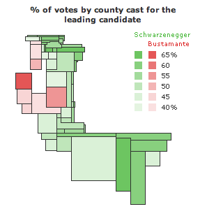 588 588 | 2003 computer graphics by Jonathon Corum County maps and the 2003 California Statewide Special Election. County maps can be deceptive, especially for large states like California. Unless the population of a state is dispersed evenly in proportion to the size of each county, there is no direct relationship between the physical area of a county and the number of people, registered voters, or votes cast within it. Which is why I was surprised to see an analyst from a leading all-news television network point to a map of California and single out San Bernadino county, California's largest county by area, as a significant reason for Arnold Schwarzenegger's victory. I saw a similar map on the day after the election, a map of leading gubernatorial candidates by county, provided as part of California's official election results and reproduced at right. What's wrong with this map? The official county map shows at least four things: the location and size of each county (as a surface area), the leading candidate within that county (as a color), and the percentage of votes cast for that candidate (as a number). The map legend adds the statewide totals and the percentage of votes cast for each of the top 10 candidates. The map is correct in showing that Schwarzenegger won this election, but the map doesn't fit the data very well. The tally of votes gives him 48.6% of the total, but almost all of the map is green. Stretching or condensing data to fit a physical area often results in visual misrepresention or exaggeration, and I was curious to find out how much the county map exaggerates the voting data. Does area matter? After removing captions, text, and drop shadows, the map shows a total of 86,031 colored pixels. Of that total, 81,560 pixels (95%) are Schwarzenegger green, and 4,471 pixels (5%) are Bustamante red. |
 664 664 | computer graphics by Herausgegeben von Professor K. v Image:Teubners_Weltwirtschaftskarten_III_2.jpg Export and Imports of Corn (Maize), Oats and Barley in 1925 Globalization involves movement—of people, goods, cultures, etc. One of the challenges of analyzing and displaying this phenomenon is that static images and text fail to convey the historical complexities and geographical patterns. In this section, we use different forms of animation to represent movements across time and space. |
 1037 1037 | 2003 computer graphics by David Link Poetry Machine is a text generator based on semantic networks. Users can enter concepts that are meaningful to them or for which they expect an answer. Poetry Machine responds with a never ending stream of sentences that circulate around these words. Since these answers are not dependent on scripted answering modules that were written beforehand but are generated dynamically, they are always different and never repeat themselves. They are printed out on a projection screen and spoken out loudly by a text-to-speech system. The semantic information of Poetry Machine comes mainly from the internet. Autonomous "bots" continuously search the internet for concepts that are still unknown to the program and feed the resulting documents back into its database. Consequently, the content of the database and the output of the machine change over time. Poetry Machine consists out of the central program that reads and writes texts, a bot system that automatically retrieves information from the internet, a chat client that communicates with people in chatrooms and a local display that shows the current network structures in the database. |
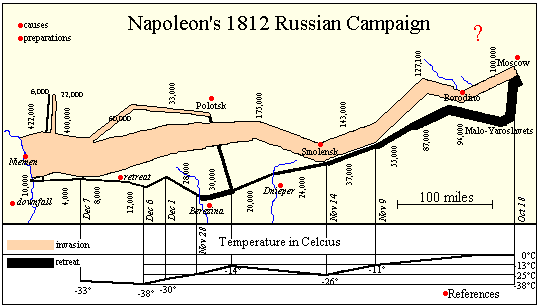 241 241 | computer graphics by Sunny of Andrew Donoho's Information Design course at the University of Texas at Austin The WWW and other new technology (CD rom, DVD) allows the easy integration of the easy integration of text, graphics, sound, and other media. Andrew Donoho teaches an Information Design course at the University of Texas at Austin. For the past several years, a course project asked students to design a web presentation based on Minard's graphic. Sunny's page is one example of the graphic linked (as an image map) to pages of text describing the major battles of the campaign. Another image map compares the account in War and Peace with historical sources. Lori Eichelberger's page (http://www.ddg.com/LIS/InfoDesignF97/lkeich/index.htm) is another example, relating the March on Moscow to the memoirs of Francois Bourgogne, a Sergeant in Napoleon's Imperial Guard. Other interesting attempts may be found on the LIS Class Projects page (http://www.ddg.com/LIS/). |
 232 232 | computer graphics (SAGE) by Sage Visualization Group, Carnegie Mellon University "The temporal characteristics of the march were weakly conveyed in the original because they were expressed as text labels. Here the relation between date, troop location (longitude only), and temperature is more strongly conveyed because they are all exp ressed as properties of the rectangles. Battle sites are indicated in text." Sage Visualization Group, Carnegie Mellon University: http://www.cs.cmu.edu/~sage/ |
 1065 1065 | 1999 computer graphics by Tom Corby, Gavin Baily Reconnoitre is part of an ongoing series of works concerned with our experience of the network as a bizarre_scape; an environment with a high metabolism whose boundaries are continuously re-shaped; accreting and thickening under the influence of powerful social and commercial forces. While Reconnoitre can be considered as a browser in that it allows the user to search for and access web sites, it is less concerned with the coherent display of information as with representing browsing as a behavioural activity. Probably best described as a dysfunctional browser it seeks to enunciate our consumption of information as a journey of surprise, that seeks to reinstate the pleasure of browsing as technologically experienced "derive" (drift) in its own right - an ambient grazing of text. |
 956 956 | 2003 computer graphics by Ben Fry The revisionist software generates an image that shows the evolution of the structure and content of the Processing project over time, from its initial inception through forty releases. The experiment consists of large-format printed pieces to depict broader changes over time. One image shows an overall picture of the changes, with each column representing one version of the software. Lines are drawn between the columns to connect lines that have changed. Notable changes can be seen for the removal of one large file (bottom, middle), and the later addition of a new file (top, right), or a spike in activity (about two-thirds to the right) coinciding with a push for the initial alpha release of the project. The second image shows a detail of the image, zoomed 13x to make the text of one portion of a column legible. While the method of depicting changes between versions of a file is not new, the representation of many versions in a single instance is less conventional. The result is a depiction of the organic process in which even the smallest pieces of software code become mature through the course of its development, as they are passed between developers, revisited for later refinement, merged, removed, and simplified. This project was created as part of Ben Fry's "Visually Deconstructing Code" series shown in the Ars Electronica 2003 CODE Exhibition. The series was made up of several short sketch projects done in about two days to one week a piece. |
 1049 1049 | 2006 computer graphics by Walter Rafelsberger RhNav (Rhizome Navigation) is a continuous work in progress by Walter Rafelsberger that aims to visualize data through analyzation of user behaviour. It provides both text based and three dimensional dynamic navigation interfaces based on log analysis and user tracking. RhNav renders the relations between single Pages from a Wiki site by analyzing how links where used and how long visitors stayed on a page. A page is represented by a box and the corresponding title, a link is displayed by a line between to page-boxes. If a link was used more often, the line gets shorter and thicker, bringing the two page-boxes closer together. |
 661 661 | computer graphics by The SAGE Visualization Group This picture, generated with the SAGE system, depicts most of the information in Minard's original picture. The same data set was mapped to different graphical techniques. The temporal characteristics of the march were weakly conveyed in the original because they were expressed as text labels. Here the relation between date, troop location (longitude only), and temperature is more strongly conveyed because they are all expressed as properties of the rectangles. Battle sites are indicated in text. Notice the clear gaps which indicate lengthy stays at particular locations as well as the battle sites indicated as yellow diamonds. In the original picture it was not clear what happened along the northern flank of the army. Here it is clear: it branched off from the main force, captured Polock in August and remained there until after a second battle in October. Later in November, they rejoined the main retreat as the temperature dropped dramatically. |
 862 862 | 2003 computer graphics by (unknown) Starlight is a generic information visualization tool, developed by the Pacific Northwest National Laboratory (USA), that is applicable to a wide range of problems. In these images, Starlight is being used as an assisting tool to uncover complex file systems. Many information resources are organized into hierarchical structures. Starlight's Hierarchy View can be used to explore the contents of extremely large categorical ontologies such as large, multipart documents, Web directories such as Yahoo, or, as shown here, large file directory structures. The images show a Hierarchy View of a typical Microsoft Windows "Program Files" directory structure that was mapped out using the Starlight DirCrawler information harvesting utility. Provided with a starting directory, DirCrawler will navigate downwards through all constituent subdirectories, collecting file and directory property information as it goes. Once this process has been completed, the application outputs an XML file that can be used as input to Starlight. The directory structure shown below contains approximately 41,000 individual files organized into about 1400 discrete directories. The individual file glyphs have been color-encoded according to file extension, with image files colored green, text documents blue, computer programming-related files (e.g. source code) orange, etc. Executable files (.exe, .dll, etc.) are shown in yellow. |
 863 863 | 2003 computer graphics by (unknown) Starlight is a generic information visualization tool, developed by the Pacific Northwest National Laboratory (USA), that is applicable to a wide range of problems. The first image shows a Starlight Network View representation of the "Information Visualization" Web community. This collection of Web pages was harvested using the Google search engine to retrieve the top 100 ranked pages containing the phrase "information visualization," as well as all pages that link to, or are linked to from, the pages in the query result set. The entire collection consists of approximately 1500 pages. In this view, nodes represent discrete Web pages, and edges represent hyperlink references among the pages. The pages are color-encoded according to their link class, with pages in the original result set colored green, result set inlinks colored blue, and result set outlinks colored yellow. Note that the majority of the result set pages are embedded in the clique (dodecahedra) and cluster (stellated dodecahedra) nodes. The second image portraits the same Web page collection, now displayed as a Starlight Concept View. It shows conceptual correlations among the contents of the page text. Groups of conceptually related pages are shown displayed in the same cluster, and the clusters are arranged spatially such that clusters that are most similar are spatially adjacent. |
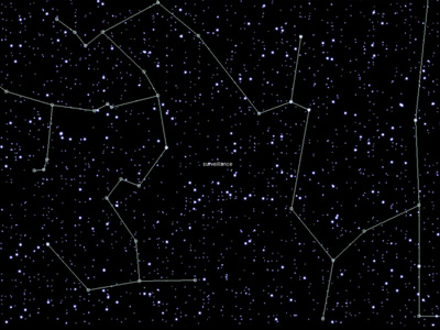 881 881 | 1999 computer graphics by Alex Galloway, Mark Tribe, Marti When a new text is read for the first time on the Rhizome.org website, it appears on StarryNight as a dim star. Each time a text gets read again by any Internet user around the world the corresponding star gets a bit brighter. Over time, the page comes to resemble a starry night sky, with bright stars corresponding to the most popular texts in the database, and dim stars corresponding to less-popular ones. Dragging the mouse over one of the stars brings up a pop-up list of keywords that the corresponding text shares with other texts. Select a keyword in the pop-up list to draw a constellation linking all the stars that share that keyword. StarryNight depends on two pieces of original software: a set of Perl scripts that sort texts by keyword and record their individual hits, and a Java applet that filters this information to draw stars and constellations. Technology used: Perl and Java Number of stars: 2000 Age of oldest star: February 5th, 1996 New stars added: 5 per week |
 892 892 | 2005 computer graphics by Ethan Miller The SXSW INTERACTIVE FESTIVAL brings together uber-geeks and digital innovators from around the world for four days of keynote speeches, trade shows, panels, parties and assorted evening fun. The 2005 SXSW Interactive Program of panels is targeted at both insiders and outsiders with the intent of attracting, informing and tantalizing potential attendees. As such it is the most public face of the conference. Ethan Miller has taken the text from this program and made obvious the conceptual connections between the presentations in a visualization build with Processing. Connections are extracted from vocabulary used in more than one description. Lines connect paragraphs with common words and the total number of connections is tallied. Each square represents a transcript from the SXSW conference. The brightness of the lines connecting boxes indicates the number of words shared ("noise words" are filtered out). The distance to the center of the visualization indicated the total number of connections the text shares. The closer to the center, the more words the text shares with other texts. By default, all connections are displayed. Hovering on a box shows only the connections for that text, and the name of the text at the top of the screen. Clicking on a box selects it, so that one can hover over a second box. When hovering over a box while another box is selected, the connections for both texts will be shown, along with the titles, and the words they have in common at the top of the screen. |
 1270 1270 | 1833 print The text of this print is in French. This print is a reproduction of a fascinating antique print created circa 1833. It maps the chronology of French history from 1787 to 1833. The center stream flowing from top to bottom represents the geographic expansion and contraction of the French Empire during this time. Detailed portraits of important men and women bracket the central stream. |
 13 13 | print In 1508 a map of the Roman empire came in the way of Konrad Peutinger from Augsburg. Later this map was called after him: Tabula Peutingeriana, Peutinger-map. A few centuries before Peutinger got the map he was copied from an old Roman world-map, from the 4th century A.D, and was copied from the world-map of Agrippina, end 1st century B.C. The Peutinger-map was drawn on a narrow book-roll with a length of 7 metres. He shows the whole Roman empire, from todays Great Britain till the Indus. The creator was sure that Rome was the central point, therefor Rome was located at the centre of the map. There were 12 ways to leave Rome. The map wasn't meant as an accurate map like we find in todays atlasses rather an outline for people who were traveling. The creator only reasoned left to right, but that was enough for a traveller. He also mentioned the distance next to the roads, because the length of the lines on the map had no meaning. (366-335 BCE) Further text: The whole of the Roman world is reproduced on this painted parchment 34 centimetres in height and almost 7 metres in length. Although it is the most reproduced Roman chart, the Table of Peutinger does not make it possible to perceive the extent of the cartographic work undertaken by the Romans. Land conquerors, they had a utilitary vision of geography and their cartographic representations were related to the imperial conquests. Topographers accompanied the Roman armies in their campaigns in order to recognize the conquered grounds. Information collected was used for the military needs and the development of infrastructures such as the routes, but also to describe the routes. The table of Peutinger, named after the XVI century German collector to which it was offered, was a form of very widespread geographical description. If this chart does not bring topographic information, it gives indications of distances and size of the places, very practical information for the traveller. The North-South distances are represented on a smaller scale than the East-West distances, thus making it possible to the traveller to unfold or unroll the section which corresponded to its course. |
 8 8 | print In 1508 a map of the Roman empire came in the way of Konrad Peutinger from Augsburg. Later this map was called after him: Tabula Peutingeriana, Peutinger-map. A few centuries before Peutinger got the map he was copied from an old Roman world-map, from the 4th century A.D, and was copied from the world-map of Agrippina, end 1st century B.C. The Peutinger-map was drawn on a narrow book-roll with a length of 7 metres. He shows the whole Roman empire, from todays Great Britain till the Indus. The creator was sure that Rome was the central point, therefor Rome was located at the centre of the map. There were 12 ways to leave Rome. The map wasn't meant as an accurate map like we find in todays atlasses rather an outline for people who were traveling. The creator only reasoned left to right, but that was enough for a traveller. He also mentioned the distance next to the roads, because the length of the lines on the map had no meaning. (366-335 BCE) Further text: The whole of the Roman world is reproduced on this painted parchment 34 centimetres in height and almost 7 metres in length. Although it is the most reproduced Roman chart, the Table of Peutinger does not make it possible to perceive the extent of the cartographic work undertaken by the Romans. Land conquerors, they had a utilitary vision of geography and their cartographic representations were related to the imperial conquests. Topographers accompanied the Roman armies in their campaigns in order to recognize the conquered grounds. Information collected was used for the military needs and the development of infrastructures such as the routes, but also to describe the routes. The table of Peutinger, named after the XVI century German collector to which it was offered, was a form of very widespread geographical description. If this chart does not bring topographic information, it gives indications of distances and size of the places, very practical information for the traveller. The North-South distances are represented on a smaller scale than the East-West distances, thus making it possible to the traveller to unfold or unroll the section which corresponded to its course. |
 18 18 | print In 1508 a map of the Roman empire came in the way of Konrad Peutinger from Augsburg. Later this map was called after him: Tabula Peutingeriana, Peutinger-map. A few centuries before Peutinger got the map he was copied from an old Roman world-map, from the 4th century A.D, and was copied from the world-map of Agrippina, end 1st century B.C. The Peutinger-map was drawn on a narrow book-roll with a length of 7 metres. He shows the whole Roman empire, from todays Great Britain till the Indus. The creator was sure that Rome was the central point, therefor Rome was located at the centre of the map. There were 12 ways to leave Rome. The map wasn't meant as an accurate map like we find in todays atlasses rather an outline for people who were traveling. The creator only reasoned left to right, but that was enough for a traveller. He also mentioned the distance next to the roads, because the length of the lines on the map had no meaning. (366-335 BCE) Further text: The whole of the Roman world is reproduced on this painted parchment 34 centimetres in height and almost 7 metres in length. Although it is the most reproduced Roman chart, the Table of Peutinger does not make it possible to perceive the extent of the cartographic work undertaken by the Romans. Land conquerors, they had a utilitary vision of geography and their cartographic representations were related to the imperial conquests. Topographers accompanied the Roman armies in their campaigns in order to recognize the conquered grounds. Information collected was used for the military needs and the development of infrastructures such as the routes, but also to describe the routes. The table of Peutinger, named after the XVI century German collector to which it was offered, was a form of very widespread geographical description. If this chart does not bring topographic information, it gives indications of distances and size of the places, very practical information for the traveller. The North-South distances are represented on a smaller scale than the East-West distances, thus making it possible to the traveller to unfold or unroll the section which corresponded to its course. |
 14 14 | print In 1508 a map of the Roman empire came in the way of Konrad Peutinger from Augsburg. Later this map was called after him: Tabula Peutingeriana, Peutinger-map. A few centuries before Peutinger got the map he was copied from an old Roman world-map, from the 4th century A.D, and was copied from the world-map of Agrippina, end 1st century B.C. The Peutinger-map was drawn on a narrow book-roll with a length of 7 metres. He shows the whole Roman empire, from todays Great Britain till the Indus. The creator was sure that Rome was the central point, therefor Rome was located at the centre of the map. There were 12 ways to leave Rome. The map wasn't meant as an accurate map like we find in todays atlasses rather an outline for people who were traveling. The creator only reasoned left to right, but that was enough for a traveller. He also mentioned the distance next to the roads, because the length of the lines on the map had no meaning. (366-335 BCE) Further text: The whole of the Roman world is reproduced on this painted parchment 34 centimetres in height and almost 7 metres in length. Although it is the most reproduced Roman chart, the Table of Peutinger does not make it possible to perceive the extent of the cartographic work undertaken by the Romans. Land conquerors, they had a utilitary vision of geography and their cartographic representations were related to the imperial conquests. Topographers accompanied the Roman armies in their campaigns in order to recognize the conquered grounds. Information collected was used for the military needs and the development of infrastructures such as the routes, but also to describe the routes. The table of Peutinger, named after the XVI century German collector to which it was offered, was a form of very widespread geographical description. If this chart does not bring topographic information, it gives indications of distances and size of the places, very practical information for the traveller. The North-South distances are represented on a smaller scale than the East-West distances, thus making it possible to the traveller to unfold or unroll the section which corresponded to its course. |
 12 12 | print In 1508 a map of the Roman empire came in the way of Konrad Peutinger from Augsburg. Later this map was called after him: Tabula Peutingeriana, Peutinger-map. A few centuries before Peutinger got the map he was copied from an old Roman world-map, from the 4th century A.D, and was copied from the world-map of Agrippina, end 1st century B.C. The Peutinger-map was drawn on a narrow book-roll with a length of 7 metres. He shows the whole Roman empire, from todays Great Britain till the Indus. The creator was sure that Rome was the central point, therefor Rome was located at the centre of the map. There were 12 ways to leave Rome. The map wasn't meant as an accurate map like we find in todays atlasses rather an outline for people who were traveling. The creator only reasoned left to right, but that was enough for a traveller. He also mentioned the distance next to the roads, because the length of the lines on the map had no meaning. (366-335 BCE) Further text: The whole of the Roman world is reproduced on this painted parchment 34 centimetres in height and almost 7 metres in length. Although it is the most reproduced Roman chart, the Table of Peutinger does not make it possible to perceive the extent of the cartographic work undertaken by the Romans. Land conquerors, they had a utilitary vision of geography and their cartographic representations were related to the imperial conquests. Topographers accompanied the Roman armies in their campaigns in order to recognize the conquered grounds. Information collected was used for the military needs and the development of infrastructures such as the routes, but also to describe the routes. The table of Peutinger, named after the XVI century German collector to which it was offered, was a form of very widespread geographical description. If this chart does not bring topographic information, it gives indications of distances and size of the places, very practical information for the traveller. The North-South distances are represented on a smaller scale than the East-West distances, thus making it possible to the traveller to unfold or unroll the section which corresponded to its course. |
 11 11 | print In 1508 a map of the Roman empire came in the way of Konrad Peutinger from Augsburg. Later this map was called after him: Tabula Peutingeriana, Peutinger-map. A few centuries before Peutinger got the map he was copied from an old Roman world-map, from the 4th century A.D, and was copied from the world-map of Agrippina, end 1st century B.C. The Peutinger-map was drawn on a narrow book-roll with a length of 7 metres. He shows the whole Roman empire, from todays Great Britain till the Indus. The creator was sure that Rome was the central point, therefor Rome was located at the centre of the map. There were 12 ways to leave Rome. The map wasn't meant as an accurate map like we find in todays atlasses rather an outline for people who were traveling. The creator only reasoned left to right, but that was enough for a traveller. He also mentioned the distance next to the roads, because the length of the lines on the map had no meaning. (366-335 BCE) Further text: The whole of the Roman world is reproduced on this painted parchment 34 centimetres in height and almost 7 metres in length. Although it is the most reproduced Roman chart, the Table of Peutinger does not make it possible to perceive the extent of the cartographic work undertaken by the Romans. Land conquerors, they had a utilitary vision of geography and their cartographic representations were related to the imperial conquests. Topographers accompanied the Roman armies in their campaigns in order to recognize the conquered grounds. Information collected was used for the military needs and the development of infrastructures such as the routes, but also to describe the routes. The table of Peutinger, named after the XVI century German collector to which it was offered, was a form of very widespread geographical description. If this chart does not bring topographic information, it gives indications of distances and size of the places, very practical information for the traveller. The North-South distances are represented on a smaller scale than the East-West distances, thus making it possible to the traveller to unfold or unroll the section which corresponded to its course. |
 10 10 | print In 1508 a map of the Roman empire came in the way of Konrad Peutinger from Augsburg. Later this map was called after him: Tabula Peutingeriana, Peutinger-map. A few centuries before Peutinger got the map he was copied from an old Roman world-map, from the 4th century A.D, and was copied from the world-map of Agrippina, end 1st century B.C. The Peutinger-map was drawn on a narrow book-roll with a length of 7 metres. He shows the whole Roman empire, from todays Great Britain till the Indus. The creator was sure that Rome was the central point, therefor Rome was located at the centre of the map. There were 12 ways to leave Rome. The map wasn't meant as an accurate map like we find in todays atlasses rather an outline for people who were traveling. The creator only reasoned left to right, but that was enough for a traveller. He also mentioned the distance next to the roads, because the length of the lines on the map had no meaning. (366-335 BCE) Further text: The whole of the Roman world is reproduced on this painted parchment 34 centimetres in height and almost 7 metres in length. Although it is the most reproduced Roman chart, the Table of Peutinger does not make it possible to perceive the extent of the cartographic work undertaken by the Romans. Land conquerors, they had a utilitary vision of geography and their cartographic representations were related to the imperial conquests. Topographers accompanied the Roman armies in their campaigns in order to recognize the conquered grounds. Information collected was used for the military needs and the development of infrastructures such as the routes, but also to describe the routes. The table of Peutinger, named after the XVI century German collector to which it was offered, was a form of very widespread geographical description. If this chart does not bring topographic information, it gives indications of distances and size of the places, very practical information for the traveller. The North-South distances are represented on a smaller scale than the East-West distances, thus making it possible to the traveller to unfold or unroll the section which corresponded to its course. |
 9 9 | print In 1508 a map of the Roman empire came in the way of Konrad Peutinger from Augsburg. Later this map was called after him: Tabula Peutingeriana, Peutinger-map. A few centuries before Peutinger got the map he was copied from an old Roman world-map, from the 4th century A.D, and was copied from the world-map of Agrippina, end 1st century B.C. The Peutinger-map was drawn on a narrow book-roll with a length of 7 metres. He shows the whole Roman empire, from todays Great Britain till the Indus. The creator was sure that Rome was the central point, therefor Rome was located at the centre of the map. There were 12 ways to leave Rome. The map wasn't meant as an accurate map like we find in todays atlasses rather an outline for people who were traveling. The creator only reasoned left to right, but that was enough for a traveller. He also mentioned the distance next to the roads, because the length of the lines on the map had no meaning. (366-335 BCE) Further text: The whole of the Roman world is reproduced on this painted parchment 34 centimetres in height and almost 7 metres in length. Although it is the most reproduced Roman chart, the Table of Peutinger does not make it possible to perceive the extent of the cartographic work undertaken by the Romans. Land conquerors, they had a utilitary vision of geography and their cartographic representations were related to the imperial conquests. Topographers accompanied the Roman armies in their campaigns in order to recognize the conquered grounds. Information collected was used for the military needs and the development of infrastructures such as the routes, but also to describe the routes. The table of Peutinger, named after the XVI century German collector to which it was offered, was a form of very widespread geographical description. If this chart does not bring topographic information, it gives indications of distances and size of the places, very practical information for the traveller. The North-South distances are represented on a smaller scale than the East-West distances, thus making it possible to the traveller to unfold or unroll the section which corresponded to its course. |
 7 7 | print In 1508 a map of the Roman empire came in the way of Konrad Peutinger from Augsburg. Later this map was called after him: Tabula Peutingeriana, Peutinger-map. A few centuries before Peutinger got the map he was copied from an old Roman world-map, from the 4th century A.D, and was copied from the world-map of Agrippina, end 1st century B.C. The Peutinger-map was drawn on a narrow book-roll with a length of 7 metres. He shows the whole Roman empire, from todays Great Britain till the Indus. The creator was sure that Rome was the central point, therefor Rome was located at the centre of the map. There were 12 ways to leave Rome. The map wasn't meant as an accurate map like we find in todays atlasses rather an outline for people who were traveling. The creator only reasoned left to right, but that was enough for a traveller. He also mentioned the distance next to the roads, because the length of the lines on the map had no meaning. (366-335 BCE) Further text: The whole of the Roman world is reproduced on this painted parchment 34 centimetres in height and almost 7 metres in length. Although it is the most reproduced Roman chart, the Table of Peutinger does not make it possible to perceive the extent of the cartographic work undertaken by the Romans. Land conquerors, they had a utilitary vision of geography and their cartographic representations were related to the imperial conquests. Topographers accompanied the Roman armies in their campaigns in order to recognize the conquered grounds. Information collected was used for the military needs and the development of infrastructures such as the routes, but also to describe the routes. The table of Peutinger, named after the XVI century German collector to which it was offered, was a form of very widespread geographical description. If this chart does not bring topographic information, it gives indications of distances and size of the places, very practical information for the traveller. The North-South distances are represented on a smaller scale than the East-West distances, thus making it possible to the traveller to unfold or unroll the section which corresponded to its course. |
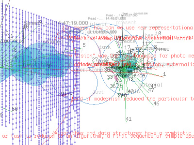
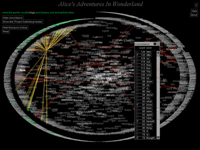 717 717 | 2002 computer graphics by W. Bradford Paley TextArc: Revealing Word Associations, Distribution and Frequency. TextArc is a tool designed to help people discover patterns and concepts in any text by leveraging a powerful, underused resource: human visual processing. It compliments approaches such as Statistical Natural Language Processing and Computational Linguistics by providing an overview, letting intuition help extract meaning from an unread text. Here, an analysis of Lewis Carroll's Alice in Wonderland demonstrates TextArc's structure and some capabilities. TextArc represents the entire text as two concentric spirals on the screen: each line is drawn in a tiny (one pixel tall) font around the outside, starting at the top; then each word is drawn in a more readable size. Important typographic features, like the mouse-tail shape of a poem at about two o'clock, can be seen because the tiny lines retain their formatting. Frequently used words stand out from the background more intensely. |
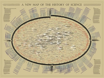 1034 1034 | 2006 computer graphics by W. Bradford Paley For the "Places & Spaces: Mapping Science" exhibition, W. Bradford Paley approached making a map of science indirectly, by making a map of a book describing The History of Science. In this way, he leveraged the intelligent organization by Henry Smith Williams (the history's author): this map was created more to take advantage of a culturally recognized way of organizing science than to invent a new one. The history's first two volumes are organized strictly historically, so as the book wraps around the right side of the ellipse it is organized as a time line. The next two volumes distinguish two major domains - making two time lines - for more recent scientific exploration: the physical sciences (along the bottom left) and the life sciences (top left). Since the scattered words are pulled toward the places where they are used in the text, structure emerges: names of individuals appear along the outside, as they are usually mentioned in only one or two places, and concepts that are common to science of all eras (e.g., system, theory, experiment) are pulled to the center, as they are mentioned everywhere. This map was on display at the NYPL Science, Industry, and Business Library, New York, as part of the "Places & Spaces: Mapping Science" exhibition, from April 3rd - August 31st, 2006. |
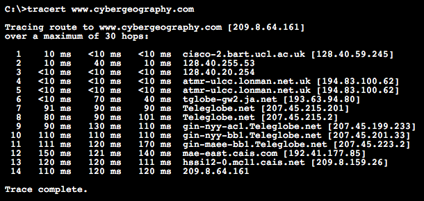 499 499 | computer graphics The normal output from traceroute is a text listing of the hops. As an example we used the Windows 95 traceroute utility (called tracert) to run a trace to the Atlas mirror site in the US at www.cybergeography.com. This took 14 hops from my machine in London. |
 953 953 | 2004 computer graphics by (unknown) txtkit is an Open Source visual text mining tool for exploring large amounts of multilingual texts. It's a multi-user application which mainly focuses on the process of reading and reasoning as a series of decisions and events. To expand this single perspective activity txtkit collects all of the users mining data and uses them to create content recommendations through collaborative filtering. The txtkit interface is divided into two parts: txtshell (shell interface) and txtvbot (visual bot). txtshell provides several commands to browse, to read and to select text, whilst txtvbot displays the user activity in real-time. The visualization is based on the users actions, statistical information about the data as well as collaborative filtering schemes. Therefore, the complexity of its visual output relates to the increasing number of users. |
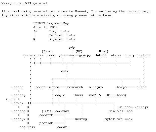 329 329 | 1981 ASCII text |
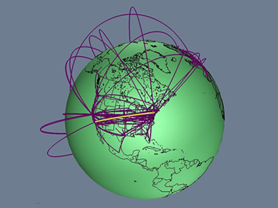 736 736 | 1996 computer graphics by Tamara Munzner, Eric Hoffman, K. We present a case study of visualizing the global topology of the Internet MBone. Developed and initially deployed by researchers within the Internet community, the MBone has been extremely popular for efficient transmission across the Internet of real-time video and audio streams such as conferences, meetings, congressional sessions, and NASA shuttle launches. The MBone, like the Internet itself, grew exponentially with no central authority. The resulting suboptimal topology is of growing concern to network providers and the multicast research community. We create a geographic representation of the tunnel structure as arcs on a globe by resolving the latitude and longitude of MBone routers. The interactive 3D maps permit an immediate understanding of the global structure unavailable from the data in its original form as lines of text with only hostnames and IP addresses. Data visualization techniques such as grouping and thresholding allow further analysis of specific aspects of the MBone topology. |
 656 656 | computer graphics by Teuvo Kohonen WEBSOM is a method for automatically organizing collections of text documents and for preparing visual maps of them to facilitate the mining and retrieval of information. The documents are in the points, or "pigeon-holes", of the map, and their contents can be browsed by clicking the points visible on the lowest level of the map display. You can use a full text search to find an interesting starting point for browsing. |