Found 6 results for "navigational":
 777 777 | 2001 computer graphics by (unknown) Produced as a project by students at the Hochschule fur Gestaltung Schwabisch Gmund in Germany, f.i.n.d.x. is a visually-aided investigation instrument for the medical industry. The website uses as its starting point the chaos of fragmented information that is the Internet, illustrated using hundreds of small green floating squares which form an organic galaxy of information. The user can select areas and zoom in to focus on specific areas of research and information. Source: Fawcett-Tang, Robert, and William Owen. Mapping: An Illustrated Guide to Graphic Navigational Systems. Rockport Publishers, 2002. |
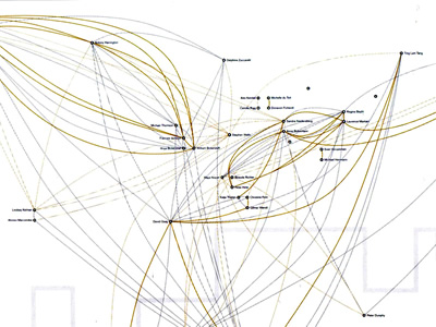
 773 773 | 1992 computer graphics by Simon Patterson The artist Simon Patterson, a finalist for the Turner Prize, the UK's leading award for modern art, has worked extensively with the process of reinterpreting existing information systems. Shown here is a work by the artist which utilizes maps and navigation/information systems. J.P. 233 in C.S.O. Blue is a large wall drawing which takes as its reference a global airline route map, using large sweeping arcs to represent the journeys between countries, which are implied by their relative positions rather than a delineation of boundaries. The destination names are replaced with seemingly unrelated famous people, from Julius Caesar, Elizabeth I, Pope John Paul II and Mussolini to actors William Shatner, Helen Mirren, Leonard Nimoy and Peter Falk. Source: Fawcett-Tang, Robert, and William Owen. Mapping: An Illustrated Guide to Graphic Navigational Systems. Rockport Publishers, 2002. |
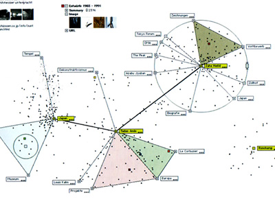 774 774 | 2000 computer graphics by Martin Grothmaak, Jurgen Spath This research tool looks for information in big databases or on the Internet, evaluates it and displays it geometrically. The dynamic model illustrates both the content-based relationships between search criteria and the generation of search results. The results appear not as a list but as data clouds in the form of points in a circle around the central search word. If you search for information about Japan, for example, all the available information on that country appears as points distributed in a circle. The points closest to the search word contain a lot of information about Japan and the more distant ones less. If a second word - museums - is entered at the edge of the circle the points rearrange themselves dynamically. The user can now look at a point in more detail that is close to the word 'museums' but relatively far from 'Japan'. The information revealed when one clicks on the point turns out to be a museum of ethnology with Japanese exhibits. Source: Fawcett-Tang, Robert, and William Owen. Mapping: An Illustrated Guide to Graphic Navigational Systems. Rockport Publishers, 2002. |
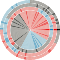
 775 775 | 2000 computer graphics by Sandra Niedersberg Using the 'six degrees of separation' theory as an inspiration, Sandra Niedersberg mapped and analyzed the way she made friends and acquaintances over a five-month period after moving from Germany to London. The research was extended to include interviews with each contact that formed a book. With the information amassed she also created a series of A2 maps printed onto translucent paper allowing the different levels to be over-laid to show further associations. Each map uses the geography of London as its framework, reduced to a symbolic representation of the river Thames. Each person is represented by a dot and their name, the position of which corresponds to where they live. All the co-ordinate dots appear on every map, but a person's name only appears if they have a connection on that particular map. Each map shows different statistics for different situations, such as living, home, work, institutions, school, meeting points and so on, with color coding used to reveal further levels of information. Source: Fawcett-Tang, Robert, and William Owen. Mapping: An Illustrated Guide to Graphic Navigational Systems. Rockport Publishers, 2002. |
 475 475 | computer graphics by Romain Zeiliger The Nestor Navigator is an experimental tool that provides several navigational and mapping tools for Web browsing. It is being developed by Romain Zeiliger, a researcher at Centre National de la Recherche Scientifique (CNRS) GATE, near Lyon, France. |
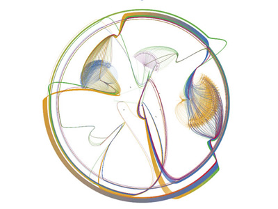 942 942 | 2003 computer graphics by James Spahr Working with log data from webservers, James Spahr wrote software that looked at the referrer data and created a site tree. This map of the site is particularly relevant since it's formed by how the users travel through the site, illustrating its navigational flow. It is the aggregate view of how the user base views the hierarchy of the website. Its intent is to serve as a feedback tool for site designers. Does the user base have the same mental model of the website as the designer? Simple straight lines between pages are not used. Instead all traffic moves clockwise around the map. A clockwise circular pattern is used because directionality cannot be clearly labeled with straight lines. This work was displayed in the poster exhibit at the 2003 Information Architecture Summit. |