Found 11 results for "longitude":
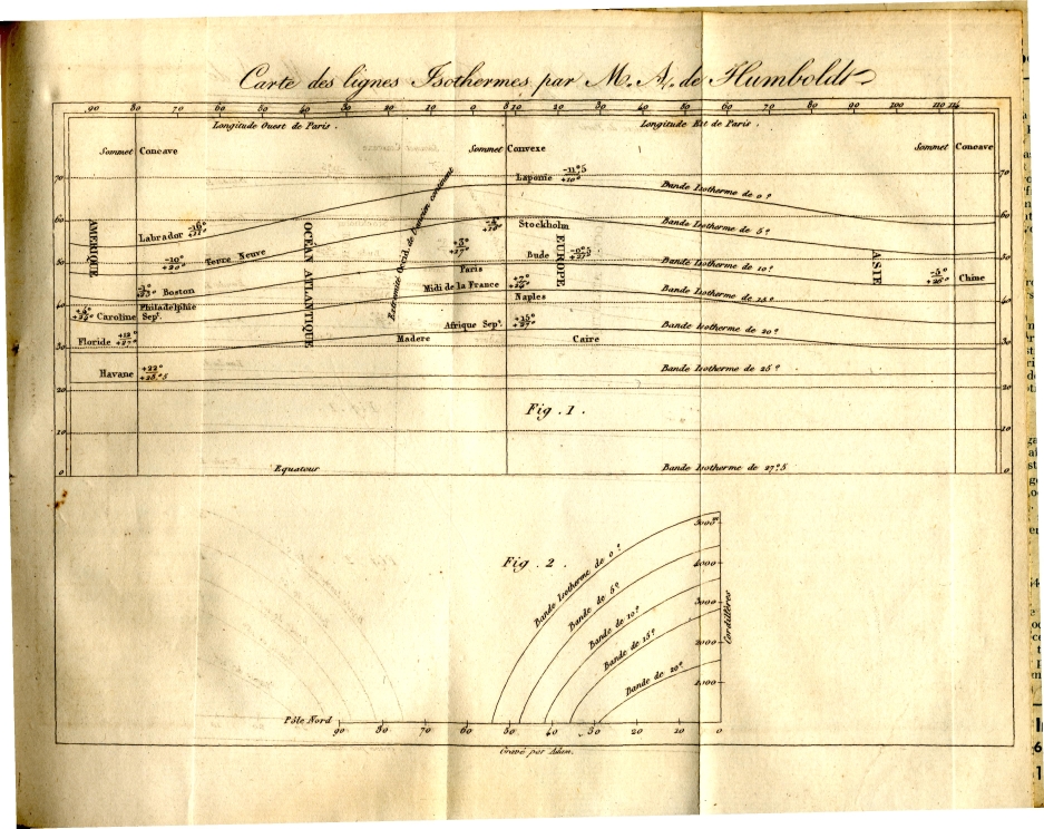 64 64 | 1817 print by Alexander von Humboldt (1769-1859), Germany First graph of isotherms, showing mean temperature around the world by latitude and longitude. Recognizing that temperature depends more on latitude and altitude, a subscripted graph shows the direct relation of temperature on these two variables. von Humboldt, A. (1817). Sur les lignes isothermes. Annales de Chimie et de Physique, 5:102-112. |
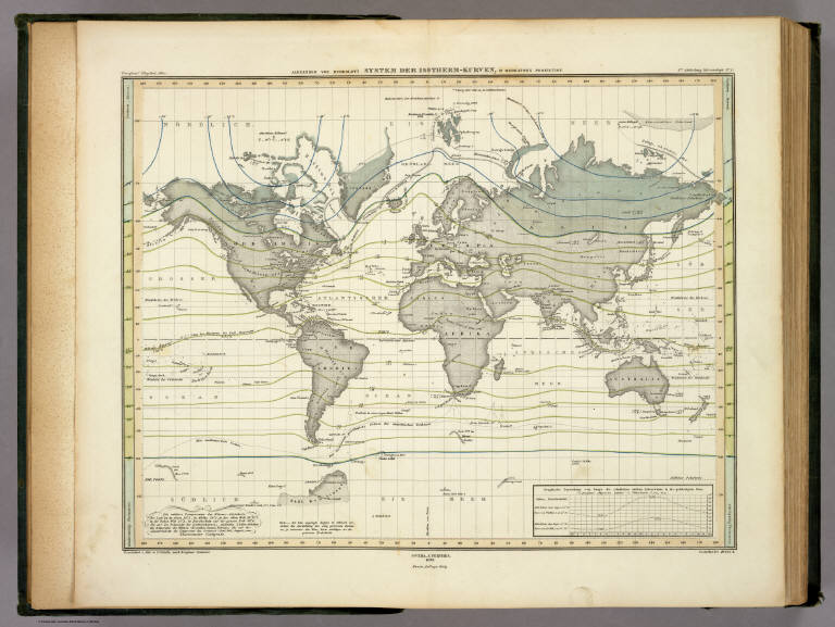 66 66 | 1817 print by Alexander von Humboldt (1769-1859) von Humboldt isotherms from Berghaus' 1849 AtlasrnrnFirst graph of isotherms, showing mean temperature around the world by latitude and longitude. Recognizing that temperature depends more on latitude and altitude, a subscripted graph shows the direct relation of temperature on these two variables - Germany |
 1056 1056 | 2006 computer graphics by (unknown) Freefall puts the wonders of satellite exploration at your fingertips, simulating the flight path of more than 850 actual satellites Global Positioning Systems, GOES, NOAA and other unclassified orbiters used by amateur radio stations, weather services, search and rescue teams and more. This powerful MAC OSX screensaver has a 3D viewer which interacts directly with the simulator, allowing control over dozens of preferences and perspectives. You can turn any geographic location into a ground link and watch satellites fly by each location, or choose from a database of over 28,000 cities or define your own using latitude and longitude. You can even see detailed information about each satellite including altitude, speed, coordinates, launch data, and mission background. All satellite data can be automatically updated daily via the Internet. As an example, the first image shows all the GPS Satellites (with tails, sensors, radio links, etc). |
 25 25 | 1603 print by Guillaume Le Nautonier (1557-1620), France Tables, and first world map showing lines of geomagnetism (isogons), used in work on finding longitude by means of magnetic variation. The tables give the world distribution of the variation, by latitude, along each of the meridians . Mandea, M. and Mayaud, P.-N. (2004). Guillaume le nautonier, un precurseur dans l'histoire du géomagnétisme magnetism. Revue d'Histoire des Sciences , 57 (1):161-174. Nautonier, G. L. (1602-1604). Mecometrie de l'eymant, c'est a dire la maniere de mesurer les longitudes par le moyen de l'eymant . Paris: n.p. BL: 533.k.9. |
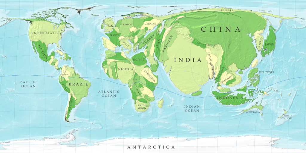 699 699 | 2006 computer graphics by Mark Newman, Danny Dorling In this map the sizes of countries are proportional not to their actual landmass but instead to the number of people living there; a country with 20 million people, for instance, appears twice as large as a country with 10 million. Although the figures for populations of countries are well established and familiar to many, the cartogram provides a new way of looking at them and in particular makes clear the enormous disparity in the population of different regions. Note how large India and China have become: between them these two countries account for more than a third of the population of the world. On the other hand, notice the near-disappearance of Canada and Russia, the world's two largest countries by land area, which have relatively few people in them. Notice also how the lines of latitude and longitude have become distorted by the growing and shrinking countries. This is an unavoidable consequence of the cartogram transformation: in order to give the countries the right sizes and still have them fit together you need to warp things a bit. The method used here, however, does a pretty good job of keeping the map recognizable. Technical details: These cartograms were created using a variant of the diffusion algorithm of Gastner and Newman. Data for the population cartogram were taken from the Gridded Population of the World compiled by the International Center for Earth Science at Columbia University; elevation and bathymetric data were taken from the NOAA 2-minute Gridded Global Relief data set. Data for the other cartograms came from the United Nations Statistics Division and from the databases of the World Health Organization. In all of the cartograms on this page, Antarctica has been treated the same as the sea, meaning its area is unchanged although its shape may be distorted slightly to make room for changes in the sizes of other parts of the world. |
 21 21 | 150 print by Claudius Ptolemy (c. 85-c. 165), Alexandria, Egypt Map projections of a spherical earth and use of latitude and longitude to characterize position (first display of longitude) - Alexandria, Egypt. |
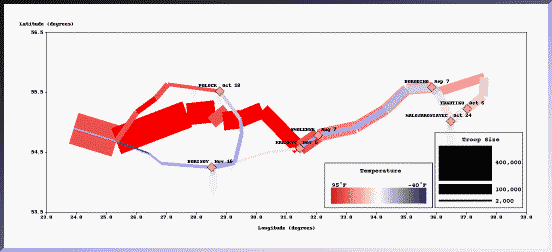 231 231 | computer graphics (SAGE) by Sage Visualization Group, Carnegie Mellon University This graph, from the Visualization and Intelligent Interfaces group at CMU is one re-design, attempting to link the information about temperature directly to the path and strength of Napoleon's army, emphasizing their interrelations more directly. The (X,Y) coordinates are still map-based (latitude and longitude). "The use of color clearly shows the heat wave during the advance and the steady decline in temperature through the retreat. The exception, a spell of temperatures above freezing, is clearly visible when the retreating army is between the cities of Krasnyj and Bobr." Sage Visualization Group, Carnegie Mellon University: http://www.cs.cmu.edu/~sage/ |
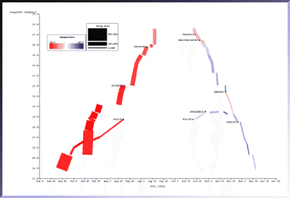
 232 232 | computer graphics (SAGE) by Sage Visualization Group, Carnegie Mellon University "The temporal characteristics of the march were weakly conveyed in the original because they were expressed as text labels. Here the relation between date, troop location (longitude only), and temperature is more strongly conveyed because they are all exp ressed as properties of the rectangles. Battle sites are indicated in text." Sage Visualization Group, Carnegie Mellon University: http://www.cs.cmu.edu/~sage/ |
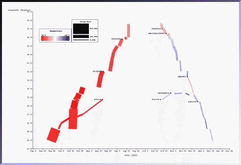
 661 661 | computer graphics by The SAGE Visualization Group This picture, generated with the SAGE system, depicts most of the information in Minard's original picture. The same data set was mapped to different graphical techniques. The temporal characteristics of the march were weakly conveyed in the original because they were expressed as text labels. Here the relation between date, troop location (longitude only), and temperature is more strongly conveyed because they are all expressed as properties of the rectangles. Battle sites are indicated in text. Notice the clear gaps which indicate lengthy stays at particular locations as well as the battle sites indicated as yellow diamonds. In the original picture it was not clear what happened along the northern flank of the army. Here it is clear: it branched off from the main force, captured Polock in August and remained there until after a second battle in October. Later in November, they rejoined the main retreat as the temperature dropped dramatically. |
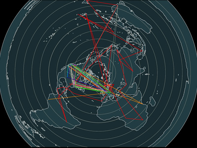
 736 736 | 1996 computer graphics by Tamara Munzner, Eric Hoffman, K. We present a case study of visualizing the global topology of the Internet MBone. Developed and initially deployed by researchers within the Internet community, the MBone has been extremely popular for efficient transmission across the Internet of real-time video and audio streams such as conferences, meetings, congressional sessions, and NASA shuttle launches. The MBone, like the Internet itself, grew exponentially with no central authority. The resulting suboptimal topology is of growing concern to network providers and the multicast research community. We create a geographic representation of the tunnel structure as arcs on a globe by resolving the latitude and longitude of MBone routers. The interactive 3D maps permit an immediate understanding of the global structure unavailable from the data in its original form as lines of text with only hostnames and IP addresses. Data visualization techniques such as grouping and thresholding allow further analysis of specific aspects of the MBone topology. |
 744 744 | 1996 computer graphics by (unknown) Web Hopper translates the IP address from http packet information passing through the backbone of WIDE Project into latitude and longitude which is visualized via JAVA applets. To translate from the host name to the location information, a database on the Host name to Latitude/Longitude page at Illinois University was used. |