Found 49 results for "traffic":
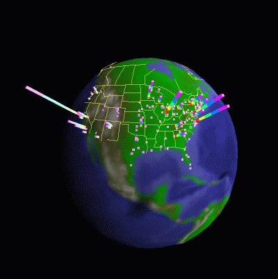
 306 306 | 1996 computer graphics by Stephen G. Eick and colleagues, Bell Laboratories Two examples of the research work of Stephen G. Eick and colleagues at Bell Laboratories into the visualization and analysis of Internet traffic flows. Their 1996 research paper "3D Geographic Network Display" provides further details. |
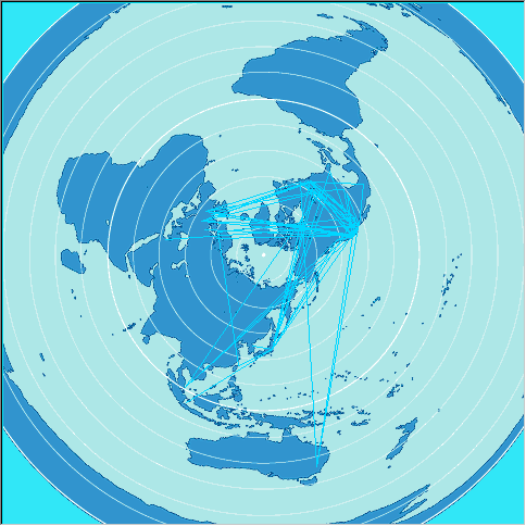
 789 789 | 1993 computer graphics by Stephen G. Eick The arc map displays a 3D network structure as arcs curving smoothly above a flat map of the world. The data being visualized is Internet traffic flows between fifty countries, as measured by the NSFNET backbone in 1993. The colour, thickness and height of the arcs is used to encode the traffic statistics for particular inter-country links. The arcs are also partially translucent so as not to completely obscure lines at the back of the map, while their height above the base map is in relation to total volume of traffic flowing over a link. This has the effect of making the most important (high traffic) links, the highest and therefore most visually prominent on the map. The user has considerable interactive control over the arc map, for example the arc height scaling and translucency can be varied. The map can also be rotated and scaled, so that the user can view it from any angle. |
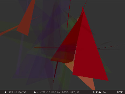 885 885 | 2002 computer graphics by (unknown) Limiteazero is an architecture, media design and media art studio based in Milan, Italy. Among it's rich portfolio in installation/exhibition design, sound design and new media, they created a Carnivore client with audio/visual feedback, entitled Active Metaphor. The basis of the project is the "Carnivore" engine, a software application that listens to all internet traffic on a specific local network. Carnivore was created by RSG and has won Golden Nica at Ars Electronica and an honorable mention at read_me 1.2. The authors made a script that gets the ip address ("aaa.bbb.ccc.ddd"), and breaks it down into four different groups of numbers ("aaa", "bbb","ccc", "ddd"). These elements are used as coordinates for 3D shapes and blending percentages ("x", "y", "z", "blend"). They choose to work with ip addresses because: "it's the main data that identifies an Internet relationship. Users identify their interaction by requesting ip addresses, even if they're not aware of it. Each ip address flowing over the net could be thought of as a human action, a communication, or an experience." This piece of work lets the user see and hear the data flow, which is something that we normally can't perceive. It allows us to see the net as a huge data field that is constantly moving, like a digital life-form that feeds itself with human interaction. |
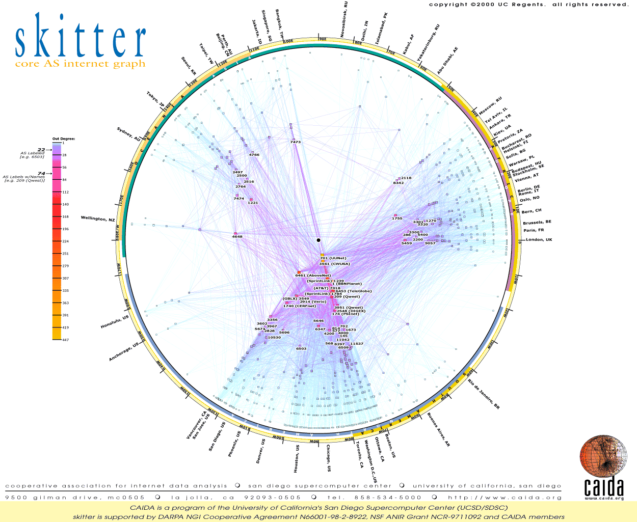 478 478 | computer graphics by researchers at CAIDA A graph visualisation showing the topology of the core of the Internet from mid-January 2000. A version of this image is available to buy as a large wall poster. It reveals the peering relations and geographic locations of Autonomous Systems (ASes), which are a vital part of Internet infrastructure that represent large ISP networks for the complex routing of traffic flows. It was created by researchers at CAIDA as part of their skitter project. |
 620 620 | 2006 computer graphics by Chris Lightfoot, Tom Steinberg Map showing the difference in journey times by rail and taxi, and by road alone, from Cambridge to other points in Great Britain, starting at 7 o'clock on a weekday morning © Crown copyright. All rights reserved. Department for Transport 100020237 2006 Considering journeys starting from Cambridge, this map shows which parts of the country are quicker to get to by train (red and orange), and which by car (green and blue). Yellow and light orange show areas where there's no great difference. This could be useful if you had limited access to a car and were planning where to go, or wanted to see whether it was worth hiring a car for a particular trip. Contours are drawn for each hour of difference in travel time. Note also that the scale is quite asymmetric: the most time you can save travelling by train is about two hours, but—for places which are difficult to reach by train—you can save six or seven hours travelling by road. From this map, journeys to London are quicker by train (the road travel model takes no account of traffic or urban areas, so it is pessimistic about the time saving) as are journeys to Leeds, Berwick, Edinburgh, Glasgow and other points served by trains on the East Coast Main Line. In the west of England, journeys to Exeter and thereabouts are quicker by rail, but all other journeys are quicker by road (largely because most westward journeys require a change at London or a slow cross-country train to Birmingham). (However, the model of car journey times is very simplistic, so these results should not be taken too seriously—we hope to extend the work with a more realistic model of driving times, which may substantially change the comparative results.) |
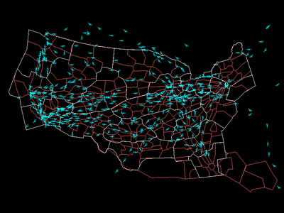
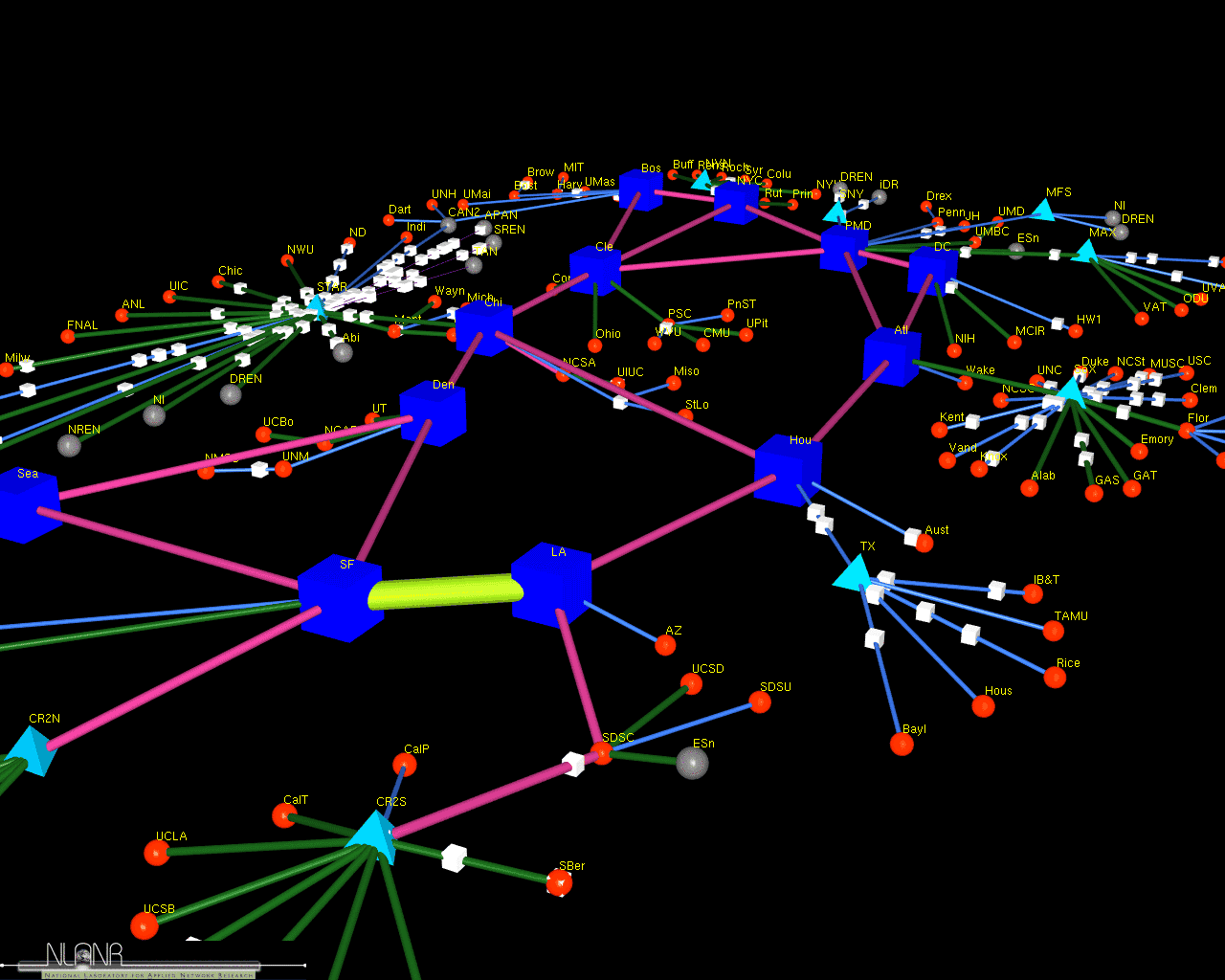 486 486 | computer graphics (Cichlid) by Jeff Brown A screenshot of a 3D model of the vBNS network which connects universities and laboratories in the USA. The model was created by Jeff Brown, a researcher at MOAT, National Laboratory for Applied Network Research (NLANR), USA, using his Cichlid data visualisation software. The model is animated to show how traffic flows over the links. More information on their work can be found in the paper "Network Performance Visualization: Insight Through Animation" by J.A. Brown, McGregor A.J and H-W Braun. |
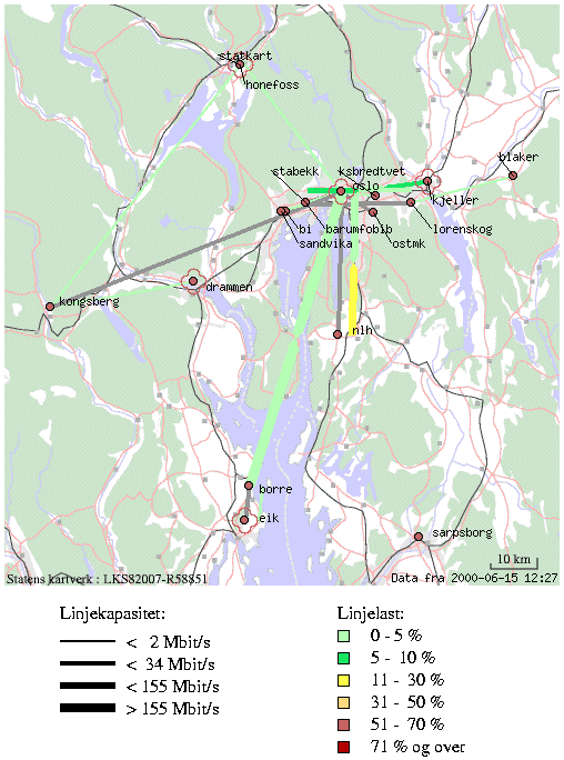 507 507 | computer graphics This is a dynamic network weather map of the backbone of Uninett, serving the education and research sector in Norway. The maps show the network capacity by line thickness and daily traffic load by line colour at different geographic scales. |
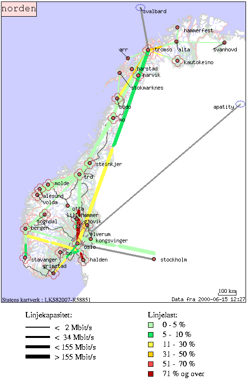 506 506 | computer graphics This is a dynamic network weather map of the backbone of Uninett, serving the education and research sector in Norway. The maps show the network capacity by line thickness and daily traffic load by line colour at different geographic scales. |
 283 283 | 1995 computer graphics by TeleGeography Inc. Example of the statistical maps and diagrams produced by TeleGeography, Inc. This map shows European telecommunications traffic flows in 1995. [For more information see the Map of the Month article "TeleGeography's Traffic Flow Maps".] |
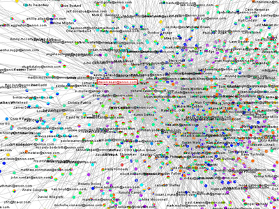 751 751 | 2005 computer graphics by Jeffrey Heer This project attempts to take the first steps toward an exploratory data environment for e-mail corpora, using the Enron e-mail corpus as a motivating data set. The interface--currently named "enronic"--unifies information visualization techniques with various algorithms for processing the e-mail corpus, including social network inference, message categorization, and community analysis. Though still a preliminary design, enronic shows promise as a platform for more tightly coupling manual and automated data analysis. The graph on the left shows the resulting social network visualization. People are drawn as nodes with labels containing either their name or their e-mail address, depending on what was present in the database. Edges represent the histories of ALL e-mail traffic between two people. Pie graphs are placed in the center of each edge, conveying an overall picture of how the e-mail traffic represented by that edge has been categorized. |
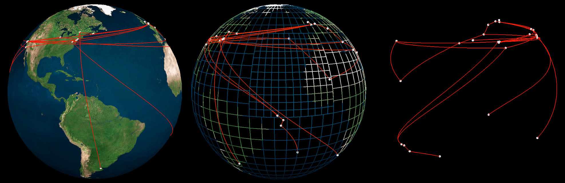
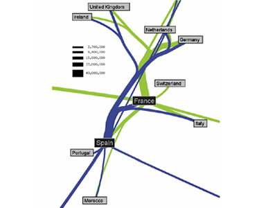 927 927 | 2005 computer graphics by Doantam Phan, Ling Xiao, Ron Yeh Flow Map Layout is a novel visualization technique seen as a hybrid of graphs and flow maps. Cartographers have long used flow maps to show the movement of objects from one location to another, such as the number of people in a migration, the amount of goods being traded, or the number of packets in a network. One of the most famous flow maps, depicting Napoleon's Russian Campaign, was created by Charles Joseph Minard in 1869, and can be seen here. The advantage of flow maps is that they reduce visual clutter by merging edges. Most flow maps are drawn by hand and there are few computer algorithms available. In Flow Map Layout, the authors present a method for generating flow maps using hierarchical clustering given a set of nodes, positions, and flow data between the nodes. The technique is inspired by graph layout algorithms that minimize edge crossings and distort node positions, while maintaining their relative position to one another. The authors have demonstrated the technique by producing flow maps for network traffic, census data, and trade data. The first image illustrates a close-up of top 15 imports to Spain and France. Notice the branching structure is shared across different nodes, for example Spain, and France branch to the Netherlands, Germany and the UK in the same way. The second image represents an outgoing migration map from Colorado (USA) from 1995-2000, generated by the algorithm without layout adjustment or edge routing. |
| | 1837 print by Henry Drury Harness (1804-1883), Ireland First published flow maps, showing transportation by means of shaded lines, widths proportional to amount (passengers). Harness, H. D. (1838). Atlas to Accompany the Second Report of the Railway Commissioners, Ireland . Dublin: H.M.S.O. (a) Map showing the relative number of passengers in different directions by regular public conveyances, 80 x 64 cm; (b) map showing the relative quantities of traffic in different directions, 80 x 64 cm; (c) map showing by varieties of shading the comparative density of the population, 80 x 64 cm. Robinson, A. H. (1955). The 1837 maps of Henry Drury Harness. Geographical Journal, 121:440-450. Robinson, A. H. (1982). Early Thematic Mapping in the History of Cartography . Chicago: University of Chicago Press. ISBN 0-226-72285-6. |
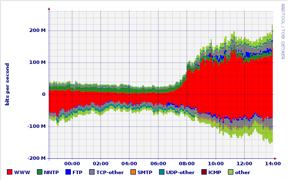 690 690 | 200505 computer graphics by Simon Leinen Fluxoscope is a system used by SWITCH for measurements of our external network traffic. One of its products are graphs which represent, for each external connection, the protocol distribution of traffic over time. The example graph shows the traffic distribution on one of our "upstream" or transit ISPs over a period of a few hours. The "positive" part of the graph shows incoming traffic (what we receive from the ISP), the "negative" part corresponds to outgoing traffic (what we send them). |
 611 611 | 2005 computer graphics by TeleGeography |
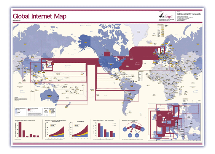 607 607 | 2006 computer graphics by TeleGeography TeleGeography's Global Internet Map 2006 shows the latest view of the internet's international infrastructure. The map features: * International internet bandwidth, scaled by capacity—covering backbones operated by more than 300 international Internet carriers as of mid-2005 * Detailed inset map showing intra-European internet bandwidth * Charts including international internet bandwidth growth, internet traffic and capacity growth forecasts through 2008, Gigabit Ethernet IP price declines, and interregional internet bandwidth * Countries color-coded to show international internet bandwidth * Dialing codes and internet domains for every country in the world * Country tags color-coded according to host density (Internet hosts per 10,000 people) |
 608 608 | 2006 computer graphics by TeleGeography TeleGeography's Global Internet Map 2006 shows the latest view of the internet's international infrastructure. The map features: * International internet bandwidth, scaled by capacity—covering backbones operated by more than 300 international Internet carriers as of mid-2005 * Detailed inset map showing intra-European internet bandwidth * Charts including international internet bandwidth growth, internet traffic and capacity growth forecasts through 2008, Gigabit Ethernet IP price declines, and interregional internet bandwidth * Countries color-coded to show international internet bandwidth * Dialing codes and internet domains for every country in the world * Country tags color-coded according to host density (Internet hosts per 10,000 people) |
 763 763 | 1998 computer graphics by Bradley Huffaker, Jaeyeon Jung, Web caching is a technology for migrating copies of documents from a server across the network toward points closer to the end users requesting those documents. Caching can reduce response time and network bandwidth consumption by reducing the number of repeated transmissions of the same documents across the wide area Internet. Consequently, web caching is now being widely deployed to mitigate problems imposed by explosive growth of Internet traffic. By extending this concept across a cooperative mesh, one can form cache meshes, or hierarchies, to distribute load and leverage content among caches, further increasing overall performance. For these reasons, rapid growth in the demand for web caching has led to many research, development, and deployment projects in the last few years. One well-known caching project in the United States, the NSF-sponsored NLANR root cache system has been developing and deploying a prototype global web caching hierarchy since 1995. |
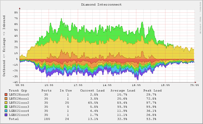 688 688 | 200603 computer graphics (RRDtool) by Ben Golden Graph shows inbound and outbound call traffic going in and out of the switch via the 6 trunks connected to the Diamond exchange. Inbound traffic shown as positive and uses a lowest-free fill method. Outbound traffic shown as negative uses a distributed fill method. Tech details on RRDtrac. |
 930 930 | 2002 computer graphics by Annja Krautgasser, Rainer Mandl, IP-III is a visualization application for mapping the online user presence in the Internet. The basic idea is to create a space typical to the Internet, which does not refer to the usual geographic information of online users (compare traffic visualization tools), but rather derives directly from the Internet specific code of the IP numbers.If the binary code of the IP addresses is transposed into spatial coordinates, a space constructing structure can be produced, which corresponds to a spatial language inherent to the Internet. Through the online user's applications as spatial coordinates, the created space modifies itself in real-time with the behavior of its visitors. An important aspect of the code conversion of the IP addresses into spatial coordinates is that the spatial interpretation of the IP addresses is not geographically translated in a classical sense, but rather the IP addresses are broken down into their binary code and, following this, allocated to a Cartesian coordinate system. With this, a virtual map is generated in which an autogenous net space is described - quasi a spatial map of the virtual Internet space. The installable net project 'IP-III' is comprised of two parts: In the 'online part' which is immediately defined for the online user as a website and in an 'installable part' of the exhibition. The sum of both parts produces a superposition of virtual and real space. |
 989 989 | 2005 computer graphics by Carlo Ratti, Andres Sevtsuk, Son The technology for determining the geographic location of cellphones and other hand-held devices is becoming increasingly available. It is opening the way to a wide range of applications, collectively referred to as Location Based Services (LBS), which are primarily aimed at individual users. However, if deployed to retrieve aggregated data in cities, LBS could become a powerful tool for urban cartography. The "Mobile Landscapes: Graz in Real Time" project was developed as part of the M-City exhibition (Graz Kunsthaus, 1 October 2005 - 8 January 2006, with curator Marco De Michelis), in collaboration with the cellphone operator A1/Mobilkom Austria. Three types of maps of the urban area of Graz, Austria, were developed and shown in real-time on the exhibition premises: cellphone traffic intensity, traffic migration (handovers) and traces of registered users as they move through the city. The images shown here represent traffic migration. This mapping method computes origins and destinations of cell-phone calls passing through the city of Graz. The results shown are calculated anonymously on all calls, in a statistically chosen order. The actual process of transferring calls from one cell-phone to another cell-phone is called a "handover." The traces, represented as orange lines, start and end in the corresponding geographic areas of where the cell phones were used to make and receive calls. |
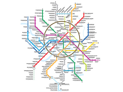 975 975 | computer graphics by (unknown) The Moscow Metro in Moscow, Russia, is the world's most heavily used metro system, with 3.2 billion passenger rides a year. It is well known for the ornate design of many of the stations, containing stunningly beautiful examples of socialist realist art. Inaugurated in May 1935, the Moscow Metro network currently has 277.9 km of route length, 12 lines and 171 stations, and on a normal weekday (according to the annual report 2004) it carries 10.05 million passengers. Passenger traffic is considerably lower on weekends bringing the average daily passenger traffic during the year to 8.745 million passengers per day. |
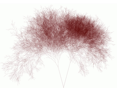 1059 1059 | 2006 computer graphics by (unknown) 2,147,483,647 web pages ('nodes') were numbered and arranged in a Binary Search Tree. For each page the traffic of the three major search bots (Yahoo! Slurp, Googlebot and msnbot) was monitored over a period of one year (between 2005-4-13 and 2006-4-13). Each search engine's behavior was visualized as a tree image that represents which nodes were crawled. Each line in the image represents a node, the number of times a search bot visited the node determines the length of the line. As part of the results, the authors found Yahoo! Slurp to be the most active search bot and the first search engine to discover the Binary Search Tree experiment. In the first hours after discovery it crawled the tree vigorously, at a speed of over 2.3 nodes per second. The image shown represents the resulting tree of Yahoo! Slurp crawling over 1 year. |
 319 319 | 1995 computer graphics by Evangelos P. Markatos and Athanasios E. Papathanasiou, Institute of Computer Science (ICS), Foundation for Research & Technology - Hellas (FORTH), Crete. |
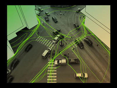 967 967 | 2005 computer graphics by Thomas Laureyssens The creation of the work is based on the movement of pedestrians on a public space. Some pedestrians walk only on the sidewalk and use the pedestrian crossing for crossing the street, other pedestrians freely make shortcuts on the formally imposed traffic situation. Pedestrian Levitation.net is an artwork in public space that reflects on this movement. It visualizes the real movement of people, and adds a virtual movement based on the assumption that people's mind is not subject to gravity or any other physical limitations. The movement of pedestrians is recorded with a camera from a high place like the roof of a building. A pattern of movement of the pedestrians is extracted by reworking this recording frame by frame with video animation software: it is as if pedestrians draw lines though the space. From this pattern, some dominant directions can be found. These directions will not be exactly what the urbanist foresaw when designing the public space at the location, but be the real flow, the real use of the city by its inhabitants. The movement of the pedestrians could be regarded as force-vectors thought the space. A person's trajectory from A -> B is nearly never a straight line, as many obstacles are in the way (like buildings), imposed trajectories (pedestrian crossings, sidewalks) and physical limitations (gravity). At this point a question is asked: how would the pedestrians move when they were not limited by anything? |
 310 310 | computer graphics by Stephen E. Lamm and Daniel A. Reed, Department of Computer Science, University of Illinois, USA |
 311 311 | computer graphics by Stephen E. Lamm and Daniel A. Reed, Department of Computer Science, University of Illinois, USA |
 312 312 | computer graphics by Stephen E. Lamm and Daniel A. Reed, Department of Computer Science, University of Illinois, USA |
 321 321 | 1999 computer graphics by Art+Com, Germany This image shows the interface of Ride the Byte, a virtual reality installation for exploring how Internet traffic is routed across the globe. The installation was created by Art+Com and first exhibited in the Wired Worlds gallery at the National Museum of Photography, Film and Television in the UK. From the artcom.de website: http://www.artcom.de/index.php?lang=en&option=com_acprojects&id=15&page=6 Ride the Byte was developed to make the normally invisible structure of the internet transparent for the general public and allow people to see the path taken by data packages transmitted via the internet. This electronic representation also visualises the flow of information to selected websites in the form of a simulated journey across a virtual reality globe. The journey begins at the actual site of the installation with a website being called up. This triggers the dispatch of data packages to the geographic destination of the selected website and the relevant server. The ever-changing route of the data packages is charted visually on the surface of the virtual reality globe. |
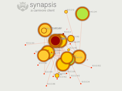 771 771 | 2003 computer graphics by Marcos Weskamp Synapsis is an application that partially visualizes network traffic. It is the uppermost layer for Carnivore, a network surveillance tool. Carnivore is an application that listens to all data traffic in a network (email, web surfing, etc.). Data travels on the Internet between two computers in packets. The Synapsis client visualizes the actual packets flowing on the network and partially reveals the network topology, at the same time that utlizies that input to generate a unique sound ambience. |
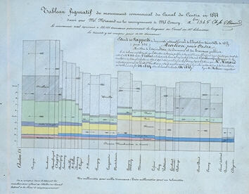 59 59 | 1844 Print by Charles Joseph Minard (1781-1870), France "Tableau-graphique" showing transportation of commercial traffic by variable-width (distance), divided bars (height ~ amount), area ~ cost of transport [An early form of the mosaic plot.]. Minard, C. J. (May 1844). Tableaux figuratifs de la circulation de quelques chemins de fer. lith. (n.s.). ENPC:5860/C351, 5299/C307. Dainville, F. d. (Oct. 1970). Les bases d'une cartographie industrielle de L'Europe au XIXe siècle. Tech. Rep. 540, Centre National de la Recherch Scientifique, Lyon. Colloques Internationaux du C.N.R.S. Robinson, A. H. (1967). The thematic maps of Charles Joseph Minard. Imago Mundi, 21 :95-108. |
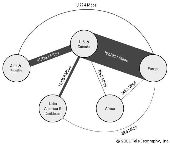 282 282 | 2001 computer graphics by TeleGeography, Inc. Example of the statistical maps and diagrams produced by TeleGeography, Inc. This map shows aggregate international Internet bandwidth between regions from 2001. [For more information see the Map of the Month article "TeleGeography's Traffic Flow Maps".] |
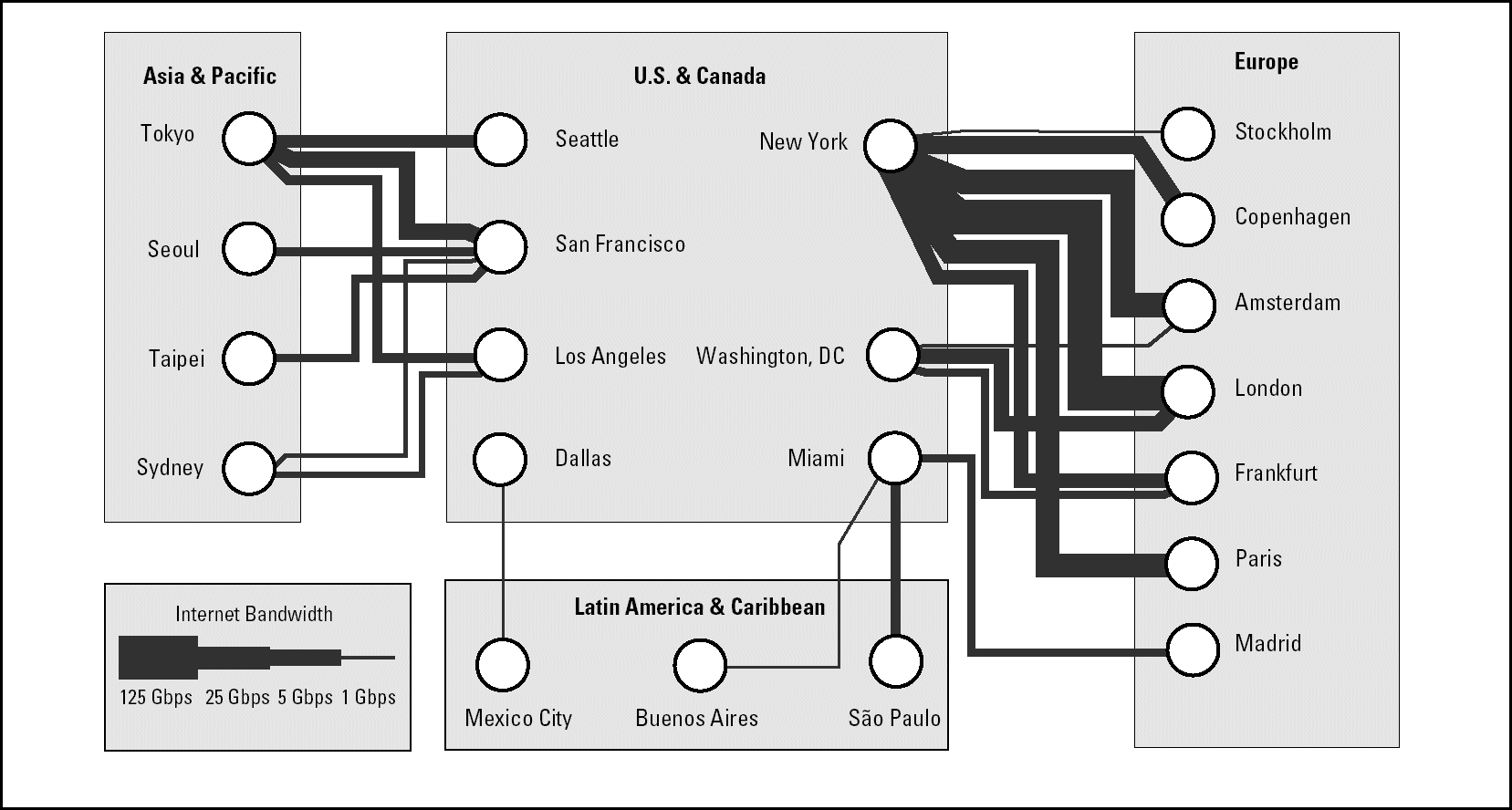 284 284 | 2001 computer graphics by TeleGeography, Inc. Example of the statistical maps and diagrams produced by TeleGeography, Inc. This map shows telegeography routes between regions from 2001. [For more information see the Map of the Month article "TeleGeography's Traffic Flow Maps".] |
 980 980 | 2003 computer graphics by Ed Blanchfield Ed Blanchfield used a Firewall/Intrusion Detection System (IDS) log data to get "before" and "after" graphs showing the impact of an MS-SQL worm, which hit the Internet around January 25th 2003. When this particular worm hit a large class B sized network, an IDS system designed and implemented by Blanchfield for a large managed services provider, was one of the first sites in the world to detect and report the incident. Ed posted his original findings and info to various security lists and quickly wrote up a parser to create GDL files from Firewall and IDS logs, which he fed into aiSee Graph Layout Software in order to visually map this worm's effect on their customer's network. The first image is a visualization of log data for a class B firewall without background worm traffic, while the second represents the same data with background worm traffic. The graphs show just 15 minutes worth of traffic at midnight, but the impact of the worm is already clearly visible. You can imagine what 24 hours must have been like. |
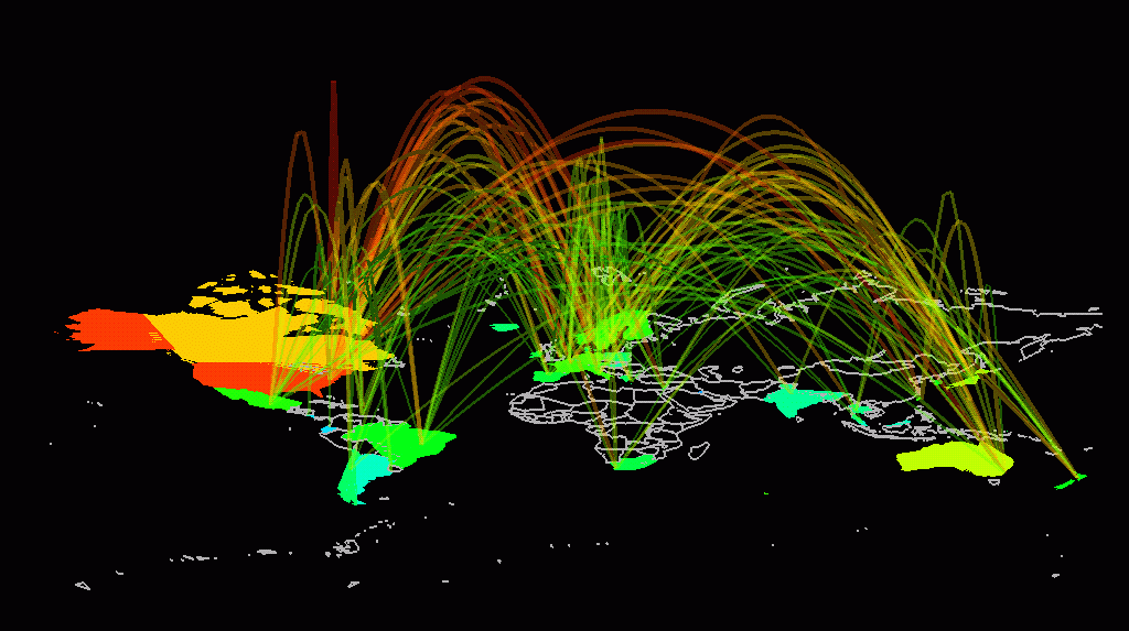
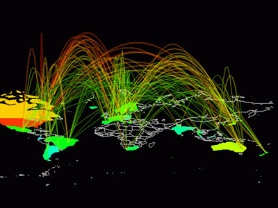
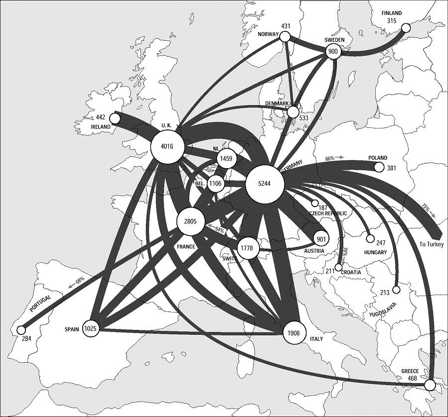
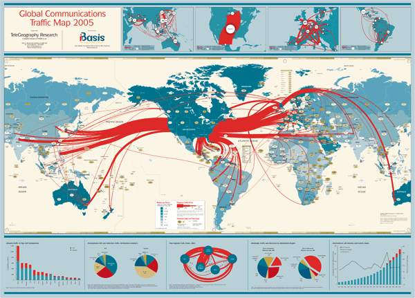
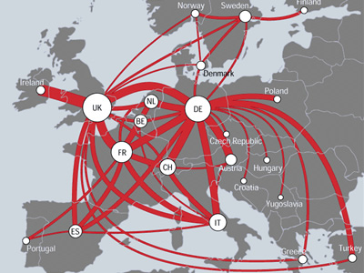 727 727 | 2000 computer graphics by (unknown) TeleGeography has produced arguably the best flows maps of the Net thus far, based on the volume of international telephone traffic between nations. Below is an example of one of their handcrafted telecommunications traffic flow maps for the European region. The map shows countries with traffic flows between them represented as smoothly curving red lines. The thickness of the lines is proportional to the annual volume of traffic between those two countries, measured in millions of minutes of voice telecommunication. (Note: only the principal route pairs, above a set threshold, are shown, to avoid cluttering the map.) Circular symbols, located on the capital city, encode the country's total annual outgoing traffic to all other countries. It is clear from the map that the UK, Germany, and France dominate traffic intra-European flows, forming a powerful triangle at the heart of the continent. Source: (http://mappa.mundi.net/maps/maps_014/) |
 1408 1408 | UK Road Traffic Accidents: A Leading Killer2012 Image by Pannone |
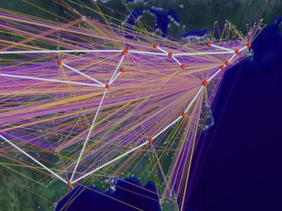
 934 934 | 2000 computer graphics by Karl Bilimoria, Banavar Sridhar An efficient and effective air traffic management system is vital to the U.S. transportation infrastructure. Since 1978, when the airline industry was deregulated, the inflation adjusted gross domestic product (GDP) has increased by 62 percent. In this same time period, total output of scheduled passenger air transportation (as measured by Revenue Passenger Miles) has increased by 190 percent and total airfreight ton miles have increased by 289 percent. Since 1997, flight delays have skyrocketed - doubling in only four years. These trends are expected to continue. In 1998, airline delays in the U.S. cost industry and passengers $4.5 billion -- the equivalent of a 7 percent tax on every dollar collected by all the domestic airlines combined. These screenshots are from an quicktime animation created with Future ATM Concepts Evaluation Tool (FACET) by NASA. It represents a day in the life of Air Traffic over the continental USA. The animation illustrates critical patterns on major airports and it's quite interesting to notice the different traffic intensity throughout the day. For more information one can read the paper here. |
 442 442 | computer graphics by Ben Fry A ghostly information visualisation of traffic through a Web site called Valence. It was created by Ben Fry, as part of his research into organic information design in the Aesthetics and Computation Group at the MIT Media Lab. |
 739 739 | 1995 computer graphics by Judith S. Donath The population of a real-world community creates many visual patterns. Some are patterns of activity: the ebb and flow of rush hour traffic or the swift appearance of umbrellas at the onset of a rain-shower. Others are patterns of affiliation, such as the sea of business suits streaming from a commuter train, or the bright t-shirts and sun-glasses of tourists circling a historic site.rnrnVisual Who makes these patterns visible. It creates an interactive visualization of the members' affiliations and animates their arrivals and departures. The visualization uses a spring model. The user chooses groups (for example, subscribers to a mailing-list) to place on the screen as anchor points. The names of the community members are pulled to each anchor by a spring, the strength of which is determined by the individual's degree of affiliation with the group represented by the anchor. The visualization is dynamic, with the motion of the names contributing to the viewer's understanding of the underlying data. |
 729 729 | 1994 computer graphics by Cox, Donna; Patterson, Robert This high-definition computer animation educates general audiences about the exponential growth of networking in the US and world. A data visualization spanning a two-year period represents rapid traffic growth that exceeds ten's of billions of bytes per day. The first image represents byte traffic into the ANS/NSFNET T3 backbone from its client networks for the month of December'94. The virtual connections, colored by traffic level, visualize traffic statistics collected by Merit Network Incorporated. The line colors represent traffic levels ranging from 0 bytes (purple) to one trillion bytes (white) The second image is a visualization study of inbound traffic measured in billions of bytes on the NSFNET T1 backbone for September 1991. The traffic volume range is depicted from purple (zero bytes) to white (100 billion bytes). |
 491 491 | computer graphics by Young Hyun This striking image is a 3D hyperbolic graph of Internet topology. They are created using the Walrus visualisation tool developed by Young Hyun at the Cooperative Association for Internet Data Analysis (CAIDA). The underlying data on the topological structure of the Internet is gathered by skitter, a CAIDA tool for large-scale collection and analysis of Internet traffic path data. |
 492 492 | computer graphics by Young Hyun This striking image is a 3D hyperbolic graph of Internet topology. They are created using the Walrus visualisation tool developed by Young Hyun at the Cooperative Association for Internet Data Analysis (CAIDA). The underlying data on the topological structure of the Internet is gathered by skitter, a CAIDA tool for large-scale collection and analysis of Internet traffic path data. |
 509 509 | computer graphics This is an example of the weather map for the CESNET2 network serving the education and research community in the Czech Republic from the 24th of January 2002. This map shows traffic load for links in the network over the previous ten minutes by colour coding of the arrow. |
 508 508 | computer graphics This is the weather map for the GRNET, the education and research network for Greece. Clicking on individual link arrows brings up more detailed traffic graphs. |
 503 503 | computer graphics Weather maps can also use non-geographic, topological diagrams to represent the network structure. This example diagram shows the traffic load on the GARR-B network in Italy. |
 433 433 | computer graphics by Antoine Visonneau, with colleagues in the Center for Design Informatics, Harvard Design School This project is developing prototype 3D visualisations of online behaviour. Their current designs use VRML to visualise traffic within a website, with the vertical gray bars being individual pages and the red lines. |
 325 325 | computer graphics by Sensorium WebHopper was an experimental mapping of Internet traffic in real-time. |
 326 326 | computer graphics by Sensorium WebHopper was an experimental mapping of Internet traffic in real-time. |
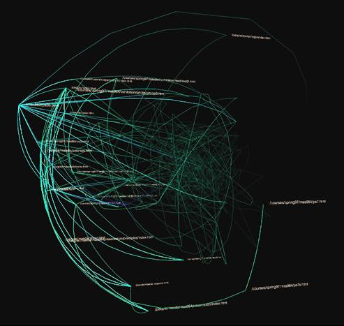
 942 942 | 2003 computer graphics by James Spahr Working with log data from webservers, James Spahr wrote software that looked at the referrer data and created a site tree. This map of the site is particularly relevant since it's formed by how the users travel through the site, illustrating its navigational flow. It is the aggregate view of how the user base views the hierarchy of the website. Its intent is to serve as a feedback tool for site designers. Does the user base have the same mental model of the website as the designer? Simple straight lines between pages are not used. Instead all traffic moves clockwise around the map. A clockwise circular pattern is used because directionality cannot be clearly labeled with straight lines. This work was displayed in the poster exhibit at the 2003 Information Architecture Summit. |
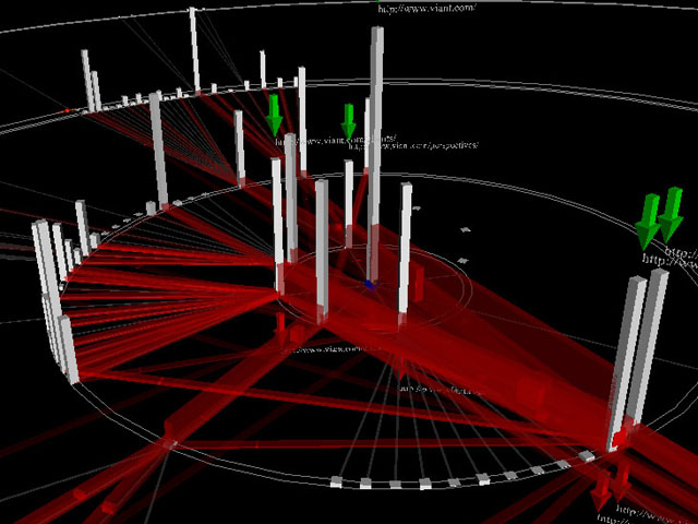
 843 843 | computer graphics by Antoine Visonneau (et al) The intent of WebTraffic is to develop prototype 3D visualizations of online behaviour - user paths across cyberspace. The project is lead by Antoine Visonneau, with colleagues in the Center for Design Informatics, Harvard Design School. Their latest designs used VRML to visualize traffic within a website, with the vertical gray bars being individual pages and the red lines links between them. |