Found 59 results for "science":
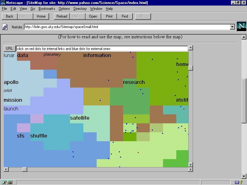 421 421 | computer graphics by Xia Lin, Drexel University This example is SiteMap developed by Xia Lin, Drexel University, maps part of the Web space relating to astronomy and space science as stored in the Yahoo directory. The hierarchical, text listing in Yahoo is transformed into landuse cybermap. |
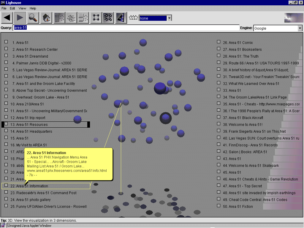 413 413 | computer graphics by Anton Leuski Lighthouse provides a visual interface to Web search engines. It was developed by Anton Leuski, a graduate student in the Computer Science Department at University of Massachusetts at Amherst. A demo version allowed you to visualise the results from major search engines such as Google and Excite. |
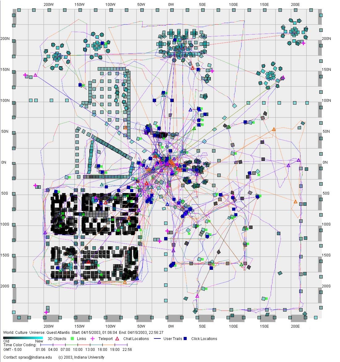 449 449 | computer graphics by Katy Börner, Shashikant Penumarthy and colleagues at the School of Library and Information Science, Indiana University A visualisation of the social patterns in the Culture virtual environment, part of the Quest Atlantis universe. The map shows user trails over time. It was produced using a visualisation tool developed by Katy Börner, Shashikant Penumarthy and colleagues at the School of Library and Information Science, Indiana University. The gallery page give more examples. This research paper gives more details on their analysis: "Visualizing the Spatial and Temporal Distribution of User Interaction Data Collected in Three-Dimensional Virtual Worlds", by Katy Börner, William R. Hazlewood and Sy-Miaw Lin. |
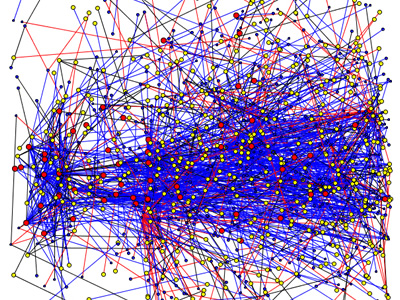
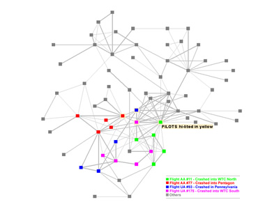 838 838 | computer graphics by Valdis Krebs "Social Network Analysis is a mathematical methodology for connecting the dots -- using science to fight terrorism. Connecting multiple pairs of dots soon reveals an emergent network of organization. Once you have a network map, you can measure parts of the network, or the whole, using social network metrics." Valdis Krebs used public information, from major newspapers on the WWW, to map the terrorist networks. In the network map, the hijackers are color coded by the flight they were on. The dark grey nodes are others who were reported to have had direct, or indirect, interactions with the hijackers. The gray lines indicate the reported interactions -- a thicker line indicates a stronger tie between two nodes. Notice the clustering around the pilots. |
 145 145 | 1989 computer graphics by Ted Mihalisin, USA Use of 'nested dimensions' (related to trellis and mosaic displays) for the visualization of multidimensional data. Continuous variables are binned, and variables are allocated to the horizontal and vertical dimensions in a nested fashion. Mihalisin, T., Gawlinski, E., Timlin, J., and Schwegler, J. (Oct. 1989). Multi-dimensional graphing in two dimensional spaces. Scientific Computing and Automation, 6:15-20. Mihalisin, T., Schwegler, J., and Timlin, J. (1992). Hierarchical multivariate visualization. In H. J. Newton (ed.), Computing Science and Statistics: Proceedings of the 24th Symposium on the Interface, vol. 24, pp.141-149. |
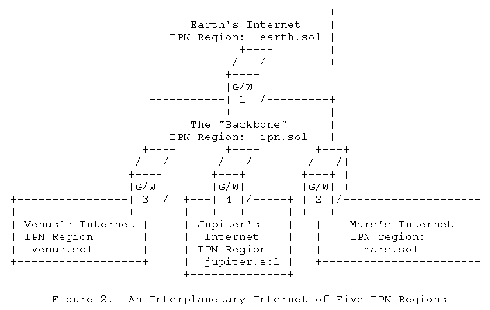 290 290 | 2001 computer graphics by Vint Cerf and colleagues A conceptual sketch of the possible architecture of the Interplanetary Internet (IPN), as proposed by Vint Cerf and colleagues. Further details are given in their Internet Draft (http://www.ipnsig.org/reports/memo-ipnrg-arch-00.pdf): Interplanetary Internet (IPN): Architectural Definition V. Cerf, Worldcom/Jet Propulsion Laboratory S. Burleigh, A. Hooke, L. Torgerson, NASA/Jet Propulsion Laboratory R. Durst, K. Scott, The MITRE Corporation E. Travis, Global Science and Technology H. Weiss, SPARTA, Inc. |
 1032 1032 | 2006 computer graphics by (unknown) The Atlas of Science project proposes the creation of an information system whose major aims is to achieve a graphic representation of the Spanish Science Research. Such representation is conceived as a collection of maps - hence its name - which pursues three major objectives: (1) To provide the Spanish Research Community with a tool for the analysis of the structure formed by the diverse scientific domains and its corresponding research fronts. (2) To generate a graphical interface allowing navigation functions throughout the semantic spaces formed by the maps. (3) To represent, through these dynamic maps, the evolution of the research in particular knowledge and institution domains. This will improve the ability of the scientific community to analyze trends in the development of future research directions. On the Atlas of Science website (http://www.atlasofscience.net) there are currently 8 countries being mapped, respectively Argentina, Brazil, Chile, Colombia, Cuba, Mexico, Spain, Venezuela. The map shown here represents Argentina's Atlas of Science, between 1990-2004, with its various thematic areas and links between them. |
 721 721 | 2002 computer graphics by Katy Borner, William Hazlewood, A visualisation of the social patterns in the Culture virtual environment, part of the Quest Atlantis universe. The map shows user trails over time. It was produced using a visualisation tool developed by Katy Borner, Shashikant Penumarthy and colleagues at the School of Library and Information Science, Indiana University. For more information on their analysis consult the research paper: Visualizing the Spatial and Temporal Distribution of User Interaction Data Collected in Three-Dimensional Virtual Worlds, by Katy Borner, William R. Hazlewood and Sy-Miaw Lin. |
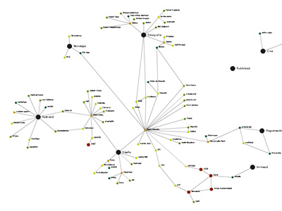
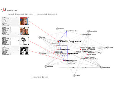 950 950 | computer graphics by (unknown) Bestiario is a studio based in Barcelona which work is based on a solid collaboration among several contributors. As stated in their website, they use non-conventional methods to transform complex content in interactive information spaces. The displayed graph shows the network of interactions between individuals and group representatives that collaborate with bestiario. The initial configuration organizes people by their knowledge and core competences, where intertwined names of people are arranged according to key domains, such as science, narrative or community. Every domain node can be re-arranged and names are clickable, showing more detailed information about the individual's expertise. |
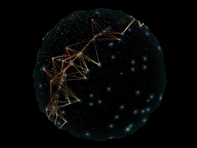 998 998 | 2005 computer graphics by Scott Hessels, Gabriel Dunne Celestial Mechanics is a planetarium artwork being created by Scott Hessels and Gabriel Dunne. Rather than a presentation of stars and planets, this "night sky" program reveals many of the aerial technologies hovering, flying, and drifting above us. This project combines science, statistical display, and contemporary art by interpreting the mechanical patterns and behaviors of these systems as culturally significant poetics. With help from government agencies and the science community, the artists worked with accurate tracking and protocol statistics to create 3-D models of the airborne systems. They then led a team of top animators to visualize those models in a style that reflects the chaos, force, and influence of these technologies. |
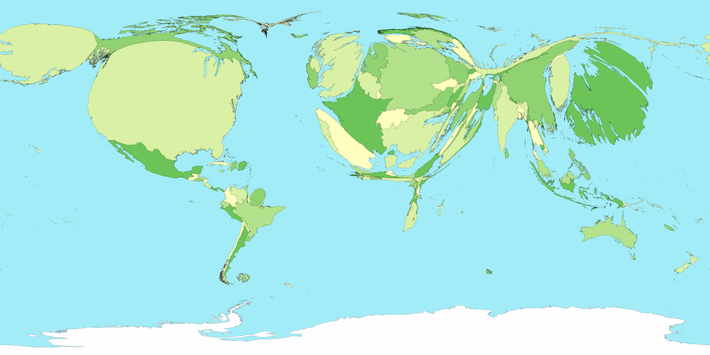
 701 701 | 2006 computer graphics by Mark Newman Cartogram of child mortality. Technical details: These cartograms were created using a variant of the diffusion algorithm of Gastner and Newman. Data for the population cartogram were taken from the Gridded Population of the World compiled by the International Center for Earth Science at Columbia University; elevation and bathymetric data were taken from the NOAA 2-minute Gridded Global Relief data set. Data for the other cartograms came from the United Nations Statistics Division and from the databases of the World Health Organization. In all of the cartograms on this page, Antarctica has been treated the same as the sea, meaning its area is unchanged although its shape may be distorted slightly to make room for changes in the sizes of other parts of the world. |
 928 928 | 2005 computer graphics by Wayne McIntosh, Ken Cousins, Ste This project focuses on the articulation, development, and dissemination of legal precedent across the multi-tiered system of American courts. With support from the National Science Foundation, the investigators are engaged in a mission to study and map the flow of precedent across the American court system during the full course of the 20th century on the issue of regulatory takings. They are still in the process of identifying and acquiring the corpus of cases relevant to the issue of regulatory takings, but have already demonstrated "proof of concept" for the citation mining and network graphing aspect of the project. The first graph represents a detail of the citations between all decisions in the current pool. Decisions (circles) are ordered on the x-axis, such that recent decisions appear furthest to the right side of the graph. Position along the y-axis is arbitrary. Information appearing to the right of the graph is generated by selecting decisions within the network. The second graph portraits the dynamics of citations to Parallel Courts. Decisions (circles) are coded by the court that issued them: Red - US Supreme, Yellow - US Circuit, Blue - US District. Citations (lines) are coded by the position of the court whose decision is cited, relative to the citing court: Blue - Higher, Black - Parallel, Red - Lower. |
 887 887 | 2005 computer graphics by (unknown) FAS.research is a research institution located in Vienna, Austria, which has been producing great work in network analysis for science and business. These images illustrate one of their several network analysis.rnrnSome Managers in Austria are officials of different companies. A person who is an official in two companies connects these companies. Information can flow from one board of directors to another by the connectors. The network shows the most important Austrian enterprises. The size of the circles shows the number of employees in the company. Lines represent connecting managers between these enterprises. The thicker a line, the more common managers these enterprises have. Red lines show the 1 step environment of Key Player Enterprises. Blue circles represent Key Player Enterprises. Key Players are those five companies from which information spread most efficient threw the whole network. Who the key players are depends on the selected number of key players.rnrnSource: Commercial Register, AustriarnPopulation: 2150 most important Austrian companiesrnSelection: 238 most central companies |
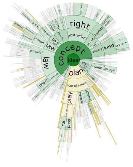 1264 1264 | 2006 Java by Christopher Collins DocuBurst is the first visualization of document content which takes advantage of the human-created structure in lexical databases. We use an accepted design paradigm to generate visualizations which improve the usability and utility of WordNet as the backbone for document content visualization. A radial, space-filling layout of hyponymy (IS-A relation) is presented with interactive techniques of zoom, filter, and details-on-demand for the task of document visualization. The techniques can be generalized to multiple documents. This image shows the occurrences of "idea" words in a general science textbook. The opacity of the node fill colour corresponds to the strength of occurrence of related terms in the target text. The graph structure is the WordNet hyponymy graph, rooted at "idea", and the gold coloured nodes match a search query for words starting with "pl". |
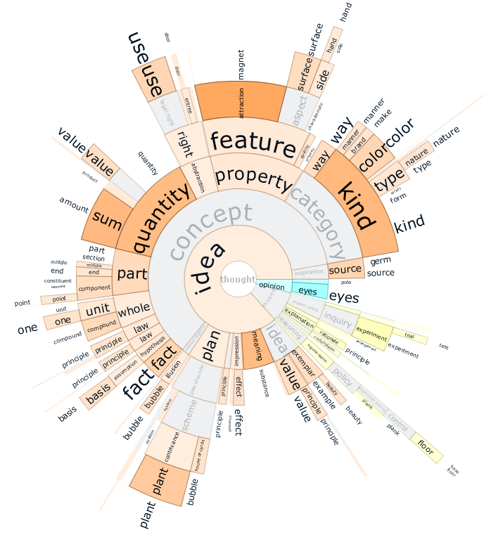 1268 1268 | 2006 Java by Christopher Collins DocuBurst is the first visualization of document content which takes advantage of the human-created structure in lexical databases. We use an accepted design paradigm to generate visualizations which improve the usability and utility of WordNet as the backbone for document content visualization. A radial, space-filling layout of hyponymy (IS-A relation) is presented with interactive techniques of zoom, filter, and details-on-demand for the task of document visualization. The techniques can be generalized to multiple documents. In this DocuBurst graph, occurrences of words in the document of interest (a science textbook) is indicated by increased opacity of the corresponding graph node. The graph structure is the WordNet hyponymy tree. Here, we can see that "kind" and "quantity" occur more often than "feature" and "idea", while "concept" does not occur at all. |
 704 704 | 2006 computer graphics by Mark Newman Cartogram of energy consumption (including oil). Technical details: These cartograms were created using a variant of the diffusion algorithm of Gastner and Newman. Data for the population cartogram were taken from the Gridded Population of the World compiled by the International Center for Earth Science at Columbia University; elevation and bathymetric data were taken from the NOAA 2-minute Gridded Global Relief data set. Data for the other cartograms came from the United Nations Statistics Division and from the databases of the World Health Organization. In all of the cartograms on this page, Antarctica has been treated the same as the sea, meaning its area is unchanged although its shape may be distorted slightly to make room for changes in the sizes of other parts of the world. |
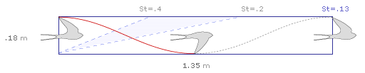 591 591 | 2003 computer graphics by Jonathon Corum Hashing out the classic question with Strouhal numbers and simplified flight waveforms. After spending some time last month trying to develop alternate graphic presentations for kinematic ratios in winged flight, I decided to try to answer one of the timeless questions of science: just what is the airspeed velocity of an unladen swallow? What do you mean, an African or European Swallow? To begin with, I needed basic kinematic data on African and European swallow species. South African Swallow (Hirundo spilodera) European Swallow (Hirundo rustica) ... |
 1054 1054 | 2006 computer graphics by Harald Katzmair, Helmut Neundlin FAS.research is a research institution located in Vienna, Austria, which has been producing great work in network analysis for science and business. Produced on July 9th, 2006, the day of FIFA World Cup Germany 2006 final match between Italy and France, this network shows the passes from every player to those three team-mates he passes to most frequently. Strength of arcs displays the number of passes. Size of nodes displays the influence (flowbetweenness) of a player. |
 99 99 | 1874 print by Francis Galton (1822-1911), England Galton's first semi-graphic scatterplot and correlation diagram, of head size and height, from his notebook on Special Peculiarities. Hilts, V. L. (1975). A Guide to Francis Galton's English Men of Science, vol.65. Philadelphia, PA: American Philosophical Society. |
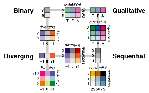 162 162 | 1994 by Cynthia Brewer Appropriate use of color for data display allows interrelationships and patterns within data to be easily observed. The careless use of color will obscure these patterns. When color is used 'appropriately,' the organization of the perceptual dimensions of color corresponds to the logical ordering in the data. Brewer develops a color scheme typology which matches the ways in which data are organized with corresponding organizations of hue and lightness. Four types of color schemes are represented. The image also illustrates how they can be used in combination for two-variable maps or visulizations. * diverging-- when the coloring variable has a meaningful midpoint (e.g., 0) * sequential-- for a continuously increasing series of values * qualitative-- when the coloring variable is categorical * binary-- for a two-level categorical coloring variable. Figure from Cynthia Brewer, Color Use Guidelines for Mapping and Visualization (http://www.personal.psu.edu/faculty/c/a/cab38/ColorSch/SchHome.html). Cynthia A. Brewer, 1994, "Color Use Guidelines for Mapping and Visualization," Chapter 7 (pp. 123-147) in Visualization in Modern Cartography, edited by A.M. MacEachren and D.R.F. Taylor, Elsevier Science, Tarrytown, NY. Cynthia A. Brewer, 1994, "Guidelines for Use of the Perceptual Dimensions of Color for Mapping and Visualization," Color Hard Copy and Graphic Arts III, edited by J. Bares, Proceedings of the International Society for Optical Engineering (SPIE), San Jose, February 1994, Vol. 2171, pp. 54-63. See also, Brewer's online color scheme picker, appropriately called "ColorBrewer," (http://www.personal.psu.edu/cab38/ColorBrewer/ColorBrewer_intro.html) and my Color Picker Page (http://www.math.yorku.ca/SCS/Gallery/colorpick.html). |
 705 705 | 2006 computer graphics by Mark Newman Cartogram of greenhouse gas emissions. Technical details: These cartograms were created using a variant of the diffusion algorithm of Gastner and Newman. Data for the population cartogram were taken from the Gridded Population of the World compiled by the International Center for Earth Science at Columbia University; elevation and bathymetric data were taken from the NOAA 2-minute Gridded Global Relief data set. Data for the other cartograms came from the United Nations Statistics Division and from the databases of the World Health Organization. In all of the cartograms on this page, Antarctica has been treated the same as the sea, meaning its area is unchanged although its shape may be distorted slightly to make room for changes in the sizes of other parts of the world. |
 700 700 | 2006 computer graphics by Mark Newman Cartograms are most often used to show population data, but there is no reason why they need be limited to population. They can in principle be used to show almost any quantity. Here is a cartogram of the world in which the sizes of countries are proportional to Gross Domestic Product, which is a measure of how much wealth a country's economy generates, and hence, to an extent, of the wealth of the country's inhabitants. Notice how America and Europe dominate this map, along with Japan (yes – that huge dark-green island on the right really is Japan), while Africa dwindles almost to invisiblity. Technical details: These cartograms were created using a variant of the diffusion algorithm of Gastner and Newman. Data for the population cartogram were taken from the Gridded Population of the World compiled by the International Center for Earth Science at Columbia University; elevation and bathymetric data were taken from the NOAA 2-minute Gridded Global Relief data set. Data for the other cartograms came from the United Nations Statistics Division and from the databases of the World Health Organization. In all of the cartograms on this page, Antarctica has been treated the same as the sea, meaning its area is unchanged although its shape may be distorted slightly to make room for changes in the sizes of other parts of the world. |
 1023 1023 | 2006 computer graphics by (unknown) Coordinated by the Institute for Philosophical Research and in cooperation the Hungarian Ministry of Information and Communicaton and the Hungarian Academy of Science, this knowledge network is an attempt to visualize the relationships among main subject areas within the Hungarian Virtual Encyclopedia. Based on a force directed algorithm (spring algorithm) this highly complex and detailed interactive piece allows the user to navigate between a large variety of words, such as atom, information, Descartes or ADSL, and see all the inherent relationships between them. All the entries (in Hungarian) were edited by highly recognized researchers of the field. When accessing the Encyclopedia website, a user can just click on "cimdokumentumok terkepe", in the upper right corner of every entry, for a map of the interlinkage of the entries to appear. |
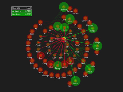 791 791 | 2004 computer graphics by Axel Cleeremans This Java applet (build with Processing) is a demonstration of "Interactive Activation and Competition" neural networks, as first described by J.L. McClelland in the following paper: McClelland, J.L. (1981). Retrieving general and specific information from stored knowledge of specifics. Proceedings of the Third Annual Meeting of the Cognitive Science Society, 170-172. The model was a landmark illustration of how simple networks of interconnected elements (artificial neurons, so to speak) can be organized so as to form a memory system that exhibits several crucial properties of human memory. In this demo and in the original article, the model captures what someone might know about characters inspired from the 1961 musical "West Side Story", in which two gangs (the "Jets" and the "Sharks") fight for territory and overall dominance. Units, the activation level of which represents the fact that the feature they stand for is true to some degree, are organized in separate groups, each corresponding to the different possible values of a single feature, such as the name of an individual, his age, his education level, his marital status, his occupation, or the gang to which he belongs. |
 279 279 | 1991 computer graphics by Larry Landweber, Computer Science Department, University of Wisconsin - Madison, USA A "census" of Internet connectivity by countries has been undertaken at regular intervals by Larry Landweber, Computer Science Department, University of Wisconsin - Madison, USA. This map shows the differential levels of network connectivity in September 1991. The change in connectivity levels (compared with his 1997 map) is clearly evident, showing the spread of the Internet. Landweber's maps and data tables are available. [For more information on Landweber's maps see the Map of the Month article "Mapping the Global Spread of the Net" in Mappa.Mundi Magazine.] |
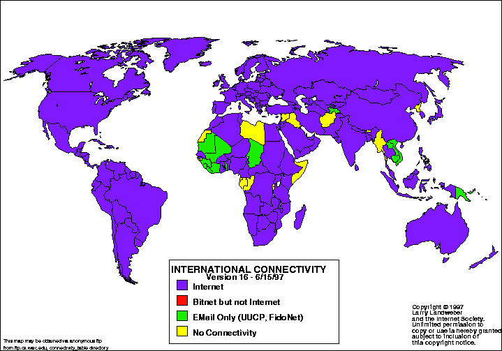 278 278 | 1997 computer graphics by Larry Landweber, Computer Science Department, University of Wisconsin - Madison, USA A "census" of Internet connectivity by countries has been undertaken at regular intervals by Larry Landweber, Computer Science Department, University of Wisconsin - Madison, USA. This map shows the connectivity position in June 1997. The change in connectivity levels (compared with his 1991 map) is clearly evident, showing the spread of the Internet. Landweber's maps and data tables are available. [For more information on Landweber's maps see the Map of the Month article "Mapping the Global Spread of the Net" in Mappa.Mundi Magazine.] |
 133 133 | 1996 computer graphics by Jason Dykes, England Cartographic Data Visualiser: a map visualization toolkit with graphical tools for viewing data, including a wide range of mapping options for exploratory spatial data analysis. Dykes, J. A. (1996). Dynamic maps for spatial science, a unified approach to cartographic visualization. In D. Parker (ed.), Innovations in GIS 3, pp. 177-187. London: Taylor & Francis. |
 748 748 | 2005 computer graphics by George Legrady, Andreas Schlegel Making Visible the Invisible is an installation consisting of 6 large LCD screens located on a glass wall horizontally behind the librarian's main information desk in the Mixing Chamber of the Seattle Central Library, a large open 19,500 sq ft space dedicated to information retrieval and public accessible computer research. "The screens feature real-time calculated animation visualizations generated by custom designed statistical and algorithmic software using data received each hour. This data consists of a list of checked-out items organized in chronological order. The item may be a book, a DVD, a CD, a VHS tape, etc. and from the list we can collect and aggregate titles, checkout time, catalog descriptors such as keywords, Dewey classification code if they are non-fiction items. There are approximately 36000 items circulating per day. Items with Dewey Decimal System labels provide for a way to get a perspective on what subject matters are of current interest at any given time as the Dewey system classifies all items according to 10 major categories: 000 Generalities; 100 Philosophy & Psychology; 200 Religion; 300 Social Science; 400 Language; 500 Natural Science & Mathematics; 600 Technology & Applied Sciences; 700 Arts; 800 Literature; 900 Geography & History. These are then subdivided into 100 segments." |
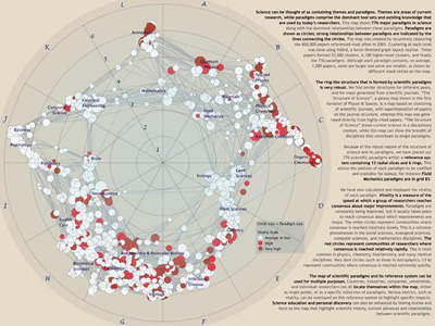 1028 1028 | 2006 computer graphics by Kevin W. Boyack, Richard Klavans Dr. Kevin Boyack is in the Computation, Computers, and Mathematics Center at Sandia National Laboratories. Richard Klavans is with SciTech Strategies, Inc. They are interested in the mapping of science as a platform for planning and evaluation on national, corporate, and personal levels. Science can be thought of as containing themes and paradigms; themes are current areas of research while paradigms comprise the dominant tool sets and existing knowledge that are used by current researchers. To generate this map, Boyack and Klavans recursively clustered (using the VxOrd graph layout tool) the 820,000 most important papers referenced in 2003, resulting in 776 paradigms. The most dominant relationships between paradigms were also calculated and are shown as lines between paradigms. The map of scientific paradigms comprises a reference system that can be used for multiple purposes. Countries, industries, companies, and individual researchers can all locate themselves within the map, either as single points, or as a specific collection of paradigms. Science education and discovery can also be enhanced by linking stories and facts to the map that highlight content and relationships between scientific paradigms. This map will be on display at the NYPL Science, Industry, and Business Library, New York, as part of the "Places & Spaces: Mapping Science" exhibition, from April 3rd - August 31st, 2006. |
 906 906 | 2005 computer graphics by Guille Lopez Gines The knowledge has revealed like a key factor in the development of any idea or project. Nowadays we are surrounded by information, but what really interests it is to be able to interpret and understand data, thus to obtain knowledge. For it, under the idea of this project, it has to arise a new form to show and to interact with the information: the schematic. The schematic is a logical and structured language, where data and abstract slight knowledge can be show in a "organized complex" visualization constituted by significant informative elements and the established underlying relations among them. Really, a place where the user can understand each data in its own context. This flash tools visualizes a series of URL's organized by main areas such as: Design, Illustration, Photography, Music, Science, etc, in an effort to organize one's source of inspiration for new ideas to arise. |
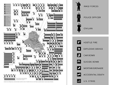 999 999 | 2006 computer graphics by Adriana Lins de Albuquerque, Ali In January 2006, more than 800 people - soldiers, security officers and civilians - were killed as a result of the insurgency in Iraq. While the daily toll is noted in the newspapers and on TV, it is hard for many of us to see these isolated reports in a broader context. This map, based on data from the American, British and Iraqi governments and news reports, shows the dates, locations and circumstances of deaths for the first month of the year. It was developed by Adriana Lins de Albuquerque, a doctoral student in political science at Columbia University, and by Alicia Cheng, a graphic designer at mgmt. design in Brooklyn. Given the fog of war, the information may be incomplete. Nonetheless, it was the authors' effort to visually depict the continuing human cost of the Iraq war. |
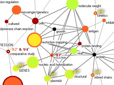 715 715 | 2004 computer graphics by Ketan K. Mane, Katy Borner This work demonstrates an approach to map the dynamics of scientific knowledge via analysis of the complete set of papers published in the Proceedings of the National Academy of Science (PNAS) in the years 1982-2001. Data analysis techniques are applied to citation data within this corpus to analyze and visualize highly frequent words as well as sudden increases in the usage patterns of words, called 'bursts'. |
 828 828 | 1996 computer graphics by Elan Amir A map of the Multicast Internet backbone (MBone) topology in August 1996. The map was produced by Elan Amir, Computer Science Division, University of California at Berkeley, USA. For a large version of this image click here. |
 936 936 | 2003 computer graphics by (unknown) This highly complex diagram is part of Roche Applied Science "Biochemical Pathways" series of wall charts. Roche created two informative wall charts, representing metabolic research in many life science fields, including molecular biology, cell biology, receptors and immunological interactions, and much more. The charts make it easy to find the metabolic pathways that most interest a particular user/researcher. This digitized version of the pathways map focuses on Metabolic Pathways and is available at the ExPASy Molecular Biology Server. |
 899 899 | 2003 computer graphics by T.J. Jankun-Kelly, Kwan-Liu Ma Graph and tree visualization techniques enable interactive exploration of complex relations while communicating topology. However, most existing techniques have not been designed for situations where visual information such as images is also present at each node and must be displayed. MoireGraphs intents to address this need. MoireGraphs combine a focus+context radial graph layout with a suite of interaction techniques (focus strength changing, radial rotation, level highlighting, secondary foci, animated transitions and node information) to assist in the exploration of graphs with visual nodes. The method is scalable to hundreds of displayed visual nodes. Source: IEEE Computer Science Press 2003 |
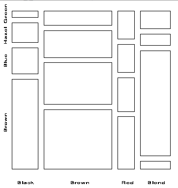 142 142 | 1981 computer graphics by John Hartigan and Beat Kleiner, USA Mosaic display á la Hartigan and Kleiner. Hartigan, J. A. and Kleiner, B. (1981). Mosaics for contingency tables. In W. F. Eddy (ed.), Computer Science and Statistics: Proceedings of the 13th Symposium on the Interface, pp. 268-273. New York, NY: Springer-Verlag. Friendly, M. (2002). A brief history of the mosaic display. Journal of Computational and Graphical Statistics, 11(1):89-107. |
 467 467 | computer graphics by H. Shiozawa and Y. Matsushita Natto View, a dynamic 3D visualisation of the Web. It is being developed by H. Shiozawa and Y. Matsushita, Faculty of Science and Technology, Keio University, Japan. |
 319 319 | 1995 computer graphics by Evangelos P. Markatos and Athanasios E. Papathanasiou, Institute of Computer Science (ICS), Foundation for Research & Technology - Hellas (FORTH), Crete. |
 702 702 | 2006 computer graphics by Mark Newman Cartogram of people living with HIV/AIDS. Technical details: These cartograms were created using a variant of the diffusion algorithm of Gastner and Newman. Data for the population cartogram were taken from the Gridded Population of the World compiled by the International Center for Earth Science at Columbia University; elevation and bathymetric data were taken from the NOAA 2-minute Gridded Global Relief data set. Data for the other cartograms came from the United Nations Statistics Division and from the databases of the World Health Organization. In all of the cartograms on this page, Antarctica has been treated the same as the sea, meaning its area is unchanged although its shape may be distorted slightly to make room for changes in the sizes of other parts of the world. |
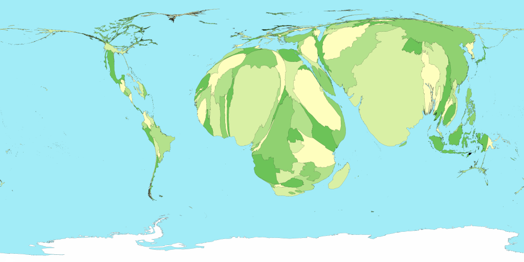
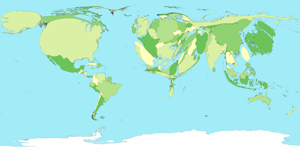
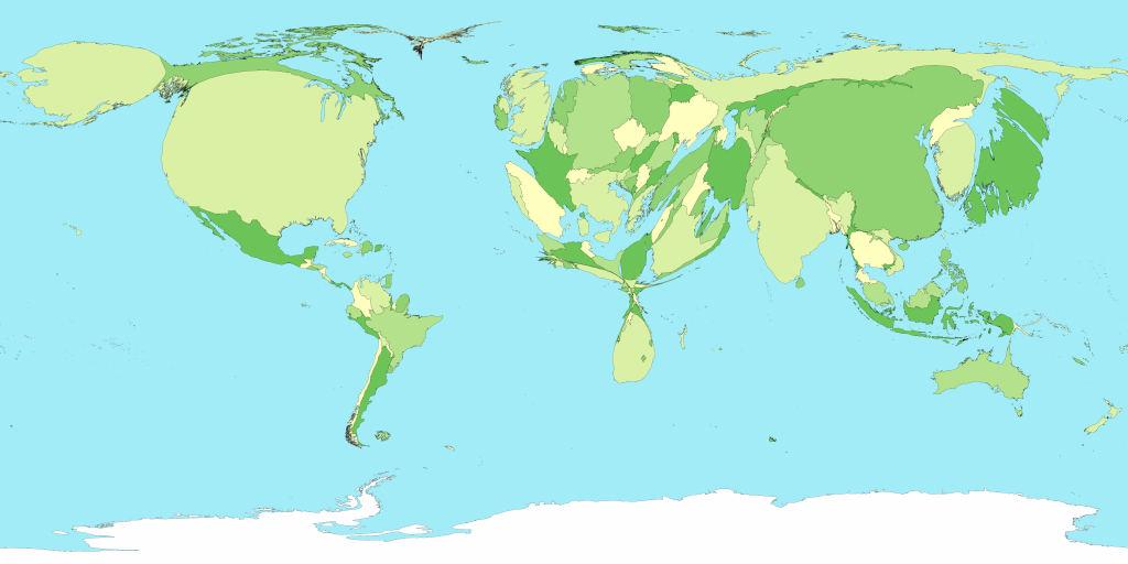
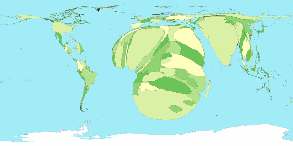
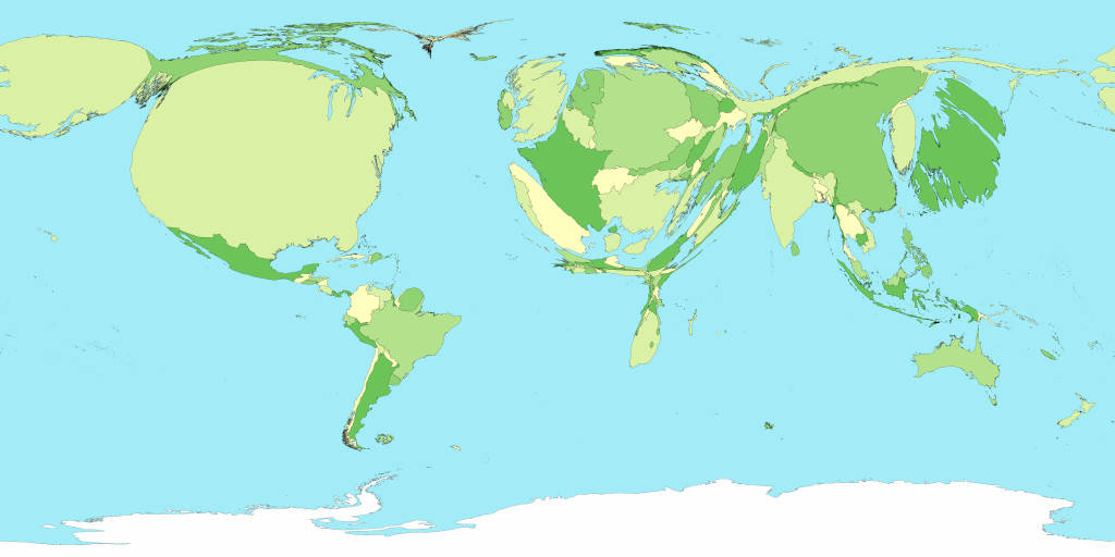
 699 699 | 2006 computer graphics by Mark Newman, Danny Dorling In this map the sizes of countries are proportional not to their actual landmass but instead to the number of people living there; a country with 20 million people, for instance, appears twice as large as a country with 10 million. Although the figures for populations of countries are well established and familiar to many, the cartogram provides a new way of looking at them and in particular makes clear the enormous disparity in the population of different regions. Note how large India and China have become: between them these two countries account for more than a third of the population of the world. On the other hand, notice the near-disappearance of Canada and Russia, the world's two largest countries by land area, which have relatively few people in them. Notice also how the lines of latitude and longitude have become distorted by the growing and shrinking countries. This is an unavoidable consequence of the cartogram transformation: in order to give the countries the right sizes and still have them fit together you need to warp things a bit. The method used here, however, does a pretty good job of keeping the map recognizable. Technical details: These cartograms were created using a variant of the diffusion algorithm of Gastner and Newman. Data for the population cartogram were taken from the Gridded Population of the World compiled by the International Center for Earth Science at Columbia University; elevation and bathymetric data were taken from the NOAA 2-minute Gridded Global Relief data set. Data for the other cartograms came from the United Nations Statistics Division and from the databases of the World Health Organization. In all of the cartograms on this page, Antarctica has been treated the same as the sea, meaning its area is unchanged although its shape may be distorted slightly to make room for changes in the sizes of other parts of the world. |
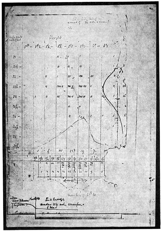
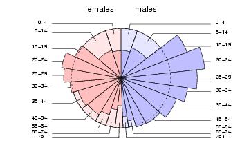
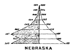 89 89 | 1874 print by Francis Amasa Walker (Superintendent of U.S. Census) (1840-1897), USA Age pyramid (bilateral histogram), bilateral frequency polygon, and the use of subdivided squares to show the division of population by two variables jointly (an early mosaic display) in the first true U.S. national statistical atlas. Walker, F. A. (1874). Statistical Atlas of the United States, Based on the Results of Ninth Census, 1870, with Contributions from Many Eminent Men of Science and Several Departments of the [Federal] Government. New York: Julius Bien. |
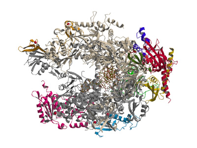 824 824 | computer graphics by Peter Uetz Large protein complex and its protein-protein interactions. Ribbon representation of the RNA Polymerase II complex structure. (B) Schematic interaction diagram for the 10 subunits. The thickness of the connecting lines corresponds to the surface area buried in the corresponding subunit interface. Colors of subunits are identical in (A) and (B). From Cramer et al. (2001) Structural basis of transcription: RNA polymerase II at 2.8 � resolution. Science 2001, 292:1863-1876. |
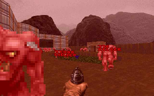 431 431 | computer graphics by Dennis Chao at the University of New Mexico Department of Computer Science The popular game Doom is used as a 3D information environment for Unix system management in this neat tool. The computer processes are represented by individual monsters which you can kill! |
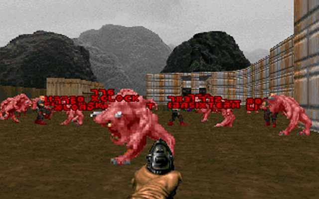 430 430 | computer graphics by Dennis Chao at the University of New Mexico Department of Computer Science The popular game Doom is used as a 3D information environment for Unix system management in this neat tool. The computer processes are represented by individual monsters which you can kill! |
 908 908 | 2004 computer graphics by (unknown) FAS.research is a research institution located in Vienna, Austria, which has been producing great work in network analysis for science and business. These images illustrate one of their several network analysis. Various institutions (circles) are engaged in joint activities, which shall promote the public understanding of science and technology. The participating institutions are members of various color coded fields: Enterprises (purple), schools (light green), lobbies (blue), universities (orange), political organisations (yellow), museums (teal), media (turquoise), non-university research (red), non-governmental organizations (dark plum). The color-distribution shows at one glance the interconnectedness between various fields: political organisations (as for example ministries) are located in the centre of the network, universities and non-university-research are strongly tied together, whereas enterprises play a peripheral role, particularly connected with the field of media. |
 100 100 | 1863 print by William Stanley Jevons (1835-1882), England Semilogarithmic grid (showing percentage changes in commodities). Jevons, W. S. (1863). A serious fall in the value of gold ascertained, and its social effects set fourth. London. Jevons, W. S. ([1879] 1958). Graphical method. In Principles of Science: A Treatise on Logic and Scientific Method, pp. 492-496. New York: Dover, 3rd edn. First ed.: 1874; page numbers from 3rd Ed. Dover reprint (1958). |
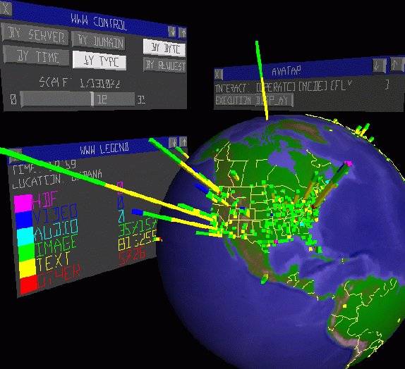 311 311 | computer graphics by Stephen E. Lamm and Daniel A. Reed, Department of Computer Science, University of Illinois, USA |
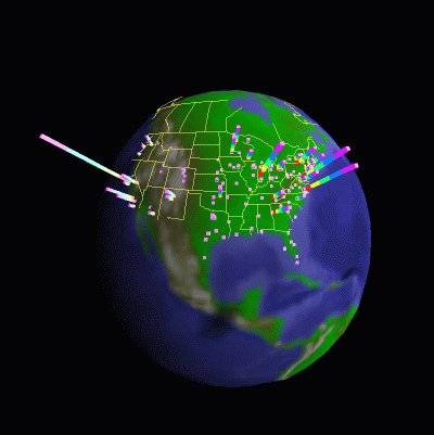 312 312 | computer graphics by Stephen E. Lamm and Daniel A. Reed, Department of Computer Science, University of Illinois, USA |
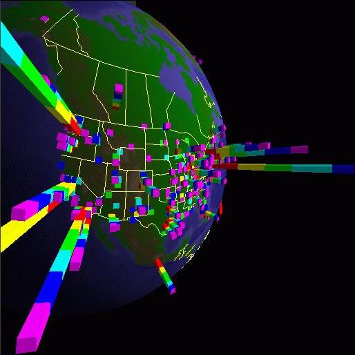 310 310 | computer graphics by Stephen E. Lamm and Daniel A. Reed, Department of Computer Science, University of Illinois, USA |
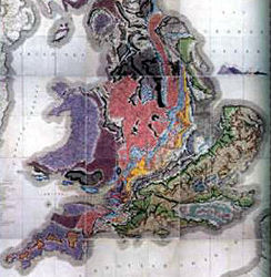 62 62 | 1801 print by William Smith (1769-1839), England The first large-scale geological map of England and Wales, setting the pattern for geological cartography, and founding stratigraphic geology. Recently called (hyperbolically) "the map that changed the world." (Smith's map was first drawn in 1801, but the final version was not published until 1815.) Smith, W. (Feb. 1815). A delineation of the strata of England and Wales, with part of Scotland; exhibiting the collieries and mines, the marshes and fenlands originally overflowed by the sea, and the varieties of soil according to the substrata, illustrated by the most descriptive names . London: John Cary. BL: Maps 1180.(19). Morton, J. L. (1992). Strata: How William Smith drew the First map of the Earth in 1801 and inspired the Science of Geology. Stroud, England: Tempus Publishing. ISBN 0 7524 1992. Winchester, S. (2001). The Map That Changed the World: William Smith and the Birth of Modern Geology. New York: Harper Collins. |
 171 171 | 2003 print by Israel Bureau of Statistics The crusty pie chart gets a new topping! A pie chart depicts a partition. A Spie chart combines two pie charts to compare partitions. One pie chart is drawn as-is, and serves as the basis for comparison. The other is superimposed on the first, using the same angles for the slices, but different radii, so as to achieve the desired areas. The example shows road casualties data from Israel. The base pie chart shows the general population parititoned into gender and age groups. The superimposed chart shows the same partitioning for the population of road casualties. Obviously the main age group hit is 20--24, and males are much more often involved in accidents that females. Reference: D. G. Feitelson, "Comparing Partitions with Spie Charts". Technical Report 2003-87, School of Computer Science and Engineering, The Hebrew University of Jerusalem, Dec 2003. URL: http://www.cs.huji.ac.il/~feit/papers/Spie03TR.pdf |
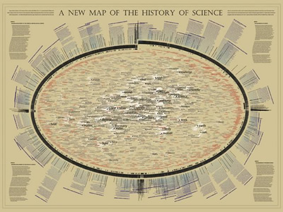 1034 1034 | 2006 computer graphics by W. Bradford Paley For the "Places & Spaces: Mapping Science" exhibition, W. Bradford Paley approached making a map of science indirectly, by making a map of a book describing The History of Science. In this way, he leveraged the intelligent organization by Henry Smith Williams (the history's author): this map was created more to take advantage of a culturally recognized way of organizing science than to invent a new one. The history's first two volumes are organized strictly historically, so as the book wraps around the right side of the ellipse it is organized as a time line. The next two volumes distinguish two major domains - making two time lines - for more recent scientific exploration: the physical sciences (along the bottom left) and the life sciences (top left). Since the scattered words are pulled toward the places where they are used in the text, structure emerges: names of individuals appear along the outside, as they are usually mentioned in only one or two places, and concepts that are common to science of all eras (e.g., system, theory, experiment) are pulled to the center, as they are mentioned everywhere. This map was on display at the NYPL Science, Industry, and Business Library, New York, as part of the "Places & Spaces: Mapping Science" exhibition, from April 3rd - August 31st, 2006. |
 888 888 | 2005 computer graphics by (unknown) FAS.research is a research institution located in Vienna, Austria, which has been producing great work in network analysis for science and business. These images illustrate one of their several network analysis. The celebrity report 'Seitenblicke' features three events every night, taking place at different locations. All events are subsumed under 9 main and 45 mythological subclasses. (birth: opening nights, vernissage; death: leaving stage, an enterprise, an ambassador leaving the country, etc.) If a ball, like the opera ball took place at the Opera House, there is a link between the Viennese Opera House and the category CYCLIC EVENTS: Cyclic Balls. The thickness/ the value of the line not only shows how often a cyclic Ball took place at the opera house. The number of people interviewed at each ball also puts weight on the line. White nodes represent locations that are linked to more than just one and the same main category. By brokering like this, the centrality of these locations is higher. As for the enourmous amount of nodes (995 different locations, 45 categories of 2200 different events, 6150 different people, 13100 relations) a cut off level of 10 has been imposed on the lines of the 2mode network. Observation Period: Oct 01- June 04 |
 703 703 | 2006 computer graphics by Mark Newman Cartogram of total spending on healthcare. Technical details: These cartograms were created using a variant of the diffusion algorithm of Gastner and Newman. Data for the population cartogram were taken from the Gridded Population of the World compiled by the International Center for Earth Science at Columbia University; elevation and bathymetric data were taken from the NOAA 2-minute Gridded Global Relief data set. Data for the other cartograms came from the United Nations Statistics Division and from the databases of the World Health Organization. In all of the cartograms on this page, Antarctica has been treated the same as the sea, meaning its area is unchanged although its shape may be distorted slightly to make room for changes in the sizes of other parts of the world. |
 88 88 | 1880 print by John Venn (1834-1923), England Representation of logical propositions and relations diagrammatically. [Actually, Liebnitz and, to some degree, Euler had used such diagrams previously.]. Venn, J. (1880). On the diagrammatic and mechanical representation of propositions and reasonings. The London, Edinburgh, and Dublin Philosophical Magazine and Journal of Science, 9:1-18. Venn, J. (1881). Symbolic Logic. London: MacMillan. |
 912 912 | 2003 computer graphics by Katy Borner, Chaomei Chen, Kevin Advanced data mining and information visualization techniques can be applied to support science and technology management. Large amounts of, e.g., publication, patent, and grant data are analyzed, correlated, and visualized to map the semantic space of researchers, publications, funding, etc.. The resulting visualizations can be utilized to objectively identify major research areas, experts, institutions, grants, publications, journals, etc. in a research area of interest. In addition, they can assist identify interconnections, the import and export of research between fields, the dynamics (speed of growth, diversification) of scientific fields, scientific and social networks, and the impact of strategic and applied research funding programs among others. Using a tutorial style, various algorithms were applied to map papers related to "Visualizing Knowledge Domain" research, the so called ARIST data set. Never before have so many knowledge domain mapping algorithms been applied to one data set. |
 737 737 | computer graphics by Katy Borner, Chaomei Chen, Kevi Boyack, Kevin W. and Börner, Katy. (2003). Indicator-Assisted Evaluation and Funding of Research: Visualizing the Influence of Grants on the Number and Citation Counts of Research Papers, Journal of the American Society of Information Science and Technology, Special Topic Issue on Visualizing Scientific Paradigms, 54(5):447-461. |
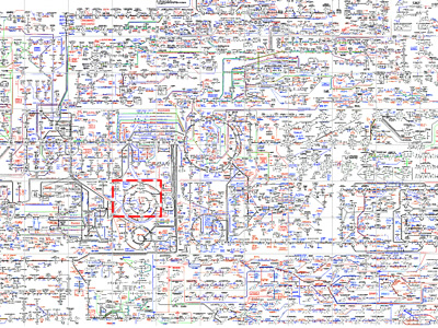
 713 713 | 2001 computer graphics by Chandra L. Tucker, Joseph F. Ger Yeast protein interaction network of aprox. 200 interacting proteins based on published interactions. Inset shows close-up of region highlighted in box. Highlighted in red are cell structure proteins (a single functional class). Proteins in this category can be observed to cluster primarily in one region. Although interacting proteins are not depicted in a way that is consistent with their known cellular location (i.e. those proteins known to be present in the nucleus in the center of the interaction map and those present in plasma membranes in the periphery), signal-transduction pathways (or at least protein contact paths) can be inferred from this diagram. Also highlighted (in blue) are proteins involved in galactose regulation. These proteins are put in a functional context. (copyright) 2001 Elsevier Science Ltd. |
 811 811 | computer graphics by (unknown) Yeast protein interaction network of aprox. 200 interacting proteins based on published interactions. Inset shows close-up of region highlighted in box. Highlighted in red are cell structure proteins (a single functional class). Proteins in this category can be observed to cluster primarily in one region. Although interacting proteins are not depicted in a way that is consistent with their known cellular location (i.e. those proteins known to be present in the nucleus in the center of the interaction map and those present in plasma membranes in the periphery), signal-transduction pathways (or at least protein contact paths) can be inferred from this diagram. Also highlighted (in blue) are proteins involved in galactose regulation. These proteins are put in a functional context. (copyright) 2001 Elsevier Science Ltd. |