Found 272 results for "network traffic ":
 848 848 | computer graphics by Kenneth C.Cox, Stephen G. Eick, In an attempt to solve some of the inherent problems of 2D network visualizations, Eick (et al) proposed a series of alternative structures. As the authors say: "One way to solve the clutter problem inherent in 2D network displays is to draw the network in 3D. The idea is that by positioning the nodes in 3D and drawing arcs instead of links, we can eliminate the line crossings that confuse 2D displays. Of course when viewed from any particular angle certain links may appear to cross on a 2D computer screen. The advantage, however, of the 3D representation is that through our preattentive depth perception we will automatically perceive the display correctly." The second image shows an attempt of positioning the nodes in a helix, which according to the authors, makes a better use of screen real-estate. |
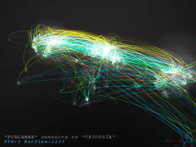
 306 306 | 1996 computer graphics by Stephen G. Eick and colleagues, Bell Laboratories Two examples of the research work of Stephen G. Eick and colleagues at Bell Laboratories into the visualization and analysis of Internet traffic flows. Their 1996 research paper "3D Geographic Network Display" provides further details. |
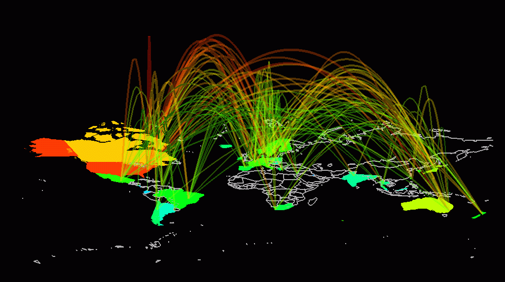
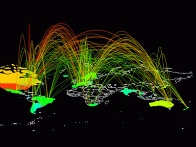 789 789 | 1993 computer graphics by Stephen G. Eick The arc map displays a 3D network structure as arcs curving smoothly above a flat map of the world. The data being visualized is Internet traffic flows between fifty countries, as measured by the NSFNET backbone in 1993. The colour, thickness and height of the arcs is used to encode the traffic statistics for particular inter-country links. The arcs are also partially translucent so as not to completely obscure lines at the back of the map, while their height above the base map is in relation to total volume of traffic flowing over a link. This has the effect of making the most important (high traffic) links, the highest and therefore most visually prominent on the map. The user has considerable interactive control over the arc map, for example the arc height scaling and translucency can be varied. The map can also be rotated and scaled, so that the user can view it from any angle. |
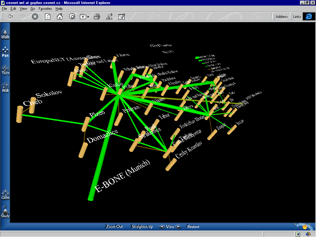 360 360 | computer graphics CESNET is the Czech educational and scientific network. Unfortunately, the map is no longer available. Current topology of CESNET: http://www.ces.net/network/ |
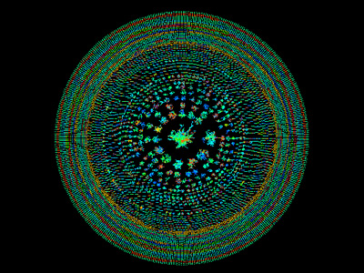
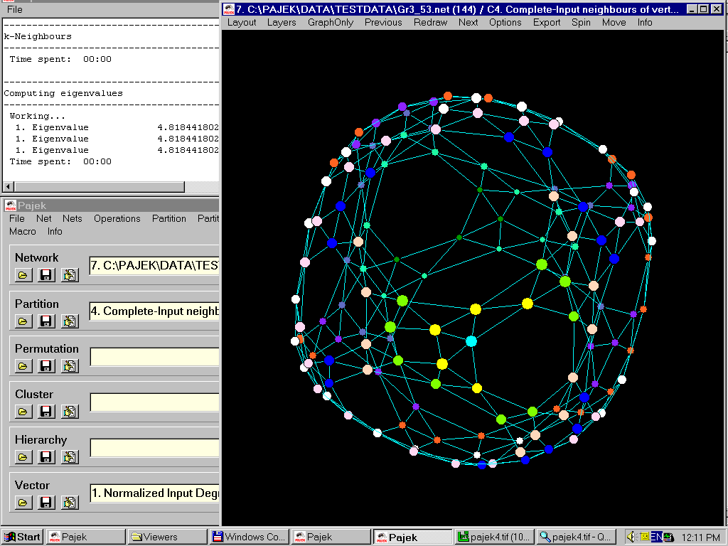 683 683 | computer graphics (Pajek) 3d layout of 5-regular graph G(3,53) obtained using eigenvectors. Colors of vertices represent distances from the 'Cyan' vertex. |
 854 854 | 2005 computer graphics by (unknown) These diagrams represent the topology of all the network connections in the 6Bone, an experimental international IPv6 tested network. The first image portraits Full Site Connectivity for 6Bone in October 1997, while the second depicts the same network in October 2005. A range of 6Bone maps and diagrams tracking the global development of the 6Bone are available from the IPv6 Resource Centre website. |
 538 538 | computer graphics by Frank Keeney 802.11b Wireless Networks One of the most interesting area of wireless network provision in the last couple years has been the emergence of community LANs based on sharing network access using the the 802.11b standard (commonly known as Wi-Fi or WLAN). Many local groups are forming in cities. This is largely an unplanned, activist lead movement, working to share access for free. Here are example maps produced by different groups in London, New York City, and Seattle. These maps show the location of WLAN base station nodes that provide wireless access. People are searching for active 802.11b nodes by so called 'war driving' - i.e. driving around sniffing for unsecured wireless networks. (This is named after the 80s idea of war dialing.) This example map by Frank Keeney shows the results of his war driving in the Los Angeles area. A useful review article, "802.11b Access Point Mapping", by Simon Byers and Dave Kormann, Communications of the ACM, May 2003. Many other WLAN groups are organising in cities and towns in many countries. A comprehensive list is provided by the Personal Telco Project. Also worth checking out is Freenetworks.org. Background information on the 802.11b free network movement: "A LAN line", The Economist,11th January 2001. "Motley Crew Beams No-Cost Broadband to New York High Speed Freed", Village Voice, by Peter Meyers, 15th August 2001. |
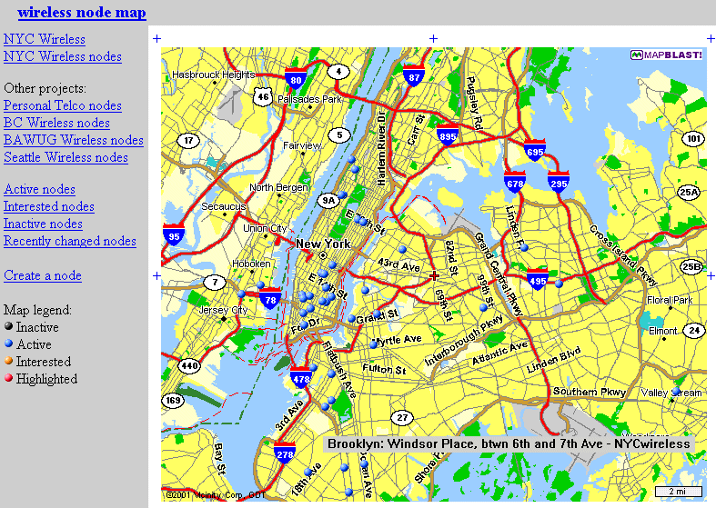 532 532 | computer graphics 802.11b Wireless Networks One of the most interesting area of wireless network provision in the last couple years has been the emergence of community LANs based on sharing network access using the the 802.11b standard (commonly known as Wi-Fi or WLAN). Many local groups are forming in cities. This is largely an unplanned, activist lead movement, working to share access for free. The blue dots on the map show bases stations registered with NYCWireless in New York City. This map shows the location of WLAN base station nodes that provide wireless access. A useful review article, "802.11b Access Point Mapping", by Simon Byers and Dave Kormann, Communications of the ACM, May 2003. Many other WLAN groups are organising in cities and towns in many countries. A comprehensive list is provided by the Personal Telco Project. Also worth checking out is Freenetworks.org. Background information on the 802.11b free network movement: "A LAN line", The Economist,11th January 2001. "Motley Crew Beams No-Cost Broadband to New York High Speed Freed", Village Voice, by Peter Meyers, 15th August 2001. |
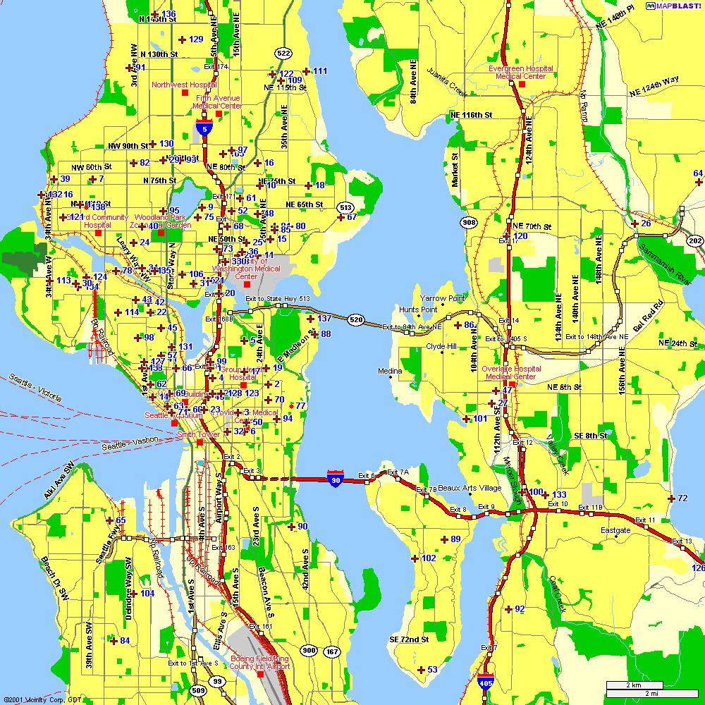 535 535 | computer graphics One of the most interesting areas of wireless network provision in the last couple years has been the emergence of community LANs based on sharing network access using the the 802.11b standard (commonly known as Wi-Fi or WLAN). Many local groups are forming in cities. This is largely an unplanned, activist lead movement, working to share access for free. This is a 802.11b network node map from Seattle Wireless. This map shows the location of WLAN base station nodes that provide wireless access. A useful review article, "802.11b Access Point Mapping", by Simon Byers and Dave Kormann, Communications of the ACM, May 2003. Many other WLAN groups are organising in cities and towns in many countries. A comprehensive list is provided by the Personal Telco Project. Also worth checking out is Freenetworks.org. Background information on the 802.11b free network movement: "A LAN line", The Economist,11th January 2001. "Motley Crew Beams No-Cost Broadband to New York High Speed Freed", Village Voice, by Peter Meyers, 15th August 2001. |
 530 530 | computer graphics by Consume One of the most interesting area of wireless network provision in the last couple years has been the emergence of community LANs based on sharing network access using the the 802.11b standard (commonly known as Wi-Fi or WLAN). Many local groups are forming in cities. This is largely an unplanned, activist lead movement, working to share access for free. |
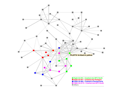 838 838 | computer graphics by Valdis Krebs "Social Network Analysis is a mathematical methodology for connecting the dots -- using science to fight terrorism. Connecting multiple pairs of dots soon reveals an emergent network of organization. Once you have a network map, you can measure parts of the network, or the whole, using social network metrics." Valdis Krebs used public information, from major newspapers on the WWW, to map the terrorist networks. In the network map, the hijackers are color coded by the flight they were on. The dark grey nodes are others who were reported to have had direct, or indirect, interactions with the hijackers. The gray lines indicate the reported interactions -- a thicker line indicates a stronger tie between two nodes. Notice the clustering around the pilots. |
 1038 1038 | 2006 computer graphics by Jeff Gray Presented at the 2006 ITP Spring Show A Shift in the Fabric is an exploration of the overlapping networks we face in our daily life and their integration together as one large network "eco-system". The Earth has become an ecosystem of networks and connections, with overwhelming and complex layers of such intermingling systems. This project attempts to begin visualizing these networks, not as exact representations of the actual data, but rather abstractions. By abstracting the information, each individual participant viewing this piece can make their own interpretations, allowing the viewers to create the solution, rather than some algorithm or heuristic. This exploration raises a variety of questions. By attempting to visualize these abstract networks, what new information can we gleam? Is it even possible to visualize such intensive and complex systems, especially when comparing connections between them? Further, how does the sheer volume of this data become relevant visually or logistically? |
 502 502 | computer graphics by Network Operations Center at Indiana University This is a real-time weather map of the Abilene network produced by Network Operations Center at Indiana University. The Abilene network is part of the Internet2 project linking US universities with a very fast, high-capacity network. |
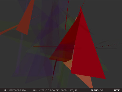 885 885 | 2002 computer graphics by (unknown) Limiteazero is an architecture, media design and media art studio based in Milan, Italy. Among it's rich portfolio in installation/exhibition design, sound design and new media, they created a Carnivore client with audio/visual feedback, entitled Active Metaphor. The basis of the project is the "Carnivore" engine, a software application that listens to all internet traffic on a specific local network. Carnivore was created by RSG and has won Golden Nica at Ars Electronica and an honorable mention at read_me 1.2. The authors made a script that gets the ip address ("aaa.bbb.ccc.ddd"), and breaks it down into four different groups of numbers ("aaa", "bbb","ccc", "ddd"). These elements are used as coordinates for 3D shapes and blending percentages ("x", "y", "z", "blend"). They choose to work with ip addresses because: "it's the main data that identifies an Internet relationship. Users identify their interaction by requesting ip addresses, even if they're not aware of it. Each ip address flowing over the net could be thought of as a human action, a communication, or an experience." This piece of work lets the user see and hear the data flow, which is something that we normally can't perceive. It allows us to see the net as a huge data field that is constantly moving, like a digital life-form that feeds itself with human interaction. |
 959 959 | 2002 computer graphics by Marius Watz Marius Watz, Art Director of Generator.x, has used the nom-de-guerre Amoeba since 1995 for experimentation in electronic media, with the web site Evolutionzone.com as the output. In this environment, Watz shows amazing generative art pieces that are both intriguing and captivating. AmoebaAbstracts 1-3, is a set of 3 experiments in abstract computational composition and dynamic form. The abstracts, responsive to user input, were built with Processing for the exhibition "Abstraction Now", Kunstlerhaus Wien, September 2003, and were also exhibited at Sonar 2004, Barcelona. The images shown are representative of Abstract 2, an endlessly emerging geometric pattern. This generative piece of visual abstraction doesn't consider any set of actual data, however, its aesthetical visual depiction represents a fresh approach that might prove inspiring to any network visualization endeavor. |
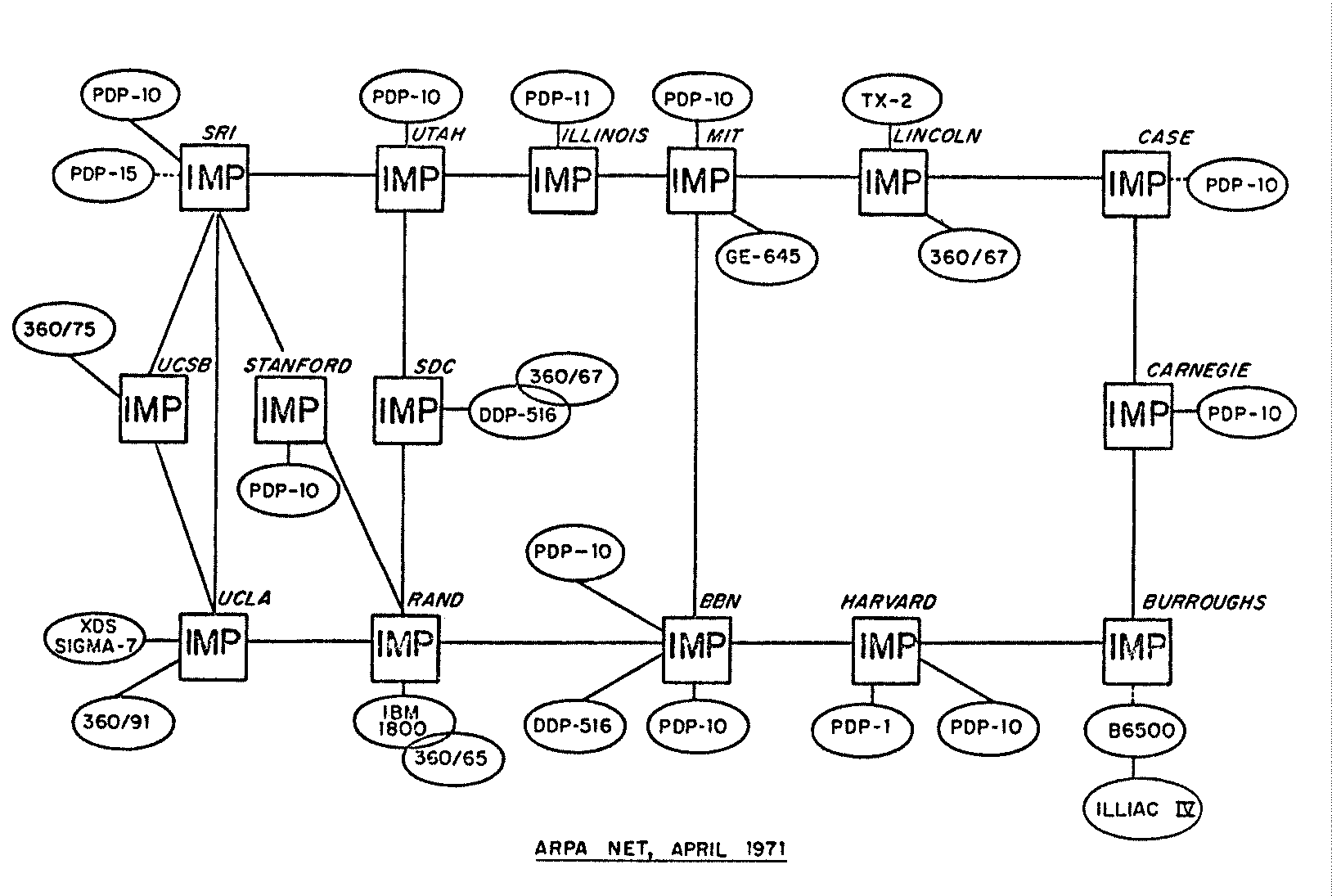 337 337 | 1971 Logical network maps charting the growing of sites connecting to ARPANET in the early 1970s. (Sources : "Casting the Net", page 64; CCR, page 93) |
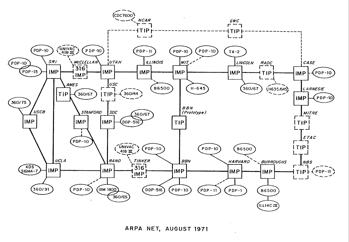 338 338 | 1971 Logical network maps charting the growing of sites connecting to ARPANET in the early 1970s. (Sources : "Casting the Net", page 64; CCR, page 93) |
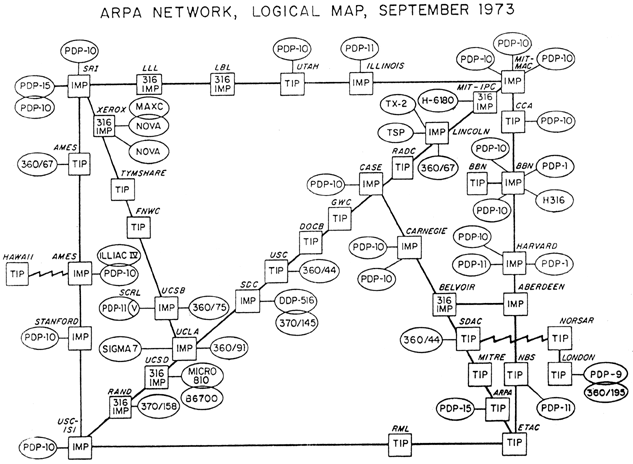 340 340 | 1971 Logical network maps charting the growing of sites connecting to ARPANET in the early 1970s. (Sources : "Casting the Net", page 64; CCR, page 93) |
 339 339 | 1974 Logical network maps charting the growing of sites connecting to ARPANET in the early 1970s. (Sources : "Casting the Net", page 64; CCR, page 93) |
 732 732 | 2002 computer graphics by (unknown) This graph reflects 1,134,634 IP addresses and 2,434,073 IP links (immediately adjacent addresses in a traceroute-like path) of topology data gathered from 25 monitors probing approximately 865,000 destinations spread across 76,000 (62% of the total) globally routable network prefixes. "We then aggregate this view of the network into a topology of Autonomous Systems (ASes), each of which approximately maps to an Internet Service Provider (ISP) (Some ISPs administer more than one AS but it is not typical). We map each IP address to the AS responsible for routing it, i.e., the origin (end-of-path) AS for the best match IP prefix of this address in Border Gateway Protocol (BGP) routing tables collected by the University of Oregon's RouteViews project. The abstracted graph consists of 12,517 Autonomous System (AS) nodes and 35,334 peering sessions. The resulting graph contains 11,411 AS (73% of all ASes present in RouteViews BGP tables on 8 May 2003) and 32,209 peering sessions." |
 781 781 | 1997 computer graphics by (unknown) A potential for a visualization (similar to http://moat.nlanr.net/AS/background.html) maps Autonomous Systems as nodes on the surface of a sphere, and then interconnect via reachability paths. The following visualization attempts to to this, by then also mapping the nine BGP peers (which exchange data with the server in Oregon) onto a site of the sphere opposite the target AS number (90). The graphic shows the (green) Oregon server on the left site, connected to the (purple) BGP sites, from where then the paths emerge via (yellow) pipes and (red) Autonomous System spheres at the inside of the (blue, transparent) system sphere, towards the (green) target network. |
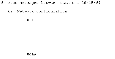 328 328 | 1969 ASCII text by Elmer B. Shapiro A very simple ascii map of the first network link on ARPANET between UCLA and SRI taken from RFC-4 Network Timetable, by Elmer B. Shapiro, March 1969. |
 358 358 | computer graphics The backbone network of FORTHnet, a major Internet provider in Greece. |
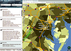
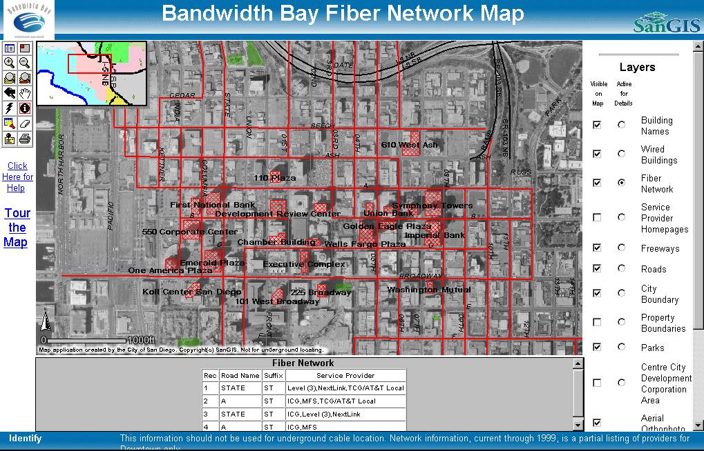 249 249 | 1999 interactive computer graphics by Andrew G. Abouna, San Diego Geographic Information Source This image is from Bandwidth Bay interactive network map which allows you to explore the fiber optic networks and wired buildings in downtown San Diego. The interactive map was developed by the San Diego Geographic Information Source. "A Tour of the Bandwidth Bay Fiber Network Map", a paper by Andrew G. Abouna gives more technical details on the map. Website: http://www.sangis.org/sangis/intmaps/fibermap.htm Content: Downtown San Diego has recently been branded "Bandwidth Bay," highlighting the miles and miles of bandwidth inside, and beautiful waterfront bayviews outside. This fitting description captures why downtown San Diego is "technology's perfect climate;" prepared to accommodate the growing and changing needs of modern high-tech industries. With over 70,000 strand miles of fiber optic cable stretching beneath its city streets, downtown San Diego is one of the most wired cities in the country, providing a comprehensive infrastructure to enable everything from small Internet start-up companies to large corporations the flexibility to quickly move in, plug in, and begin working immediately. Emerging new media companies like Yahoo! Simplenet , Cayenta.com, Toonscape, and Mass Hysteria have already discovered downtown San Diego's many advantages and other companies are on the way. The City of San Diego has converted the downtown's end-user fiber optic network database into an interactive Geographical Information System (GIS) color-coded format which allows the data to be viewed across the Internet. This Bandwidth Bay Fiber Network Map shows the providers who are servicing a particular street or building. Using a variety of query tools a particular fiber optic provider can be located and various types of information about the streets or buildings can be viewed. Some 10 layers of information can be viewed and queried with the Bandwidth Bay Fiber Network Map, including the fiber optic network, "wired" buildings, service provider homepages, freeways, local roads, property boundaries, parks, Centre City Development Corporation areas, aerial orthophoto, and street addresses. |
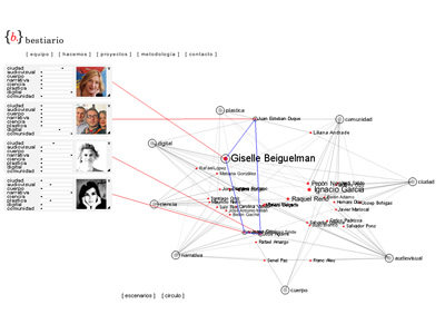 950 950 | computer graphics by (unknown) Bestiario is a studio based in Barcelona which work is based on a solid collaboration among several contributors. As stated in their website, they use non-conventional methods to transform complex content in interactive information spaces. The displayed graph shows the network of interactions between individuals and group representatives that collaborate with bestiario. The initial configuration organizes people by their knowledge and core competences, where intertwined names of people are arranged according to key domains, such as science, narrative or community. Every domain node can be re-arranged and names are clickable, showing more detailed information about the individual's expertise. |
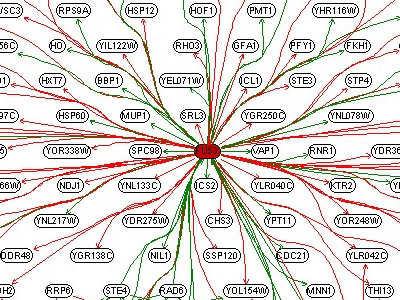 716 716 | 2002 computer graphics by Rung J., Schlitt T., Brazma A., Neighbourhood of mating response genes. 20 genes in mating response (in red) were selected, and their immediate neighbours in the network work analysed. Many neighbouring genes are related. |
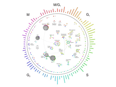 1016 1016 | 2005 computer graphics by Ulrik de Lichtenberg, Lars Juhl Most things that happen in the cell are the work of 'molecular machines' -- complexes of proteins that carry out important cellular functions. Until now, scientists didn't have a clear idea of when proteins form these machines -- are these complexes pre-fabricated or put together on the spot for each specific job? Researchers at the European Molecular Biology Laboratory (EMBL), working closely with scientists from the Technical University of Denmark (DTU), have now answered that question by drawing together many types of data in a fascinating new model. "Past studies of this type have usually left out a crucial element -- time," says EMBL Group Leader Peer Bork. "But now a picture has emerged which is extremely dynamic." This graph represents a temporal protein interaction network of the yeast mitotic cell cycle. Cell cycle proteins that are part of complexes or other physical interactions are shown within the circle. For the dynamic proteins, the time of peak expression is shown by the node color; static proteins are represented by white nodes. Outside the circle, the dynamic proteins without interactions are both positioned and colored according to their peak time, and thus also serve as a legend for the color scheme in the network. |
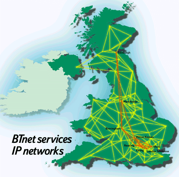 354 354 | 2000 computer graphics The IP backbone network of BTnet in the United Kingdom, as early 2000. |
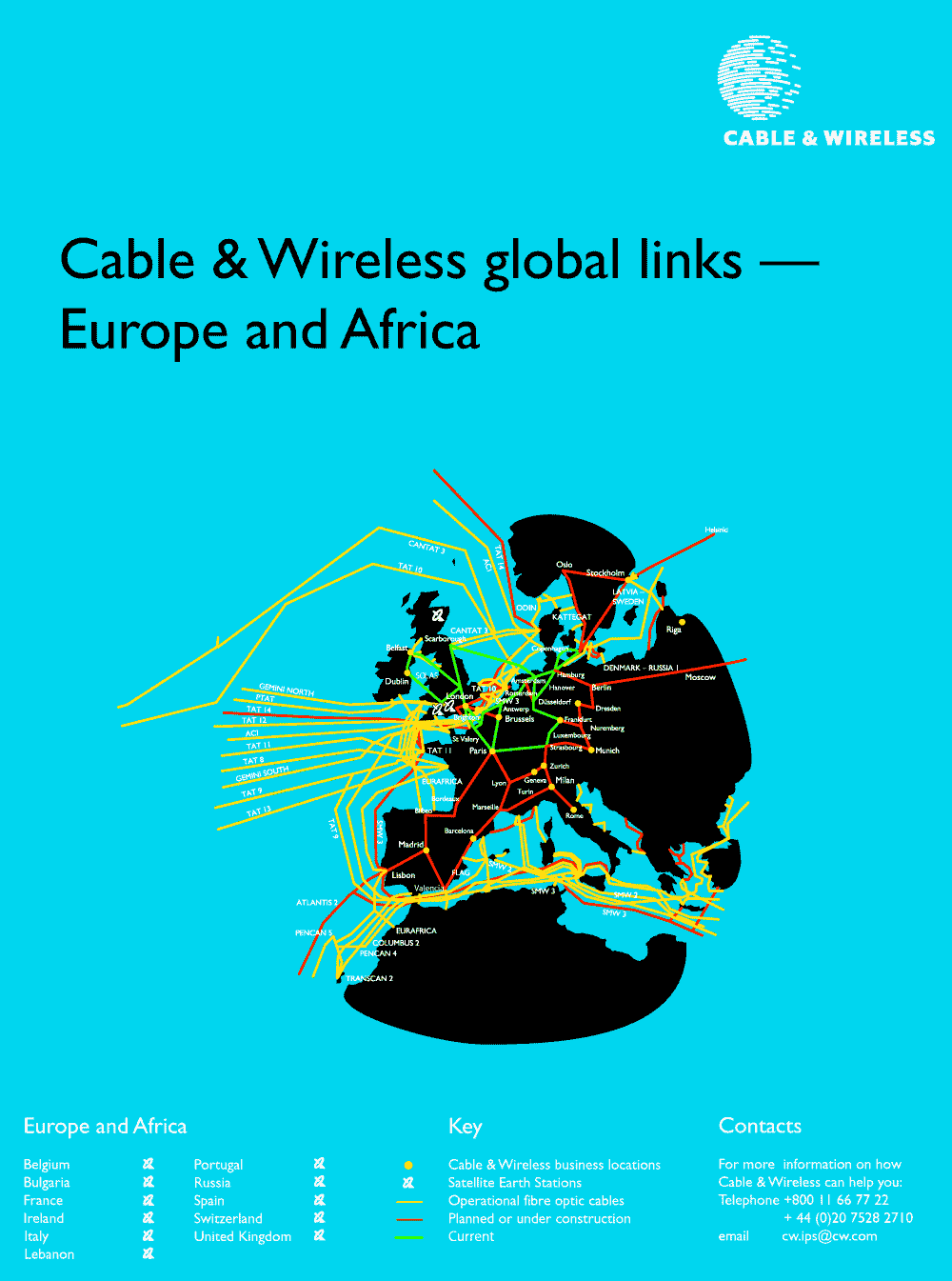 250 250 | computer graphics by Cable and Wireless Cable & Wireless is global telecommunications carrier operating undersea cables in many different regions of the world. The maps show Cable & Wireless's UK and European network facilities. |
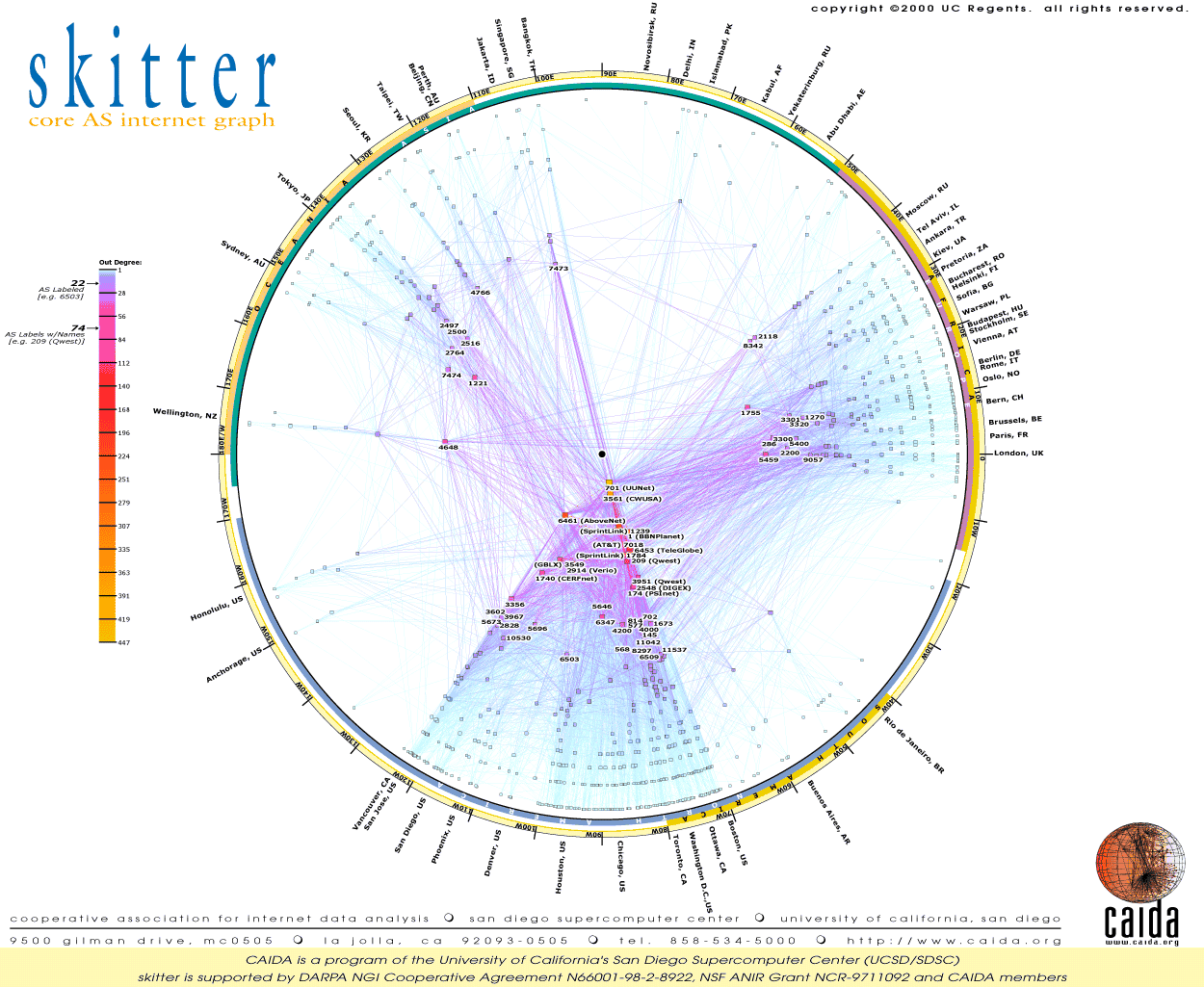 478 478 | computer graphics by researchers at CAIDA A graph visualisation showing the topology of the core of the Internet from mid-January 2000. A version of this image is available to buy as a large wall poster. It reveals the peering relations and geographic locations of Autonomous Systems (ASes), which are a vital part of Internet infrastructure that represent large ISP networks for the complex routing of traffic flows. It was created by researchers at CAIDA as part of their skitter project. |
 620 620 | 2006 computer graphics by Chris Lightfoot, Tom Steinberg Map showing the difference in journey times by rail and taxi, and by road alone, from Cambridge to other points in Great Britain, starting at 7 o'clock on a weekday morning © Crown copyright. All rights reserved. Department for Transport 100020237 2006 Considering journeys starting from Cambridge, this map shows which parts of the country are quicker to get to by train (red and orange), and which by car (green and blue). Yellow and light orange show areas where there's no great difference. This could be useful if you had limited access to a car and were planning where to go, or wanted to see whether it was worth hiring a car for a particular trip. Contours are drawn for each hour of difference in travel time. Note also that the scale is quite asymmetric: the most time you can save travelling by train is about two hours, but—for places which are difficult to reach by train—you can save six or seven hours travelling by road. From this map, journeys to London are quicker by train (the road travel model takes no account of traffic or urban areas, so it is pessimistic about the time saving) as are journeys to Leeds, Berwick, Edinburgh, Glasgow and other points served by trains on the East Coast Main Line. In the west of England, journeys to Exeter and thereabouts are quicker by rail, but all other journeys are quicker by road (largely because most westward journeys require a change at London or a slow cross-country train to Birmingham). (However, the model of car journey times is very simplistic, so these results should not be taken too seriously—we hope to extend the work with a more realistic model of driving times, which may substantially change the comparative results.) |
 806 806 | 1995 computer graphics by Andrew Wuensche Cellular automata (CA) are a much studied class of discrete dynamical network that support emergent behaviour resulting from homogeneous, local, short range interactions. They are applied in many overlapping areas; to model processes in physical, chemical and biological systems such as fluid dynamics and reaction-difusion; to study self-organization and self-reproduction by the emergence of coherent interacting structures; in mathematics and computation where the systems themselves are the focus of interest. CA dynamics are driven by complex feedback webs that are difficult to treat analytically except for special cases. Understanding these systems depends to a large extent on computer experiments, where a key notion is that state space is connected into basins of attraction. |
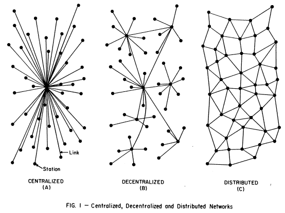 341 341 | 1964 by Paul Baran The pioneering research of Paul Baran in the 1960s, who envisioned a communications network that would survive a major enemy attacked. The sketch shows three different network topologies described in his RAND Memorandum, "On Distributed Communications: 1. Introduction to Distributed Communications Network" (August 1964). The distributed network structure offered the best survivability. |
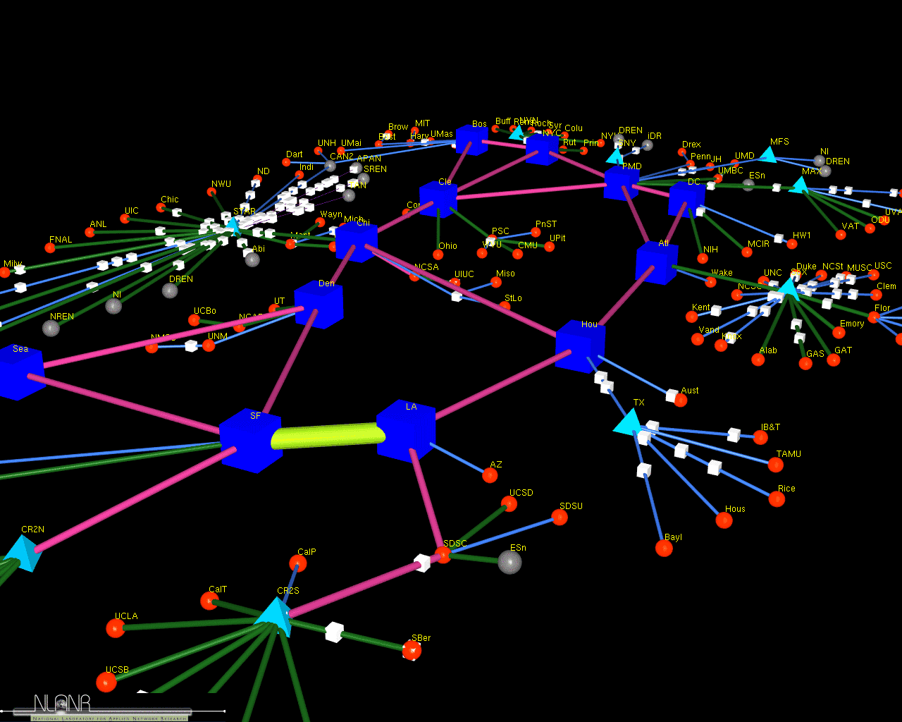 486 486 | computer graphics (Cichlid) by Jeff Brown A screenshot of a 3D model of the vBNS network which connects universities and laboratories in the USA. The model was created by Jeff Brown, a researcher at MOAT, National Laboratory for Applied Network Research (NLANR), USA, using his Cichlid data visualisation software. The model is animated to show how traffic flows over the links. More information on their work can be found in the paper "Network Performance Visualization: Insight Through Animation" by J.A. Brown, McGregor A.J and H-W Braun. |
 1017 1017 | 2006 computer graphics by (unknown) Circling Galaxy explores the history of the America's Cup through the people and the boats who are part of the legend. This tool provides a rich network environment where one can easily search and navigate through all the boats, people and corresponding links between them. Developed in flash and based on Liveplasma (www.liveplasma.com), Circling Galaxy provides a deep understanding of this event in a smooth toggling between person and boat. Whenever a boat is selected, a related web of people immediately surrounds it, and when a person is choosen, an architect for instance, it shows all teams and boats he's been involved with. Besides the name, every person is characterized by its activity: Skipper, Helmsman, Afterguard, Team Member, Team Manager, Owner, Architect, Builder, Sail Maker. The information in the Circling Galaxy is regularly updated. |
 928 928 | 2005 computer graphics by Wayne McIntosh, Ken Cousins, Ste This project focuses on the articulation, development, and dissemination of legal precedent across the multi-tiered system of American courts. With support from the National Science Foundation, the investigators are engaged in a mission to study and map the flow of precedent across the American court system during the full course of the 20th century on the issue of regulatory takings. They are still in the process of identifying and acquiring the corpus of cases relevant to the issue of regulatory takings, but have already demonstrated "proof of concept" for the citation mining and network graphing aspect of the project. The first graph represents a detail of the citations between all decisions in the current pool. Decisions (circles) are ordered on the x-axis, such that recent decisions appear furthest to the right side of the graph. Position along the y-axis is arbitrary. Information appearing to the right of the graph is generated by selecting decisions within the network. The second graph portraits the dynamics of citations to Parallel Courts. Decisions (circles) are coded by the court that issued them: Red - US Supreme, Yellow - US Circuit, Blue - US District. Citations (lines) are coded by the position of the court whose decision is cited, relative to the citing court: Blue - Higher, Black - Parallel, Red - Lower. |
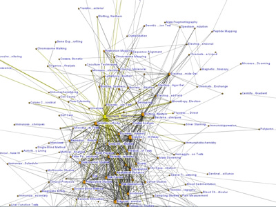
 841 841 | computer graphics by Lothar Krempel This diagram represents a large network of co-authorships among 555 scientists. It is a subset of a dataset containing information for 970 people. |
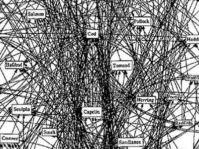 759 759 | computer graphics by Prof. David Lavigne The importance of fully understanding the dynamics of scale-free networks as been recognized by the cod fishery industry in the worst way. The collapse of the Northwest Atlantic cod fishery has become a metaphor for ecological catastrophe and is universally cited as an example of failed management of a natural resource" (MacKenzie 1995). Peter Meisenheimer in his paper "Seals, Cod, Ecology and Mythology" says, the use of seals as scapegoats for the failings of Canadian fisheries management is an example of a global problem in the management of fisheries and wildlife. Whether the system is aquatic or terrestrial, tropical or arctic, the predators of the world are seen as problems to be controlled, not as integral parts of a functioning ecosystem. Prof. David Lavigne, a zoologist researcher sponsored by the Natural Sciences and Engineering Research Council and the International Marine Management Association is a leading force in combating this miscomprehension of food webs. Regarding the cod stock decrease, he also claims that seals are being used as scapegoats because government scientists are failing to look at the problem in a macro level, the way any network should to be analyzed. The graph on the left is Lavigne's effort to understand the complex dynamics of a food web. This astonishing work shows the Cod food web displaying some trophic interactions for part of the Northwest Atlantic. |
 1248 1248 | Comment Flow2007 software (Java) by Dietmar Offenhuber A browser visualizing conversations via guest book entries across myspace profiles We have designed and implemented a flexible tool for the content driven exploration and visualisation of a social network. Building upon a traditional force-directed network layout consisting of nodes (profiles) and edges (friend-links), our system shows the activity and the information exchange (postings in the comment box) between nodes, taking the sequence and age of the messages into account. This project serves both as an illustration of one approach to the general problem of individuated network visualization and as an example of the practical uses of such representations. In the mySpace service network-only visualization methods are no longer sufficient to meaningfully represent the community structure. Numerous commercial profiles, fake/spam/celebrity profiles and tools such as automated friend adders result in a huge numbers of connections, many of which carry little information about a person’s actual social ties and behavior. The average myspace user has more than 130 friends, but there are also profiles with over a million “friends”. By going beyond the “skeleton” of network connectivity and looking at the flow of information between the individual actors we can create a far more accurate portrait of online social life. |
 1246 1246 | Comment Flow2007 software (Java) by Dietmar Offenhuber A browser visualizing conversations via guest book entries across myspace profiles We have designed and implemented a flexible tool for the content driven exploration and visualisation of a social network. Building upon a traditional force-directed network layout consisting of nodes (profiles) and edges (friend-links), our system shows the activity and the information exchange (postings in the comment box) between nodes, taking the sequence and age of the messages into account. This project serves both as an illustration of one approach to the general problem of individuated network visualization and as an example of the practical uses of such representations. In the mySpace service network-only visualization methods are no longer sufficient to meaningfully represent the community structure. Numerous commercial profiles, fake/spam/celebrity profiles and tools such as automated friend adders result in a huge numbers of connections, many of which carry little information about a person’s actual social ties and behavior. The average myspace user has more than 130 friends, but there are also profiles with over a million “friends”. By going beyond the “skeleton” of network connectivity and looking at the flow of information between the individual actors we can create a far more accurate portrait of online social life. |
 1247 1247 | Comment Flow2007 software (Java) by Dietmar Offenhuber A browser visualizing conversations via guest book entries across myspace profiles We have designed and implemented a flexible tool for the content driven exploration and visualisation of a social network. Building upon a traditional force-directed network layout consisting of nodes (profiles) and edges (friend-links), our system shows the activity and the information exchange (postings in the comment box) between nodes, taking the sequence and age of the messages into account. This project serves both as an illustration of one approach to the general problem of individuated network visualization and as an example of the practical uses of such representations. In the mySpace service network-only visualization methods are no longer sufficient to meaningfully represent the community structure. Numerous commercial profiles, fake/spam/celebrity profiles and tools such as automated friend adders result in a huge numbers of connections, many of which carry little information about a person’s actual social ties and behavior. The average myspace user has more than 130 friends, but there are also profiles with over a million “friends”. By going beyond the “skeleton” of network connectivity and looking at the flow of information between the individual actors we can create a far more accurate portrait of online social life. |
 1249 1249 | Comment Flow2007 software (Java) by Dietmar Offenhuber A browser visualizing conversations via guest book entries across myspace profiles We have designed and implemented a flexible tool for the content driven exploration and visualisation of a social network. Building upon a traditional force-directed network layout consisting of nodes (profiles) and edges (friend-links), our system shows the activity and the information exchange (postings in the comment box) between nodes, taking the sequence and age of the messages into account. This project serves both as an illustration of one approach to the general problem of individuated network visualization and as an example of the practical uses of such representations. In the mySpace service network-only visualization methods are no longer sufficient to meaningfully represent the community structure. Numerous commercial profiles, fake/spam/celebrity profiles and tools such as automated friend adders result in a huge numbers of connections, many of which carry little information about a person’s actual social ties and behavior. The average myspace user has more than 130 friends, but there are also profiles with over a million “friends”. By going beyond the “skeleton” of network connectivity and looking at the flow of information between the individual actors we can create a far more accurate portrait of online social life. |
 1252 1252 | Comment Flow2007 software (Java) by Dietmar Offenhuber A browser visualizing conversations via guest book entries across myspace profiles We have designed and implemented a flexible tool for the content driven exploration and visualisation of a social network. Building upon a traditional force-directed network layout consisting of nodes (profiles) and edges (friend-links), our system shows the activity and the information exchange (postings in the comment box) between nodes, taking the sequence and age of the messages into account. This project serves both as an illustration of one approach to the general problem of individuated network visualization and as an example of the practical uses of such representations. In the mySpace service network-only visualization methods are no longer sufficient to meaningfully represent the community structure. Numerous commercial profiles, fake/spam/celebrity profiles and tools such as automated friend adders result in a huge numbers of connections, many of which carry little information about a person’s actual social ties and behavior. The average myspace user has more than 130 friends, but there are also profiles with over a million “friends”. By going beyond the “skeleton” of network connectivity and looking at the flow of information between the individual actors we can create a far more accurate portrait of online social life. |
 933 933 | 2005 computer graphics by Richard Rogers, Marieke van Dijk The Govcom.org Foundation, an Amsterdam-based foundation dedicated to creating and hosting political tools on the Web, and its collaborators have developed a software tool that locates and visualizes networks on the Web. The Issue Crawler, at http://issuecrawler.net, is used by NGOs and other researchers to answer questions about specific networks and effective networking more generally. One may also do in-depth research with the software. Generated by Issue Crawler, this map represents a hyperlink network analysis of the communicationrights.org world forum organizers, with select sniplets on WSIS-related activities. Node size indicates inlink count while colors represent, respectively, orange - NGOs, green - Funders, and purple - Inter-gov. |
 827 827 | computer graphics by Pablo Martin Gleiser "We use the information available in the Red Hot Jazz Archive database in order to study the collaboration network between jazz musicians. First we study the collaboration network between individuals (first image). In this case each vertex corresponds to a musician. Two musicians are connected if they have played in the same band. The figure shows the network obtained using this construction." "Then we study the collaboration network between bands (second image). In this case each vertex corresponds to a band. Two bands are connected if they have a musician in common. The figure shows the network obtained using this construction." "The community structure analysis reveals that these constructions capture essential ingredients of the social interactions between jazz musicians. We observe correlations between recording locations, racial segregation and the community structure. A quantitative analysis of the community size distribution reveals a surprising similarity with an e-mail based social network." |
 408 408 | computer graphics ContactMap is a prototype information map for visually managing your social network. |
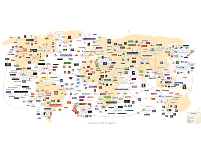 995 995 | 2006 computer graphics by Zohar Manor-Abel What is the connection between 3 celebrities, 35 corporations, 40 subsidiaries and more than 300 brands? Global business interests make up a complex network of connections between corporations from around the world. Corporate Connection, intends to shed light on 'who owns what' in the global marketplace and on the intricate nature of the world wide "business" web. As the author explains: "Corporate Connection started in my first year of studies, as a small project to find out which brands were doing animal testing. Slowly it developed into the intricate nature of corporations, brands, consumerisms and the connections between them in about six months of research". Besides its unquestionable effort of putting this network together, I would only point out the confusing element of having a world map in the background, since the placement of nodes (corporations and subsidiaries) are not based on geographical location. |
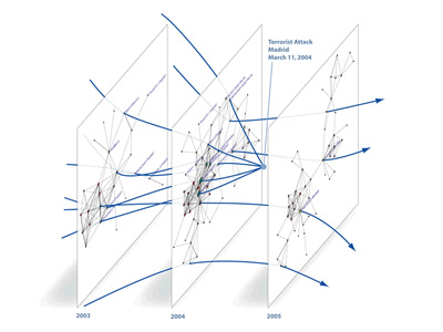 878 878 | 2005 computer graphics by (unknown) ATA (Advanced Technology Assessment) is a business intelligence company developing a unique combination of knowledge-bases, software, technological solutions and expertise to support decision-makers in identifying actionable patterns in complex dynamic business environments. One of ATA's network visualization techniques is called Dynamic Network Rendering. The method supports effective representations of both static structural information and changes over time, which significantly boost understanding of complex relational datasets, and allow analysts to effectively gather competitive technological and organizational intelligence. Representation of time evolution can be addressed from complementary perspectives that can be integrated into unified graph visualization solutions: Static Approach - networks are generated corresponding to "slices" of the original dataset at different points in time; Dynamic Approach - changes to network structure and node relative positions over time are conveyed by motion of graphical elements on the screen. This graph incorporates ATA's network-based technology and represents a time-sliced view of hypothetical network trajectories of individuals involved in the terrorist attack in Spain, March 2004. (Data from J. A. Rodriguez) |
 876 876 | 2004 computer graphics by David Bihanic Crystal hy-map is a complete representation system that uses a hypermedia structure designed to support a large network of links. It relies on a connectionist system capable of handling numerous data units where information is organized in directories and indexed by geo-semantic analysis. For this, the information is based on a hypermedia browsing repository structured from a "grid" (C.S. : X, Y, Z) for semantic positioning of information revealing new integration procedures mainly between various documentation models and ergonomic knowledge. The main objective lies on the possibility of optimising parameters which constitute the workload for the human operator (e.g. number of objects handled, temporal constraints, parallelism of tasks, length of procedures, etc.) and setting-up a method to diagnose the cognitive workload for the interfaces. Its aim is to highlight the obsolescense of traditional browsing and graphical search tools by insisting on the need to offer new strategies for the processing of information in virtual contexts that are suitable for complex situations. This leads to the implementation of new paradigms for prospective representation of space that make the elaboration of procedures for distribution and project evaluation useful. |
 714 714 | 1933 computer graphics by (unknown) A comprehensive narrative description of a transport system requires a record of both time and spatial experiences. Here a complex network of routes is brought together with flight times and identification numbers in a brilliant map/schedule for the Czechoslovakia Air Transport Company in 1933. Source: E. R. Tufte., Envisioning Information (Graphics Press, May 1, 1990). |
 1046 1046 | 2006 computer graphics by Ian Timourian Ian Timourian (kiddphunk), who runs mandalabrot.net, home of some amazing generative art pieces, has developed del.icio.us.discover, a stunning set of visualizations + explorations into "link-spaces" in the del.icio.us collaborative bookmarking network. It was created with Processing + Perl, using data gathered early March, 2006. The project aims to deliver: 1) direct and abstract visualizations of intra- and inter-user relationships. 2) simple, implementable algorithms to recommend "links-of-interest" that might otherwise be missed by a user currently utilizing only popularity-based link aggregators, and ideas for their further usages. |
 887 887 | 2005 computer graphics by (unknown) FAS.research is a research institution located in Vienna, Austria, which has been producing great work in network analysis for science and business. These images illustrate one of their several network analysis.rnrnSome Managers in Austria are officials of different companies. A person who is an official in two companies connects these companies. Information can flow from one board of directors to another by the connectors. The network shows the most important Austrian enterprises. The size of the circles shows the number of employees in the company. Lines represent connecting managers between these enterprises. The thicker a line, the more common managers these enterprises have. Red lines show the 1 step environment of Key Player Enterprises. Blue circles represent Key Player Enterprises. Key Players are those five companies from which information spread most efficient threw the whole network. Who the key players are depends on the selected number of key players.rnrnSource: Commercial Register, AustriarnPopulation: 2150 most important Austrian companiesrnSelection: 238 most central companies |
 726 726 | computer graphics by Graham J. Wills A set of 10 million receipts from a large DIY store were processed so as to link together items that often appear on the same receipt. The resultant network of 40K nodes and many links has several important variables associated with the nodes; price, discount, volume, department. |
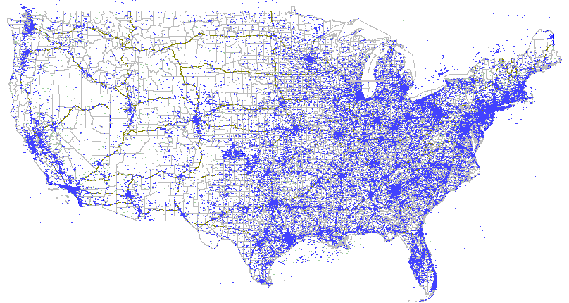 537 537 | computer graphics by Tower Maps A simple dot map of commercial wireless antennas in the USA. The full database of tower locations can be purchased from Tower Maps. |
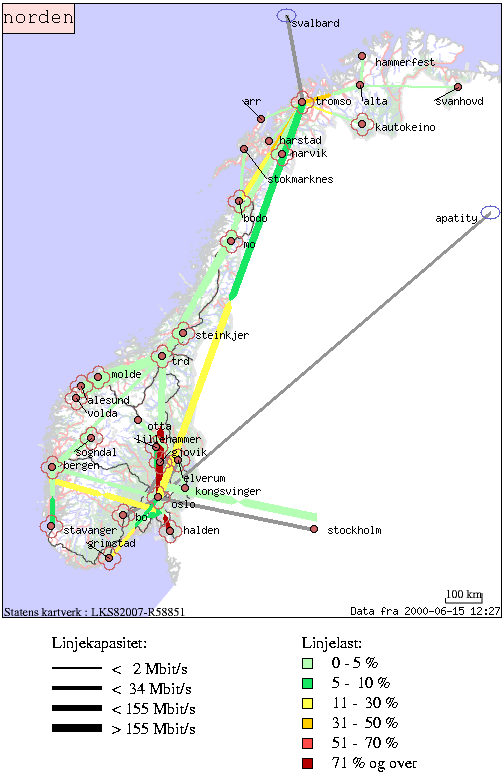 506 506 | computer graphics This is a dynamic network weather map of the backbone of Uninett, serving the education and research sector in Norway. The maps show the network capacity by line thickness and daily traffic load by line colour at different geographic scales. |
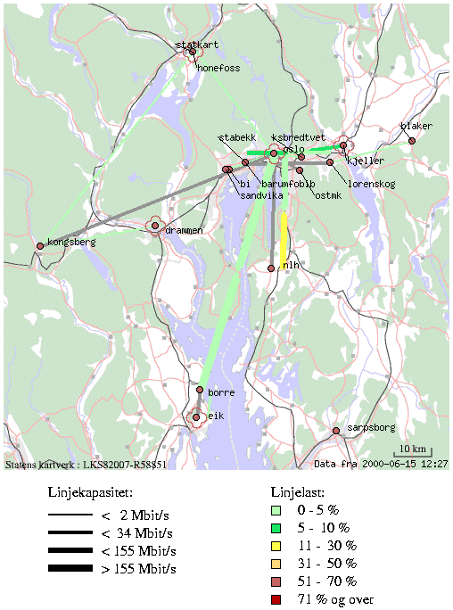 507 507 | computer graphics This is a dynamic network weather map of the backbone of Uninett, serving the education and research sector in Norway. The maps show the network capacity by line thickness and daily traffic load by line colour at different geographic scales. |
 879 879 | 2005 computer graphics by (unknown) ATA (Advanced Technology Assessment) is a business intelligence company developing a unique combination of knowledge-bases, software, technological solutions and expertise to support decision-makers in identifying actionable patterns in complex dynamic business environments. ATA's DyNet is an innovative knowledge visualization tool which enables rapid domain analysis. Data are mined from corporate databases and public data sources. Relationships between concepts and entities (i.e. firms, patents, publications) are identified using citations, descriptive terms, or textual similarities. Linkages among thousands of concepts and entities are then represented as an evolving network in time. The software includes a variety of features which allow exploration, mapping and manipulation of knowledge networks, and which give detail-on-demand, enabling rapid and powerful multi-level analysis of complex, attribute-rich data. |
 1006 1006 | 2002 computer graphics by Raffi Krikorian This project aims to be a free, flexible, and easily modifiable visualisation tool that allows a user to intuitively understand their online social group structure. This software was inspired by social network fragments and buddy graph -- this code has all the functionality from its counterparts (except zoom) that could be implemented in a generic fashion. As the author explains: "Colouring is not in this software as it is currently impossible to colour the graph without asking the user to classify his or her entire mail network manually; it is too hard to do automatic classification and colouring of e-mail addresses". In this example, the user's mailbox scanned has been relaxed into about 10 different social groups. by looking at To:, From:, and Cc: headers, this tool constructs a graph of who knows who. each "star" represents a person, and each "constellation line" draws out the relationship. |
 851 851 | 2005 computer graphics by Valdis Krebs This is a map of an online community, which portraits a concentric structure where the network "hubs" or "connectors" -- people with a high number of ties, are located in the center. This arrangement cleverly follows the inherent organization of these type of communities, where the hubs are the central elements of its sustainability. As the author explains: "Parts of it are well connected, while most of it is sparse. We see this pattern with many emergent communities -- groups that people join and participate in through common interests or affiliations. Two nodes are connected if they have exchanged emails or IMs past a certain level. The nodes are colored by their connectivity. The yellow nodes are the core, with the greatest number of direct links. The red nodes are connected to the core and have less interconnectivity. The blue nodes are "young clusters" that are just forming. The green nodes are various forms of isolates who may have just joined the on-line community, or have chosen to be inactive -- they may be the common "lurker" found in many on-line communities. The lurker listens to the public info being disseminated but chooses not to interact." (Thanks Valdis) |
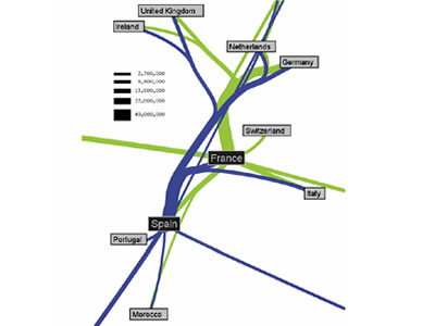
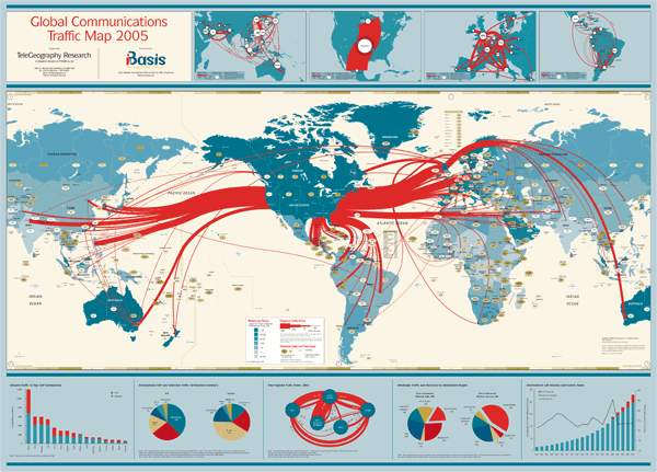
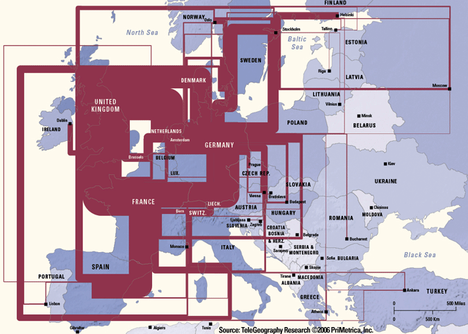
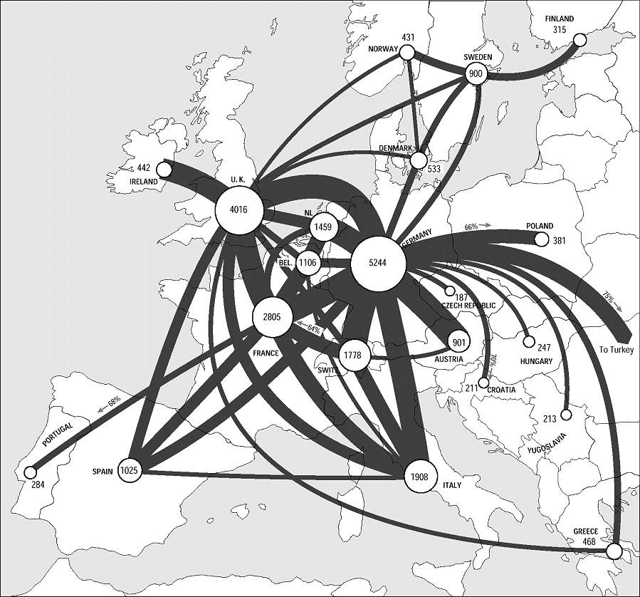 283 283 | 1995 computer graphics by TeleGeography Inc. Example of the statistical maps and diagrams produced by TeleGeography, Inc. This map shows European telecommunications traffic flows in 1995. [For more information see the Map of the Month article "TeleGeography's Traffic Flow Maps".] |
 798 798 | 2002 computer graphics by (unknown) The map features: - Total lit bandwidth between 145 European cities,(including connections between the top 60 cities - Number of bandwidth providers per city - Number of metro area networks per city - European E-1 Annual Lease Prices on Major Routes, 1999-2002 - International Internet Circuits and Bandwidth within Europe - Value of Announced Bandwidth Sales Contracts by Buyer Type, 2000-2001 - Total Network Route Kilometers for Major Networks International Circuit Usage by City (Gbps) |
 372 372 | computer graphics The pan European KPNQwest network, when complete, will connect major cities together by six high-capacity backbone rings. |
 751 751 | 2005 computer graphics by Jeffrey Heer This project attempts to take the first steps toward an exploratory data environment for e-mail corpora, using the Enron e-mail corpus as a motivating data set. The interface--currently named "enronic"--unifies information visualization techniques with various algorithms for processing the e-mail corpus, including social network inference, message categorization, and community analysis. Though still a preliminary design, enronic shows promise as a platform for more tightly coupling manual and automated data analysis. The graph on the left shows the resulting social network visualization. People are drawn as nodes with labels containing either their name or their e-mail address, depending on what was present in the database. Edges represent the histories of ALL e-mail traffic between two people. Pie graphs are placed in the center of each edge, conveying an overall picture of how the e-mail traffic represented by that edge has been categorized. |
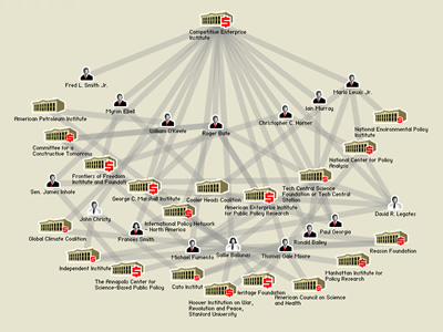 919 919 | 2005 computer graphics by Josh On, Amy Balkin Developed for Greenpeace, as a research tool for journalists and the interested public, Exxon Secrets is Documenting Exxon-Mobil's funding of climate change skeptics and provides a research database of information on the corporate funded anti-environmental movement.. Certain corporations, think tanks, conservative institutions and their spokespeople, call global warming a hoax. This project pretends to show how ExxonMobil is quietly funding these organizations by exposing the perfidious network of connections between ExxonMobil and the organizations and people that benefit from their funding. Source: The database behind this project builds on the anti-environmental research of CLEAR, the Clearinghouse on Advocacy and Environmental Research. |
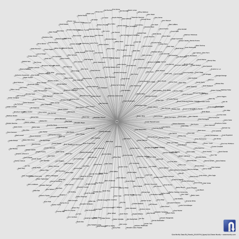 1399 1399 | 2010 by Give Me My Data / Nodebox 1.0 Network graph visualization of Facebook contacts using data retrieved using Give Me My Data http://givememydata.com and Nodebox 1.0. |
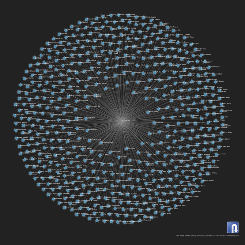 1400 1400 | 2010 by Give Me My Data / Nodebox 1.0 Network graph visualization of Facebook contacts using data retrieved using Give Me My Data http://givememydata.com and Nodebox 1.0. |
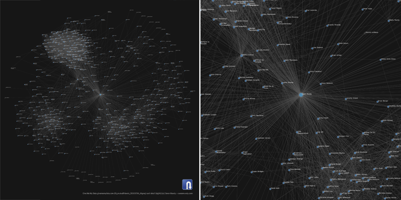 1401 1401 | 2010 by Give Me My Data / Nodebox 1.0 Network graph visualization of Facebook contacts and mutual contacts using data retrieved using Give Me My Data http://givememydata.com and Nodebox 1.0. |
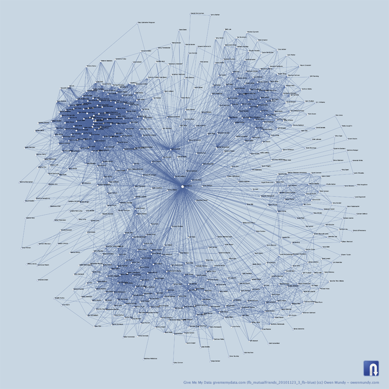 1402 1402 | 2010 by Give Me My Data / Nodebox 1.0 Network graph visualization of Facebook contacts and mutual contacts using data retrieved using Give Me My Data http://givememydata.com and Nodebox 1.0. |
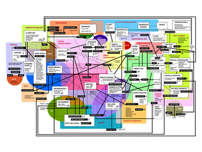 1031 1031 | 2006 computer graphics by Katharine Gates The human sexual imagination is a vast landscape, a sprawl of inter-connected suburbs and neighborhoods, a web of ideas. There are many ways to chart the routes in this new world. Connections are everywhere, and it depends greatly on one's subjective point of view to understand and disentangle this network. Katharine Gates, author of Deviant Desires and DeviantDesires.com (an expansion upon the book) has produced this Fetish Roadmap as an overview and field guide to fetishes. The map provides overviews of general categories such as "Animal transformation" or "Growth" as well as quick descriptions of the subcategories, such as "ponyplay" or "vore". It also describes base fetish materials, general thematic grouping, and popularity among different genders or sexual orientations. As the internet grows and the various realms of sexual play expand, this map is a continuous growing roadmap into deviance. |
 260 260 | 2002 computer graphics by TeleGeography, Inc. An example of the detailed city maps of fibre routes produced by TeleGeography. This example shows the Interoute's fibre ring for Amsterdam. TeleGeography's metropolitan area networks report provides technical data and detailed maps on many network providers in major U.S. and European cities. |
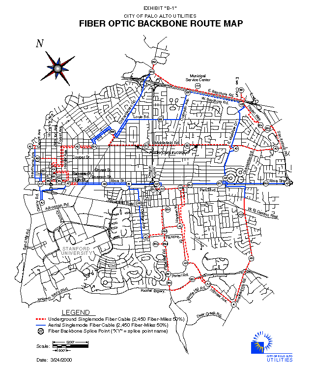 258 258 | 2000 computer graphics by City of Palo Alto Utilities A street level route map of the fibre-optic backbone in the city of Palo Alto, California. The map shows the routes as of April 2000. The network is operated by the City of Palo Alto Utilities. |
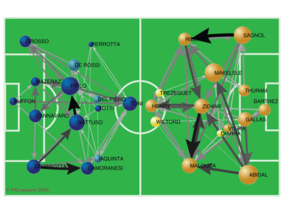 1054 1054 | 2006 computer graphics by Harald Katzmair, Helmut Neundlin FAS.research is a research institution located in Vienna, Austria, which has been producing great work in network analysis for science and business. Produced on July 9th, 2006, the day of FIFA World Cup Germany 2006 final match between Italy and France, this network shows the passes from every player to those three team-mates he passes to most frequently. Strength of arcs displays the number of passes. Size of nodes displays the influence (flowbetweenness) of a player. |
 803 803 | 2005 computer graphics by Marcos Weskamp Flickr Graph is an application that explores the social relationships inside flickr.com. It makes use of the classic attraction-repulsion algorithm for graphs. The user starts exploring its contacts by entering their flickr username or email address, after which the network starts emerging around its own icon. One can also explore uploaded photos by any user present in the graph. |
 750 750 | 2005 computer graphics by Gustavo G Network analysis of the Flickr population, based on data collected on March 14th, 2005. |
 927 927 | 2005 computer graphics by Doantam Phan, Ling Xiao, Ron Yeh Flow Map Layout is a novel visualization technique seen as a hybrid of graphs and flow maps. Cartographers have long used flow maps to show the movement of objects from one location to another, such as the number of people in a migration, the amount of goods being traded, or the number of packets in a network. One of the most famous flow maps, depicting Napoleon's Russian Campaign, was created by Charles Joseph Minard in 1869, and can be seen here. The advantage of flow maps is that they reduce visual clutter by merging edges. Most flow maps are drawn by hand and there are few computer algorithms available. In Flow Map Layout, the authors present a method for generating flow maps using hierarchical clustering given a set of nodes, positions, and flow data between the nodes. The technique is inspired by graph layout algorithms that minimize edge crossings and distort node positions, while maintaining their relative position to one another. The authors have demonstrated the technique by producing flow maps for network traffic, census data, and trade data. The first image illustrates a close-up of top 15 imports to Spain and France. Notice the branching structure is shared across different nodes, for example Spain, and France branch to the Netherlands, Germany and the UK in the same way. The second image represents an outgoing migration map from Colorado (USA) from 1995-2000, generated by the algorithm without layout adjustment or edge routing. |
| | 1837 print by Henry Drury Harness (1804-1883), Ireland First published flow maps, showing transportation by means of shaded lines, widths proportional to amount (passengers). Harness, H. D. (1838). Atlas to Accompany the Second Report of the Railway Commissioners, Ireland . Dublin: H.M.S.O. (a) Map showing the relative number of passengers in different directions by regular public conveyances, 80 x 64 cm; (b) map showing the relative quantities of traffic in different directions, 80 x 64 cm; (c) map showing by varieties of shading the comparative density of the population, 80 x 64 cm. Robinson, A. H. (1955). The 1837 maps of Henry Drury Harness. Geographical Journal, 121:440-450. Robinson, A. H. (1982). Early Thematic Mapping in the History of Cartography . Chicago: University of Chicago Press. ISBN 0-226-72285-6. |
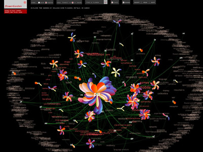 964 964 | 2005 computer graphics by Greg Judelman, Maria Lantin flowerGarden is an web-based software application, produced in Flash, for real-time social network and conversation visualization. It was used at the 3-day Bodies in Play summit in Banff, May 2005, at which the 50 participants were invited to input information about who they spoke to and what they discussed during the duration of the event. The visualization was projected on a large screen in the main summit venue to reflect the current state of the social network and discussion space of the summit. Each participant, upon entering information into a form, is visually represented by a flower, with a petal growing on the flower in real-time as a new conversation is entered. The flowers of individuals who have conversed with one another are connected by green vines, and the closer two flowers are distanced from each other the more those people have spoken. The concepts discussed between all participants are laid out in the background according to their frequency of use. By rolling over flowers, petals, and words, different perspectives of the information can be seen. |
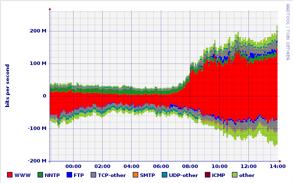 690 690 | 200505 computer graphics by Simon Leinen Fluxoscope is a system used by SWITCH for measurements of our external network traffic. One of its products are graphs which represent, for each external connection, the protocol distribution of traffic over time. The example graph shows the traffic distribution on one of our "upstream" or transit ISPs over a period of a few hours. The "positive" part of the graph shows incoming traffic (what we receive from the ISP), the "negative" part corresponds to outgoing traffic (what we send them). |
 682 682 | computer graphics (Pajek) Snapshot of SVG picture (in Web browser) of football players export. |
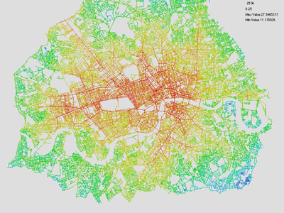 905 905 | 2005 computer graphics by Sheep N. Dalton These images are part of a research done by Sheep N. Dalton in the context of a paper for the Third Space Syntax conference in Atlanta, USA. The paper covers a new theory that can perform new kinds of configurational analysis. The software which performs the analysis is called "Meanda" (Mean Depth Angular) and was developed by Dalton. The project visualizes the network structure of the graph that is formed from the network of streets. This work is derived from a set of network theories in architecture known as "Space Syntax". It is generally found that these colors which are formed from a measurement of graph structure correlate well with observed patterns of pedestrian movement. The first image illustrates London Radius infinity Mean Depth. This is a vehicular map so Oxford street has been removed to represent it's non availability to cars. The second image shows Amsterdam Mean depth. For more information on how fractional analysis is computed click here |
 362 362 | 1999 computer graphics by Garr & Esa/Esrin The backbone network of GARR-B which connects scientific institutions in Italy. |
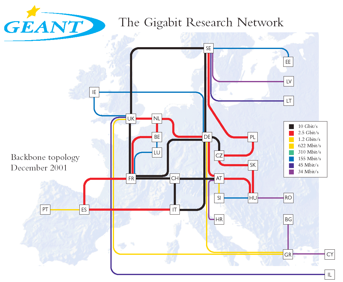 364 364 | computer graphics Ten-155 was the pan European high-speed network connecting the national reseach and education networks of 20 countries from 1998 until the end of 2001. It has now be superceded by the GÉANT network running at gigabit bandwidths. The topology of this new backbone network, as of December 2001 is show here. |
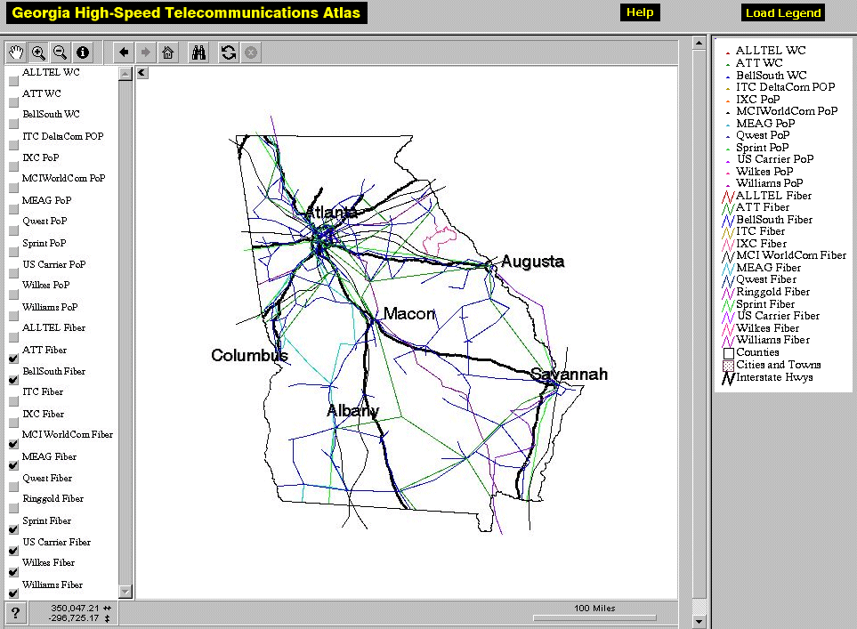 253 253 | interactive computer graphics by Steven P. French and XuDong Jia, Georgia Center for Advanced Telecommunications Technology and the Center for Geographic Information Systems The Georgia High-Speed Telecommunications Atlas provides detailed route maps of multiple fibre optic network providers within the state. The atlas uses an interactive mapping system, shown opposite, allowing you to explore the data fully. It is being developed by the Georgia Center for Advanced Telecommunications Technology and the Center for Geographic Information Systems. Further information is given the paper "Georgia High-Speed Telecommunications Atlas: An ArcIMS Implementation", by Steven P. French and XuDong Jia. |
 1215 1215 | Geospace & Media Tool (GMT): Geolocated news2007 computer graphics by Parsons Institute for Information Mapping (PIIM) This screenshot shows a selected news abstract set in geographical context. GMT Description The Geospace & Media Tool is an advanced information visualization application that ties incoming news flow with geospatial, census, and human network data. Related news articles are scored and aggregated into single, convenient event files. Easy-to-use graphic and geographic visualizations give the user the ability to see events, demographics, rnorganizations and current as well as past professional connections between people. Key features include: Detailed content and metadata on every news article Full dossier of individuals mentioned in every news articlern Ability to track and search events by location, topic, and customized filters Automatic extraction and aggregation of related network and statistical data Visual display of network connections between professionals Access to hundreds of statistical values specifically relevant to each news article, accompanied by map overlays |
 1213 1213 | Geospace & Media Tool (GMT): Human organizational networks2007 computer graphics by Parsons Institute for Information Mapping (PIIM) This screenshot shows the relationships among individuals as a human organizational network diagram. GMT Description The Geospace & Media Tool is an advanced information visualization application that ties incoming news flow with geospatial, census, and human network data. Related news articles are scored and aggregated into single, convenient event files. Easy-to-use graphic and geographic visualizations give the user the ability to see events, demographics, rnorganizations and current as well as past professional connections between people. Key features include: Detailed content and metadata on every news article Full dossier of individuals mentioned in every news articlern Ability to track and search events by location, topic, and customized filters Automatic extraction and aggregation of related network and statistical data Visual display of network connections between professionals Access to hundreds of statistical values specifically relevant to each news article, accompanied by map overlays |
 1214 1214 | Geospace & Media Tool (GMT): Statistics2007 computer graphics by Parsons Institute for Information Mapping (PIIM) This screenshot shows census data for a selected congressional district. GMT Description The Geospace & Media Tool is an advanced information visualization application that ties incoming news flow with geospatial, census, and human network data. Related news articles are scored and aggregated into single, convenient event files. Easy-to-use graphic and geographic visualizations give the user the ability to see events, demographics, rnorganizations and current as well as past professional connections between people. Key features include: Detailed content and metadata on every news article Full dossier of individuals mentioned in every news articlern Ability to track and search events by location, topic, and customized filters Automatic extraction and aggregation of related network and statistical data Visual display of network connections between professionals Access to hundreds of statistical values specifically relevant to each news article, accompanied by map overlays |
 611 611 | 2005 computer graphics by TeleGeography |
 551 551 | computer graphics This cartogram places cities in their approximate relative geographical positions. There may or may not be hierarchical patterns within the spatial organisation of individual firms at the global scale (it depends on their particular strategies), but when aggregated the result is a world city network. This network is illustrated as a pattern of nodes in this figure. The cartogram includes all cities that have at least one fifth of the highest city connectivity (i.e London's) which creates a roster of 123 'world cities'. |
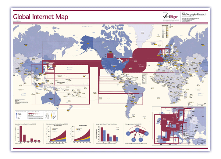 607 607 | 2006 computer graphics by TeleGeography TeleGeography's Global Internet Map 2006 shows the latest view of the internet's international infrastructure. The map features: * International internet bandwidth, scaled by capacity—covering backbones operated by more than 300 international Internet carriers as of mid-2005 * Detailed inset map showing intra-European internet bandwidth * Charts including international internet bandwidth growth, internet traffic and capacity growth forecasts through 2008, Gigabit Ethernet IP price declines, and interregional internet bandwidth * Countries color-coded to show international internet bandwidth * Dialing codes and internet domains for every country in the world * Country tags color-coded according to host density (Internet hosts per 10,000 people) |
 608 608 | 2006 computer graphics by TeleGeography TeleGeography's Global Internet Map 2006 shows the latest view of the internet's international infrastructure. The map features: * International internet bandwidth, scaled by capacity—covering backbones operated by more than 300 international Internet carriers as of mid-2005 * Detailed inset map showing intra-European internet bandwidth * Charts including international internet bandwidth growth, internet traffic and capacity growth forecasts through 2008, Gigabit Ethernet IP price declines, and interregional internet bandwidth * Countries color-coded to show international internet bandwidth * Dialing codes and internet domains for every country in the world * Country tags color-coded according to host density (Internet hosts per 10,000 people) |
 767 767 | 2005 computer graphics by Pedro Ortiz, Santiago Ortiz, Lui The goal of the GNOM project is to develop a series of digital interfaces for the exploration of genetic networks. The first stage of the project explores the genetic interaction network in the bacteria Escherichia Coli. The graph shown represents the first tryout of the Oracle interface: A circular interface of high control level over the node selection, where the entire network of relations can be visualised. |
 768 768 | 2005 computer graphics by Pedro Ortiz, Santiago Ortiz, Lui The goal of the GNOM project is to develop a series of digital interfaces for the exploration of genetic networks. The first stage of the project explores the genetic interaction network in the bacteria Escherichia Coli. This circular approach is the finalized graphical representation (oracle) of the network of interactions. It represents each gene with coloured segments associated to the structural description of the gene's main function. The colour of the relation curves express the nature of relation, and the traces external to the circle establish a relation of auto regulation. |
 976 976 | computer graphics by Gregory Bray Looking for a new way to surf the Gnutella network - a P2P community sharing network (http://www.gnutella.com) - Gregory Bray decided to use a web spider, as a means of collecting information from each node, in order to create a map of the network and gather statistics without changing the Gnutella protocol. After the web spider downloads all the information it can find, a simple parser creates the statistics and outputs the data file in a graph using aiSee Graph Layout Software (http://www.aisee.com). As the author explains: "So far the largest data set I have collected was about 80,000 nodes in half an hour (...) way more than the 10 or 20 thousand that the common user can see". |
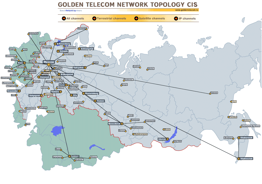 366 366 | computer graphics The Internet infrastructure of Golden Telecom in Russia. |
 1027 1027 | 2004 computer graphics by Richard Jones Google Cartography uses the Google Search API to build a visual representation of the interconnectivity of streets in an area. It is indeed a very innovative and appealing concept, particularly since its interactive functionality allows a deeper understanding of the vast mesh of intersections that form a city's street network. This application takes a starting street and finds streets that intersect with it. Traversing the streets in a breadth-first manner, further intersections are discovered. Eventually a connected graph is produced showing the interconnectivity of streets flowing from the starting street. The largest connected subgraph is visualized using a Radial Layout algorithm provided by the Prefuse graph visualization framework. The graph is initially centered on the start street but will automatically adjust its focus to center around the most recently selected street. On the provided URL you can try navigating through the streets of New York or Melbourne, or in case you have a Google key, you can explore your own area. |
 763 763 | 1998 computer graphics by Bradley Huffaker, Jaeyeon Jung, Web caching is a technology for migrating copies of documents from a server across the network toward points closer to the end users requesting those documents. Caching can reduce response time and network bandwidth consumption by reducing the number of repeated transmissions of the same documents across the wide area Internet. Consequently, web caching is now being widely deployed to mitigate problems imposed by explosive growth of Internet traffic. By extending this concept across a cooperative mesh, one can form cache meshes, or hierarchies, to distribute load and leverage content among caches, further increasing overall performance. For these reasons, rapid growth in the demand for web caching has led to many research, development, and deployment projects in the last few years. One well-known caching project in the United States, the NSF-sponsored NLANR root cache system has been developing and deploying a prototype global web caching hierarchy since 1995. |
 725 725 | 2001 computer graphics by Dr. Joe Luczkovich These food web models are screenshots from Dr. Joseph Luczkovich's Java Application developed at the Biology Department at East Carolina University. These models are extremely interesting, appealing and functional. One can select the different species and elements to analyze, compare their interactions and zoom extensively in and out of the digitally produced food web. The application has also some 3D features, since it's possible to rotate the whole network of interactions on 3 axes. |
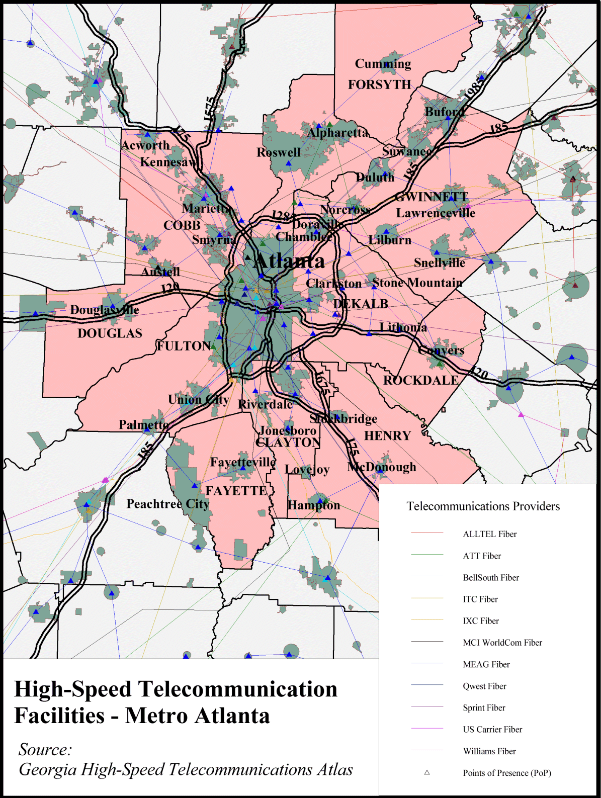 248 248 | computer graphics by Steven P. French and XuDong Jia The Georgia High-Speed Telecommunications Atlas provides detailed route maps of multiple fibre optic network providers within the state. The atlas uses an interactive mapping system, shown opposite, allowing you to explore the data fully. It is being developed by the Georgia Center for Advanced Telecommunications Technology and the Center for Geographic Information Systems. Further information is given the paper "Georgia High-Speed Telecommunications Atlas: An ArcIMS Implementation", by Steven P. French and XuDong Jia. |
 1023 1023 | 2006 computer graphics by (unknown) Coordinated by the Institute for Philosophical Research and in cooperation the Hungarian Ministry of Information and Communicaton and the Hungarian Academy of Science, this knowledge network is an attempt to visualize the relationships among main subject areas within the Hungarian Virtual Encyclopedia. Based on a force directed algorithm (spring algorithm) this highly complex and detailed interactive piece allows the user to navigate between a large variety of words, such as atom, information, Descartes or ADSL, and see all the inherent relationships between them. All the entries (in Hungarian) were edited by highly recognized researchers of the field. When accessing the Encyclopedia website, a user can just click on "cimdokumentumok terkepe", in the upper right corner of every entry, for a map of the interlinkage of the entries to appear. |
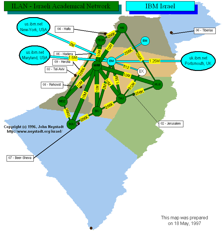 378 378 | 1997 computer graphics by John Neystadt Israeli ISP backbone map. |
 263 263 | 2000 computer graphics by Williams Communications A map of the extensive fibre optic network of Williams Communications spanning much of the USA. The map shows the extent of the network as of January 2000. For the latest information you should consult their interactive map. |
 654 654 | computer graphics by Valdis Krebs Software for Social Network Analysis & Organizational Network Analysis |
 384 384 | computer graphics A nice interactive network map of the TeliaNet Internet backbone, based in Sweden, but with connections to many other countries. The map includes interactive query of details on the link capacities. |
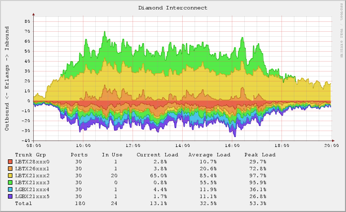 688 688 | 200603 computer graphics (RRDtool) by Ben Golden Graph shows inbound and outbound call traffic going in and out of the switch via the 6 trunks connected to the Diamond exchange. Inbound traffic shown as positive and uses a lowest-free fill method. Outbound traffic shown as negative uses a distributed fill method. Tech details on RRDtrac. |
 279 279 | 1991 computer graphics by Larry Landweber, Computer Science Department, University of Wisconsin - Madison, USA A "census" of Internet connectivity by countries has been undertaken at regular intervals by Larry Landweber, Computer Science Department, University of Wisconsin - Madison, USA. This map shows the differential levels of network connectivity in September 1991. The change in connectivity levels (compared with his 1997 map) is clearly evident, showing the spread of the Internet. Landweber's maps and data tables are available. [For more information on Landweber's maps see the Map of the Month article "Mapping the Global Spread of the Net" in Mappa.Mundi Magazine.] |
 918 918 | 2002 computer graphics by Simon Greenwold The Internet constitutes an enormous electronic architecture that defines spaces without regard to physical structure. We navigate these spaces with browsers, moving from place to place with a click on a link. Internaut proposes that a physical architecture may be derived from the shape of the network and navigated with a first-person 3D game engine. The applet represented here demonstrates the process of turning a network structure into a physical map. The nodes are pages connected by links. The links act as springs, drawing the graph into its lowest energy state, a configuration best suited to physical navigation. The cells themselves are generated as a Voronoi diagram, bounded by a convex hull around the set of sites. |
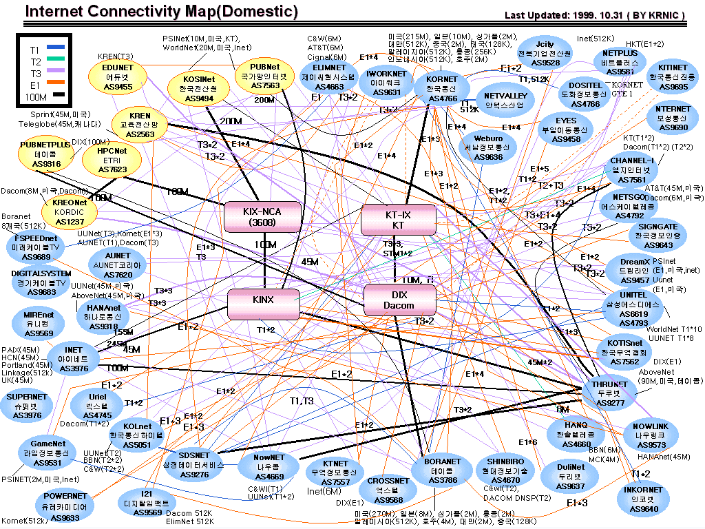 277 277 | 1999 computer graphics by KR Network Information Centre, South Korea Maps tracking the Internet infrastructure in South of Korea produced by KR Network Information Centre (NIC). A whole series of maps over the past five years were produced using topological graphs creating a useful census of the growing complexity the links between ISPs and their capacity. When this map, showing the infrastructure in October 1999, is compared with the one from May 1995, they clearly reveal the tremendous growth in ISPs, connections and capacity. |
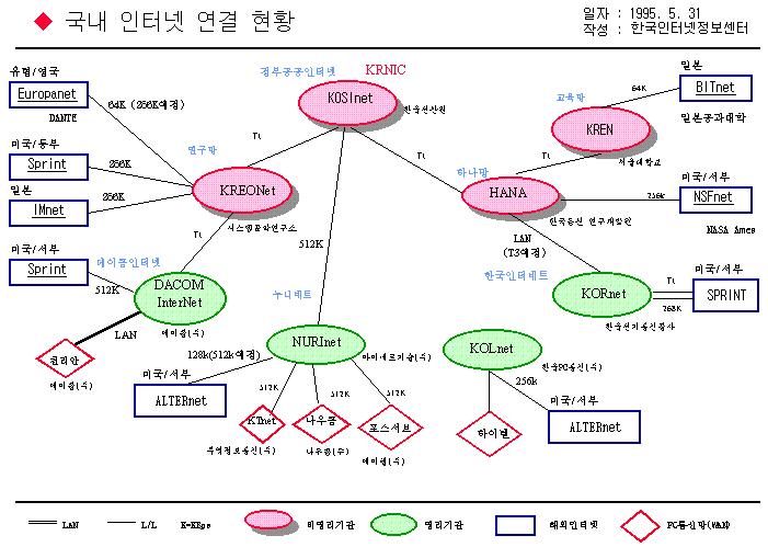 276 276 | 1995 computer graphics by KR Network Information Centre, South Korea This is one of the maps tracking the Internet infrastructure in South of Korea produced by KR Network Information Centre (NIC). A whole series of maps over the past five years were produced using topological graphs creating a useful census of the growing complexity the links between ISPs and their capacity. When this map, showing the infrastructure in May 1995, is compared with the one from October 1999, they clearly reveal the tremendous growth in ISPs, connections and capacity. |
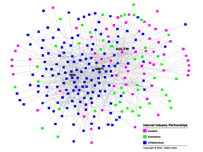 880 880 | 2002 computer graphics by Valdis Krebs Each node in the network represents a company that competes in the Internet industry. Two companies are connected with a grey line if they have announced a joint venture, strategic alliance or other partnership. This map shows a subset of the total internet industry -- 250 companies -- during the period from 1998 to 2001. Many companies have a few partnerships, a few companies have many. The industry is dominated by several 'hubs' -- companies with bridging ties that connect the unconnected. Prior to 2002, the best positioned companies in this network of partnerships were: Microsoft, AOL-TimeWarner and IBM. These industry visualizations demonstrate the forces that organizations exhibit upon each other in complex, interconnected economic systems. The data is gathered from various public sources and includes only data on business partnerships such as strategic alliances and joint ventures. |
 291 291 | 2000 computer graphics by Valdis Krebs Valdis Krebs is an expert in organisation network analysis. He has analysed the structure of the Internet industry, looking at the ownership and alliances between different companies providing the infrastructure, content and commerce. Three key metrics were used to understand the structure - control, access and status. The results are presented in an interactive graph in the Internet Industry map. The four companies with the most control over the Internet industry were AOL, Microsoft, AT&T and Yahoo!, shown by the large red circles. |
 829 829 | 1998 computer graphics by Hal Burch and Bill Cheswick The Internet Mapping Project was started at Bell Labs in the summer of 1998. Its long-term goal is to acquire and save Internet topological data over a long period of time. This data has been used in the study of routing problems and changes, DDoS attacks, and graph theory. "This mapping consists of frequent traceroute-style path probes, one to each registered Internet entity. From this, we build a tree showing the paths to most of the nets on the Internet. We have no interest in the specific endpoints or network services on those endpoints, just the topology of the 'center' of the Internet." These paths change over time, as routes reconfigure and the Internet grows. "We are preserving this data, and plan to run the scans for a long time. The database should help show how the Internet grows. We think we can even make a movie of this growth someday." |
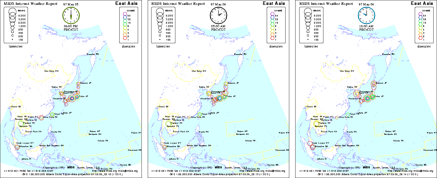 504 504 | computer graphics by Matrix NetSystems Matrix NetSystems produces an animated map called the Internet Weather Report (IWR), which dynamically maps the condition of the Internet measured by timing network latencies six times a day from their HQ in Texas to over four thousand domains around the world. Shown below are three frames from an IWR of East Asia. To fully appreciate the dynamic nature of IWR, see the animated maps in action. Matrix NetSystems also produces a wide range of real-time Internet performance statistics in its Internet Ratings and Internet Average services. |
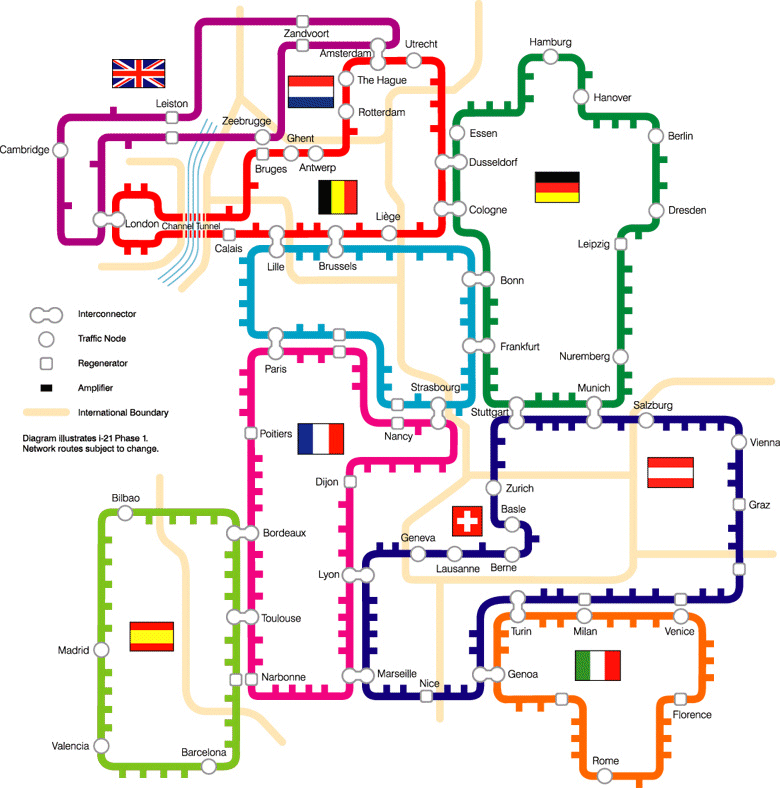 368 368 | computer graphics A map of the Interoute i-21 network spanning much of Europe. It is a nice example of the use of a subway map metaphor. |
 930 930 | 2002 computer graphics by Annja Krautgasser, Rainer Mandl, IP-III is a visualization application for mapping the online user presence in the Internet. The basic idea is to create a space typical to the Internet, which does not refer to the usual geographic information of online users (compare traffic visualization tools), but rather derives directly from the Internet specific code of the IP numbers.If the binary code of the IP addresses is transposed into spatial coordinates, a space constructing structure can be produced, which corresponds to a spatial language inherent to the Internet. Through the online user's applications as spatial coordinates, the created space modifies itself in real-time with the behavior of its visitors. An important aspect of the code conversion of the IP addresses into spatial coordinates is that the spatial interpretation of the IP addresses is not geographically translated in a classical sense, but rather the IP addresses are broken down into their binary code and, following this, allocated to a Cartesian coordinate system. With this, a virtual map is generated in which an autogenous net space is described - quasi a spatial map of the virtual Internet space. The installable net project 'IP-III' is comprised of two parts: In the 'online part' which is immediately defined for the online user as a website and in an 'installable part' of the exhibition. The sum of both parts produces a superposition of virtual and real space. |
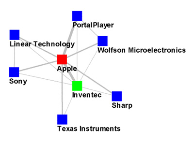 864 864 | 2005 computer graphics by Valdis Krebs These two images reflect the evolution of Apple's iPod "ecosystem" and its giant leap into mainstream. The first image exposes the initial network in 2001, the year the device was launched, while the second shows the same network in 2004, when iPod became truly a mass product. The nodes are colored by the role they play in the portable music player industry: yellow = competitors green = content providers/distributors blue = technology providers pink = accessory makers |
 344 344 | 1992 computer graphics by Sam Wilson, EUCS This map shows the structure of JANET, the UK's academic and research network, in 1992. The one above shows international connections with 256 Kbps links to Europe and the "Fat-Pipe" transatlantic link to the USA running at 768 Kbps. Not surprisingly the capacity of these links have been increased massively since then. |
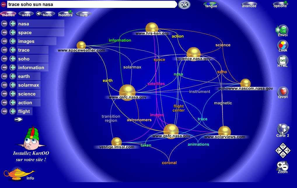 412 412 | computer graphics An interesting network metaphor as a visual interface to search engine results. |
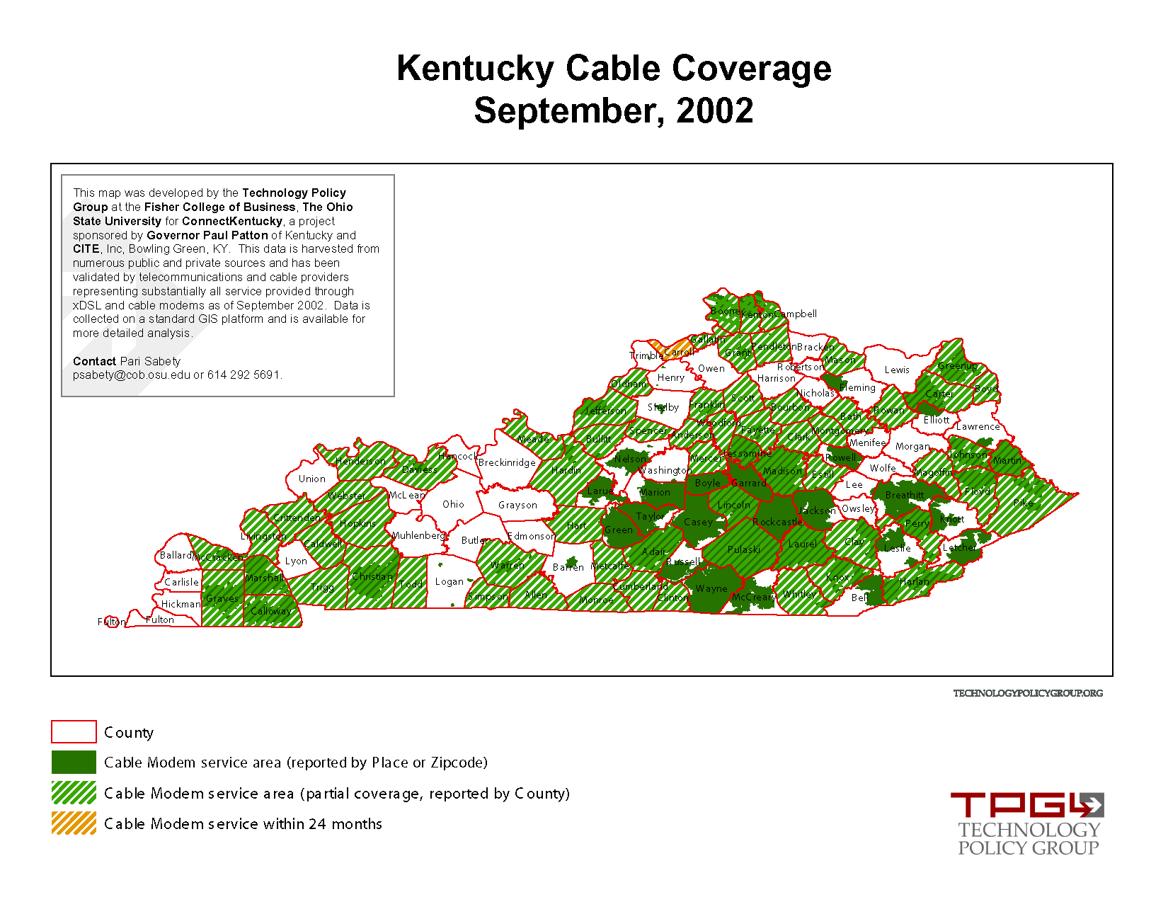 275 275 | 2002 computer graphics by Technology Policy Group, and ConnectKentucky This map provides a visual census of network infrastructure. It is produced by the Technology Policy Group as part of their NetmapUSA project which benchmarks regional information infrastructure in the U.S. This map shows the coverage of cable modem Internet service throughout the state of Kentucky, September 2002. It was produced by TGP and ConnectKentucky. |
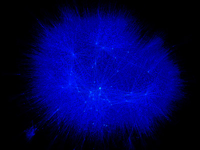 809 809 | 2004 computer graphics by Jeffrey Heer This image is a visualization of Jeffrey Heer's personal friendster network to 3 hops out, an online social network consisting of Jeffrey, his "friends", his friends' friends, and his friends' friends' friends. The resulting networks consist of 47471 people connected by 432430 friendship relations. The data was collected during the timespan of October 2003 to February 2004 as part of the Vizster project. The images were created using the prefuse visualization toolkit. Nodes are colored by proximity to the center of the network (which in this case is Jeffrey Heer himself). The central person is the brightest, that person's friends next brightest and so on. The elements are also ordered so that friends and relations closer from the central person are drawn on top of more distant relations and people. The graph layout was computed using a standard force-directed layout method in which nodes exert anti-gravity against each other and the edges are treated as springs. |
 742 742 | computer graphics by M. Newman, M. Girvan The network of interactions between major characters in the novel Les Miserables by Victor Hugo, divided in 11 communities represented by different colors. |
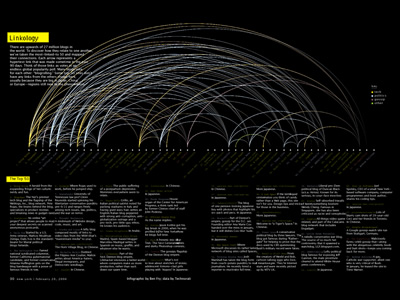 1010 1010 | 2006 computer graphics by Ben Fry As part of its 2006 February 20 Issue, dedicated to "The Blog Establishment", New York Magazine commissioned Ben Fry to map the connections between the most-linked-to 50 blogs, using data from Technorati. Each arrow represents a hypertext link that was made sometime in the previous 90 days. The Blogosphere encompasses a vast communication network of interconnected individuals (bloggers) who are linked by shared interests and patterned flows of information. Links between blogs (blogrolling) represent recognition votes in an endless global popularity poll. Some top-50 sites don't have any links from the others shown here, mainly because they are from countries other then the USA, such as Japan, China, Spain or Germany; and therefore, they have a tendency to remain within their immediate linguistic/cultural community. On the top 3 popularity list is Boing Boing, Engadget and PostSecret. For an updated listing on Technorati click here. |
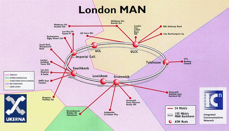 374 374 | 1996 computer graphics by Integrated Communications Network The London MAN (metropolitan area network) of SuperJANET - the UK's high-speed academic and research network. This map above shows the topology of the network in 1996. |
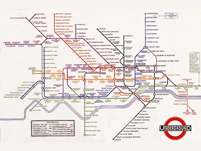 902 902 | 1933 computer graphics by Harry Beck The father of all subway maps, the London Underground map, was the brainchild of Underground electrical draughtsman, Harry Beck, who produced this imaginative yet stunningly simple design back in 1933. Beck based the map on the circuit diagrams he drew for his day job, stripping the sprawling Tube network down to basics and ignoring the exact geographical location of the tube stations. The result was an instantly clear and comprehensible chart that would become an essential guide to London - and a template for transport maps the world over. Beck's revolutionary design, with certain modifications and additions, survives to the present day and is set to serve London Underground and its millions of customers for many years to come. The first image represents Beck's original map from 1933, while the second image shows the most up-to-date version of the London Underground map. To view the map according to its accurate geographical location click here. |
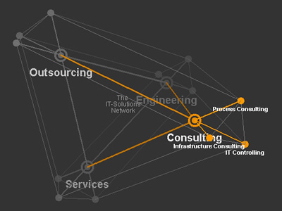 929 929 | 2005 computer graphics by Jeremy Abbett Lufthansa Systems Network provides sophisticated infrastructure IT services for clients around the world. Creative Director, Jeremy Abbett, developed a three-dimensional, java-based navigation tool that succeeds in visualizing the sheer scope and intricacy of this network. The 3-D navigation encourages browsing complex topics and services within a simple information hierarchy. As the user concentrates on a particular theme, the navigation zooms into a focused representation of immediately related topics. The 3-D model can be manipulated by users, allowing them a feeling of how the various points of the model relate to one another and as a whole. Audio clues are also used, as well as visual clues that respond to the user's actions. |
 483 483 | 2001 computer graphics This large graph shows the router level connectivity of the Internet as measured by Hal Burch and Bill Cheswick's Internet Mapping Project. The work is being commercially developed by Lumeta. Lumeta are developing network measurement and mapping tools for analysing large corporate intranets. This graph part of this graph show the portion of a corporate intranet that are 'leaking' with the Internet. For more information see the article "What Can You Do With traceroute?" by Steve Branigan, Hal Burch, Bill Cheswick, and Frank Wojcik, Internet Computing, Sept./Oct. 2001. |
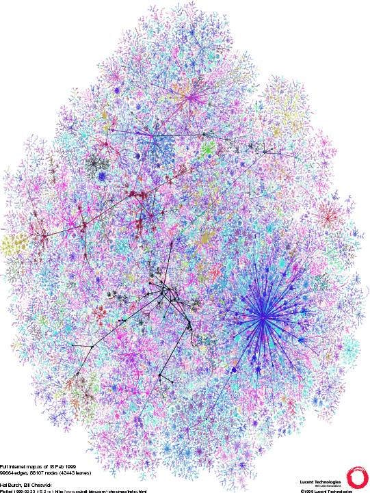 488 488 | 2001 computer graphics This large graph shows the router level connectivity of the Internet as measured by Hal Burch and Bill Cheswick's Internet Mapping Project. The work is being commercially developed by Lumeta. Lumeta are developing network measurement and mapping tools for analysing large corporate intranets. This graph part of this graph show the portion of a corporate intranet that are 'leaking' with the Internet. For more information see the article "What Can You Do With traceroute?" by Steve Branigan, Hal Burch, Bill Cheswick, and Frank Wojcik, Internet Computing, Sept./Oct. 2001. |
 679 679 | computer graphics (Pajek) Main core subgraph extracted from routing data on the Internet network (124651 vertices, 207214 arcs). |
 346 346 | 1989 computer graphics Map of MILNET (Defense Data Network) in the US and Europe, from 1989. MILNET split from ARPANET in 1984. (Source: Directory of Computer Networks, edited by Tracey L. Laquey, Digital Press, 1990) |
 347 347 | 1989 computer graphics Map of MILNET (Defense Data Network) in the US and Europe, from 1989. MILNET split from ARPANET in 1984. (Source: Directory of Computer Networks, edited by Tracey L. Laquey, Digital Press, 1990) |
 386 386 | 1998 computer graphics Map of UUNET's UK backbone network from mid 1998. [For more information on this map see the Map of the Month article "Maps to Market Your Network" in Mappa.Mundi Magazine.] |
 388 388 | 1999 computer graphics Map of UUNET's UK backbone network from February 1999. [For more information on this map see the Map of the Month article "Maps to Market Your Network" in Mappa.Mundi Magazine.] |
 588 588 | 2003 computer graphics by Jonathon Corum County maps and the 2003 California Statewide Special Election. County maps can be deceptive, especially for large states like California. Unless the population of a state is dispersed evenly in proportion to the size of each county, there is no direct relationship between the physical area of a county and the number of people, registered voters, or votes cast within it. Which is why I was surprised to see an analyst from a leading all-news television network point to a map of California and single out San Bernadino county, California's largest county by area, as a significant reason for Arnold Schwarzenegger's victory. I saw a similar map on the day after the election, a map of leading gubernatorial candidates by county, provided as part of California's official election results and reproduced at right. What's wrong with this map? The official county map shows at least four things: the location and size of each county (as a surface area), the leading candidate within that county (as a color), and the percentage of votes cast for that candidate (as a number). The map legend adds the statewide totals and the percentage of votes cast for each of the top 10 candidates. The map is correct in showing that Schwarzenegger won this election, but the map doesn't fit the data very well. The tally of votes gives him 48.6% of the total, but almost all of the map is green. Stretching or condensing data to fit a physical area often results in visual misrepresention or exaggeration, and I was curious to find out how much the county map exaggerates the voting data. Does area matter? After removing captions, text, and drop shadows, the map shows a total of 86,031 colored pixels. Of that total, 81,560 pixels (95%) are Schwarzenegger green, and 4,471 pixels (5%) are Bustamante red. |
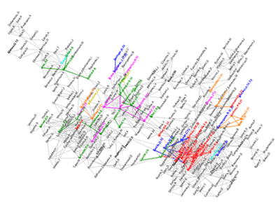 724 724 | 2003 computer graphics by Jean-Pierre Eckmann This project was originally produced by Jean-Pierre Eckmann for the IAMP Conference 2003 in Lisbon. The concept was later pursued by Sid Redner, from Boston University, who showed that the network of scientific papers, connected by citations, has a power law degree distribution. In a test of this concept papers from the Mathematical Physics Archive were examined for reciprocal citation of the authors, yielding the preceding graph, where colors indicate areas of obvious curvature that were then checked for content. The strongest curvature is the area in red, statistical mechanics, which is reasonable given the nature of the database. This result emerged from the analysis that did not use scientific field as a parameter in generating the clusters. |
 1057 1057 | 1990 computer graphics by (unknown) Max/MSP is a graphical environment for music, audio and multimedia developed and maintained by San Francisco-based software company Cycling'74. It has been used since 1990 by composers, performers, software designers, researchers and artists interested in creating interactive software. The Max program itself is highly modular, with most routines existing in the form of shared libraries. An API allows third-party development of new routines (called "external objects"). As a result, Max has a large userbase of programmers not affiliated with Cycling'74 who enhance the software with commercial and non-commercial extensions to the program. One of the most notorious aspects of Max/MSP is its extensible design and graphical interface (which in a novel way represents the program structure and the GUI as presented to the user simultaneously). Its distinguished and sometimes demanding interface also provides a great example of how to work with a network of interdependencies and can certainly be a source of inspiration for interactive models of this kind. |
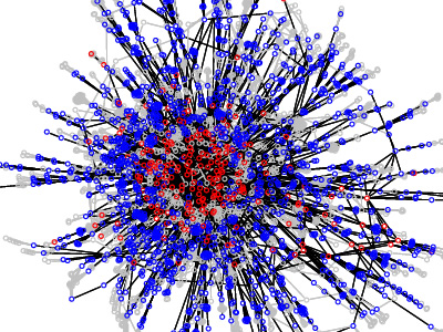 758 758 | 1998 computer graphics by Ramesh Govindan and Anoop Reddy We have prototyped Mercator, a program that uses hop-limited probes--the same primitive used in traceroute--to infer the map of the Internet. Mercator uses informed random address probing to carefully explore the IP address space when determining router adjacencies. It also uses source-route capable routers wherever possible to enhance the quality of the resulting map, and employs novel mechanisms for resolving aliases (interfaces belonging to the same router). Mercator maps are useful for obtaining context for fault-isolation. In addition, they can be used to visualize small, medium-sized, and large ISP topologies, generate realistic topologies for simulation, and understand properties of network structure. |
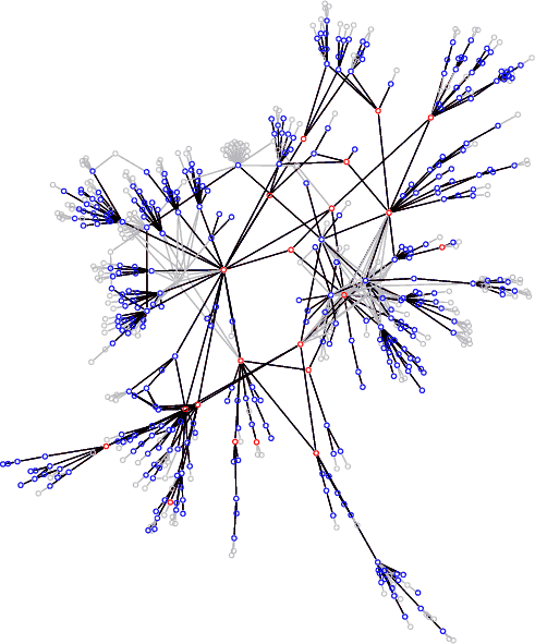 487 487 | computer graphics (Mercator) by Ramesh Govindan, Anoop Reddy and colleagues A topology map of a core network of a medium-sized ISP. It was created using an automatic network discovery tool called Mercator developed as part of the Scan project by Ramesh Govindan, Anoop Reddy and colleagues, at the Information Sciences Institute, USA. |
 960 960 | 2005 computer graphics by Burak Arikan, Ben Dalton The system of fashion is set on the continuous change of styles and speculations of the image of clothing that are represented through mass media and network of individual expressions. This work aims to explore the effect of the fashion system by creating a micro fashion network with the basic elements color and time. A fixed camera and the custom software processed and stored dominant colors of moving people in Cambridge's busy neighborhoods. Similar colors connected to each other form a large color network over time. As the network grow, the new vertices are connected to existing similar colors; because of this preferential attachment model, we see the power law distribution, and highly connected dense color hubs in the resulting images. In the result demonstration, three different artistic representations put side by side: captured human figures, color information as abstract boxes, and the complex network of colors. |
 1063 1063 | 2006 computer graphics by Valdis Krebs This self-organizing network model of the Mideast shows both attracting and repelling forces between various players. Nodes connected with links show positive relationships (friends). Negative relationships (enemies) have no links, but a repelling force pushes the nodes apart. You can interact with the maps by dragging the nodes around the screen when they are in motion or when stopped. Use right mouse-click on nodes to show and hide aspects of the network. |
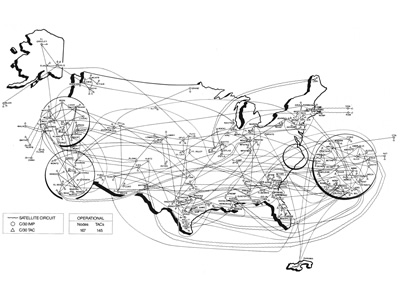 793 793 | 1989 computer graphics by (unknown) Maps of MILNET (Defense Data Network) in the US and Europe, from 1989. MILNET split from ARPANET in 1984. (Source: Directory of Computer Networks, edited by Tracey L. Laquey, Digital Press, 1990). |
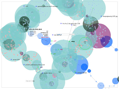 815 815 | 2002 computer graphics by (unknown) Minitasking is a free visual client for browsing the Gnutella network, released in April 2002. It provides a very different interface to P2P network spaces compared to the norm. Required Operating System: Microsoft Windows NT/2000/XP Minitasking won an Award of Distinction Net Excellence Prix at Ars Electronica 2002 - Linz/Austria(( and a Software Award from transmediale.03 - Berlin/Germany. |
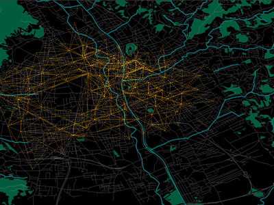 989 989 | 2005 computer graphics by Carlo Ratti, Andres Sevtsuk, Son The technology for determining the geographic location of cellphones and other hand-held devices is becoming increasingly available. It is opening the way to a wide range of applications, collectively referred to as Location Based Services (LBS), which are primarily aimed at individual users. However, if deployed to retrieve aggregated data in cities, LBS could become a powerful tool for urban cartography. The "Mobile Landscapes: Graz in Real Time" project was developed as part of the M-City exhibition (Graz Kunsthaus, 1 October 2005 - 8 January 2006, with curator Marco De Michelis), in collaboration with the cellphone operator A1/Mobilkom Austria. Three types of maps of the urban area of Graz, Austria, were developed and shown in real-time on the exhibition premises: cellphone traffic intensity, traffic migration (handovers) and traces of registered users as they move through the city. The images shown here represent traffic migration. This mapping method computes origins and destinations of cell-phone calls passing through the city of Graz. The results shown are calculated anonymously on all calls, in a statistically chosen order. The actual process of transferring calls from one cell-phone to another cell-phone is called a "handover." The traces, represented as orange lines, start and end in the corresponding geographic areas of where the cell phones were used to make and receive calls. |
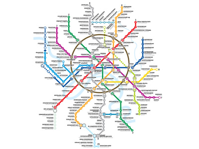 975 975 | computer graphics by (unknown) The Moscow Metro in Moscow, Russia, is the world's most heavily used metro system, with 3.2 billion passenger rides a year. It is well known for the ornate design of many of the stations, containing stunningly beautiful examples of socialist realist art. Inaugurated in May 1935, the Moscow Metro network currently has 277.9 km of route length, 12 lines and 171 stations, and on a normal weekday (according to the annual report 2004) it carries 10.05 million passengers. Passenger traffic is considerably lower on weekends bringing the average daily passenger traffic during the year to 8.745 million passengers per day. |
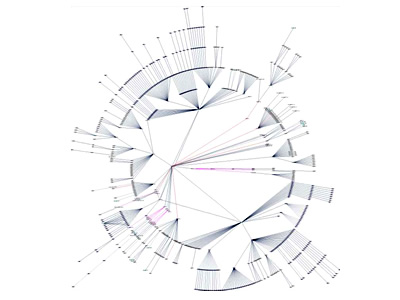 910 910 | computer graphics by Max Baker Netdisco is an Open Source web-based network management tool. Designed for moderate to large networks, configuration information and connection data for network devices are retrieved by SNMP. With Netdisco one can locate the switch port of an end-user system by IP or MAC address. Data is stored using a SQL database for scalability and speed. Cisco Discovery Protocol (CDP) optionally provides automatic discovery of the network topology. Netdisco gets all its data including CDP information from SNMP. It does not use CLI access and has no need for privilege passwords. Security features include a wire-side Wireless Access Point (AP) locator. |
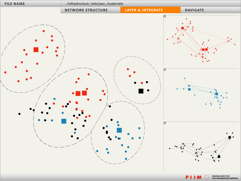 1234 1234 | 2006 computer graphics by Arno Klein and Nadia Ries-Shen (PIIM) Networks can be represented in many different forms, each of which may be projected into different mathematical spaces for analysis. Node-link diagrams can expose network vulnerabilities, highlight optimal paths, and cluster nodes for analysis. Radial formats provide alternate ways of layering, integrating, and navigating networks. Quantitative icons can help to explore the dynamics of interacting subnetworks. |
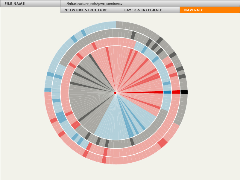 1232 1232 | 2006 computer graphics by Arno Klein and Sayoko Yoshida (PIIM) Radial formats provide alternate ways of layering, integrating, and navigating networks. This “combination lock†approach to decision making uses stepwise combinatorics to selectively navigate a solution space. Other network representations include more conventional node-link diagrams that can expose network vulnerabilities, highlight optimal paths, and cluster nodes for analysis, and even quantitative icons that can help to explore the dynamics of interacting subnetworks. |
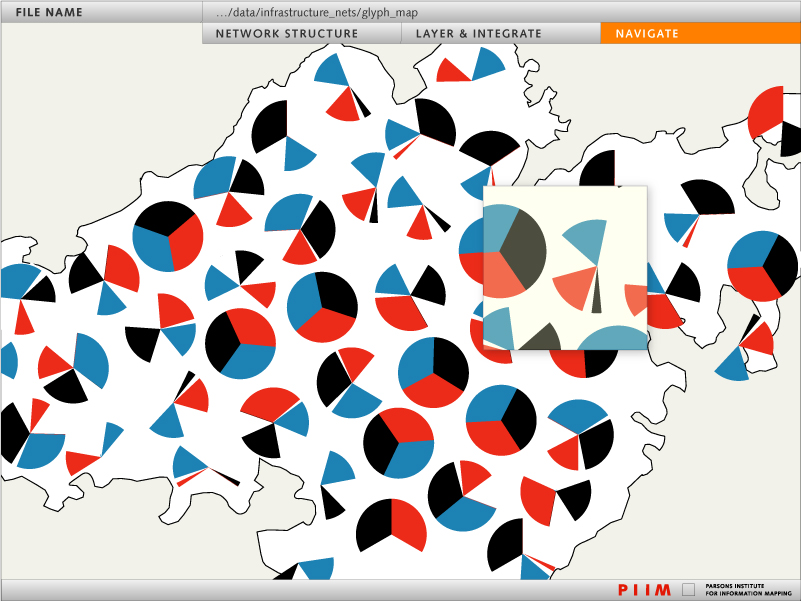 1235 1235 | 2006 computer graphics by Arno Klein and Nadia Ries-Shen (PIIM) Network visualizations can take unexpected forms, such as discontinuous yet related glyphs for wayfinding through regions with varying resources. Other network representations include node-link diagrams that can expose network vulnerabilities, highlight optimal paths, and cluster nodes for analysis, as well as radial formats that provide alternate ways of layering, integrating, and navigating networks. |
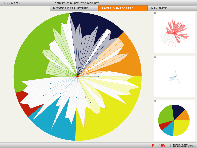 1233 1233 | 2006 computer graphics by Arno Klein and Sayoko Yoshida (PIIM) Layering and integrating networks presents information in a form for rapid analysis. Layers may consist of different network representations, such as node-link diagrams, radial formats, and quantitative icons. |
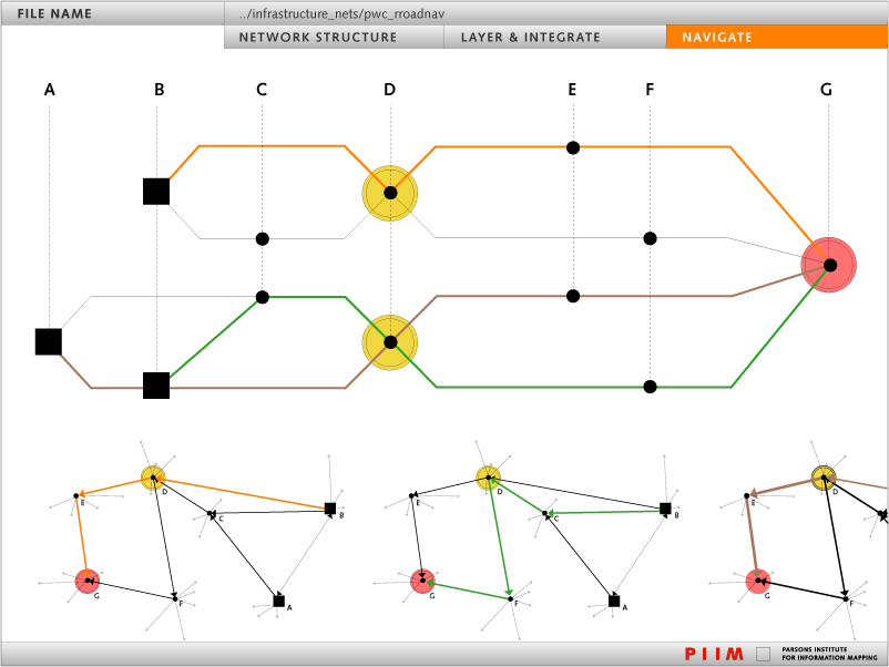 1231 1231 | 2006 computer graphics by Jamie Smith, Arno Klein, and Nadia Ries-Shen (PIIM) Node-link diagrams can expose critical network vulnerabilities and highlight optimal paths. Networks can be represented in a multitude of forms quite distinct from node-link diagrams. For example, radial formats provide alternate ways of layering, integrating, and navigating networks, and even quantitative icons can help to explore the dynamics of interacting subnetworks. |
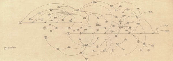 227 227 | 1999 drawing by Mark Lombardi (1955-2000) Mark Lombardi (1955-2000) was an abstract painter, best known for his network diagrams of crime and conspiracy. Lombardi's drawings attempt to document financial and political frauds by power brokers. Nodes in the diagrams represent individuals, corporations and government agencies, connected by lines showing associations, deals and so forth. His 1999 drawing, entitled George W. Bush, Harken Energy and Jackson Stephens, ca 1979-90, shows the proven connections between James Bath, the Bush and bin Laden families, and business deals in Texas and around the world. Thirteen lines originate with or point to James R. Bath, more than any other name presented. Among those linked to this obscure yet central character are George W. Bush, Jr., George H.W. Bush, Sr., Senator Lloyd Bentsen of Texas, Governor John B. Connally of Texas, Sheik Salim bin Laden of Saudi Arabia, and Sheik Salim's younger brother, Osama bin Laden. Lombardi's other network diagrams relate to the Iran-Contra Affair, World Finance Corporation, the Bay of Pigs invasion, and so forth. Each was based on thousands of notes gathered from news reports and written on index cards. |
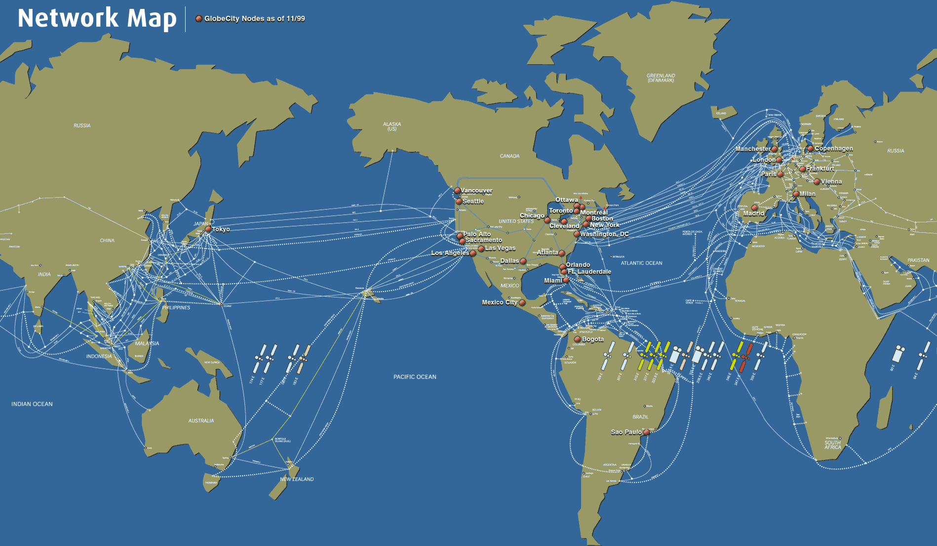 262 262 | 1999 computer graphics by Teleglobe, Inc. The cable and satellite infrastructure of Teleglobe Inc., a global telecommunications corporation, as of November 1999. |
 1019 1019 | 2006 computer graphics by Mark Miller Brains are gorgeous at the right magnification, says Mark Miller on his "neuro" set of photos in flickr. Self-described as an intracellular recording artist, Miller in this set shows 17 striking images of a mouse's neuronal network. Covering different areas of the brain such as the cingulated cortex or motor cortex, the images are quite impressive, particularly since the neurons connecting in the brain resemble the large-scale structure of the universe. See the Millennium Simulation to better understand this noticeable similarity. Other representations of neuronal networks can be seen here and here. |
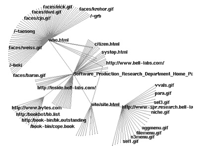 745 745 | 1999 computer graphics by Graham J. Wills The difference between displaying networks with 100-1,000 nodes and displaying ones with 10,000-100,000 nodes is not merely quantitative, it is qualitative. Layout algorithms suitable for the former are too slow for the latter, requiring new algorithms or modified (often relaxed) versions of existing algorithms to be invented. The density of nodes and edges displayed per inch of screen real estate requires special visual techniques to filter the graphs and focus attention. NicheWorks is a visualization tool for the investigation of very large graphs. By 'very large' we mean graphs for which we cannot look at the complete set of labeled nodes and edges on one static display. Typical analyses performed using NicheWorks have between 20,000 and 1,000,000 nodes. On current mid-range workstations, a network of around 50,000 nodes and edges can be visualized and manipulated in real time with ease. Increased size decreases interactive performance linearly. NicheWorks allows the user to examine a variety of node and edge attributes in conjunction with their connectivity information. Categorical, textual and continuous attributes can be explored with a variety of one-way, two-way, and multidimensional views. |
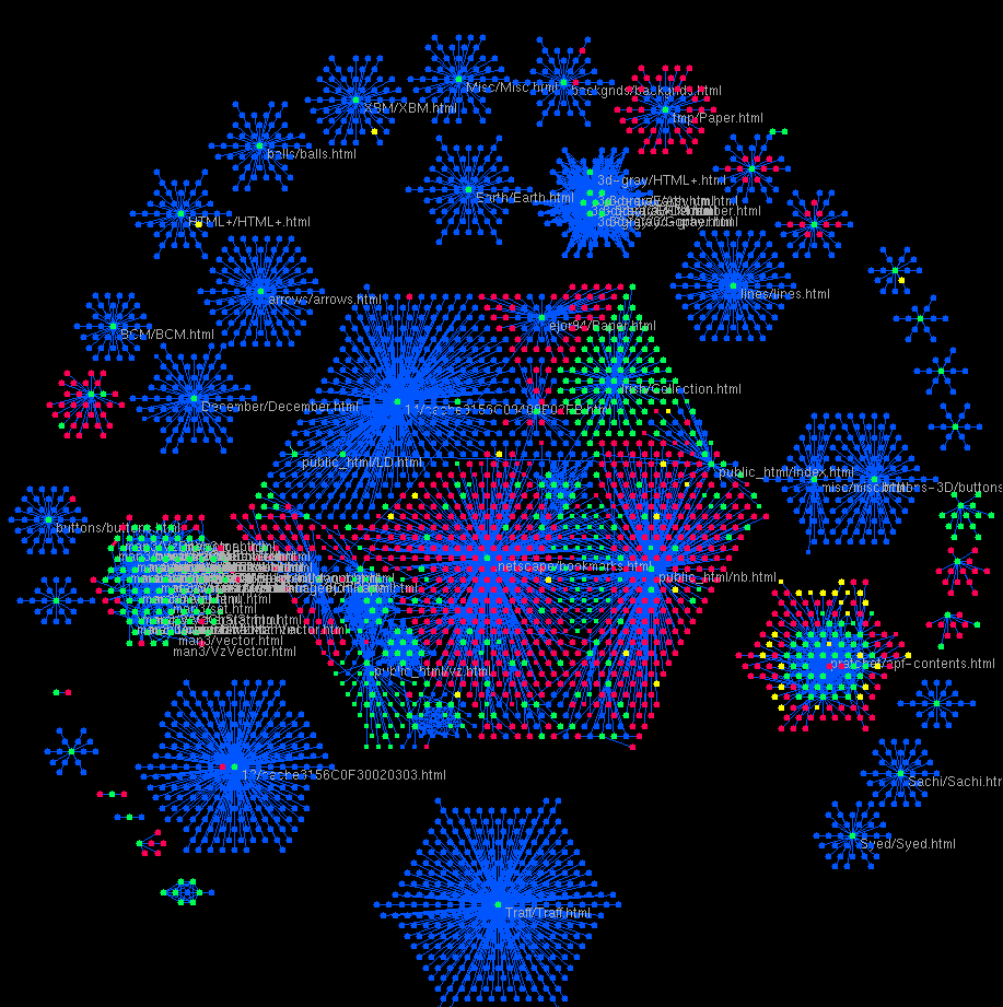 522 522 | computer graphics by Graham Wills at Bell Labs Nicheworks is a interactive tool for visualising massive networks with hundreds of thousands of nodes. The screen-shots here show Nicheworks visualisation of the network structure of a large Web site. |
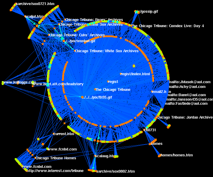 523 523 | computer graphics by Graham Wills at Bell Labs Nicheworks is a interactive tool for visualising massive networks with hundreds of thousands of nodes. The screen-shots here show Nicheworks visualisation of the network structure of a large Web site. |
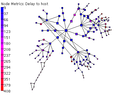 678 678 | 2006 computer graphics (Otter) Otter is a historical CAIDA tool used for visualizing arbitrary network data that can be expressed as a set of nodes, links or paths. Otter was developed to handle visualization tasks for a wide variety of Internet data, including data sets on topology, workload, performance, and routing. Otter is in maintenance rather than development mode. |
 785 785 | 2001 computer graphics by Dr. Joe Luczkovich These food web models are screenshots from Dr. Joseph Luczkovich's Java Application developed at the Biology Department at East Carolina University. These models are extremely interesting, appealing and functional. One can select the different species and elements to analyze, compare their interactions and zoom extensively in and out of the digitally produced food web. The application has also some 3D features, since it's possible to rotate the whole network of interactions on 3 axes. |
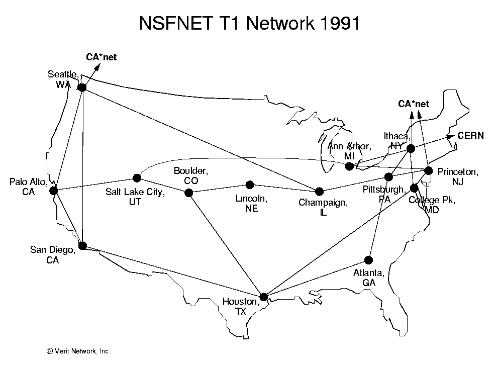 348 348 | 1991 computer graphics by Merit Network, Inc The NSFNET infrastructure and topology in 1991. (Source : NSFNET postscript maps from ftp://ftp.uu.net/inet/maps/nsfnet/.) |
 979 979 | 2004 computer graphics by Eddie Jabbour Eddie Jabbour, Creative Director at Kick Design, New York, is a tireless advocate for a new map design and communication solution for the world's most complex subway system. The NYC subway is indeed a challenge by itself. It has the biggest number of stations in the world (468), the second longest network and it's seventh in daily passenger numbers. But that didn't seem to intimidate Eddie Jabbour, who has produced a truly impressive proposal for redesigning the New York City subway map. He has made it easier to see all the different lines and made it clearer to identify the stations. The new map has not yet been released in totality, but Kick Design has put some samples out, which look exciting. |
 764 764 | 2005 computer graphics by Timothy M. O'Brien Timothy O'Brien used Python and GraphViz to generate this astonishing visualization of his 1st and 2nd level of connections on the O'Reilly Connection social networking site. The red highlighted connections are from Tim O'Reilly to other people, and, predictably, he's at the center of the activity. The graph was created by crawling FOAF (Friend Of A Friend) documents from Timothy's O'Reilly Connection profile and then obtaining the FOAF documents of people associated with him. The results were then stored in a neato format and visualized using graphviz neato. |
 1059 1059 | 2006 computer graphics by (unknown) 2,147,483,647 web pages ('nodes') were numbered and arranged in a Binary Search Tree. For each page the traffic of the three major search bots (Yahoo! Slurp, Googlebot and msnbot) was monitored over a period of one year (between 2005-4-13 and 2006-4-13). Each search engine's behavior was visualized as a tree image that represents which nodes were crawled. Each line in the image represents a node, the number of times a search bot visited the node determines the length of the line. As part of the results, the authors found Yahoo! Slurp to be the most active search bot and the first search engine to discover the Binary Search Tree experiment. In the first hours after discovery it crawled the tree vigorously, at a speed of over 2.3 nodes per second. The image shown represents the resulting tree of Yahoo! Slurp crawling over 1 year. |
 782 782 | 2003 computer graphics by Barrett Lyon This project was created to make a visual representation of a space that is very much one-dimensional, a metaphysical universe. The data represented and collected here serves a multitude of purposes: Modeling the Internet, analyzing wasted IP space, IP space distribution, detecting the result of natural disasters, weather, war, and esthetics/art. The goal is to use a single computer and a single Internet connection to map the location of every single class C network on the Internet. It is obvious that the Internet is not routed as a bunch of class-c networks, but it is easy to see that by treating the Internet IP space as a bunch of class C networks, it will be possible to make a detailed map of the entire Internet. In reality, the address space has been allocated in fairly large contiguous blocks, which renders strictly optimal utilization difficult. The smallest block that is logically routed via BGP or allocated by ARIN is a class C network (CIDR /24.) |
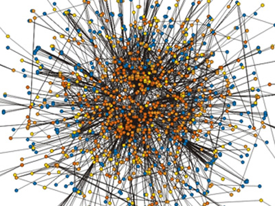 733 733 | computer graphics by Snel Snel et al. examined a network of 1600 orthologous gene groups (orthologous genes are related by phylogenetic descent) compiled from 38 genomes, comprising 23,400 genes, for genes that are related by being in the same operon. Here is the primary result shown graphically. The colors reflect abundance. Orthologous groups that occur in two or three evolutionarily distant species are blue, those that occur in 4-7 species are yellow, those that occur in 8-15 species are orange, while those occurring in 16 or more species are red. |
 680 680 | computer graphics (Pajek) p-graph of the largest component in the genealogy of American presidents with shortest path between G.H.W. Bush and F.D. Roosevelt. |
 342 342 | Donald Davies A sketch of the packet switching network in the United Kingdom proposed by Donald Davies, a pioneer in networking in the 1960s. (Source: National Archive for the History of Computing, scanned with permission from Janet Abbate's, "Inventing the Internet", 1999, page 31). |
 319 319 | 1995 computer graphics by Evangelos P. Markatos and Athanasios E. Papathanasiou, Institute of Computer Science (ICS), Foundation for Research & Technology - Hellas (FORTH), Crete. |
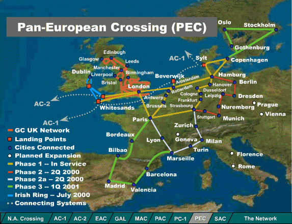 255 255 | 2000 computer graphics by Global Crossing Maps of the network infrastructure of Global Crossing, one of the leading network operators. These maps show the state of built and planned networks in South America and Europe, in spring 2000. See their network map. |
 965 965 | 2003 computer graphics by bdcconseil The Paris Metro was originally known as the "Chemin de Fer Metropolitain" ("Metropolitan railway"), then "Metropolitain," quickly abbreviated to "Metro". Inaugurated in 1900, it is one of the oldest subway systems in the world, and the second biggest in number of stations, right next to New York City. The system consists of 16 lines, identified by numbers from 1 to 14, with two minor lines 3bis and 7bis, numbered thus because they are branch lines split off from their respective original lines. The Paris Metro network has 221.6 km (137.7 miles) of track and 380 stations (87 offering connection between lines). Most of the network was built from 1900 to 1939. After the war, most extension focused on the RER, a metropolitan express subway system. The images shown here are representative of the latest re-design of the Metro map, produced by the design agency bdcconseil (http://www.bdcconseil.com) in 2003. Click here to see the Paris metro network pictured at a geographically accurate scale. |
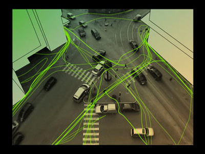 967 967 | 2005 computer graphics by Thomas Laureyssens The creation of the work is based on the movement of pedestrians on a public space. Some pedestrians walk only on the sidewalk and use the pedestrian crossing for crossing the street, other pedestrians freely make shortcuts on the formally imposed traffic situation. Pedestrian Levitation.net is an artwork in public space that reflects on this movement. It visualizes the real movement of people, and adds a virtual movement based on the assumption that people's mind is not subject to gravity or any other physical limitations. The movement of pedestrians is recorded with a camera from a high place like the roof of a building. A pattern of movement of the pedestrians is extracted by reworking this recording frame by frame with video animation software: it is as if pedestrians draw lines though the space. From this pattern, some dominant directions can be found. These directions will not be exactly what the urbanist foresaw when designing the public space at the location, but be the real flow, the real use of the city by its inhabitants. The movement of the pedestrians could be regarded as force-vectors thought the space. A person's trajectory from A -> B is nearly never a straight line, as many obstacles are in the way (like buildings), imposed trajectories (pedestrian crossings, sidewalks) and physical limitations (gravity). At this point a question is asked: how would the pedestrians move when they were not limited by anything? |
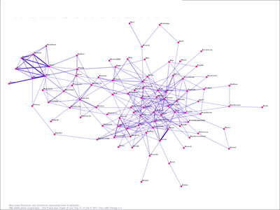 810 810 | 2004 computer graphics by Paul Mutton PieSpy is an IRC bot that monitors a set of IRC channels. It uses a simple set of heuristics to infer relationships between pairs of users. These inferrences allow PieSpy to build a mathematical model of a social network for any channel. These social networks can be drawn and used to create animations of evolving social networks. PieSpy was presented at the Information Visualization conference (IV'04) in July 2004. It has also appeared in Computer Weekly and c't magazine. |
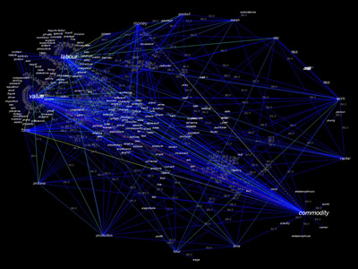 1037 1037 | 2003 computer graphics by David Link Poetry Machine is a text generator based on semantic networks. Users can enter concepts that are meaningful to them or for which they expect an answer. Poetry Machine responds with a never ending stream of sentences that circulate around these words. Since these answers are not dependent on scripted answering modules that were written beforehand but are generated dynamically, they are always different and never repeat themselves. They are printed out on a projection screen and spoken out loudly by a text-to-speech system. The semantic information of Poetry Machine comes mainly from the internet. Autonomous "bots" continuously search the internet for concepts that are still unknown to the program and feed the resulting documents back into its database. Consequently, the content of the database and the output of the machine change over time. Poetry Machine consists out of the central program that reads and writes texts, a bot system that automatically retrieves information from the internet, a chat client that communicates with people in chatrooms and a local display that shows the current network structures in the database. |
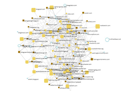 875 875 | 2004 computer graphics by Jodi Dean, Zachary Devereaux and The Govcom.org Foundation, an Amsterdam-based organization dedicated to creating and hosting political tools on the Web, and its collaborators have developed a software tool that locates and visualizes networks on the Web. The Issue Crawler, at http://issuecrawler.net, is used by NGOs and other researchers to answer questions about specific networks and effective networking more generally. One may also do in-depth research with the software. This image represents the entangled network of the most popular political blogs on the net. The graph build with Issue Crawler was produced by John Hawkin for issuenetwork.org (the workshop site by the Govcom.org Foundation), using a list available at rightwingnews.com that can be seen here. Source: News about Networks, workshop by the Govcom.org Foundation, de Balie Center for Culture and Politics, Amsterdam, 21-24 June 2004, with support from the Ford Foundation, New York, (http://www.issuenetwork.org/node.php?id=47). |
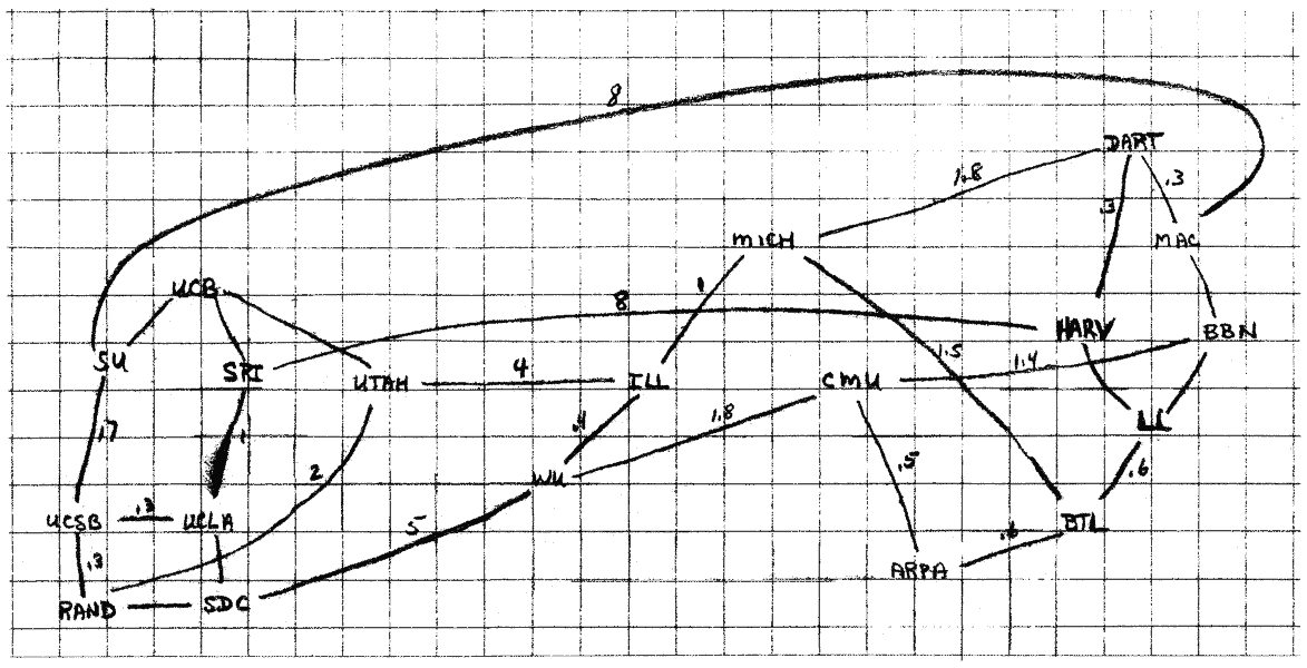 351 351 | late 1960s drawing by Larry Roberts A rough sketch map of the possible topology of ARPANET by Larry Roberts. The map was drawn in the late 1960s as part of the planning for the network. (Scanned from Where Wizards Stay Up Late: The Origins of the Internet, by Katie Hafner and Matthew Lyon, page 50.) |
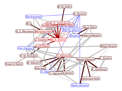 874 874 | 2004 computer graphics by Jeffrey Heer, Alan Newberger prefuse is a user interface toolkit for building highly interactive visualizations of structured and unstructured data. This includes any form of data that can be represented as a set of entities (or nodes) possibly connected by any number of relations (or edges). Examples of data supported by prefuse include hierarchies (organization charts, taxonomies, file systems), networks (computer networks, social networks, web site linkage) and even non-connected collections of data (timelines, scatterplots). These images show a prefuse applet that visualizes suspected connections between terrorists involved in the September 11th attacks. The width of the line indicates how strong the suspected link is. People are placed on concentric circles based on the number of links between them and the central person, making it easy to measure the social distance between the central person and any other person. This applet applies re-implementations of techniques used in Animated Exploration of Dynamic Graphs with Radial Layout by Ping Yee, Danyel Fisher, Rachna Dhamija, and Marti Hearst, IEEE Symposium on Information Visualization, 2001. |
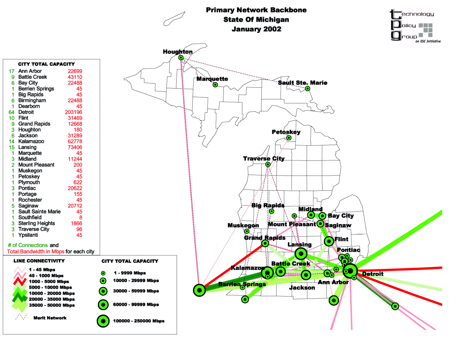 280 280 | 2002 computer graphics by Technology Policy Group This map provides a visual census of network infrastructure. It is produced by the Technology Policy Group as part of their NetmapUSA project which benchmarks regional information infrastructure in the U.S. This is map is of the aggregate Internet bandwidth capacity between cities in the state of Michigan, as of January 2002. |
 834 834 | 2002 computer graphics by Alex Adai LGL (Large Graph Layout) is a compendium of software applications for making the visualization of large networks and trees tractable. LGL was specifically motivated by the need to make the visualization and exploration of large biological networks more accessible. The website contains a rich gallery with a collection of different graphs and trees generated by LGL from different sources of biological data. This image portraits the Protein Homology Network in an impressive visualization. The network summarizes the results of aprox. 92 billion pairwise amino acid sequence alignments between 289,069 proteins from 90 genomes. The final network is composed of 27,325 connected sets summing to 7,940,873 edges. An edge is colored blue if it connectes 2 proteins from the same species, and red if it connects 2 proteins from 2 different species. If that information is not available the edges are colored based on layout hierarchy. |
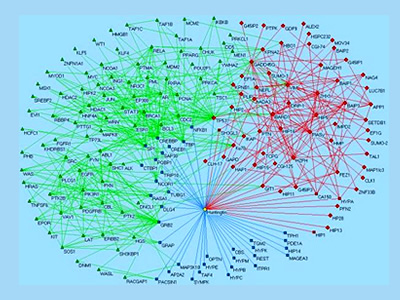 856 856 | 2005 computer graphics by (unknown) This graph is a view of a protein-interaction-network in Huntington's disease (HD). As the authors explain: Within the last two years we have applied the automated two-hybrid system for the identification of protein-protein interactions involved in HD. Using this method, a network of protein-protein interactions involved in Huntington's disease including 188 protein-protein interactions were found (left images). Protein interactions were verified by in vitro binding experiments, co-immunoprecipitations and co-localization studies. The network permitted the functional annotation of 16 uncharacterized proteins and lead to the discovery of GIT1, a G protein-coupled receptor kinase interacting protein, crucial for Huntington's disease pathogenesis. Currently, the automated yeast two-hybrid system is used to identify the partner proteins of human disease proteins. We propose that the understanding of protein-protein networks of human diseases will help to identify novel targets for therapeutic intervention. |
 796 796 | computer graphics by Dr. Peter Uetz An interaction map of the yeast proteome assembled from published interactions. The map contains 1,548 proteins (boxes) and 2,358 interactions (connecting lines). Proteins are colored according to their functional role: proteins involved in membrane fusion (blue), chromatin structure (gray), cell structure (green), lipid metabolism (yellow), and cytokinesis (red). After Schwikowski, Uetz & Fields (2000) A network of interacting proteins in yeast. Nat. Biotechnol. 18, 1257-1261. |
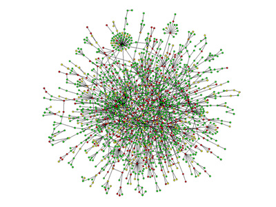 896 896 | computer graphics by Hawoong Jeong |
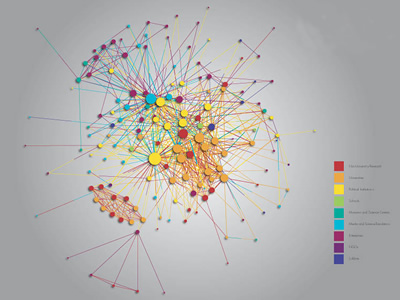 908 908 | 2004 computer graphics by (unknown) FAS.research is a research institution located in Vienna, Austria, which has been producing great work in network analysis for science and business. These images illustrate one of their several network analysis. Various institutions (circles) are engaged in joint activities, which shall promote the public understanding of science and technology. The participating institutions are members of various color coded fields: Enterprises (purple), schools (light green), lobbies (blue), universities (orange), political organisations (yellow), museums (teal), media (turquoise), non-university research (red), non-governmental organizations (dark plum). The color-distribution shows at one glance the interconnectedness between various fields: political organisations (as for example ministries) are located in the centre of the network, universities and non-university-research are strongly tied together, whereas enterprises play a peripheral role, particularly connected with the field of media. |
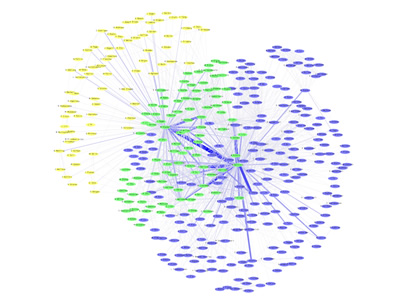 988 988 | 2005 computer graphics by SM Douglas, GT Montelione, M Ger PubNet is a utility that accepts as input up to two PubMed queries, and returns as output a network graph (in multiple image formats) based on user-specified node and edge selection properties. PubMed is a search system offered by the United States National Library of Medicine as part of the Entrez system. It provides a means of searching the MEDLINE database. The resulting nodes from PubNet output represent data items associated with publications returned by the queries (such as paper ids, author names, and databank ids), and edges represent instances of shared properties. PubNet can be used to visualize a variety of relationships, such as the degree to which two authors collaborate or the MeSH Term relatedness of publications with PDB ids. The visualization is done with the aid of aiSee visualization software. The particular image on the left is the result of two queries: Mark+Mike. |
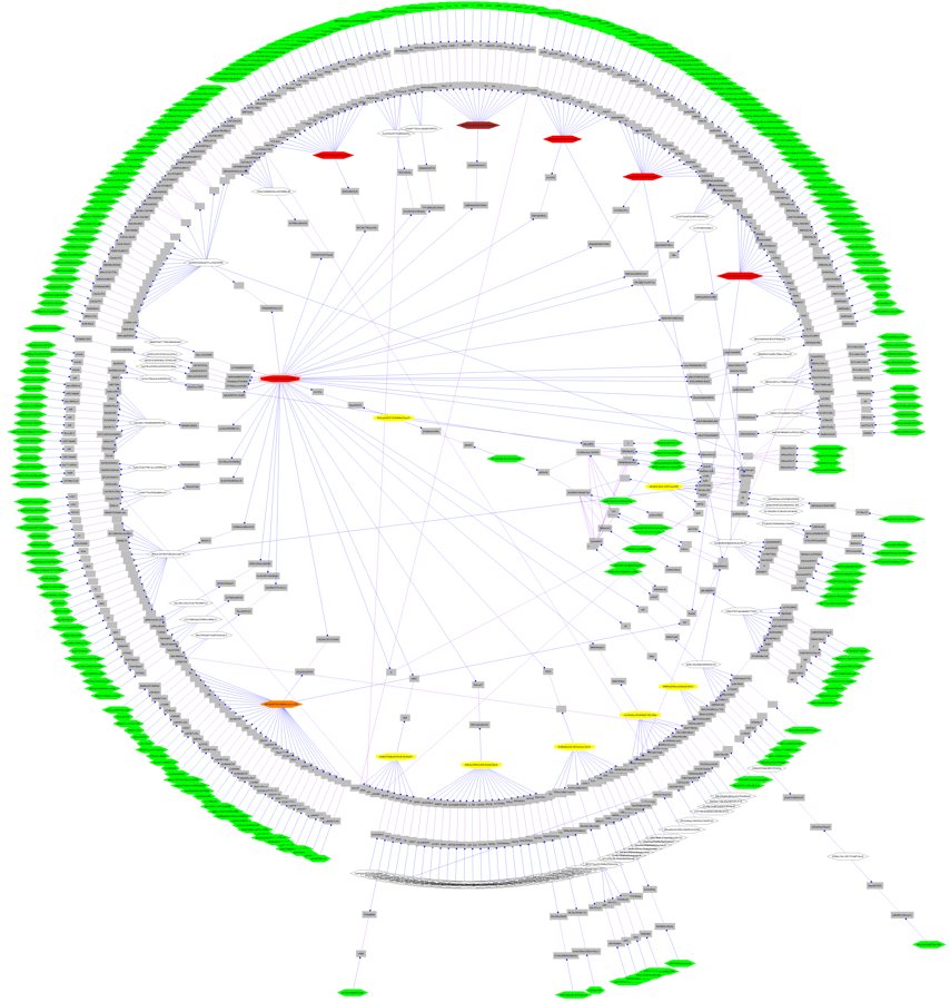 642 642 | computer graphics (Graphviz) by Graphviz - Graph Visualization Software (drawn using twopi) A real-world network containing 300 sites over 40 countries. The diagram was made to trace network incidents and to support maintenance. Original names and other details were obfuscated for anonymity. (This was not an AT&T network!) Drawn using twopi. |
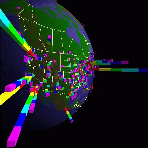 310 310 | computer graphics by Stephen E. Lamm and Daniel A. Reed, Department of Computer Science, University of Illinois, USA |
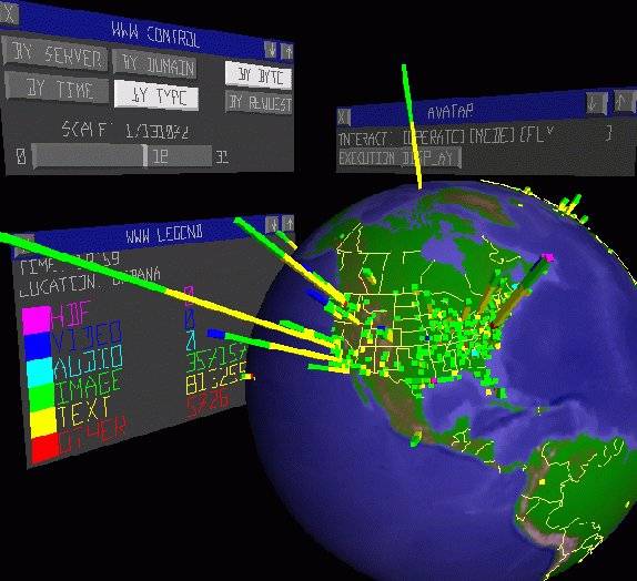 311 311 | computer graphics by Stephen E. Lamm and Daniel A. Reed, Department of Computer Science, University of Illinois, USA |
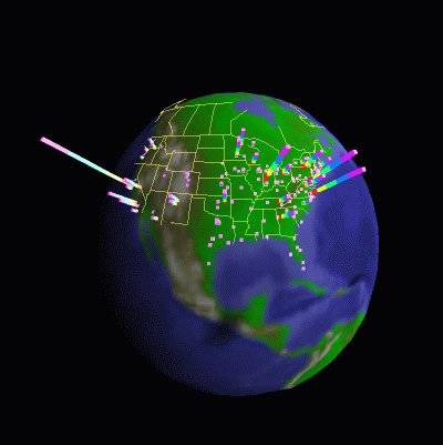 312 312 | computer graphics by Stephen E. Lamm and Daniel A. Reed, Department of Computer Science, University of Illinois, USA |
 1065 1065 | 1999 computer graphics by Tom Corby, Gavin Baily Reconnoitre is part of an ongoing series of works concerned with our experience of the network as a bizarre_scape; an environment with a high metabolism whose boundaries are continuously re-shaped; accreting and thickening under the influence of powerful social and commercial forces. While Reconnoitre can be considered as a browser in that it allows the user to search for and access web sites, it is less concerned with the coherent display of information as with representing browsing as a behavioural activity. Probably best described as a dysfunctional browser it seeks to enunciate our consumption of information as a journey of surprise, that seeks to reinstate the pleasure of browsing as technologically experienced "derive" (drift) in its own right - an ambient grazing of text. |
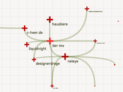 1061 1061 | 2006 computer graphics by Moritz Stefaner Moritz Stefaner is the author of the original and engaging Relation Browser, one of the most successful projects featured in VC. Not only is the idea of visualizing the CIA World Factbook in that manner quite innovative, but it also provides an interesting approach for navigating networks, by revealing small clusters at a time. Besides that, Relation Browser is simple, smooth and quite compelling to use. But Moritz has not stayed there. Among several other projects, this small flash experiment has such a great impact for interacting with any complex network. Again, by being able to reveal small groups of nodes at a time with correspondent linkage, it brings a fresh method that has a great potential for numerous applications. |
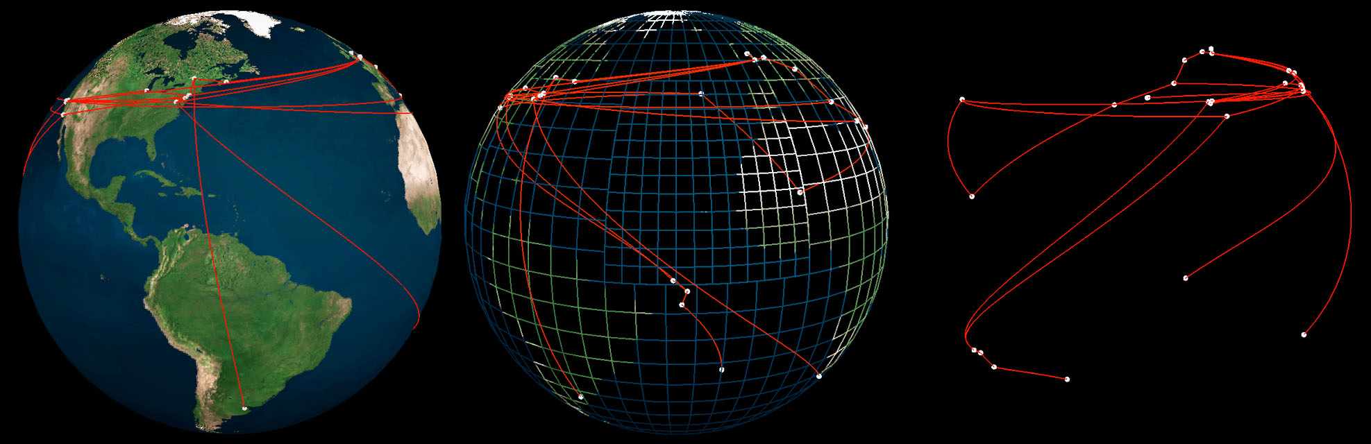 321 321 | 1999 computer graphics by Art+Com, Germany This image shows the interface of Ride the Byte, a virtual reality installation for exploring how Internet traffic is routed across the globe. The installation was created by Art+Com and first exhibited in the Wired Worlds gallery at the National Museum of Photography, Film and Television in the UK. From the artcom.de website: http://www.artcom.de/index.php?lang=en&option=com_acprojects&id=15&page=6 Ride the Byte was developed to make the normally invisible structure of the internet transparent for the general public and allow people to see the path taken by data packages transmitted via the internet. This electronic representation also visualises the flow of information to selected websites in the form of a simulated journey across a virtual reality globe. The journey begins at the actual site of the installation with a website being called up. This triggers the dispatch of data packages to the geographic destination of the selected website and the relevant server. The ever-changing route of the data packages is charted visually on the surface of the virtual reality globe. |
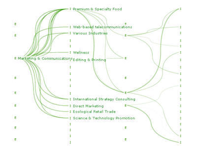 1004 1004 | 2005 computer graphics by Alain Leclerc von Bonin, Balz Le rkssc Project Network is a visualization of the database of a business consultant and a representation of lateral thinking. The projects are categorised by industry and expertise. A project is represented as a connection between an industry and an expertise. The user can choose a category and the system then shows all connections of the chosen category. The projects are not shown as separate units but as a network. |
 322 322 | computer graphics by Soon-Hyung Yook, Hawoong Jeong and Albert-Laszlo Barabasi, University of Notre Dame This map compares the geographic distribution of Internet routers (top) against the global distribution of population (bottom). It was produced by Soon-Hyung Yook, Hawoong Jeong, and Albert-Laszlo Barabasi at the University of Notre Dame as part of their research in the network structure of the Internet. For more information see their paper, Modeling the Internet's large scale topology, July 2001. |
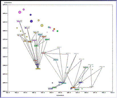 662 662 | computer graphics by The SAGE Visualization Group This graphic demonstrates the utility of SAGE for exploratory data analysis. Users can obtain displays of diverse combinations of information. The graphic integrates a unique combination of network, map (2D coordinates), and conventional chart size, color, and gauge techniques in a single display. Current research is focusing on interactive control of the design characteristics and information content of displays. |
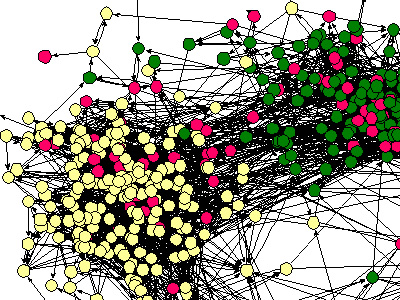 731 731 | computer graphics by James Moody |
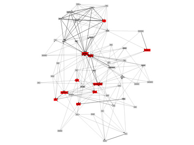 943 943 | 2005 computer graphics by Ciro Cattuto Ciro Cattuto wrote a simple piece of code that builds and visualizes a network of inferred semantic relations among the tags that Flickr users attach to their photos. He wrote a Python script that collects tagging info for the public photos of a given user. It does so by using FlickrClient, a Python interface to the Flickr API. The collected information is analyzed using this simple idea: if the presence of tag X and the presence of tag Y are statistically correlated, then X and Y must be somehow "semantically related". The script focuses on the 50 most used tags of a given user. It loops over pairs of tags and uses a simple correlation heuristic to decide whether two tags are related or not. A graph is built by connecting related tags (nodes) with links (edges). Frequency information is used to measure the strength of a link and a simple conditional probability analysis is used to guess the link orientation, so that "less general" tags point to "more general" ones. The resulting partially directed graph is stored in DOT format and handed over to Graphviz (neato) for visualization. Nodes correspond to tags, red nodes are the 10 most frequently used tags for the given user, label size increases with tag frequency, and thick edges represent statistically strong links. In this visualization model, strong links act as "elastic strings" pulling nodes close to each other: the closer two nodes are, the stronger is their correlation. Weak links are not shown, in an attempt to keep the graph readable. |
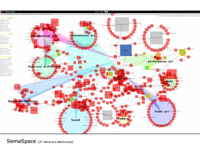 1050 1050 | 2006 computer graphics by Dietmar Offenhuber, Gerhard Dirm SemaSpace is a fast and easy to use graph editor for large knowledge networks, specially designed for the application in non technical sciences and the arts. It creates interactive graph layouts in 2d and 3d by means of a flexible algorithm. The system is powerful enough for the calculation of complex networks and can incorporate additional data such as images, sounds and full texts. In this case SemaSpace is mapping Ars electronica social network, containing all projects and people involved in Ars Electronica between 1996 and 2003 (data from the Ars Electronica database). |
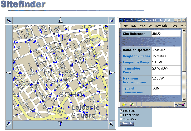 536 536 | computer graphics Sitefinder is an interactive map of all mobile phone base stations in the UK provided by the Radiocommunications Agency. The map above shows the density of antennas on a base street map for a small part of central London. Each small blue triangle is an antenna and clicking on them brings up further technical details on emissions. Sitefinder was created in response to health fears of mobile phone towers. As of October 2002 the map database contained about 24,000 base stations and is updated every three months. |
 681 681 | computer graphics (Pajek) Reordered matrix representation (using Richard's numbering) of 3-neighbourhood of the word write. |
 684 684 | computer graphics (Pajek) |
 720 720 | 2002 computer graphics by Danah Boyd, Jeff Potter Social Network Fragments was developed as a self-awareness tool for individuals to explore the social networks that they create without structural consideration. Our goal was to help users examine their structure so as to unveil the structural holes that are built in such complex networks. These structural holes exist when users choose to fragment portions of their network, often revealing facets of their own identity. As an individual interacts with a diverse range of people, they are motivated to reveal different aspects of their identity, thereby creating a multi-faceted social identity, whereby different people know different things about the individual. This faceting of one's identity allows them to interact in a socially appropriate way in a wide variety of potential environments. In engaging in this behavior, individuals start to segment their social network into a variety of different clusters, or types of people. Often, these people are only aware of a fraction of the individual's entire social network, those with similar identity information. |
 926 926 | 2004 computer graphics by Valdis Krebs This is the third "social network" map of political books based on purchase patterns from major web book retailers, which highlight the strong division between left and right. Two books are linked in the social network if they were purchased by the same person -- "Customers who bought this book also bought?". On this version Valdis Krebs used the top 100 political books on Amazon as a guide. The data was gathered in late April 2004, after the release of many greatly anticipated political books. InFlow software was used to map and measure the "social network of books." The books are organized, and colored red, blue or purple, based on book buying data. The links determine the grouping and coloring of the nodes. Many thought that Woodward's latest book, Plan of Attack would be read equally by pro and anti-Bush readers. The 'also bought' data does not support that theory. Mostly those reading left leaning books are buying Woodward?s book. The big difference between this network map and the previous two are the number of books in the middle. The release of two popular middle books, colored purple, expose a further network of middle books. Ghost Wars reveals one group of middle books, while The Rise of the Vulcans reveals a second group. Yet, the increase in boundary-spanning books does not indicate a shift in the political landscape. The three network maps are not that different within common statistical limits. |
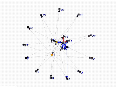 877 877 | 2004 computer graphics by Dan McFarland, Skye Bender-deMol SoNIA (Social Network Image Animator) is a java package for making animations of dynamic networks. Networks in SoNIA are not limited to the standard notion of a set of relations among a set of entities at a given point in time. Instead, consider the entities (or nodes and individuals) as a stream of events. Every event has a real-valued time coordinate indicating when it occurs. If the event is not instantaneous, it also has an ending coordinate to indicate its duration. A node-event, for example, can describe a company that comes into existence on Jan 1, 1990 and then dissolves on June 1, 1996. Alternatively, a node event might describe a single observation of a node, such as an individual in a friendship survey wave done in 1995. These images represent a movie of a classroom attention network built from a streaming record of interactions collected by Dan McFarland. The dataset consists of repeated observations of social interactions in over 150 high school classrooms during the 1996-97 school-year. In the network movie, the interaction was depicted from one of these class periods using 2.5 minute time slices (average tie value in each), a .5 minute delta, and multi-component Kamada-Kawai layout process. As such, there is a sliding window of 2.5 minutes of interaction always being shown. The authors selected this time-window because it is wide enough to capture enough of the interaction to represent fluid patterns or network forms, and narrow enough so as to not merge a variety of interaction routines together, thereby confounding meaningful configurations. |
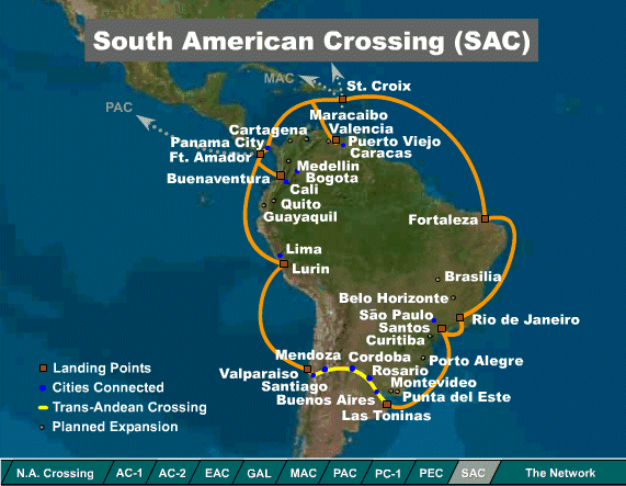 254 254 | 2000 computer graphics by Global Crossing Maps of the network infrastructure of Global Crossing, one of the leading network operators. These maps show the state of built and planned networks in South America and Europe, in spring 2000. See their network map. |
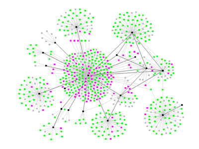 740 740 | 2003 computer graphics by Valdis Krebs An airborne contagion, such as SARS or TB, spreads through human networks based on who comes in contact with whom, and how infectious and susceptible each party is. Multiple contacts play a role in the probability of infection. Public health officials perform contact tracing to map the spread of the infection and manage its diffusion. The network on the left shows the spread of an airborne infectious disease. The map was created using actual contact data from the community in which the outbreak was happening. Black nodes are persons with clinical disease (and are potentially infectious), pink nodes represent exposed persons with incubating (or dormant) infection and are not infectious, green represent exposed persons with no infection and are not infectious. The infection status is unknown for the grey nodes. Unfortunately the 'social butterfly' in this community, the black node in the center of the graph, is also the most infectious -- a super spreader. |
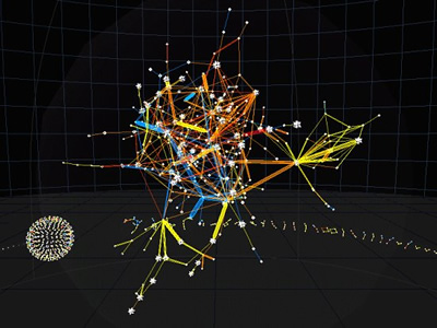 868 868 | 2003 computer graphics by (unknown) Starlight is a generic information visualization tool, developed by the Pacific Northwest National Laboratory (USA), that is applicable to a wide range of problems. Computer network security has become an increasingly pressing issue for many organizations. Starlight can enable network analysts to quickly achieve and maintain an in-depth understanding of network vulnerabilities and security status. The first image shows a Starlight Network View of computer NIDS data associated with an actual network intrusion incident. In this incident, several unauthorized users gained access to computers on official U.S. Government computer networks. In this example of "edge-oriented" network data visualization, individual NIDS log entries describing suspicious connections among computers are represented as edges in the display, with the nodes representing the individual computers (IP addresses) referenced in the data. This depiction portrays approximately 10,000 connections involving several hundred discrete IP addresses. The edges in this display have been color-encoded according to the "warning level" of the connection, with bright yellow indicating the most critical events. The second image is a closeup view of the suspicious connection (yellow line, left) shown in the preceeding image. |
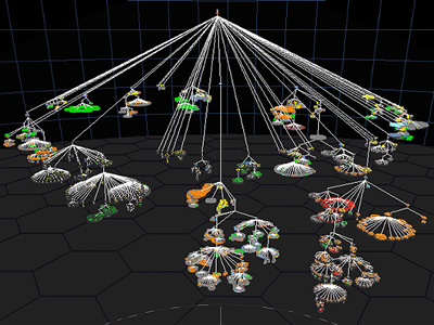 863 863 | 2003 computer graphics by (unknown) Starlight is a generic information visualization tool, developed by the Pacific Northwest National Laboratory (USA), that is applicable to a wide range of problems. The first image shows a Starlight Network View representation of the "Information Visualization" Web community. This collection of Web pages was harvested using the Google search engine to retrieve the top 100 ranked pages containing the phrase "information visualization," as well as all pages that link to, or are linked to from, the pages in the query result set. The entire collection consists of approximately 1500 pages. In this view, nodes represent discrete Web pages, and edges represent hyperlink references among the pages. The pages are color-encoded according to their link class, with pages in the original result set colored green, result set inlinks colored blue, and result set outlinks colored yellow. Note that the majority of the result set pages are embedded in the clique (dodecahedra) and cluster (stellated dodecahedra) nodes. The second image portraits the same Web page collection, now displayed as a Starlight Concept View. It shows conceptual correlations among the contents of the page text. Groups of conceptually related pages are shown displayed in the same cluster, and the clusters are arranged spatially such that clusters that are most similar are spatially adjacent. |
 1044 1044 | 2002 computer graphics by Aymeric Mansoux A "Hyper Instrument" based on a visual and sonic translation of a traceroute, proposes to the spectator an electronic voyage: the study of a creation process through the representation of a digital data source. StmSq3 is a journey into the inaccessible and prohibited universe of the machines. A personal and artistic vision of the inhuman numerical communications structures subjacent through the Internet network. This voyage is a performance. Various courses through the Internet network are analyzed and represented in visual and audio forms, while an instrumentalist orchestrates these different scenes exploiting the various levels of interpretation of the visited paths. An IP address is randomly picked, if this one corresponds to a machine currentlyconnected on the Internet, a traceroute is carried out towards it. This traceroute is then analyzed and retranscribed in the form of sound patterns and 3D architecture. The instrumentalist accompanies them by giving place to a musical and graphic immersive improvisation. |
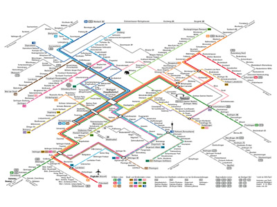 846 846 | 1998 computer graphics by (unknown) Map of the entire Stuttgart VVS rail network. |
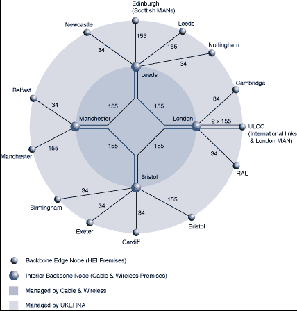 476 476 | 1996 computer graphics The evolving topology of SuperJANET, the high-speed academic network in the UK. This map shows the ATM network circa September 1996. |
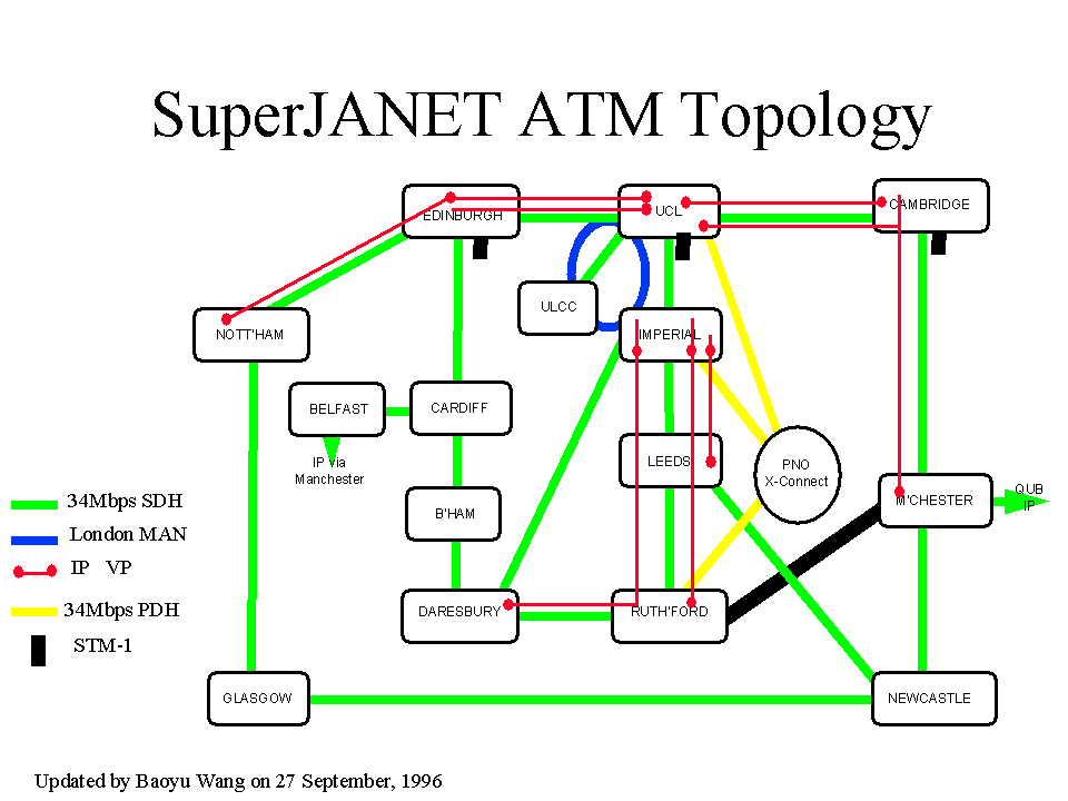 477 477 | computer graphics The evolving topology of SuperJANET, the high-speed academic network in the UK. This map is a schematic map of the backbone topology of SuperJANET III from early 1998. |
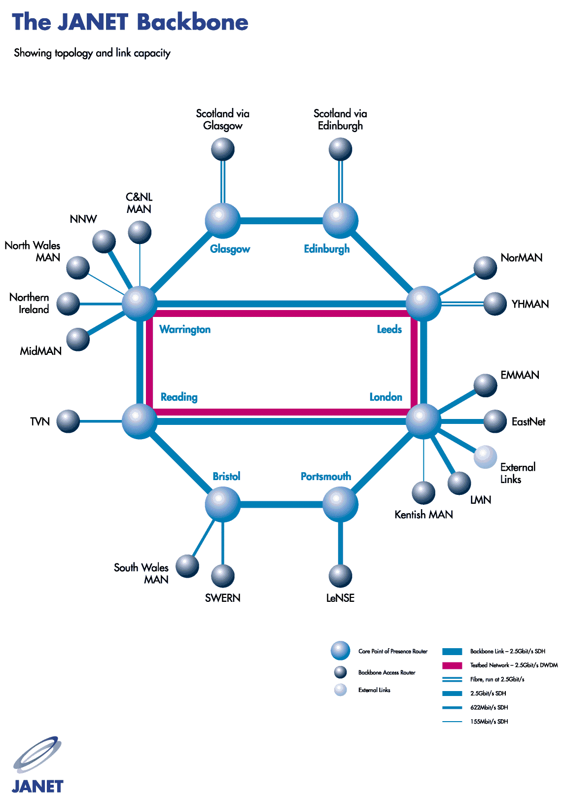 490 490 | 2001 computer graphics The evolving topology of SuperJANET, the high-speed academic network in the UK. This topology map shows the new SuperJANET4 backbone, as of March 2001. |
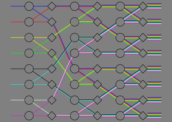 645 645 | computer graphics (Graphviz) by Graphviz - Graph Visualization Software A non-blocking switch network consisting of only 2-way splitters and selectors. This graph was created to illustrate the parallel edge feature. |
 382 382 | 2002 computer graphics The SWITCH network, the national academic and research network in Switzerland. |
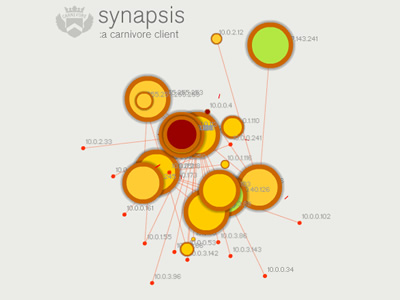 771 771 | 2003 computer graphics by Marcos Weskamp Synapsis is an application that partially visualizes network traffic. It is the uppermost layer for Carnivore, a network surveillance tool. Carnivore is an application that listens to all data traffic in a network (email, web surfing, etc.). Data travels on the Internet between two computers in packets. The Synapsis client visualizes the actual packets flowing on the network and partially reveals the network topology, at the same time that utlizies that input to generate a unique sound ambience. |
 644 644 | computer graphics (Graphviz) by Graphviz - Graph Visualization Software A diagram of the relationships between objects in an SDH (Synchronous Digital Hierarchy) network. This graph was created to show a multiplicity of semantic relationships in a single graph. In the graph file, the setting of the global page size, graph layout size, aspect ratio (to fill the allowed layout size) and centering means that the layout will be placed in a box that is precisely 7.5" wide by 7" high and centered on an 8.5x11 page. The default node is to draw nodes unlabeled. Subgraphs are employed to mark sets of nodes to be placed on the same rank (level) in the layout, and as local scopes for node or edge attribute initialization. |
 59 59 | 1844 Print by Charles Joseph Minard (1781-1870), France "Tableau-graphique" showing transportation of commercial traffic by variable-width (distance), divided bars (height ~ amount), area ~ cost of transport [An early form of the mosaic plot.]. Minard, C. J. (May 1844). Tableaux figuratifs de la circulation de quelques chemins de fer. lith. (n.s.). ENPC:5860/C351, 5299/C307. Dainville, F. d. (Oct. 1970). Les bases d'une cartographie industrielle de L'Europe au XIXe siècle. Tech. Rep. 540, Centre National de la Recherch Scientifique, Lyon. Colloques Internationaux du C.N.R.S. Robinson, A. H. (1967). The thematic maps of Charles Joseph Minard. Imago Mundi, 21 :95-108. |
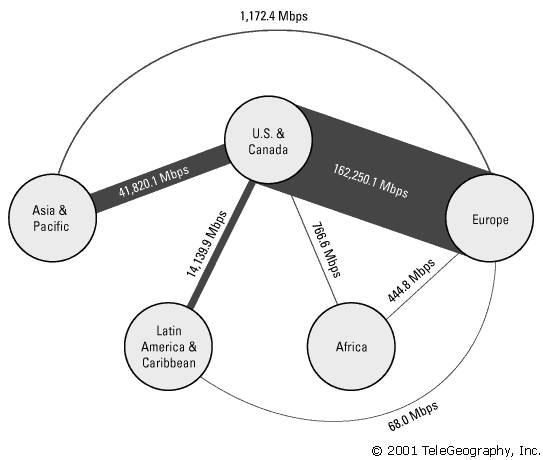 282 282 | 2001 computer graphics by TeleGeography, Inc. Example of the statistical maps and diagrams produced by TeleGeography, Inc. This map shows aggregate international Internet bandwidth between regions from 2001. [For more information see the Map of the Month article "TeleGeography's Traffic Flow Maps".] |
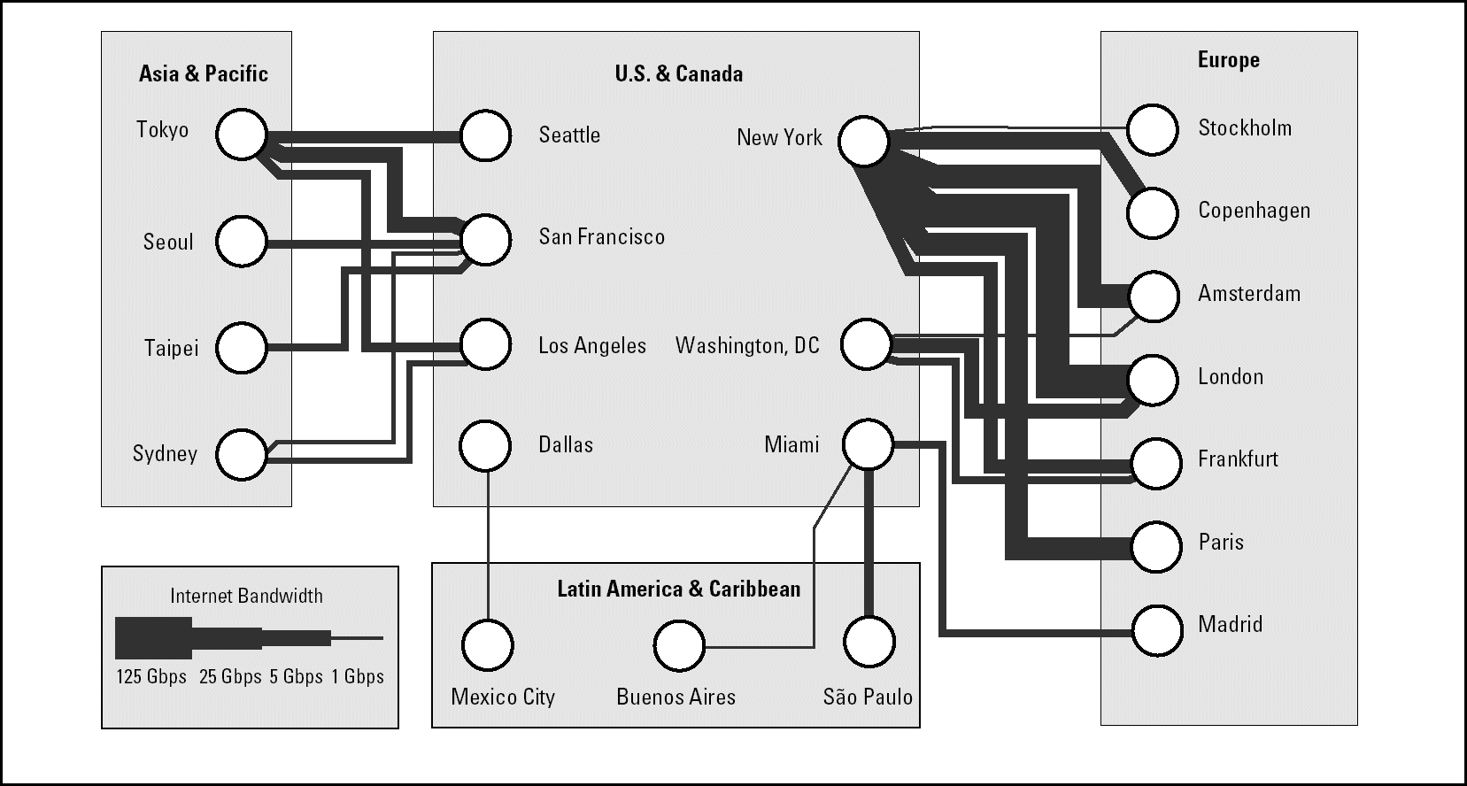 284 284 | 2001 computer graphics by TeleGeography, Inc. Example of the statistical maps and diagrams produced by TeleGeography, Inc. This map shows telegeography routes between regions from 2001. [For more information see the Map of the Month article "TeleGeography's Traffic Flow Maps".] |
 872 872 | computer graphics by (unknown) Teleglobe owns and operates one of the world's most extensive global telecommunications networks, providing reach to over 240 countries and territories with advanced voice, data and signaling capabilities. This map is a representation of Teleglobe's Global Network, which supports global IP Transit, international private leased circuits (IPLs), bandwidth capacity, and broadcast services. Teleglobe has ownership in over 100 subsea and terrestrial cable systems and has access to over 40 teleport antennas and transponder capacity serving the Atlantic, Pacific and Indian Oceans. Teleglobe is a global Tier 1 internet service provider (ISP) and operates the IP backbone AS 6453. Their MPLS-enabled IP network connects more than 90 countries to the Internet and is ready for IPv6, the new generation IP protocol. Teleglobe offers International Private Lease (IPLs) service to over 95 countries via 131 carriers agreements of which 55 have enabled the One-stop shopping arrangement. Broadcast services are worldwide. |
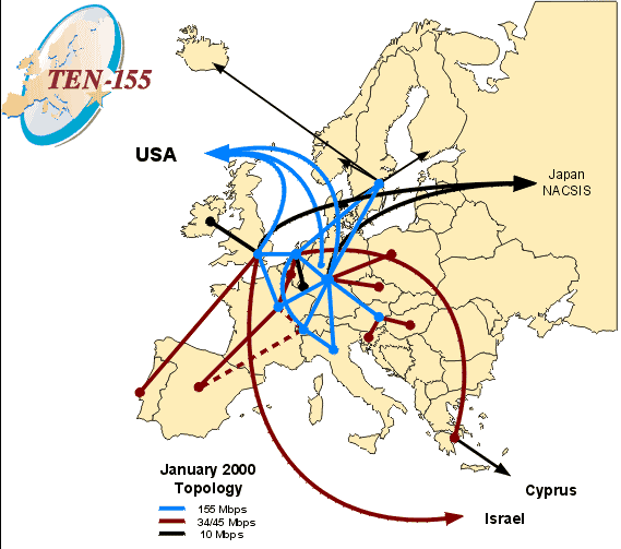 355 355 | 2000 computer graphics Ten-155 was the pan European high-speed network connecting the national reseach and education networks of 20 countries from 1998 until the end of 2001. It has now be superceded by the GÉANT network running at gigabit bandwidths. |
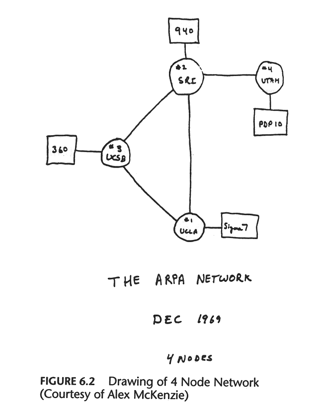 333 333 | 1969 drawing by Alex McKenzie By the end of the 1969 there are four nodes on the "ARPA NETWORK", as shown in schematic above. These were University of California Los Angeles (UCLA), University of California Santa Barbara (UCSB), University of Utah and the Stanford Research Institute (SRI). (Source: "Casting the Net", page 56. See also The Computer Museum's Timeline.) |
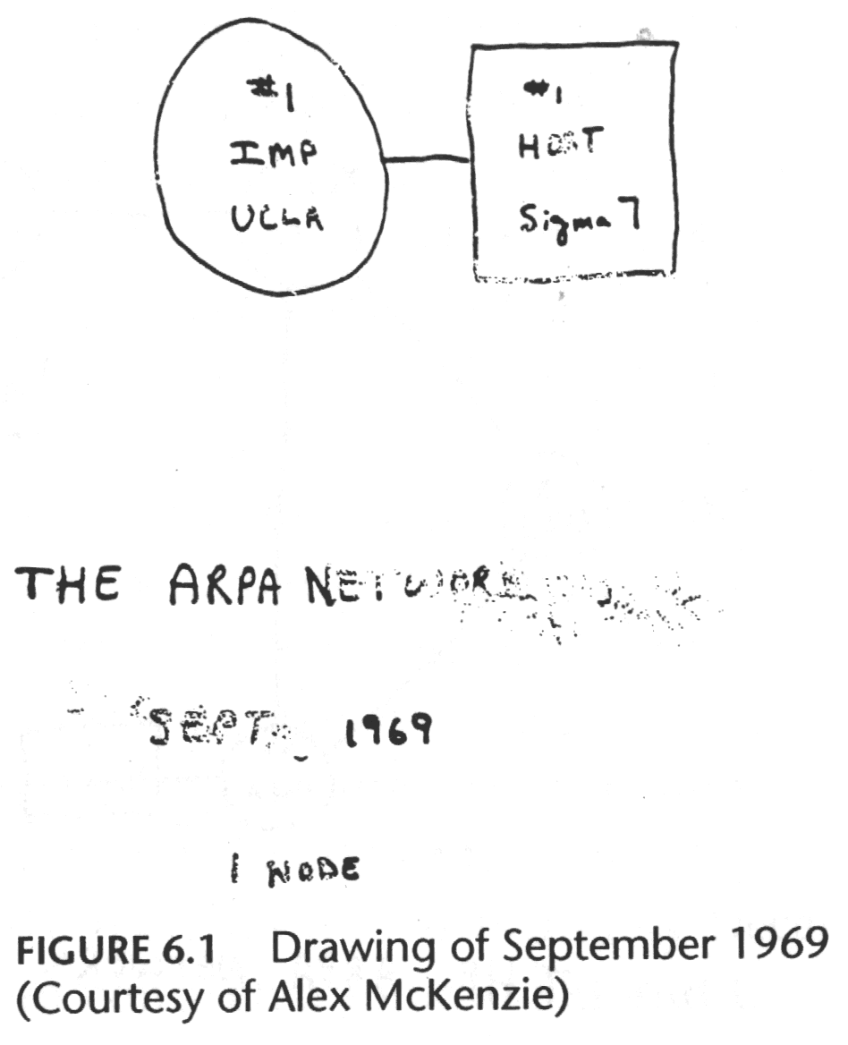 330 330 | 1969 drawing by Alex McKenzie The first node on ARPANET at University California Los Angeles (UCLA) on the 2nd of September 1969. (Source : "Casting the Net", page 55) |
 561 561 | 20050603 computer graphics by CNET Networks 2005-10-04: "The Big Picture" - Ontology viewer for cnet.com articles From InfoVis:Wiki The Big Picture is an online ontology viewer that is applied to c|net News.com articles to show relationships between stories, companies, and topics. It allows for a completely new and very interesting way of exploring news stories. The tool has been developed in cooperation with Liveplasma.com (formerly MusicPlasma). The Big Picture - Ontology viewer that connects stories, companies, and topics within the News.com website. The example shows the network centered around the article Apple to ditch IBM, switch to Intel chips.[CNET, 2005a] The Big Picture - Ontology viewer that connects stories, companies, and topics within the News.com website. The example shows the network centered around the article Apple to ditch IBM, switch to Intel chips. [CNET, 2005a] via information aesthetics blog [edit] References * [CNET, 2005a] CNET Networks. The Big Picture. Retrieved at: October 4, 2005. http://beta.news.com.com/The+Big+Picture/2030-12_3-5843390.html? * [CNET, 2005b] CNET Networks. Apple to ditch IBM, switch to Intel chips. Created at: June 3, 2005. Retrieved at: October 4, 2005. http://beta.news.com.com/Apple+to+ditch+IBM%2C+switch+to+Intel+chips/2100-1006_3-5731398.html?tag=nl |
 1067 1067 | 2006 computer graphics by (unknown) This project represents a visualization of the genealogical tree of an online community (Breedster). Breedster is an online community website designed for friends. The main goal of the service is to make one's social life, and that of their friends, more active and stimulating, by both enriching existing relationships and establishing new ones by reaching out to people never met before. Breedster organizes every personal web of acquaintances in an innovative format called Copulogram. It doesn't just show one's personal network, it gives an accurate depiction of all their relations. These images represent a Copulogram of all 10313 Breedster members (6018 active, 4295 terminated accounts) generated on 2004-05-22. Not all relations are mapped, encounters that produced no offspring are not visualised to avoid further clutter. Father relations are shown in blue, mother relions in red, children with identical parents are grouped in semi circles. All 43 community founders are shown in the center, the youngest generation is shown on the perimeter. |
 980 980 | 2003 computer graphics by Ed Blanchfield Ed Blanchfield used a Firewall/Intrusion Detection System (IDS) log data to get "before" and "after" graphs showing the impact of an MS-SQL worm, which hit the Internet around January 25th 2003. When this particular worm hit a large class B sized network, an IDS system designed and implemented by Blanchfield for a large managed services provider, was one of the first sites in the world to detect and report the incident. Ed posted his original findings and info to various security lists and quickly wrote up a parser to create GDL files from Firewall and IDS logs, which he fed into aiSee Graph Layout Software in order to visually map this worm's effect on their customer's network. The first image is a visualization of log data for a class B firewall without background worm traffic, while the second represents the same data with background worm traffic. The graphs show just 15 minutes worth of traffic at midnight, but the impact of the worm is already clearly visible. You can imagine what 24 hours must have been like. |
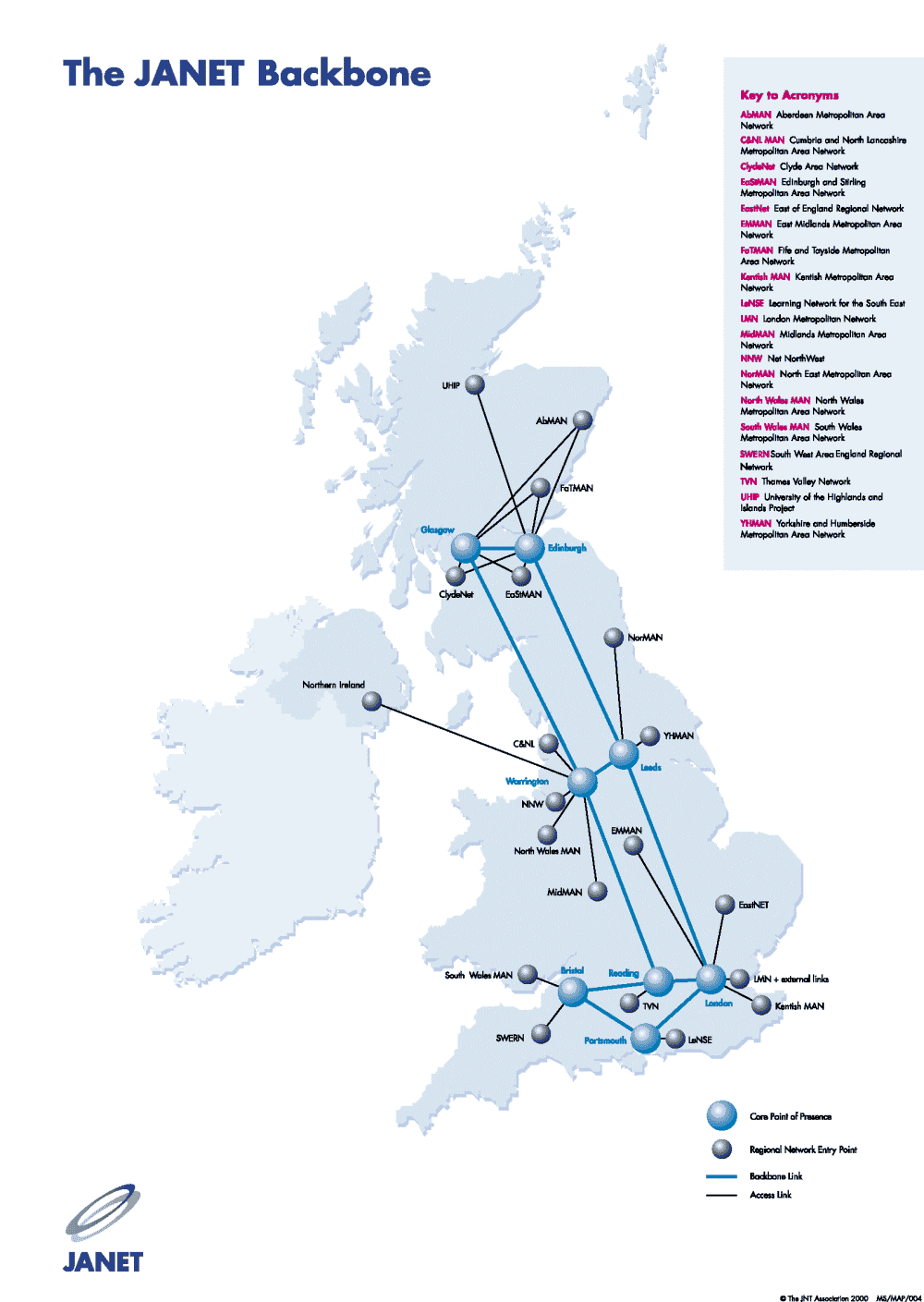 370 370 | 2000 computer graphics by The JNT Association The backbone of JANET, the UK academic and research network as of the spring 2001 (sic). |
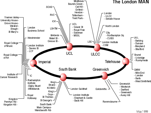 376 376 | 1999 computer graphics The London MAN (metropolitan area network) of SuperJANET - the UK's high-speed academic and research network. This map sows the topology of the network in May 1999. |
 888 888 | 2005 computer graphics by (unknown) FAS.research is a research institution located in Vienna, Austria, which has been producing great work in network analysis for science and business. These images illustrate one of their several network analysis. The celebrity report 'Seitenblicke' features three events every night, taking place at different locations. All events are subsumed under 9 main and 45 mythological subclasses. (birth: opening nights, vernissage; death: leaving stage, an enterprise, an ambassador leaving the country, etc.) If a ball, like the opera ball took place at the Opera House, there is a link between the Viennese Opera House and the category CYCLIC EVENTS: Cyclic Balls. The thickness/ the value of the line not only shows how often a cyclic Ball took place at the opera house. The number of people interviewed at each ball also puts weight on the line. White nodes represent locations that are linked to more than just one and the same main category. By brokering like this, the centrality of these locations is higher. As for the enourmous amount of nodes (995 different locations, 45 categories of 2200 different events, 6150 different people, 13100 relations) a cut off level of 10 has been imposed on the lines of the 2mode network. Observation Period: Oct 01- June 04 |
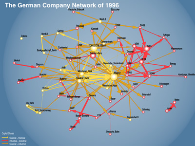 830 830 | computer graphics by Martin Hopner, Lothar Krempel For over 100 years, the German company network was a major feature of organized corporate governance in Germany. Martin Hopner and Lothar Krempel used network visualization techniques and qualitative-historical analysis to discuss the structure, origins and development of this network and to analyze the reasons for its recent erosion. "Network visualization makes it possible to identify crucial entanglement patterns that can be traced back historically. In three phases of network formation - the 1880s, 1920s and the 1950s - capital entanglement resulted from the interplay of company behavior and government policy. In its heyday, the company network was de facto encompassing and provided its core participants, especially the banks, with a national, macroeconomic perspective. Because of the strategic reorientation of the largest banks toward investment banking, ties between banks and industry underwent functional changes. Since the year 2000, the German government's tax policy has sped up network erosion. Vanishing capital ties imply a declining degree of strategic coordination among large German companies." |
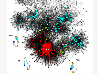 903 903 | 2004 computer graphics by Francesco Rao, Amedeo Caflisch The energy landscape for the folding of the beta3s peptide is investigated by Molecular Dynamics simulations. Conformations of the peptide and the transitions between them are the nodes and the links of the network, respectively. The size and color coding of the nodes reflect the statistical weight and average neighbor connectivity. Representative conformations are shown by a pipe colored according to secondary structure: white stands for coil, red for alpha-helix, orange for bend, cyan for strand and the N-terminus is in blue. The variable radius of the pipe reflects structural variability within snapshots in a conformation. The yellow diamonds are folding TS conformations. Source: F. Rao and A. Caflisch, JMB 342, 299-306 (2004) |
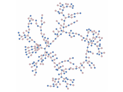 762 762 | computer graphics by Bearman PS, Moody J, Stovel K. "Understanding the structure of sexual networks is critical for modeling disease transmission dynamics, if disease is spread via sexual contact. This project describes the structure of an adolescent sexual network among a population of over 800 adolescents residing in a mid-sized town in the mid-western United States. Precise images and measures of network structure are derived from reports of relationships that occurred over a period of eighteen months between 1993 and 1995. We compare the structural characteristics of the observed network to simulated networks governed by similar constraints on the distribution of ties, and show that the observed structure differs radically from chance expectation. Specifically, we find that real sexual and romantic networks are characterized by long contact chains and few cycles. We identify the micro-mechanism that generates networks with similar structural features to the observed network. Implications for disease transmission dynamics and social policy are explored." |
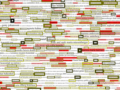 1005 1005 | 2006 computer graphics by Lisa Jevbratt The Voice is commissioned by The Swedish National Public Art Council (Statens Konstrid) and it is a public art project for their network/website. The project is in progress and will be finalized in Winter 2006. The Art Council is a government body responsible to the Ministry of Education, Research and Culture whose primary function is to commission permanent, site-specific contemporary works of art and to purchase art for placement in government premises. This project is their first attempt to work with an Internet art project as site-specific, public artwork. The Voice visualizes the words the users of the Art Council website are searching for on the site and in search engines in order to find the site, and a comparison of these words with the word usage at the office of the Art Council (for example words written in emails and read by the office staff on web pages). The visualization consists of the last two thousand words searched for, displayed in different font sizes/colors, with different border sizes/colors, reflecting how many times it has been searched for, when it was searched for, how much it has been mentioned in the internal communication and how much it is used on the Internet in general. Each word links to the pages on the server that contains the search-word, the visualization thus functions an alternate interface to the Art Council website. The visualization is updated daily and each new "image" is saved in an archive accessible by the user. |
 951 951 | 2003 computer graphics by (unknown) Universite Tangente (UT) has produced some of the most amazing maps in an attempt to uncover major contemporary control systems. Mark Lombardi would truly be impressed by the level of detail and thought that went into some of the intricate network maps produced by UT. It's not only a great cartographic resource for understanding the current global issues, but also, a rich source of knowledge and history. This map, entitled "The World Government", is an attempt to understand how world governance behaves, by analyzing its major contributors, from independent states, financial institutions, industrial firms, foundations, schools, universities, NGO's, international organizations, lobbyist groups, religious institutions, and others, in an endless network of influence. Dozens of icons represent each of these key players spread throughout the graph, while lines between them represent different types of ties. A special icon was created to characterize a percentage of property between elements. |
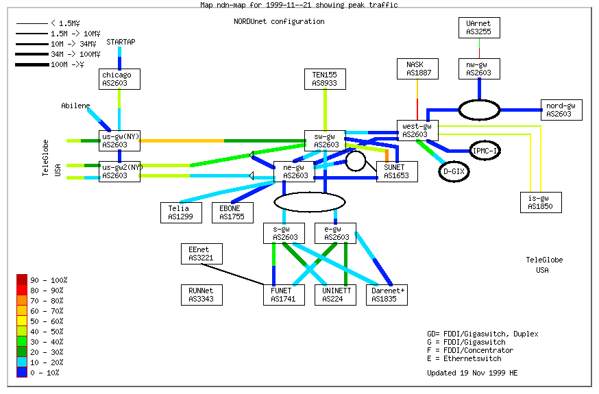 505 505 | computer graphics Here is a nice example of a weather map which presents network load using a topology diagram. The diagram shows the performance on the NORDUnet network, which is the research and education network connecting Denmark, Finland, Iceland, Norway and Sweden. |
 795 795 | computer graphics by Martin Spernau Java application that uses the Web API to produce graphs of related pages by running "similar-to" queries on Google. Google ranks search results partly based upon the number and importance of links pointing to a particular page. The TouchGraph Google Browser uses Google's database to determine and display the links between a URL that you enter and other pages on the web. The results are displayed in a graph that shows both inbound and outbound relationships between URLs. Bill Koelzer has written a great feature on the TouchGraph GoogleBrowser in RealityTimes "Once you see your interconnected Web revealed to you on the Touchgraph GoogleBrowser, you will never be the same. This is because you will have actually seen that which you could only imagine before." "TouchGraph provides a hands-on way to visualize networks of interrelated information. Networks are rendered as interactive graphs, which lend themselves to a variety of transformations. By engaging their visual image, a user is able to navigate through large networks, and to explore different ways of arranging the network's components on screen." Similar applications have been created using TouchGraph, such as the Amazon Browser and LiveJournal Browser. |
 969 969 | 2005 computer graphics by Trejkaz Xaoza LiveJournal's Statistics page indicates that there are over 300,000 hosted weblogs updated daily, making LiveJournal one of the largest online social network communities. The magnitude of the LiveJournal userbase combined with their accommodating data collection policies makes it a perfect platform for social network visualization. The TouchGraph LiveJournal Browser displays users as nodes connected by edges indicating friendship. Above the users float their mutually shared interests. Moving the mouse over an interest highlights the users that share that interest, and moving a mouse over a user highlights the friends and interests of that user. By examining at the interests above and between clusters one can see the subjects that bring together individuals and communities. Similar applications have been created using TouchGraph, such as the Amazon Browser and Google Browser. |
 772 772 | 2004 computer graphics by W. Bradford Paley, Jeff Han TraceEncounters is a social network tracking and visualization project. It was debuted September 3 in Linz, Austria at the 2004 Ars Electronica festival. White circles connect cliques of size greater than 3 when the user clicks the 'Find cliques' button. The brighter links mean more encounters between the two people involved, and they're also the strongest springs, so it's possible to extract cliques by pulling out one or more of the people involved in the clique. (Often the greenest ones - the people having the most connections to other people regardless of the number of conversations - are the best to pull on; they're intentionally the easiest to pick when several nodes are nearby. The project distributed aproximately 900 small stickpins, each of which uses limited-rage infrared data exchange to remember every other pin that it encounters. When pin wearers came to a central location to view the accreting network, they saw a thousand circles on a plasma display panel, each representing a pin. |
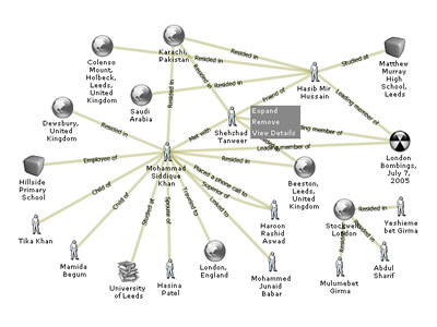 1029 1029 | 2005 computer graphics by (unknown) TrackingTheThreat.com is database of open source information about the Al Qaeda terrorist network, developed as a research project of the FMS Advanced Systems Group. The goal is to apply new technologies and software engineering approaches to open source intelligence while providing researchers and analysts with information about Al Qaeda. TrackingTheThreat.com attempts to bridge the gap between rich-client analytical environments running on Windows or Unix/Linux platforms, and traditional web-based database query tools. By providing browser-based geospatial and network tools, coupled with the standard database tools, TrackingTheThreat.com investigates the application of new technologies and solution ideas. The images shown illustrate the display of Network Navigator, one of the analysis tools available on the website, which performs an interactive graphical link breakdown on the Al Qaeda network. |
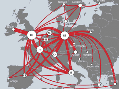 727 727 | 2000 computer graphics by (unknown) TeleGeography has produced arguably the best flows maps of the Net thus far, based on the volume of international telephone traffic between nations. Below is an example of one of their handcrafted telecommunications traffic flow maps for the European region. The map shows countries with traffic flows between them represented as smoothly curving red lines. The thickness of the lines is proportional to the annual volume of traffic between those two countries, measured in millions of minutes of voice telecommunication. (Note: only the principal route pairs, above a set threshold, are shown, to avoid cluttering the map.) Circular symbols, located on the capital city, encode the country's total annual outgoing traffic to all other countries. It is clear from the map that the UK, Germany, and France dominate traffic intra-European flows, forming a powerful triangle at the heart of the continent. Source: (http://mappa.mundi.net/maps/maps_014/) |
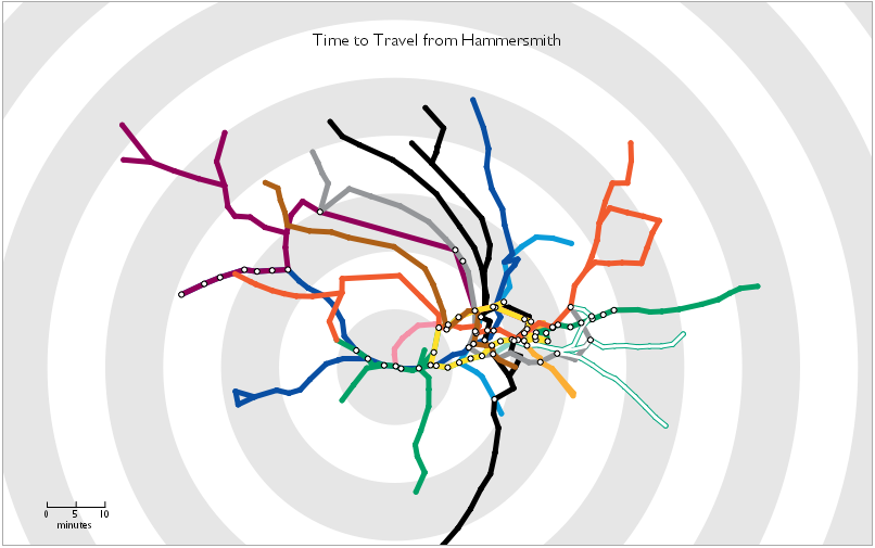 560 560 | 2006 computer graphics by Tom Carden 2006-01-25: Travel Time Tube Map From InfoVis:Wiki Travel Time Tube Map - Screenshot of an processing Applet that distorts the London underground network circularly according to travel times from a selected station.[Carden, 2006] Travel Time Tube Map - Screenshot of an processing Applet that distorts the London underground network circularly according to travel times from a selected station. [Carden, 2006] Travel Time Tube Map is a processing Applet that distorts the London underground network circularly according to travel times from a selected station. Homepage: http://www.tom-carden.co.uk/p5/tube_map_travel_times/applet/ [Carden, 2006] Tom Carden, Travel Time Tube Map, created at: January 1, 2006, retrieved at: January 25, 2006. http://www.tom-carden.co.uk/p5/tube_map_travel_times/applet/ |
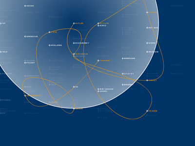 937 937 | 2002 computer graphics by Patrick Vuarnoz Tsunami is a visual prototype on the topic "visual thesaurus". The aim of this visual thesaurus is to avoid the resulting visual complexity of too many connecting lines between the term of interest and the describing terms, which interferes with the readability of the information. Instead it tries to reduce the complexity-problem by having all terms on a fix position within the system, which might be grouped by thematic regions. This allows to display other information, in this example the path a user takes and the terms he skipped while browsing the system. The issue of overlapping edges in complex graphs is an ever-present concern in most network visualizations. In static graph representations, Mark Lombardi is a major reference by the cleanness of his drawings, where rarely there's any edge overlapping. Here, Patrick Vuarnoz, taking advantage of user interaction, explores a fresh approach to the problem, which with more matureness and avoiding excessive use of sound might derive in an important contribution. |
 994 994 | 2006 computer graphics by Maurits de Bruijn, Jeanne van He The graphic designer Maurits de Bruijn created an impressive relational map to navigate through all the projects where Dutch artist Jeanne van Heeswijk was involved. The interactive map on Heeswijk's website (http://www.jeanneworks.net/) allows a smooth navigation between all the projects and shows how different people are related to them. It becomes an intricate social network where every project, represented as a key node, is surrounded by its direct collaborators, which in turn can be linked to others. Jeanne van Heeswijk stimulates and develops cultural production and creates new public (meeting-)spaces or remodels existing ones. To achieve that, she often works closely with artists, designers, architects, software developers, governments and inhabitants. She regularly gives lectures on topics as urban renewal, participation and cultural production. |
 1408 1408 | UK Road Traffic Accidents: A Leading Killer2012 Image by Pannone |
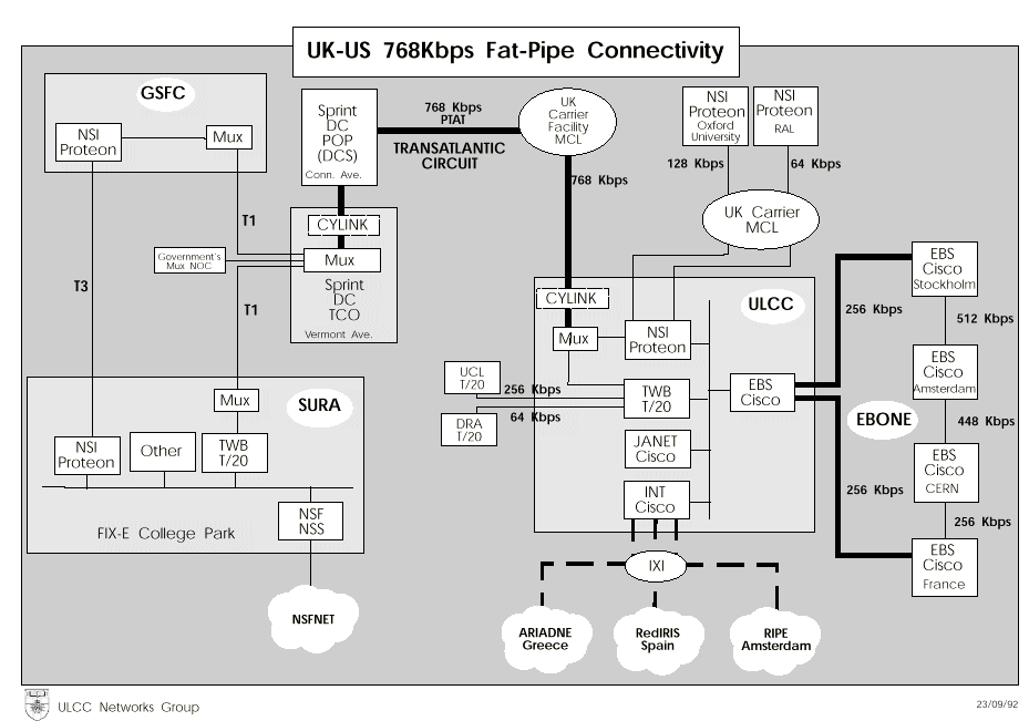 345 345 | 1992 computer graphics by ULCC Networks Group This map shows the structure of JANET, the UK's academic and research network, in 1992. The one above shows international connections with 256 Kbps links to Europe and the "Fat-Pipe" transatlantic link to the USA running at 768 Kbps. Not surprisingly the capacity of these links have been increased massively since then. |
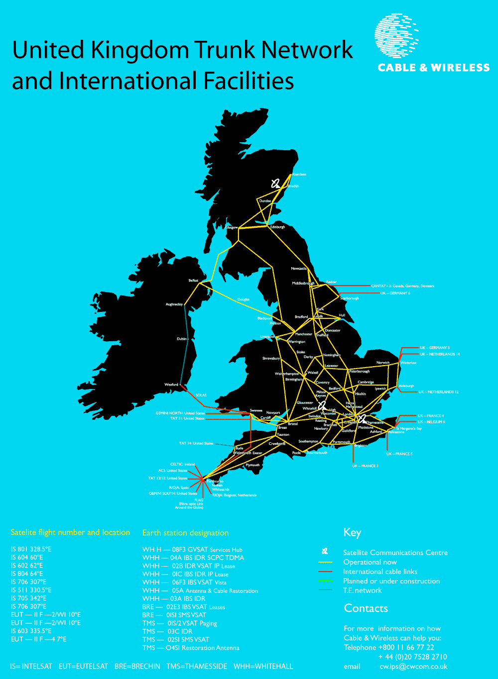 251 251 | computer graphics by Cable and Wireless Cable & Wireless is global telecommunications carrier operating undersea cables in many different regions of the world. The maps show Cable & Wireless's UK and European network facilities. |
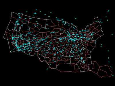 934 934 | 2000 computer graphics by Karl Bilimoria, Banavar Sridhar An efficient and effective air traffic management system is vital to the U.S. transportation infrastructure. Since 1978, when the airline industry was deregulated, the inflation adjusted gross domestic product (GDP) has increased by 62 percent. In this same time period, total output of scheduled passenger air transportation (as measured by Revenue Passenger Miles) has increased by 190 percent and total airfreight ton miles have increased by 289 percent. Since 1997, flight delays have skyrocketed - doubling in only four years. These trends are expected to continue. In 1998, airline delays in the U.S. cost industry and passengers $4.5 billion -- the equivalent of a 7 percent tax on every dollar collected by all the domestic airlines combined. These screenshots are from an quicktime animation created with Future ATM Concepts Evaluation Tool (FACET) by NASA. It represents a day in the life of Air Traffic over the continental USA. The animation illustrates critical patterns on major airports and it's quite interesting to notice the different traffic intensity throughout the day. For more information one can read the paper here. |
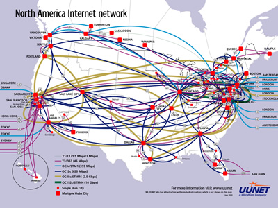 982 982 | 2000 computer graphics by (unknown) UUNET is one of the oldest and largest Internet Service Providers. Prior to its founding, access to Usenet and E-mail exchange from non-ARPANET sites was accomplished using a cooperative network of systems running the UUCP protocol over POTS lines. UUNET Communications Services began operation in 1987 as a non-profit corporation providing Usenet feeds, E-mail exchange and access to a large repository of software source code and related information. In 1990, UUNET launched its AlterNet service, which provided access to an IP backbone independent of the constraints of those operated by the government. That network lives on in a much larger form and serves as the core of a set of products which include access at dial-up and broadband speeds as well as web hosting. This map, from June 2000, represents UUNET's Internet backbone in North America. It shows its vast network infrastructure of Tier 1, Tier 3, OC3c, OC12c, OC48c and OC192c connections (corresponding to different bandwidths, from 1.5 Mbps to 10 Gbps respectively) as well as its major city hubs. Today, UUNET is a brand of Verizon (formerly MCI). The name UUNET has lost much of its luster in the eyes of today's network engineers due to MCI's lax policies toward spam. |
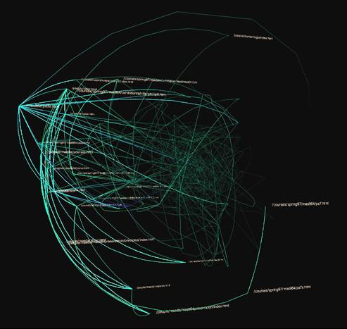 442 442 | computer graphics by Ben Fry A ghostly information visualisation of traffic through a Web site called Valence. It was created by Ben Fry, as part of his research into organic information design in the Aesthetics and Computation Group at the MIT Media Lab. |
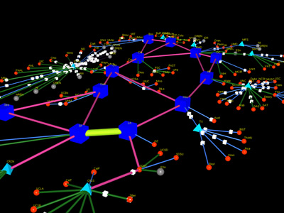 807 807 | computer graphics by Jeff Brown (MOAT - National Laboratory for Applied Network Research (NLANR)) This map represents a 3D model of the vBNS network, using the tool CICHLID,which connects universities and laboratories in the USA. "A vertex-edge graph consists of two arrays: one of vertex structures, and one of edge structures. This corresponds closely to the abstract mathematical representation of a graph as G(V;E), except that the vertices and edges in Cichlid contain not only connectivity information, but also graphical attributes. Each vertex is defined by a VtxInfo structure, which contains a 3-D location vector, a relative size parameter, color information, and a drawing style hint. Each edge is defined by an EdgeInfo structure, which indicates the vertices where the edge terminates, the directionality of the edge, size, color, and style. The vertices are defined to exist in a 3-D coordinate space, which is declared ahead of time; this space is mapped to the final graphical representation. The edges are defined to connect pairs of vertices." |
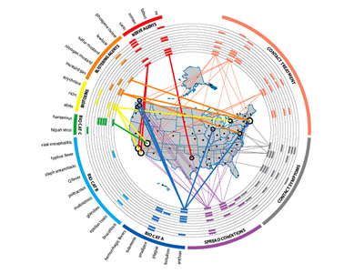 963 963 | 2005 computer graphics by Yarden Livnat, Jim Agutter, Shau Presented at the Infovis 2005 Conference in Minneapolis, MN (USA), VisAware reveals a novel visual correlation paradigm that takes advantage of human perceptive and cognitive facilities in order to enhance users' situational awareness and support decision-making. The first image reflects VisAware used in a Biowatch scenario where its structure classifies agents in colored sections around a ring. It shows the different categories of biological agents and the different types of chemical agents (i.e. blistering and nerve agents). With the map in the middle, it is easy to correlate the presence of agents to the sensor that detected it. The correlating line has a variable width that shows the probability of the agent under analysis; the thicker the line the greater the probability of an actual attack. The second image shows VisAlert, a visualization method for network intrusion detection. The authors based their approach on representing the network alerts as connections between two domains. These two domains are a one dimensional domain representing the node attribute, and a two-dimensional domain representing the time and type attributes. A network alert instance, in this scheme, is thus a straight line from a point in the type-time domain to a point in the node domain. They choose to separate the node attribute from the type and time as nodes provide a more or less static set of objects that can be used as visualization anchors for the transient alert instances. |
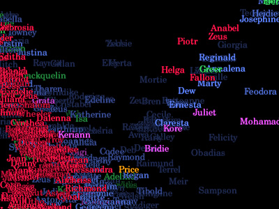 739 739 | 1995 computer graphics by Judith S. Donath The population of a real-world community creates many visual patterns. Some are patterns of activity: the ebb and flow of rush hour traffic or the swift appearance of umbrellas at the onset of a rain-shower. Others are patterns of affiliation, such as the sea of business suits streaming from a commuter train, or the bright t-shirts and sun-glasses of tourists circling a historic site.rnrnVisual Who makes these patterns visible. It creates an interactive visualization of the members' affiliations and animates their arrivals and departures. The visualization uses a spring model. The user chooses groups (for example, subscribers to a mailing-list) to place on the screen as anchor points. The names of the community members are pulled to each anchor by a spring, the strength of which is determined by the individual's degree of affiliation with the group represented by the anchor. The visualization is dynamic, with the motion of the names contributing to the viewer's understanding of the underlying data. |
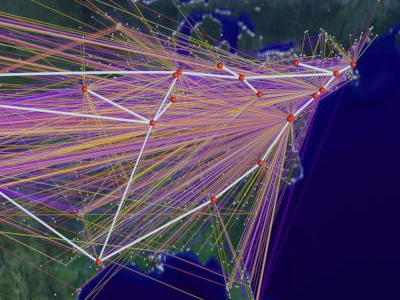 729 729 | 1994 computer graphics by Cox, Donna; Patterson, Robert This high-definition computer animation educates general audiences about the exponential growth of networking in the US and world. A data visualization spanning a two-year period represents rapid traffic growth that exceeds ten's of billions of bytes per day. The first image represents byte traffic into the ANS/NSFNET T3 backbone from its client networks for the month of December'94. The virtual connections, colored by traffic level, visualize traffic statistics collected by Merit Network Incorporated. The line colors represent traffic levels ranging from 0 bytes (purple) to one trillion bytes (white) The second image is a visualization study of inbound traffic measured in billions of bytes on the NSFNET T1 backbone for September 1991. The traffic volume range is depicted from purple (zero bytes) to white (100 billion bytes). |
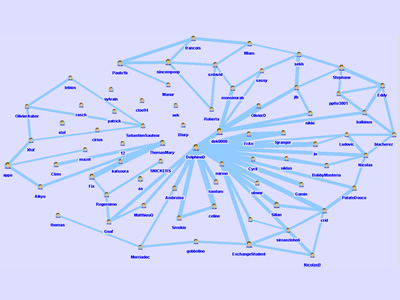 900 900 | 2005 computer graphics by (unknown) This project visualizes the community within 36trucs.com (similar to 43things.com), a group of people that share a set of personal goals and tips on how to achieve them. This project supports this community by highlighting the proximities between persons by shared objectives. Goals are linked through common attributes (one or more) and are grouped on 'places' while attributes appear on 'roads'. The wider the road, the more numerous are the common attributes. Other applications for this tool are described in French on www.social-computing.com. In the application section of the website one can see some of the listed domains: social network analysis, music sample proximities through common playlists, companies networks through common boards of directors, among others. |
 812 812 | computer graphics by Richard A. Becker, Stephen G. Eick, Allan R. Wilks (AT&T Bell Laboratories) These images represent the overload into and out of the Oakland node. The half-lines between the nodes code the overload by direction. The idea embodied in a nodemap is to display node-oriented data by showing a glyph or symbol such as a circle or square at each node on the map, with the visual characteristics such as size, shape, and color of the glyph coding the value of the statistic. More complex symbols can be used to represent more than one statistic simultaneously. "Networks are critical to modern society, and a thorough understanding of how they behave is crucial to their efficient operation. Our focus is on visualizing the data associated with a network and not on simply visualizing the structure of the network itself. We begin with three static network displays; two of these use geographical relationships (top image), while the third (bottom image) is a matrix arrangement that gives equal emphasis to all network links." |
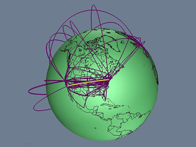 736 736 | 1996 computer graphics by Tamara Munzner, Eric Hoffman, K. We present a case study of visualizing the global topology of the Internet MBone. Developed and initially deployed by researchers within the Internet community, the MBone has been extremely popular for efficient transmission across the Internet of real-time video and audio streams such as conferences, meetings, congressional sessions, and NASA shuttle launches. The MBone, like the Internet itself, grew exponentially with no central authority. The resulting suboptimal topology is of growing concern to network providers and the multicast research community. We create a geographic representation of the tunnel structure as arcs on a globe by resolving the latitude and longitude of MBone routers. The interactive 3D maps permit an immediate understanding of the global structure unavailable from the data in its original form as lines of text with only hostnames and IP addresses. Data visualization techniques such as grouping and thresholding allow further analysis of specific aspects of the MBone topology. |
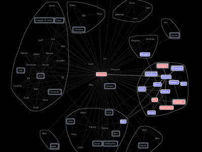 797 797 | 2004 computer graphics by Jeffrey Heer Vizster is an interactive visualization tool for online social networks, allowing exploration of the community structure of social networking services such as friendster.com, tribe.net, and orkut. Such services provide means by which users can publicly articulate their mutual "friendship" in the form of friendship links, forming an undirected graph in which users are the nodes and friendship links are the edges. These services also allow users to describe themselves in a profile, including attributes such as age, marital status, sexual orientation, and various interests. Vizster provides a visualization of such services, providing an interactive sociogram for exploring the links between network members. In addition to visualizing "friendship" linkages, Vizster supports a range of exploratory search features, providing visualization of the rich profile data characteristic of these services, features which traditional sociograms are not designed to communicate. |
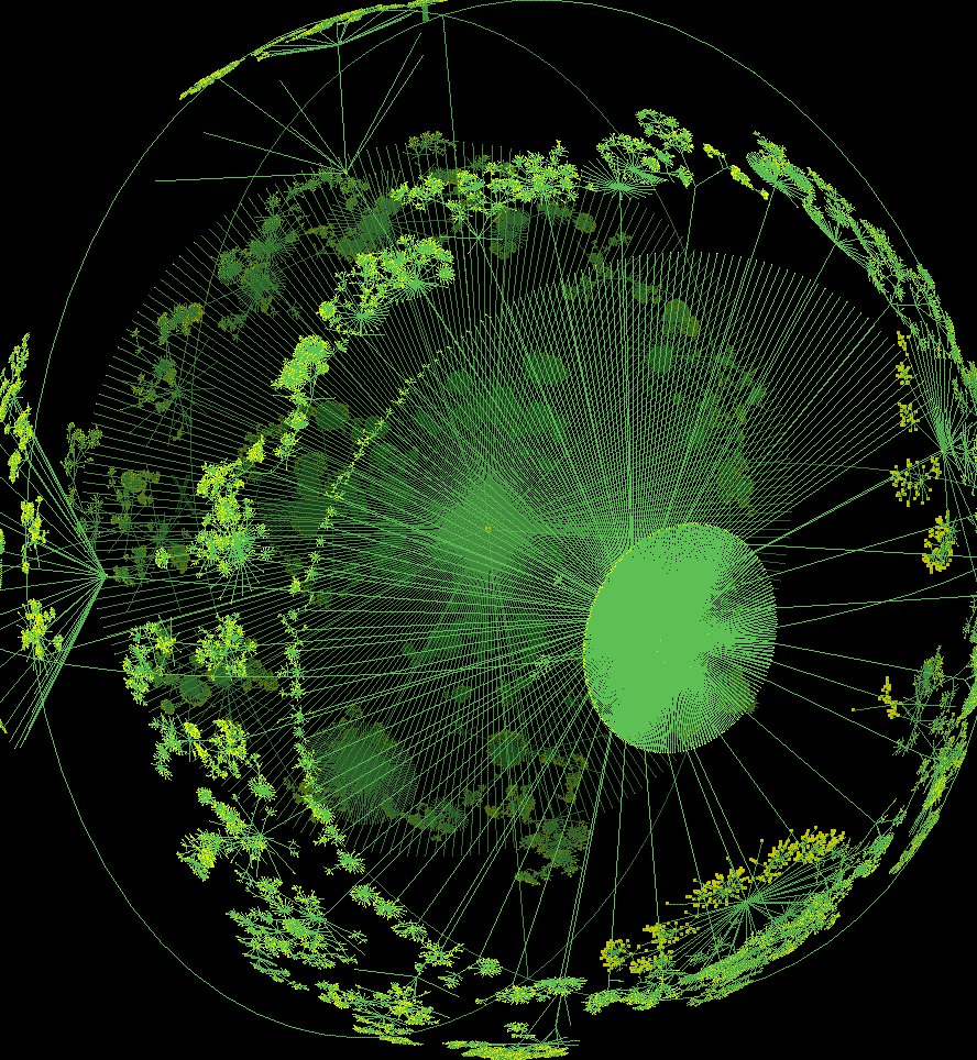 491 491 | computer graphics by Young Hyun This striking image is a 3D hyperbolic graph of Internet topology. They are created using the Walrus visualisation tool developed by Young Hyun at the Cooperative Association for Internet Data Analysis (CAIDA). The underlying data on the topological structure of the Internet is gathered by skitter, a CAIDA tool for large-scale collection and analysis of Internet traffic path data. |
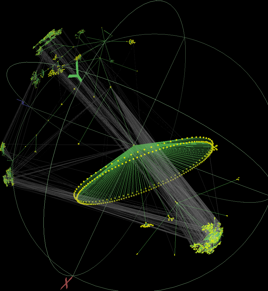 492 492 | computer graphics by Young Hyun This striking image is a 3D hyperbolic graph of Internet topology. They are created using the Walrus visualisation tool developed by Young Hyun at the Cooperative Association for Internet Data Analysis (CAIDA). The underlying data on the topological structure of the Internet is gathered by skitter, a CAIDA tool for large-scale collection and analysis of Internet traffic path data. |
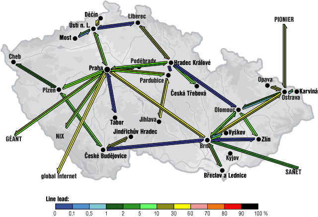 509 509 | computer graphics This is an example of the weather map for the CESNET2 network serving the education and research community in the Czech Republic from the 24th of January 2002. This map shows traffic load for links in the network over the previous ten minutes by colour coding of the arrow. |
 508 508 | computer graphics This is the weather map for the GRNET, the education and research network for Greece. Clicking on individual link arrows brings up more detailed traffic graphs. |
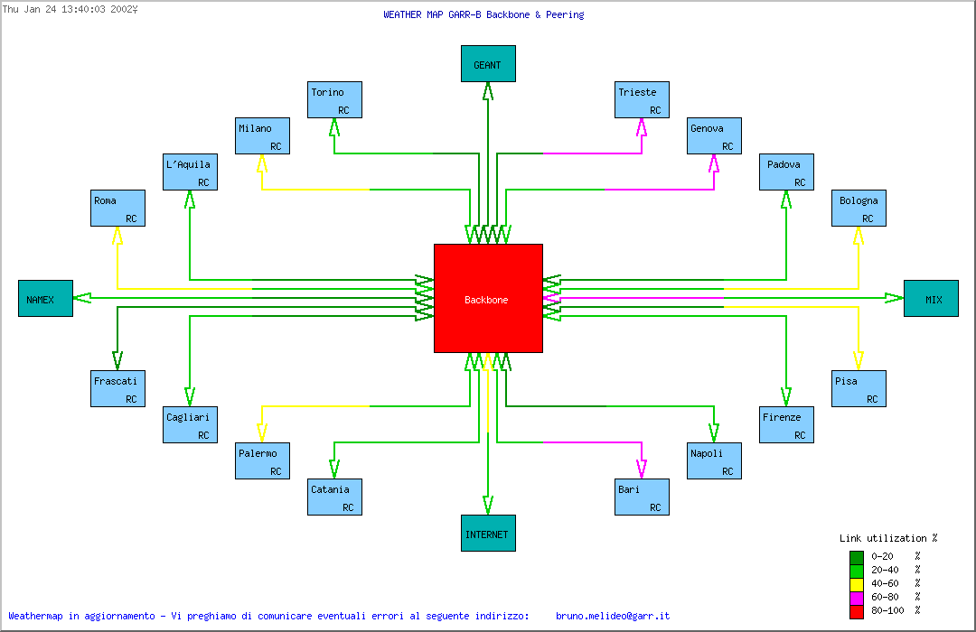 503 503 | computer graphics Weather maps can also use non-geographic, topological diagrams to represent the network structure. This example diagram shows the traffic load on the GARR-B network in Italy. |
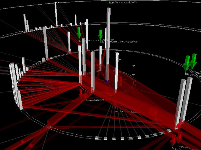 433 433 | computer graphics by Antoine Visonneau, with colleagues in the Center for Design Informatics, Harvard Design School This project is developing prototype 3D visualisations of online behaviour. Their current designs use VRML to visualise traffic within a website, with the vertical gray bars being individual pages and the red lines. |
 325 325 | computer graphics by Sensorium WebHopper was an experimental mapping of Internet traffic in real-time. |
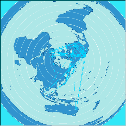 326 326 | computer graphics by Sensorium WebHopper was an experimental mapping of Internet traffic in real-time. |
 534 534 | computer graphics The webmap of the network infrastructure of 02, a major mobile phone provider in the United Kingdom. Green triangle and circle symbols represent cell sites while the background shading shows predicted strength of GSM coverage. The map on the right shows the high density of antennas in central London, contrasting with suburban south London shown below. |
 533 533 | computer graphics The webmap of the network infrastructure of 02, a major mobile phone provider in the United Kingdom. Green triangle and circle symbols represent cell sites while the background shading shows predicted strength of GSM coverage. This map shows the high density of antennas in central London. |
 942 942 | 2003 computer graphics by James Spahr Working with log data from webservers, James Spahr wrote software that looked at the referrer data and created a site tree. This map of the site is particularly relevant since it's formed by how the users travel through the site, illustrating its navigational flow. It is the aggregate view of how the user base views the hierarchy of the website. Its intent is to serve as a feedback tool for site designers. Does the user base have the same mental model of the website as the designer? Simple straight lines between pages are not used. Instead all traffic moves clockwise around the map. A clockwise circular pattern is used because directionality cannot be clearly labeled with straight lines. This work was displayed in the poster exhibit at the 2003 Information Architecture Summit. |
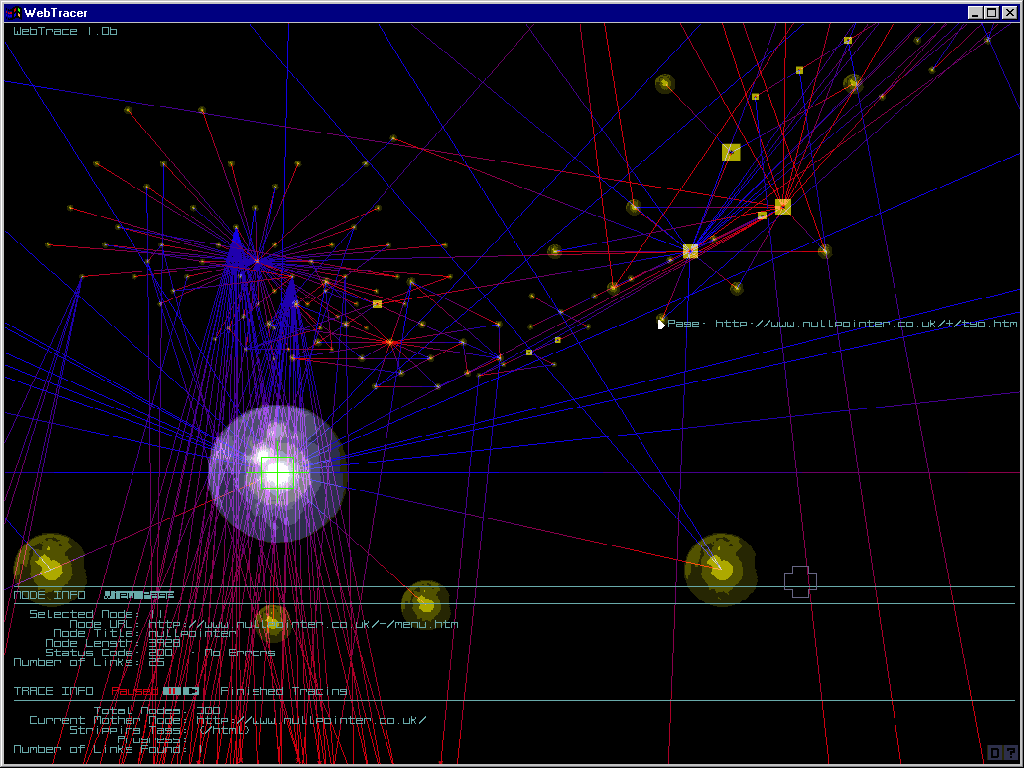 529 529 | computer graphics by Tom Betts WebTracer is a tool for mapping the structure of websites being developed by Tom Betts at nullpointer. This freeware tool utilises a 3D molecular model visualisation to show hyperlinks of a given site. An interview with Tom Betts by Matthew Fuller at Rhizome.org gives background information on the project. |
 843 843 | computer graphics by Antoine Visonneau (et al) The intent of WebTraffic is to develop prototype 3D visualizations of online behaviour - user paths across cyberspace. The project is lead by Antoine Visonneau, with colleagues in the Center for Design Informatics, Harvard Design School. Their latest designs used VRML to visualize traffic within a website, with the vertical gray bars being individual pages and the red lines links between them. |
 501 501 | computer graphics (WhatRoute) by Bryan Christianson WhatRoute, a graphical and geographical traceroute utility for the Mac created by Bryan Christianson, IHUG. |
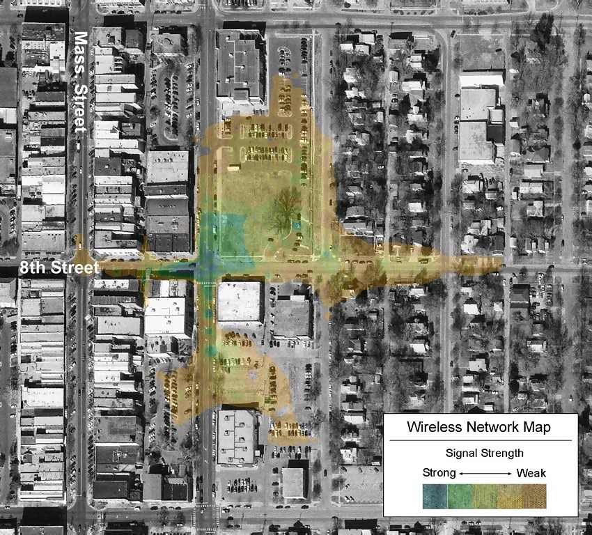 531 531 | computer graphics by Researchers at University of Kansas' Information & Telecommunications Technology Center and Kansas Applied Remote Sensing Progra Wireless network mapping by researchers at University of Kansas' Information & Telecommunications Technology Center and Kansas Applied Remote Sensing Program. This map shows interpolated signal strength from a 802.11b access point on aerial photographs. |
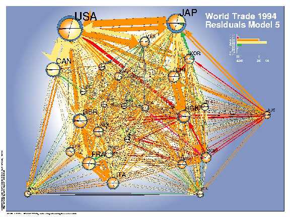 176 176 | 1998 by Lothar Krempel and Thomas Plumper Network diagrams are often used to show the relations between pairs of objects. Among other difficulties, it is hard to produce a pleasing arrangement of the nodes and links, and hard to use a network diagram as a data display. Krempel and Plümper used the geographic distances among 26 countries with a spring-embedding algorithm to obtain a simplistic geographical layout. They fit a series of regression models predicting the amount of bilateral trade between these countries, and used the network diagram to show both the data (trade volume) and the residuals (errors) from a given model. This visual procedure was used to suggest additional variables to be included into the models. The network diagrams show the volumes of bilateral trade (sizes of the arrows) and use colors to depict the errors of a given model--- which countries trade more than estimated (orange, red) or less (green, blue). The size of the country symbols stands for their volume of trade (in $ US), the balance of trade can be read from the comparision of the imports (bottom) and the exports (top). The pie slices indicate the degree to which the volume of the imports and exports (size) of a single country are overestimated respectively underestimated (colors). Model 2, which accounts for geographical distance and the GDP of the importing and exporting countries, shows a systematic regional imperfection of the estimates for the Pacific region. An enhanced model accounts additionally for joint borders, joint oceans regional economic areas and yields an improved fit. Nevertheless one can easily detect a systematic component in the errors, which points to the importance of the former British Commonwealth (GBR - HKG - AUS) for which the trade volumes are systematically underestimated. From Lothar Krempel and Thomas Plümper, Exploring the Dynamics of International Trade by Combining the Comparative Advantages of Multivariate Statistics and Network Visualisations An online version and the color images are available under: Version 2.1. 14.07.1998 http://www.mpi-fg-koeln.mpg.de/~lk/netvis/visualtrade |
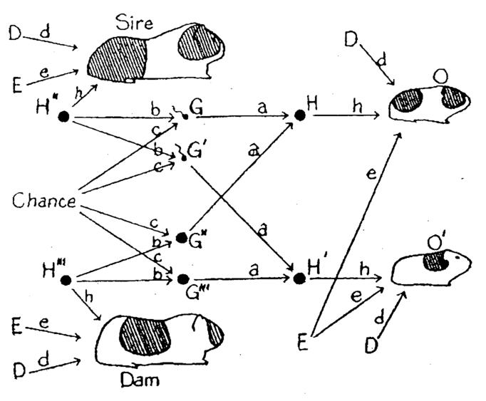 114 114 | 1920 print by Sewall Wright (1889-1988), USA Invention of the path diagram to show relations among a network of endogenous and exogenous variables forming a system of structural equations. Wright, S. (1920). The relative importance of heredity and environment in determining the piebald pattern of guinea-pigs. Proceedings of the National Academy of Sciences, 6:320-332. |
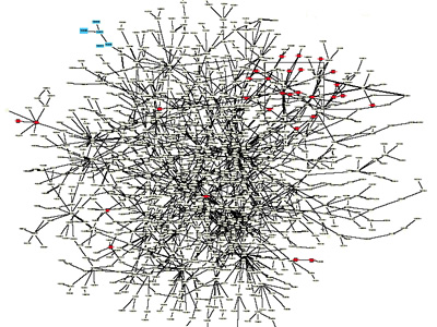 713 713 | 2001 computer graphics by Chandra L. Tucker, Joseph F. Ger Yeast protein interaction network of aprox. 200 interacting proteins based on published interactions. Inset shows close-up of region highlighted in box. Highlighted in red are cell structure proteins (a single functional class). Proteins in this category can be observed to cluster primarily in one region. Although interacting proteins are not depicted in a way that is consistent with their known cellular location (i.e. those proteins known to be present in the nucleus in the center of the interaction map and those present in plasma membranes in the periphery), signal-transduction pathways (or at least protein contact paths) can be inferred from this diagram. Also highlighted (in blue) are proteins involved in galactose regulation. These proteins are put in a functional context. (copyright) 2001 Elsevier Science Ltd. |
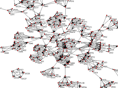 811 811 | computer graphics by (unknown) Yeast protein interaction network of aprox. 200 interacting proteins based on published interactions. Inset shows close-up of region highlighted in box. Highlighted in red are cell structure proteins (a single functional class). Proteins in this category can be observed to cluster primarily in one region. Although interacting proteins are not depicted in a way that is consistent with their known cellular location (i.e. those proteins known to be present in the nucleus in the center of the interaction map and those present in plasma membranes in the periphery), signal-transduction pathways (or at least protein contact paths) can be inferred from this diagram. Also highlighted (in blue) are proteins involved in galactose regulation. These proteins are put in a functional context. (copyright) 2001 Elsevier Science Ltd. |