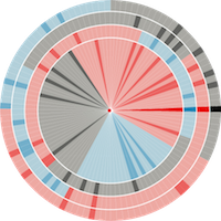
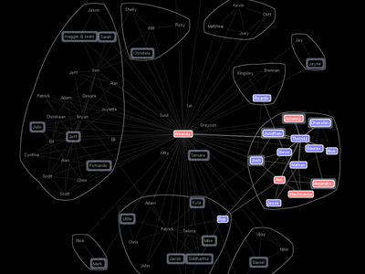
 410 410 | computer graphics by Judith S. Donath, Media Lab, MIT, USA A map of the social patterns of an electronic community produced by Visual Who. |
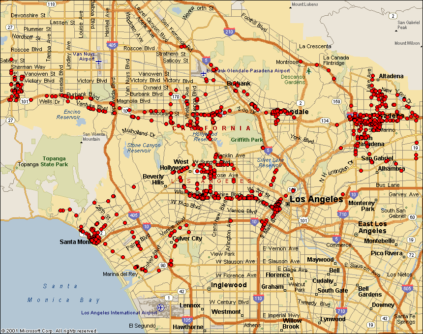 538 538 | computer graphics by Frank Keeney 802.11b Wireless Networks One of the most interesting area of wireless network provision in the last couple years has been the emergence of community LANs based on sharing network access using the the 802.11b standard (commonly known as Wi-Fi or WLAN). Many local groups are forming in cities. This is largely an unplanned, activist lead movement, working to share access for free. Here are example maps produced by different groups in London, New York City, and Seattle. These maps show the location of WLAN base station nodes that provide wireless access. People are searching for active 802.11b nodes by so called 'war driving' - i.e. driving around sniffing for unsecured wireless networks. (This is named after the 80s idea of war dialing.) This example map by Frank Keeney shows the results of his war driving in the Los Angeles area. A useful review article, "802.11b Access Point Mapping", by Simon Byers and Dave Kormann, Communications of the ACM, May 2003. Many other WLAN groups are organising in cities and towns in many countries. A comprehensive list is provided by the Personal Telco Project. Also worth checking out is Freenetworks.org. Background information on the 802.11b free network movement: "A LAN line", The Economist,11th January 2001. "Motley Crew Beams No-Cost Broadband to New York High Speed Freed", Village Voice, by Peter Meyers, 15th August 2001. |
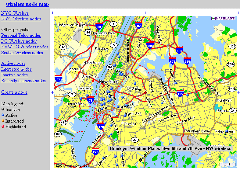 532 532 | computer graphics 802.11b Wireless Networks One of the most interesting area of wireless network provision in the last couple years has been the emergence of community LANs based on sharing network access using the the 802.11b standard (commonly known as Wi-Fi or WLAN). Many local groups are forming in cities. This is largely an unplanned, activist lead movement, working to share access for free. The blue dots on the map show bases stations registered with NYCWireless in New York City. This map shows the location of WLAN base station nodes that provide wireless access. A useful review article, "802.11b Access Point Mapping", by Simon Byers and Dave Kormann, Communications of the ACM, May 2003. Many other WLAN groups are organising in cities and towns in many countries. A comprehensive list is provided by the Personal Telco Project. Also worth checking out is Freenetworks.org. Background information on the 802.11b free network movement: "A LAN line", The Economist,11th January 2001. "Motley Crew Beams No-Cost Broadband to New York High Speed Freed", Village Voice, by Peter Meyers, 15th August 2001. |
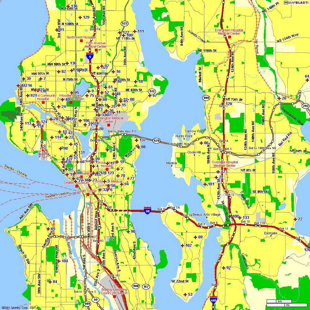 535 535 | computer graphics One of the most interesting areas of wireless network provision in the last couple years has been the emergence of community LANs based on sharing network access using the the 802.11b standard (commonly known as Wi-Fi or WLAN). Many local groups are forming in cities. This is largely an unplanned, activist lead movement, working to share access for free. This is a 802.11b network node map from Seattle Wireless. This map shows the location of WLAN base station nodes that provide wireless access. A useful review article, "802.11b Access Point Mapping", by Simon Byers and Dave Kormann, Communications of the ACM, May 2003. Many other WLAN groups are organising in cities and towns in many countries. A comprehensive list is provided by the Personal Telco Project. Also worth checking out is Freenetworks.org. Background information on the 802.11b free network movement: "A LAN line", The Economist,11th January 2001. "Motley Crew Beams No-Cost Broadband to New York High Speed Freed", Village Voice, by Peter Meyers, 15th August 2001. |
 530 530 | computer graphics by Consume One of the most interesting area of wireless network provision in the last couple years has been the emergence of community LANs based on sharing network access using the the 802.11b standard (commonly known as Wi-Fi or WLAN). Many local groups are forming in cities. This is largely an unplanned, activist lead movement, working to share access for free. |
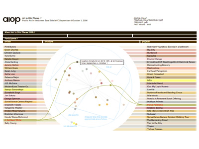 1068 1068 | 2006 computer graphics by (unknown) The second annual Art in Odd Places (AIOP) is an independent art exhibition which presents visual art, installations, and performances in unexpected public places on September 4 - October 1, 2006 in the Lower East Side (LES) of Manhattan, NY. It provides an opportunity for artists to explore and examine the role public space plays in our society. Using a map, the audience roams the Lower East Side discovering art in places throughout the community. AIOP 2006 projects continue to examine current public space potential, spaces that have recently been privatized, and the boundaries of public space. The printed maps are available on different locations around LES and also as a pdf on the project's website. On the interactive map available online (shown here), one can easily understand the relationships between authors, location, and projects, placed in three correspondent columns, by rolling over each one of the instances. For a more accurate view of the projects' location, there's also a google map version of it. |
 1032 1032 | 2006 computer graphics by (unknown) The Atlas of Science project proposes the creation of an information system whose major aims is to achieve a graphic representation of the Spanish Science Research. Such representation is conceived as a collection of maps - hence its name - which pursues three major objectives: (1) To provide the Spanish Research Community with a tool for the analysis of the structure formed by the diverse scientific domains and its corresponding research fronts. (2) To generate a graphical interface allowing navigation functions throughout the semantic spaces formed by the maps. (3) To represent, through these dynamic maps, the evolution of the research in particular knowledge and institution domains. This will improve the ability of the scientific community to analyze trends in the development of future research directions. On the Atlas of Science website (http://www.atlasofscience.net) there are currently 8 countries being mapped, respectively Argentina, Brazil, Chile, Colombia, Cuba, Mexico, Spain, Venezuela. The map shown here represents Argentina's Atlas of Science, between 1990-2004, with its various thematic areas and links between them. |
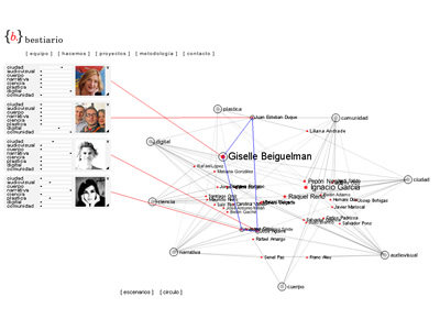 950 950 | computer graphics by (unknown) Bestiario is a studio based in Barcelona which work is based on a solid collaboration among several contributors. As stated in their website, they use non-conventional methods to transform complex content in interactive information spaces. The displayed graph shows the network of interactions between individuals and group representatives that collaborate with bestiario. The initial configuration organizes people by their knowledge and core competences, where intertwined names of people are arranged according to key domains, such as science, narrative or community. Every domain node can be re-arranged and names are clickable, showing more detailed information about the individual's expertise. |
 1009 1009 | 2006 computer graphics by Tom Carden Inspired by Christian Nold's Biomapping project, this processing applet developed by Tom Carden is a visualisation of GPS data from people walking on the Greenwich peninsula (London, UK). The height of the mesh is a measure of GSR (Galvanic Skin Response, related to stress levels) at that point. As Tom Carden explains: "since I didn't split out the individual walks from the sample data this shouldn't really be considered an accurate map of stress in Greenwich!". The Bio Mapping project allows the wearer to record their Galvanic Skin Response (GSR), which is a simple indicator of emotional arousal in conjunction with their geographical location. This can be used to plot a map that highlights point of high and low arousal. By sharing this data one can construct maps that visualise where a community might feel stressed and excited. |
 557 557 | computer graphics |
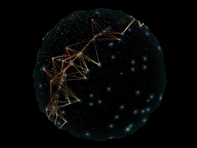 998 998 | 2005 computer graphics by Scott Hessels, Gabriel Dunne Celestial Mechanics is a planetarium artwork being created by Scott Hessels and Gabriel Dunne. Rather than a presentation of stars and planets, this "night sky" program reveals many of the aerial technologies hovering, flying, and drifting above us. This project combines science, statistical display, and contemporary art by interpreting the mechanical patterns and behaviors of these systems as culturally significant poetics. With help from government agencies and the science community, the artists worked with accurate tracking and protocol statistics to create 3-D models of the airborne systems. They then led a team of top animators to visualize those models in a style that reflects the chaos, force, and influence of these technologies. |
 883 883 | 2004 computer graphics by Richard Rogers The Govcom.org Foundation, an Amsterdam-based foundation dedicated to creating and hosting political tools on the Web, and its collaborators have developed a software tool that locates and visualizes networks on the Web. The Issue Crawler, at http://issuecrawler.net, is used by NGOs and other researchers to answer questions about specific networks and effective networking more generally. One may also do in-depth research with the software. These images represent a co-link analysis of significant climate change URLs, using the IssueCrawler, the Java crawler, co-link analysis and SVG visualisation software by the Govcom.org Foundation. The international, institutionalized climate change discussion is disconnected from the U.S. domestic initiatives, where for example epa.gov appears in the same space as the most noteworthy national climate change activity (me3.org, Sustainable Minnesota). Contrary to expectations, the international NGO community, represented most starkly on this map by climatenetwork.org, is far closer to the US domestic activitis (e.g., energystar.gov, sustainable-business.com than to the inter-governmental players, with the World Resource Institute a notable exception. Overall there is a vast divide between those undertaking projects for a sustainable future, and those discussing climate change and regulatory regimes on an inter-governmental level. |
 572 572 | 2005 computer graphics by Martin Wattenberg and Jonathan Feinberg 2005-08-29: "Color Code" - Interactive Map of the English Language From InfoVis:Wiki Martin Wattenberg and Jonathan Feinberg created Color Code, an astonishing interactive map of 33,000 English nouns: A picture of 33,000 English nouns, grouped by meaning. Each word is given the average color of web images found when searching for that term.[Wattenberg and Feinberg, 2005] A picture of 33,000 English nouns, grouped by meaning. Each word is given the average color of web images found when searching for that term. [Wattenberg and Feinberg, 2005] Color Code is a full-color portrait of the English language. The artwork is an interactive map of more than 33,000 words. Each word has been assigned a color based on the average color of images found by a search engine. The words are then grouped by meaning. The resulting patterns form an atlas of our lexicon. [Wattenberg and Feinberg, 2005] via thedesignweblog [Wattenberg and Feinberg, 2005] Martin Wattenberg and Jonathan Feinberg, Color Code: A Color Portrait of the English Language, Retrieved at: August 29, 2005. http://loop.aiga.org/resources/loop/loop9/colorproject/index.html |
 571 571 | 2005 computer graphics by Martin Wattenberg and Jonathan Feinberg 2005-08-29: "Color Code" - Interactive Map of the English Language From InfoVis:Wiki Martin Wattenberg and Jonathan Feinberg created Color Code, an astonishing interactive map of 33,000 English nouns: A picture of 33,000 English nouns, grouped by meaning. Each word is given the average color of web images found when searching for that term.[Wattenberg and Feinberg, 2005] A picture of 33,000 English nouns, grouped by meaning. Each word is given the average color of web images found when searching for that term. [Wattenberg and Feinberg, 2005] Color Code is a full-color portrait of the English language. The artwork is an interactive map of more than 33,000 words. Each word has been assigned a color based on the average color of images found by a search engine. The words are then grouped by meaning. The resulting patterns form an atlas of our lexicon. [Wattenberg and Feinberg, 2005] via thedesignweblog [Wattenberg and Feinberg, 2005] Martin Wattenberg and Jonathan Feinberg, Color Code: A Color Portrait of the English Language, Retrieved at: August 29, 2005. http://loop.aiga.org/resources/loop/loop9/colorproject/index.html |
 1248 1248 | Comment Flow2007 software (Java) by Dietmar Offenhuber A browser visualizing conversations via guest book entries across myspace profiles We have designed and implemented a flexible tool for the content driven exploration and visualisation of a social network. Building upon a traditional force-directed network layout consisting of nodes (profiles) and edges (friend-links), our system shows the activity and the information exchange (postings in the comment box) between nodes, taking the sequence and age of the messages into account. This project serves both as an illustration of one approach to the general problem of individuated network visualization and as an example of the practical uses of such representations. In the mySpace service network-only visualization methods are no longer sufficient to meaningfully represent the community structure. Numerous commercial profiles, fake/spam/celebrity profiles and tools such as automated friend adders result in a huge numbers of connections, many of which carry little information about a person’s actual social ties and behavior. The average myspace user has more than 130 friends, but there are also profiles with over a million “friends”. By going beyond the “skeleton” of network connectivity and looking at the flow of information between the individual actors we can create a far more accurate portrait of online social life. |
 1246 1246 | Comment Flow2007 software (Java) by Dietmar Offenhuber A browser visualizing conversations via guest book entries across myspace profiles We have designed and implemented a flexible tool for the content driven exploration and visualisation of a social network. Building upon a traditional force-directed network layout consisting of nodes (profiles) and edges (friend-links), our system shows the activity and the information exchange (postings in the comment box) between nodes, taking the sequence and age of the messages into account. This project serves both as an illustration of one approach to the general problem of individuated network visualization and as an example of the practical uses of such representations. In the mySpace service network-only visualization methods are no longer sufficient to meaningfully represent the community structure. Numerous commercial profiles, fake/spam/celebrity profiles and tools such as automated friend adders result in a huge numbers of connections, many of which carry little information about a person’s actual social ties and behavior. The average myspace user has more than 130 friends, but there are also profiles with over a million “friends”. By going beyond the “skeleton” of network connectivity and looking at the flow of information between the individual actors we can create a far more accurate portrait of online social life. |
 1247 1247 | Comment Flow2007 software (Java) by Dietmar Offenhuber A browser visualizing conversations via guest book entries across myspace profiles We have designed and implemented a flexible tool for the content driven exploration and visualisation of a social network. Building upon a traditional force-directed network layout consisting of nodes (profiles) and edges (friend-links), our system shows the activity and the information exchange (postings in the comment box) between nodes, taking the sequence and age of the messages into account. This project serves both as an illustration of one approach to the general problem of individuated network visualization and as an example of the practical uses of such representations. In the mySpace service network-only visualization methods are no longer sufficient to meaningfully represent the community structure. Numerous commercial profiles, fake/spam/celebrity profiles and tools such as automated friend adders result in a huge numbers of connections, many of which carry little information about a person’s actual social ties and behavior. The average myspace user has more than 130 friends, but there are also profiles with over a million “friends”. By going beyond the “skeleton” of network connectivity and looking at the flow of information between the individual actors we can create a far more accurate portrait of online social life. |
 1249 1249 | Comment Flow2007 software (Java) by Dietmar Offenhuber A browser visualizing conversations via guest book entries across myspace profiles We have designed and implemented a flexible tool for the content driven exploration and visualisation of a social network. Building upon a traditional force-directed network layout consisting of nodes (profiles) and edges (friend-links), our system shows the activity and the information exchange (postings in the comment box) between nodes, taking the sequence and age of the messages into account. This project serves both as an illustration of one approach to the general problem of individuated network visualization and as an example of the practical uses of such representations. In the mySpace service network-only visualization methods are no longer sufficient to meaningfully represent the community structure. Numerous commercial profiles, fake/spam/celebrity profiles and tools such as automated friend adders result in a huge numbers of connections, many of which carry little information about a person’s actual social ties and behavior. The average myspace user has more than 130 friends, but there are also profiles with over a million “friends”. By going beyond the “skeleton” of network connectivity and looking at the flow of information between the individual actors we can create a far more accurate portrait of online social life. |
 1252 1252 | Comment Flow2007 software (Java) by Dietmar Offenhuber A browser visualizing conversations via guest book entries across myspace profiles We have designed and implemented a flexible tool for the content driven exploration and visualisation of a social network. Building upon a traditional force-directed network layout consisting of nodes (profiles) and edges (friend-links), our system shows the activity and the information exchange (postings in the comment box) between nodes, taking the sequence and age of the messages into account. This project serves both as an illustration of one approach to the general problem of individuated network visualization and as an example of the practical uses of such representations. In the mySpace service network-only visualization methods are no longer sufficient to meaningfully represent the community structure. Numerous commercial profiles, fake/spam/celebrity profiles and tools such as automated friend adders result in a huge numbers of connections, many of which carry little information about a person’s actual social ties and behavior. The average myspace user has more than 130 friends, but there are also profiles with over a million “friends”. By going beyond the “skeleton” of network connectivity and looking at the flow of information between the individual actors we can create a far more accurate portrait of online social life. |
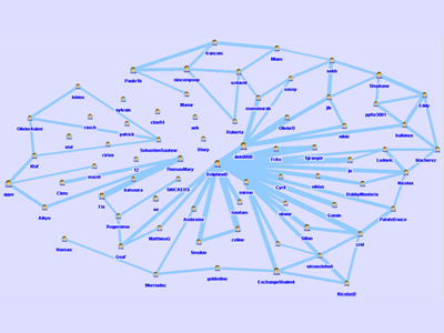
 1036 1036 | 2006 computer graphics by Matthias Trier (et al) Commetrix is a software application to support Community Moderators, Members, and Researchers. The functionality covers four main features: (1) Import of existing virtual communication over the Internet (2) Extraction of underlying electronic communication networks and knowledge communities (3) Visualization of community properties, structures and dynamic behaviour (4) Evaluation of important properties using a qualitative and quantitative measurement system. Besides all the promising features of Commetrix I must admit I was somehow fascinated with a Commetrix output sample video showing the animated formation of a community over time, quite compelling. To see the video just go to the "Documents/Videos" section. |
 940 940 | 2002 computer graphics by Holly Coleman, Boris Muller, Jos Part of the Connected Communities research project at the Interaction Design Institute Ivrea, the Community Browser's goal is to create an awareness of a community, by facilitating an easy way to see and find others, and find oneself in a particular social context. Every member of the community is represented as an icon. So every member of the community can find herself / himself in a social context. It is possible to find out, who else is in the community and who shares similar ideas or works on the same projects. The personal profile, i.e. the sum of all activities and contributions of a member are accessible via the icon. So the Community Browser is both a tool for visualisation and navigation. The interaction is quite interesting and fresh. The user can easily navigate through his/her "small-world" in a rotating globe and look for a particular person. The concept seems like a clever analogy to "The Little Prince" story, by Antoine de Saint Exupery. |
 827 827 | computer graphics by Pablo Martin Gleiser "We use the information available in the Red Hot Jazz Archive database in order to study the collaboration network between jazz musicians. First we study the collaboration network between individuals (first image). In this case each vertex corresponds to a musician. Two musicians are connected if they have played in the same band. The figure shows the network obtained using this construction." "Then we study the collaboration network between bands (second image). In this case each vertex corresponds to a band. Two bands are connected if they have a musician in common. The figure shows the network obtained using this construction." "The community structure analysis reveals that these constructions capture essential ingredients of the social interactions between jazz musicians. We observe correlations between recording locations, racial segregation and the community structure. A quantitative analysis of the community size distribution reveals a surprising similarity with an e-mail based social network." |
 1273 1273 | 2007 Web application by Christian Marc Schmidt and Maki Tsuchiya/Processing Identity goes beyond brand: the character of a community is largely determined by its plan. This visualization of 12 new communities around the world seeks to address the question: How is identity expressed in the design of the branded communities appearing in or adjacent to cities around the world? |
 920 920 | 2005 computer graphics by Yugo Nakamura Developed by Yugo Nakamura, Context Viewer is a visual browser which visualizes the context within registered "keywords" in Japanese pioneering contextual community "Kanshin Kukan" service. It's still under construction but its beta version is now running. |
 570 570 | 2005 computer graphics by Olivier Zitvogel Delicous Soup shows related del.icio.us tags in a circular graph manner: Delicious Soup - A tool that reveals your del.icio.us activities... [Zitvogel, 2005] via information aesthetics blog [edit] 3 References [Ivy, 2005] Ivy, Revealicious, Created at: 2005, Retrieved at: September 15, 2005. http://www.ivy.fr/revealicious/ [Zitvogel, 2005] Olivier Zitvogel, Delicous Soup, Created at: 2005, Retrieved at: September 15, 2005. http://www.zitvogel.com/delicioussoup/ Retrieved from "http://www.infovis-wiki.net/index.php?title=2005-09-15:_%22Revealicious%22_and_%22Delicious_Soup%22_-_two_Flash_based_del.icio.us_visualization_tools" |
 966 966 | 2005 computer graphics by Sebastian Heycke DOLBY is an interactive application for the visualization of the subject catalog of INCOM. INCOM is the Internet-based communication platform of the Interface Design Department of Potsdam's University of Applied Sciences. INCOM's goal is to improve internal communication among students and faculty as a community informational aggregator of projects, articles, seminars and events. INCOM is developed and produced by students and coworkers of the Interface Design Department, under the direction of Professor Boris Mueller. DOLBY maps INCOM's existing key words on a clockwise radial structure, organized alphabetically by small circles. In addition all contributions are represented by rectangles shown in an encircled radius. One can easily rollover a keyword to see which articles relate to it, or mouse over an article and discover the array of associated keywords, and the title and author of the contribution. If an article or specific keyword is clicked, the selection centers itself being immediately surrounded by its related articles/keywords in an ever-morphing constellation. DOLBY visualizes both qualitative and quantitative relationships of the subject catalog of INCOM, and through its visualization it answers questions not fully solved on the INCOM platform. |
 851 851 | 2005 computer graphics by Valdis Krebs This is a map of an online community, which portraits a concentric structure where the network "hubs" or "connectors" -- people with a high number of ties, are located in the center. This arrangement cleverly follows the inherent organization of these type of communities, where the hubs are the central elements of its sustainability. As the author explains: "Parts of it are well connected, while most of it is sparse. We see this pattern with many emergent communities -- groups that people join and participate in through common interests or affiliations. Two nodes are connected if they have exchanged emails or IMs past a certain level. The nodes are colored by their connectivity. The yellow nodes are the core, with the greatest number of direct links. The red nodes are connected to the core and have less interconnectivity. The blue nodes are "young clusters" that are just forming. The green nodes are various forms of isolates who may have just joined the on-line community, or have chosen to be inactive -- they may be the common "lurker" found in many on-line communities. The lurker listens to the public info being disseminated but chooses not to interact." (Thanks Valdis) |
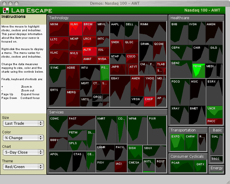 565 565 | 2005 computer graphics by Lab Escape 2005-08-24: Integrating graphs into Treemaps From InfoVis:Wiki Lab Escape has integrated time-series graphs into their Treemap application Enterprise Tree Map 2.0 Demo of Enterprise Tree Map 2.0 showing stock market data. Time-series graphs of individual stocks are integrated into the Treemap[Lab Escape, 2005] Demo of Enterprise Tree Map 2.0 showing stock market data. Time-series graphs of individual stocks are integrated into the Treemap [Lab Escape, 2005] via information aesthetics blog [Lab Escape, 2005] Lab Escape, Screenshot of Enterprise Tree Map 2.0 Demo, Retrieved at: 2005-08-24, http://labescape.com/products/treemap/index.html |
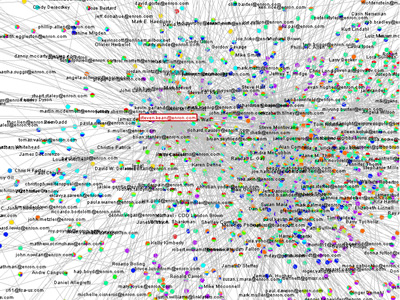 751 751 | 2005 computer graphics by Jeffrey Heer This project attempts to take the first steps toward an exploratory data environment for e-mail corpora, using the Enron e-mail corpus as a motivating data set. The interface--currently named "enronic"--unifies information visualization techniques with various algorithms for processing the e-mail corpus, including social network inference, message categorization, and community analysis. Though still a preliminary design, enronic shows promise as a platform for more tightly coupling manual and automated data analysis. The graph on the left shows the resulting social network visualization. People are drawn as nodes with labels containing either their name or their e-mail address, depending on what was present in the database. Edges represent the histories of ALL e-mail traffic between two people. Pie graphs are placed in the center of each edge, conveying an overall picture of how the e-mail traffic represented by that edge has been categorized. |
 257 257 | 1999 computer graphics by Oregon Economic & Community Development Department Detailed map of the fibre optic routes in the metropolitan region of Oregon, USA. A series of maps are available for the whole state, produced by the Oregon Economic & Community Development Department. |
 1022 1022 | 2005 computer graphics by Marian Bantjes I have to admit I only recently found the amazing work of Marian Bantjes, but certainly enough I became an instant admirer. As portrayed by the Brazilian magazine tupigrafia: "Hidden in a forest near Vancouver, Marian Bantjes promotes a silent revolution. Pulverizing the borders between calligraphic gesture and digital precision, her work is remarkable for its flow. Any tool in her hands can be a weapon to serve this revolution: vectors, bitmaps, or even a plain ballpoint pen". The images shown here are part of a project Bantjes developed for Fontshop's Font 004 magazine, where she was given the opportunity to write/draw over 3 spreads on the subject of Community. The process is better described by Bantjes herself: "I initially wrote a fairly lengthy piece on the inclusiveness/exclusiveness of community and the varying levels of exclusivity, as well as the various potential communities to which we all belong. And after writing, I started to draw. And as I drew, I eliminated the text as it became absorbed into the graphics. I used 6 Fontshop typefaces in the piece, breaking most of the typographic rules I diligently insist my typography students observe. I also created 31 pattern rings made from dissected pieces of the typefaces. The whole became a kind of organic narrative diagram, and is by far one of my favourite pieces ever". |
 976 976 | computer graphics by Gregory Bray Looking for a new way to surf the Gnutella network - a P2P community sharing network (http://www.gnutella.com) - Gregory Bray decided to use a web spider, as a means of collecting information from each node, in order to create a map of the network and gather statistics without changing the Gnutella protocol. After the web spider downloads all the information it can find, a simple parser creates the statistics and outputs the data file in a graph using aiSee Graph Layout Software (http://www.aisee.com). As the author explains: "So far the largest data set I have collected was about 80,000 nodes in half an hour (...) way more than the 10 or 20 thousand that the common user can see". |
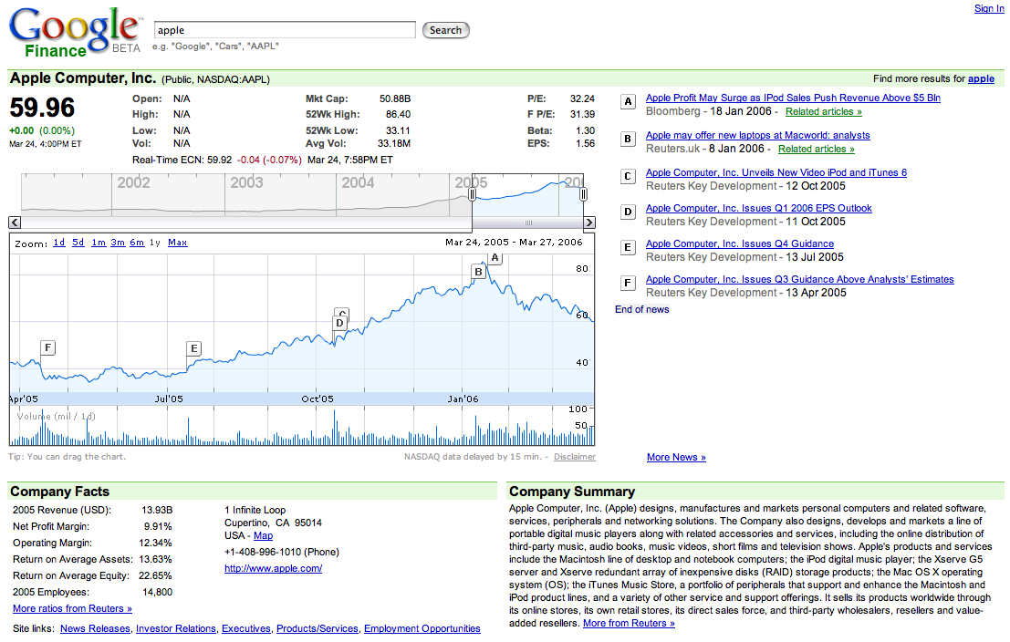 574 574 | 2006 computer graphics by Google 2006-03-27: Google Finance - Interactive Flash graphs to explore stock price data From InfoVis:Wiki Google Finance - Interactive Flash graphs to explore stock price data [Google, 2006] Interactive Flash graphs that combine stock price data in form of Line graphs (top) and sold volumes via Spike graphs (bottom). The data can be explored interactively providing Details on demand for each day; navigation can be performed via dragging the chart by mouse or moving the top Overview-plus-Detail slider. The current level of detail can be determined by dragging the overview window or selecting predefined granularities. Furthermore, company news are related to time by placing flags along the price chart. Details: http://finance.google.com via information aesthetics blog [Google, 2006] Google, Finance BETA, Retrieved at: March 27, 2006. http://finance.google.com |
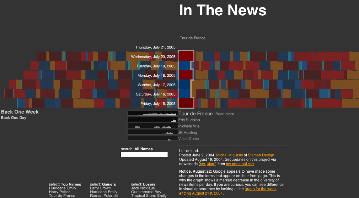 563 563 | 20040609 computer graphics by Michal Migurski 2005-07-21: "In The News" - Interactive Visualization of Google News From InfoVis:Wiki Apart from the well known Newsmap visualization that utilizes Treemaps to present the current distribution of Google News topics, another very interesting visualization exists: In The News is the title of Michal Migurski's interactive Flash application that was posted already a year ago: http://news.stamen.com/ In contrast to Newsmap that only shows current news, In The News adds temporal aspects via presenting the history of news topics over time. Thus, it allows for interactive exploration of the development of news topics over time. In The News (Google News visualization) [Migurski, 2004] Michal Migurski, In The News. Created at: June 9, 2004. Retrieved at: July 21, 2005. http://news.stamen.com/ * One week worth of news is represented in rows on the display. * A single news topic is represented as color chip whereas the size of a chip denotes its relative importance on that day. * Color is used to show whether an item has gained or lost importance relative to the previous day. * When selecting a news topic, the corresponding color chips are highlighted and a small bar graph showing the topic's performance over the last month is shown below the main visualization. * If a new topic is selected, another small bar graph is added while keeping the history of the last five selected topics visible and allowing for their comparison. * Furthermore, news topics can be searched and lists of Top Names, Top Gainers, and Top Losers are provided. The different views are very well coordinated and smooth transitions are provided, which adds to the coherent picture of the whole application making it an excellent example for a highly interactive exploration tool for time-oriented abstract data. And even nicer, the source code is available and released under a Creative Commons License. via sendung.de blog [Migurski, 2004] Michal Migurski, In The News. Created at: June 9, 2004. Retrieved at: July 21, 2005. http://news.stamen.com/ |
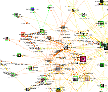
 817 817 | computer graphics by AT&T Labs - Research cobot is a software agent who lives in the MUD - LambdaMOO, an active online community frequented by several hundred users. His goal in life is to interact with other members of the community and to become a real part of his social fabric. Toward this end, Cobot builds models of those around him, based on statistics of who performs what actions, and on whom they use them. This graph is a representation of the social relationships inside cobot's head. Each node in this graph is a person. The color represents communicative style, translated into HSV space. One dimension measures the amount of interaction generated by that player while another measures the ratio of speech actions (eg "say") to non-speech actions (eg "hug" or "kick"). The third dimension is held constant to provide uniform brightness. Red-purple colors tend to be players who are average interactors, and who interact mainly through speaking; yellow, a normal interactors, but through non-speech acts; blue, heavy interactors through speaking; and green heavy non-speaking interactors. |
 558 558 | 2005 computer graphics (processing.org) by Carolin Horn and Florian Jenett 2005-11-29: Jellyfish - visualization of an art encyclopedia (developed using processing.org) From InfoVis:Wiki Jellyfish visualizes an encyclopedia of the arts. [Horn and Jenett, 2005] Jellyfish visualizes an encyclopedia of the arts. The project should be seen as an experiment, which deals with a dynamic interface. The purpose was to remove a static, conventional design and to achieve a playful interface. The application is developed in Processing and uses an XML-database to update content. [Horn and Jenett, 2005] Homepage: http://www.carohorn.de/jellyfish/index.htm [Horn and Jenett, 2005] Carolin Horn and Florian Jenett, Jellyfish - an encyclopedia of the arts, Created at: 2005, Retrieved at: November 29, 2005. http://www.carohorn.de/jellyfish/index.htm |
 1010 1010 | 2006 computer graphics by Ben Fry As part of its 2006 February 20 Issue, dedicated to "The Blog Establishment", New York Magazine commissioned Ben Fry to map the connections between the most-linked-to 50 blogs, using data from Technorati. Each arrow represents a hypertext link that was made sometime in the previous 90 days. The Blogosphere encompasses a vast communication network of interconnected individuals (bloggers) who are linked by shared interests and patterned flows of information. Links between blogs (blogrolling) represent recognition votes in an endless global popularity poll. Some top-50 sites don't have any links from the others shown here, mainly because they are from countries other then the USA, such as Japan, China, Spain or Germany; and therefore, they have a tendency to remain within their immediate linguistic/cultural community. On the top 3 popularity list is Boing Boing, Engadget and PostSecret. For an updated listing on Technorati click here. |
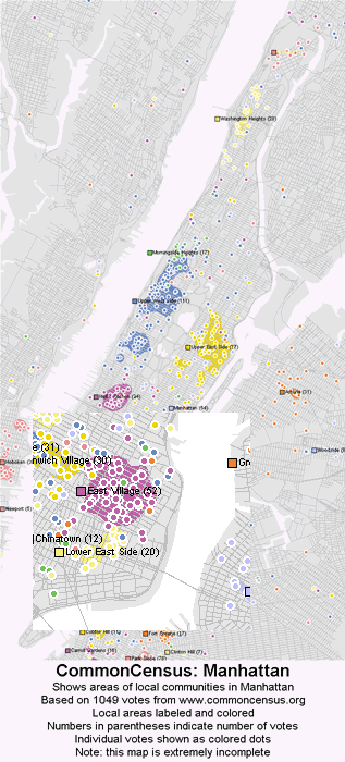 624 624 | 20070827 computer graphics by The Commoncensus Project Local maps draw the geographic responses to the question, "What do you consider to be your local community?" The results are interesting because in some areas people select neighborhoods, in others towns or cities, and in others towns or cities that differ from the boundaries set by governments or the post office. However, a very large amount of data is necessary to draw these maps, so expect only a few maps of the most populated cities over the next few months. More comprehensive coverage will come over the years. This demonstration map is extremely inaccurate and spotty, and intended only to give an idea of how the data is starting to take shape. Individual colored votes are shown by exact location, and areas that have received enough votes have been shaded the neighborhood's color. Most of the map has been left gray, for areas without enough votes. It is interesting to note that while a significant minority of people choose to identify their local community as 'Manhattan' or 'New York', the majority chooses to identify their neighborhood. First added Oct. 31, 2005. |
 1278 1278 | 2007 Digital by Daniel Jones, using Processing Conceived and developed for the August 2007 exhibition staged by What They Could Do, They Did, "Map of a Micro-Community" renders visible the changing structure of an online community, depicting the growth and flux of its usage over an 18-month period. This community is comprised of over 100 members, and acts as a forum for discussion on a diverse array of topics. Discussions are built up from distinct 'posts', which can then be extended to project-based developmental chains. The content of these forums over time has been abstracted to a numeric stream of post identifiers and significance ratings, determined by the amount of discussion surrounding a post. Each post is transcribed onto a 2-dimensional plane, with its size defined by its significance rating, vertical position by the user ID of its author, and horizontal position by the time at which it was created. Relationships between posts, based on overlaps in subject matter or authorship, are indicated by colour-coded threads. |
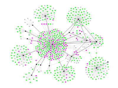
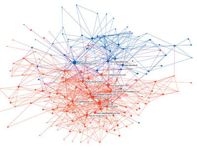
 939 939 | 2005 computer graphics by Lada Adamic, Natalie Glance In this paper, the authors studied the linking patterns and discussion topics of political bloggers. The goal was to measure the degree of interaction between liberal and conservative blogs, and to uncover any differences in the structure of the two communities. Specifically, they analyzed the posts of 40 "A-list" blogs over the period of two months preceding the U.S. Presidential Election of 2004, to study how often they referred to one another and to quantify the overlap in the topics they discussed, both within the liberal and conservative communities, and also across communities. They also studied a single day snapshot of over 1,000 political blogs. This snapshot captured blogrolls (the list of links to other blogs frequently found in sidebars), and presents a more static picture of a broader blogosphere. Most significantly, the authors found differences in the behavior of liberal and conservative blogs, with conservative blogs linking to each other more frequently and in a denser pattern. The image shown, portraits the community structure of the analyzed political blogs (expanded set), shown using utilizing a GEM layout in the GUESS visualization and analysis tool. The colors reflect political orientation, red for conservative, and blue for liberal. Orange links go from liberal to conservative, and purple ones from conservative to liberal. The size of each blog reflects the number of other blogs that link to it. |
 568 568 | 2006 computer graphics by SmartMoney.com 2006-03-27: Market Radar: interactive data visualization of historical stock prices at SmartMoney.com From InfoVis:Wiki Market Radar - interactive data visualization of historical stock prices using dotplots [SmartMoney.com, 2006] THE MARKET RADAR is a new way to get a broad, historical view of stock prices. Our first radar tool displays nine years of weekly price changes for 500 companies — more than 200,000 data points in all. Presenting such a large database in a single picture makes it possible to see market dynamics that might otherwise be invisible. [...] Each weekly price change is represented by a single dot on the screen, colored green if the stock went up that week and red if it went down. Large movements are colored brightly, while smaller changes are dimmer. The dots are arranged in a grid, with each row representing a single company's performance, and columns representing points in time. The labels at top show the passage of time. The companies are grouped by sector and industry. [SmartMoney.com, 2006] Details: http://www.smartmoney.com/marketradar/ via information aesthetics blog [SmartMoney.com, 2006] SmartMoney.com, Market Radar, Retrieved at: March 27, 2006. http://www.smartmoney.com/marketradar/ |
 625 625 | computer graphics by The Commoncensus Project Regional maps draw what respondents consider to be their "local areas", in response to the question, "Please choose the name of the local community that you feel is the natural cultural and economic center within your local area." Or, if you feel a general name (i.e. "Hope Valley", "Pleasant Lake Area" or "Midway-Fairview Area") is more descriptive of your local area culturally than the name of a single central community, then please give what you feel to be the best commonly accepted name for your local area." To produce regional maps, many more votes are needed than for the national map, because of the greater level of detail. More maps for different regions of the country will be posted over the next few months as more votes allow initial versions to be drawn. This demonstration map is extremely inaccurate and intended only to give an idea of how the data is starting to take shape. Some areas are based on just a few votes and a lot of extrapolation. The area includes parts of New York State, Pennsylvania, New Jersey, Connecticut, Massachusetts and others. County boundaries are overlaid in faint white, to allow for comparison. First added Nov. 2, 2005. |
 569 569 | 2005 computer graphics by Turner, T. C., Smith, M. A., Fisher, D., and Welser, H. T. 2005-08-26: New article on visualizion techniques for the Usenet From InfoVis:Wiki Treemap of January 2004 Usenet posts. [Turner et al., 2005] The current issue (10(4), 2005) of the Journal of Computer-Mediated Communication contains a special theme on "Online Communities". One of the articles is about information visualization techniques used for the Usenet: Picturing Usenet: Mapping Computer-Mediated Collective Action [Turner et al., 2005] Turner, T. C., Smith, M. A., Fisher, D., and Welser, H. T. Picturing Usenet: Mapping computer-mediated collective action. Journal of Computer-Mediated Communication, 10(4), article 7, 2005. |
 564 564 | 2004 computer graphics by Martin Krzywinski 2005-08-24: "Schemaball" - Schema Viewer for SQL Databases From InfoVis:Wiki Visualization of a MySQL Database schema [Krzywinski, 2004] Schemaball is a flexible schema visualizer for SQL databases. The purpose of Schemaball is to help visualize the relationships between tables. Tables are related by foreign keys, which are fields which store the value of a record field from another table. Foreign keys create a lookup relationship between two tables. Large schemas can have hundreds of tables and table relationships. Keeping track of them call can be tedious, error-prone and slow down the schema development process. Schemaball provides a means to create flexible, static graphic images of a schema. Tables and table links can be hidden, highlighted and foreign key relationships can be traversed forward or backward to highlight connected tables. Schemaball produces images called schema balls. Schema balls are schema visualizations in which tables are ordered along a circle with table relationships drawn as curves or straight lines. Using an input configuration file, all elements of the schema ball can be configured. Schemaball is free software, licensed under GPL. It is written in Perl and requires a few CPAN modules to run. It's simple to use, while being able to produce high quality schema balls suitable for publication. In particular, you can use Schemaball to generate elements of a schema ball and then create a composite in an image editing program. One such result is shown in the figure at right. [Krzywinski, 2004] via information aesthetics blog [Krzywinski, 2004] Martin Krzywinski, Schemaball - Schema Viewer for SQL Databases, Created at: 2004, Retrieved at: 2005-08-24, http://mkweb.bcgsc.ca/schemaball/ |
 567 567 | 2006 computer graphics by Dietmar Offenhuber and Gerhard Dirmoser 2006-05-24: SemaSpace - Graph editor for large knowledge networks From InfoVis:Wiki SemaSpace - Graph editor for large knowledge networks [Offenhuber and Dirmoser, 2006] SemaSpace is a fast and easy to use graph editor for large knowledge networks, specially designed for the application in non technical sciences and the arts. It creates interactive graph layouts in 2d and 3d by means of a flexible algorithm. The system is powerful enough for the calculation of complex networks and can incorporate additional data such as images, sounds and full texts. [Offenhuber and Dirmoser, 2006] Details: http://residence.aec.at/didi/FLweb/ [Offenhuber and Dirmoser, 2006] Dietmar Offenhuber and Gerhard Dirmoser, SemaSpace, Retrieved at: May 24, 2006. http://residence.aec.at/didi/FLweb/ |
 1218 1218 | 2006 computer graphics by Robert Pietrusko, Jamie Smith, and Sayoko Yoshida (PIIM) Data collected by researchers can be compared by region as well as by content. This visualization shows the buildup of economic, demographic and structural knowledge of Mumbai over a fifty-year period. Source Description Do We Know What We Don't Know? Source is a proposed software environment where a community of researchers will be able to contribute information at any temporal or spatial resolution, and at varying levels of detail and formality. The tool will highlight data that are consistent across datasets with regard to data format, resolution and availability. The tool will also highlight those aspects that remain incommensurable. Additionally, the researchers will be provided a set of visualization tools that will allow them to analyze and reason with both quantitative and qualitative information as well as gauge what areas of the information space are still poorly defined, thus fostering future work and data gathering. When applied to test case data about the cities of New York, Mumbai, and Shanghai, Source highlighted an abundance of data from Mumbai compared with the other two cities. This does not suggest there are more data for Mumbai than New York, but rather that the team of scholars were largely experts on Indian urban research and had not sufficiently built their knowledge base for a true comparative study. The tool made explicit and visually accessible how much of what kinds of data were available, exposing problems with the researchers' assumptions and intuitions. |
 1217 1217 | 2006 computer graphics by Robert Pietrusko, Jamie Smith, and Sayoko Yoshida (PIIM) A geographic interface allows a researcher to inspect the scale and coverage of different data sources. By selecting any point on the map, the researcher would see each piece of data that covers the selected region. Source Description Do We Know What We Don't Know? Source is a proposed software environment where a community of researchers will be able to contribute information at any temporal or spatial resolution, and at varying levels of detail and formality. The tool will highlight data that are consistent across datasets with regard to data format, resolution and availability. The tool will also highlight those aspects that remain incommensurable. Additionally, the researchers will be provided a set of visualization tools that will allow them to analyze and reason with both quantitative and qualitative information as well as gauge what areas of the information space are still poorly defined, thus fostering future work and data gathering. When applied to test case data about the cities of New York, Mumbai, and Shanghai, Source highlighted an abundance of data from Mumbai compared with the other two cities. This does not suggest there are more data for Mumbai than New York, but rather that the team of scholars were largely experts on Indian urban research and had not sufficiently built their knowledge base for a true comparative study. The tool made explicit and visually accessible how much of what kinds of data were available, exposing problems with the researchers' assumptions and intuitions. |
 1219 1219 | 2006 computer graphics by Robert Pietrusko, Jamie Smith, and Sayoko Yoshida (PIIM) Data lines that come from the same source are highlighted. Multiple sources could be inspected simultaneously. Source Description Do We Know What We Don't Know? Source is a proposed software environment where a community of researchers will be able to contribute information at any temporal or spatial resolution, and at varying levels of detail and formality. The tool will highlight data that are consistent across datasets with regard to data format, resolution and availability. The tool will also highlight those aspects that remain incommensurable. Additionally, the researchers will be provided a set of visualization tools that will allow them to analyze and reason with both quantitative and qualitative information as well as gauge what areas of the information space are still poorly defined, thus fostering future work and data gathering. When applied to test case data about the cities of New York, Mumbai, and Shanghai, Source highlighted an abundance of data from Mumbai compared with the other two cities. This does not suggest there are more data for Mumbai than New York, but rather that the team of scholars were largely experts on Indian urban research and had not sufficiently built their knowledge base for a true comparative study. The tool made explicit and visually accessible how much of what kinds of data were available, exposing problems with the researchers' assumptions and intuitions. |
 1216 1216 | 2006 computer graphics by Robert Pietrusko, Jamie Smith, and Sayoko Yoshida (PIIM) The Lineage View illustrates how documents are related through citation. Source Description Do We Know What We Don't Know? Source is a proposed software environment where a community of researchers will be able to contribute information at any temporal or spatial resolution, and at varying levels of detail and formality. The tool will highlight data that are consistent across datasets with regard to data format, resolution and availability. The tool will also highlight those aspects that remain incommensurable. Additionally, the researchers will be provided a set of visualization tools that will allow them to analyze and reason with both quantitative and qualitative information as well as gauge what areas of the information space are still poorly defined, thus fostering future work and data gathering. When applied to test case data about the cities of New York, Mumbai, and Shanghai, Source highlighted an abundance of data from Mumbai compared with the other two cities. This does not suggest there are more data for Mumbai than New York, but rather that the team of scholars were largely experts on Indian urban research and had not sufficiently built their knowledge base for a true comparative study. The tool made explicit and visually accessible how much of what kinds of data were available, exposing problems with the researchers' assumptions and intuitions. |
 769 769 | 2005 computer graphics by Santiago Ortiz Spheres shaped by dialogue, a net of semantical combinations. The richness of words consists in their relations with one another. A single pair of words placed together is enough to create narrative, reflections, theories, poetry, humour, or even the arbitrary... Spheres is an open project in constant development. The aim of this project is to create an unlimited number of spheres in distinct languages with different themes, and to explore different forms of interaction. The general objective of the spheres is to generate layers of dialogue for specific communities. Some spheres search to establish dialogue within a community; however others serve as interfaces of dialogue between distinct communities. |
 740 740 | 2003 computer graphics by Valdis Krebs An airborne contagion, such as SARS or TB, spreads through human networks based on who comes in contact with whom, and how infectious and susceptible each party is. Multiple contacts play a role in the probability of infection. Public health officials perform contact tracing to map the spread of the infection and manage its diffusion. The network on the left shows the spread of an airborne infectious disease. The map was created using actual contact data from the community in which the outbreak was happening. Black nodes are persons with clinical disease (and are potentially infectious), pink nodes represent exposed persons with incubating (or dormant) infection and are not infectious, green represent exposed persons with no infection and are not infectious. The infection status is unknown for the grey nodes. Unfortunately the 'social butterfly' in this community, the black node in the center of the graph, is also the most infectious -- a super spreader. |
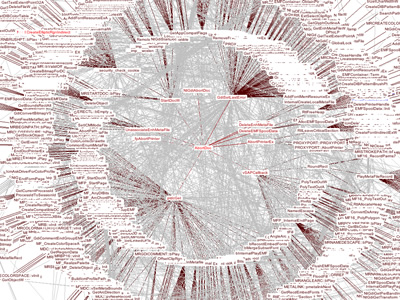
 863 863 | 2003 computer graphics by (unknown) Starlight is a generic information visualization tool, developed by the Pacific Northwest National Laboratory (USA), that is applicable to a wide range of problems. The first image shows a Starlight Network View representation of the "Information Visualization" Web community. This collection of Web pages was harvested using the Google search engine to retrieve the top 100 ranked pages containing the phrase "information visualization," as well as all pages that link to, or are linked to from, the pages in the query result set. The entire collection consists of approximately 1500 pages. In this view, nodes represent discrete Web pages, and edges represent hyperlink references among the pages. The pages are color-encoded according to their link class, with pages in the original result set colored green, result set inlinks colored blue, and result set outlinks colored yellow. Note that the majority of the result set pages are embedded in the clique (dodecahedra) and cluster (stellated dodecahedra) nodes. The second image portraits the same Web page collection, now displayed as a Starlight Concept View. It shows conceptual correlations among the contents of the page text. Groups of conceptually related pages are shown displayed in the same cluster, and the clusters are arranged spatially such that clusters that are most similar are spatially adjacent. |
 561 561 | 20050603 computer graphics by CNET Networks 2005-10-04: "The Big Picture" - Ontology viewer for cnet.com articles From InfoVis:Wiki The Big Picture is an online ontology viewer that is applied to c|net News.com articles to show relationships between stories, companies, and topics. It allows for a completely new and very interesting way of exploring news stories. The tool has been developed in cooperation with Liveplasma.com (formerly MusicPlasma). The Big Picture - Ontology viewer that connects stories, companies, and topics within the News.com website. The example shows the network centered around the article Apple to ditch IBM, switch to Intel chips.[CNET, 2005a] The Big Picture - Ontology viewer that connects stories, companies, and topics within the News.com website. The example shows the network centered around the article Apple to ditch IBM, switch to Intel chips. [CNET, 2005a] via information aesthetics blog [edit] References * [CNET, 2005a] CNET Networks. The Big Picture. Retrieved at: October 4, 2005. http://beta.news.com.com/The+Big+Picture/2030-12_3-5843390.html? * [CNET, 2005b] CNET Networks. Apple to ditch IBM, switch to Intel chips. Created at: June 3, 2005. Retrieved at: October 4, 2005. http://beta.news.com.com/Apple+to+ditch+IBM%2C+switch+to+Intel+chips/2100-1006_3-5731398.html?tag=nl |
 1070 1070 | computer graphics by Li-Te Cheng, Bernard Kerr Open source software, such as Firefox, Linux, and Eclipse, is created collaboratively by a group of individuals who make the code accessible to the public to both use and enhance. Seeing the pattern of contributions to these projects can provide useful insights into the vitality of the project and the community building it. The Bloom Diagram provides a visualization of contribution activity in open source projects. At a glance, this tool can summarize the overall level of coding and discussion in a project, show which individuals are the recent key contributors, and allow comparisons across multiple projects. The Bloom Diagram is being used to study Sourceforge.net, one of the most popular open source community sites, and the IIOSB (the IBM Internal Open Source Bazaar), a site hosted internally within IBM to promote open source-style development. The screenshot below is an example of the Bloom Diagram for a Sourceforge project. The upper left portion provides summary statistics about the project, for example the total number of events by commentor and coder. Using the slider in the timeline, top right, users can see the state of the project at different points in time. Users can also play an animation of the activity over time from this timeline. The inset on the bottom left is a live "magnifying glass" view around the current mouse position. Keyboard controls are also available to let users zoom in, out, and pan around the screen. This diagram gives us a clear sense of the overall proportion of coding to commenting activity in this project. The inner ring, which represents code events, takes up slightly more than a quarter of the circle. One quarter of the outer ring, which represents comment events, overlaps with the inner ring, revealing that only 25% of the community is commenting and coding. The majority of contributors (75%) are just discussing the project. When the user moves the timeline slider, animated bubbles appear in the inner or outer ring. A bubble in the inner ring represents a code event, while a bubble in the outer ring indicates a comment event. The bubble position as it animates provides a cue about the frequency and recency of the event. If the person associated with the event seldom contributes code or comments after that event, the bubble drifts outward, leaving a "trail" (a series of unfilled circles). If the person continues to create code or comments, the bubble moves back to its starting position, creating a "bounce-back" effect. Judging from this diagram, there seems to be a core group of developers who frequently contribute code (25% of the bubbles in the inner ring are bouncing around the center) and a peripheral group of people commenting on the project less frequently (75% bubbles in the outer ring with fewer bouncing toward the center). Bloom Diagrams can provide useful insights into how things are going on a project. For example, project leads can use them as a dashboard to monitor how often people are contributing and follow up when contributions start to slow. Potential contributors may decide whether or not to join a project depending on the activity they see. Hosting providers of open source projects can identify the hot projects to promote on the front pages of their community sites or check on the ones that seem to be dying down. |
 1067 1067 | 2006 computer graphics by (unknown) This project represents a visualization of the genealogical tree of an online community (Breedster). Breedster is an online community website designed for friends. The main goal of the service is to make one's social life, and that of their friends, more active and stimulating, by both enriching existing relationships and establishing new ones by reaching out to people never met before. Breedster organizes every personal web of acquaintances in an innovative format called Copulogram. It doesn't just show one's personal network, it gives an accurate depiction of all their relations. These images represent a Copulogram of all 10313 Breedster members (6018 active, 4295 terminated accounts) generated on 2004-05-22. Not all relations are mapped, encounters that produced no offspring are not visualised to avoid further clutter. Father relations are shown in blue, mother relions in red, children with identical parents are grouped in semi circles. All 43 community founders are shown in the center, the youngest generation is shown on the perimeter. |
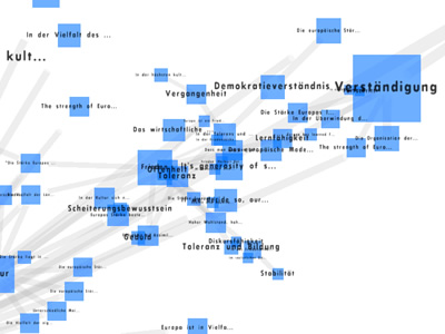 984 984 | 2005 computer graphics by Dietmar Offenhuber Commissioned by Ars Electronica FutureLab, Thought Landscape (Gedankenlandschaft), is an interactive 3 dimensional browser that allows a smooth navigation among thoughts concerning the European Community. For the Austrian EC presidency, 200 European key people were questioned about their opinions on the strengths, weaknesses, chances and risks of the European Union. Dietmar Offenhuber, a resident artist at FutureLab, developed Thought Landscape based on the co-occurrences of these specific topics and created 4 different color-coded dynamic graphs, which illustrate common ideas within each of the key subjects, respectively, strengths (Starken), weakenesses (Schwachen), chances (Chancen) and risks (Risiken). |
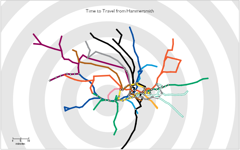 560 560 | 2006 computer graphics by Tom Carden 2006-01-25: Travel Time Tube Map From InfoVis:Wiki Travel Time Tube Map - Screenshot of an processing Applet that distorts the London underground network circularly according to travel times from a selected station.[Carden, 2006] Travel Time Tube Map - Screenshot of an processing Applet that distorts the London underground network circularly according to travel times from a selected station. [Carden, 2006] Travel Time Tube Map is a processing Applet that distorts the London underground network circularly according to travel times from a selected station. Homepage: http://www.tom-carden.co.uk/p5/tube_map_travel_times/applet/ [Carden, 2006] Tom Carden, Travel Time Tube Map, created at: January 1, 2006, retrieved at: January 25, 2006. http://www.tom-carden.co.uk/p5/tube_map_travel_times/applet/ |
 562 562 | 2005 computer graphics by codecubed.com 2005-07-18: Treemap representation of del.icio.us most popular bookmarks From InfoVis:Wiki Treemap representation of del.icio.us bookmarks [codecubed.com, 2005] codecubed.com offers a treemap represenation of the most popular bookmarks in the del.icio.us online social bookmarks manager: http://codecubed.com/map.html via information aesthetics blog [codecubed.com, 2005] dgottfrid@gmail.com, Retrieved: July 19, 2005. http://codecubed.com/map.html |
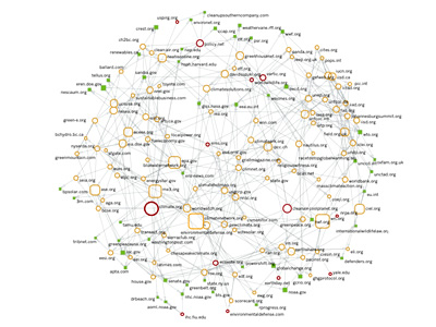
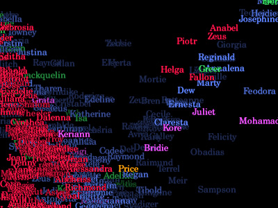 739 739 | 1995 computer graphics by Judith S. Donath The population of a real-world community creates many visual patterns. Some are patterns of activity: the ebb and flow of rush hour traffic or the swift appearance of umbrellas at the onset of a rain-shower. Others are patterns of affiliation, such as the sea of business suits streaming from a commuter train, or the bright t-shirts and sun-glasses of tourists circling a historic site.rnrnVisual Who makes these patterns visible. It creates an interactive visualization of the members' affiliations and animates their arrivals and departures. The visualization uses a spring model. The user chooses groups (for example, subscribers to a mailing-list) to place on the screen as anchor points. The names of the community members are pulled to each anchor by a spring, the strength of which is determined by the individual's degree of affiliation with the group represented by the anchor. The visualization is dynamic, with the motion of the names contributing to the viewer's understanding of the underlying data. |
 900 900 | 2005 computer graphics by (unknown) This project visualizes the community within 36trucs.com (similar to 43things.com), a group of people that share a set of personal goals and tips on how to achieve them. This project supports this community by highlighting the proximities between persons by shared objectives. Goals are linked through common attributes (one or more) and are grouped on 'places' while attributes appear on 'roads'. The wider the road, the more numerous are the common attributes. Other applications for this tool are described in French on www.social-computing.com. In the application section of the website one can see some of the listed domains: social network analysis, music sample proximities through common playlists, companies networks through common boards of directors, among others. |
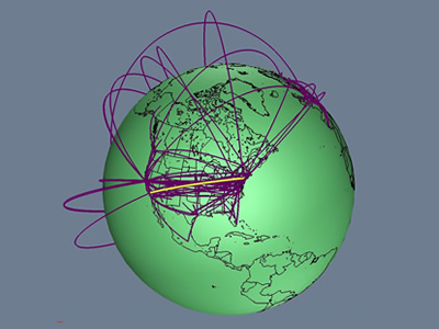 736 736 | 1996 computer graphics by Tamara Munzner, Eric Hoffman, K. We present a case study of visualizing the global topology of the Internet MBone. Developed and initially deployed by researchers within the Internet community, the MBone has been extremely popular for efficient transmission across the Internet of real-time video and audio streams such as conferences, meetings, congressional sessions, and NASA shuttle launches. The MBone, like the Internet itself, grew exponentially with no central authority. The resulting suboptimal topology is of growing concern to network providers and the multicast research community. We create a geographic representation of the tunnel structure as arcs on a globe by resolving the latitude and longitude of MBone routers. The interactive 3D maps permit an immediate understanding of the global structure unavailable from the data in its original form as lines of text with only hostnames and IP addresses. Data visualization techniques such as grouping and thresholding allow further analysis of specific aspects of the MBone topology. |
 925 925 | 2005 computer graphics by Franck Ghitalla, Guilhem Fouetil This visualization reflects the impact of blogs and websites in swinging public opinion on the May referendum about European Constitution in France. The goal of this study was to better understand the political debate on the Web and how it is structured in terms of sites correlations. Taking as treating starting point ten sites of the referendum, the authors repatriated more than 12.000 sites and 2.500.000 pages. After an extensive automated filtering process seeking for words or expressions in connection with the debate, 295 sites were selected and classified in either sites of Yes or sites of No. The No campaign set up 161 of the 295 sites focusing on the constitutional debate, helping redress a bias towards the Yes campaign in the mainstream media. The No vote eventually won the referendum on May 29 with a 55 per cent majority. It is the community of No which is densest, 76% of its bonds are intercommunity against 52,5% for Yes. If one brings back these figures to the respective sizes of the communities and calculates the coefficient of opening for each community, there's a coefficient of opening 20% more significant for the community of Yes than for that of No. In the depicted graph, red nodes denote the No sites while the blue ones reflect the Yes. Edges express relationships (linkage) and the nodes' size represents the level of authority (popularity), in analogy to GoggleRank. |
 797 797 | 2004 computer graphics by Jeffrey Heer Vizster is an interactive visualization tool for online social networks, allowing exploration of the community structure of social networking services such as friendster.com, tribe.net, and orkut. Such services provide means by which users can publicly articulate their mutual "friendship" in the form of friendship links, forming an undirected graph in which users are the nodes and friendship links are the edges. These services also allow users to describe themselves in a profile, including attributes such as age, marital status, sexual orientation, and various interests. Vizster provides a visualization of such services, providing an interactive sociogram for exploring the links between network members. In addition to visualizing "friendship" linkages, Vizster supports a range of exploratory search features, providing visualization of the rich profile data characteristic of these services, features which traditional sociograms are not designed to communicate. |
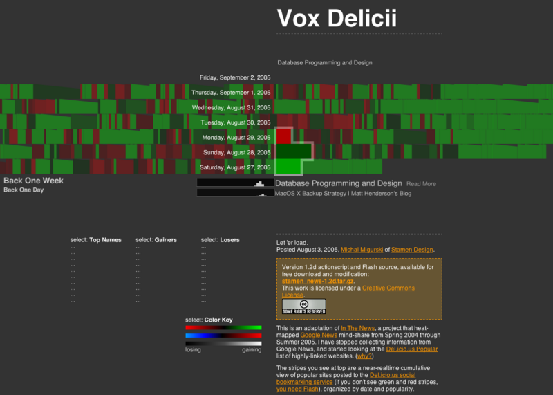 559 559 | 2005 computer graphics by Michal Migurski 2005-09-02: "In The News" moves from Google News to del.icio.us tags and is now called "Vox Delicii" From InfoVis:Wiki Michal Miguski's interesting work In The News (see 2005-07-21: "In The News" - Interactive Visualization of Google News) abandoned the visualization of Google News entries due to various issues regarding Google's News service and moved over to visualizing del.icio.us bookmark tags. The only downside is the disappearance of the Search functionality... Vox Delicii (del.icio.us bookmarks visualization) [Migurski, 2005] Related Information * 2005-07-18: Treemap representation of del.icio.us most popular bookmarks * 2005-07-21: "In The News" - Interactive Visualization of Google News [Migurski, 2005] Michal Migurski, Vox Delicii. Created at: August 3, 2005. Retrieved at: September 2, 2005. http://news.stamen.com/vox/ |
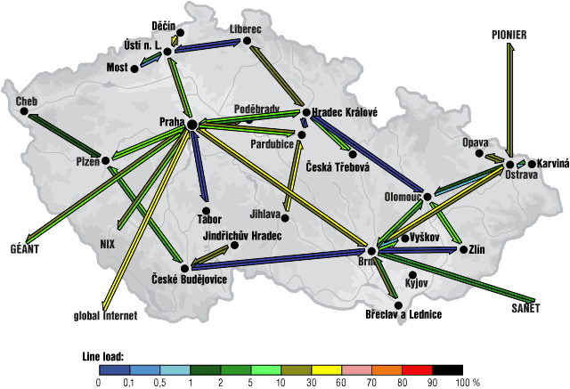 509 509 | computer graphics This is an example of the weather map for the CESNET2 network serving the education and research community in the Czech Republic from the 24th of January 2002. This map shows traffic load for links in the network over the previous ten minutes by colour coding of the arrow. |
 992 992 | computer graphics by Pedram Amini Founded in June of 2005 as the brainchild of Pedram Amini, the Open Reverse Code Engineering community was created to foster a shared learning environment among researchers interested in the field of reverse engineering. OpenRCE aims to serve as a centralized resource for reverse engineers (currently heavily win32/security/malcode biased) by hosting files, blogs, forums articles and more. The Win32 Call Chains database, initially contributed to OpenRCE by Pedram Amini, attempts to provide a useful and comprehensive interface to the function call trees of the main Microsoft Windows Dynamic Link Libraries (DLLs). The data-set was originally contructed during the development of a proof of concept Windows Intrusion Prevention System (IPS), similar to NAI Entercept and Okena/Cisco CSA. The database is organized by each Windows Operating System version (2000, 2003 SE, XP) and can be easily browsed and searched. Within each OS version, there's an interactive Java visualization for every module which creates some of the most amazingly complex graphs. The first image shows the resulting graph of Windows XP SP2 GDI32 module, while the second represents the NETAPI32 module of the same OS. |
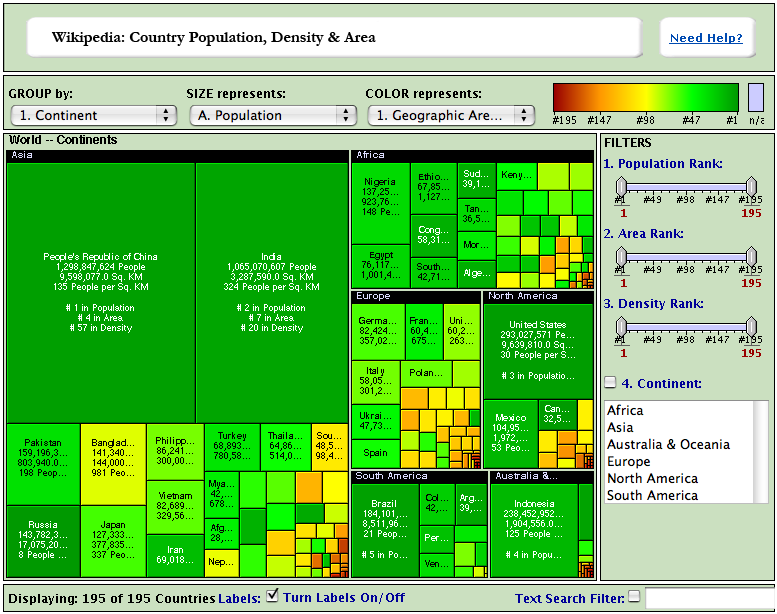 636 636 | computer graphics (interactive) by The Hive Group Wikipedia: Country Population, Density & Area Each square in the Honeycomb map is a country. A Brief Explanation * Population, population density, and geographic area estimates used in this map are taken from the CIA Factbook 2004, a wonderful public domain source of information. There are 191 United Nations member states depicted in the map. Also included are Taiwan, Vatican City, the West Bank, and the Gaza Strip. As we have likely made a great number of typographical errors in entering the information, we encourage you to take this data with more than a grain of salt: Please apply salt liberally. If you discover an error that simply demands fixing, please email us. (Note: We've updated the map to reflect 2004 population figures.) * We have played rather fast and loose with the continents. Betraying what some might call a continent-centric bias, all island nations belong to continents. We've treated Australia and the surrounding island groupings as Australia & Oceania, a label that is certain to raise someone's ire. For purposes of simplicity, We have interpreted Asia and North America very broadly, with each corresponding roughly to the area that it would occupy in the board game Risk™. All countries have been assigned a primary continent. For purposes of this map, Russia and Turkey are in Asia. * Many countries have populations and geographical area added to their totals on the basis of protectorate or commonwealth holdings. These countries have notes that appear within their mouseover boxes, indicating that their totals are somewhat inflated by additional territories. The only "double-counting" in the map — areas included in one country's total but also considered independently — are the Gaza Strip & the West Bank, which are both included in Israel's total and included as separate entries. We did not include these regions in this manner as a political statement, but rather to note the remarkable population density of the Gaza Strip. Had these areas been solely included in Israel's total, the Gaza Strip's decidedly urban character would be lost on the user. * Yes, Denmark includes Greenland. Denmark by itself is just not that big and has a relatively dense population. Since Greenland is humungous and not very populous, Denmark's population density ends up being, well, not very high. * Make sure and click on a few countries to view their Wikipedia entries. Wikipedia is a community-maintained encyclopedia, and it is a peerless source of organized general information. * The Most Incredible Tidbit We Learned While Building the Map: Russia is more than 100x as large as Bangladesh, but the two have very similiarly sized populations. |